
Search results for "Science primarily based" in Home Design Ideas
 The Cultural Landscape Foundation
Saturday, May 30, 1:30 to 3:00pm | Santa Monica
Hightree by Jay Griffith of Jay Griffith Design
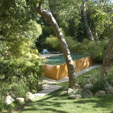
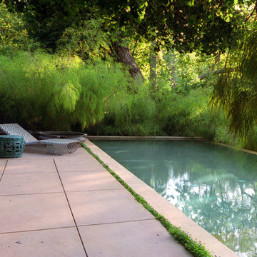
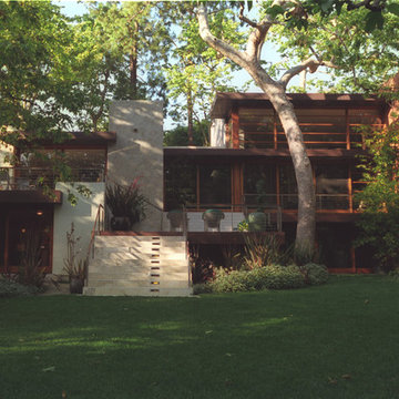
This half-acre site is nestled into the Rustic Canyon neighborhood, and is the second collaboration between the landscape designer and client. Architect Steven Ehrlich designed the striking Modernist home fifteen years ago. It is set on the canyon floor amidst native California sycamores, the only holdover from the previous design. The garden is naturalistic in spirit, but carefully calibrated to include species that thrive in the canyon’s specific microclimate, primarily determined by soil conditions and limited light quality. A dramatic rectilinear elevated pool, based on the house’s strong geometry, offsets the sycamore’s angularity and curvilinear nature. The pool’s design is practical, it’s five-foot tall walls address safety concerns associated with having small children; but It’s also very sculptural, a seamless, buff-colored plaster-coated concrete monolith. The watery surface suggests one of the house’s giant windows. Vast sweeps of understory plantings offer subtle contrasts both textural and though tonal variations of green. Photos by Jorge Rafael
 Turf Care Enterprises, Inc.
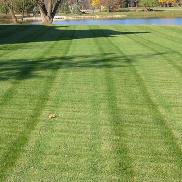
We primarily use natural mineral- and organic-based fertilizers on your lawn. 100% organic fertilizers are an option too.
 Constructive Alternatives
SUSTAINABLE, COOL, AND A SMOOTH FLIGHT FOR YOU
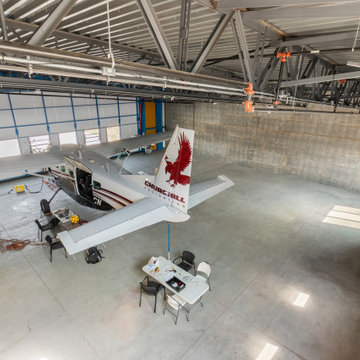
This was the first Executive VIP CAT I & II Airport Hangar ever sold at the Boulder Municipal Airport. We completed the first phase of this pilot project in 2019. We completed a remodel for a national shoe brand's headquarters in 2022.
The original build made it perfect for private aircraft/jet owners who want to be based right in the heart of the developing area of Boulder City.
The first of three planned executive hangars is nestled in the premium south-west location of Boulder Airport with stunning waterfront & mountain views of Hayden Lake, the iconic Flatirons, Boulder Foothills, and white capped Front Range.
Before being remodeled primarily for office space, the 4,650 SF executive hangar could accommodate as many as 5 aircraft and included a 30’x15’ 2nd floor mezzanine office flooded with natural light, operable skylight providing ventilation, large picture window and phenomenal Skydeck with panoramic views of the lake and flatirons. The new owners added more mezzanine square footage and windows to section off the area for an executive office space and multi-purpose/multi-media room.
This is one of the only high-performance renewable energy executive airport hangars in the country, exempt from energy code requirements due to low energy usage of less than 1 watt/SF. It was designed with a 6 hour fire-rating, fire sprinkling system, and built with high performance hybrid engineering and technologies to offset the energy load pathways so when all renewables are added it can operate completely standalone and self-sustainable. The building envelope insulation & sound attenuation systems includes 10” Insulated Concrete Form walls using recycled materials & radiant in-floor heat. In the recent remodel we added geothermal loops to utilize the in-floor tubing for renewable cooling in the hot summer months.
The 58’x18’ Schweiss hydraulic hangar door features insulated panels (like what NASA uses inside their rockets) and 6 windows. There’s an additional 10’x10’ overhead door & 2 personnel doors. The 4,095 SF new structural concrete slab apron was constructed to CDOT spec with 65’ trench drain at apron entrance. The main floor features an ADA bathroom with shower, utility floor sink, 2 interior hot & cold hose bibs. Electrical service is a commercial 480-volt, 3-phase with 400 amps with outlets throughout. Ready with 2 EV (Electric vehicle) charging outlets on the west exterior.
As mentioned, after the hangar was purchased by a sustainable national shoe brand, we remodeled it for the new owner's work and warehousing requirements. We added 3 Viessman Solar thermal collectors, HRV-Geothermal Pre-Heating and Cooling System & Battery Power Back-Up System, portable work station “pods”, a large bar, kitchen area, eating spaces, lounge, multimedia room, shoe display areas, more natural lighting and other custom finishes.
Once a solar PV system is added to the south-facing rooftop, the hangar will achieve better than a net zero designation, it could in fact help power some of the other facilities at the airport as well as several EVs through outdoor charging stations.
Contact Constructive Alternatives if you’re interested in a similar self-sustainable executive hangar, built to suit.
Find the right local pro for your project
 Little Crown Interiors
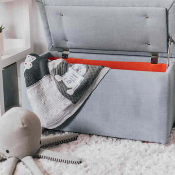
This boy's nursery is modern with clean lines and a masculine feel. We had to get creative with placing the furniture in this design because the room is triangular in shape. The color palette for this nursery is primarily white and gray. For a bit of contrast we added navy details throughout the room. The client fell in love with a super versatile crib in white with acrylic details. We opted for a custom dresser with a changing table tray to get the perfect fit and color. One of my favorite pieces in this space is the light-colored modern rocking chair, which is compact yet comfortable. We used mixed metallics in this space so the chrome base of the rocker ties in with gold detail on the side table. Even the cozy textured gray rug has metallic details. The storage bench with a surprise pop of color doubles as additional seating. We installed two white shelving units on both sides of the bench for a peaceful, symmetrical look and a display for decor and toys. The major statement penguin photograph was a favorite of my client! It makes for a playful artistic focal point and I love that is versatile enough to grow with the child and space.
Design: Little Crown Interiors
Photography: Full Spectrum Photography
 User
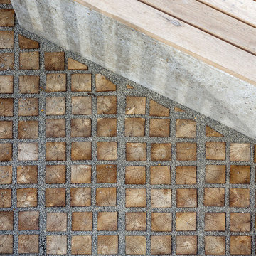
UserBudapest, Hungary | Dublin-based O'Donnell + Tuomey collaborated with the Hungarian architectural, firm M-Teampannon, to refurbish and enhance Budapest's Central European University – a U.S.- and Hungarian-accredited graduate school which focuses on social sciences and humanities. The 34€ million project plans include a five-story library, a cafe and an expanded auditorium and a rooftop terrance featuring BLL USA's patent-pending Black Locust Permeable Pavers.
 Truitt and White Window and Door Showroom
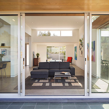
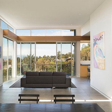
This hillside home in Piedmont, CA was remodeled to change the style from a 1940's rancher with eight foot ceilings and dark interiors, into a modern geometric composition with vast white interiors for casual living and generous daylighting for displaying the artist-owner's works.
In a city known for rigorous and difficult design review, an addition, two variances, and a full stylistic change were unanimously approved on the first round. All sloped roofs and attics were eliminated and replaced by a series of stacked and overlapping flat roofs. This made the house taller on the inside and shorter on the outside, which helped earn design review cooperation in the community. Windows were concentrated toward the rear yard views or moved up high on the side walls for daylight and privacy, benefitting the owners as well as the neighbors.
At the start, the owner husband was so enthusiastic and engaged in transforming his house into something modern that he presented the architect with a scaled foamcore model, rather than the usual magazine clippings and wish list. He participated in the design decisions throughout the process. The owner wife is the artist who did all the artwork in the house. She had been craving a display space with large walls and good natural light. Both of them loved the location and great views.
The project was an opportunity to transform the style of an older traditional home into a modern one, while solving numerous problems. By rebuilding the 1800 ft2 top of the 3-story home it was possible to change the style of the whole building, since the lower floors were a neutral base, and also to change the lifestyle of the owners, who wanted to move their master suite upstairs and live primarily on the top floor as empty nesters.
Going into the project, the architect knew there were multiple encroachments into the setbacks and potential privacy issues with close by neighbors. He approached this as a complex puzzle made up of architectural and political pieces which all had to fit together elegantly. It took many careful moves, small and large, to arrive at a serene and cohesive result that tied old and new together seamlessly.
The design-build contractor worked closely with the owners and handled all of the construction phase documents and design adjustments, adding ideas of their own to make the project really sing.
The project was a collaboration in three acts. The owner had a strong design concept from the start. The architect developed it into a realistic project and garnered the design approvals. Then the contractor executed brilliantly
 True Carpentry and Cabinetry
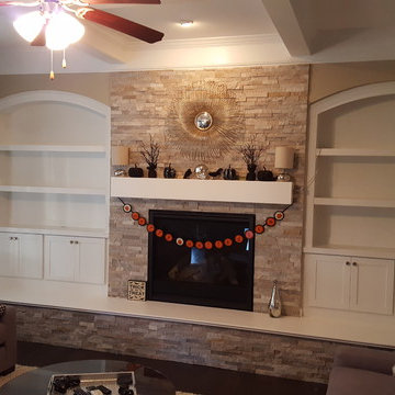
Fireplace built-ins design primarily by the customer with a little help. Platform was their idea. Base units are just 26" tall, but still enough for a 2-shelf media cabinet on the left side. Includes a hidden drawer for DVD's, also on the left side (facing it). Upper unit shelves are actually adjustable, thought this is hardly evident.

 User
UserThis hillside home in Piedmont, CA was remodeled to change the style from a 1940's rancher with eight foot ceilings and dark interiors, into a modern geometric composition with vast white interiors for casual living and generous daylighting for displaying the artist-owner's works.
In a city known for rigorous and difficult design review, an addition, two variances, and a full stylistic change were unanimously approved on the first round. All sloped roofs and attics were eliminated and replaced by a series of stacked and overlapping flat roofs. This made the house taller on the inside and shorter on the outside, which helped earn design review cooperation in the community. Windows were concentrated toward the rear yard views or moved up high on the side walls for daylight and privacy, benefitting the owners as well as the neighbors.
At the start, the owner husband was so enthusiastic and engaged in transforming his house into something modern that he presented the architect with a scaled foamcore model, rather than the usual magazine clippings and wish list. He participated in the design decisions throughout the process. The owner wife is the artist who did all the artwork in the house. She had been craving a display space with large walls and good natural light. Both of them loved the location and great views.
The project was an opportunity to transform the style of an older traditional home into a modern one, while solving numerous problems. By rebuilding the 1800 ft2 top of the 3-story home it was possible to change the style of the whole building, since the lower floors were a neutral base, and also to change the lifestyle of the owners, who wanted to move their master suite upstairs and live primarily on the top floor as empty nesters.
Going into the project, the architect knew there were multiple encroachments into the setbacks and potential privacy issues with close by neighbors. He approached this as a complex puzzle made up of architectural and political pieces which all had to fit together elegantly. It took many careful moves, small and large, to arrive at a serene and cohesive result that tied old and new together seamlessly.
The design-build contractor worked closely with the owners and handled all of the construction phase documents and design adjustments, adding ideas of their own to make the project really sing.
The project was a collaboration in three acts. The owner had a strong design concept from the start. The architect developed it into a realistic project and garnered the design approvals. Then the contractor executed brilliantly.
 Gallery KBNY
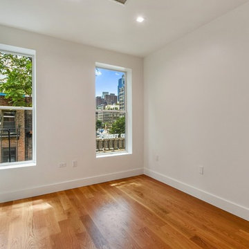
The owner of this historic and landmarked town-home renovation in Hudson Square, originally built in 1826, hired Gallery Kitchen and Bath to fully gut-renovate this 3-unit row-home. The scope of work included a full-scale renovation of the owners unit, including the renovation of the kitchen, one 4-piece master ensuite bathroom, one 3-piece bathroom with a walk-in steam shower, and a beautiful powder room. Additional work in the owners unit also included flooring, electrical upgrade, major plumbing work, new HVAC system, restoration of a fireplace, installation of a fully integrated smart home system and landmarked approved windows.
CELLAR RENOVATION IN NYC LANDMARKED TOWN-HOME
Rounding out the owners unit we renovated the cellar, which was converted into an entertainment space and featured a custom glass curtain wall, along with a custom staircase with an exposed brick wall. During the demolition phase of the cellar, our team discovered 56 wine jugs filled with wine from the prohibition era, leading us to name this project the prohibition house. For the two tenant units, Gallery Kitchen and Bath undertook the renovation of 2 kitchens, 4 bathrooms, new hardwood flooring throughout, along with detailed carpentry work in the entire home.
WHY GALLERY KITCHEN AND BATH
After interviewing multiple contractors, our client decided on Gallery Kitchen and Bath primarily because of our turnkey design, selection, and build process. In a renovation of this magnitude it is crucial to have a centralized full service contractor under one roof to handle all of the aspects and simultaneous moving parts of the project. Decentralizing the entire process by having multiple unaffiliated vendors handle various parts of the process can easily become chaotic, time consuming, and costly.
Because Gallery Kitchen and Bath undertook the entire process, from the design of the entire space to the selection and procurement of all finishes and fixtures, down to the procurement of all permits and LPC filings, it made a seemingly chaotic project a’lot more manageable.
PHASE 1: DESIGN, SELECTION, PROCUREMENT
Our client wanted the renovation to incorporate a fully modern design into his Hudson Square town-house. Being that this is a landmarked property, the exterior facade had to be restored and kept with the original aesthetic, the interior of the home however was a whole different story.
In keeping up with the modern aesthetic, our designers went to work to design a custom kitchen that included fully custom flat panel base cabinets in a white high gloss finish and an absolute matte black appliance/pantry wall. The kitchen design also included a white quartz countertop and backsplash with a waterfall edge island. To bring warmth to the modern kitchen, our designers incorporated a rifted and quartered select oak wood floor in a herringbone pattern, and custom blended stain with matte polyurethane finish. For continuity, the wood floor was also extended throughout the entire owners unit.
In the ensuite bathroom we created a “wet area” which houses a standalone soaking tub as well as a beautiful rainfall shower, completely leveled with the rest of the floor in the bathroom. Some highlights within this space include a tiled square drain, large niche cutouts with a carrera marble accents. Once again, to bring warmth to this modern bathroom, our designers incorporated a floating rustic oak vanity and carrera marble mosaic floor tile.
Last on the list on the owners unit floor was the cellar, which our client wanted to utilize as an entertainment space for his friends and family. During the design phase, we incorporated an open concept layout, wedding the indoor and outdoor space with a custom glass curtain wall. The design also included custom walnut built-ins that serve as a custom wet bar and storage piece.
With the design approved and selections made our office liaisons moved to procure all of the material selections and finishes.
PHASE 2: DEMO
Because this home is almost two centuries old, we had to take extra precaution during the interior demolition phase of the project. One specific area that we had to pay special attention to was the existing brick. Over time the mortar in old brick homes deteriorates and turns into dust – for this reason it was extremely important that a thorough and ongoing inspection of the exteriors and interior walls took place during the demolition of the space.
After 14 30-yard debris containers and 56 wine filled jugs from the prohibition era later , the demolition of this historic Hudson Square town-home came to an end. If you are wondering whether we tried the wine? After notifying the owner we agreed to open one of the jugs and try them together – nothing but vinegar.
PHASE 3: BUILD
One of the challenges in a renovation project of this scope is nailing down the logistics and delivery of fixtures and finish material. Adding to this challenge was a narrow entry door that required us to use a boom truck in order to deliver some of the larger materials on site. To ensure a succinct time schedule, we boomed all of the materials through the 3rd floor for the entire project and worked our renovation work from top floor to cellar. This technique also insured that any unexpected water issues during the renovation process would not damage a finished floor.
With all roughing and framing complete, the Gallery KBNY team proceeded to execute on the design plan.
THE REVEAL
From what was once a dilapidated town-home with nothing but potential, to a glamorous and luxurious modern interior space – the prohibition house was complete. Ready to speak with us about your renovation project? Contact us to schedule your free consultation and let Gallery KBNY show you why our all-inclusive approach to your renovation is the smartest way to renovating in NYC.
 User
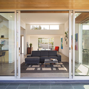
UserThis hillside home in Piedmont, CA was remodeled to change the style from a 1940's rancher with eight foot ceilings and dark interiors, into a modern geometric composition with vast white interiors for casual living and generous daylighting for displaying the artist-owner's works.
In a city known for rigorous and difficult design review, an addition, two variances, and a full stylistic change were unanimously approved on the first round. All sloped roofs and attics were eliminated and replaced by a series of stacked and overlapping flat roofs. This made the house taller on the inside and shorter on the outside, which helped earn design review cooperation in the community. Windows were concentrated toward the rear yard views or moved up high on the side walls for daylight and privacy, benefitting the owners as well as the neighbors.
At the start, the owner husband was so enthusiastic and engaged in transforming his house into something modern that he presented the architect with a scaled foamcore model, rather than the usual magazine clippings and wish list. He participated in the design decisions throughout the process. The owner wife is the artist who did all the artwork in the house. She had been craving a display space with large walls and good natural light. Both of them loved the location and great views.
The project was an opportunity to transform the style of an older traditional home into a modern one, while solving numerous problems. By rebuilding the 1800 ft2 top of the 3-story home it was possible to change the style of the whole building, since the lower floors were a neutral base, and also to change the lifestyle of the owners, who wanted to move their master suite upstairs and live primarily on the top floor as empty nesters.
Going into the project, the architect knew there were multiple encroachments into the setbacks and potential privacy issues with close by neighbors. He approached this as a complex puzzle made up of architectural and political pieces which all had to fit together elegantly. It took many careful moves, small and large, to arrive at a serene and cohesive result that tied old and new together seamlessly.
The design-build contractor worked closely with the owners and handled all of the construction phase documents and design adjustments, adding ideas of their own to make the project really sing.
The project was a collaboration in three acts. The owner had a strong design concept from the start. The architect developed it into a realistic project and garnered the design approvals. Then the contractor executed brilliantly.
 User
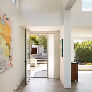
UserThis hillside home in Piedmont, CA was remodeled to change the style from a 1940's rancher with eight foot ceilings and dark interiors, into a modern geometric composition with vast white interiors for casual living and generous daylighting for displaying the artist-owner's works.
In a city known for rigorous and difficult design review, an addition, two variances, and a full stylistic change were unanimously approved on the first round. All sloped roofs and attics were eliminated and replaced by a series of stacked and overlapping flat roofs. This made the house taller on the inside and shorter on the outside, which helped earn design review cooperation in the community. Windows were concentrated toward the rear yard views or moved up high on the side walls for daylight and privacy, benefitting the owners as well as the neighbors.
At the start, the owner husband was so enthusiastic and engaged in transforming his house into something modern that he presented the architect with a scaled foamcore model, rather than the usual magazine clippings and wish list. He participated in the design decisions throughout the process. The owner wife is the artist who did all the artwork in the house. She had been craving a display space with large walls and good natural light. Both of them loved the location and great views.
The project was an opportunity to transform the style of an older traditional home into a modern one, while solving numerous problems. By rebuilding the 1800 ft2 top of the 3-story home it was possible to change the style of the whole building, since the lower floors were a neutral base, and also to change the lifestyle of the owners, who wanted to move their master suite upstairs and live primarily on the top floor as empty nesters.
Going into the project, the architect knew there were multiple encroachments into the setbacks and potential privacy issues with close by neighbors. He approached this as a complex puzzle made up of architectural and political pieces which all had to fit together elegantly. It took many careful moves, small and large, to arrive at a serene and cohesive result that tied old and new together seamlessly.
The design-build contractor worked closely with the owners and handled all of the construction phase documents and design adjustments, adding ideas of their own to make the project really sing.
The project was a collaboration in three acts. The owner had a strong design concept from the start. The architect developed it into a realistic project and garnered the design approvals. Then the contractor executed brilliantly.
 Kansas City Landscape
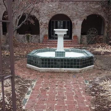
 Historic fountain restoration and renovation kansas city Arkansas, Historic fountain restoration and renovation Denver Co, Historic fountain restoration and renovation Nebraska , Historic fountain restoration and renovation Memphis TN, Historic fountain restoration and renovation Nashville TN, Historic fountain restoration and renovation Springfield IL , is a professional endeavor that seeks to preserve, conserve, revive, and protect fountains and water features, and associated ornamental objects, landscapes or other artifacts of historic significance. Thru history we have seen the design and construction of fountains and water features move in two diametrically opposed directions. From the aesthetic side fountain have become much more simple and have far less architectural and artistic features, alternately we have seen fountains develop as objects of spectacle thru the use of technology and the application of advanced systems, engineering, and components. Architectural fountain conservation describes the process through which the material, historical, and design integrity of a fountain is prolonged through carefully planned interventions. The individual engaged in this pursuit is known as an architectural fountain conservator. The decisions of when and how to engage in an restoration intervention are critical to the ultimate conservation of the object. Ultimately, the decision is value based: a combination of artistic, contextual, and informational values is normally considered. In some cases, a decision to not intervene may be the most appropriate choice. The Masons Co and Dionysian Artificers deals with issues of prolonging the life and integrity of architectural fountains character and integrity, such as form and style, and/or its constituent materials, such as stone, brick, glass, metal, concrete, and systems . In this sense, the term refers to the professional use of a combination of science, art, craft, and technology as a preservation tool, and is allied with its parent fields, of historic environment conservation and art conservation
 Little Crown Interiors
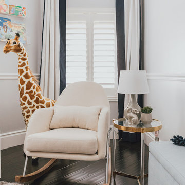
This boy's nursery is modern with clean lines and a masculine feel. We had to get creative with placing the furniture in this design because the room is triangular in shape. The color palette for this nursery is primarily white and gray. For a bit of contrast we added navy details throughout the room. The client fell in love with a super versatile crib in white with acrylic details. We opted for a custom dresser with a changing table tray to get the perfect fit and color. One of my favorite pieces in this space is the light-colored modern rocking chair, which is compact yet comfortable. We used mixed metallics in this space so the chrome base of the rocker ties in with gold detail on the side table. Even the cozy textured gray rug has metallic details. The storage bench with a surprise pop of color doubles as additional seating. We installed two white shelving units on both sides of the bench for a peaceful, symmetrical look and a display for decor and toys. The major statement penguin photograph was a favorite of my client! It makes for a playful artistic focal point and I love that is versatile enough to grow with the child and space.
Design: Little Crown Interiors
Photography: Full Spectrum Photography
 Abodo Wood Ltd
Cockle Bay House
Auckland, New Zealand
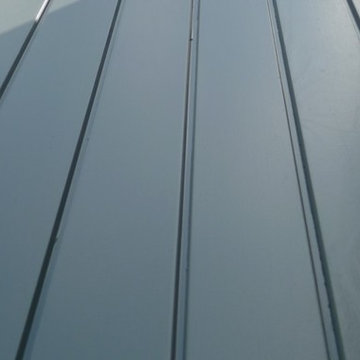
During the design of their new home, the Powell’s had a specific colour pallet in mind for the exterior. This included contrasting dark vertical cladding to the top of the building with light coloured brick at the base. Vulcan Primed Cladding was chosen primarily due to it’s ability to perform with a dark colour in the harsh Auckland climate . The weatherboards were painted on site with Resene Mako CoolColour- with 15% LRV, this colour is much darker than allowed on other timber weatherboard products. The cladding continues to perform excellently with virtually no movement or warping.
 Lista & Vidmar - Storage & Workspace Systems
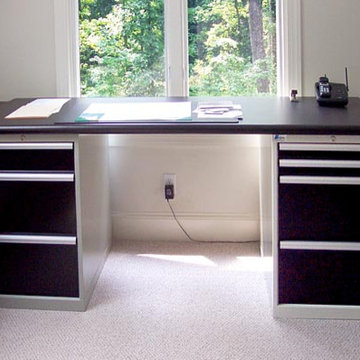
A clean, organized workplace is a productive workplace. So when sales representative Randy Kirchof was researching how to furnish his new home office, he knew it had to do a lot more than just look good.
His former home office furnishings were not only unsuitable for a thriving home-based business, they didn't work with each other, either. "My old home office had a mismatch of furniture," Randy says. "When we built our new house, I decided I was going to do it right. That meant outfitting my office with Lista cabinets."
A solid choice.
Randy's office now contains a bank of Lista drawer storage cabinets, which stand a short chair-roll from his Lista desk, and fit nicely against the short vertical wall space that meets a sloping ceiling. The drawers' sharp black finish adds a clean contrast to the office's primarily white surroundings. The desk is comprised of two Lista cabinet pedestals, each of which flanks a sizable window that overlooks the passing seasons.
A solid worktop bridges the space between the two cabinets, creating a spacious desk surface that not only maintains the aesthetic feel of the surroundings, but also enhances the space's durable functionality - features that are certainly not lost on Randy.
"Most file cabinets are rickety pieces of junk," he says. "Lista's are really solid."
It's an impression that seems to be shared by visitors as well. "Lista stuff works perfectly in a home environment. Everyone who comes up to see the office is blown away."
 User
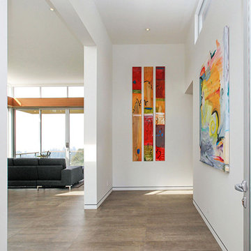
UserThis hillside home in Piedmont, CA was remodeled to change the style from a 1940's rancher with eight foot ceilings and dark interiors, into a modern geometric composition with vast white interiors for casual living and generous daylighting for displaying the artist-owner's works.
In a city known for rigorous and difficult design review, an addition, two variances, and a full stylistic change were unanimously approved on the first round. All sloped roofs and attics were eliminated and replaced by a series of stacked and overlapping flat roofs. This made the house taller on the inside and shorter on the outside, which helped earn design review cooperation in the community. Windows were concentrated toward the rear yard views or moved up high on the side walls for daylight and privacy, benefitting the owners as well as the neighbors.
At the start, the owner husband was so enthusiastic and engaged in transforming his house into something modern that he presented the architect with a scaled foamcore model, rather than the usual magazine clippings and wish list. He participated in the design decisions throughout the process. The owner wife is the artist who did all the artwork in the house. She had been craving a display space with large walls and good natural light. Both of them loved the location and great views.
The project was an opportunity to transform the style of an older traditional home into a modern one, while solving numerous problems. By rebuilding the 1800 ft2 top of the 3-story home it was possible to change the style of the whole building, since the lower floors were a neutral base, and also to change the lifestyle of the owners, who wanted to move their master suite upstairs and live primarily on the top floor as empty nesters.
Going into the project, the architect knew there were multiple encroachments into the setbacks and potential privacy issues with close by neighbors. He approached this as a complex puzzle made up of architectural and political pieces which all had to fit together elegantly. It took many careful moves, small and large, to arrive at a serene and cohesive result that tied old and new together seamlessly.
The design-build contractor worked closely with the owners and handled all of the construction phase documents and design adjustments, adding ideas of their own to make the project really sing.
The project was a collaboration in three acts. The owner had a strong design concept from the start. The architect developed it into a realistic project and garnered the design approvals. Then the contractor executed brilliantly.
 Louis Poulsen USA
Design: Ross Lovegrove
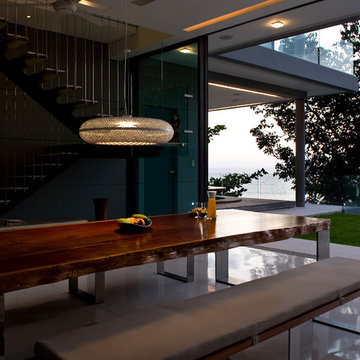
Concept: The fixture emits warm diffuse light directed primarily downwards. The reflector design is based on the organic Fibonacci pattern and provides a rare and appealing light distribution, as well as a decorative effect on the fixture. The organically inspired perforation pattern on the body of the fixture also provides an interesting and mystical lighting effect. The fixture has an almost three-dimensional expression, which makes it appear to float in the room.
Finish: Golden sand or white, wet painted.
Material: Shades: Deep drawn aluminum. Diffuser: Acrylic. Wire connector: Turned aluminum. Canopy: Spun aluminum.
Mounting: Suspension type: 3x stainless steel aircraft cables. Canopy: Golden sand or white. Cord type: 3-conductor, 18 AWG white PVC power cord. Cord length (fixture): 5’. Cord length (extension): 13'
Weight: Max. 9.9 lbs.
Label: cULus, Dry location. IBEW.
Sponsored
Columbus, OH

Hope Restoration & General Contracting
Columbus Design-Build, Kitchen & Bath Remodeling, Historic Renovations

 LOREC Ranch Home Furnishings
LOREC Ranch, based in Oklahoma, is known for its exceptional rustic and Western-inspired furniture. However, the store also offers a curated selection of books that complement its unique aesthetic and appeal to a wide range of interests. These books span various genres, focusing primarily on themes that resonate with LOREC Ranch's brand, such as Western culture, rustic living, cooking, and lifestyle.
 The Cultural Landscape Foundation
Saturday, May 30, 1:30 to 3:00pm | Santa Monica
Hightree by Jay Griffith of Jay Griffith Design
This half-acre site is nestled into the Rustic Canyon neighborhood, and is the second collaboration between the landscape designer and client. Architect Steven Ehrlich designed the striking Modernist home fifteen years ago. It is set on the canyon floor amidst native California sycamores, the only holdover from the previous design. The garden is naturalistic in spirit, but carefully calibrated to include species that thrive in the canyon’s specific microclimate, primarily determined by soil conditions and limited light quality. A dramatic rectilinear elevated pool, based on the house’s strong geometry, offsets the sycamore’s angularity and curvilinear nature. The pool’s design is practical, it’s five-foot tall walls address safety concerns associated with having small children; but It’s also very sculptural, a seamless, buff-colored plaster-coated concrete monolith. The watery surface suggests one of the house’s giant windows. Vast sweeps of understory plantings offer subtle contrasts both textural and though tonal variations of green. Photos by Jorge Rafael
 The Cultural Landscape Foundation
Saturday, May 30, 1:30 to 3:00pm | Santa Monica
Hightree
Jay Griffith of Jay Griffith
This half-acre site is nestled into the Rustic Canyon neighborhood, and is the second collaboration between the landscape designer and client. Architect Steven Ehrlich designed the striking Modernist home fifteen years ago. It is set on the canyon floor amidst native California sycamores, the only holdover from the previous design. The garden is naturalistic in spirit, but carefully calibrated to include species that thrive in the canyon’s specific microclimate, primarily determined by soil conditions and limited light quality. A dramatic rectilinear elevated pool, based on the house’s strong geometry, offsets the sycamore’s angularity and curvilinear nature. The pool’s design is practical, it’s five-foot tall walls address safety concerns associated with having small children; but It’s also very sculptural, a seamless, buff-colored plaster-coated concrete monolith. The watery surface suggests one of the house’s giant windows. Vast sweeps of understory plantings offer subtle contrasts both textural and though tonal variations of green.
31