
Search results for "Science primarily based" in Home Design Ideas
 San Luis Kitchen Co.
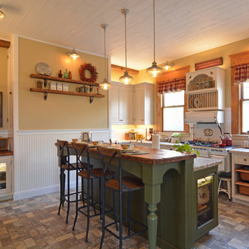
Using the home’s Victorian architecture and existing mill-work as inspiration we restored an antique home to its vintage roots. The many-times remodeled kitchen was desperately in need of a unifying theme so we used Pavilion Raised cabinetry in a cottage finish to bring back a bygone era. The homeowner purchased Elmira Stove Works antique style appliances, reclaimed wood for the bar counter, and rustic (grayed brick) flooring. Victorian period appropriate inset cabinetry is hand distressed for a ‘lived-in’ look. The owners are avid antique collectors of unique Americana freestanding pieces and accessories which add a wealth of playful accents, while at the same time, are useful items for the cook. Together these details create a kitchen that fits comfortably in this classic home.
The island features a Special Cottage Russian Olive finish with bead board paneling, turned posts, curved valances, a farmhouse style sink, paneled dishwasher and, finally, a unique combination cabinet with double trash facing the front and a shallow cabinet with wire mesh door facing out the side. The inset doorstyle called for combination cabinets blending such items as a base corner turn-out cabinet with drawers and then a base pull-out pantry. We included wicker baskets, fine-line drawer inserts, a dish rack and wall storage with faux cubby drawers (the drawers are full width with multiple drawerheads). Note also the eyebrow pediment, pull-out pantry and the hide-away doors on the ‘appliance wall’.

 down2earth Interior Design, LLC.
Is your closet busting at the seams? Or do you perhaps have no closet at all? Time to consider adding a mudroom to your house. Mudrooms are a popular interior design trend these days, and for good reason - they can house far more than a simple coat closet can. They can serve as a family command center for kids' school flyers and menus, for backpacks and shoes, for art supplies and sports equipment. Some mudrooms contain a laundry area, and some contain a mail station. Some mudrooms serve as a home base for a dog or a cat, with easy to clean, low maintenance building materials. A mudroom may consist of custom built-ins, or may simply be a corner of an existing room with pulled some clever, freestanding furniture, hooks, or shelves to house your most essential mudroom items.
Whatever your storage needs, extensive or streamlined, carving out a mudroom area can keep the whole family more organized. And, being more organized saves you stress and countless hours that would otherwise be spent searching for misplaced items.
While we love to design mudroom niches, a full mudroom interior design allows us to do what we do best here at Down2Earth Interior Design: elevate a space that is primarily driven by pragmatic requirements into a space that is also beautiful to look at and comfortable to occupy. I find myself voluntarily taking phone calls while sitting on the bench of my mudroom, simply because it's a comfortable place to be. My kids do their homework in the mudroom sometimes. My cat loves to curl up on sweatshirts temporarily left on the bench, or cuddle up in boxes on their way out to the recycling bins, just outside the door. Designing a custom mudroom for our family has elevated our lifestyle in so many ways, and I look forward to the opportunity to help make your mudroom design dreams a reality as well.
Photos by Ryan Macchione
 The Cultural Landscape Foundation
Saturday, May 30, 1:30 to 3:00pm | Santa Monica
Hightree by Jay Griffith of Jay Griffith Design
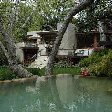
This half-acre site is nestled into the Rustic Canyon neighborhood, and is the second collaboration between the landscape designer and client. Architect Steven Ehrlich designed the striking Modernist home fifteen years ago. It is set on the canyon floor amidst native California sycamores, the only holdover from the previous design. The garden is naturalistic in spirit, but carefully calibrated to include species that thrive in the canyon’s specific microclimate, primarily determined by soil conditions and limited light quality. A dramatic rectilinear elevated pool, based on the house’s strong geometry, offsets the sycamore’s angularity and curvilinear nature. The pool’s design is practical, it’s five-foot tall walls address safety concerns associated with having small children; but It’s also very sculptural, a seamless, buff-colored plaster-coated concrete monolith. The watery surface suggests one of the house’s giant windows. Vast sweeps of understory plantings offer subtle contrasts both textural and though tonal variations of green. Photos by Jorge Rafael
Find the right local pro for your project
 The Cultural Landscape Foundation
Saturday, May 30, 1:30 to 3:00pm | Santa Monica
Hightree by Jay Griffith of Jay Griffith Design
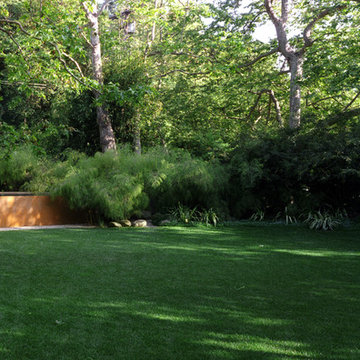
This half-acre site is nestled into the Rustic Canyon neighborhood, and is the second collaboration between the landscape designer and client. Architect Steven Ehrlich designed the striking Modernist home fifteen years ago. It is set on the canyon floor amidst native California sycamores, the only holdover from the previous design. The garden is naturalistic in spirit, but carefully calibrated to include species that thrive in the canyon’s specific microclimate, primarily determined by soil conditions and limited light quality. A dramatic rectilinear elevated pool, based on the house’s strong geometry, offsets the sycamore’s angularity and curvilinear nature. The pool’s design is practical, it’s five-foot tall walls address safety concerns associated with having small children; but It’s also very sculptural, a seamless, buff-colored plaster-coated concrete monolith. The watery surface suggests one of the house’s giant windows. Vast sweeps of understory plantings offer subtle contrasts both textural and though tonal variations of green. Photos by Jorge Rafael
 Truitt and White Window and Door Showroom
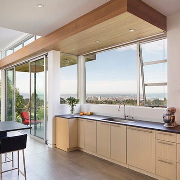
This hillside home in Piedmont, CA was remodeled to change the style from a 1940's rancher with eight foot ceilings and dark interiors, into a modern geometric composition with vast white interiors for casual living and generous daylighting for displaying the artist-owner's works.
In a city known for rigorous and difficult design review, an addition, two variances, and a full stylistic change were unanimously approved on the first round. All sloped roofs and attics were eliminated and replaced by a series of stacked and overlapping flat roofs. This made the house taller on the inside and shorter on the outside, which helped earn design review cooperation in the community. Windows were concentrated toward the rear yard views or moved up high on the side walls for daylight and privacy, benefitting the owners as well as the neighbors.
At the start, the owner husband was so enthusiastic and engaged in transforming his house into something modern that he presented the architect with a scaled foamcore model, rather than the usual magazine clippings and wish list. He participated in the design decisions throughout the process. The owner wife is the artist who did all the artwork in the house. She had been craving a display space with large walls and good natural light. Both of them loved the location and great views.
The project was an opportunity to transform the style of an older traditional home into a modern one, while solving numerous problems. By rebuilding the 1800 ft2 top of the 3-story home it was possible to change the style of the whole building, since the lower floors were a neutral base, and also to change the lifestyle of the owners, who wanted to move their master suite upstairs and live primarily on the top floor as empty nesters.
Going into the project, the architect knew there were multiple encroachments into the setbacks and potential privacy issues with close by neighbors. He approached this as a complex puzzle made up of architectural and political pieces which all had to fit together elegantly. It took many careful moves, small and large, to arrive at a serene and cohesive result that tied old and new together seamlessly.
The design-build contractor worked closely with the owners and handled all of the construction phase documents and design adjustments, adding ideas of their own to make the project really sing.
The project was a collaboration in three acts. The owner had a strong design concept from the start. The architect developed it into a realistic project and garnered the design approvals. Then the contractor executed brilliantly
 Blue Hill Cabinet & Woodwork
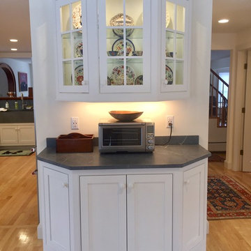
This angled end cabinet upper has glass doors and glass shelves and is primarily for show casing pottery. The angled base cabinet has pullout trays in front and adjustable shelves on either end.
 Fresh Paint LLC
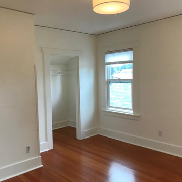
This is the room after we skim-coated, primed and painted. We sprayed the millwork and used a brush and roller for the walls and ceilings. We primarily use Benjamin Moore paint, but sometimes we use Sherwin Williams paints.

 Lista & Vidmar - Storage & Workspace Systems
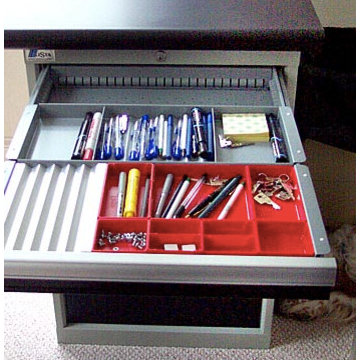
A clean, organized workplace is a productive workplace. So when sales representative Randy Kirchof was researching how to furnish his new home office, he knew it had to do a lot more than just look good.
His former home office furnishings were not only unsuitable for a thriving home-based business, they didn't work with each other, either. "My old home office had a mismatch of furniture," Randy says. "When we built our new house, I decided I was going to do it right. That meant outfitting my office with Lista cabinets."
A solid choice.
Randy's office now contains a bank of Lista drawer storage cabinets, which stand a short chair-roll from his Lista desk, and fit nicely against the short vertical wall space that meets a sloping ceiling. The drawers' sharp black finish adds a clean contrast to the office's primarily white surroundings. The desk is comprised of two Lista cabinet pedestals, each of which flanks a sizable window that overlooks the passing seasons.
A solid worktop bridges the space between the two cabinets, creating a spacious desk surface that not only maintains the aesthetic feel of the surroundings, but also enhances the space's durable functionality - features that are certainly not lost on Randy.
"Most file cabinets are rickety pieces of junk," he says. "Lista's are really solid."
It's an impression that seems to be shared by visitors as well. "Lista stuff works perfectly in a home environment. Everyone who comes up to see the office is blown away."
 San Luis Kitchen Co.
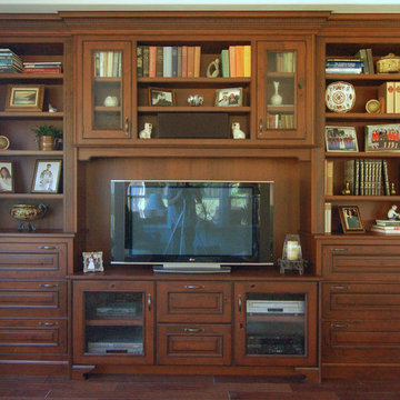
This client brought me a catalog featuring entertainment furniture and asked if we could do something similar with built-in cabinetry customized to their needs. I replied in the positive and asked what their specific needs were -- what electronic components did they want, what would be stored here, did they want any open shelves for display or books, etc? Using primarily inset style cabinetry we created a built-in wall unit that includes storage drawers (for both their video library and for the grandkids toys and games), open shelves and display cabinets. Centrally we have the TV, video and audio equipment (infrared remotes necessitated the glass doors), and additional storage -- we used frame-less construction cabinets here to gain usable space inside the base unit.
Wood-Mode Fine Custom Cabinetry, Galleria Raised
 Truitt and White Window and Door Showroom
This hillside home in Piedmont, CA was remodeled to change the style from a 1940's rancher with eight foot ceilings and dark interiors, into a modern geometric composition with vast white interiors for casual living and generous daylighting for displaying the artist-owner's works.
In a city known for rigorous and difficult design review, an addition, two variances, and a full stylistic change were unanimously approved on the first round. All sloped roofs and attics were eliminated and replaced by a series of stacked and overlapping flat roofs. This made the house taller on the inside and shorter on the outside, which helped earn design review cooperation in the community. Windows were concentrated toward the rear yard views or moved up high on the side walls for daylight and privacy, benefitting the owners as well as the neighbors.
At the start, the owner husband was so enthusiastic and engaged in transforming his house into something modern that he presented the architect with a scaled foamcore model, rather than the usual magazine clippings and wish list. He participated in the design decisions throughout the process. The owner wife is the artist who did all the artwork in the house. She had been craving a display space with large walls and good natural light. Both of them loved the location and great views.
The project was an opportunity to transform the style of an older traditional home into a modern one, while solving numerous problems. By rebuilding the 1800 ft2 top of the 3-story home it was possible to change the style of the whole building, since the lower floors were a neutral base, and also to change the lifestyle of the owners, who wanted to move their master suite upstairs and live primarily on the top floor as empty nesters.
Going into the project, the architect knew there were multiple encroachments into the setbacks and potential privacy issues with close by neighbors. He approached this as a complex puzzle made up of architectural and political pieces which all had to fit together elegantly. It took many careful moves, small and large, to arrive at a serene and cohesive result that tied old and new together seamlessly.
The design-build contractor worked closely with the owners and handled all of the construction phase documents and design adjustments, adding ideas of their own to make the project really sing.
The project was a collaboration in three acts. The owner had a strong design concept from the start. The architect developed it into a realistic project and garnered the design approvals. Then the contractor executed brilliantly
 Wilson AC & Appliance
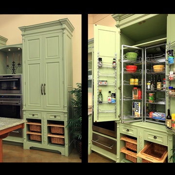
Pair Sub-Zero’s refrigeration and Wolf’s cooking appliances and you’ve got a kitchen that can’t be beat. Both are made in the United States with premium grade materials and thoroughly tested for reliability, performance and energy efficiency. Enjoy food preparation and preservation that is technologically advanced and artistically beautiful.
Sub-Zero’s design possibilities are endless with choices including integrated units or built ins with custom cabinetry, stainless steel finishes and even glass doors. Sub-Zero’s dual refrigeration technology has taken the science of food preservation to an all new level. Fresh foods stay fresh, frozen foods last longer. Sub-Zero’s advanced water filtration system keeps water and ice clean and tasting fresh. Air is refreshed every 20 minutes with an antimicrobial purification system (based on NASA technology) scrubbing the air of bacteria, mold and viruses. Vegetables stay crisper, fruits and meats are fresher and food odors are significantly reduced.
Wolf’s vast array of rangetops, cooktops, and integrated modules blend together beautifully with the style of your kitchen and the space you’ve got - all with Wolf’s famous quality and precision cooking technology. Whether your preference be gas, induction, and even infrared; whether you are an expert cook or novice; Wolf’s extraordinary performance will give you consistent, precise and beautiful results.
 Dube Fine Art Design Studios
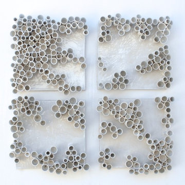
Designed from a mathematical equation!
Each tile base is approximately 10" square. The wheel-thrown tubes are individually attached with about a 3" depth. Glossy white glaze.
Set of 4.
 Columbia Cabinets
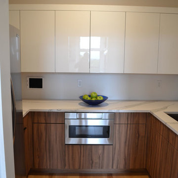
Type of Project: Kitchen and Pantry
Style of Project: Mid-Century Modern
Cabinetry: Brookhaven (Wood-Mode)
Wood: High Gloss MDF, Laminate Doors
Finishes: Bright White High Gloss, Vertical Oiled Walnut Laminate
Door: Vista
Countertop: Cambria Britannica Matte
Other Design Elements:
• Fridge wrapped with walnut laminate, mixed with high gloss white drawer base adjacent to range
• Two-sided island with waterfall ends and lower table area for casual meals with two young daughters
• Back of island and pantry with touch latch (no hardware)
• No wall cabinets in kitchen to keep the clean contemporary lines
• Walnut laminate chosen to blend with the darkest color variation in birch flooring
• Pantry like a second kitchen with sink, fridge and pantry for out of sight entertaining prep and clean-up as well as abundant storage
Awards:
2018 Saratoga Showcase of Homes, Luxury Homes-Best Kitchen
2018 Saratoga Showcase of Homes, Luxury Homes-People’s Choice Award
Project Year: 2017-2018
Others who worked on this project: Form Collaborative, Wood-Mode,
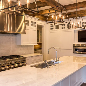
This extraordinary project was part of a very special Saratoga Showcase home designed by The Form Collaborative for a family with two small girls. Every detail was considered to maximize the vision of an open floorplan, with emphasis on unique focal points and indoor/outdoor connectivity and symmetry.
The kitchen was designed in two parts: the statement making kitchen that is part of the great room and the pantry that acts as a second space for prep, clean-up and storage. The kitchen achieves a tailored, clean aesthetic through carefully curated design elements including the handsome juxtaposition of oiled walnut laminate and bright white high gloss, touch latch mechanisms removing the need for hardware, and an absence of any wall cabinetry. The pantry, while primarily designed around functional needs, does not disappoint in its striking, modern design.
 Truitt and White Window and Door Showroom
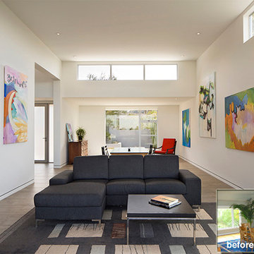
This hillside home in Piedmont, CA was remodeled to change the style from a 1940's rancher with eight foot ceilings and dark interiors, into a modern geometric composition with vast white interiors for casual living and generous daylighting for displaying the artist-owner's works.
In a city known for rigorous and difficult design review, an addition, two variances, and a full stylistic change were unanimously approved on the first round. All sloped roofs and attics were eliminated and replaced by a series of stacked and overlapping flat roofs. This made the house taller on the inside and shorter on the outside, which helped earn design review cooperation in the community. Windows were concentrated toward the rear yard views or moved up high on the side walls for daylight and privacy, benefitting the owners as well as the neighbors.
At the start, the owner husband was so enthusiastic and engaged in transforming his house into something modern that he presented the architect with a scaled foamcore model, rather than the usual magazine clippings and wish list. He participated in the design decisions throughout the process. The owner wife is the artist who did all the artwork in the house. She had been craving a display space with large walls and good natural light. Both of them loved the location and great views.
The project was an opportunity to transform the style of an older traditional home into a modern one, while solving numerous problems. By rebuilding the 1800 ft2 top of the 3-story home it was possible to change the style of the whole building, since the lower floors were a neutral base, and also to change the lifestyle of the owners, who wanted to move their master suite upstairs and live primarily on the top floor as empty nesters.
Going into the project, the architect knew there were multiple encroachments into the setbacks and potential privacy issues with close by neighbors. He approached this as a complex puzzle made up of architectural and political pieces which all had to fit together elegantly. It took many careful moves, small and large, to arrive at a serene and cohesive result that tied old and new together seamlessly.
The design-build contractor worked closely with the owners and handled all of the construction phase documents and design adjustments, adding ideas of their own to make the project really sing.
The project was a collaboration in three acts. The owner had a strong design concept from the start. The architect developed it into a realistic project and garnered the design approvals. Then the contractor executed brilliantly
 User
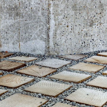
UserBudapest, Hungary | Dublin-based O'Donnell + Tuomey collaborated with the Hungarian architectural, firm M-Teampannon, to refurbish and enhance Budapest's Central European University – a U.S.- and Hungarian-accredited graduate school which focuses on social sciences and humanities. The 34€ million project plans include a five-story library, a cafe and an expanded auditorium and a rooftop terrance featuring BLL USA's patent-pending Black Locust Permeable Pavers.
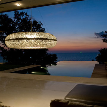
 Louis Poulsen USA
Design: Ross Lovegrove
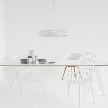
Concept: The fixture emits warm diffuse light directed primarily downwards. The reflector design is based on the organic Fibonacci pattern and provides a rare and appealing light distribution, as well as a decorative effect on the fixture. The organically inspired perforation pattern on the body of the fixture also provides an interesting and mystical lighting effect. The fixture has an almost three-dimensional expression, which makes it appear to float in the room.
Finish: Golden sand or white, wet painted.
Material: Shades: Deep drawn aluminum. Diffuser: Acrylic. Wire connector: Turned aluminum. Canopy: Spun aluminum.
Mounting: Suspension type: 3x stainless steel aircraft cables. Canopy: Golden sand or white. Cord type: 3-conductor, 18 AWG white PVC power cord. Cord length (fixture): 5’. Cord length (extension): 13'
Weight: Max. 9.9 lbs.
Label: cULus, Dry location. IBEW.
 Gallery KBNY
The owner of this historic and landmarked town-home renovation in Hudson Square, originally built in 1826, hired Gallery Kitchen and Bath to fully gut-renovate this 3-unit row-home. The scope of work included a full-scale renovation of the owners unit, including the renovation of the kitchen, one 4-piece master ensuite bathroom, one 3-piece bathroom with a walk-in steam shower, and a beautiful powder room. Additional work in the owners unit also included flooring, electrical upgrade, major plumbing work, new HVAC system, restoration of a fireplace, installation of a fully integrated smart home system and landmarked approved windows.
CELLAR RENOVATION IN NYC LANDMARKED TOWN-HOME
Rounding out the owners unit we renovated the cellar, which was converted into an entertainment space and featured a custom glass curtain wall, along with a custom staircase with an exposed brick wall. During the demolition phase of the cellar, our team discovered 56 wine jugs filled with wine from the prohibition era, leading us to name this project the prohibition house. For the two tenant units, Gallery Kitchen and Bath undertook the renovation of 2 kitchens, 4 bathrooms, new hardwood flooring throughout, along with detailed carpentry work in the entire home.
WHY GALLERY KITCHEN AND BATH
After interviewing multiple contractors, our client decided on Gallery Kitchen and Bath primarily because of our turnkey design, selection, and build process. In a renovation of this magnitude it is crucial to have a centralized full service contractor under one roof to handle all of the aspects and simultaneous moving parts of the project. Decentralizing the entire process by having multiple unaffiliated vendors handle various parts of the process can easily become chaotic, time consuming, and costly.
Because Gallery Kitchen and Bath undertook the entire process, from the design of the entire space to the selection and procurement of all finishes and fixtures, down to the procurement of all permits and LPC filings, it made a seemingly chaotic project a’lot more manageable.
PHASE 1: DESIGN, SELECTION, PROCUREMENT
Our client wanted the renovation to incorporate a fully modern design into his Hudson Square town-house. Being that this is a landmarked property, the exterior facade had to be restored and kept with the original aesthetic, the interior of the home however was a whole different story.
In keeping up with the modern aesthetic, our designers went to work to design a custom kitchen that included fully custom flat panel base cabinets in a white high gloss finish and an absolute matte black appliance/pantry wall. The kitchen design also included a white quartz countertop and backsplash with a waterfall edge island. To bring warmth to the modern kitchen, our designers incorporated a rifted and quartered select oak wood floor in a herringbone pattern, and custom blended stain with matte polyurethane finish. For continuity, the wood floor was also extended throughout the entire owners unit.
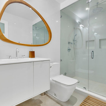
In the ensuite bathroom we created a “wet area” which houses a standalone soaking tub as well as a beautiful rainfall shower, completely leveled with the rest of the floor in the bathroom. Some highlights within this space include a tiled square drain, large niche cutouts with a carrera marble accents. Once again, to bring warmth to this modern bathroom, our designers incorporated a floating rustic oak vanity and carrera marble mosaic floor tile.
Last on the list on the owners unit floor was the cellar, which our client wanted to utilize as an entertainment space for his friends and family. During the design phase, we incorporated an open concept layout, wedding the indoor and outdoor space with a custom glass curtain wall. The design also included custom walnut built-ins that serve as a custom wet bar and storage piece.
With the design approved and selections made our office liaisons moved to procure all of the material selections and finishes.
PHASE 2: DEMO
Because this home is almost two centuries old, we had to take extra precaution during the interior demolition phase of the project. One specific area that we had to pay special attention to was the existing brick. Over time the mortar in old brick homes deteriorates and turns into dust – for this reason it was extremely important that a thorough and ongoing inspection of the exteriors and interior walls took place during the demolition of the space.
After 14 30-yard debris containers and 56 wine filled jugs from the prohibition era later , the demolition of this historic Hudson Square town-home came to an end. If you are wondering whether we tried the wine? After notifying the owner we agreed to open one of the jugs and try them together – nothing but vinegar.
PHASE 3: BUILD
One of the challenges in a renovation project of this scope is nailing down the logistics and delivery of fixtures and finish material. Adding to this challenge was a narrow entry door that required us to use a boom truck in order to deliver some of the larger materials on site. To ensure a succinct time schedule, we boomed all of the materials through the 3rd floor for the entire project and worked our renovation work from top floor to cellar. This technique also insured that any unexpected water issues during the renovation process would not damage a finished floor.
With all roughing and framing complete, the Gallery KBNY team proceeded to execute on the design plan.
THE REVEAL
From what was once a dilapidated town-home with nothing but potential, to a glamorous and luxurious modern interior space – the prohibition house was complete. Ready to speak with us about your renovation project? Contact us to schedule your free consultation and let Gallery KBNY show you why our all-inclusive approach to your renovation is the smartest way to renovating in NYC.
 Studio Albaghuba
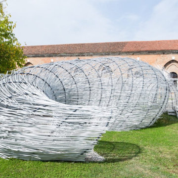
The Parasite Installation is the outcome of the cooperation between the architect Hsieh Ying Chun and TCA Think Tank, led by Pier Alessio Rizzardi, Zhang Hankun and Martin Huba
The pavilion took part in the installation Synergy & Symbiosis during the Architecture Biennale 2014 at the garden outside the Chinese Pavilion attracting visitors arriving from the Giardini and Arsenale exhibitions. (Based on the Bug Dome pavilion, a similar experiment from Hong Kong 2009, constructed by Weak! Architects as an icon of “illegal architecture).
The structure was primarily used as physical research of fundamental elements of the traditional space, understanding the basic concepts behind traditional Chinese spaces created the reference to developing the design.
We were happy to use simple parametric tools to build the form defined by two curves interacting with the existing permanent structure. As a result was created a lively spatial composition shaped by a single curved mesh.
The workshop used contemporary and locally produced economical materials, such as wires, metal nets and PVC pipes. The pipes are bent to create arches that guarantees zero impact, as well as a temporary environment for the fragile Venice Biennale venue. PVC was chosen for its flexibility, which allows several possible and flexible forms.
Main Designer: Pier Alessio Rizzardi
Design Team: Martin Huba, Zhang Hankun
http://tcathinktank.com/parasite-pavilion.html
 Columbia Cabinets
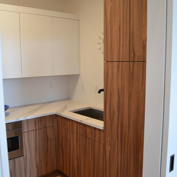
Type of Project: Kitchen and Pantry
Style of Project: Mid-Century Modern
Cabinetry: Brookhaven (Wood-Mode)
Wood: High Gloss MDF, Laminate Doors
Finishes: Bright White High Gloss, Vertical Oiled Walnut Laminate
Door: Vista
Countertop: Cambria Britannica Matte
Other Design Elements:
• Fridge wrapped with walnut laminate, mixed with high gloss white drawer base adjacent to range
• Two-sided island with waterfall ends and lower table area for casual meals with two young daughters
• Back of island and pantry with touch latch (no hardware)
• No wall cabinets in kitchen to keep the clean contemporary lines
• Walnut laminate chosen to blend with the darkest color variation in birch flooring
• Pantry like a second kitchen with sink, fridge and pantry for out of sight entertaining prep and clean-up as well as abundant storage
Awards:
2018 Saratoga Showcase of Homes, Luxury Homes-Best Kitchen
2018 Saratoga Showcase of Homes, Luxury Homes-People’s Choice Award
Project Year: 2017-2018
Others who worked on this project: Form Collaborative, Wood-Mode,
This extraordinary project was part of a very special Saratoga Showcase home designed by The Form Collaborative for a family with two small girls. Every detail was considered to maximize the vision of an open floorplan, with emphasis on unique focal points and indoor/outdoor connectivity and symmetry.
The kitchen was designed in two parts: the statement making kitchen that is part of the great room and the pantry that acts as a second space for prep, clean-up and storage. The kitchen achieves a tailored, clean aesthetic through carefully curated design elements including the handsome juxtaposition of oiled walnut laminate and bright white high gloss, touch latch mechanisms removing the need for hardware, and an absence of any wall cabinetry. The pantry, while primarily designed around functional needs, does not disappoint in its striking, modern design.
 Louis Poulsen USA
Design: Ross Lovegrove
Concept: The fixture emits warm diffuse light directed primarily downwards. The reflector design is based on the organic Fibonacci pattern and provides a rare and appealing light distribution, as well as a decorative effect on the fixture. The organically inspired perforation pattern on the body of the fixture also provides an interesting and mystical lighting effect. The fixture has an almost three-dimensional expression, which makes it appear to float in the room.
Finish: Golden sand or white, wet painted.
Material: Shades: Deep drawn aluminum. Diffuser: Acrylic. Wire connector: Turned aluminum. Canopy: Spun aluminum.
Mounting: Suspension type: 3x stainless steel aircraft cables. Canopy: Golden sand or white. Cord type: 3-conductor, 18 AWG white PVC power cord. Cord length (fixture): 5’. Cord length (extension): 13'
Weight: Max. 9.9 lbs.
Label: cULus, Dry location. IBEW.
28