
Search results for "Select credit" in Home Design Ideas

 RAJ Kitchen and Bath, LLC
**Check out the video of this transformation on our website**
This small kitchen was way too small for this 2 bedrooms, 2 bathrooms apartment. Not only was it a very small kitchen, but the physical location of it made it very difficult to make it any bigger. There wasn't much that could have been done without incurring astronomical cost, which would get little or no return on the investment. The client wanted a kitchen that can be optimized in its current location to add a ton of value for resale.
This was difficult to do, because there was no moving of any mechanical around in the kitchen and even if we wanted to, the management of the building would not allow. For those of you who live in condos, co-ops or apartment building, you know how difficult it is to rework these foot prints. When we showed up, we saw the problems, but we also saw a huge opportunity where we can achieve those goals in the small space. This was accomplished by making some key changes and to incorporate some new things that was not possible when this kitchen was built years ago.
The crucial part of the design that would drive the entire new layout, was selecting the only appliance; that was the Refrigerator. Once we nailed down that refrigerator, we then proceeded to design the kitchen around it. We moved it to the other side of the wall where the sink was so that we can tap into the water line from the sink plumbing. It was crucial that it stays exactly 24" deep, not an inch more because we had to keep the entry as open as possible. Also, it was going to be directly in front of another big storage unit - The pantry. It is not ideal in most cases, but we needed the rest of the space to ramp up the design and open feel towards the side where all of the activities would take place, which happend to be the dining room and the view.
Once all that was figured out, we re-positioned the sink, dishwasher and the range and proceeded to wrap the cabinets around the columns to integrate them into the space. Thirty- six inches cabinets height was used so that they can be installed higher towards the ceiling height to give more room rather than the standard 18" required height between the counter tops. This was done to make the room feel a lot bigger than it really was. Not to mention, we also didn't want the faucet to be buried under the cabinets so that was also a necessary design detail for the space.
We then lowered both knee walls so that the counter top can sit on top of them, by removing that stop point that would have otherwise defined the kitchen area. This allowed us to pick up that extra footprint into the room for added prep space and enabled us to create the illusion of a kitchen that is looking longer than it really is. Every inch mattered when designing this kitchen and we made a conscious decision to use every one of that inch.
White cabinets were selected to do just what white cabinets are design to do; make a small or dark room appear bigger, brighter and more open. In this kitchen, this was amplified the more because of the kitchen location. It was perfect! We knew we did justice to the space because while we were there taking some photos, a few potential buyers walked in and went straight for the kitchen! They said its design just to fit the apartment.
Pantry roll out shelving, Double recycle bin, fancy handles, LED lighting, Quartz counter top, beautiful backslash tiles and grey linen floors finished off the kitchen which looked over a beautiful view of the George Washington Bridge from the top of this lovely 4th floor apartment.
Credit to Masterpiece Tile and Marble (Annmarie on the selection of Tiles and countertop and Val on the Construction to complete this project).
Davor Kokic Photography
 RAJ Kitchen and Bath, LLC
**Check out the video of this transformation on our website**
This small kitchen was way too small for this 2 bedrooms, 2 bathrooms apartment. Not only was it a very small kitchen, but the physical location of it made it very difficult to make it any bigger. There wasn't much that could have been done without incurring astronomical cost, which would get little or no return on the investment. The client wanted a kitchen that can be optimized in its current location to add a ton of value for resale.
This was difficult to do, because there was no moving of any mechanical around in the kitchen and even if we wanted to, the management of the building would not allow. For those of you who live in condos, co-ops or apartment building, you know how difficult it is to rework these foot prints. When we showed up, we saw the problems, but we also saw a huge opportunity where we can achieve those goals in the small space. This was accomplished by making some key changes and to incorporate some new things that was not possible when this kitchen was built years ago.
The crucial part of the design that would drive the entire new layout, was selecting the only appliance; that was the Refrigerator. Once we nailed down that refrigerator, we then proceeded to design the kitchen around it. We moved it to the other side of the wall where the sink was so that we can tap into the water line from the sink plumbing. It was crucial that it stays exactly 24" deep, not an inch more because we had to keep the entry as open as possible. Also, it was going to be directly in front of another big storage unit - The pantry. It is not ideal in most cases, but we needed the rest of the space to ramp up the design and open feel towards the side where all of the activities would take place, which happend to be the dining room and the view.
Once all that was figured out, we re-positioned the sink, dishwasher and the range and proceeded to wrap the cabinets around the columns to integrate them into the space. Thirty- six inches cabinets height was used so that they can be installed higher towards the ceiling height to give more room rather than the standard 18" required height between the counter tops. This was done to make the room feel a lot bigger than it really was. Not to mention, we also didn't want the faucet to be buried under the cabinets so that was also a necessary design detail for the space.
We then lowered both knee walls so that the counter top can sit on top of them, by removing that stop point that would have otherwise defined the kitchen area. This allowed us to pick up that extra footprint into the room for added prep space and enabled us to create the illusion of a kitchen that is looking longer than it really is. Every inch mattered when designing this kitchen and we made a conscious decision to use every one of that inch.
White cabinets were selected to do just what white cabinets are design to do; make a small or dark room appear bigger, brighter and more open. In this kitchen, this was amplified the more because of the kitchen location. It was perfect! We knew we did justice to the space because while we were there taking some photos, a few potential buyers walked in and went straight for the kitchen! They said its design just to fit the apartment.
Pantry roll out shelving, Double recycle bin, fancy handles, LED lighting, Quartz counter top, beautiful backslash tiles and grey linen floors finished off the kitchen which looked over a beautiful view of the George Washington Bridge from the top of this lovely 4th floor apartment.
Credit to Masterpiece Tile and Marble (Annmarie on the selection of Tiles and countertop and Val on the Construction to complete this project).
Davor Kokic Photography
 RAJ Kitchen and Bath, LLC
**Check out the video of this transformation on our website**
This small kitchen was way too small for this 2 bedrooms, 2 bathrooms apartment. Not only was it a very small kitchen, but the physical location of it made it very difficult to make it any bigger. There wasn't much that could have been done without incurring astronomical cost, which would get little or no return on the investment. The client wanted a kitchen that can be optimized in its current location to add a ton of value for resale.
This was difficult to do, because there was no moving of any mechanical around in the kitchen and even if we wanted to, the management of the building would not allow. For those of you who live in condos, co-ops or apartment building, you know how difficult it is to rework these foot prints. When we showed up, we saw the problems, but we also saw a huge opportunity where we can achieve those goals in the small space. This was accomplished by making some key changes and to incorporate some new things that was not possible when this kitchen was built years ago.
The crucial part of the design that would drive the entire new layout, was selecting the only appliance; that was the Refrigerator. Once we nailed down that refrigerator, we then proceeded to design the kitchen around it. We moved it to the other side of the wall where the sink was so that we can tap into the water line from the sink plumbing. It was crucial that it stays exactly 24" deep, not an inch more because we had to keep the entry as open as possible. Also, it was going to be directly in front of another big storage unit - The pantry. It is not ideal in most cases, but we needed the rest of the space to ramp up the design and open feel towards the side where all of the activities would take place, which happend to be the dining room and the view.
Once all that was figured out, we re-positioned the sink, dishwasher and the range and proceeded to wrap the cabinets around the columns to integrate them into the space. Thirty- six inches cabinets height was used so that they can be installed higher towards the ceiling height to give more room rather than the standard 18" required height between the counter tops. This was done to make the room feel a lot bigger than it really was. Not to mention, we also didn't want the faucet to be buried under the cabinets so that was also a necessary design detail for the space.
We then lowered both knee walls so that the counter top can sit on top of them, by removing that stop point that would have otherwise defined the kitchen area. This allowed us to pick up that extra footprint into the room for added prep space and enabled us to create the illusion of a kitchen that is looking longer than it really is. Every inch mattered when designing this kitchen and we made a conscious decision to use every one of that inch.
White cabinets were selected to do just what white cabinets are design to do; make a small or dark room appear bigger, brighter and more open. In this kitchen, this was amplified the more because of the kitchen location. It was perfect! We knew we did justice to the space because while we were there taking some photos, a few potential buyers walked in and went straight for the kitchen! They said its design just to fit the apartment.
Pantry roll out shelving, Double recycle bin, fancy handles, LED lighting, Quartz counter top, beautiful backslash tiles and grey linen floors finished off the kitchen which looked over a beautiful view of the George Washington Bridge from the top of this lovely 4th floor apartment.
Credit to Masterpiece Tile and Marble (Annmarie on the selection of Tiles and countertop and Val on the Construction to complete this project).
Davor Kokic Photography
Find the right local pro for your project

 Bilotta Kitchen & Home
The homeowners wanted a sleek, contemporary kitchen that didn't feel cold, and still worked with the style of their classic, red brick colonial home. The design team, consisting of Bilotta senior designer, RitaLuisa Garcés and Billy Ceglia of Billy Ceglia Designs, opted for the warmth of traditional walnut cabinetry done in an exaggerated shaker style with ultra-thin stiles and rails and light textured laminate cabinets with distinct horizontal graining. The cabinetry they selected is Bilotta’s contemporary Artcraft line – European style cabinets manufactured in Canada. This combination of colors and textures helped solve another design issue: a long narrow space that opened directly into the family room. Cabinet colors and finishes helped to create the illusion of width in the space by situating the light cabinetry in an “L” across the rear wall and window wall of the space and “bookending” it with the full height walnut units that read more as paneling than cabinetry when viewed from the adjoining family room. The large simple island outfitted with Donghia counter stools, allows for an uninterrupted work space, storage of tabletop items, and also houses a “snack zone” for the client’s children with cabinetry and roll-outs for snacks, a microwave, and a beverage center all within easy reach, but outside of the main work area.
The custom stainless steel exhaust hood and handcrafted tile backsplash also add subtle visual interest to the space, reinforcing the idea that the back walls of the kitchen recede into the background creating the illusion of more space.
The centerpiece of the breakfast room is the multi light, hand blown chandelier from Niche Modern hanging above a blue lacquered breakfast table with stainless steel detailing and vintage Saarinen dining chairs. Together the components create a comfortable spot to dine, or just hang out.
Designers: RitaLuisa Garcés in collaboration with Billy Ceglia of Billy Ceglia Designs; Photo Credit: Peter Krupenye
 RAJ Kitchen and Bath, LLC
**Check out the video of this transformation on our website**
This small kitchen was way too small for this 2 bedrooms, 2 bathrooms apartment. Not only was it a very small kitchen, but the physical location of it made it very difficult to make it any bigger. There wasn't much that could have been done without incurring astronomical cost, which would get little or no return on the investment. The client wanted a kitchen that can be optimized in its current location to add a ton of value for resale.
This was difficult to do, because there was no moving of any mechanical around in the kitchen and even if we wanted to, the management of the building would not allow. For those of you who live in condos, co-ops or apartment building, you know how difficult it is to rework these foot prints. When we showed up, we saw the problems, but we also saw a huge opportunity where we can achieve those goals in the small space. This was accomplished by making some key changes and to incorporate some new things that was not possible when this kitchen was built years ago.
The crucial part of the design that would drive the entire new layout, was selecting the only appliance; that was the Refrigerator. Once we nailed down that refrigerator, we then proceeded to design the kitchen around it. We moved it to the other side of the wall where the sink was so that we can tap into the water line from the sink plumbing. It was crucial that it stays exactly 24" deep, not an inch more because we had to keep the entry as open as possible. Also, it was going to be directly in front of another big storage unit - The pantry. It is not ideal in most cases, but we needed the rest of the space to ramp up the design and open feel towards the side where all of the activities would take place, which happend to be the dining room and the view.
Once all that was figured out, we re-positioned the sink, dishwasher and the range and proceeded to wrap the cabinets around the columns to integrate them into the space. Thirty- six inches cabinets height was used so that they can be installed higher towards the ceiling height to give more room rather than the standard 18" required height between the counter tops. This was done to make the room feel a lot bigger than it really was. Not to mention, we also didn't want the faucet to be buried under the cabinets so that was also a necessary design detail for the space.
We then lowered both knee walls so that the counter top can sit on top of them, by removing that stop point that would have otherwise defined the kitchen area. This allowed us to pick up that extra footprint into the room for added prep space and enabled us to create the illusion of a kitchen that is looking longer than it really is. Every inch mattered when designing this kitchen and we made a conscious decision to use every one of that inch.
White cabinets were selected to do just what white cabinets are design to do; make a small or dark room appear bigger, brighter and more open. In this kitchen, this was amplified the more because of the kitchen location. It was perfect! We knew we did justice to the space because while we were there taking some photos, a few potential buyers walked in and went straight for the kitchen! They said its design just to fit the apartment.
Pantry roll out shelving, Double recycle bin, fancy handles, LED lighting, Quartz counter top, beautiful backslash tiles and grey linen floors finished off the kitchen which looked over a beautiful view of the George Washington Bridge from the top of this lovely 4th floor apartment.
Credit to Masterpiece Tile and Marble (Annmarie on the selection of Tiles and countertop and Val on the Construction to complete this project).
Davor Kokic Photography

 California Closets Connecticut
BROOKLYN OFFICE
Inserts Options
• Inserts provide stylish or colorful accents to your storage system, creating a highly personalized design feature to suit you and your home.
• Choose from a wide range of options like leather, glass, acrylic, and more.
• Accents of color provide a high-end look and make your storage system unique to your home.
• Inserts are durable and easy to maintain.
• Inserts provide an opportunity to add texture and depth to a design palette.
Our Products
At California Closets, we constantly pursue opportunities to provide our clients with environmentally sustainable options, and our products reflect this commitment.
All of our board is compliant with the California Air Resources Board (CARB), which consists of some of the most rigorous regulations for emission standards, and is available in a variety of substrates, including low-emitting formaldehyde. This certification applies to our three finishes - Classic, Lago®, and TesoroTM - which come in a wide range of beautiful colors and textures.
All of our composite wood doors and drawers are made from recycled or reclaimed wood fiber and can contribute toward achieving credit in both the LEED® 2009 and LEED v4 standards. LEED, Leadership in Energy and Environmental Design, is a nationally recognized system for green building that is administered by the U.S. Green Building Council.
We offer a selection of translucent accents door/drawer inserts, back panels and countertops, designed with solid finishes or organic material that contain between 38 - 40 percent recycled content and can be reclaimed at their end-of-life stage through the supplier. They are also certified by GREENGUARD, an environmental institute that seeks to improve indoor air quality and reduce human exposure to chemicals and other pollutants.
As an industry leader, California Closets continually seeks to increase our environmental commitment. Your design consultant can provide more details to determine which products best suit your sustainability needs. Revisit us as we continue to source new products with sustainable features.

 KINGDOM WOODWORKS
Collaboration with Canonbury Homes and Frank Neely Design Associates.
Inspiration for a timeless open concept kitchen remodel in Atlanta with beaded inset cabinets and two islands
Inspiration for a timeless open concept kitchen remodel in Atlanta with beaded inset cabinets and two islands


 Bilotta Kitchen & Home
For this expansive kitchen renovation, Designer, Randy O’Kane of Bilotta Kitchens worked with interior designer Gina Eastman and architect Clark Neuringer. The backyard was the client’s favorite space, with a pool and beautiful landscaping; from where it’s situated it’s the sunniest part of the house. They wanted to be able to enjoy the view and natural light all year long, so the space was opened up and a wall of windows was added. Randy laid out the kitchen to complement their desired view. She selected colors and materials that were fresh, natural, and unique – a soft greenish-grey with a contrasting deep purple, Benjamin Moore’s Caponata for the Bilotta Collection Cabinetry and LG Viatera Minuet for the countertops. Gina coordinated all fabrics and finishes to complement the palette in the kitchen. The most unique feature is the table off the island. Custom-made by Brooks Custom, the top is a burled wood slice from a large tree with a natural stain and live edge; the base is hand-made from real tree limbs. They wanted it to remain completely natural, with the look and feel of the tree, so they didn’t add any sort of sealant. The client also wanted touches of antique gold which the team integrated into the Armac Martin hardware, Rangecraft hood detailing, the Ann Sacks backsplash, and in the Bendheim glass inserts in the butler’s pantry which is glass with glittery gold fabric sandwiched in between. The appliances are a mix of Subzero, Wolf and Miele. The faucet and pot filler are from Waterstone. The sinks are Franke. With the kitchen and living room essentially one large open space, Randy and Gina worked together to continue the palette throughout, from the color of the cabinets, to the banquette pillows, to the fireplace stone. The family room’s old built-in around the fireplace was removed and the floor-to-ceiling stone enclosure was added with a gas fireplace and flat screen TV, flanked by contemporary artwork.
Designer: Bilotta’s Randy O’Kane with Gina Eastman of Gina Eastman Design & Clark Neuringer, Architect posthumously
Photo Credit: Phillip Ennis
 Bilotta Kitchen & Home
From the outside of this very traditional home in Harrison, New York, you would never expect the contemporary styling and pops of color throughout the interior, including the white feather chandelier and oversized painting of Marilyn Monroe with pink bubblegum, both of which accent the dinner table. When the client first came into meet with Bilotta designer, Danielle Florie, they had an idea of what they wanted, and what they didn’t want. They have modern/transitional taste and wanted both an aesthetically “wow” kitchen that was also very functional. Danielle made it come to life. They had been collecting photos for ten years before they decided to pull the trigger. They opted for Bilotta’s private cabinetry line, the Bilotta Collection, and selected a frameless, stepped door with double tiered wall cabinets, all accented by polished chrome rectangular pulls and square knobs. Instead of a deep corner cabinet they went with thick alumasteel shelves in the corner of the kitchen. At the peninsula they added some “bling” with the polished chrome and glass doors above the appliance garage. Also at the peninsula they decided to face their secondary, “prep” sink out towards the dinner table primarily so the kids could wash their hands before eating. There is also an undercounter beverage center to the right of that sink for easy access to drinks. Instead of going with a smooth painted finish they opted for a hand-brushed finish for a little texture. All appliances are Miele including their brand new 48” duel fuel range, smart enough on its own to tell you how to cook! The backsplash behind the range is the Stone Fox Collection from Ellen Blakeley of Ellen Blakely Studio in Santa Rosa, CA. It is a custom made tempered glass mosaic. The countertops and rest of the backsplash are White Diamond marble from Rye Marble, and the flooring is a porcelain Tile from Terra Tile. Designer: Danielle Florie. Photo Credit: Peter Krupenye
 RAJ Kitchen and Bath, LLC
**Check out the video of this transformation on our website**
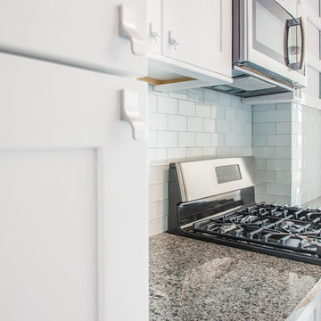
This small kitchen was way too small for this 2 bedrooms, 2 bathrooms apartment. Not only was it a very small kitchen, but the physical location of it made it very difficult to make it any bigger. There wasn't much that could have been done without incurring astronomical cost, which would get little or no return on the investment. The client wanted a kitchen that can be optimized in its current location to add a ton of value for resale.
This was difficult to do, because there was no moving of any mechanical around in the kitchen and even if we wanted to, the management of the building would not allow. For those of you who live in condos, co-ops or apartment building, you know how difficult it is to rework these foot prints. When we showed up, we saw the problems, but we also saw a huge opportunity where we can achieve those goals in the small space. This was accomplished by making some key changes and to incorporate some new things that was not possible when this kitchen was built years ago.
The crucial part of the design that would drive the entire new layout, was selecting the only appliance; that was the Refrigerator. Once we nailed down that refrigerator, we then proceeded to design the kitchen around it. We moved it to the other side of the wall where the sink was so that we can tap into the water line from the sink plumbing. It was crucial that it stays exactly 24" deep, not an inch more because we had to keep the entry as open as possible. Also, it was going to be directly in front of another big storage unit - The pantry. It is not ideal in most cases, but we needed the rest of the space to ramp up the design and open feel towards the side where all of the activities would take place, which happend to be the dining room and the view.
Once all that was figured out, we re-positioned the sink, dishwasher and the range and proceeded to wrap the cabinets around the columns to integrate them into the space. Thirty- six inches cabinets height was used so that they can be installed higher towards the ceiling height to give more room rather than the standard 18" required height between the counter tops. This was done to make the room feel a lot bigger than it really was. Not to mention, we also didn't want the faucet to be buried under the cabinets so that was also a necessary design detail for the space.
We then lowered both knee walls so that the counter top can sit on top of them, by removing that stop point that would have otherwise defined the kitchen area. This allowed us to pick up that extra footprint into the room for added prep space and enabled us to create the illusion of a kitchen that is looking longer than it really is. Every inch mattered when designing this kitchen and we made a conscious decision to use every one of that inch.
White cabinets were selected to do just what white cabinets are design to do; make a small or dark room appear bigger, brighter and more open. In this kitchen, this was amplified the more because of the kitchen location. It was perfect! We knew we did justice to the space because while we were there taking some photos, a few potential buyers walked in and went straight for the kitchen! They said its design just to fit the apartment.
Pantry roll out shelving, Double recycle bin, fancy handles, LED lighting, Quartz counter top, beautiful backslash tiles and grey linen floors finished off the kitchen which looked over a beautiful view of the George Washington Bridge from the top of this lovely 4th floor apartment.
Credit to Masterpiece Tile and Marble (Annmarie on the selection of Tiles and countertop and Val on the Construction to complete this project).
Davor Kokic Photography
 RAJ Kitchen and Bath, LLC
**Check out the video of this transformation on our website**
This small kitchen was way too small for this 2 bedrooms, 2 bathrooms apartment. Not only was it a very small kitchen, but the physical location of it made it very difficult to make it any bigger. There wasn't much that could have been done without incurring astronomical cost, which would get little or no return on the investment. The client wanted a kitchen that can be optimized in its current location to add a ton of value for resale.
This was difficult to do, because there was no moving of any mechanical around in the kitchen and even if we wanted to, the management of the building would not allow. For those of you who live in condos, co-ops or apartment building, you know how difficult it is to rework these foot prints. When we showed up, we saw the problems, but we also saw a huge opportunity where we can achieve those goals in the small space. This was accomplished by making some key changes and to incorporate some new things that was not possible when this kitchen was built years ago.
The crucial part of the design that would drive the entire new layout, was selecting the only appliance; that was the Refrigerator. Once we nailed down that refrigerator, we then proceeded to design the kitchen around it. We moved it to the other side of the wall where the sink was so that we can tap into the water line from the sink plumbing. It was crucial that it stays exactly 24" deep, not an inch more because we had to keep the entry as open as possible. Also, it was going to be directly in front of another big storage unit - The pantry. It is not ideal in most cases, but we needed the rest of the space to ramp up the design and open feel towards the side where all of the activities would take place, which happend to be the dining room and the view.
Once all that was figured out, we re-positioned the sink, dishwasher and the range and proceeded to wrap the cabinets around the columns to integrate them into the space. Thirty- six inches cabinets height was used so that they can be installed higher towards the ceiling height to give more room rather than the standard 18" required height between the counter tops. This was done to make the room feel a lot bigger than it really was. Not to mention, we also didn't want the faucet to be buried under the cabinets so that was also a necessary design detail for the space.
We then lowered both knee walls so that the counter top can sit on top of them, by removing that stop point that would have otherwise defined the kitchen area. This allowed us to pick up that extra footprint into the room for added prep space and enabled us to create the illusion of a kitchen that is looking longer than it really is. Every inch mattered when designing this kitchen and we made a conscious decision to use every one of that inch.
White cabinets were selected to do just what white cabinets are design to do; make a small or dark room appear bigger, brighter and more open. In this kitchen, this was amplified the more because of the kitchen location. It was perfect! We knew we did justice to the space because while we were there taking some photos, a few potential buyers walked in and went straight for the kitchen! They said its design just to fit the apartment.
Pantry roll out shelving, Double recycle bin, fancy handles, LED lighting, Quartz counter top, beautiful backslash tiles and grey linen floors finished off the kitchen which looked over a beautiful view of the George Washington Bridge from the top of this lovely 4th floor apartment.
Credit to Masterpiece Tile and Marble (Annmarie on the selection of Tiles and countertop and Val on the Construction to complete this project).
Davor Kokic Photography
 Bilotta Kitchen & Home
The homeowners wanted a sleek, contemporary kitchen that didn't feel cold, and still worked with the style of their classic, red brick colonial home. The design team, consisting of Bilotta senior designer, RitaLuisa Garcés and Billy Ceglia of Billy Ceglia Designs, opted for the warmth of traditional walnut cabinetry done in an exaggerated shaker style with ultra-thin stiles and rails and light textured laminate cabinets with distinct horizontal graining. The cabinetry they selected is Bilotta’s contemporary Artcraft line – European style cabinets manufactured in Canada. This combination of colors and textures helped solve another design issue: a long narrow space that opened directly into the family room. Cabinet colors and finishes helped to create the illusion of width in the space by situating the light cabinetry in an “L” across the rear wall and window wall of the space and “bookending” it with the full height walnut units that read more as paneling than cabinetry when viewed from the adjoining family room. The large simple island outfitted with Donghia counter stools, allows for an uninterrupted work space, storage of tabletop items, and also houses a “snack zone” for the client’s children with cabinetry and roll-outs for snacks, a microwave, and a beverage center all within easy reach, but outside of the main work area.
The custom stainless steel exhaust hood and handcrafted tile backsplash also add subtle visual interest to the space, reinforcing the idea that the back walls of the kitchen recede into the background creating the illusion of more space.
The centerpiece of the breakfast room is the multi light, hand blown chandelier from Niche Modern hanging above a blue lacquered breakfast table with stainless steel detailing and vintage Saarinen dining chairs. Together the components create a comfortable spot to dine, or just hang out.
Designers: RitaLuisa Garcés in collaboration with Billy Ceglia of Billy Ceglia Designs; Photo Credit: Peter Krupenye
Sponsored
Columbus, OH

Snider & Metcalf Interior Design, LTD
Leading Interior Designers in Columbus, Ohio & Ponte Vedra, Florida
 Bilotta Kitchen & Home
The homeowners wanted a sleek, contemporary kitchen that didn't feel cold, and still worked with the style of their classic, red brick colonial home. The design team, consisting of Bilotta senior designer, RitaLuisa Garcés and Billy Ceglia of Billy Ceglia Designs, opted for the warmth of traditional walnut cabinetry done in an exaggerated shaker style with ultra-thin stiles and rails and light textured laminate cabinets with distinct horizontal graining. The cabinetry they selected is Bilotta’s contemporary Artcraft line – European style cabinets manufactured in Canada. This combination of colors and textures helped solve another design issue: a long narrow space that opened directly into the family room. Cabinet colors and finishes helped to create the illusion of width in the space by situating the light cabinetry in an “L” across the rear wall and window wall of the space and “bookending” it with the full height walnut units that read more as paneling than cabinetry when viewed from the adjoining family room. The large simple island outfitted with Donghia counter stools, allows for an uninterrupted work space, storage of tabletop items, and also houses a “snack zone” for the client’s children with cabinetry and roll-outs for snacks, a microwave, and a beverage center all within easy reach, but outside of the main work area.
The custom stainless steel exhaust hood and handcrafted tile backsplash also add subtle visual interest to the space, reinforcing the idea that the back walls of the kitchen recede into the background creating the illusion of more space.
The centerpiece of the breakfast room is the multi light, hand blown chandelier from Niche Modern hanging above a blue lacquered breakfast table with stainless steel detailing and vintage Saarinen dining chairs. Together the components create a comfortable spot to dine, or just hang out.
Designers: RitaLuisa Garcés in collaboration with Billy Ceglia of Billy Ceglia Designs; Photo Credit: Peter Krupenye
 Bilotta Kitchen & Home
The homeowners wanted a sleek, contemporary kitchen that didn't feel cold, and still worked with the style of their classic, red brick colonial home. The design team, consisting of Bilotta senior designer, RitaLuisa Garcés and Billy Ceglia of Billy Ceglia Designs, opted for the warmth of traditional walnut cabinetry done in an exaggerated shaker style with ultra-thin stiles and rails and light textured laminate cabinets with distinct horizontal graining. The cabinetry they selected is Bilotta’s contemporary Artcraft line – European style cabinets manufactured in Canada. This combination of colors and textures helped solve another design issue: a long narrow space that opened directly into the family room. Cabinet colors and finishes helped to create the illusion of width in the space by situating the light cabinetry in an “L” across the rear wall and window wall of the space and “bookending” it with the full height walnut units that read more as paneling than cabinetry when viewed from the adjoining family room. The large simple island outfitted with Donghia counter stools, allows for an uninterrupted work space, storage of tabletop items, and also houses a “snack zone” for the client’s children with cabinetry and roll-outs for snacks, a microwave, and a beverage center all within easy reach, but outside of the main work area.
The custom stainless steel exhaust hood and handcrafted tile backsplash also add subtle visual interest to the space, reinforcing the idea that the back walls of the kitchen recede into the background creating the illusion of more space.
The centerpiece of the breakfast room is the multi light, hand blown chandelier from Niche Modern hanging above a blue lacquered breakfast table with stainless steel detailing and vintage Saarinen dining chairs. Together the components create a comfortable spot to dine, or just hang out.
Designers: RitaLuisa Garcés in collaboration with Billy Ceglia of Billy Ceglia Designs; Photo Credit: Peter Krupenye
 Bilotta Kitchen & Home
The homeowners wanted a sleek, contemporary kitchen that didn't feel cold, and still worked with the style of their classic, red brick colonial home. The design team, consisting of Bilotta senior designer, RitaLuisa Garcés and Billy Ceglia of Billy Ceglia Designs, opted for the warmth of traditional walnut cabinetry done in an exaggerated shaker style with ultra-thin stiles and rails and light textured laminate cabinets with distinct horizontal graining. The cabinetry they selected is Bilotta’s contemporary Artcraft line – European style cabinets manufactured in Canada. This combination of colors and textures helped solve another design issue: a long narrow space that opened directly into the family room. Cabinet colors and finishes helped to create the illusion of width in the space by situating the light cabinetry in an “L” across the rear wall and window wall of the space and “bookending” it with the full height walnut units that read more as paneling than cabinetry when viewed from the adjoining family room. The large simple island outfitted with Donghia counter stools, allows for an uninterrupted work space, storage of tabletop items, and also houses a “snack zone” for the client’s children with cabinetry and roll-outs for snacks, a microwave, and a beverage center all within easy reach, but outside of the main work area.
The custom stainless steel exhaust hood and handcrafted tile backsplash also add subtle visual interest to the space, reinforcing the idea that the back walls of the kitchen recede into the background creating the illusion of more space.
The centerpiece of the breakfast room is the multi light, hand blown chandelier from Niche Modern hanging above a blue lacquered breakfast table with stainless steel detailing and vintage Saarinen dining chairs. Together the components create a comfortable spot to dine, or just hang out.
Designers: RitaLuisa Garcés in collaboration with Billy Ceglia of Billy Ceglia Designs; Photo Credit: Peter Krupenye
 Bilotta Kitchen & Home
From the outside of this very traditional home in Harrison, New York, you would never expect the contemporary styling and pops of color throughout the interior, including the white feather chandelier and oversized painting of Marilyn Monroe with pink bubblegum, both of which accent the dinner table. When the client first came into meet with Bilotta designer, Danielle Florie, they had an idea of what they wanted, and what they didn’t want. They have modern/transitional taste and wanted both an aesthetically “wow” kitchen that was also very functional. Danielle made it come to life. They had been collecting photos for ten years before they decided to pull the trigger. They opted for Bilotta’s private cabinetry line, the Bilotta Collection, and selected a frameless, stepped door with double tiered wall cabinets, all accented by polished chrome rectangular pulls and square knobs. Instead of a deep corner cabinet they went with thick alumasteel shelves in the corner of the kitchen. At the peninsula they added some “bling” with the polished chrome and glass doors above the appliance garage. Also at the peninsula they decided to face their secondary, “prep” sink out towards the dinner table primarily so the kids could wash their hands before eating. There is also an undercounter beverage center to the right of that sink for easy access to drinks. Instead of going with a smooth painted finish they opted for a hand-brushed finish for a little texture. All appliances are Miele including their brand new 48” duel fuel range, smart enough on its own to tell you how to cook! The backsplash behind the range is the Stone Fox Collection from Ellen Blakeley of Ellen Blakely Studio in Santa Rosa, CA. It is a custom made tempered glass mosaic. The countertops and rest of the backsplash are White Diamond marble from Rye Marble, and the flooring is a porcelain Tile from Terra Tile. Designer: Danielle Florie. Photo Credit: Peter Krupenye
Sponsored
Columbus, OH
Snider & Metcalf Interior Design, LTD
Leading Interior Designers in Columbus, Ohio & Ponte Vedra, Florida
 Bilotta Kitchen & Home
The homeowners wanted a sleek, contemporary kitchen that didn't feel cold, and still worked with the style of their classic, red brick colonial home. The design team, consisting of Bilotta senior designer, RitaLuisa Garcés and Billy Ceglia of Billy Ceglia Designs, opted for the warmth of traditional walnut cabinetry done in an exaggerated shaker style with ultra-thin stiles and rails and light textured laminate cabinets with distinct horizontal graining. The cabinetry they selected is Bilotta’s contemporary Artcraft line – European style cabinets manufactured in Canada. This combination of colors and textures helped solve another design issue: a long narrow space that opened directly into the family room. Cabinet colors and finishes helped to create the illusion of width in the space by situating the light cabinetry in an “L” across the rear wall and window wall of the space and “bookending” it with the full height walnut units that read more as paneling than cabinetry when viewed from the adjoining family room. The large simple island outfitted with Donghia counter stools, allows for an uninterrupted work space, storage of tabletop items, and also houses a “snack zone” for the client’s children with cabinetry and roll-outs for snacks, a microwave, and a beverage center all within easy reach, but outside of the main work area.
The custom stainless steel exhaust hood and handcrafted tile backsplash also add subtle visual interest to the space, reinforcing the idea that the back walls of the kitchen recede into the background creating the illusion of more space.
The centerpiece of the breakfast room is the multi light, hand blown chandelier from Niche Modern hanging above a blue lacquered breakfast table with stainless steel detailing and vintage Saarinen dining chairs. Together the components create a comfortable spot to dine, or just hang out.
Designers: RitaLuisa Garcés in collaboration with Billy Ceglia of Billy Ceglia Designs; Photo Credit: Peter Krupenye
 Bilotta Kitchen & Home
The homeowners wanted a sleek, contemporary kitchen that didn't feel cold, and still worked with the style of their classic, red brick colonial home. The design team, consisting of Bilotta senior designer, RitaLuisa Garcés and Billy Ceglia of Billy Ceglia Designs, opted for the warmth of traditional walnut cabinetry done in an exaggerated shaker style with ultra-thin stiles and rails and light textured laminate cabinets with distinct horizontal graining. The cabinetry they selected is Bilotta’s contemporary Artcraft line – European style cabinets manufactured in Canada. This combination of colors and textures helped solve another design issue: a long narrow space that opened directly into the family room. Cabinet colors and finishes helped to create the illusion of width in the space by situating the light cabinetry in an “L” across the rear wall and window wall of the space and “bookending” it with the full height walnut units that read more as paneling than cabinetry when viewed from the adjoining family room. The large simple island outfitted with Donghia counter stools, allows for an uninterrupted work space, storage of tabletop items, and also houses a “snack zone” for the client’s children with cabinetry and roll-outs for snacks, a microwave, and a beverage center all within easy reach, but outside of the main work area.
The custom stainless steel exhaust hood and handcrafted tile backsplash also add subtle visual interest to the space, reinforcing the idea that the back walls of the kitchen recede into the background creating the illusion of more space.
The centerpiece of the breakfast room is the multi light, hand blown chandelier from Niche Modern hanging above a blue lacquered breakfast table with stainless steel detailing and vintage Saarinen dining chairs. Together the components create a comfortable spot to dine, or just hang out.
Designers: RitaLuisa Garcés in collaboration with Billy Ceglia of Billy Ceglia Designs; Photo Credit: Peter Krupenye
 Bilotta Kitchen & Home
The homeowners wanted a sleek, contemporary kitchen that didn't feel cold, and still worked with the style of their classic, red brick colonial home. The design team, consisting of Bilotta senior designer, RitaLuisa Garcés and Billy Ceglia of Billy Ceglia Designs, opted for the warmth of traditional walnut cabinetry done in an exaggerated shaker style with ultra-thin stiles and rails and light textured laminate cabinets with distinct horizontal graining. The cabinetry they selected is Bilotta’s contemporary Artcraft line – European style cabinets manufactured in Canada. This combination of colors and textures helped solve another design issue: a long narrow space that opened directly into the family room. Cabinet colors and finishes helped to create the illusion of width in the space by situating the light cabinetry in an “L” across the rear wall and window wall of the space and “bookending” it with the full height walnut units that read more as paneling than cabinetry when viewed from the adjoining family room. The large simple island outfitted with Donghia counter stools, allows for an uninterrupted work space, storage of tabletop items, and also houses a “snack zone” for the client’s children with cabinetry and roll-outs for snacks, a microwave, and a beverage center all within easy reach, but outside of the main work area.
The custom stainless steel exhaust hood and handcrafted tile backsplash also add subtle visual interest to the space, reinforcing the idea that the back walls of the kitchen recede into the background creating the illusion of more space.
The centerpiece of the breakfast room is the multi light, hand blown chandelier from Niche Modern hanging above a blue lacquered breakfast table with stainless steel detailing and vintage Saarinen dining chairs. Together the components create a comfortable spot to dine, or just hang out.
Designers: RitaLuisa Garcés in collaboration with Billy Ceglia of Billy Ceglia Designs; Photo Credit: Peter Krupenye
61