
Search results for "Select credit" in Home Design Ideas

 Texas Hometown Remodeling
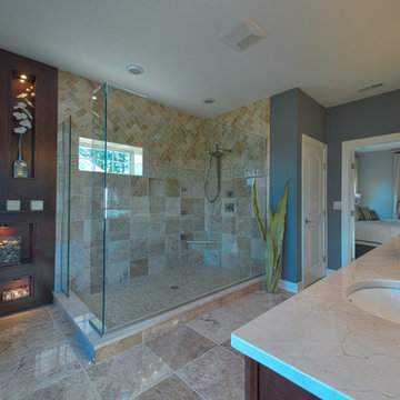
Needing more shower space in the Master Bathroom lets remove the Jacuzzi tub, create a pony wall for the shower, and enlarge the shower from a single to double. This double shower has Brazos Beige ceramic tiles by Daltile on walls and multi natural stone mosaic flooring by Merola Tile Riverstone, with built-in corner seat, shared built-in soap caddy, and let's not forget the best feature of all the his & her shower unit which includes: rain showers, sprinklers, select values and thermostatic value. Since there is not a shower door the slope was created as a ramp to center of drain keeping the water in. The frameless shower glass attached to the pony walls has the Diamon-Fusion an award-winning innovative technology that protects any silica- based surface such as glass. With light pressure, it takes out "etched in" water spots and mineral deposits such as line scale, calcium, oxidation, iron, alkali, mildew, mold, soap scum, paint and salt spray. Diamon-Fusion applied properly on glass comes with a 5 year warranty. To see more pictures please visit us at www.TexasHometown Remodeling.com.
Photo Credit: Marc Vandendriessche

 RAJ Kitchen and Bath, LLC
**Check out the video of this transformation on our website**
This small kitchen was way too small for this 2 bedrooms, 2 bathrooms apartment. Not only was it a very small kitchen, but the physical location of it made it very difficult to make it any bigger. There wasn't much that could have been done without incurring astronomical cost, which would get little or no return on the investment. The client wanted a kitchen that can be optimized in its current location to add a ton of value for resale.
This was difficult to do, because there was no moving of any mechanical around in the kitchen and even if we wanted to, the management of the building would not allow. For those of you who live in condos, co-ops or apartment building, you know how difficult it is to rework these foot prints. When we showed up, we saw the problems, but we also saw a huge opportunity where we can achieve those goals in the small space. This was accomplished by making some key changes and to incorporate some new things that was not possible when this kitchen was built years ago.
The crucial part of the design that would drive the entire new layout, was selecting the only appliance; that was the Refrigerator. Once we nailed down that refrigerator, we then proceeded to design the kitchen around it. We moved it to the other side of the wall where the sink was so that we can tap into the water line from the sink plumbing. It was crucial that it stays exactly 24" deep, not an inch more because we had to keep the entry as open as possible. Also, it was going to be directly in front of another big storage unit - The pantry. It is not ideal in most cases, but we needed the rest of the space to ramp up the design and open feel towards the side where all of the activities would take place, which happend to be the dining room and the view.
Once all that was figured out, we re-positioned the sink, dishwasher and the range and proceeded to wrap the cabinets around the columns to integrate them into the space. Thirty- six inches cabinets height was used so that they can be installed higher towards the ceiling height to give more room rather than the standard 18" required height between the counter tops. This was done to make the room feel a lot bigger than it really was. Not to mention, we also didn't want the faucet to be buried under the cabinets so that was also a necessary design detail for the space.
We then lowered both knee walls so that the counter top can sit on top of them, by removing that stop point that would have otherwise defined the kitchen area. This allowed us to pick up that extra footprint into the room for added prep space and enabled us to create the illusion of a kitchen that is looking longer than it really is. Every inch mattered when designing this kitchen and we made a conscious decision to use every one of that inch.
White cabinets were selected to do just what white cabinets are design to do; make a small or dark room appear bigger, brighter and more open. In this kitchen, this was amplified the more because of the kitchen location. It was perfect! We knew we did justice to the space because while we were there taking some photos, a few potential buyers walked in and went straight for the kitchen! They said its design just to fit the apartment.
Pantry roll out shelving, Double recycle bin, fancy handles, LED lighting, Quartz counter top, beautiful backslash tiles and grey linen floors finished off the kitchen which looked over a beautiful view of the George Washington Bridge from the top of this lovely 4th floor apartment.
Credit to Masterpiece Tile and Marble (Annmarie on the selection of Tiles and countertop and Val on the Construction to complete this project).
Davor Kokic Photography
 RAJ Kitchen and Bath, LLC
**Check out the video of this transformation on our website**
This small kitchen was way too small for this 2 bedrooms, 2 bathrooms apartment. Not only was it a very small kitchen, but the physical location of it made it very difficult to make it any bigger. There wasn't much that could have been done without incurring astronomical cost, which would get little or no return on the investment. The client wanted a kitchen that can be optimized in its current location to add a ton of value for resale.
This was difficult to do, because there was no moving of any mechanical around in the kitchen and even if we wanted to, the management of the building would not allow. For those of you who live in condos, co-ops or apartment building, you know how difficult it is to rework these foot prints. When we showed up, we saw the problems, but we also saw a huge opportunity where we can achieve those goals in the small space. This was accomplished by making some key changes and to incorporate some new things that was not possible when this kitchen was built years ago.
The crucial part of the design that would drive the entire new layout, was selecting the only appliance; that was the Refrigerator. Once we nailed down that refrigerator, we then proceeded to design the kitchen around it. We moved it to the other side of the wall where the sink was so that we can tap into the water line from the sink plumbing. It was crucial that it stays exactly 24" deep, not an inch more because we had to keep the entry as open as possible. Also, it was going to be directly in front of another big storage unit - The pantry. It is not ideal in most cases, but we needed the rest of the space to ramp up the design and open feel towards the side where all of the activities would take place, which happend to be the dining room and the view.
Once all that was figured out, we re-positioned the sink, dishwasher and the range and proceeded to wrap the cabinets around the columns to integrate them into the space. Thirty- six inches cabinets height was used so that they can be installed higher towards the ceiling height to give more room rather than the standard 18" required height between the counter tops. This was done to make the room feel a lot bigger than it really was. Not to mention, we also didn't want the faucet to be buried under the cabinets so that was also a necessary design detail for the space.
We then lowered both knee walls so that the counter top can sit on top of them, by removing that stop point that would have otherwise defined the kitchen area. This allowed us to pick up that extra footprint into the room for added prep space and enabled us to create the illusion of a kitchen that is looking longer than it really is. Every inch mattered when designing this kitchen and we made a conscious decision to use every one of that inch.
White cabinets were selected to do just what white cabinets are design to do; make a small or dark room appear bigger, brighter and more open. In this kitchen, this was amplified the more because of the kitchen location. It was perfect! We knew we did justice to the space because while we were there taking some photos, a few potential buyers walked in and went straight for the kitchen! They said its design just to fit the apartment.
Pantry roll out shelving, Double recycle bin, fancy handles, LED lighting, Quartz counter top, beautiful backslash tiles and grey linen floors finished off the kitchen which looked over a beautiful view of the George Washington Bridge from the top of this lovely 4th floor apartment.
Credit to Masterpiece Tile and Marble (Annmarie on the selection of Tiles and countertop and Val on the Construction to complete this project).
Davor Kokic Photography
Find the right local pro for your project

 Ward Jewell Architect AIA
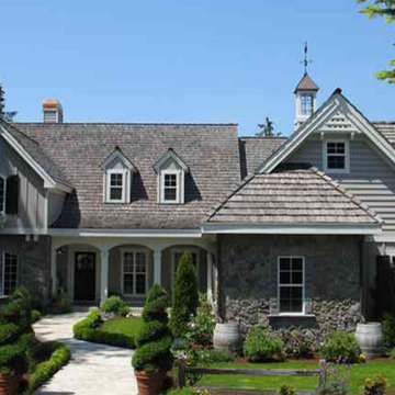
Ward Jewell, AIA was asked to design a comfortable one-story stone and wood pool house that was "barn-like" in keeping with the owner’s gentleman farmer concept. Thus, Mr. Jewell was inspired to create an elegant New England Stone Farm House designed to provide an exceptional environment for them to live, entertain, cook and swim in the large reflection lap pool.
Mr. Jewell envisioned a dramatic vaulted great room with hand selected 200 year old reclaimed wood beams and 10 foot tall pocketing French doors that would connect the house to a pool, deck areas, loggia and lush garden spaces, thus bringing the outdoors in. A large cupola “lantern clerestory” in the main vaulted ceiling casts a natural warm light over the graceful room below. The rustic walk-in stone fireplace provides a central focal point for the inviting living room lounge. Important to the functionality of the pool house are a chef’s working farm kitchen with open cabinetry, free-standing stove and a soapstone topped central island with bar height seating. Grey washed barn doors glide open to reveal a vaulted and beamed quilting room with full bath and a vaulted and beamed library/guest room with full bath that bookend the main space.
The private garden expanded and evolved over time. After purchasing two adjacent lots, the owners decided to redesign the garden and unify it by eliminating the tennis court, relocating the pool and building an inspired "barn". The concept behind the garden’s new design came from Thomas Jefferson’s home at Monticello with its wandering paths, orchards, and experimental vegetable garden. As a result this small organic farm, was born. Today the farm produces more than fifty varieties of vegetables, herbs, and edible flowers; many of which are rare and hard to find locally. The farm also grows a wide variety of fruits including plums, pluots, nectarines, apricots, apples, figs, peaches, guavas, avocados (Haas, Fuerte and Reed), olives, pomegranates, persimmons, strawberries, blueberries, blackberries, and ten different types of citrus. The remaining areas consist of drought-tolerant sweeps of rosemary, lavender, rockrose, and sage all of which attract butterflies and dueling hummingbirds.
Photo Credit: Laura Hull Photography. Interior Design: Jeffrey Hitchcock. Landscape Design: Laurie Lewis Design. General Contractor: Martin Perry Premier General Contractors

 William Hoffman Architect
What simply started out as the purchase of a 30” Wolf gas stove to replace the old, turned into a complete kitchen renovation. The original intent was to replace the existing stove with the new. The new Wolf came other issues one being installing an adequate exhaust system to meet the needs of the stove. One thing led to the next and with that a new kitchen. The renovation included removing all existing fixtures, cabinetry and lighting. The existing tile floor remained the same but with some added area that was previously under existing base cabinets.
The goal of the project, once the decision was made to do a complete renovation, was to update the kitchen creating an eclectic aesthetic with all new fixtures of the best quality that could be afforded. Listed below are the changes that were made. All fixtures remained in their existing locations other than removing small piece of wall that allowed an extended length of the new bakers table to extend 24” into the existing dining and living room space to pull the spaces together and provide a small eating bar with adjoining bar stools. One stool was a custom design and fabrication (Marlin Stool)
Fixtures
1. Existing gas stove replaced with new 30” gas Wolf stove.
2. Existing Refrigerator replace with new 36” stainless steel Jen-Air refrigerator with bottom freezer.
3. Existing Dishwasher replace with new Jen-Air stainless steel interior and exterior dishwasher.
4. Existing base cabinets replaced with a combination of open and closed tables and cabinets. Two stainless steel commercial kitchen tables with an open bases and shelving. One with a stainless steel top the other a bakers table with a wood butcher block top. The cabinets were Kraft Made traditional wood base cabinets with a Kaffe finish and Fireslate counter surface. These cabinets were customized with stainless steel perforated door inserts and Mockett stainless steel drawer and door pulls.
5. Surface counter and table material included wood butcher block, stainless steel and Fireslate.
6. Overhead shelving included open commercial kitchen stainless steel shelves and open Appleply wood shelves with Rakks aluminum shelf brackets.
7. Existing lighting was replaced with Zumtobel track lighting with Ushio lamps, Lutron dimmers and an up lighted coffered ceiling (see Superman).
8. Existing kitchen sink was replaced with a large single compartment sink from Kindred with an In-Sinkerator Evolution garbage disposal. Filter water tap was added that connects to an Everprue water filter system.
9. Walls were tiled with Bottle Green 4 1/4” x 4 1/4” Daltile to staying consistent with existing original house tile.
10. The ceiling was reworked as required with a plaster finish
11. Marine grade caulk was used as required.
12. A soffit with up lighting was added to the periphery of kitchen facing the adjoining living and dining rooms.
13. Silver Masonite peg board storage wall adjacent to refrigerator.
Credits:
• Little Pete the Parakeet.....for being there
• Catalina Aguirre.....pots
• Many Friends....pots
• David D’Imperio.....Sputnik lamp
• Jose Maria Concha Sali.....painting
• Ron Meyers.....Plates on wall
• Bill Sanders.....Bunny screen painting
• William Hoffman....Beverly lamp
• William Hoffman.....marlin stool
• William Hoffman.....Gulfstream side chair
• William Hoffman.....Gulfstream dining table
• William Hoffman.....5 from 1 plywood chair
Problems
• A custom fabricated exhaust duct was required due to existing soffit framing conditions.
• The ceiling was not parallel to the floor so the intended full wall tile installation was held short of the ceiling.
• Return Air duct to A/C air handler required relocation
Project cost
• +/- $22,000
Fixtures, materials and appliances
Selection of fixtures, materials and fixtures were made based on quality, aesthetic and cost. Extensive research was done to find the best quality at a price point that was affordable. Items that were splurged on were the Wolf stove and Jen-Air refrigerator and dishwasher and the Zumtobel lighting
Bill Sanders Photography

 Mitra Designs Studio Collaborative
All windows were re-positioned strategically to take full advantage of the view, for example, the living room new windows were positioned to take full advantage of the beautiful views of the property. The linear layout of the new windows in the living room was designed to frame and echo the panoramic view of the beautiful pond, farm fields, tree lines and the Adirondack mountains seen beyond As part of architectural and interiors design, here Mitra paid careful attention to use green building products as much as possible, which was done by selecting and using environmentally friendly and low VOC emission products, as well as sing salvaged products where possible, and using as much local products as possible.
Aside from using green building products as much as possible, another very important goal of this project was to dramatically improve and maximize the energy efficiency of this home. To meet the specific and mechanical needs, a team of independent expert energy efficient consultants was assembled at the early phase of the design, so that energy solutions were studied and evaluated to the fullest. After extensive energy audits and study of the existing conditions and after extensive evaluation and brainstorming between all parties, Mitra compiled all the information and findings and incorporated them in her design solutions. In short, during construction, extensive energy upgrading measures were achieved by constructing a tight insulating envelope on the interior sides of all exterior walls and roofs, installing the most efficient heating and cooling system along with the introduction of a geothermal system installation. All windows and doors were replaced by state of the art and modern design energy efficient product available in the market which also visually modernized the design and maximized the beautiful westerly view of the landscape outside. To further address the energy efficiency of this project Mitra designed a concrete and steel and concrete fireplace box for it so that it can act as a chase for the mechanical needs of this new super energy efficient fireplace unit. - Photo credit: Susan Teare
 Mitra Designs Studio Collaborative
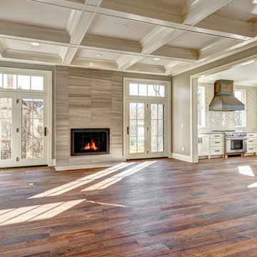
A Vermont Guest House Project which involved renovation to an existing art studio (see existing photos)and an addition to house the bedroom area and loft. The Architectural and Interior Design concepts were developed by Mitra Designs Studio Collaborative(me), a design firm based in Vermont. This building is located on a 160-acre private property. The guest house sits on beautiful rocky ledges, looking over the spectacular view of the Adirondack Mountains, a pond, and Vermont farm fields. The homeowners are Americans who work and live in Hongkong and come to their Vermont home several times a year to get away from the hustle bustles of the concrete city of Hongkong, ( please note that their main house is a short walk to this guest house). The goal of the design was to create a Guest House and a Forest retreat with subtle influences of a modern tree-house and a theme where east-meets-west! The original studio was not insulated and did not have plumbing, as you can see in the photos plumbing was added as part of the renovation and the building was insulated very tightly. All built-ins including the queen bed and two children's bed was custom designed by Mitra. Much of the design concepts were created artfully to bring the outdoors indoors. The bathroom theme of concrete counters and river stone pebble flooring suggests subtle influences of a river that is surrounded with rocks; Mitra selected mid-century furniture to further complement this clean and modern forest retreat. A local artist was commissioned to take artful photographs from the natural surroundings of this property. Her photographs were then infused on a floating brushed chrome plate. There are many stories to be given about this wonderful project and I will be happy to speak with you and provide you with any other information you may need. Photo credit Susan Teare Photography
Sponsored
Columbus, OH

Hope Restoration & General Contracting
Columbus Design-Build, Kitchen & Bath Remodeling, Historic Renovations
 RAJ Kitchen and Bath, LLC
**Check out the video of this transformation on our website**
This small kitchen was way too small for this 2 bedrooms, 2 bathrooms apartment. Not only was it a very small kitchen, but the physical location of it made it very difficult to make it any bigger. There wasn't much that could have been done without incurring astronomical cost, which would get little or no return on the investment. The client wanted a kitchen that can be optimized in its current location to add a ton of value for resale.
This was difficult to do, because there was no moving of any mechanical around in the kitchen and even if we wanted to, the management of the building would not allow. For those of you who live in condos, co-ops or apartment building, you know how difficult it is to rework these foot prints. When we showed up, we saw the problems, but we also saw a huge opportunity where we can achieve those goals in the small space. This was accomplished by making some key changes and to incorporate some new things that was not possible when this kitchen was built years ago.
The crucial part of the design that would drive the entire new layout, was selecting the only appliance; that was the Refrigerator. Once we nailed down that refrigerator, we then proceeded to design the kitchen around it. We moved it to the other side of the wall where the sink was so that we can tap into the water line from the sink plumbing. It was crucial that it stays exactly 24" deep, not an inch more because we had to keep the entry as open as possible. Also, it was going to be directly in front of another big storage unit - The pantry. It is not ideal in most cases, but we needed the rest of the space to ramp up the design and open feel towards the side where all of the activities would take place, which happend to be the dining room and the view.
Once all that was figured out, we re-positioned the sink, dishwasher and the range and proceeded to wrap the cabinets around the columns to integrate them into the space. Thirty- six inches cabinets height was used so that they can be installed higher towards the ceiling height to give more room rather than the standard 18" required height between the counter tops. This was done to make the room feel a lot bigger than it really was. Not to mention, we also didn't want the faucet to be buried under the cabinets so that was also a necessary design detail for the space.
We then lowered both knee walls so that the counter top can sit on top of them, by removing that stop point that would have otherwise defined the kitchen area. This allowed us to pick up that extra footprint into the room for added prep space and enabled us to create the illusion of a kitchen that is looking longer than it really is. Every inch mattered when designing this kitchen and we made a conscious decision to use every one of that inch.
White cabinets were selected to do just what white cabinets are design to do; make a small or dark room appear bigger, brighter and more open. In this kitchen, this was amplified the more because of the kitchen location. It was perfect! We knew we did justice to the space because while we were there taking some photos, a few potential buyers walked in and went straight for the kitchen! They said its design just to fit the apartment.
Pantry roll out shelving, Double recycle bin, fancy handles, LED lighting, Quartz counter top, beautiful backslash tiles and grey linen floors finished off the kitchen which looked over a beautiful view of the George Washington Bridge from the top of this lovely 4th floor apartment.
Credit to Masterpiece Tile and Marble (Annmarie on the selection of Tiles and countertop and Val on the Construction to complete this project).
Davor Kokic Photography
 RAJ Kitchen and Bath, LLC
**Check out the video of this transformation on our website**
This small kitchen was way too small for this 2 bedrooms, 2 bathrooms apartment. Not only was it a very small kitchen, but the physical location of it made it very difficult to make it any bigger. There wasn't much that could have been done without incurring astronomical cost, which would get little or no return on the investment. The client wanted a kitchen that can be optimized in its current location to add a ton of value for resale.
This was difficult to do, because there was no moving of any mechanical around in the kitchen and even if we wanted to, the management of the building would not allow. For those of you who live in condos, co-ops or apartment building, you know how difficult it is to rework these foot prints. When we showed up, we saw the problems, but we also saw a huge opportunity where we can achieve those goals in the small space. This was accomplished by making some key changes and to incorporate some new things that was not possible when this kitchen was built years ago.
The crucial part of the design that would drive the entire new layout, was selecting the only appliance; that was the Refrigerator. Once we nailed down that refrigerator, we then proceeded to design the kitchen around it. We moved it to the other side of the wall where the sink was so that we can tap into the water line from the sink plumbing. It was crucial that it stays exactly 24" deep, not an inch more because we had to keep the entry as open as possible. Also, it was going to be directly in front of another big storage unit - The pantry. It is not ideal in most cases, but we needed the rest of the space to ramp up the design and open feel towards the side where all of the activities would take place, which happend to be the dining room and the view.
Once all that was figured out, we re-positioned the sink, dishwasher and the range and proceeded to wrap the cabinets around the columns to integrate them into the space. Thirty- six inches cabinets height was used so that they can be installed higher towards the ceiling height to give more room rather than the standard 18" required height between the counter tops. This was done to make the room feel a lot bigger than it really was. Not to mention, we also didn't want the faucet to be buried under the cabinets so that was also a necessary design detail for the space.
We then lowered both knee walls so that the counter top can sit on top of them, by removing that stop point that would have otherwise defined the kitchen area. This allowed us to pick up that extra footprint into the room for added prep space and enabled us to create the illusion of a kitchen that is looking longer than it really is. Every inch mattered when designing this kitchen and we made a conscious decision to use every one of that inch.
White cabinets were selected to do just what white cabinets are design to do; make a small or dark room appear bigger, brighter and more open. In this kitchen, this was amplified the more because of the kitchen location. It was perfect! We knew we did justice to the space because while we were there taking some photos, a few potential buyers walked in and went straight for the kitchen! They said its design just to fit the apartment.
Pantry roll out shelving, Double recycle bin, fancy handles, LED lighting, Quartz counter top, beautiful backslash tiles and grey linen floors finished off the kitchen which looked over a beautiful view of the George Washington Bridge from the top of this lovely 4th floor apartment.
Credit to Masterpiece Tile and Marble (Annmarie on the selection of Tiles and countertop and Val on the Construction to complete this project).
Davor Kokic Photography
 User
House Plan #137-202 : Houseplans.com
Questions? Call us at 1-800-913-2350
Photographs may show modified designs. All images are copyrighted.
Plan 137-202
3549 sq ft
4 beds
4.00 baths
67' wide
71' deep
×
Plans
Main Floor Plan
Reverse
Upper Floor Plan
Reverse
Specifications
Plan Styles
Country
Traditional
Southern
Dimension
Depth
71'
Width
67'
Outdoor Spaces
Loft Balcony
Covered Front Porch
Lot Characteristics
Suited For Corner Lot
Garage
Side Entry Garage
Basic Features
Potential Bedrooms
0
Garage Stalls
2
Stories
2
Baths
4.00
Bedrooms
4
Additional Rooms
Family Room Keeping Room
Unfinished Future Space
Storage Area
Kitchen Features
Nook Breakfast Area Dining
Peninsula Eating Bar
Area
Upper Floor Sq Ft
981 sq ft
Main Floor Sq Ft
2568 sq ft
Total Sq Ft
3549 sq ft
Bedroom Features
Main Floor Bed Bath
Walk In Closet
Main Floor Master Bed Bath
Ceiling
Upper Ceiling Ft
8'
Main Ceiling Ft
9'
Designer Notes
Included
All plans are drawn at 1/4" scale or larger and include:
Rendering of Front Elevation
Foundation Plan: Most plans include alternate basement plan.
Fully Dimensioned Floor Plan(s)
Electrical Plans
Section Through House
All Exterior Elevations
Selected Interior Elevations
Door and Window Sizes
Construction Details: Including fireplace, stair, molding and cabinet details
Roof Plan and Exterior Details
Pricing
Plan Set
Price
5 Copy Set
$920.00
8 Copy Set
$1020.00
PDF Set
$1200.00
Reproducible Set
$1200.00
Single Set
$800.00
Foundation
Price
Basement
+$0.00
Additional Construction Sets
$55.00/each
Mirror Reverse Sets
$55.00/each
* The Single Set and PDF Study Set are typically stamped "Not for Construction" and are to be used for studying / obtaining bids only. We do offer a 90% credit when you upgrade from a Single Set to a 5-Copy set (or greater).
Plan Content
All plans are drawn at ¼” scale or larger and include :
Designer’s rendering of front elevations
Foundation and dimensioned floor plans
Electrical plans
Section through house
All exterior elevation
Selec
 RAJ Kitchen and Bath, LLC
**Check out the video of this transformation on our website**
This small kitchen was way too small for this 2 bedrooms, 2 bathrooms apartment. Not only was it a very small kitchen, but the physical location of it made it very difficult to make it any bigger. There wasn't much that could have been done without incurring astronomical cost, which would get little or no return on the investment. The client wanted a kitchen that can be optimized in its current location to add a ton of value for resale.
This was difficult to do, because there was no moving of any mechanical around in the kitchen and even if we wanted to, the management of the building would not allow. For those of you who live in condos, co-ops or apartment building, you know how difficult it is to rework these foot prints. When we showed up, we saw the problems, but we also saw a huge opportunity where we can achieve those goals in the small space. This was accomplished by making some key changes and to incorporate some new things that was not possible when this kitchen was built years ago.
The crucial part of the design that would drive the entire new layout, was selecting the only appliance; that was the Refrigerator. Once we nailed down that refrigerator, we then proceeded to design the kitchen around it. We moved it to the other side of the wall where the sink was so that we can tap into the water line from the sink plumbing. It was crucial that it stays exactly 24" deep, not an inch more because we had to keep the entry as open as possible. Also, it was going to be directly in front of another big storage unit - The pantry. It is not ideal in most cases, but we needed the rest of the space to ramp up the design and open feel towards the side where all of the activities would take place, which happend to be the dining room and the view.
Once all that was figured out, we re-positioned the sink, dishwasher and the range and proceeded to wrap the cabinets around the columns to integrate them into the space. Thirty- six inches cabinets height was used so that they can be installed higher towards the ceiling height to give more room rather than the standard 18" required height between the counter tops. This was done to make the room feel a lot bigger than it really was. Not to mention, we also didn't want the faucet to be buried under the cabinets so that was also a necessary design detail for the space.
We then lowered both knee walls so that the counter top can sit on top of them, by removing that stop point that would have otherwise defined the kitchen area. This allowed us to pick up that extra footprint into the room for added prep space and enabled us to create the illusion of a kitchen that is looking longer than it really is. Every inch mattered when designing this kitchen and we made a conscious decision to use every one of that inch.
White cabinets were selected to do just what white cabinets are design to do; make a small or dark room appear bigger, brighter and more open. In this kitchen, this was amplified the more because of the kitchen location. It was perfect! We knew we did justice to the space because while we were there taking some photos, a few potential buyers walked in and went straight for the kitchen! They said its design just to fit the apartment.
Pantry roll out shelving, Double recycle bin, fancy handles, LED lighting, Quartz counter top, beautiful backslash tiles and grey linen floors finished off the kitchen which looked over a beautiful view of the George Washington Bridge from the top of this lovely 4th floor apartment.
Credit to Masterpiece Tile and Marble (Annmarie on the selection of Tiles and countertop and Val on the Construction to complete this project).
Davor Kokic Photography
 BAY BUILDERS
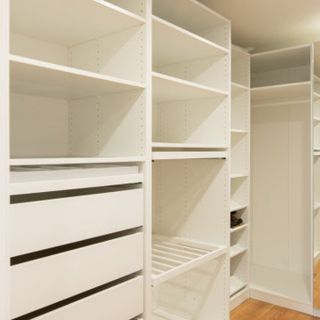
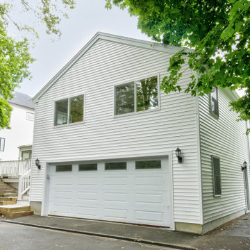
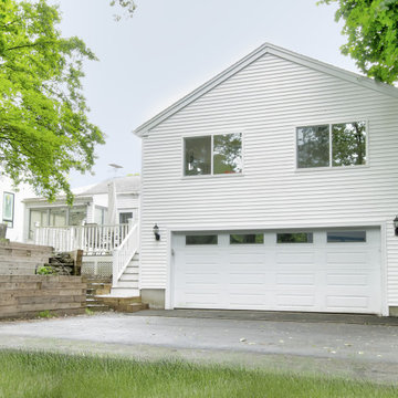
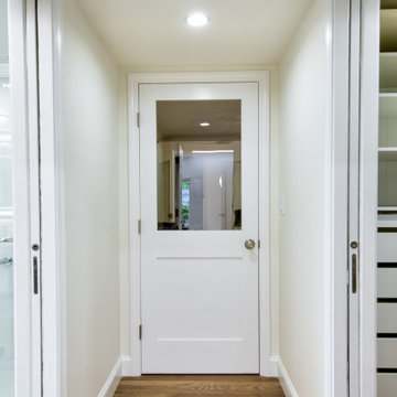
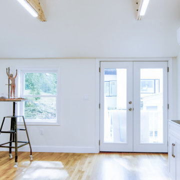
A ground-up design-build addition in Newton, MA — a dedicated studio built for a working sculptor. Bay Builders managed the full lifecycle, from pre-construction planning and architectural development through permitting, right into construction and final finishes. One accountable team, start to finish.
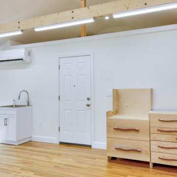
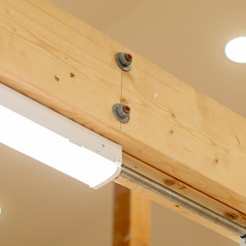
We built the new structure from the ground up — framing, roofing, and siding — then focused on what matters most for an artist's space: a stable, comfortable, light-filled environment to create in. High-performance spray foam insulation and a modern heat-pump mini-split HVAC system keep the studio precisely climate-controlled year-round, protecting both the artist and the work. Pella windows flood the space with the natural light a sculptor needs to see form and shadow clearly.
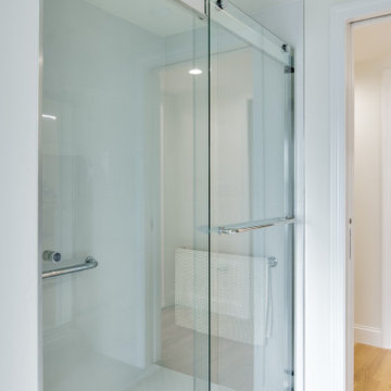
Inside, professional drywall and plaster finishing, fresh paint, and durable hardwood flooring give the studio a clean, modern feel that's built to last.
Key features & materials:
- Windows — Pella, positioned for optimal natural light
- Insulation — high-efficiency spray foam for superior climate control
- Systems — new water heating and heat-pump mini-split HVAC
- Interior — plaster finishing and hardwood floors
- Fixtures — plumbing fixtures from Ferguson Supply
Like every Bay Builders project, this one ran on our IDDS™ process: design, selections, and pricing were finalized before construction began — so the client had a clear scope, a fixed price, and no surprises from groundbreaking to final walkthrough.
Project credits:
- General Contractor — Bay Builders
- Partners — VIP Plumbing, Inspire Development, Gold Tile, Christoforou & Son Electrical

 Bilotta Kitchen & Home
For this expansive kitchen renovation, Designer, Randy O’Kane of Bilotta Kitchens worked with interior designer Gina Eastman and architect Clark Neuringer. The backyard was the client’s favorite space, with a pool and beautiful landscaping; from where it’s situated it’s the sunniest part of the house. They wanted to be able to enjoy the view and natural light all year long, so the space was opened up and a wall of windows was added. Randy laid out the kitchen to complement their desired view. She selected colors and materials that were fresh, natural, and unique – a soft greenish-grey with a contrasting deep purple, Benjamin Moore’s Caponata for the Bilotta Collection Cabinetry and LG Viatera Minuet for the countertops. Gina coordinated all fabrics and finishes to complement the palette in the kitchen. The most unique feature is the table off the island. Custom-made by Brooks Custom, the top is a burled wood slice from a large tree with a natural stain and live edge; the base is hand-made from real tree limbs. They wanted it to remain completely natural, with the look and feel of the tree, so they didn’t add any sort of sealant. The client also wanted touches of antique gold which the team integrated into the Armac Martin hardware, Rangecraft hood detailing, the Ann Sacks backsplash, and in the Bendheim glass inserts in the butler’s pantry which is glass with glittery gold fabric sandwiched in between. The appliances are a mix of Subzero, Wolf and Miele. The faucet and pot filler are from Waterstone. The sinks are Franke. With the kitchen and living room essentially one large open space, Randy and Gina worked together to continue the palette throughout, from the color of the cabinets, to the banquette pillows, to the fireplace stone. The family room’s old built-in around the fireplace was removed and the floor-to-ceiling stone enclosure was added with a gas fireplace and flat screen TV, flanked by contemporary artwork.
Designer: Bilotta’s Randy O’Kane with Gina Eastman of Gina Eastman Design & Clark Neuringer, Architect posthumously
Photo Credit: Phillip Ennis

 BAY BUILDERS
A ground-up design-build addition in Newton, MA — a dedicated studio built for a working sculptor. Bay Builders managed the full lifecycle, from pre-construction planning and architectural development through permitting, right into construction and final finishes. One accountable team, start to finish.
We built the new structure from the ground up — framing, roofing, and siding — then focused on what matters most for an artist's space: a stable, comfortable, light-filled environment to create in. High-performance spray foam insulation and a modern heat-pump mini-split HVAC system keep the studio precisely climate-controlled year-round, protecting both the artist and the work. Pella windows flood the space with the natural light a sculptor needs to see form and shadow clearly.
Inside, professional drywall and plaster finishing, fresh paint, and durable hardwood flooring give the studio a clean, modern feel that's built to last.
Key features & materials:
- Windows — Pella, positioned for optimal natural light
- Insulation — high-efficiency spray foam for superior climate control
- Systems — new water heating and heat-pump mini-split HVAC
- Interior — plaster finishing and hardwood floors
- Fixtures — plumbing fixtures from Ferguson Supply
Like every Bay Builders project, this one ran on our IDDS™ process: design, selections, and pricing were finalized before construction began — so the client had a clear scope, a fixed price, and no surprises from groundbreaking to final walkthrough.
Project credits:
- General Contractor — Bay Builders
- Partners — VIP Plumbing, Inspire Development, Gold Tile, Christoforou & Son Electrical
 BAY BUILDERS
A ground-up design-build addition in Newton, MA — a dedicated studio built for a working sculptor. Bay Builders managed the full lifecycle, from pre-construction planning and architectural development through permitting, right into construction and final finishes. One accountable team, start to finish.
We built the new structure from the ground up — framing, roofing, and siding — then focused on what matters most for an artist's space: a stable, comfortable, light-filled environment to create in. High-performance spray foam insulation and a modern heat-pump mini-split HVAC system keep the studio precisely climate-controlled year-round, protecting both the artist and the work. Pella windows flood the space with the natural light a sculptor needs to see form and shadow clearly.
Inside, professional drywall and plaster finishing, fresh paint, and durable hardwood flooring give the studio a clean, modern feel that's built to last.
Key features & materials:
- Windows — Pella, positioned for optimal natural light
- Insulation — high-efficiency spray foam for superior climate control
- Systems — new water heating and heat-pump mini-split HVAC
- Interior — plaster finishing and hardwood floors
- Fixtures — plumbing fixtures from Ferguson Supply
Like every Bay Builders project, this one ran on our IDDS™ process: design, selections, and pricing were finalized before construction began — so the client had a clear scope, a fixed price, and no surprises from groundbreaking to final walkthrough.
Project credits:
- General Contractor — Bay Builders
- Partners — VIP Plumbing, Inspire Development, Gold Tile, Christoforou & Son Electrical
 BAY BUILDERS
A ground-up design-build addition in Newton, MA — a dedicated studio built for a working sculptor. Bay Builders managed the full lifecycle, from pre-construction planning and architectural development through permitting, right into construction and final finishes. One accountable team, start to finish.
We built the new structure from the ground up — framing, roofing, and siding — then focused on what matters most for an artist's space: a stable, comfortable, light-filled environment to create in. High-performance spray foam insulation and a modern heat-pump mini-split HVAC system keep the studio precisely climate-controlled year-round, protecting both the artist and the work. Pella windows flood the space with the natural light a sculptor needs to see form and shadow clearly.
Inside, professional drywall and plaster finishing, fresh paint, and durable hardwood flooring give the studio a clean, modern feel that's built to last.
Key features & materials:
- Windows — Pella, positioned for optimal natural light
- Insulation — high-efficiency spray foam for superior climate control
- Systems — new water heating and heat-pump mini-split HVAC
- Interior — plaster finishing and hardwood floors
- Fixtures — plumbing fixtures from Ferguson Supply
Like every Bay Builders project, this one ran on our IDDS™ process: design, selections, and pricing were finalized before construction began — so the client had a clear scope, a fixed price, and no surprises from groundbreaking to final walkthrough.
Project credits:
- General Contractor — Bay Builders
- Partners — VIP Plumbing, Inspire Development, Gold Tile, Christoforou & Son Electrical
 BAY BUILDERS
A ground-up design-build addition in Newton, MA — a dedicated studio built for a working sculptor. Bay Builders managed the full lifecycle, from pre-construction planning and architectural development through permitting, right into construction and final finishes. One accountable team, start to finish.
We built the new structure from the ground up — framing, roofing, and siding — then focused on what matters most for an artist's space: a stable, comfortable, light-filled environment to create in. High-performance spray foam insulation and a modern heat-pump mini-split HVAC system keep the studio precisely climate-controlled year-round, protecting both the artist and the work. Pella windows flood the space with the natural light a sculptor needs to see form and shadow clearly.
Inside, professional drywall and plaster finishing, fresh paint, and durable hardwood flooring give the studio a clean, modern feel that's built to last.
Key features & materials:
- Windows — Pella, positioned for optimal natural light
- Insulation — high-efficiency spray foam for superior climate control
- Systems — new water heating and heat-pump mini-split HVAC
- Interior — plaster finishing and hardwood floors
- Fixtures — plumbing fixtures from Ferguson Supply
Like every Bay Builders project, this one ran on our IDDS™ process: design, selections, and pricing were finalized before construction began — so the client had a clear scope, a fixed price, and no surprises from groundbreaking to final walkthrough.
Project credits:
- General Contractor — Bay Builders
- Partners — VIP Plumbing, Inspire Development, Gold Tile, Christoforou & Son Electrical

Sponsored
Plain City, OH

The Creative Kitchen Company
Columbus Area Kitchen Remodeling and Refacing Professional
 BAY BUILDERS
A ground-up design-build addition in Newton, MA — a dedicated studio built for a working sculptor. Bay Builders managed the full lifecycle, from pre-construction planning and architectural development through permitting, right into construction and final finishes. One accountable team, start to finish.
We built the new structure from the ground up — framing, roofing, and siding — then focused on what matters most for an artist's space: a stable, comfortable, light-filled environment to create in. High-performance spray foam insulation and a modern heat-pump mini-split HVAC system keep the studio precisely climate-controlled year-round, protecting both the artist and the work. Pella windows flood the space with the natural light a sculptor needs to see form and shadow clearly.
Inside, professional drywall and plaster finishing, fresh paint, and durable hardwood flooring give the studio a clean, modern feel that's built to last.
Key features & materials:
- Windows — Pella, positioned for optimal natural light
- Insulation — high-efficiency spray foam for superior climate control
- Systems — new water heating and heat-pump mini-split HVAC
- Interior — plaster finishing and hardwood floors
- Fixtures — plumbing fixtures from Ferguson Supply
Like every Bay Builders project, this one ran on our IDDS™ process: design, selections, and pricing were finalized before construction began — so the client had a clear scope, a fixed price, and no surprises from groundbreaking to final walkthrough.
Project credits:
- General Contractor — Bay Builders
- Partners — VIP Plumbing, Inspire Development, Gold Tile, Christoforou & Son Electrical
 BAY BUILDERS
A ground-up design-build addition in Newton, MA — a dedicated studio built for a working sculptor. Bay Builders managed the full lifecycle, from pre-construction planning and architectural development through permitting, right into construction and final finishes. One accountable team, start to finish.
We built the new structure from the ground up — framing, roofing, and siding — then focused on what matters most for an artist's space: a stable, comfortable, light-filled environment to create in. High-performance spray foam insulation and a modern heat-pump mini-split HVAC system keep the studio precisely climate-controlled year-round, protecting both the artist and the work. Pella windows flood the space with the natural light a sculptor needs to see form and shadow clearly.
Inside, professional drywall and plaster finishing, fresh paint, and durable hardwood flooring give the studio a clean, modern feel that's built to last.
Key features & materials:
- Windows — Pella, positioned for optimal natural light
- Insulation — high-efficiency spray foam for superior climate control
- Systems — new water heating and heat-pump mini-split HVAC
- Interior — plaster finishing and hardwood floors
- Fixtures — plumbing fixtures from Ferguson Supply
Like every Bay Builders project, this one ran on our IDDS™ process: design, selections, and pricing were finalized before construction began — so the client had a clear scope, a fixed price, and no surprises from groundbreaking to final walkthrough.
Project credits:
- General Contractor — Bay Builders
- Partners — VIP Plumbing, Inspire Development, Gold Tile, Christoforou & Son Electrical
 BAY BUILDERS
A ground-up design-build addition in Newton, MA — a dedicated studio built for a working sculptor. Bay Builders managed the full lifecycle, from pre-construction planning and architectural development through permitting, right into construction and final finishes. One accountable team, start to finish.
We built the new structure from the ground up — framing, roofing, and siding — then focused on what matters most for an artist's space: a stable, comfortable, light-filled environment to create in. High-performance spray foam insulation and a modern heat-pump mini-split HVAC system keep the studio precisely climate-controlled year-round, protecting both the artist and the work. Pella windows flood the space with the natural light a sculptor needs to see form and shadow clearly.
Inside, professional drywall and plaster finishing, fresh paint, and durable hardwood flooring give the studio a clean, modern feel that's built to last.
Key features & materials:
- Windows — Pella, positioned for optimal natural light
- Insulation — high-efficiency spray foam for superior climate control
- Systems — new water heating and heat-pump mini-split HVAC
- Interior — plaster finishing and hardwood floors
- Fixtures — plumbing fixtures from Ferguson Supply
Like every Bay Builders project, this one ran on our IDDS™ process: design, selections, and pricing were finalized before construction began — so the client had a clear scope, a fixed price, and no surprises from groundbreaking to final walkthrough.
Project credits:
- General Contractor — Bay Builders
- Partners — VIP Plumbing, Inspire Development, Gold Tile, Christoforou & Son Electrical
59