
Search results for "Separate overview" in Home Design Ideas
 Irene Designs
Home Remodeling Project Overview
This extensive home remodeling project transformed a dated and inefficient layout into a functional, open, and aesthetically cohesive living space. The original layout had several challenges:
• A kitchen with limited storage, no cabinets on the window side, a sink facing the wall, and a range crammed into the corner. The pantry closet was too deep and impractical.
• A living room that couldn’t accommodate furniture without interfering with traffic flow.
• A front foyer with wasted space.
• A claustrophobic hallway toilet room without a sink, located near the laundry room.
The Remodeling Concept
The scope of this project extended well beyond the kitchen. We proposed several layout options to address issues in all adjacent spaces, ultimately implementing a plan that:
• Removed two walls and moved doorways.
• Replaced the kitchen window.
• Converted the hallway toilet room into a storage space.
• Installed pocket doors to separate the laundry hallway from the living room.
Kitchen Transformation
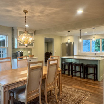
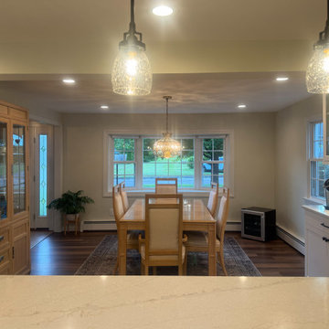
• Open Concept: By removing the wall between the kitchen and dining room, the two spaces became a seamless open area.
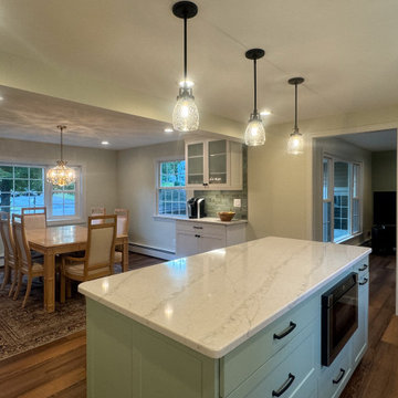
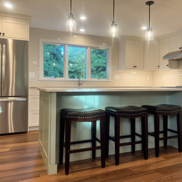
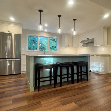
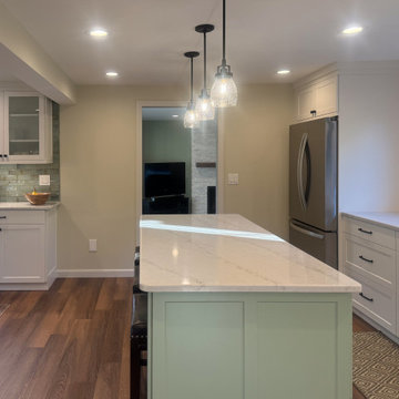
• New Layout: Cabinets were relocated to the window side for more storage and natural light. A central island with storage and seating was added, and a coffee bar was installed in the dining room.
• Updated Pantry: The deep pantry closet was converted into a pullout pantry with a cabinet front for better accessibility.
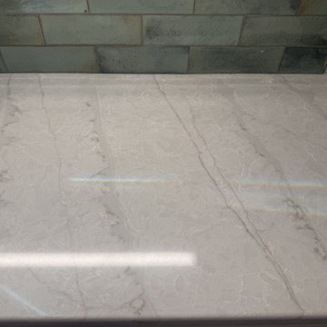
• Design Details: Off-white kitchen cabinets pair beautifully with a light green island. Warm white quartz counters and an artisan tile backsplash complete the look.
Dining Room
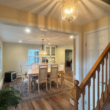
• Expanded Space: Most of the wall separating the dining room and foyer was removed, creating a more spacious area while still accommodating all furniture thanks to careful measurements.
Living Room Improvements
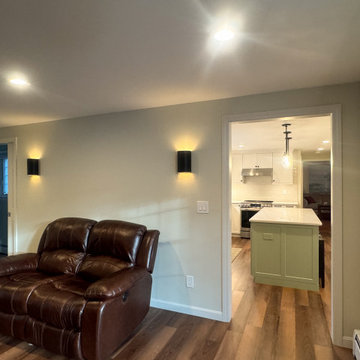
• Optimized Layout: Moving doorways and installing pocket doors allowed for better furniture placement, including a sofa that doesn’t interfere with traffic flow.
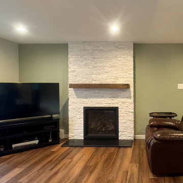
• Fireplace Upgrade: The brick fireplace was updated with a three-dimensional staggered stone veneer in a color matching the kitchen cabinets, creating a cohesive look. A TV was installed above the fireplace at a comfortable viewing angle.
Additional Updates
• New Flooring: All remodeled rooms now feature updated flooring.
• Ceilings: Popcorn ceilings were replaced with smooth, flat finishes, complemented by recessed lighting.
• Walls: Fresh paint throughout the space, with an accent wall in the living room matching the light green of the kitchen island.
• Lighting: Stylish sconces were added for a touch of elegance.
The Result
The homeowners are thrilled with the transformation, marveling at how their once cramped and inefficient home now feels spacious, functional, and beautifully cohesive. They can’t believe their house could ever look like this!
 Irene Designs
Home Remodeling Project Overview
This extensive home remodeling project transformed a dated and inefficient layout into a functional, open, and aesthetically cohesive living space. The original layout had several challenges:
• A kitchen with limited storage, no cabinets on the window side, a sink facing the wall, and a range crammed into the corner. The pantry closet was too deep and impractical.
• A living room that couldn’t accommodate furniture without interfering with traffic flow.
• A front foyer with wasted space.
• A claustrophobic hallway toilet room without a sink, located near the laundry room.
The Remodeling Concept
The scope of this project extended well beyond the kitchen. We proposed several layout options to address issues in all adjacent spaces, ultimately implementing a plan that:
• Removed two walls and moved doorways.
• Replaced the kitchen window.
• Converted the hallway toilet room into a storage space.
• Installed pocket doors to separate the laundry hallway from the living room.
Kitchen Transformation
• Open Concept: By removing the wall between the kitchen and dining room, the two spaces became a seamless open area.
• New Layout: Cabinets were relocated to the window side for more storage and natural light. A central island with storage and seating was added, and a coffee bar was installed in the dining room.
• Updated Pantry: The deep pantry closet was converted into a pullout pantry with a cabinet front for better accessibility.
• Design Details: Off-white kitchen cabinets pair beautifully with a light green island. Warm white quartz counters and an artisan tile backsplash complete the look.
Dining Room
• Expanded Space: Most of the wall separating the dining room and foyer was removed, creating a more spacious area while still accommodating all furniture thanks to careful measurements.
Living Room Improvements
• Optimized Layout: Moving doorways and installing pocket doors allowed for better furniture placement, including a sofa that doesn’t interfere with traffic flow.
• Fireplace Upgrade: The brick fireplace was updated with a three-dimensional staggered stone veneer in a color matching the kitchen cabinets, creating a cohesive look. A TV was installed above the fireplace at a comfortable viewing angle.
Additional Updates
• New Flooring: All remodeled rooms now feature updated flooring.
• Ceilings: Popcorn ceilings were replaced with smooth, flat finishes, complemented by recessed lighting.
• Walls: Fresh paint throughout the space, with an accent wall in the living room matching the light green of the kitchen island.
• Lighting: Stylish sconces were added for a touch of elegance.
The Result
The homeowners are thrilled with the transformation, marveling at how their once cramped and inefficient home now feels spacious, functional, and beautifully cohesive. They can’t believe their house could ever look like this!
 Irene Designs
Home Remodeling Project Overview
This extensive home remodeling project transformed a dated and inefficient layout into a functional, open, and aesthetically cohesive living space. The original layout had several challenges:
• A kitchen with limited storage, no cabinets on the window side, a sink facing the wall, and a range crammed into the corner. The pantry closet was too deep and impractical.
• A living room that couldn’t accommodate furniture without interfering with traffic flow.
• A front foyer with wasted space.
• A claustrophobic hallway toilet room without a sink, located near the laundry room.
The Remodeling Concept
The scope of this project extended well beyond the kitchen. We proposed several layout options to address issues in all adjacent spaces, ultimately implementing a plan that:
• Removed two walls and moved doorways.
• Replaced the kitchen window.
• Converted the hallway toilet room into a storage space.
• Installed pocket doors to separate the laundry hallway from the living room.
Kitchen Transformation
• Open Concept: By removing the wall between the kitchen and dining room, the two spaces became a seamless open area.
• New Layout: Cabinets were relocated to the window side for more storage and natural light. A central island with storage and seating was added, and a coffee bar was installed in the dining room.
• Updated Pantry: The deep pantry closet was converted into a pullout pantry with a cabinet front for better accessibility.
• Design Details: Off-white kitchen cabinets pair beautifully with a light green island. Warm white quartz counters and an artisan tile backsplash complete the look.
Dining Room
• Expanded Space: Most of the wall separating the dining room and foyer was removed, creating a more spacious area while still accommodating all furniture thanks to careful measurements.
Living Room Improvements
• Optimized Layout: Moving doorways and installing pocket doors allowed for better furniture placement, including a sofa that doesn’t interfere with traffic flow.
• Fireplace Upgrade: The brick fireplace was updated with a three-dimensional staggered stone veneer in a color matching the kitchen cabinets, creating a cohesive look. A TV was installed above the fireplace at a comfortable viewing angle.
Additional Updates
• New Flooring: All remodeled rooms now feature updated flooring.
• Ceilings: Popcorn ceilings were replaced with smooth, flat finishes, complemented by recessed lighting.
• Walls: Fresh paint throughout the space, with an accent wall in the living room matching the light green of the kitchen island.
• Lighting: Stylish sconces were added for a touch of elegance.
The Result
The homeowners are thrilled with the transformation, marveling at how their once cramped and inefficient home now feels spacious, functional, and beautifully cohesive. They can’t believe their house could ever look like this!
Find the right local pro for your project
 Irene Designs
Home Remodeling Project Overview
This extensive home remodeling project transformed a dated and inefficient layout into a functional, open, and aesthetically cohesive living space. The original layout had several challenges:
• A kitchen with limited storage, no cabinets on the window side, a sink facing the wall, and a range crammed into the corner. The pantry closet was too deep and impractical.
• A living room that couldn’t accommodate furniture without interfering with traffic flow.
• A front foyer with wasted space.
• A claustrophobic hallway toilet room without a sink, located near the laundry room.
The Remodeling Concept
The scope of this project extended well beyond the kitchen. We proposed several layout options to address issues in all adjacent spaces, ultimately implementing a plan that:
• Removed two walls and moved doorways.
• Replaced the kitchen window.
• Converted the hallway toilet room into a storage space.
• Installed pocket doors to separate the laundry hallway from the living room.
Kitchen Transformation
• Open Concept: By removing the wall between the kitchen and dining room, the two spaces became a seamless open area.
• New Layout: Cabinets were relocated to the window side for more storage and natural light. A central island with storage and seating was added, and a coffee bar was installed in the dining room.
• Updated Pantry: The deep pantry closet was converted into a pullout pantry with a cabinet front for better accessibility.
• Design Details: Off-white kitchen cabinets pair beautifully with a light green island. Warm white quartz counters and an artisan tile backsplash complete the look.
Dining Room
• Expanded Space: Most of the wall separating the dining room and foyer was removed, creating a more spacious area while still accommodating all furniture thanks to careful measurements.
Living Room Improvements
• Optimized Layout: Moving doorways and installing pocket doors allowed for better furniture placement, including a sofa that doesn’t interfere with traffic flow.
• Fireplace Upgrade: The brick fireplace was updated with a three-dimensional staggered stone veneer in a color matching the kitchen cabinets, creating a cohesive look. A TV was installed above the fireplace at a comfortable viewing angle.
Additional Updates
• New Flooring: All remodeled rooms now feature updated flooring.
• Ceilings: Popcorn ceilings were replaced with smooth, flat finishes, complemented by recessed lighting.
• Walls: Fresh paint throughout the space, with an accent wall in the living room matching the light green of the kitchen island.
• Lighting: Stylish sconces were added for a touch of elegance.
The Result
The homeowners are thrilled with the transformation, marveling at how their once cramped and inefficient home now feels spacious, functional, and beautifully cohesive. They can’t believe their house could ever look like this!
 Irene Designs
Home Remodeling Project Overview
This extensive home remodeling project transformed a dated and inefficient layout into a functional, open, and aesthetically cohesive living space. The original layout had several challenges:
• A kitchen with limited storage, no cabinets on the window side, a sink facing the wall, and a range crammed into the corner. The pantry closet was too deep and impractical.
• A living room that couldn’t accommodate furniture without interfering with traffic flow.
• A front foyer with wasted space.
• A claustrophobic hallway toilet room without a sink, located near the laundry room.
The Remodeling Concept
The scope of this project extended well beyond the kitchen. We proposed several layout options to address issues in all adjacent spaces, ultimately implementing a plan that:
• Removed two walls and moved doorways.
• Replaced the kitchen window.
• Converted the hallway toilet room into a storage space.
• Installed pocket doors to separate the laundry hallway from the living room.
Kitchen Transformation
• Open Concept: By removing the wall between the kitchen and dining room, the two spaces became a seamless open area.
• New Layout: Cabinets were relocated to the window side for more storage and natural light. A central island with storage and seating was added, and a coffee bar was installed in the dining room.
• Updated Pantry: The deep pantry closet was converted into a pullout pantry with a cabinet front for better accessibility.
• Design Details: Off-white kitchen cabinets pair beautifully with a light green island. Warm white quartz counters and an artisan tile backsplash complete the look.
Dining Room
• Expanded Space: Most of the wall separating the dining room and foyer was removed, creating a more spacious area while still accommodating all furniture thanks to careful measurements.
Living Room Improvements
• Optimized Layout: Moving doorways and installing pocket doors allowed for better furniture placement, including a sofa that doesn’t interfere with traffic flow.
• Fireplace Upgrade: The brick fireplace was updated with a three-dimensional staggered stone veneer in a color matching the kitchen cabinets, creating a cohesive look. A TV was installed above the fireplace at a comfortable viewing angle.
Additional Updates
• New Flooring: All remodeled rooms now feature updated flooring.
• Ceilings: Popcorn ceilings were replaced with smooth, flat finishes, complemented by recessed lighting.
• Walls: Fresh paint throughout the space, with an accent wall in the living room matching the light green of the kitchen island.
• Lighting: Stylish sconces were added for a touch of elegance.
The Result
The homeowners are thrilled with the transformation, marveling at how their once cramped and inefficient home now feels spacious, functional, and beautifully cohesive. They can’t believe their house could ever look like this!
 Irene Designs
Home Remodeling Project Overview
This extensive home remodeling project transformed a dated and inefficient layout into a functional, open, and aesthetically cohesive living space. The original layout had several challenges:
• A kitchen with limited storage, no cabinets on the window side, a sink facing the wall, and a range crammed into the corner. The pantry closet was too deep and impractical.
• A living room that couldn’t accommodate furniture without interfering with traffic flow.
• A front foyer with wasted space.
• A claustrophobic hallway toilet room without a sink, located near the laundry room.
The Remodeling Concept
The scope of this project extended well beyond the kitchen. We proposed several layout options to address issues in all adjacent spaces, ultimately implementing a plan that:
• Removed two walls and moved doorways.
• Replaced the kitchen window.
• Converted the hallway toilet room into a storage space.
• Installed pocket doors to separate the laundry hallway from the living room.
Kitchen Transformation
• Open Concept: By removing the wall between the kitchen and dining room, the two spaces became a seamless open area.
• New Layout: Cabinets were relocated to the window side for more storage and natural light. A central island with storage and seating was added, and a coffee bar was installed in the dining room.
• Updated Pantry: The deep pantry closet was converted into a pullout pantry with a cabinet front for better accessibility.
• Design Details: Off-white kitchen cabinets pair beautifully with a light green island. Warm white quartz counters and an artisan tile backsplash complete the look.
Dining Room
• Expanded Space: Most of the wall separating the dining room and foyer was removed, creating a more spacious area while still accommodating all furniture thanks to careful measurements.
Living Room Improvements
• Optimized Layout: Moving doorways and installing pocket doors allowed for better furniture placement, including a sofa that doesn’t interfere with traffic flow.
• Fireplace Upgrade: The brick fireplace was updated with a three-dimensional staggered stone veneer in a color matching the kitchen cabinets, creating a cohesive look. A TV was installed above the fireplace at a comfortable viewing angle.
Additional Updates
• New Flooring: All remodeled rooms now feature updated flooring.
• Ceilings: Popcorn ceilings were replaced with smooth, flat finishes, complemented by recessed lighting.
• Walls: Fresh paint throughout the space, with an accent wall in the living room matching the light green of the kitchen island.
• Lighting: Stylish sconces were added for a touch of elegance.
The Result
The homeowners are thrilled with the transformation, marveling at how their once cramped and inefficient home now feels spacious, functional, and beautifully cohesive. They can’t believe their house could ever look like this!
 VAULT®
In the Tuscany region of central Italy, a region made famous around the world for its history, landscapes, traditions, artistic legacy and fine wine, perhaps nothing is more universally recognized than the old world villa’s that are nestled into the rolling countryside. Standing at approximately 10,500 square feet, this custom residence has all of the elegance, style and craftsmanship of those old world homes, but with all of the modern amenities of a new modern luxury home. This stunning residence was recognized by the National Association of Home Builders (NAHB) as the best custom built home in the country in 2010, a testament to the skillful designers and craftsmen who brought the homeowners vision into reality.
When Chad Haas, Founder of VAULT (www.vaultgarage.com), a company that prides itself in furnishing some of the most beautiful garages in the world, was brought into the project, the home and garage had already been built. The accolades of the gorgeous villa already awarded. But the homeowner felt that the exterior and interior of the garage lacked architectural harmony with the rest of the home and so he flew Mr. Haas out to visit the space directly so that he could assist hands-on with re-designing a new look and to add furnishings to accessories the space.
“When I first approached the villa from the street, I knew that I’d have my work cut out for me. Everything looked so perfect exactly the way it was designed and built. I questioned myself ‘how was I going to improve upon perfection?’, since remarkable attention was paid to even the smallest of details in the home” asked Haas.
The client’s goal was to engage Haas to design and furnish a garage where he could relax, separate from the home, enjoy his growing car collection and entertain family and friends.
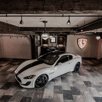
After spending a short weekend together with the home owner to gather his ideas, Haas returned back to his Beaverton, Oregon-based company with a clearer vision: create the ultimate gentlemen’s retreat through the look of a turn-of-a-century Tuscan ‘car barn’.
Absolutely nothing in the garage was overlooked – and it shows. Every design element in the garage for color, texture and material was meticulously thought out to elicit just the right feeling and emotion in everyone that enters what may be one of the most beautifully elegant garages in America, a space commonly overlooked in the construction of homes today.
A main focal point of the exterior of garage is the beautiful view from the courtyard, where all three carriage doors can be seen. While the existing wood doors looked acceptable, it was agreed that something more befitting of the quality and beauty of the home were appropriate. Haas designed luxurious castle-style doors handcrafted from solid Mahogany and bathed in a rich dark brown stain that was complemented by hand-wrought iron grills, clavos and door pull hardware. The double-wide door, in particular, is truly remarkable in both its elegance, as well as its one-of-a-kind operation. “The client was concerned in this area of having mounting hardware and a motor on the ceiling. Because the cars in this area do not get brought out on a regular (daily) basis, the doors open manually by hand and operate accordion style on a track”. The homes main overhead garage doors feature jack-shaft operation which removes the clutter of a motor on the garage ceiling, but offers the convenience of powered operation. These extraordinary, custom-made castle doors look just as beautiful on the inside as the out and their unparalleled design and craftsmanship take the exterior of the home to even greater heights than before.
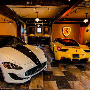
On to the interior, a black and white epoxy coating was stripped and replaced with porcelain tiles that resembled Italian travertine stone. To give the car barn a rustic feeling and a presence that it was older, not modern, Haas worked on the development and concept directly with the home owner to collaborate with a local millwork company that designed and hand-finished substantial wood beams from distressed Doug Fir. All of the walls were hand-plastered by a local artist using straw that was harvested from the immediate area surrounding the home and incorporated into the plaster to give it a rustic antique quality.
Haas conceived and designed a bar area and cabinetry for a work area that pulled inspiration from old ice boxes of the 1920’s that utilized heavy nickel-plated hardware, again to give storage spaces a rustic appearance.
The warm glow from several custom porcelain neon signs, each one meticulously built entirely by hand by VAULT, are dispersed throughout the space and transform the entire room and bring it to life. The client had never previously owned a neon sign before and along with the carriage doors felt that these items have transformed the space more than any other feature. Several antique gas pumps, restored in the client’s favorite petro bran, and a few additional porcelain signs will eventually furnish the rest of the space to complement the clients amazing car collection.
In addition to the countless details that set this showcase garage apart, its ability to seamlessly blend with the rest of the home and the natural, rustic setting of the Colorado Rockies, yet house modern automobiles in a manner in which they feel well placed and belong, is also noteworthy.
GARAGE DESIGN & FURNISHINGS
To learn more about VAULT visit them at: http://www.vaultgarage.com/
And on Facebook: http://www.facebook.com/VaultGarage
PHOTOGRAPHY
All photographs were used with the permission of photographer John Vanderpool (john.vanderpool5@gmail.com)
You can visit John Vanderpool on Facebook at: https://www.facebook.com/JVanderpoolPhotography
ARCHITECTURE
Jerry Gloss, Principal, KGA Architects: http://www.kgarch.com/
HOMEBUILDER
Thomas Sattler Home: http://thomassattlerhomes.com/
VEHICLES
Here is an overview of the cars that were photographed in this article:
1. 2014 Ferrari 458 Italia
2. 2013 Maserati GranTurismo Sport
3. 2007 Porsche 911 GT3 RS (997)
4. 2008 Porsche Cayenne GTS
5. 2008 Porsche GT3 RS
6. 2013 Porsche 911 Turbo S (997)
7. 2014 Porsche Panamera GTS
8. 2013 Ford SVT Raptor (6.2L CrewCab)’
Overview of project reprinted with permission of DuPont Registry.
Sponsored
Sunbury, OH

J.Holderby - Renovations
Franklin County's Leading General Contractors - 2X Best of Houzz!
 Irene Designs
Home Remodeling Project Overview
This extensive home remodeling project transformed a dated and inefficient layout into a functional, open, and aesthetically cohesive living space. The original layout had several challenges:
• A kitchen with limited storage, no cabinets on the window side, a sink facing the wall, and a range crammed into the corner. The pantry closet was too deep and impractical.
• A living room that couldn’t accommodate furniture without interfering with traffic flow.
• A front foyer with wasted space.
• A claustrophobic hallway toilet room without a sink, located near the laundry room.
The Remodeling Concept
The scope of this project extended well beyond the kitchen. We proposed several layout options to address issues in all adjacent spaces, ultimately implementing a plan that:
• Removed two walls and moved doorways.
• Replaced the kitchen window.
• Converted the hallway toilet room into a storage space.
• Installed pocket doors to separate the laundry hallway from the living room.
Kitchen Transformation
• Open Concept: By removing the wall between the kitchen and dining room, the two spaces became a seamless open area.
• New Layout: Cabinets were relocated to the window side for more storage and natural light. A central island with storage and seating was added, and a coffee bar was installed in the dining room.
• Updated Pantry: The deep pantry closet was converted into a pullout pantry with a cabinet front for better accessibility.
• Design Details: Off-white kitchen cabinets pair beautifully with a light green island. Warm white quartz counters and an artisan tile backsplash complete the look.
Dining Room
• Expanded Space: Most of the wall separating the dining room and foyer was removed, creating a more spacious area while still accommodating all furniture thanks to careful measurements.
Living Room Improvements
• Optimized Layout: Moving doorways and installing pocket doors allowed for better furniture placement, including a sofa that doesn’t interfere with traffic flow.
• Fireplace Upgrade: The brick fireplace was updated with a three-dimensional staggered stone veneer in a color matching the kitchen cabinets, creating a cohesive look. A TV was installed above the fireplace at a comfortable viewing angle.
Additional Updates
• New Flooring: All remodeled rooms now feature updated flooring.
• Ceilings: Popcorn ceilings were replaced with smooth, flat finishes, complemented by recessed lighting.
• Walls: Fresh paint throughout the space, with an accent wall in the living room matching the light green of the kitchen island.
• Lighting: Stylish sconces were added for a touch of elegance.
The Result
The homeowners are thrilled with the transformation, marveling at how their once cramped and inefficient home now feels spacious, functional, and beautifully cohesive. They can’t believe their house could ever look like this!
 Irene Designs
Home Remodeling Project Overview
This extensive home remodeling project transformed a dated and inefficient layout into a functional, open, and aesthetically cohesive living space. The original layout had several challenges:
• A kitchen with limited storage, no cabinets on the window side, a sink facing the wall, and a range crammed into the corner. The pantry closet was too deep and impractical.
• A living room that couldn’t accommodate furniture without interfering with traffic flow.
• A front foyer with wasted space.
• A claustrophobic hallway toilet room without a sink, located near the laundry room.
The Remodeling Concept
The scope of this project extended well beyond the kitchen. We proposed several layout options to address issues in all adjacent spaces, ultimately implementing a plan that:
• Removed two walls and moved doorways.
• Replaced the kitchen window.
• Converted the hallway toilet room into a storage space.
• Installed pocket doors to separate the laundry hallway from the living room.
Kitchen Transformation
• Open Concept: By removing the wall between the kitchen and dining room, the two spaces became a seamless open area.
• New Layout: Cabinets were relocated to the window side for more storage and natural light. A central island with storage and seating was added, and a coffee bar was installed in the dining room.
• Updated Pantry: The deep pantry closet was converted into a pullout pantry with a cabinet front for better accessibility.
• Design Details: Off-white kitchen cabinets pair beautifully with a light green island. Warm white quartz counters and an artisan tile backsplash complete the look.
Dining Room
• Expanded Space: Most of the wall separating the dining room and foyer was removed, creating a more spacious area while still accommodating all furniture thanks to careful measurements.
Living Room Improvements
• Optimized Layout: Moving doorways and installing pocket doors allowed for better furniture placement, including a sofa that doesn’t interfere with traffic flow.
• Fireplace Upgrade: The brick fireplace was updated with a three-dimensional staggered stone veneer in a color matching the kitchen cabinets, creating a cohesive look. A TV was installed above the fireplace at a comfortable viewing angle.
Additional Updates
• New Flooring: All remodeled rooms now feature updated flooring.
• Ceilings: Popcorn ceilings were replaced with smooth, flat finishes, complemented by recessed lighting.
• Walls: Fresh paint throughout the space, with an accent wall in the living room matching the light green of the kitchen island.
• Lighting: Stylish sconces were added for a touch of elegance.
The Result
The homeowners are thrilled with the transformation, marveling at how their once cramped and inefficient home now feels spacious, functional, and beautifully cohesive. They can’t believe their house could ever look like this!
 Irene Designs
Home Remodeling Project Overview
This extensive home remodeling project transformed a dated and inefficient layout into a functional, open, and aesthetically cohesive living space. The original layout had several challenges:
• A kitchen with limited storage, no cabinets on the window side, a sink facing the wall, and a range crammed into the corner. The pantry closet was too deep and impractical.
• A living room that couldn’t accommodate furniture without interfering with traffic flow.
• A front foyer with wasted space.
• A claustrophobic hallway toilet room without a sink, located near the laundry room.
The Remodeling Concept
The scope of this project extended well beyond the kitchen. We proposed several layout options to address issues in all adjacent spaces, ultimately implementing a plan that:
• Removed two walls and moved doorways.
• Replaced the kitchen window.
• Converted the hallway toilet room into a storage space.
• Installed pocket doors to separate the laundry hallway from the living room.
Kitchen Transformation
• Open Concept: By removing the wall between the kitchen and dining room, the two spaces became a seamless open area.
• New Layout: Cabinets were relocated to the window side for more storage and natural light. A central island with storage and seating was added, and a coffee bar was installed in the dining room.
• Updated Pantry: The deep pantry closet was converted into a pullout pantry with a cabinet front for better accessibility.
• Design Details: Off-white kitchen cabinets pair beautifully with a light green island. Warm white quartz counters and an artisan tile backsplash complete the look.
Dining Room
• Expanded Space: Most of the wall separating the dining room and foyer was removed, creating a more spacious area while still accommodating all furniture thanks to careful measurements.
Living Room Improvements
• Optimized Layout: Moving doorways and installing pocket doors allowed for better furniture placement, including a sofa that doesn’t interfere with traffic flow.
• Fireplace Upgrade: The brick fireplace was updated with a three-dimensional staggered stone veneer in a color matching the kitchen cabinets, creating a cohesive look. A TV was installed above the fireplace at a comfortable viewing angle.
Additional Updates
• New Flooring: All remodeled rooms now feature updated flooring.
• Ceilings: Popcorn ceilings were replaced with smooth, flat finishes, complemented by recessed lighting.
• Walls: Fresh paint throughout the space, with an accent wall in the living room matching the light green of the kitchen island.
• Lighting: Stylish sconces were added for a touch of elegance.
The Result
The homeowners are thrilled with the transformation, marveling at how their once cramped and inefficient home now feels spacious, functional, and beautifully cohesive. They can’t believe their house could ever look like this!
 Irene Designs
Home Remodeling Project Overview
This extensive home remodeling project transformed a dated and inefficient layout into a functional, open, and aesthetically cohesive living space. The original layout had several challenges:
• A kitchen with limited storage, no cabinets on the window side, a sink facing the wall, and a range crammed into the corner. The pantry closet was too deep and impractical.
• A living room that couldn’t accommodate furniture without interfering with traffic flow.
• A front foyer with wasted space.
• A claustrophobic hallway toilet room without a sink, located near the laundry room.
The Remodeling Concept
The scope of this project extended well beyond the kitchen. We proposed several layout options to address issues in all adjacent spaces, ultimately implementing a plan that:
• Removed two walls and moved doorways.
• Replaced the kitchen window.
• Converted the hallway toilet room into a storage space.
• Installed pocket doors to separate the laundry hallway from the living room.
Kitchen Transformation
• Open Concept: By removing the wall between the kitchen and dining room, the two spaces became a seamless open area.
• New Layout: Cabinets were relocated to the window side for more storage and natural light. A central island with storage and seating was added, and a coffee bar was installed in the dining room.
• Updated Pantry: The deep pantry closet was converted into a pullout pantry with a cabinet front for better accessibility.
• Design Details: Off-white kitchen cabinets pair beautifully with a light green island. Warm white quartz counters and an artisan tile backsplash complete the look.
Dining Room
• Expanded Space: Most of the wall separating the dining room and foyer was removed, creating a more spacious area while still accommodating all furniture thanks to careful measurements.
Living Room Improvements
• Optimized Layout: Moving doorways and installing pocket doors allowed for better furniture placement, including a sofa that doesn’t interfere with traffic flow.
• Fireplace Upgrade: The brick fireplace was updated with a three-dimensional staggered stone veneer in a color matching the kitchen cabinets, creating a cohesive look. A TV was installed above the fireplace at a comfortable viewing angle.
Additional Updates
• New Flooring: All remodeled rooms now feature updated flooring.
• Ceilings: Popcorn ceilings were replaced with smooth, flat finishes, complemented by recessed lighting.
• Walls: Fresh paint throughout the space, with an accent wall in the living room matching the light green of the kitchen island.
• Lighting: Stylish sconces were added for a touch of elegance.
The Result
The homeowners are thrilled with the transformation, marveling at how their once cramped and inefficient home now feels spacious, functional, and beautifully cohesive. They can’t believe their house could ever look like this!
 VAULT®
In the Tuscany region of central Italy, a region made famous around the world for its history, landscapes, traditions, artistic legacy and fine wine, perhaps nothing is more universally recognized than the old world villa’s that are nestled into the rolling countryside. Standing at approximately 10,500 square feet, this custom residence has all of the elegance, style and craftsmanship of those old world homes, but with all of the modern amenities of a new modern luxury home. This stunning residence was recognized by the National Association of Home Builders (NAHB) as the best custom built home in the country in 2010, a testament to the skillful designers and craftsmen who brought the homeowners vision into reality.
When Chad Haas, Founder of VAULT (www.vaultgarage.com), a company that prides itself in furnishing some of the most beautiful garages in the world, was brought into the project, the home and garage had already been built. The accolades of the gorgeous villa already awarded. But the homeowner felt that the exterior and interior of the garage lacked architectural harmony with the rest of the home and so he flew Mr. Haas out to visit the space directly so that he could assist hands-on with re-designing a new look and to add furnishings to accessories the space.
“When I first approached the villa from the street, I knew that I’d have my work cut out for me. Everything looked so perfect exactly the way it was designed and built. I questioned myself ‘how was I going to improve upon perfection?’, since remarkable attention was paid to even the smallest of details in the home” asked Haas.
The client’s goal was to engage Haas to design and furnish a garage where he could relax, separate from the home, enjoy his growing car collection and entertain family and friends.
After spending a short weekend together with the home owner to gather his ideas, Haas returned back to his Beaverton, Oregon-based company with a clearer vision: create the ultimate gentlemen’s retreat through the look of a turn-of-a-century Tuscan ‘car barn’.
Absolutely nothing in the garage was overlooked – and it shows. Every design element in the garage for color, texture and material was meticulously thought out to elicit just the right feeling and emotion in everyone that enters what may be one of the most beautifully elegant garages in America, a space commonly overlooked in the construction of homes today.
A main focal point of the exterior of garage is the beautiful view from the courtyard, where all three carriage doors can be seen. While the existing wood doors looked acceptable, it was agreed that something more befitting of the quality and beauty of the home were appropriate. Haas designed luxurious castle-style doors handcrafted from solid Mahogany and bathed in a rich dark brown stain that was complemented by hand-wrought iron grills, clavos and door pull hardware. The double-wide door, in particular, is truly remarkable in both its elegance, as well as its one-of-a-kind operation. “The client was concerned in this area of having mounting hardware and a motor on the ceiling. Because the cars in this area do not get brought out on a regular (daily) basis, the doors open manually by hand and operate accordion style on a track”. The homes main overhead garage doors feature jack-shaft operation which removes the clutter of a motor on the garage ceiling, but offers the convenience of powered operation. These extraordinary, custom-made castle doors look just as beautiful on the inside as the out and their unparalleled design and craftsmanship take the exterior of the home to even greater heights than before.
On to the interior, a black and white epoxy coating was stripped and replaced with porcelain tiles that resembled Italian travertine stone. To give the car barn a rustic feeling and a presence that it was older, not modern, Haas worked on the development and concept directly with the home owner to collaborate with a local millwork company that designed and hand-finished substantial wood beams from distressed Doug Fir. All of the walls were hand-plastered by a local artist using straw that was harvested from the immediate area surrounding the home and incorporated into the plaster to give it a rustic antique quality.
Haas conceived and designed a bar area and cabinetry for a work area that pulled inspiration from old ice boxes of the 1920’s that utilized heavy nickel-plated hardware, again to give storage spaces a rustic appearance.
The warm glow from several custom porcelain neon signs, each one meticulously built entirely by hand by VAULT, are dispersed throughout the space and transform the entire room and bring it to life. The client had never previously owned a neon sign before and along with the carriage doors felt that these items have transformed the space more than any other feature. Several antique gas pumps, restored in the client’s favorite petro bran, and a few additional porcelain signs will eventually furnish the rest of the space to complement the clients amazing car collection.
In addition to the countless details that set this showcase garage apart, its ability to seamlessly blend with the rest of the home and the natural, rustic setting of the Colorado Rockies, yet house modern automobiles in a manner in which they feel well placed and belong, is also noteworthy.
GARAGE DESIGN & FURNISHINGS
To learn more about VAULT visit them at: http://www.vaultgarage.com/
And on Facebook: http://www.facebook.com/VaultGarage
PHOTOGRAPHY
All photographs were used with the permission of photographer John Vanderpool (john.vanderpool5@gmail.com)
You can visit John Vanderpool on Facebook at: https://www.facebook.com/JVanderpoolPhotography
ARCHITECTURE
Jerry Gloss, Principal, KGA Architects: http://www.kgarch.com/
HOMEBUILDER
Thomas Sattler Home: http://thomassattlerhomes.com/
VEHICLES
Here is an overview of the cars that were photographed in this article:
1. 2014 Ferrari 458 Italia
2. 2013 Maserati GranTurismo Sport
3. 2007 Porsche 911 GT3 RS (997)
4. 2008 Porsche Cayenne GTS
5. 2008 Porsche GT3 RS
6. 2013 Porsche 911 Turbo S (997)
7. 2014 Porsche Panamera GTS
8. 2013 Ford SVT Raptor (6.2L CrewCab)’
Overview of project reprinted with permission of DuPont Registry.

 ZeroEnergy Design
OVERVIEW
Set into a mature Boston area neighborhood, this sophisticated 2900SF home offers efficient use of space, expression through form, and myriad of green features.
MULTI-GENERATIONAL LIVING
Designed to accommodate three family generations, paired living spaces on the first and second levels are architecturally expressed on the facade by window systems that wrap the front corners of the house. Included are two kitchens, two living areas, an office for two, and two master suites.
CURB APPEAL
The home includes both modern form and materials, using durable cedar and through-colored fiber cement siding, permeable parking with an electric charging station, and an acrylic overhang to shelter foot traffic from rain.
FEATURE STAIR
An open stair with resin treads and glass rails winds from the basement to the third floor, channeling natural light through all the home’s levels.
LEVEL ONE
The first floor kitchen opens to the living and dining space, offering a grand piano and wall of south facing glass. A master suite and private ‘home office for two’ complete the level.
LEVEL TWO
The second floor includes another open concept living, dining, and kitchen space, with kitchen sink views over the green roof. A full bath, bedroom and reading nook are perfect for the children.
LEVEL THREE
The third floor provides the second master suite, with separate sink and wardrobe area, plus a private roofdeck.
ENERGY
The super insulated home features air-tight construction, continuous exterior insulation, and triple-glazed windows. The walls and basement feature foam-free cavity & exterior insulation. On the rooftop, a solar electric system helps offset energy consumption.
WATER
Cisterns capture stormwater and connect to a drip irrigation system. Inside the home, consumption is limited with high efficiency fixtures and appliances.
TEAM
Architecture & Mechanical Design – ZeroEnergy Design
Contractor – Aedi Construction
Photos – Eric Roth Photography
Sponsored
Sunbury, OH
J.Holderby - Renovations
Franklin County's Leading General Contractors - 2X Best of Houzz!

 ZeroEnergy Design
OVERVIEW
Set into a mature Boston area neighborhood, this sophisticated 2900SF home offers efficient use of space, expression through form, and myriad of green features.
MULTI-GENERATIONAL LIVING
Designed to accommodate three family generations, paired living spaces on the first and second levels are architecturally expressed on the facade by window systems that wrap the front corners of the house. Included are two kitchens, two living areas, an office for two, and two master suites.
CURB APPEAL
The home includes both modern form and materials, using durable cedar and through-colored fiber cement siding, permeable parking with an electric charging station, and an acrylic overhang to shelter foot traffic from rain.
FEATURE STAIR
An open stair with resin treads and glass rails winds from the basement to the third floor, channeling natural light through all the home’s levels.
LEVEL ONE
The first floor kitchen opens to the living and dining space, offering a grand piano and wall of south facing glass. A master suite and private ‘home office for two’ complete the level.
LEVEL TWO
The second floor includes another open concept living, dining, and kitchen space, with kitchen sink views over the green roof. A full bath, bedroom and reading nook are perfect for the children.
LEVEL THREE
The third floor provides the second master suite, with separate sink and wardrobe area, plus a private roofdeck.
ENERGY
The super insulated home features air-tight construction, continuous exterior insulation, and triple-glazed windows. The walls and basement feature foam-free cavity & exterior insulation. On the rooftop, a solar electric system helps offset energy consumption.
WATER
Cisterns capture stormwater and connect to a drip irrigation system. Inside the home, consumption is limited with high efficiency fixtures and appliances.
TEAM
Architecture & Mechanical Design – ZeroEnergy Design
Contractor – Aedi Construction
Photos – Eric Roth Photography
 SHELLEY RODNER DESIGN / DDI
DESIGN CHALLENGES ADDRESSED:
To anyone who may be reading this project overview, I do hope you'll have the opportunity to
have a look at the 'before' photo of this space. It's quite a transformation!
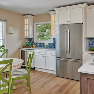
Our homeowners purchased their condo at the beach several years ago. As shown in the 'before'
photo, the casual dining area was a dark and dated space with unsightly paneled walls, heavy
faux ceiling beams and odds and ends for furniture. It was cut off from the kitchen and did not
lend itself for entertaining. Everything felt cramped and cluttered throughout the condo,
especially this space. The client's vision was for a relaxed and welcoming dining space that
would allow them to comfortably host friends and family.
DESIGN SOLUTIONS PROVIDED:
The entire condo was taken down to the stud. The faux beams were edited out and the ceiling
raised. The heavy out-dated paneling was replaced with fresh clean walls that were painted in a
calming creamy sand tone throughout the entire condo. The wall that once separated the kitchen
and dining area was completely removed. This space now felt far more spacious and open.
The existing heavy and out dated furniture was replaced with stylish functional pieces. Great
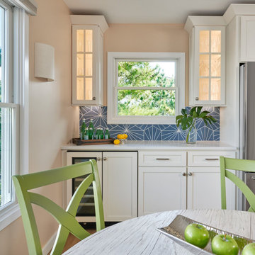
thought was given to the size, scale and textiles used. A round table with a wonderful archectural
base in a richly textured weathered driftwood finish was selected. With the option of adding an
extension leaf (which converted the table into a generous rectangle) the homeowners now had
the desired space to host a sizable group of guests without feeling crowded as before. Dining
chairs with a 'x' back wood frame in a playful shade of kiwi and crisp striped cushions completed
the look.
Clean line sconces in a rich linen textile were added on either of the window for soft ambient
lighting.
The overall effect of the renovation was quite dramatic and the clients were thrilled with the
results. This casual dining area went from being dark and dated to light and airy and is now a
wonderful space that is both inviting and relaxing along with being a great place to entertain.
RETAIL PROJECT PRICE: $ 5,000.00
Retail price is defined as the total sale you submitted on your sales repor
 SHELLEY RODNER DESIGN / DDI
DESIGN CHALLENGES ADDRESSED:
To anyone who may be reading this project overview, I do hope you'll have the opportunity to
have a look at the 'before' photo of this space. It's quite a transformation!
Our homeowners purchased their condo at the beach several years ago. As shown in the 'before'
photo, the casual dining area was a dark and dated space with unsightly paneled walls, heavy
faux ceiling beams and odds and ends for furniture. It was cut off from the kitchen and did not
lend itself for entertaining. Everything felt cramped and cluttered throughout the condo,
especially this space. The client's vision was for a relaxed and welcoming dining space that
would allow them to comfortably host friends and family.
DESIGN SOLUTIONS PROVIDED:
The entire condo was taken down to the stud. The faux beams were edited out and the ceiling
raised. The heavy out-dated paneling was replaced with fresh clean walls that were painted in a
calming creamy sand tone throughout the entire condo. The wall that once separated the kitchen
and dining area was completely removed. This space now felt far more spacious and open.
The existing heavy and out dated furniture was replaced with stylish functional pieces. Great
thought was given to the size, scale and textiles used. A round table with a wonderful archectural
base in a richly textured weathered driftwood finish was selected. With the option of adding an
extension leaf (which converted the table into a generous rectangle) the homeowners now had
the desired space to host a sizable group of guests without feeling crowded as before. Dining
chairs with a 'x' back wood frame in a playful shade of kiwi and crisp striped cushions completed
the look.
Clean line sconces in a rich linen textile were added on either of the window for soft ambient
lighting.
The overall effect of the renovation was quite dramatic and the clients were thrilled with the
results. This casual dining area went from being dark and dated to light and airy and is now a
wonderful space that is both inviting and relaxing along with being a great place to entertain.
RETAIL PROJECT PRICE: $ 5,000.00
Retail price is defined as the total sale you submitted on your sales repor
Sponsored
Columbus, OH

Structural Remodeling
Franklin County's Heavy Timber Specialists | Best of Houzz 2020!
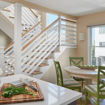 SHELLEY RODNER DESIGN / DDI
DESIGN CHALLENGES ADDRESSED:
To anyone who may be reading this project overview, I do hope you'll have the opportunity to
have a look at the 'before' photo of this space. It's quite a transformation!
Our homeowners purchased their condo at the beach several years ago. As shown in the 'before'
photo, the casual dining area was a dark and dated space with unsightly paneled walls, heavy
faux ceiling beams and odds and ends for furniture. It was cut off from the kitchen and did not
lend itself for entertaining. Everything felt cramped and cluttered throughout the condo,
especially this space. The client's vision was for a relaxed and welcoming dining space that
would allow them to comfortably host friends and family.
DESIGN SOLUTIONS PROVIDED:
The entire condo was taken down to the stud. The faux beams were edited out and the ceiling
raised. The heavy out-dated paneling was replaced with fresh clean walls that were painted in a
calming creamy sand tone throughout the entire condo. The wall that once separated the kitchen
and dining area was completely removed. This space now felt far more spacious and open.
The existing heavy and out dated furniture was replaced with stylish functional pieces. Great
thought was given to the size, scale and textiles used. A round table with a wonderful archectural
base in a richly textured weathered driftwood finish was selected. With the option of adding an
extension leaf (which converted the table into a generous rectangle) the homeowners now had
the desired space to host a sizable group of guests without feeling crowded as before. Dining
chairs with a 'x' back wood frame in a playful shade of kiwi and crisp striped cushions completed
the look.
Clean line sconces in a rich linen textile were added on either of the window for soft ambient
lighting.
The overall effect of the renovation was quite dramatic and the clients were thrilled with the
results. This casual dining area went from being dark and dated to light and airy and is now a
wonderful space that is both inviting and relaxing along with being a great place to entertain.
RETAIL PROJECT PRICE: $ 5,000.00
Retail price is defined as the total sale you submitted on your sales repor
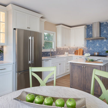 SHELLEY RODNER DESIGN / DDI
DESIGN CHALLENGES ADDRESSED:
To anyone who may be reading this project overview, I do hope you'll have the opportunity to
have a look at the 'before' photo of this space. It's quite a transformation!
Our homeowners purchased their condo at the beach several years ago. As shown in the 'before'
photo, the casual dining area was a dark and dated space with unsightly paneled walls, heavy
faux ceiling beams and odds and ends for furniture. It was cut off from the kitchen and did not
lend itself for entertaining. Everything felt cramped and cluttered throughout the condo,
especially this space. The client's vision was for a relaxed and welcoming dining space that
would allow them to comfortably host friends and family.
DESIGN SOLUTIONS PROVIDED:
The entire condo was taken down to the stud. The faux beams were edited out and the ceiling
raised. The heavy out-dated paneling was replaced with fresh clean walls that were painted in a
calming creamy sand tone throughout the entire condo. The wall that once separated the kitchen
and dining area was completely removed. This space now felt far more spacious and open.
The existing heavy and out dated furniture was replaced with stylish functional pieces. Great
thought was given to the size, scale and textiles used. A round table with a wonderful archectural
base in a richly textured weathered driftwood finish was selected. With the option of adding an
extension leaf (which converted the table into a generous rectangle) the homeowners now had
the desired space to host a sizable group of guests without feeling crowded as before. Dining
chairs with a 'x' back wood frame in a playful shade of kiwi and crisp striped cushions completed
the look.
Clean line sconces in a rich linen textile were added on either of the window for soft ambient
lighting.
The overall effect of the renovation was quite dramatic and the clients were thrilled with the
results. This casual dining area went from being dark and dated to light and airy and is now a
wonderful space that is both inviting and relaxing along with being a great place to entertain.
RETAIL PROJECT PRICE: $ 5,000.00
Retail price is defined as the total sale you submitted on your sales repor

 Fiorito Interior Design
For this project, my client’s goal was to remove a rarely-used existing bath tub next to a medium-sized shower and replace it all with a roomy, open, walk-in shower. With soaring, ten-foot high ceilings, this space became a luxurious statement in minimalism!
I chose a neutral, linen-striated ceramic tile for the floor which, since we were creating a barrier-free shower, meant I could run this tile into the shower and add a hidden, tiled drain for a continuous, seamless look. This makes the bathroom appear even larger. For interest, I added opulent, large-format, ceramic tiles with a blue- and grey-veined marble pattern trimmed out with metal strips. A grand glass wall separates the wet area from the rest of the bathroom. Controls for the shower were wisely placed at the entrance which also features towel hooks and a towel bar on a coordinating panel of blue marble ceramic tile.
The rest of the bathroom received a modern makeover as well with a crisp, custom-built vanity and quartz counter top replacing the old tile counter. Undermount sinks and sculptural hardware sit under modern mirrors with integrated LED lights for maximum light on the face. To top this design off, I chose a glamorous but tailored chandelier with discreet crystal embellishments to infuse sophistication into this sleek, minimalist space.
The new room is light, bright, and uncluttered. For this client, the ultimate luxury is not having a space full of things, but having a space that is simply full of space!
Photo by Bernardo Grijalva
9