
Search results for "Separating graphics" in Home Design Ideas
 TVL Creative Ltd.
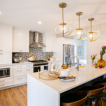
Cramped kitchen be gone! That was the project motto and top priority. The goal was to transform the current layout from multiple smaller spaces into a connected whole that would activate the main level for our clients, a young family of four.
The biggest obstacle was the wall dividing the kitchen and the dining room. Removing this wall was central to opening up and integrating the main living spaces, but the existing ductwork that ran right through the center of the wall posed a design challenge, er design opportunity. The resulting design solution features a central pantry that captures the ductwork and provides valuable storage- especially when compared to the original kitchen's 18" wide pantry cabinet. The pantry also anchors the kitchen island and serves as a visual separation of space between the kitchen and homework area.
Through our design development process, we learned the formal living room was of no service to their lifestyle and therefore space they rarely spent time in. With that in mind, we proposed to eliminate the unused living room and make it the new dining room. Relocating the dining room to this space inherently felt right given the soaring ceiling and ample room for holiday dinners and celebrations. The new dining room was spacious enough for us to incorporate a conversational seating area in the warm, south-facing window alcove.
Now what to do with the old dining room?! To answer that question we took inspiration from our clients' shared profession in education and developed a craft area/homework station for both of their boys. The semi-custom cabinetry of the desk area carries over to the adjacent wall and forms window bench base with storage that we topped with butcher block for a touch of warmth. While the boys are young, the bench drawers are the perfect place for a stash of toys close to the kitchen.
The kitchen begins just beyond the window seat with their refrigerator enclosure. Opposite the refrigerator is the new pantry with twenty linear feet of shelving and space for brooms and a stick vacuum. Extending from the backside of the pantry the kitchen island design incorporates counter seating on the family room side and a cabinetry configuration on the kitchen side with drawer storage, a trashcan center, farmhouse sink, and dishwasher.
We took careful time in design and execution to align the range and sink because while it might seem like a small detail, it plays an important role in supporting the symmetrical configuration of the back wall of the kitchen. The rear wall design utilizes an appliance garage mirrors the visual impact of the refrigerator enclosure and helps keep the now open kitchen tidy. Between the appliance garage and refrigerator enclosure is the cooking zone with 30" of cabinetry and work surface on either side of the range, a chimney style vent hood, and a bold graphic tile backsplash.
The backsplash is just one of many personal touches we added to the space to reflect our client's modern eclectic style and love of color. Swooping lines of the mid-mod style barstools compliment the pendants and backsplash pattern. A pop of vibrant green on the frame of the pantry door adds a fresh wash of color to an otherwise neutral space. The big show stopper is the custom charcoal gray and copper chevron wall installation in the dining room. This was an idea our clients softly suggested, and we excitedly embraced the opportunity. It is also a kickass solution to the head-scratching design dilemma of how to fill a large and lofty wall.
We are so grateful to bring this design to life for our clients and now dear friends.
 TVL Creative Ltd.
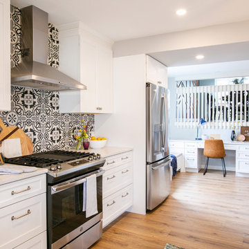
Cramped kitchen be gone! That was the project motto and top priority. The goal was to transform the current layout from multiple smaller spaces into a connected whole that would activate the main level for our clients, a young family of four.
The biggest obstacle was the wall dividing the kitchen and the dining room. Removing this wall was central to opening up and integrating the main living spaces, but the existing ductwork that ran right through the center of the wall posed a design challenge, er design opportunity. The resulting design solution features a central pantry that captures the ductwork and provides valuable storage- especially when compared to the original kitchen's 18" wide pantry cabinet. The pantry also anchors the kitchen island and serves as a visual separation of space between the kitchen and homework area.
Through our design development process, we learned the formal living room was of no service to their lifestyle and therefore space they rarely spent time in. With that in mind, we proposed to eliminate the unused living room and make it the new dining room. Relocating the dining room to this space inherently felt right given the soaring ceiling and ample room for holiday dinners and celebrations. The new dining room was spacious enough for us to incorporate a conversational seating area in the warm, south-facing window alcove.
Now what to do with the old dining room?! To answer that question we took inspiration from our clients' shared profession in education and developed a craft area/homework station for both of their boys. The semi-custom cabinetry of the desk area carries over to the adjacent wall and forms window bench base with storage that we topped with butcher block for a touch of warmth. While the boys are young, the bench drawers are the perfect place for a stash of toys close to the kitchen.
The kitchen begins just beyond the window seat with their refrigerator enclosure. Opposite the refrigerator is the new pantry with twenty linear feet of shelving and space for brooms and a stick vacuum. Extending from the backside of the pantry the kitchen island design incorporates counter seating on the family room side and a cabinetry configuration on the kitchen side with drawer storage, a trashcan center, farmhouse sink, and dishwasher.
We took careful time in design and execution to align the range and sink because while it might seem like a small detail, it plays an important role in supporting the symmetrical configuration of the back wall of the kitchen. The rear wall design utilizes an appliance garage mirrors the visual impact of the refrigerator enclosure and helps keep the now open kitchen tidy. Between the appliance garage and refrigerator enclosure is the cooking zone with 30" of cabinetry and work surface on either side of the range, a chimney style vent hood, and a bold graphic tile backsplash.
The backsplash is just one of many personal touches we added to the space to reflect our client's modern eclectic style and love of color. Swooping lines of the mid-mod style barstools compliment the pendants and backsplash pattern. A pop of vibrant green on the frame of the pantry door adds a fresh wash of color to an otherwise neutral space. The big show stopper is the custom charcoal gray and copper chevron wall installation in the dining room. This was an idea our clients softly suggested, and we excitedly embraced the opportunity. It is also a kickass solution to the head-scratching design dilemma of how to fill a large and lofty wall.
We are so grateful to bring this design to life for our clients and now dear friends.
 TVL Creative Ltd.
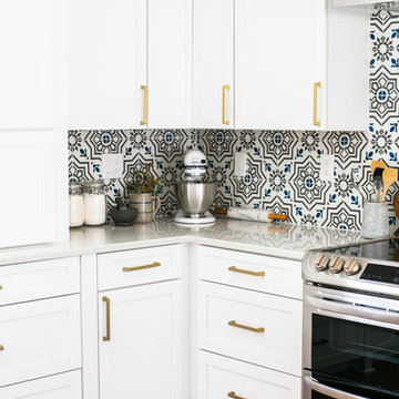
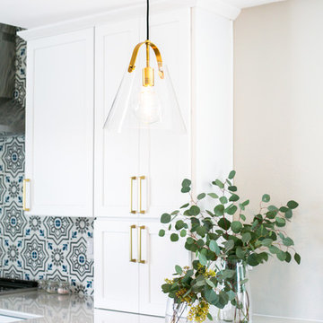
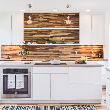
This kitchen took a tired, 80’s builder kitchen and revamped it into a personalized gathering space for our wonderful client. The existing space was split up by the dated configuration of eat-in kitchen table area to one side and cramped workspace on the other. It didn’t just under-serve our client’s needs; it flat out discouraged them from using the space. Our client desired an open kitchen with a central gathering space where family and friends could connect. To open things up, we removed the half wall separating the kitchen from the dining room and the wall that blocked sight lines to the family room and created a narrow hallway to the kitchen. The old oak cabinets weren't maximizing storage and were dated and dark. We used Waypoint Living Spaces cabinets in linen white to brighten up the room. On the east wall, we created a hutch-like stack that features an appliance garage that keeps often used countertop appliance on hand but out of sight. The hutch also acts as a transition from the cooking zone to the coffee and wine area. We eliminated the north window that looked onto the entry walkway and activated this wall as storage with refrigerator enclosure and pantry. We opted to leave the east window as-is and incorporated it into the new kitchen layout by creating a window well for growing plants and herbs. The countertops are Pental Quartz in Carrara. The sleek cabinet hardware is from our friends at Amerock in a gorgeous satin champagne bronze. One of the most striking features in the space is the pattern encaustic tile from Tile Shop. The pop of blue in the backsplash adds personality and contrast to the champagne accents. The reclaimed wood cladding surrounding the large east-facing window introduces a quintessential Colorado vibe, and the natural texture balances the crisp white cabinetry and geometric patterned tile. Minimalist modern lighting fixtures from Mitzi by Hudson Valley Lighting provide task lighting over the sink and at the wine/ coffee station. The visual lightness of the sink pendants maintains the openness and visual connection between the kitchen and dining room. Together the elements make for a sophisticated yet casual vibe-- a comfortable chic kitchen. We love the way this space turned out and are so happy that our clients now have such a bright and welcoming gathering space as the heart of their home!
Find the right local pro for your project
 TVL Creative Ltd.
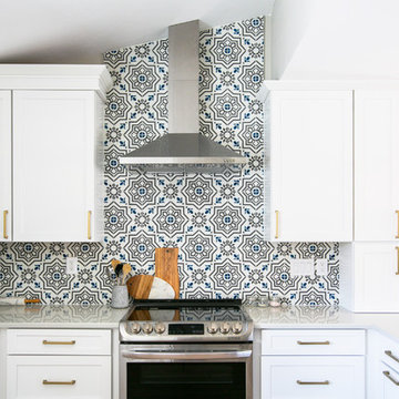
This kitchen took a tired, 80’s builder kitchen and revamped it into a personalized gathering space for our wonderful client. The existing space was split up by the dated configuration of eat-in kitchen table area to one side and cramped workspace on the other. It didn’t just under-serve our client’s needs; it flat out discouraged them from using the space. Our client desired an open kitchen with a central gathering space where family and friends could connect. To open things up, we removed the half wall separating the kitchen from the dining room and the wall that blocked sight lines to the family room and created a narrow hallway to the kitchen. The old oak cabinets weren't maximizing storage and were dated and dark. We used Waypoint Living Spaces cabinets in linen white to brighten up the room. On the east wall, we created a hutch-like stack that features an appliance garage that keeps often used countertop appliance on hand but out of sight. The hutch also acts as a transition from the cooking zone to the coffee and wine area. We eliminated the north window that looked onto the entry walkway and activated this wall as storage with refrigerator enclosure and pantry. We opted to leave the east window as-is and incorporated it into the new kitchen layout by creating a window well for growing plants and herbs. The countertops are Pental Quartz in Carrara. The sleek cabinet hardware is from our friends at Amerock in a gorgeous satin champagne bronze. One of the most striking features in the space is the pattern encaustic tile from Tile Shop. The pop of blue in the backsplash adds personality and contrast to the champagne accents. The reclaimed wood cladding surrounding the large east-facing window introduces a quintessential Colorado vibe, and the natural texture balances the crisp white cabinetry and geometric patterned tile. Minimalist modern lighting fixtures from Mitzi by Hudson Valley Lighting provide task lighting over the sink and at the wine/ coffee station. The visual lightness of the sink pendants maintains the openness and visual connection between the kitchen and dining room. Together the elements make for a sophisticated yet casual vibe-- a comfortable chic kitchen. We love the way this space turned out and are so happy that our clients now have such a bright and welcoming gathering space as the heart of their home!
 TVL Creative Ltd.
This kitchen took a tired, 80’s builder kitchen and revamped it into a personalized gathering space for our wonderful client. The existing space was split up by the dated configuration of eat-in kitchen table area to one side and cramped workspace on the other. It didn’t just under-serve our client’s needs; it flat out discouraged them from using the space. Our client desired an open kitchen with a central gathering space where family and friends could connect. To open things up, we removed the half wall separating the kitchen from the dining room and the wall that blocked sight lines to the family room and created a narrow hallway to the kitchen. The old oak cabinets weren't maximizing storage and were dated and dark. We used Waypoint Living Spaces cabinets in linen white to brighten up the room. On the east wall, we created a hutch-like stack that features an appliance garage that keeps often used countertop appliance on hand but out of sight. The hutch also acts as a transition from the cooking zone to the coffee and wine area. We eliminated the north window that looked onto the entry walkway and activated this wall as storage with refrigerator enclosure and pantry. We opted to leave the east window as-is and incorporated it into the new kitchen layout by creating a window well for growing plants and herbs. The countertops are Pental Quartz in Carrara. The sleek cabinet hardware is from our friends at Amerock in a gorgeous satin champagne bronze. One of the most striking features in the space is the pattern encaustic tile from Tile Shop. The pop of blue in the backsplash adds personality and contrast to the champagne accents. The reclaimed wood cladding surrounding the large east-facing window introduces a quintessential Colorado vibe, and the natural texture balances the crisp white cabinetry and geometric patterned tile. Minimalist modern lighting fixtures from Mitzi by Hudson Valley Lighting provide task lighting over the sink and at the wine/ coffee station. The visual lightness of the sink pendants maintains the openness and visual connection between the kitchen and dining room. Together the elements make for a sophisticated yet casual vibe-- a comfortable chic kitchen. We love the way this space turned out and are so happy that our clients now have such a bright and welcoming gathering space as the heart of their home!
 TVL Creative Ltd.
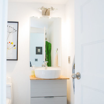
This project is an exhilarating exploration into function, simplicity, and the beauty of a white palette. Our wonderful client and friend was seeking a massive upgrade to a newly purchased home and had hopes of integrating her European inspired aesthetic throughout. At the forefront of consideration was clean-lined simplicity, and this concept is evident in every space in the home. The highlight of the project is the heart of the home: the kitchen. We integrated smooth, sleek, white slab cabinetry to create a functional kitchen with minimal door details and upgraded modernity. The cabinets are topped with concrete-look quartz from Caesarstone; a welcome soft contrast that further emphasizes the contemporary approach we took. The backsplash is a simple and elongated white subway paired against white grout for a modernist grid that virtually melts into the background. Taking the kitchen far outside of its intended footprint, we created a floating island with a waterfall countertop that can house critical cooking fixtures on one side and adequate seating on the other. The island is backed by a dramatic exotic wood countertop that extends into a full wall splash reaching the ceiling. Pops of black and high-gloss finishes in appliances add a touch of drama in an otherwise white field. The entire main level has new hickory floors in a natural finish, allowing the gorgeous variation of the wood to shine. Also included on the main level is a re-face to the living room fireplace, powder room, and upgrades to all walls and lighting. Upstairs, we created two critical retreats: a warm Mediterranean inspired bathroom for the client's mother, and the master bathroom. In the mother's bathroom, we covered the floors and a large accent wall with dramatic travertine tile in a bold Versailles pattern. We paired this highly traditional tile with sleek contemporary floating vanities and dark fixtures for contrast. The shower features a slab quartz base and thin profile glass door. In the master bath, we welcomed drama and explored space planning and material use adventurously. Keeping with the quiet monochromatic palette, we integrated all black and white into our bathroom concept. The floors are covered with large format graphic tiles in a deco pattern that reach through every part of the space. At the vanity area, high gloss white floating vanities offer separate space for his/her use. Tall linear LED fixtures provide ample lighting and illuminate another grid pattern backsplash that runs floor to ceiling. The show-stopping bathtub is a square steel soaker tub that nestles quietly between windows in the bathroom's far corner. We paired this tub with an unapologetic tub filler that is bold and large in scale. Next to the tub, an open shower is adorned with a full expanse of white grid subway tile, a slab quartz shower base, and sleek steel fixtures. This project was exciting and inspiring in its ability to push the boundaries of simplicity and quietude in color. We love the result and are so thrilled that our wonderful clients can enjoy this home for years to come!
 Unilock
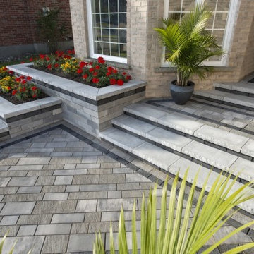
The long, clean lines of new Artline reflects an emerging trend to minimalist, modern outdoor designs. Look for Artline in an exclusive number of colors that can be used separately or combined together to create graphic interest.

Sponsored
Sunbury, OH

J.Holderby - Renovations
Franklin County's Leading General Contractors - 2X Best of Houzz!
 TVL Creative Ltd.
This project is an exhilarating exploration into function, simplicity, and the beauty of a white palette. Our wonderful client and friend was seeking a massive upgrade to a newly purchased home and had hopes of integrating her European inspired aesthetic throughout. At the forefront of consideration was clean-lined simplicity, and this concept is evident in every space in the home. The highlight of the project is the heart of the home: the kitchen. We integrated smooth, sleek, white slab cabinetry to create a functional kitchen with minimal door details and upgraded modernity. The cabinets are topped with concrete-look quartz from Caesarstone; a welcome soft contrast that further emphasizes the contemporary approach we took. The backsplash is a simple and elongated white subway paired against white grout for a modernist grid that virtually melts into the background. Taking the kitchen far outside of its intended footprint, we created a floating island with a waterfall countertop that can house critical cooking fixtures on one side and adequate seating on the other. The island is backed by a dramatic exotic wood countertop that extends into a full wall splash reaching the ceiling. Pops of black and high-gloss finishes in appliances add a touch of drama in an otherwise white field. The entire main level has new hickory floors in a natural finish, allowing the gorgeous variation of the wood to shine. Also included on the main level is a re-face to the living room fireplace, powder room, and upgrades to all walls and lighting. Upstairs, we created two critical retreats: a warm Mediterranean inspired bathroom for the client's mother, and the master bathroom. In the mother's bathroom, we covered the floors and a large accent wall with dramatic travertine tile in a bold Versailles pattern. We paired this highly traditional tile with sleek contemporary floating vanities and dark fixtures for contrast. The shower features a slab quartz base and thin profile glass door. In the master bath, we welcomed drama and explored space planning and material use adventurously. Keeping with the quiet monochromatic palette, we integrated all black and white into our bathroom concept. The floors are covered with large format graphic tiles in a deco pattern that reach through every part of the space. At the vanity area, high gloss white floating vanities offer separate space for his/her use. Tall linear LED fixtures provide ample lighting and illuminate another grid pattern backsplash that runs floor to ceiling. The show-stopping bathtub is a square steel soaker tub that nestles quietly between windows in the bathroom's far corner. We paired this tub with an unapologetic tub filler that is bold and large in scale. Next to the tub, an open shower is adorned with a full expanse of white grid subway tile, a slab quartz shower base, and sleek steel fixtures. This project was exciting and inspiring in its ability to push the boundaries of simplicity and quietude in color. We love the result and are so thrilled that our wonderful clients can enjoy this home for years to come!
 TVL Creative Ltd.
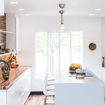
This project is an exhilarating exploration into function, simplicity, and the beauty of a white palette. Our wonderful client and friend was seeking a massive upgrade to a newly purchased home and had hopes of integrating her European inspired aesthetic throughout. At the forefront of consideration was clean-lined simplicity, and this concept is evident in every space in the home. The highlight of the project is the heart of the home: the kitchen. We integrated smooth, sleek, white slab cabinetry to create a functional kitchen with minimal door details and upgraded modernity. The cabinets are topped with concrete-look quartz from Caesarstone; a welcome soft contrast that further emphasizes the contemporary approach we took. The backsplash is a simple and elongated white subway paired against white grout for a modernist grid that virtually melts into the background. Taking the kitchen far outside of its intended footprint, we created a floating island with a waterfall countertop that can house critical cooking fixtures on one side and adequate seating on the other. The island is backed by a dramatic exotic wood countertop that extends into a full wall splash reaching the ceiling. Pops of black and high-gloss finishes in appliances add a touch of drama in an otherwise white field. The entire main level has new hickory floors in a natural finish, allowing the gorgeous variation of the wood to shine. Also included on the main level is a re-face to the living room fireplace, powder room, and upgrades to all walls and lighting. Upstairs, we created two critical retreats: a warm Mediterranean inspired bathroom for the client's mother, and the master bathroom. In the mother's bathroom, we covered the floors and a large accent wall with dramatic travertine tile in a bold Versailles pattern. We paired this highly traditional tile with sleek contemporary floating vanities and dark fixtures for contrast. The shower features a slab quartz base and thin profile glass door. In the master bath, we welcomed drama and explored space planning and material use adventurously. Keeping with the quiet monochromatic palette, we integrated all black and white into our bathroom concept. The floors are covered with large format graphic tiles in a deco pattern that reach through every part of the space. At the vanity area, high gloss white floating vanities offer separate space for his/her use. Tall linear LED fixtures provide ample lighting and illuminate another grid pattern backsplash that runs floor to ceiling. The show-stopping bathtub is a square steel soaker tub that nestles quietly between windows in the bathroom's far corner. We paired this tub with an unapologetic tub filler that is bold and large in scale. Next to the tub, an open shower is adorned with a full expanse of white grid subway tile, a slab quartz shower base, and sleek steel fixtures. This project was exciting and inspiring in its ability to push the boundaries of simplicity and quietude in color. We love the result and are so thrilled that our wonderful clients can enjoy this home for years to come!
 Five Queens Court
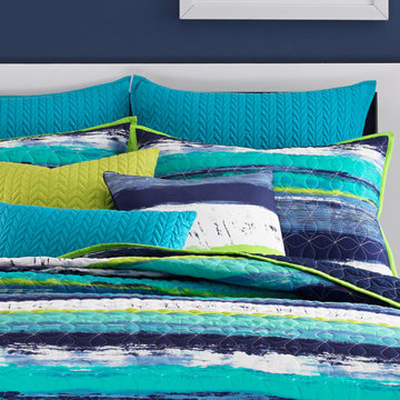
Please note listing is for coverlet ONLY. All other bedding pieces are sold separately |Adorn your bed with artistic flair using this Five Queens Court Cameron quilt featuring a watercolor pattern in cool blues and greens. The oversize cotton coverlet keeps you warm and cozy all night long.
Quilt Type: Coverlet
Style: Contemporary, Transitional, Modern
Material: Cotton
Pattern: Graphic Print, Stripe
Care Instruction: Machine Wash
Exact Color: Teal
Color: White, Blue, Green
 TVL Creative Ltd.
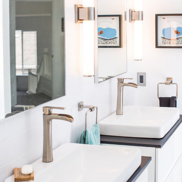
This project is an exhilarating exploration into function, simplicity, and the beauty of a white palette. Our wonderful client and friend was seeking a massive upgrade to a newly purchased home and had hopes of integrating her European inspired aesthetic throughout. At the forefront of consideration was clean-lined simplicity, and this concept is evident in every space in the home. The highlight of the project is the heart of the home: the kitchen. We integrated smooth, sleek, white slab cabinetry to create a functional kitchen with minimal door details and upgraded modernity. The cabinets are topped with concrete-look quartz from Caesarstone; a welcome soft contrast that further emphasizes the contemporary approach we took. The backsplash is a simple and elongated white subway paired against white grout for a modernist grid that virtually melts into the background. Taking the kitchen far outside of its intended footprint, we created a floating island with a waterfall countertop that can house critical cooking fixtures on one side and adequate seating on the other. The island is backed by a dramatic exotic wood countertop that extends into a full wall splash reaching the ceiling. Pops of black and high-gloss finishes in appliances add a touch of drama in an otherwise white field. The entire main level has new hickory floors in a natural finish, allowing the gorgeous variation of the wood to shine. Also included on the main level is a re-face to the living room fireplace, powder room, and upgrades to all walls and lighting. Upstairs, we created two critical retreats: a warm Mediterranean inspired bathroom for the client's mother, and the master bathroom. In the mother's bathroom, we covered the floors and a large accent wall with dramatic travertine tile in a bold Versailles pattern. We paired this highly traditional tile with sleek contemporary floating vanities and dark fixtures for contrast. The shower features a slab quartz base and thin profile glass door. In the master bath, we welcomed drama and explored space planning and material use adventurously. Keeping with the quiet monochromatic palette, we integrated all black and white into our bathroom concept. The floors are covered with large format graphic tiles in a deco pattern that reach through every part of the space. At the vanity area, high gloss white floating vanities offer separate space for his/her use. Tall linear LED fixtures provide ample lighting and illuminate another grid pattern backsplash that runs floor to ceiling. The show-stopping bathtub is a square steel soaker tub that nestles quietly between windows in the bathroom's far corner. We paired this tub with an unapologetic tub filler that is bold and large in scale. Next to the tub, an open shower is adorned with a full expanse of white grid subway tile, a slab quartz shower base, and sleek steel fixtures. This project was exciting and inspiring in its ability to push the boundaries of simplicity and quietude in color. We love the result and are so thrilled that our wonderful clients can enjoy this home for years to come!
 White Noise Design Studio
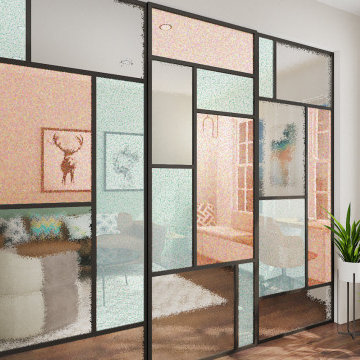
Creating a semi-private space for the client to work from home. The colorful glass screen and door was designed to separate the hallway from the comfortable living / office space.
 TVL Creative Ltd.
This project is an exhilarating exploration into function, simplicity, and the beauty of a white palette. Our wonderful client and friend was seeking a massive upgrade to a newly purchased home and had hopes of integrating her European inspired aesthetic throughout. At the forefront of consideration was clean-lined simplicity, and this concept is evident in every space in the home. The highlight of the project is the heart of the home: the kitchen. We integrated smooth, sleek, white slab cabinetry to create a functional kitchen with minimal door details and upgraded modernity. The cabinets are topped with concrete-look quartz from Caesarstone; a welcome soft contrast that further emphasizes the contemporary approach we took. The backsplash is a simple and elongated white subway paired against white grout for a modernist grid that virtually melts into the background. Taking the kitchen far outside of its intended footprint, we created a floating island with a waterfall countertop that can house critical cooking fixtures on one side and adequate seating on the other. The island is backed by a dramatic exotic wood countertop that extends into a full wall splash reaching the ceiling. Pops of black and high-gloss finishes in appliances add a touch of drama in an otherwise white field. The entire main level has new hickory floors in a natural finish, allowing the gorgeous variation of the wood to shine. Also included on the main level is a re-face to the living room fireplace, powder room, and upgrades to all walls and lighting. Upstairs, we created two critical retreats: a warm Mediterranean inspired bathroom for the client's mother, and the master bathroom. In the mother's bathroom, we covered the floors and a large accent wall with dramatic travertine tile in a bold Versailles pattern. We paired this highly traditional tile with sleek contemporary floating vanities and dark fixtures for contrast. The shower features a slab quartz base and thin profile glass door. In the master bath, we welcomed drama and explored space planning and material use adventurously. Keeping with the quiet monochromatic palette, we integrated all black and white into our bathroom concept. The floors are covered with large format graphic tiles in a deco pattern that reach through every part of the space. At the vanity area, high gloss white floating vanities offer separate space for his/her use. Tall linear LED fixtures provide ample lighting and illuminate another grid pattern backsplash that runs floor to ceiling. The show-stopping bathtub is a square steel soaker tub that nestles quietly between windows in the bathroom's far corner. We paired this tub with an unapologetic tub filler that is bold and large in scale. Next to the tub, an open shower is adorned with a full expanse of white grid subway tile, a slab quartz shower base, and sleek steel fixtures. This project was exciting and inspiring in its ability to push the boundaries of simplicity and quietude in color. We love the result and are so thrilled that our wonderful clients can enjoy this home for years to come!
Sponsored
Sunbury, OH
J.Holderby - Renovations
Franklin County's Leading General Contractors - 2X Best of Houzz!
 Nico van der Meulen Architects
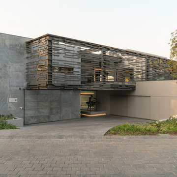
Forest Road villa.
The light-filled unique and eco-friendly home designed by Nico van der Meulen Architects is situated in Inanda, with views of the Sandton skyline to the north.
The stand is 1511 sq.m. and the glass, steel and stone clad built home faces 15° east of north.
Approaching the home, the first view is of the cantilevered porte cochere screen of suspended steel tubes with double sliding garage doors clad in dark limestone to blend with the wall. A steel sculpture by Regardt van der Meulen twirls on a podium next to the front door built of privacy glass.
Upon entering the transparency of the house becomes evident with views out over the multi-level hall, lounge, spa and pool to the water feature and the garden beyond, as well as over the double volume family room, dining room, lanai and kitchen.
A steel and glass structure enables the whole of the living/kitchen/ breakfast area to open totally through the use of frameless concertina doors to the lanai, pool and garden.
Although the spa, pool and water feature are three separate bodies of water, the effect created was that it is one interconnected system flowing into each other.
Sliding glass panels hide the bar and kitchen when not in use, creating a more intimate setting, while a skylight lit catwalk between the main suite and guest bedrooms allows views of the living spaces and garden through the brise soleil on the north side. On the catwalk a study, pyjama lounge and kitchenette are hidden behind sliding wooden panels. The study and pyjama lounge leads onto an expansive private balcony.
The LED illuminated polished concrete and wood staircase cantilevers out of the wall with vertical steel bars acting as balustrades and supports at the same time. A recessed illuminated handrail forms a graphic line in the wall, while a hidden horizontal sliding door enables the owner to cut the upper floor off from the ground floor for security.
The lanai and brise soleil on the north side cantilevers 18 meters by 6 meters unsupported by columns, partially over the pool. The lanai consists of a seating area, dining area and bar cum barbeque, seamlessly connected with the living spaces and kitchen, while the brise soleil consists of suspended steel tubes, to create both privacy and sun control. The breakfast room is situated on the north-east corner of the kitchen, to bask in the morning and winter sun.
The main suite is also placed on the north-east corner of the first floor, divided by sliding smoked glass screens. The bathroom with a free-standing spa bath gets the morning and winter sun, while the bedroom is exposed to the winter sun. Expansive his and her dressing rooms are situated behind the bedroom and bathroom.
On the opposite side of the building are two guest suites, both north facing with en-suite bathrooms and walk-in cupboards.
A geothermal system is used to heat and cool the home, and also to heat the pool and spa. Nine boreholes were sunk to a depth of 100 meter for this purpose, and a special room created in the basement to house the equipment. The photo voltaic panels on the roof have an output of 10KVA, while rain water is harvested and the whole house is double glazed, except for the frameless concertina doors.
Also in the basement is a home theatre with an adjoining light-well which allows winter sun to penetrate even this space through sliding doors into the atrium created at the bottom of the light-well. A window looks into the spa.
The kitchen and built-in cupboards were built by Dada and Porro respectively, and imported from Italy by M Square Lifestyle necessities, while the interior design was done by M Square Lifestyle design.
All the furniture was also supplied by M Square Lifestyle Necessities.
 Laqfoil Ltd.
The issues that annoyed the family in this condo are common to new condo units: Low ceilings covered with a popcorn finish, small rooms, low light in the bedrooms and living room, and no ceiling light fixtures. Concrete ceilings are not only difficult to drill into to install fixtures, installing wiring behind them for such fixtures is impossible. There are often conduits for building services embedded in the concrete along with structural steel reinforcements, so drilling without x-raying first is dangerous.
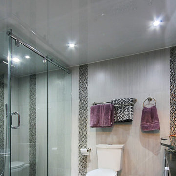
Laqfoil stretch ceiling provided a solution to all of these issues for this condo unit. A high gloss finish was chosen, as the reflections visually double the height of the space. Installing a stretch ceiling also naturally conceals the popcorn ceiling behind it, but in this case, was also used to conceal the wiring necessary to add ceiling lights in every room. The wiring was simply attached to the existing popcorn ceiling. Laqfoil stretch ceiling is supported around the perimeter only, by tracks, or profiles which are only about 0.75" thick. The ceiling membrane itself is less than one millimetre thick.
We also added a small vector graphic, printed in each corner of the living room ceiling, for a unique aesthetic effect.
We constructed a suspended bulkhead above the island and covered it with red high gloss membrane, to visually separate the kitchen and living room while keeping the design's open concept. This also provided a supporting structure for 3 mini chandelier pendant lights.
A red rose depicted on a black and white textured ground was chosen for the kitchen ceiling and applied using digital wide format printing technology, to tie the red, black and white colour scheme with the kitchen cabinets' texture.
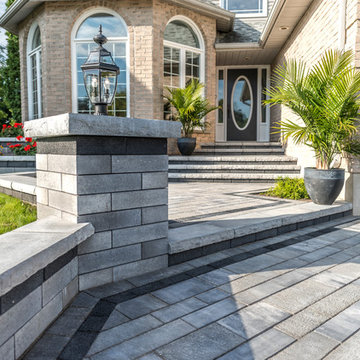 Unilock
The long, clean lines of new Artline reflects an emerging trend to minimalist, modern outdoor designs. Look for Artline in an exclusive number of colors that can be used separately or combined together to create graphic interest.
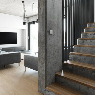
 STUDIO KONDE | Konrad Idaszewski Architect
Visit the full project: https://conde.pl/portfolio/projekt-loftowych-wnetrz-domu-w-rokietnicy/
Concrete gives the staircase a strong structural presence, while warm oak treads soften its raw appearance.
Slim black steel rails run vertically along the stairs, creating a delicate graphic layer against the concrete.
A broad concrete column marks the transition between circulation and living space.
From this angle, the staircase reads as part of the architecture of the living room rather than a separate functional element.
Oak, concrete and black steel come together in a deliberately restrained material composition.
Sponsored
Sunbury, OH
J.Holderby - Renovations
Franklin County's Leading General Contractors - 2X Best of Houzz!
 TOC design & construction inc.
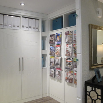
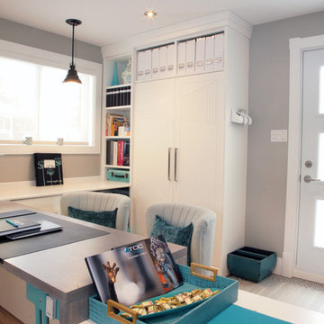
The importance of a properly designed home office ( especially when the space is also used as a meeting-place/showroom ) entails the comfort & positive experience of your customer in the following manner:
1. Exclusive office space with its own entrance separate from rest of home.
2. Ergonomic customer seating and ample presentation surfaces.
3. Dedicated customer computer screen(s) detailing CAD drawings & presentation in a show and tell manner.
4. Proper lighting ( LED lighting has come a long way )
5. Practical design touches ( hooks for purses, coats, umbrella stand, refreshments area, guest WIFI, etc...)
One of the greatest benefits of a home office is the freedom to design it with a distinct identity. In other words, we shouldn’t blend the workplace with the rest of our personal space, aka home.
 TOC design & construction inc.
The importance of a properly designed home office ( especially when the space is also used as a meeting-place/showroom ) entails the comfort & positive experience of your customer in the following manner:
1. Exclusive office space with its own entrance separate from rest of home.
2. Ergonomic customer seating and ample presentation surfaces.
3. Dedicated customer computer screen(s) detailing CAD drawings & presentation in a show and tell manner.
4. Proper lighting ( LED lighting has come a long way )
5. Practical design touches ( hooks for purses, coats, umbrella stand, refreshments area, guest WIFI, etc...)
One of the greatest benefits of a home office is the freedom to design it with a distinct identity. In other words, we shouldn’t blend the workplace with the rest of our personal space, aka home.
 Marlo Creative Interiors
A tired and dated, poorly layed out kitchen gets a bright and fresh new look in in the NW community of Arbour Lake in Calgary.
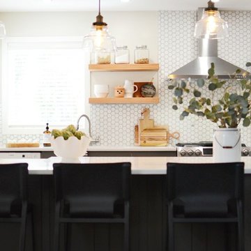
The corner pantry made way for plenty of storage and counter space and the former dining nook now houses a coffee bar. There’s no need for a separate table because the island has ample space to seat four people comfortably as well as houses extra storage for those infrequently used items. The floating wood shelves don’t just look amazing, they are great for easy access to your most used items. The hexagon tile back splash is installed to highlight the shelves and stainless hood and make a very graphic statement.
8