
Search results for "Sequence" in Home Design Ideas
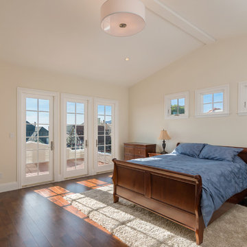
 Winder Gibson Architects
This project is the remaking and reimagining of an historically-rated storybook house in one of San Francisco’s first planned neighborhoods for a 21st century family. Strange half-levels and poor previous remodels were removed. The historic materials and forms of the house were studied and extended while creating a flowing sequence of spaces and a massive new kitchen. White painted cabinets, arched openings and wrought iron railings pull the house together.
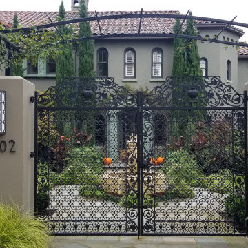
 Banyon Tree Design Studio
Front entry gate, rose trellis, outdoor lighting, stucco wall
Inspiration for a mediterranean privacy front yard stone and metal fence landscaping in Seattle for fall.
Inspiration for a mediterranean privacy front yard stone and metal fence landscaping in Seattle for fall.
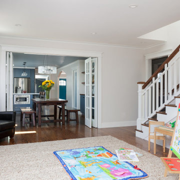
 Saikley Architects
This house was a very small mid-century bungalow with previous additions that resulted in a large but chaotic layout. The owners wanted to convert the house to a super-efficient, and charming Craftsman-style, 6 bedroom home for their large family and work at home.
We achieved the space needs by moving a few walls for a more efficient, organized layout, setting up spaces for overlapping uses, and making a small upstairs addition. Every bit of square footage was optimized to meet the goals of the project without making the house huge or adding unnecessary cost.
Much thought was given to the entry sequence near the front door. A large flow-through mudroom with storage for each family member, and adjacent laundry, make it easy for children to be taught to keep their things organized and to contribute to household chores. A mail station and central home admin area at the mudroom help keep clutter down at other areas and minimize home management tasks. A garage door near the kitchen gives quick access to bulk items.
The existing house had too much view to the street from the living room through large corner windows, and too little entry transition, to the extent that the family did not feel comfortable using the living room much without shades drawn. We raised the window sills and brought the new windows in from the corner of the house, allowing plenty of light while protecting privacy and a sense of enclosure in the living room. We enlarged the front porch to create a more graceful transition from the public to private space. We located the front door so that the circulation from entry into the house would allow for furnishing the living room with a sitting circle that is not intruded upon by people walking through the room.
Sight lines through the living spaces were an important consideration in the design. The owners wanted discreet spaces for living room, kitchen, dining and family room, but also wanted the living spaces to feel connected and to be able to easily watch their children. Being able to see the children playing in the yard while getting things done inside the house was also important. While largely working with the existing structure, we opened walls and rearranged the use of spaces to make a series of connected living spaces with long views through them.
The character of the remodeled house is a contemporary Craftsman with classic materials and cool, consistent colors. A few arches echo through the house to frame spaces and soften the feeling of the rooms.
Photography: Kurt Manley
https://saikleyarchitects.com/portfolio/bungalow-expansion/
Find the right local pro for your project
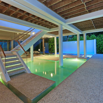
 The Cultural Landscape Foundation
Saturday, March 28, 1:00 to 2:30pm
Register Online: https://tclf.org/event/garden-dialogues-florida-gulf-coast-2015
Aquadisia by David Young of DWY Landscape Architects, with David Lowe, Interior Designer, David K. Lowe Interior Design
Situated on a barrier island overlooking the Gulf of Mexico, this landscape is a dazzling mix of geometric form, carefully manicured lawns and the shaggy manes of numerous bamboo trees. The landscape architects collaborated closely with the owner to create a garden that takes full advantage of the site’s location, views and climate. The site’s sequence of designed spaces carefully balances large but simple geometric shapes with a well calibrated plant palette. Entry to the house is gained via a concrete walkway that passes over a water garden and through a glass cube flanked by marble Foo Dogs. The water garden continues to a glass-enclosed lower-level where a waterwall provides the perfect backdrop for a beachside spa and fire pit. The experience of this exquisite landscape is not limited to the ground; a wooden terrace allows full view of the Gulf and a new spiral glass staircase leads to a crow’s nest overlooking the property.
photo by SRQ360 Photography
 Andover Landscape Design & Construction
Timeless Classic.
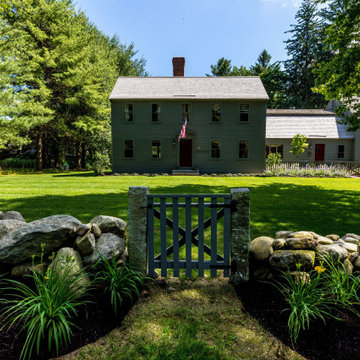
The landscape must complement the architecture of the house, so designing this garden for our antique reproduction needed to harken back to a different time. Material choices such as antique brick, reclaimed granite, and natural-cleft bluestone were all incorporated into the composition to create a timeless beauty all within the context of a bygone setting.
Directly adjacent to the driveway and guest parking, the ‘kitchen garden’ was surrounded by a custom-built cedar fence with a self-closing cannonball gate. Herbs and cutting perennials fill the space as well as a small bench for reflection or to take a break from tending to the garden. From a functional standpoint, this has become the most-used entrance to the house, with the original main door serving only as decoration. The arrival sequence is easy to understand and has the guests passing through the landscape on a well-lit path via our hand-built copper lantern atop an architectural post. Planting was purposely kept to a minimum with mostly perennials and a couple of common lilacs — all keeping within the design intent.
Existing natural-cleft bluestone was repurposed with a linear approach for a dining and lounging terrace in the rear of the property. Three sides are surrounded by sun-loving plants with grass coming right up to the patio offering a seamless transition to the yard beyond.
Simple, elegant, and timeless.
 Departure l Architecture
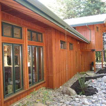
The site features a storm water control system done with artful rocks & boulders arranged to control the rain water runoff from around the house and the property in general. The stained board and batten wood siding merges the home into the forest.
 Klopf Architecture
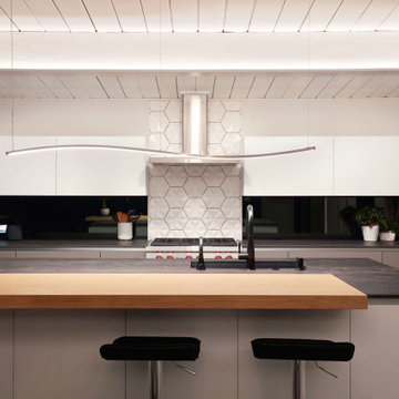
This Eichler home was strategically expanded and reconfigured to strengthen the connection between interior and exterior spaces while also adding a more spacious primary suite, formalized entry space, and an expanded bedroom and hallway bathroom. The entry sequence is now defined by custom storage, a large glass wall at the light-filled atrium, and a mid-century-inspired geometric screen. The sense of connection between indoor and outdoor spaces is heightened by a large, multi-panel sliding door system spanning the full width of the main living spaces. The outdated kitchen was relocated adjacent to the new door system, flowing into a spacious great room overlooking new landscaping. Indoor/outdoor floor tile extends the living spaces out onto patios at the atrium and rear yard to further fade the boundary between this Eichler’s interior and exterior.
Klopf Architecture project team: John Klopf, Ethan Taylor, and Fernanda Bernardes
Structural engineer: BASE Design
Interior Designer: Lucile Glessner
Landscape Designer: Bonnie Brock Landscape Design
General Contrator: Starburst Construction
Photography: © 2022 by Mariko Reed
Completion year: 2021
 Saikley Architects
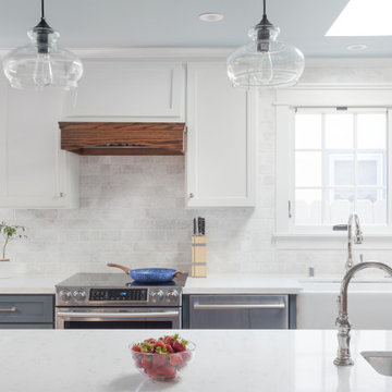
This house was a very small mid-century bungalow with previous additions that resulted in a large but chaotic layout. The owners wanted to convert the house to a super-efficient, and charming Craftsman-style, 6 bedroom home for their large family and work at home.
We achieved the space needs by moving a few walls for a more efficient, organized layout, setting up spaces for overlapping uses, and making a small upstairs addition. Every bit of square footage was optimized to meet the goals of the project without making the house huge or adding unnecessary cost.
Much thought was given to the entry sequence near the front door. A large flow-through mudroom with storage for each family member, and adjacent laundry, make it easy for children to be taught to keep their things organized and to contribute to household chores. A mail station and central home admin area at the mudroom help keep clutter down at other areas and minimize home management tasks. A garage door near the kitchen gives quick access to bulk items.
The existing house had too much view to the street from the living room through large corner windows, and too little entry transition, to the extent that the family did not feel comfortable using the living room much without shades drawn. We raised the window sills and brought the new windows in from the corner of the house, allowing plenty of light while protecting privacy and a sense of enclosure in the living room. We enlarged the front porch to create a more graceful transition from the public to private space. We located the front door so that the circulation from entry into the house would allow for furnishing the living room with a sitting circle that is not intruded upon by people walking through the room.
Sight lines through the living spaces were an important consideration in the design. The owners wanted discreet spaces for living room, kitchen, dining and family room, but also wanted the living spaces to feel connected and to be able to easily watch their children. Being able to see the children playing in the yard while getting things done inside the house was also important. While largely working with the existing structure, we opened walls and rearranged the use of spaces to make a series of connected living spaces with long views through them.
The character of the remodeled house is a contemporary Craftsman with classic materials and cool, consistent colors. A few arches echo through the house to frame spaces and soften the feeling of the rooms.
Photography: Kurt Manley
https://saikleyarchitects.com/portfolio/bungalow-expansion/
 MATHISON | MATHISON ARCHITECTS
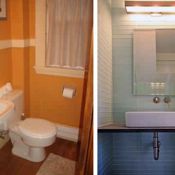
Located in Boston’s southwest corner, West Roxbury is known for its tree lined streets and established neighborhoods. The client and their young family, having lived in this historic home for 20 years, had grown to occupy each of the 2,500 square feet and required help to discover a way to make the main level feel larger including the design of a new kitchen.
With only 900 square feet on the main level, the rooms were tight with a central corridor, entry, dining, kitchen and living room. By capturing the corridor area, the central core became more functional, with stairs and a new powder room. This dramatically changed the feeling of the home by connecting the rooms in a more continuous sequence of open spaces and directing all views to the new, bright kitchen and eating area. A new 10’ wide folding door system helps expand the living space through the kitchen and into the existing spacious screen porch.
All floors on the main level were replaced with a continuous surface of wood and radiant-heated porcelain tile. When the large kitchen/porch door is open the inside/outside space is unified with a continuous wood ceiling element with integrated lighting. Materially, the existing home is detailed with ornate natural finished oak trims and paneling. For the new kitchen oak casework and ceiling wood, the surfaces are bleached for a brighter and more expansive feeling of space.
Evan’s Role: Project Designer & Project Manager
Photographer: Peyton Knisley
 Arta Building Contracting LLC
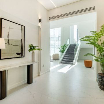
The renovated entrance foyer creates a clear arrival sequence toward the double-height staircase hall. A long stone-top console with dark cylindrical supports furnishes the wall without reducing circulation space. Abstract artwork, a sculptural table lamp and a recessed up-and-down wall light add several lighting and decorative layers. Pale marble-look flooring continues into the adjoining spaces, while the large indoor palm balances the console and softens the white architectural surfaces.
 Amos Goldreich Architecture
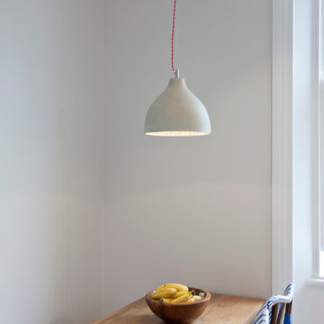
Occupying a prominent property in Notting Hill, the brief for this 120 sq m apartment was to rationalise a sequence of disconnected spaces in order to create a coherent design.
The palette of materials is restrained in order to provide a neutral backdrop for the client’s collection of furniture and artworks. High quality finishes and detailing include shadow gaps, full height door apertures, concealed storage and limed oak flooring, together with a library area equipped with bespoke storage to display books and objets d’art.
A notable feature of the apartment is the corner ‘rotunda’, now accommodating a shower-room; the rotunda’s roof structure has been exposed to add architectural interest.
Throughout the apartment, great care has been taken to maximise natural light
 Patrick Ahearn Architect
Greg Premru
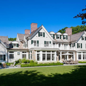
Huge traditional gray three-story mixed siding gable roof idea in Boston
Huge traditional gray three-story mixed siding gable roof idea in Boston
 Dynia Architects
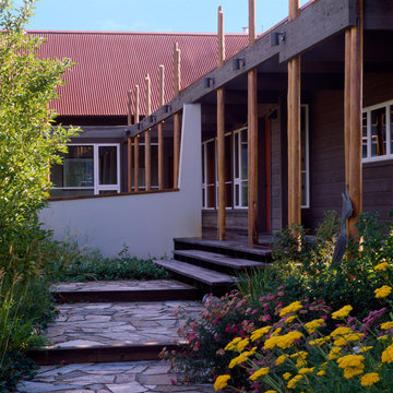
Situated in a meadow, this L-shaped 5,000 sq. ft. house wraps around a raked Japanese courtyard, which is open to the southwest for maximum sun infiltration. The walls of the house through which this outdoor room is viewed are mostly glass and are articulated with a continuous garden trellis.
The entry sequence is through a linear art gallery; the art wall splayed to affect the entry experience. This wall leads you to another wall, subtly curved, that directs you to the public space of the house which features a warm vaulted ceiling that covers the living, dining, and kitchen space.
The character of the house is enhanced inside and out by the use of distressed metals, rusted to a deep mahogany, with terra cotta stained concrete and semi-peeled log trellis columns. These materials reflect the ruggedness and timelessness of the Rocky mountain west.
1999
 Amos Goldreich Architecture
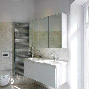
The apartment occupies the third floor of a prominent corner property originally constructed in 1860.
The building was formerly two neighbouring town houses, reconfigured in 1939 as a residential school for girls. In 1968, the State of Kuwait purchased the property which became their London Embassy until 2000 at which time the two houses were converted into 13 flats.
Amos Goldreich Architecture was appointed as lead architects to create a contemporary 3 bedroom home within this Grade II Listed Building.
AGA has sought to rationalise the formerly over-complex configuration, clarifying spatial sequences and creating a coherent visual palette. The apartment is finished to a high standard, with bespoke joinery and ingenious storage solutions.

 Amos Goldreich Architecture
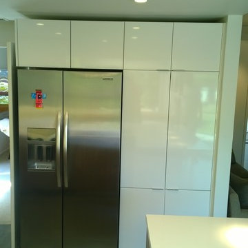
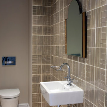
The apartment occupies the third floor of a prominent corner property originally constructed in 1860.
The building was formerly two neighbouring town houses, reconfigured in 1939 as a residential school for girls. In 1968, the State of Kuwait purchased the property which became their London Embassy until 2000 at which time the two houses were converted into 13 flats.
Amos Goldreich Architecture was appointed as lead architects to create a contemporary 3 bedroom home within this Grade II Listed Building.
AGA has sought to rationalise the formerly over-complex configuration, clarifying spatial sequences and creating a coherent visual palette. The apartment is finished to a high standard, with bespoke joinery and ingenious storage solutions.
 Klopf Architecture
From Mid-Century Classic to the Present
An iconic design updated with comfort, function, and flow for today.
A Remodel That Balances Past and Present
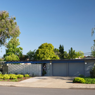
What started as a desire to update a classic Eichler soon became an exploration of how Mid-Century Modern design can successfully evolve for today. The client, a tech professional with a passion for scuba diving and underwater photography, wanted a home that would both honor its original character and feel tailored to his daily life. A lifelong technology enthusiast, he still owns the very first Mac desktop he saved up for as a teenager working at Radio Shack, a detail that underscores his appreciation for design that melds function and form.
Honoring Separation While Expanding Possibility
Unlike many contemporary remodels where walls are opened up to create expansive living spaces, this project took a more restrained approach. The client valued the defined rooms of the original plan and wanted to preserve as much wall space as possible for displaying his large-format underwater photography. The emphasis was not on dramatic spatial reinvention, but on thoughtful refinements. Klopf Architecture shaped a gallery-like backdrop while also expanding the primary suite, modernizing materials and fixtures throughout the home, and improving the functionality and layout of the kitchen. The finished home feels at once timeless and renewed, an Eichler that continues to inspire while fully supporting the lifestyle of its present-day owner.
A major turning point came mid-design. The original project brief had not included an addition, but as the reconfiguration of the primary bedroom and bath unfolded, it became clear that an expansion was the best approach to achieve the client’s vision of a more spacious suite. Fortunately, the adjustment came at a stage when revisions were still manageable and was integrated seamlessly, showing how thoughtful course corrections can strengthen a project rather than hinder it.
Navigating Challenges With Precision
The design development included multiple conceptual rounds, balancing preservation with subtle expansion. During construction, an existing post previously thought to be load-bearing turned out not to be. The structural engineer was able to pivot quickly, and both the post and the cross beam that had been intended to replace it could be omitted, allowing the original rhythm of the Eichler beam bays to be preserved.
Sustainability was not just a checklist item, but a way to align the home with the client’s values of simplicity, efficiency, and long-term functionality. R-38 roof insulation reduced energy usage, solar panels with battery storage provided independence and resilience, and passive comfort strategies eliminated the need forenergy-intensive air conditioning. An electric vehicle charger and an on-demand hot water recirculation system (with call buttons as opposed to having constant circulation) add to the home’s long-term efficiency factors. Together, these moves created a home that is quieter, more comfortable, and better equipped for the future, qualities that supported the client’s pragmatic approach to design and living lightly.
Details That Respect the Eichler DNA
The remodel carries forward the Eichler’s original spirit while introducing new layers of modern livability. Originally, the house was approached along a deep, narrow walk, with the garage on one side and the house on the other, leaving the front door tucked far back within this chasm-like space. By pulling the entry forward, the design reshaped the arrival experience, creating a clearer threshold and a natural drop-off zone for bags, shoes, and keys. This shift also made room for a custom bench at the entry that extends seamlessly through the glass sidelight. The bench and drop-off zone now work together as a single, integrated sequence that supports everyday living while offering a tactile reminder of Eichler’s philosophy of connectedness.
At the client’s request, Klopf reintroduced a classic Eichler gesture by extending the exterior siding into the entry and living room. The detail reinforces a sense of indoor/outdoor continuity while providing a subtle architectural surface that allows the client’s photography to take visual precedence.
The signature concrete masonry wall at the front was reconstructed using blocks sourced to match the originals, now strengthened with rebar for seismic resilience while maintaining a private outdoor courtyard, visually extending the kitchen outward. A decorative trellis element, a detail borrowed from a neighboring Eichler, restores a familiar mid-century modern architectural motif. At the courtyard entry door, a custom etched glass sidelight with an ocean-themed design featuring kelp and jellyfish serves as a subtle homage to the client’s passion for deep-sea diving.
Landscaping became an integral part of the overall transformation. The homeowner engaged landscape architect Randi Johnsen of Third Nature Studio to shape a series of calm, inviting outdoor rooms that read as a natural extension of the interiors. While technically outside of the core construction scope, the landscape design proved central to achieving a sense of completeness and connectedness across the property. Such whole-property considerations often emerge as design ideas take shape, underscoring the importance of flexibility in planning and budgeting, as well as close collaboration among the design team starting early in the process.
The Value of Evolving Scope
As with many custom residential projects, the scope evolved during the design process. What began as a targeted remodel grew to include a new/expanded primary suite, a rebuilt CMU patio wall for strength and longevity, and a solar panel array and battery storage for energy resilience and carbon-reduction. Each thoughtful decision represented a conscious investment in the home’s performance and character, rather than a cost overrun.
The result was a project delivered on schedule, tailored precisely to the client’s lifestyle, and positioned to add long-term value both functionally and aesthetically. By embracing scope evolution as an opportunity rather than a challenge, and relying on good design paired with transparent communication, this remodel demonstrates how Eichler homes can be adapted for contemporary living without erasing their DNA.
Klopf Architecture project team: John Klopf, AIA, and Klara Kevane, Elise Webb and Nicholas LaNasa.
Contractor: Golden Cove Construction
Landscape Design: Third Nature Studio
Structural Engineer: Daniel Bastiao Design
Photography: ©2025 Mariko Reed
Year Completed: 2024
Location: Sunnyvale, CA
 Creative Cabinetry Corp
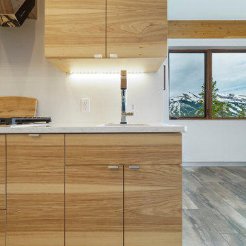
Custom Cabinetry by Homestead Cabinet and Furniture
Designer: Daniel Schaefer
Wood Species: Calico Hickory
Finish: Natural with Horizontal Sequencing
Door Style: Flat Panel
Photography: Joe Kusumoto
Countertop Details: Cambria Torquay
 SCJ Studio Landscape Architecture
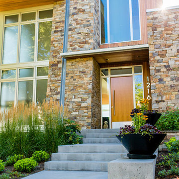
Our client built a striking new home on the east slope of Seattle’s Capitol Hill neighborhood. To complement the clean lines of the facade we designed a simple, elegant landscape that sets off the home rather than competing with the bold architecture.
Soft grasses offer contrast to the natural stone veneer, perennials brighten the mood, and planters add a bit of whimsy to the arrival sequence. On either side of the main entry, roof runoff is dramatically routed down the face of the home in steel troughs to biofilter planters faced in stone.
Around the back of the home, a small “leftover” space was transformed into a cozy patio terrace with bluestone slabs and crushed granite underfoot. A view down into, or across the back patio area provides a serene foreground to the beautiful views to Lake Washington beyond.
Collaborating with Thielsen Architects provided the owners with a sold design team--working together with one voice to build their dream home.
Photography by Miranda Estes
 Cabinet Discounters, Inc.
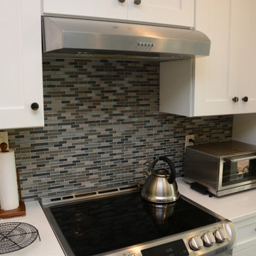
This kitchen features Brighton Cabinetry with Shaker Medium doors. One side is Maple Lace color, and the other side is a custom blue color on maple wood. The countertops are Calico White from Q Quartz. The wood top in the nook area is Grothouse Solid Wood Flat Grain Cherry with Sapwood. The backsplash tile is Baltimore 12″x 12″ mixed linear mosaic stone and glass blend from PaMarVa. The floor tile is Sequence Vortex 12″ x 24″ glazed porcelain from Florida Tile.
71