
Search results for "Sequencing" in Home Design Ideas
 LandFluent Landscape Architecture
Everfall is set within a pristine 20,000-square-foot property in one of Coral Gables’ oldest and most storied neighborhoods. Here, mature canopy trees, towering palms, and historic architecture define a sense of place often referred to as the “real Miami.”
While the residence showcases exquisitely modernized architecture and unobstructed views of Biscayne Bay, the pre-existing garden fell short of its potential. Our design challenge is twofold: to reimagine vehicular and pedestrian circulation in harmony with the site’s topography, and to create a garden that respects and reinforces the character of its historic setting.
Circulation was addressed first. The driveway was redesigned to ease steep slopes and form a welcoming motor court that blends hardscape and planting. Pedestrian access was reoriented to highlight the east–west axis, and the former unsightly pedestrian ramp was replaced with platform steps, expansive landings, and lush planting; establishing a tranquil and clearly defined entry sequence.
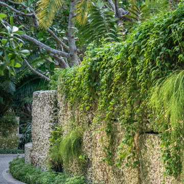
The planting design emphasizes native species along the perimeter and public right-of-way, aligning with the evolving character of surrounding gardens. Within the property, sculptural specimen trees, epiphytes, and lithophytes evoke the feeling of a long-established landscape. A palette of Mediterranean textures and cliff-dwelling Date Palm species were integrated as elegant accents. Color plays a vital role in the sensory experience, introduced through climbing vines and profusely flowering shrubs and groundcovers in shades of pink, purple, and white.
Above all, the garden is designed as a reflection of our clients—their personalities, passions, and way of life. It is a living extension of their home, offering beauty, comfort, and an immersive connection to the natural world.
We are honored to shape the vision for the Everfall. This landscape is essential to the experience of the property, and our design seeks to honor its rich context, architectural sophistication, and breathtaking views of the Miami skyline.
Scale
0.47 ACRES
Scope
HARDSCAPE + PLANTING DESIGN
Year
2025
Photography
Studio PYG
Architecture Renovation
Bravo Architecture
Interior Design
Miriam Moore Design Studio
Landscape Architecture
LandFluent
General Contractor
Artisan Custom Homes of South Florida
Landscape Contractor
Signature Trees & Palms
Lighting Design / Contractor
PCL Lighting
 Nautilus Architects
Located on a marsh in the upper reaches of the Lieutenant River in Old Lyme, the existing house was well-sited and well-built, but the design failed to exploit the views and more importantly was a confused combination of contemporary and traditional elements. The new homeowners, a successful businesswoman and an accomplished artist and photographer, were interested in creating a fully-contemporary environment to open up space, connect indoors with outdoors, display artwork and showcase the husband’s distinctive photographs.
One glaring deficiency was the curb appeal and approach sequence: the grade sloped down and the path to the house followed, but this led to an uncomfortable dip and abrupt rise to the front door. By creating a virtual “moat,” occupied by a grid of raised-bed grasses contained in aluminum-clad boxes, and spanning the moat with an ipe bridge, the approach becomes level and engaging. The façade of the existing house was blank and bland, and with no cover. Adding a deep overhang with a wide porch creates a welcoming, covered condition, accentuated by a 6’ wide pivoting front door that feels more like a moving piece of wall.
Another deficiency was the connection to the outdoors. By adding glass to the front and back of the house, and removing interior walls selectively, the house takes on a diaphanous quality that allows one to see through to the marsh beyond, even when in the driveway. The raised-bed grasses act as abstract, geometric versions of the marsh beyond. A large, pyramidal skylight establishes a spatial hierarchy around which the rooms revolve.
The house featured several tray-ceilinged spaces – living room, kitchen, and master bedroom – that were poorly-proportioned and with panels at the top that resembled inset flat panel doors. The solution was to use a different strategy for each: the bedroom turns the ceiling into an eggshell through the use of a creative trim detail; the living room has an oversized sculptural, backlit lighting element; and the kitchen has a collage of painted rectangular forms that support or include lighting pieces.
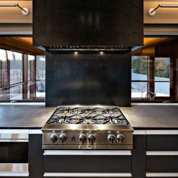
A palette of concrete, blackened steel, stainless steel and colors carefully chosen by homeowner and architect create an interior and exterior environment punctuated by moments that are as artistic as the featured works in the black-ceilinged gallery.
 birdRock Project Studio Inc.
Ever heard some say “It has good bones?” Well, no one had ever said that about this house; it needed a major overhaul - “A TOTAL GUT.”
It’s saving grace was:
1. It’s enthusiastic new homeowners.
2. The expansive and gorgeous views of Okanagan Lake.
We were asked to assist our clients with big-picture-planning for their newest investment property.
Upon initial walk through of the home, it was immediately evident there were many previous ‘bandaid-type’ updates that it had gone through over the years.
This house was in prime need of an overhaul inside and out:
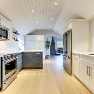
- multiple dropped Ceilings with layers of Plumbing add ons
- wall to wall Carpet
-a tired Bathtub directly inside the Master Bedroom
- a “dreaded” Corner Kitchen Sink
-multiple add ons involving three confusing front entry doors
Discovering what was previously done and the quandary of why these things were done is always so interesting to discover and can be very overwhelming for clients.
A big part of what we love most about Design is helping to propose new ideas to revitalize and improve all that has come before. It is one of the most challenging and rewarding parts of our work.
Our Renovation Strategy began in Layout Design for optimizing Interior & Exterior flow, moving into Concept & Style Planning, Millwork and Finish Selections.
We then created an ordered implementation sequence which would allow the homeowners to live on one floor while the other was being renovated Later they would move to the finished floor and renovate the remaining areas.
Once complete, the home quickly sold and we look forwards to assisting these happy investors on their next endeavour.
Find the right local pro for your project
 Lindy Architect
This project was never really about the architecture. It was about a family that collects — art, ceramics, books, ideas — and needed a home that could hold all of that without turning into a museum.
The existing unit had good bones: generous ceiling heights, a floating stair, and enough square footage to work with. What it lacked was a coherent logic — a way of moving through the space that felt intentional, where each transition earned its moment.
We rebuilt that logic from the ground up.
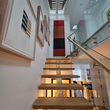
The ground floor is organized around a single corridor that runs from the kitchen island through to the living room, with the staircase serving as the spine of the whole sequence. Rather than treating the stair as purely functional, we kept the glass balustrade open and lit the treads from below, so it reads as a light source as much as a passage. The console beneath it became a natural landing for ceramics and found objects — not styled, just placed.
In the living room, the brief was simple: make room for a very large painting without the room feeling like a gallery. The answer was to keep everything else quiet — a white built-in that does its job, sheer linen curtains that diffuse the light, black leather chairs that anchor the space without competing. The painting does the rest.
Upstairs, the landing is lit by a skylight that washes the hallway in natural light through most of the day. We lined one side with a burl wood console and let the ceramics and framed works speak for themselves. The mix of abstract prints, a bold red canvas, and handmade vessels gives the corridor a rhythm that feels accumulated over time rather than installed all at once — because it was.
Throughout, the material palette is deliberately restrained: white oak floors, white walls, white millwork. The restraint isn't minimalism for its own sake — it's a backdrop. The owners bring the color, texture, and personality. Our job was to give them the right walls to hang things on.
 LandFluent Landscape Architecture
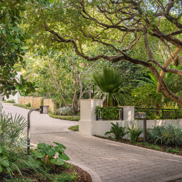
Everfall is set within a pristine 20,000-square-foot property in one of Coral Gables’ oldest and most storied neighborhoods. Here, mature canopy trees, towering palms, and historic architecture define a sense of place often referred to as the “real Miami.”
While the residence showcases exquisitely modernized architecture and unobstructed views of Biscayne Bay, the pre-existing garden fell short of its potential. Our design challenge is twofold: to reimagine vehicular and pedestrian circulation in harmony with the site’s topography, and to create a garden that respects and reinforces the character of its historic setting.
Circulation was addressed first. The driveway was redesigned to ease steep slopes and form a welcoming motor court that blends hardscape and planting. Pedestrian access was reoriented to highlight the east–west axis, and the former unsightly pedestrian ramp was replaced with platform steps, expansive landings, and lush planting; establishing a tranquil and clearly defined entry sequence.
The planting design emphasizes native species along the perimeter and public right-of-way, aligning with the evolving character of surrounding gardens. Within the property, sculptural specimen trees, epiphytes, and lithophytes evoke the feeling of a long-established landscape. A palette of Mediterranean textures and cliff-dwelling Date Palm species were integrated as elegant accents. Color plays a vital role in the sensory experience, introduced through climbing vines and profusely flowering shrubs and groundcovers in shades of pink, purple, and white.
Above all, the garden is designed as a reflection of our clients—their personalities, passions, and way of life. It is a living extension of their home, offering beauty, comfort, and an immersive connection to the natural world.
We are honored to shape the vision for the Everfall. This landscape is essential to the experience of the property, and our design seeks to honor its rich context, architectural sophistication, and breathtaking views of the Miami skyline.
Scale
0.47 ACRES
Scope
HARDSCAPE + PLANTING DESIGN
Year
2025
Photography
Studio PYG
Architecture Renovation
Bravo Architecture
Interior Design
Miriam Moore Design Studio
Landscape Architecture
LandFluent
General Contractor
Artisan Custom Homes of South Florida
Landscape Contractor
Signature Trees & Palms
Lighting Design / Contractor
PCL Lighting
 Nautilus Architects
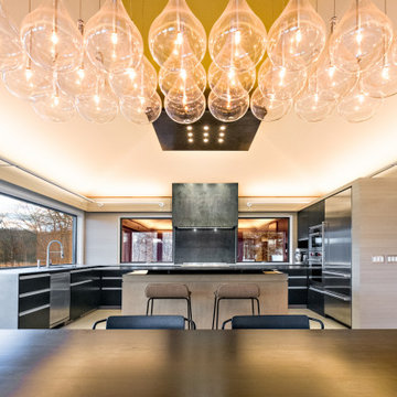
Located on a marsh in the upper reaches of the Lieutenant River in Old Lyme, the existing house was well-sited and well-built, but the design failed to exploit the views and more importantly was a confused combination of contemporary and traditional elements. The new homeowners, a successful businesswoman and an accomplished artist and photographer, were interested in creating a fully-contemporary environment to open up space, connect indoors with outdoors, display artwork and showcase the husband’s distinctive photographs.
One glaring deficiency was the curb appeal and approach sequence: the grade sloped down and the path to the house followed, but this led to an uncomfortable dip and abrupt rise to the front door. By creating a virtual “moat,” occupied by a grid of raised-bed grasses contained in aluminum-clad boxes, and spanning the moat with an ipe bridge, the approach becomes level and engaging. The façade of the existing house was blank and bland, and with no cover. Adding a deep overhang with a wide porch creates a welcoming, covered condition, accentuated by a 6’ wide pivoting front door that feels more like a moving piece of wall.
Another deficiency was the connection to the outdoors. By adding glass to the front and back of the house, and removing interior walls selectively, the house takes on a diaphanous quality that allows one to see through to the marsh beyond, even when in the driveway. The raised-bed grasses act as abstract, geometric versions of the marsh beyond. A large, pyramidal skylight establishes a spatial hierarchy around which the rooms revolve.
The house featured several tray-ceilinged spaces – living room, kitchen, and master bedroom – that were poorly-proportioned and with panels at the top that resembled inset flat panel doors. The solution was to use a different strategy for each: the bedroom turns the ceiling into an eggshell through the use of a creative trim detail; the living room has an oversized sculptural, backlit lighting element; and the kitchen has a collage of painted rectangular forms that support or include lighting pieces.
A palette of concrete, blackened steel, stainless steel and colors carefully chosen by homeowner and architect create an interior and exterior environment punctuated by moments that are as artistic as the featured works in the black-ceilinged gallery.
 Nautilus Architects
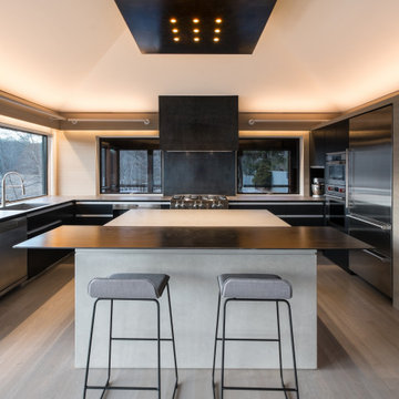
Located on a marsh in the upper reaches of the Lieutenant River in Old Lyme, the existing house was well-sited and well-built, but the design failed to exploit the views and more importantly was a confused combination of contemporary and traditional elements. The new homeowners, a successful businesswoman and an accomplished artist and photographer, were interested in creating a fully-contemporary environment to open up space, connect indoors with outdoors, display artwork and showcase the husband’s distinctive photographs.
One glaring deficiency was the curb appeal and approach sequence: the grade sloped down and the path to the house followed, but this led to an uncomfortable dip and abrupt rise to the front door. By creating a virtual “moat,” occupied by a grid of raised-bed grasses contained in aluminum-clad boxes, and spanning the moat with an ipe bridge, the approach becomes level and engaging. The façade of the existing house was blank and bland, and with no cover. Adding a deep overhang with a wide porch creates a welcoming, covered condition, accentuated by a 6’ wide pivoting front door that feels more like a moving piece of wall.
Another deficiency was the connection to the outdoors. By adding glass to the front and back of the house, and removing interior walls selectively, the house takes on a diaphanous quality that allows one to see through to the marsh beyond, even when in the driveway. The raised-bed grasses act as abstract, geometric versions of the marsh beyond. A large, pyramidal skylight establishes a spatial hierarchy around which the rooms revolve.
The house featured several tray-ceilinged spaces – living room, kitchen, and master bedroom – that were poorly-proportioned and with panels at the top that resembled inset flat panel doors. The solution was to use a different strategy for each: the bedroom turns the ceiling into an eggshell through the use of a creative trim detail; the living room has an oversized sculptural, backlit lighting element; and the kitchen has a collage of painted rectangular forms that support or include lighting pieces.
A palette of concrete, blackened steel, stainless steel and colors carefully chosen by homeowner and architect create an interior and exterior environment punctuated by moments that are as artistic as the featured works in the black-ceilinged gallery.
 Nautilus Architects
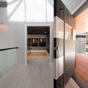
Located on a marsh in the upper reaches of the Lieutenant River in Old Lyme, the existing house was well-sited and well-built, but the design failed to exploit the views and more importantly was a confused combination of contemporary and traditional elements. The new homeowners, a successful businesswoman and an accomplished artist and photographer, were interested in creating a fully-contemporary environment to open up space, connect indoors with outdoors, display artwork and showcase the husband’s distinctive photographs.
One glaring deficiency was the curb appeal and approach sequence: the grade sloped down and the path to the house followed, but this led to an uncomfortable dip and abrupt rise to the front door. By creating a virtual “moat,” occupied by a grid of raised-bed grasses contained in aluminum-clad boxes, and spanning the moat with an ipe bridge, the approach becomes level and engaging. The façade of the existing house was blank and bland, and with no cover. Adding a deep overhang with a wide porch creates a welcoming, covered condition, accentuated by a 6’ wide pivoting front door that feels more like a moving piece of wall.
Another deficiency was the connection to the outdoors. By adding glass to the front and back of the house, and removing interior walls selectively, the house takes on a diaphanous quality that allows one to see through to the marsh beyond, even when in the driveway. The raised-bed grasses act as abstract, geometric versions of the marsh beyond. A large, pyramidal skylight establishes a spatial hierarchy around which the rooms revolve.
The house featured several tray-ceilinged spaces – living room, kitchen, and master bedroom – that were poorly-proportioned and with panels at the top that resembled inset flat panel doors. The solution was to use a different strategy for each: the bedroom turns the ceiling into an eggshell through the use of a creative trim detail; the living room has an oversized sculptural, backlit lighting element; and the kitchen has a collage of painted rectangular forms that support or include lighting pieces.
A palette of concrete, blackened steel, stainless steel and colors carefully chosen by homeowner and architect create an interior and exterior environment punctuated by moments that are as artistic as the featured works in the black-ceilinged gallery.
 birdRock Project Studio Inc.
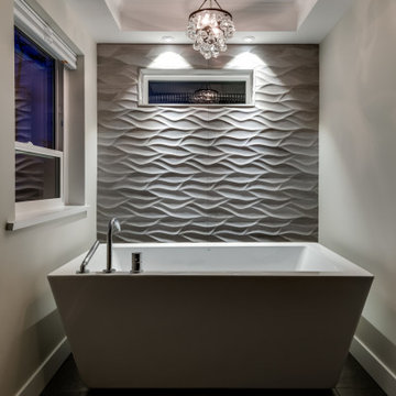
Ever heard some say “It has good bones?” Well, no one had ever said that about this house; it needed a major overhaul - “A TOTAL GUT.”
It’s saving grace was:
1. It’s enthusiastic new homeowners.
2. The expansive and gorgeous views of Okanagan Lake.
We were asked to assist our clients with big-picture-planning for their newest investment property.
Upon initial walk through of the home, it was immediately evident there were many previous ‘bandaid-type’ updates that it had gone through over the years.
This house was in prime need of an overhaul inside and out:
- multiple dropped Ceilings with layers of Plumbing add ons
- wall to wall Carpet
-a tired Bathtub directly inside the Master Bedroom
- a “dreaded” Corner Kitchen Sink
-multiple add ons involving three confusing front entry doors
Discovering what was previously done and the quandary of why these things were done is always so interesting to discover and can be very overwhelming for clients.
A big part of what we love most about Design is helping to propose new ideas to revitalize and improve all that has come before. It is one of the most challenging and rewarding parts of our work.
Our Renovation Strategy began in Layout Design for optimizing Interior & Exterior flow, moving into Concept & Style Planning, Millwork and Finish Selections.
We then created an ordered implementation sequence which would allow the homeowners to live on one floor while the other was being renovated Later they would move to the finished floor and renovate the remaining areas.
Once complete, the home quickly sold and we look forwards to assisting these happy investors on their next endeavour.

 Matthew Murrey Design
Inspired by the Louisiana architecture of A. Hays Town, this client set out to replicate a Louisiana courtyard in the midst of this creekside estate. A pool was the centerpiece of the design, and it was anchored by an antique brick clad spa. The spa, strategically placed on the home's main axis, was specifically purposed to replicate a courtyard fountain.
The vegetation includes a mixture of trimmed boxwood hedges, ferns, and azaleas, as well as a variety of other broad leafed plants. The potted plants add seasonal interest and year-round decor.
This project also features the best in outdoor living. A copper screened cabana house includes an outdoor kitchen, fireplace, and temperature controls for year round comfort. There is an outdoor firepit and seating area, sheltered by a vine covered trellis.
 LandFluent Landscape Architecture
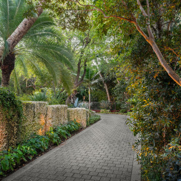
Everfall is set within a pristine 20,000-square-foot property in one of Coral Gables’ oldest and most storied neighborhoods. Here, mature canopy trees, towering palms, and historic architecture define a sense of place often referred to as the “real Miami.”
While the residence showcases exquisitely modernized architecture and unobstructed views of Biscayne Bay, the pre-existing garden fell short of its potential. Our design challenge is twofold: to reimagine vehicular and pedestrian circulation in harmony with the site’s topography, and to create a garden that respects and reinforces the character of its historic setting.
Circulation was addressed first. The driveway was redesigned to ease steep slopes and form a welcoming motor court that blends hardscape and planting. Pedestrian access was reoriented to highlight the east–west axis, and the former unsightly pedestrian ramp was replaced with platform steps, expansive landings, and lush planting; establishing a tranquil and clearly defined entry sequence.
The planting design emphasizes native species along the perimeter and public right-of-way, aligning with the evolving character of surrounding gardens. Within the property, sculptural specimen trees, epiphytes, and lithophytes evoke the feeling of a long-established landscape. A palette of Mediterranean textures and cliff-dwelling Date Palm species were integrated as elegant accents. Color plays a vital role in the sensory experience, introduced through climbing vines and profusely flowering shrubs and groundcovers in shades of pink, purple, and white.
Above all, the garden is designed as a reflection of our clients—their personalities, passions, and way of life. It is a living extension of their home, offering beauty, comfort, and an immersive connection to the natural world.
We are honored to shape the vision for the Everfall. This landscape is essential to the experience of the property, and our design seeks to honor its rich context, architectural sophistication, and breathtaking views of the Miami skyline.
Scale
0.47 ACRES
Scope
HARDSCAPE + PLANTING DESIGN
Year
2025
Photography
Studio PYG
Architecture Renovation
Bravo Architecture
Interior Design
Miriam Moore Design Studio
Landscape Architecture
LandFluent
General Contractor
Artisan Custom Homes of South Florida
Landscape Contractor
Signature Trees & Palms
Lighting Design / Contractor
PCL Lighting
 Lindy Architect
This project was never really about the architecture. It was about a family that collects — art, ceramics, books, ideas — and needed a home that could hold all of that without turning into a museum.
The existing unit had good bones: generous ceiling heights, a floating stair, and enough square footage to work with. What it lacked was a coherent logic — a way of moving through the space that felt intentional, where each transition earned its moment.
We rebuilt that logic from the ground up.
The ground floor is organized around a single corridor that runs from the kitchen island through to the living room, with the staircase serving as the spine of the whole sequence. Rather than treating the stair as purely functional, we kept the glass balustrade open and lit the treads from below, so it reads as a light source as much as a passage. The console beneath it became a natural landing for ceramics and found objects — not styled, just placed.
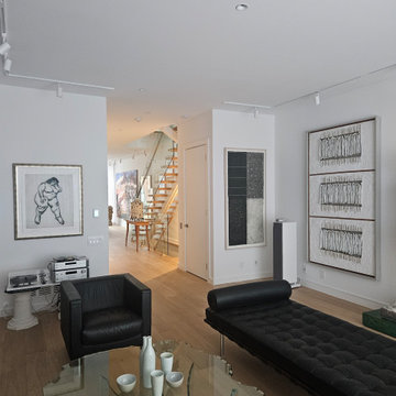
In the living room, the brief was simple: make room for a very large painting without the room feeling like a gallery. The answer was to keep everything else quiet — a white built-in that does its job, sheer linen curtains that diffuse the light, black leather chairs that anchor the space without competing. The painting does the rest.
Upstairs, the landing is lit by a skylight that washes the hallway in natural light through most of the day. We lined one side with a burl wood console and let the ceramics and framed works speak for themselves. The mix of abstract prints, a bold red canvas, and handmade vessels gives the corridor a rhythm that feels accumulated over time rather than installed all at once — because it was.
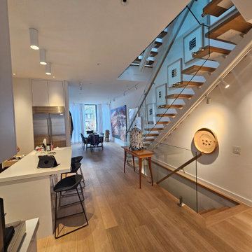
Throughout, the material palette is deliberately restrained: white oak floors, white walls, white millwork. The restraint isn't minimalism for its own sake — it's a backdrop. The owners bring the color, texture, and personality. Our job was to give them the right walls to hang things on.
 Lindy Architect
This project was never really about the architecture. It was about a family that collects — art, ceramics, books, ideas — and needed a home that could hold all of that without turning into a museum.
The existing unit had good bones: generous ceiling heights, a floating stair, and enough square footage to work with. What it lacked was a coherent logic — a way of moving through the space that felt intentional, where each transition earned its moment.
We rebuilt that logic from the ground up.
The ground floor is organized around a single corridor that runs from the kitchen island through to the living room, with the staircase serving as the spine of the whole sequence. Rather than treating the stair as purely functional, we kept the glass balustrade open and lit the treads from below, so it reads as a light source as much as a passage. The console beneath it became a natural landing for ceramics and found objects — not styled, just placed.
In the living room, the brief was simple: make room for a very large painting without the room feeling like a gallery. The answer was to keep everything else quiet — a white built-in that does its job, sheer linen curtains that diffuse the light, black leather chairs that anchor the space without competing. The painting does the rest.
Upstairs, the landing is lit by a skylight that washes the hallway in natural light through most of the day. We lined one side with a burl wood console and let the ceramics and framed works speak for themselves. The mix of abstract prints, a bold red canvas, and handmade vessels gives the corridor a rhythm that feels accumulated over time rather than installed all at once — because it was.
Throughout, the material palette is deliberately restrained: white oak floors, white walls, white millwork. The restraint isn't minimalism for its own sake — it's a backdrop. The owners bring the color, texture, and personality. Our job was to give them the right walls to hang things on.

 Paula McDonald Design Build & Interiors
The finished interior of the traditional style bedroom incorporates the owner's art collection as well as Made Good table lamps. The coffered ceiling, adding visual height and interest to the space, is a favorite architectural detail of ours.

 Cassoni Furniture & Accessories
- LONELY COFFEE TABLE.
Small tables with removable central tray covered in leather as in our sample set. Compartment with lighted perimeter edge, LED lamps with touch switch.
50''3/4W x 50''3/4D x 11''7/8H.
63''W x 31''1/2D x 11''7/8H.
http://ow.ly/3yC8ug
- MATISSE SOFA 01.
Load-bearing frame in beech wood with elastic bands covered in high density polyurethane foam. Backrest structure in wood and high density polyurethane foam.
Corner end unit L.H.: 132''1/4W x 41''3/4D x 27''5/8H.
Other width: 171’’5/8.
End unit R.H.: 90''1/2W x 41''3/4D x 27''5/8H.
Other width: 130’’.
Seat height: 15’’3/8.
Armrest height: 21’’5/8.
http://ow.ly/3yC8w0
- GUERIDON SIDE TABLE.
Small tables available in two versions with different tops.
With shaped top in marble: Elegant Brown marble, Shale Rosewood marble, Emperador Dark marble, Silver Wave marble, Port Black marble, Frappuccino marble, Calacatta Gold marble. With top in matt ebony, matt Canaletto walnut or covered in leather as in our sample set with a circular metal frame with laser cut Sequence decoration in the following finishes: bright light gold, matt Champagne gold, bright chrome, bright black chrome, matt satined bronze. Central column available in three variants.
Ø15''3/4 x 20''1/2H.
http://ow.ly/3yBDuN
- GODWIN COFFEE 01.
Small table with glass fibre structure covered in leather and metal top. Metal finish: bright light gold, bright chrome, bright black chrome, matt satined bronze.
Ø15''3/4 x 22’’H. Base: Ø11’’.
Ø11''7/8 x 27''5/8H. Base: Ø9’’7/8.
Ø15''3/4 x 33''7/8H. Base: Ø11’’.
http://ow.ly/3yyFQc

 Archadeck of Northeast Dallas
Archadeck of NE Dallas-Southlake added this custom outdoor kitchen to an existing patio for clients in Colleyville, TX. The addition makes outdoor food preparation and entertaining exciting and ultra-convenient! The outdoor kitchen is built using Grandbury boulder stone with a Tuscan pattern across the back. The kitchen includes a Big Green Egg smoker, Turbo Elite grill, custom ice chest, fridge and trash receptacle.


 The POOL ARTIST | Brian T. Stratton
Award winning pool designer Brian T. Stratton | The Pool Artist designed this beautiful custom concrete / gunite swimming pool. Luxury pool designer nj, international pool design, new jersey swimming pool designer, pool artist, swimming pool engineer, swimming pool architect nj, water designer, eleuthera Bahamas pool designer, infinity edge pool design, custom spa design, California pool designer, Mississippi pool designer, south Carolina pool designer, new York pool designer, Pennsylvania pool designer


109