
Search results for "Sequencing" in Home Design Ideas


 Baine Contracting, Inc.
Elegant bathroom creatively comes together to complete the space and make it efficient yet stylish.
Example of a large cottage chic 3/4 beige tile and ceramic tile ceramic tile bathroom design in New York with beaded inset cabinets, dark wood cabinets, a one-piece toilet, beige walls, a drop-in sink and marble countertops
Example of a large cottage chic 3/4 beige tile and ceramic tile ceramic tile bathroom design in New York with beaded inset cabinets, dark wood cabinets, a one-piece toilet, beige walls, a drop-in sink and marble countertops
 Farbica
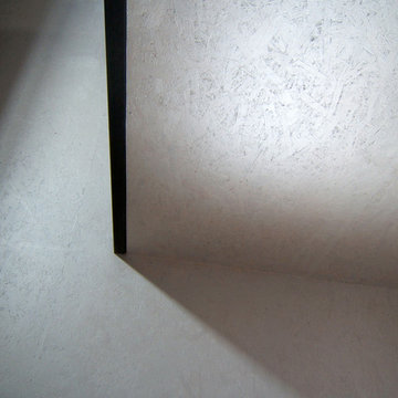
The transparent silver shimmer transforms the yellowish OSB-structure in cool and glamorous rooms.
Find the right local pro for your project


 American Buyers Discount Window Coverings, Inc
Inspiration for a mid-sized transitional enclosed porcelain tile living room library remodel with white walls
 Mangum Design-Build, Inc.
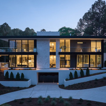
The Glenhill house settles gracefully into a mature pine forest, its form composed as a quiet
study of light, proportion, and crafted detail. A two-story residence lifted above a drive-through
garage, it is designed as a sequence of framed views — each room capturing the vertical
rhythm of pines, shifting daylight, and the subtle movement of the landscape. Boundaries
dissolve as floor-to-ceiling glass opens living spaces to broad terraces and cantilevered
balconies, allowing the forest to inhabit the interior as much as the residents inhabit the site.
A finely tuned steel frame enables deep overhangs and slender structural lines, giving the
house its floating clarity. These long spans soften the transition between indoors and out,
casting calibrated shadows across stone floors and hand-finished wood surfaces. Every
junction, from the precision-cut steel connections to the custom millwork, reflects an elevated
commitment to craft. Materials are chosen not only for their beauty but for the way they register
light—the warmth of timber, the quiet solidity of stone, the reflective sheen of metal.
The owner’s collection of art integrates seamlessly into the architectural language. Display walls
and open sightlines turn circulation paths into gallery promenades, while the garage level
becomes both threshold and exhibition space for the automobile collection. At dusk, the home
glows lantern-like within the pines, revealing a composition where structure, material, and
nature are held in delicate balance. It is a dwelling shaped less as an object in the woods and
more as a crafted extension of the forest itself.
The project began with an unexpected challenge: the original lot, once selected for its beauty,
became untenable when neighboring homeowners objected to the presence of a modern house.
Rather than compromise the vision, the team embraced a new site, one even more deeply
woven into the pine forest, and treated the change as an opportunity to refine the project’s
relationship to nature and craft.
Working within a densely wooded parcel required choreography as much as construction.
Limited access routes, the need to preserve mature trees, and the precision demands of steel
erection shaped a carefully phased process. Contractors navigated the site with restraint,
placing each piece of steel like a line of poetry between trunks. The resulting frame, powerful
yet minimal, was later infilled with lumber to create a hybrid system — efficient, warm, and
capable of carrying cantilevers far beyond what wood alone could achieve. These extended
overhangs became the project’s quiet gesture of shelter and shadow. Collaboration with the interior designer was integral to the home’s harmony. Together, the team
refined material transitions so stone, wood, and metal could pass from exterior to interior with a
single visual glance. Craftsmanship elevated everyday moments: concealed hardware, sculpted
millwork, and the sourcing of a solid limestone soaking tub, carved from a single block, all
contribute to the home’s sense of intentional calm.
What emerged is a house shaped by constraint, strengthened by collaboration, and refined
through an unwavering commitment to detail — an architectural refuge where complexity was
transformed into clarity, and obstacles into opportunities for deeper expression.
Material selection became an essential extension of the home’s design philosophy, reinforcing
the crafted clarity of each space. Hand-selected stone slabs were book-matched for the
fireplace and bath walls, creating veined compositions that read like natural murals. Custom-
built windows, engineered with specialty-coated glazing and rigorously pressure-tested, provide
both protection and extraordinary visual transparency. Above, concealed truss framing houses
recessed air diffusers and hidden shades, allowing ceilings to remain quiet and uninterrupted.
The horizontal planes of the flat roof are achieved with a commercial-grade membrane system,
delivering the crisp, modern silhouette the design demands. At the exterior, natural stone
grounds the home to its site, stitching the architecture to the forest floor and rooting the dwelling
in the land from which its materials are drawn.

 Kinghorn Gardens
Loose design from Purple Polo, Nate Huse, with drift style planting. As you can see, this drawing was used on property quiet a bit.
This is an example of a rustic full sun backyard landscaping in Omaha for summer.
This is an example of a rustic full sun backyard landscaping in Omaha for summer.

 Lightstreams Glass Tile
Lightstreams Renaissance Collection Celadon
Builder: Lifetime Pools
Photos by: Macduff Everton
Elegant pool photo in San Francisco
Elegant pool photo in San Francisco
 Carolina Craftsman Builders
 is a Craftsman Style Custom Home Builder in Charlotte, North Carolina. Neighborhoods Chantilly, Elizabeth, Plaza Midwood, Dilworth, and NoDa's Builder, Specializing in New Construction Custom Homes, Remodeling, Renovations, and Design.
 Tile Doctor Ltd
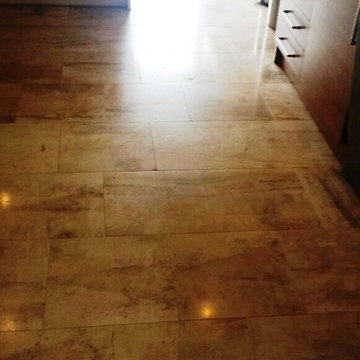
This customer from the historic city of Cardiff was keen to see what Tile Doctor could do to put some life back into their treasured Limestone kitchen floor that was laid in 2008. My first observations were mainly centred on the horrific condition of the surface which although adequately sealed initially the floor had not received any subsequent maintenance and its condition had deteriorated over time. The light shining in from the patio doors highlighted all the imperfections in the floor caused by surface wear and tear commonly seen in high traffic areas such as a kitchen.
Upon closer inspection, there were further problems: the floor was stained and scuffed, and in most places the sealer had worn off completely allowing the dirt to become ingrained into the pores of the Limestone. Additionally the grout was recessed but was now flush with the tile surface due to dirt build-up. There were also areas contaminated with grease and kitchen cooking oil.
The Limestone floor tiles were 20mm thick French Limestone, and had been laid very well so there was no requirement to do any tile or grout repairs however to get this floor back to its original condition the surface would need to be reconditioned using the Tile Doctor four stage burnishing system.
I started by giving the floor a wash with a medium dilution of Tile Doctor Pro-Clean, focusing mainly on the grout lines in order to remove the muck that had built-up there. I used a special stiff grout brush for this activity; it’s quite narrow and ideal for grout scrubbing.
This worked well, but the significant build-up of dirt along some of the grout lines meant more work was required. I tackled this problem with a hand scraper assisted with steam. At the end of this process, the whole floor was then rinsed down with water to remove any soil and the resulting slurry was then extracted using a wet vacuum.
The next step was to start the burnishing process, which basically involves applying four diamond encrusted floor pads in sequence over the floor. Each pad is a different grade, starting with the most abrasive coarse pad and moving through to the finer grades using a little water to lubricate and rinsing away any slurry between each pad.
I eventually finished with the extra fine pad which builds up shine and lustre on the tile; it had taken two days to clean the grout and burnish the Limestone but the floor was much improved and so after a final rinse down I left the floor to dry off overnight with the aid of the underfloor heating.
During this time, I also addressed the stained Limestone in the area of the kitchen where the dustbin was situated. This had been a major upset for the customer and I’m happy to report I managed to deal with it. However, it was quite an involved process, so I’ll write about this in a separate post.
On the third day I came back to seal the floor, checking first that it had dried sufficiently with a damp meter. Fortunately, the underfloor heating had done a great job of drying the stone and I was able to seal the floor using three coats of Tile Doctor Colour Grow sealant. This sealant not only provides a durable seal but also penetrates deep into the pores of the stone protecting it from within and enhancing the natural colours of the Limestone in the process.
After the final layer of sealant, I worked over the floor again with the extra fine burnishing pad both to add shine again following sealing, and to ensure that no smear marks were visible as the lighting conditions were unforgiving and highlighted any imperfections.
The customer was delighted with the results: so much so, in fact, that they booked me in to restore their Victorian hallway floor as well but that’s a story for another time!
Julian Iancono
SE Wales Tile Doctor

 Danny's Flooring & Interiors
Mid-sized elegant master brown tile and stone tile corner bathtub photo in Dallas
 Tile Doctor Ltd
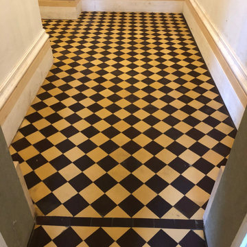
I thought I would share this case history of a Yellow and Black Victorian Tiled floor that we worked on at a large house in Lancaster last year. It’s a great example of the typical problems we face with old Victorian floors, especially around door thresholds where the transition between the different foundation invariable cause problems.
I didn’t know the full history of the floor, but it was now in quite a state and recent renovation work had left the floor unstable with loose and cracked tiles. The tiles needed to be removed and then the damaged subfloor carefully scraped out and replaced. Once that was done the floor would need relaying and then cleaned and sealed so everything would blend in.
After visiting the property and providing a quotation we were given the go ahead and agreed a date to do the work.
We returned on the agreed date and set about carefully removing the loose and cracked Victorian tiles and put them aside for later use. Some would need replacing however this would not present a problem and they are still widely available, and I have several contacts I can turn to for this.
Once this was done and the subfloor exposed and cleaned up, I used self-levelling cement to bring the floor level up and in-line with the existing. This now needed to set hard, so the rest of the day was spent cleaning up the tiles we removed earlier with Tile Doctor Grout Clean-up and Pro-clean. Our goal is to reuse as many of the original tiles as possible to preserve the heritage of the floor.
The next day with the new subfloor set it was ready for tiling. This involves laying out the tiles first without adhesive carefully cutting and fitting new tiles as needed to maintain the overall pattern of the floor. Once I was happy the tiles were moved to a board and then fitted with fresh adhesive.
I came back on day three with the aim of cleaning the floor so it could be sealed however whilst inspecting my new tiling I was disappointed to discover some were not as level as I had hoped. I had noticed the replacement tiles were not the same thickness as the originals the previous day but I had worked around this by using different levels of adhesive, clearly this plan was not as effective as I had hoped for.
To counter this problem, I used a set of 50-Grit, 100-grit and then 200-grit diamond pads in sequence to mill the floor flat and remove the lippage between them. This is done with water to lubricate the process and a weighted floor buffer. The pads generate a lot of slurry and so you need to rinse this off with more water and extract all the soil after each pad.
I followed this up with various Diamond burnishing pads of increasingly finer grits across the whole floor until we achieved a consistent finish and had the added benefit of getting the whole floor clean. More water is used to rinse the tiles after burnishing and the soil extracted with a wet vacuum as before. Once done and inspected the floor was left to dry off overnight.
Tile Doctor Colour Grow was applied to enhance the appearance of the tiles and protect them going forward. This product copes well with damp which can always be a problem with old floors like this one with no damp proof membrane present.
The floor looked amazing when finished and our attention to detail had really paid off, in fact you simply could not tell we had done any tiling work or replaced any tiles. For aftercare I recommend the use of Tile Doctor Neutral Cleaner which is designed for the regular cleaning of sealed tiles.
Russell Taylor
Lancashire Tile Doctor
 Neumann & Rudy Architecture
**Spatial Composition & Architectural Volume**
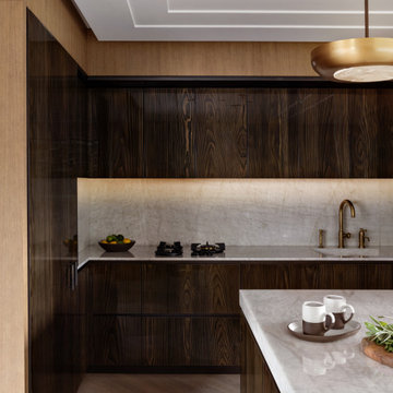
The kitchen is organized as a tightly disciplined L-configuration, with a perimeter run terminating against a full-height flanking volume of pale oak that functions less as cabinetry than as a piece of architecture — a plinth-like wall plane that crops the composition and establishes a deliberate foreground register. The photograph is constructed around this layered depth: a near-field vertical panel in figured, high-gloss timber, a middle ground of stone counter and backsplash, and a partial view of the island's marble slab entering from the right, its mitred waterfall edge implying a broader room beyond the frame. Overhead, a recessed coffer with a slender illuminated reveal introduces a subtractive geometry that lightens the ceiling plane and visually widens the volume, while a bronze-toned reveal band above the upper cabinetry acts as a horizontal datum, resolving the tall casework into a controlled cornice line. The millwork is resolutely frameless and handleless — grain-matched, push-latch or channel-pull, with a single elongated vertical bar as the sole legible hardware gesture — producing an unbroken rhythm of vertical joints that reads as continuous paneling rather than a sequence of doors. Sightlines are horizontal and calm, with the sink and cooktop absorbed into the counter plane so that no appliance disrupts the elevation's monolithic character.
**Materiality, Color & Texture**
The palette is a study in tonal wood contrast: a light, straight-grained rift-cut white oak with cool, slightly greyed undertones on the flanking wall and upper wall plane, set against a deeply fumed or shou-sugi-ban-inflected timber — likely charred cedar or ebonized ash — whose cathedral figuring erupts across the cabinet fronts in swirling, almost calligraphic pattern. The dark casework carries a lacquered or oiled sheen high enough to register soft specular reflection, an unexpected gloss that animates the grain and prevents the mass from reading as flat or inert. Countertops and the full-height backsplash are executed in a pale calcite or quartzite with a scratched, hairline-veined surface and a warm ivory-to-buff cast, honed rather than polished so that light diffuses rather than bounces. Metals are exclusively unlacquered brass in varying states of patina — the gooseneck faucet, cross-handle valves and pot-filler read as aged, almost archaeological, their warm amber oxidation echoed by the burnished spun-brass pendant. Accessory objects sustain the discipline: a dark turned-wood fruit bowl with citrus supplying the only chromatic accent, matte stoneware mugs in a two-tone glaze, and a raw olivewood board with sage — organic, low-saturation, tactile counterpoints to the machined precision of the joinery.
**Lighting, Atmosphere & Style Profile**
Illumination is almost entirely architectural and indirect. A concealed linear source beneath the upper cabinets grazes the stone backsplash, throwing a soft luminous gradient that dissolves upward and makes the slab appear internally lit — the room's principal light event and its emotional center. This is reinforced by the ceiling's perimeter reveal, which washes the plane without visible fixtures, and by the alabaster-diffused brass pendant, whose disc of translucent stone glows with a low-kelvin warmth entirely consonant with the metalwork below. Daylight appears to enter obliquely from beyond the frame, modelling the oak wall in a gentle falloff; the overall exposure is low-key and chiaroscuro-adjacent, with deep, velvety shadow permitted in the lower casework. The resulting atmosphere is hushed, cellar-cool yet materially warm — contemplative rather than performative. Stylistically, the project synthesizes into a refined **warm minimalism with distinct Japandi inheritance**: the reductive planarity and joint discipline of European modernist cabinetry married to a Japanese sensibility for charred timber, grain expression, and the elevation of patina and imperfection. It is a kitchen conceived as a quiet interior landscape — appliance-suppressed, ornament-free, and dependent for its richness entirely on the intrinsic character of its materials.


 RINEKWALL
Rinekwall-RINEKWALL continues to travel the globe, this time landing in Edinburgh, Scotland. Infinitely repeating photographic designs capture the vivid colors and spirit of these symbolic Scottish clan fabrics. RINEKWALL-ALMA MATER- presents the tartans in acutal size. Details of the textile's fibers are uncovered for all to admire. RINEKWALL's unique presentation of the tartans allows them to be translated onto any substrate and in turn enhances endless applications.

 SA-DA Architecture
Staircase - mid-sized contemporary wooden u-shaped metal railing and open staircase idea in New York

 Sally Scott Interior Designer
Karissa VanTassel Photography
Example of a mid-sized beach style kids' blue tile and mosaic tile mosaic tile floor alcove shower design in New York with raised-panel cabinets, white cabinets, a two-piece toilet, blue walls, an undermount sink and marble countertops
Example of a mid-sized beach style kids' blue tile and mosaic tile mosaic tile floor alcove shower design in New York with raised-panel cabinets, white cabinets, a two-piece toilet, blue walls, an undermount sink and marble countertops


 RWH Architect PLLC
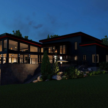
Whistle Hill Lot 2 residence stands as one of the most architecturally ambitious homes in the development, a striking example of RWH Architect’s commitment to elevating modern design. Defined by its dramatic butterfly roof and a façade composed of clean horizontal cladding, vertical accents, and expansive window groupings, the home captures a sculptural presence rarely seen in the region. This is a residence designed to open itself to its surroundings, embracing light, volume, and long views in a way that signals a new era of contemporary architecture.
The home features an attached three-car garage with an adjacent storage area, creating a practical yet visually streamlined entry sequence. Inside, the first floor is designed around livability and connection to the landscape. The foyer opens into a private office and then flows toward the main living areas. The master suite is intentionally tucked into a quiet corner on the first floor, positioned to overlook the backyard and shaped to allow morning light to filter softly into the space. Adjacent to the master suite is the laundry room, placed strategically for convenience. A secondary bedroom on the first floor includes a walk-in closet, and a nearby three-quarter bath offers flexibility for guests or extended family.
The kitchen serves as the central gathering point of the home, anchored by a large island and complemented by a walk-in pantry. It overlooks an expansive wraparound deck that transitions seamlessly to a lower patio, creating layered outdoor living spaces. Both the dining room and the great room open directly to the deck, enhancing the indoor-outdoor connection. The sunken great room is one of the home’s signature moments, featuring a floating fireplace that appears to hover within the space and accentuates the dramatic ceiling height created by the butterfly roof. The result is a room filled with daylight and volume, a contemporary living environment with an architectural presence that feels both bold and welcoming.
Upstairs, the second floor includes two additional bedrooms, each with walk-in closets, and a full bathroom designed with modern simplicity. From the upper level, the design allows for open views extending back toward the dining room, creating visual connectivity between floors and emphasizing the vertical openness of the home. This intentional play of volume heightens the spatial experience and enhances the sense of modern airiness throughout the interior.
This residence presented several unique design challenges that ultimately helped refine and elevate the final architectural expression. The sweeping butterfly roof created structural complexities due to its dramatic angles and its role in defining the home’s entire visual identity. RWH addressed this by carefully coordinating structural supports and framing patterns that allowed the roof to appear effortless while maintaining its sculptural form. Another significant challenge was balancing the extensive glazing with the need to preserve privacy and energy performance. RWH solved this by thoughtfully arranging high windows, angled openings, and varied window groupings that capture natural light without compromising comfort. Integrating a sunken great room with a floating fireplace required a precise approach to grading, floor transitions, and structural anchoring. Through detailed modeling and coordination, RWH ensured that the fireplace would appear weightless while remaining fully functional and safe. Creating uninterrupted views from the second floor to the dining room also required creative alignment of floor systems and rail detailing, which RWH resolved by designing sleek, integrated guardrails that preserve openness while meeting safety requirements.
Whistle Hill Lot 2 stands as a bold architectural statement and a defining example of the evolving design language within the development. Through innovative forms, expansive volumes, and carefully orchestrated transitions between indoor and outdoor spaces, RWH Architect has created a home that reflects the future of contemporary living in the area—forward-thinking, refined, and undeniably modern.
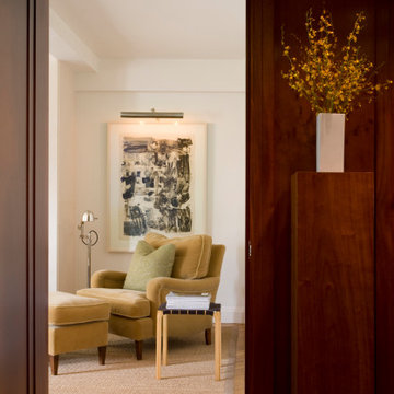 Neumann & Rudy Architecture
The photograph is constructed as a deliberate act of framing — an enfilade view captured through a threshold, in which the aperture of a doorway becomes both proscenium and compositional device. The image is organized around a strong vertical tripartite division: a dark stile of paneled millwork at the left edge, the luminous rectangle of the adjacent sitting room at center, and a substantial pier of figured hardwood joinery at right, terminating in a plinth-like pedestal. This asymmetrical clamping of the bright volume between two dark masses produces a pronounced sense of compression and release, a Wrightian sequencing in which the constricted, wood-lined passage funnels the eye toward the softer, higher-key room beyond. The architectural vocabulary within that inner volume is restrained and orthogonal: crisp painted plaster planes, a shallow soffit or dropped beam crossing the ceiling to modulate the overhead datum, and a simple flat-stock baseboard that reads as a quiet ground line rather than an ornamental flourish. The sightline is layered and telescopic — foreground jamb, mid-ground seating group, background artwork on the far wall — establishing depth through overlapping planes rather than perspectival theatrics. Underfoot, a herringbone-laid oak parquet in the passage gives way to a large-format sisal rug bound in linen tape, its rectilinear geometry reinforcing the axis while softening the transition between circulation and repose.
The material argument here is one of calibrated opposition: dense, saturated hardwood against pale, absorptive plaster and textile. The framing joinery — most plausibly a rich mahogany or stained cherry, its cathedral grain and ribbon figure fully legible under raking light — carries a deep oxblood-to-umber tonality and a satin, hand-rubbed sheen that lends the passage a library-like gravity. Against this, the interior room is rendered in a warm off-white with distinctly yellow-ochre undertones, avoiding the clinical chill of a true cool white and instead reading as parchment or unbleached linen. The upholstery — a rolled-arm wing chair and matching ottoman in a camel or buff-toned cotton velvet — supplies the tactile fulcrum of the composition: a napped, light-absorbing pile that contrasts against the coarse, tightly woven boucle of the sisal below and the smooth lacquer of the vertical joinery. Accent notes are sparing and precise: a pale celadon embroidered cushion introduces the only cool chromatic interruption; a rectilinear bench in blond ash with a woven black leather strap deck delivers a graphic, near-Nordic counterpoint; and a monolithic white ceramic vessel atop the pedestal provides a hard, matte punctuation. The abstract work on paper — a gestural monochrome in charcoal, ink and Payne's grey, generously matted behind glass — functions as the room's tonal anchor, its cool achromatics preventing the warm palette from tipping into sentimentality. Sprays of yellow oncidium orchid supply the single high-chroma gesture, echoing the ochre undertone of the walls.
The lighting strategy is layered, low-lumen and unapologetically warm, eschewing ambient wash in favor of discrete pools of illumination. A slim linear picture light, bronze-finished and cantilevered from the wall, grazes the artwork with a scalloped throw that reveals the tooth of the paper and establishes the far wall as the room's luminous terminus. A chrome-shaded articulating floor lamp — a modernist task fixture with a distinctly mid-century pedigree — provides a secondary, reflective glint and introduces the only cool metallic in the palette. Daylight enters obliquely and unseen from the left, softly modeling the plaster and the velvet nap without ever flattening the composition; the foreground joinery, meanwhile, sits in deep shadow, its grain caught only in a slow, specular gradient. The cumulative atmosphere is one of hushed, crepuscular intimacy — a room calibrated for reading and retreat rather than reception. Stylistically, the project resolves into a form of Transitional Warm Modernism: the classical proportioning, paneled millwork and rolled-arm seating are drawn from a traditional American vocabulary, yet they are stripped of applied ornament, edited to essentials, and disciplined by the graphic austerity of the abstract art and the blond-and-black bench. It is a sensibility best characterized as quiet luxury — tonal, textural, and materially honest, deriving its authority from the resonance of grain, nap and light rather than from any declarative gesture.
116