
Search results for "Sharing multiple" in Home Design Ideas

 JRP Design & Remodel
Our client had been living in her beautiful lakeside retreat for about 3 years. All around were stunning views of the lake and mountains, but the view from inside was minimal. It felt dark and closed off from the gorgeous waterfront mere feet away. She desired a bigger kitchen, natural light, and a contemporary look. Referred to JRP by a subcontractor our client walked into the showroom one day, took one look at the modern kitchen in our design center, and was inspired!
After talking about the frustrations of dark spaces and limitations when entertaining groups of friends, the homeowner and the JRP design team emerged with a new vision. Two walls between the living room and kitchen would be eliminated and structural revisions were needed for a common wall shared a wall with a neighbor. With the wall removals and the addition of multiple slider doors, the main level now has an open layout.
Everything in the home went from dark to luminous as sunlight could now bounce off white walls to illuminate both spaces. Our aim was to create a beautiful modern kitchen which fused the necessities of a functional space with the elegant form of the contemporary aesthetic. The kitchen playfully mixes frameless white upper with horizontal grain oak lower cabinets and a fun diagonal white tile backsplash. Gorgeous grey Cambria quartz with white veining meets them both in the middle. The large island with integrated barstool area makes it functional and a great entertaining space.
The master bedroom received a mini facelift as well. White never fails to give your bedroom a timeless look. The beautiful, bright marble shower shows what's possible when mixing tile shape, size, and color. The marble mosaic tiles in the shower pan are especially bold paired with black matte plumbing fixtures and gives the shower a striking visual.
Layers, light, consistent intention, and fun! - paired with beautiful, unique designs and a personal touch created this beautiful home that does not go unnoticed.
PROJECT DETAILS:
• Style: Contemporary
• Colors: Neutrals
• Countertops: Cambria Quartz, Luxury Series, Queen Anne
• Kitchen Cabinets: Slab, Overlay Frameless
Uppers: Blanco
Base: Horizontal Grain Oak
• Hardware/Plumbing Fixture Finish: Kitchen – Stainless Steel
• Lighting Fixtures:
• Flooring:
Hardwood: Siberian Oak with Fossil Stone finish
• Tile/Backsplash:
Kitchen Backsplash: White/Clear Glass
Master Bath Floor: Ann Sacks Benton Mosaics Marble
Master Bath Surround: Ann Sacks White Thassos Marble
Photographer: Andrew – Open House VC

 StudioLAB
Boasting views of the Museum of Natural History and Central Park, the Beaux Arts and French Renaissance style building built in 1900 was once home to a luxury hotel. Over the years multiple hotel rooms were combined into the larger apartment residences that exist today. The resulting units, while large in size, lacked the continuity of a single formed space. StudioLAB was presented with the challenge of re-designing the space to fit a modern family’s lifestyle today with the flexibility to adjust as they evolve into their tomorrow. Thus, the existing configuration was completely abandoned with new programmatic elements being relocated in each and every corner of the space. For clients that are big wine connoisseurs, the focal point of entry and circulation lies in a 400 bottle, custom built, blackened steel and glass, temperature controlled wine cabinet. The once enclosed living room was demolished to create one main entertaining space that includes a new dining area and open kitchen. Hafele bi-folding pocket door slides were used in the Living room wall unit to conceal the television, bar and display shelves when not in use. Posing as kitchen cabinetry, a hidden integrated door opens to reveal a guest bedroom with an en suite bathroom. Down the hallway of wide plank ebony stained walnut flooring, a compact powder room was built to house an original Paul Villinski installation of small butterflies cut from recycled aluminum cans, entitled Mistral. Continuing down the hall, and through one of the walnut veneered doors, is the shared kids bedroom where a custom-built bunk bed with integrated storage steps and desk was designed to allow for play space and a reading corner. The kids bathroom across the hall is decorated with custom Lego inspired hand cast concrete tiles and integrated pull-out footstools residing underneath the floating vanity. The master suite features a bio-ethanol fireplace wrapped in blackened steel and integrated into the Tabu veneered built-in. The spacious walk-in closet serves several purposes, which include housing the apartment’s new central HVAC system as well as a sleeping spot for the family’s dog. An integrated URC control system paired with Lutron Radio RA lighting keypads were installed to control the AV, HVAC, lighting and solar shades all by the use of smartphones.

 Cottage Home, Inc.
This fantastic Lake Michigan home offers its owners quiet and retreat – while loudly boasting some amazing interior and exterior features. This lake home is nestled at the end of a long winding drive and at the top of a breathtaking Lake Michigan bluff. Extensive designing and planning ensured that every living space and bedroom has outstanding lake views. This lake home carries a light-hearted, beachy theme throughout – with welcoming blues and greens – accented by custom white cabinetry and superior trim details. The interior details include quartz and granite countertops, stainless appliances, quarter-sawn white oak floors, Pella windows, and beautiful finishing fixtures. The exterior displays Smart-Side siding and trim details, a screen room with the EZEBreeze screen system, composite decking, maintenance-free rail systems, and an upper turret to the most pristine views. This was an amazing home to build and will offer the owners, and generations to follow, a place to share time together and create awesome memories. Cottage Home is the premiere builder on the shore of Lake Michigan, between the Indiana border and Holland.
Find the right local pro for your project

 safe ZOnea
If you’re active on GardenWeb sharing plant photos, asking for advice, tracking seasonal progress you already understand how much detail goes into gardening. Soil pH, rainfall, emerging leaves, bloom counts, fertilizer schedules it adds up fast. But all that rich information often remains buried in posts, lists or memory. What if you could visualize that data and turn it into clear quick insights? That’s where a graph maker becomes a game-changer for your gardening workflow.
1. Why garden data belongs on a graph
On GardenWeb, you’ll find forums for everything from perennial care, vegetable gardening, patios, herbs, even cooking and craft projects. While plant lovers share observations and ask questions, many track progress manually in spreadsheets or memory. A graph maker flips that around:
Instead of a list of numbers (e.g., “Soil test: pH 6.4 in May, 6.1 in October”), you get a line graph showing the decline over time.
Instead of guessing which plant bloomed most, you see a bar chart comparing counts across plants.
Instead of manually calculating average rainfall effect, you plot scatter points of bloom count vs. rainfall.
By turning your data into visuals, you’re not just recording—you’re analysing, learning and improving. For GardenWeb users this means smarter decisions: Which fertilizer actually improves bloom count? Which shady spot recovers slower? A graph maker gives clarity.
2. What is a graph maker and how to use one
A graph maker is a web tool or software that lets you input raw data (numbers, dates, categories) and output visual charts like line graphs, bar charts, scatter plots, etc. It might allow you to import a spreadsheet, select chart type, customize colours, label axes, and export the image for your blog, forum post or personal log.
Here’s how you could apply it for gardening:
Log blooms per week for each rose plant.
Using the graph maker, choose line graph to track changes over weeks.
Label your y-axis “Number of Blooms”, x-axis “Week of Year”.
Add colour lines for each plant for easy comparison.
Export as PNG and embed it in a GardenWeb forum post: “See bloom trend for my ‘Peace’ vs ‘Knock Out’ roses”.
This isn’t just pretty-to-look-at: it makes the trend obvious, invites discussion (“Hey, your ‘Knock Out’ line dips after week 28—what changed?”) and helps you refine your routine.
3. Use these specific scenarios on GardenWeb
A. Soil pH and plant health tracking
After multiple tests you have pH values over time and bloom results. Upload both datasets into the graph maker, produce a dual-axis line graph: soil pH on one axis, bloom count on the other. Post your findings in the “Soil, Fertility & Nutrients” forum and get feedback.
B. Seasonal pest or disease appearance
Record number of aphids spotted each month and whether you used treatment. A bar chart via the graph maker can show pre- and post-treatment figures. Then ask the “Insect & Disease Control” forum for advice based on your visual data.
C. Yield comparison between varieties
You grow two zucchini varieties. You keep weekly yield in pounds. Use the graph maker for a side-by-side bar chart. Share in the “Vegetable Gardening” forum: “Which was better this year? See the chart”.
D. Rainfall vs growth rate
You log weekly rainfall and growth (in cm) of your tomato plants. Use scatter plot in graph maker. If a pattern emerges, you’re ready to post: “Is my growth plateau due to drought? Chart shows a clear correlation.”
4. Why this elevates your GardenWeb contributions
When you post with a chart made by a graph maker, you’re doing more than asking or showing off. You’re investigating. You’re analysing. You invite the community to give feedback on data, not just anecdotes. That elevates the discussion. Instead of “My plant died, any ideas?” you post “See this graph of pH drop and bloom count—what might be the limiting factor?” High-quality visuals raise your post’s value and garner more thoughtful responses.
Plus, your posts become useful references for others: someone else can say, “Cool graphic, can you share your data sheet?” You build credibility and help the forum become a learning hub—not just a Q&A board.
5. Tips for using a graph maker effectively in the GardenWeb context
Keep it simple: One chart, one insight. Don’t overcrowd.
Label clearly: Titles, axis labels, units (e.g., cm/week, mg/L, °F).
Use readable colours: Avoid faint tones that vanish on mobile.
Annotate when needed: Add notes like “Fertiliser switched week 12” or “Shade cloth added”.
Provide context in your post: Don’t leave the chart alone—write a few sentences explaining what it shows and what you’re seeking.
Embed carefully: Make sure your image displays properly in GardenWeb; check mobile view.
Share raw data: If possible link to your spreadsheet so others can replicate or comment.
Be open to feedback: The chart invites questions; embrace them.
6. Possible pitfalls and how to avoid them
Bad data = bad chart: If your measurements aren’t consistent, your graph will mislead. Use standardized data collection.
Too much complexity: Multi-axis charts, too many variables—confusing. Stick to one or two variables.
Overlooking mobile viewers: Many GardenWeb users browse via phones. Use large fonts and simple visuals.
Ignoring the narrative: Chart alone won’t answer. Explain what it means and what you need.
Outdated charts: If you update your data annually, keep your visuals current or label them clearly as “2024 data”.
7. Final thoughts
On GardenWeb you’ll find a vibrant community of gardeners, DIYers, cooks and design lovers.Using a graph maker for your posts and progress turns your experience from casual hobby-logging into smart data-driven gardening. You’ll not only learn more—your peers will learn more, too.
So next time you log your plant growth, record your yield, test your soil or track pests—don’t just note it. Plot it. Use a graph maker. Share it in the forum. Let your garden tell the story, and let the community help you write the next chapter.
 StudioLAB
Boasting views of the Museum of Natural History and Central Park, the Beaux Arts and French Renaissance style building built in 1900 was once home to a luxury hotel. Over the years multiple hotel rooms were combined into the larger apartment residences that exist today. The resulting units, while large in size, lacked the continuity of a single formed space. StudioLAB was presented with the challenge of re-designing the space to fit a modern family’s lifestyle today with the flexibility to adjust as they evolve into their tomorrow. Thus, the existing configuration was completely abandoned with new programmatic elements being relocated in each and every corner of the space. For clients that are big wine connoisseurs, the focal point of entry and circulation lies in a 400 bottle, custom built, blackened steel and glass, temperature controlled wine cabinet. The once enclosed living room was demolished to create one main entertaining space that includes a new dining area and open kitchen. Hafele bi-folding pocket door slides were used in the Living room wall unit to conceal the television, bar and display shelves when not in use. Posing as kitchen cabinetry, a hidden integrated door opens to reveal a guest bedroom with an en suite bathroom. Down the hallway of wide plank ebony stained walnut flooring, a compact powder room was built to house an original Paul Villinski installation of small butterflies cut from recycled aluminum cans, entitled Mistral. Continuing down the hall, and through one of the walnut veneered doors, is the shared kids bedroom where a custom-built bunk bed with integrated storage steps and desk was designed to allow for play space and a reading corner. The kids bathroom across the hall is decorated with custom Lego inspired hand cast concrete tiles and integrated pull-out footstools residing underneath the floating vanity. The master suite features a bio-ethanol fireplace wrapped in blackened steel and integrated into the Tabu veneered built-in. The spacious walk-in closet serves several purposes, which include housing the apartment’s new central HVAC system as well as a sleeping spot for the family’s dog. An integrated URC control system paired with Lutron Radio RA lighting keypads were installed to control the AV, HVAC, lighting and solar shades all by the use of smartphones.
 Bennett Design Co.
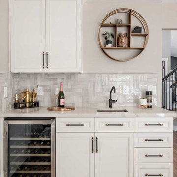
This young family purchased their first home in 2021, and let's say it was full of original 1970s charm - i.e., nothing had been done to this house in the past 50 years.
We had recently completed a project for a family member, so they called us in to help. During our initial consultation, they shared a modest project budget, and we explained that we wouldn't be able to accomplish much on such a limited budget. Several weeks passed, and they ultimately raised their funding, and we signed on for the job.
Even after doubling their budget, we still had our work cut out for us. The original kitchen was very small in comparison to the square footage of the home, and opening up the space meant we needed to add two structural beams between the first and second stories.
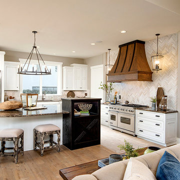
These homeowners already had one small child, and were expecting another in the coming months. They also have large families in the area, so creating an ample gathering space for multiple cooks was crucial to the final layout. Some of their wish list items included a bar and a large island with plenty of seating. They also wanted the kitchen open to the family room.
This home had a formal and informal dining area, so we opted to absorb the casual eating area into the newly expanded kitchen floorplan. We relocated their laundry room to create an extended family room, which included the new bar area. We were also able to use the under-stair space to create a kitchen pantry. The kitchen transformed from 115 sq. ft. to a spacious 260 sq. ft., all within existing poorly used space. We were able to create clear sightlines to the backyard and pool from the new kitchen and family room, perfect for a young family.
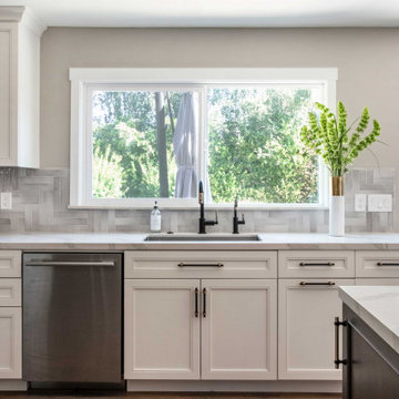
Aesthetically speaking, our clients wanted a neutral space that could grow and change with their family. We kept the expensive items like cabinets, countertops, and tile in classic finishes like whites and navy blues, while we had more fun with things like the faucet, hardware, and light fixtures that could easily be updated over the years. The finished product is a warm, clean, family-friendly space that invites you to come in and pull up a chair.

 Electronic Lifestyle Associates (ela)
These clients were in the second stage of renovating their stylish Tudor when we were approached to help formulate a final design plan for entertainment, technology integration and lighting design and control systems. Although the plan was to implement the final completion of these systems in stages, we needed to prepare the appropriate wiring to accomplish the end goals.
We provided a lighting design plan for the areas under construction and some simple control solutions from Lutron and Universal Remote Control. Once the Family room was completed we brought in the BDI Novia A/V Cabinet in Coco stained Cherry. This excellent piece of A/V furniture was just large enough to house the entertainment system along with the homes WiFi router.
The A/V system was built around a Denon AVR 3809Ci. Source components consisted of Comcast Cable HD DVR, Samsung Blu-Ray DVD player and an Apple TV. The Apple TV was the primarily used for playing the clients music and sharing their family pictures on the 50” Samsung LED TV. The Samsung Blu-Ray DVD player was designed with an internet application for Pandora Radio which is a great way to experience a wide variety of music by creating sets of personable radio stations.
Listing to the entertainment system is a real joy with the Totem Tribe in-wall speakers. These sealed cabinet in-wall speakers are some of the best in the world for a very reasonable price. The Velodyne MiniVee 10 was used as the subwoofer. Panamax surge protection was incorporated for everything including the TV.
The Universal Remote Control MX-980 was programmed to operate the primary entertainment system along with multiple audio zones for Kitchen, Dining, Patio, Master Bed & Bathroom through the Aton DLA6 zoned speaker selector and volume controller. Additional MX900 was used to support the master suite control within that area.
A Lutron Graphic eye was used in the Dining room to manage all of the lighting scenes while the Family room was controlled via the MX-980 remote and RF replacement wall dimmers. This was a great balance of budget and appropriate user interface options.
Client


 Visbeen Architects
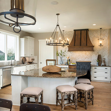
Tucked away in a densely wooded lot, this modern style home features crisp horizontal lines and outdoor patios that playfully offset a natural surrounding. A narrow front elevation with covered entry to the left and tall galvanized tower to the right help orient as many windows as possible to take advantage of natural daylight. Horizontal lap siding with a deep charcoal color wrap the perimeter of this home and are broken up by a horizontal windows and moments of natural wood siding.
Inside, the entry foyer immediately spills over to the right giving way to the living rooms twelve-foot tall ceilings, corner windows, and modern fireplace. In direct eyesight of the foyer, is the homes secondary entrance, which is across the dining room from a stairwell lined with a modern cabled railing system. A collection of rich chocolate colored cabinetry with crisp white counters organizes the kitchen around an island with seating for four. Access to the main level master suite can be granted off of the rear garage entryway/mudroom. A small room with custom cabinetry serves as a hub, connecting the master bedroom to a second walk-in closet and dual vanity bathroom.
Outdoor entertainment is provided by a series of landscaped terraces that serve as this homes alternate front facade. At the end of the terraces is a large fire pit that also terminates the axis created by the dining room doors.
Downstairs, an open concept family room is connected to a refreshment area and den. To the rear are two more bedrooms that share a large bathroom.
Photographer: Ashley Avila Photography
Builder: Bouwkamp Builders, Inc.
 Story Homes
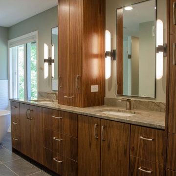
This beautifully designed home is located on secluded property with multiple private views of a nature preserve, yet only a short commute to downtown Minneapolis. The owners hired Jacobson Construction to update their master bathroom and the result is amazing.
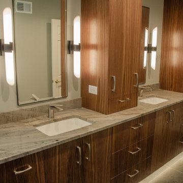
The design called for a bright, warm and comfortable space, so we began with a heated floor for those cold Minnesota nights using 12” X 24” gray porcelain bath tile and neutral grout. The custom built-in walnut vanity has a satin finish with brushed nickel hardware and a green-and-gray toned granite countertop.
The vanity includes two undermounted sinks with brushed nickel Kohler faucets. Each sink has two matching sconce lights and a large mirror. One feature the owners really enjoy is the in-cabinet and in-drawer electrical outlets – perfect for keeping the counter free of things like electric toothbrushes and hair dryers. They also love the custom two-level jewelry-organizing drawer.
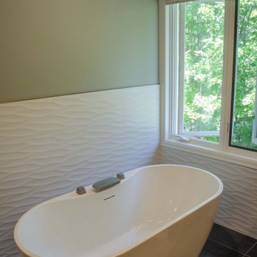
The bath’s centerpiece may be the white Kohler freestanding soaking tub with brushed nickel faucet, situated in front of a large window overlooking the nature preserve.
A 4’ x 4’ walk-in glass shower features dark gray 2” X 2” porcelain floor tile with neutral grout, 12” X 24” porcelain tile on the back wall, a granite corner seat to match the countertops, and brushed nickel Kohler showerhead.
The bath's walls are painted light green, with an additional white textured tile in a horizontal wave pattern that begins in the shower and extends to the wall behind the tub.
Recessed can, undercabinet toe-kick and sconce lights—all on dimmers--bring this room to life. The undercabinet lighting is wired with a motion sensor switch to function as a night light.
“Our only regret is that we didn’t take pictures of the bathroom before the remodel. It’s that much of an improvement!” The owners shared: “We're really enjoying the refreshed room. So far we’ve added a bright, colorful runner on the floor, and are in search of the perfect artwork to complement the wavy tile wall behind the tub.”
 Modern Citi Group: Renovations & Remodeling
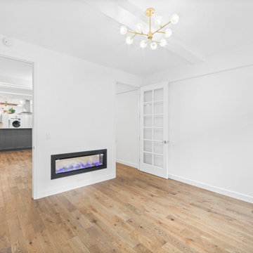
We helped the Sacara family renovate their 1,200-square-foot home in the prime Upper West Side location. The original layout included two bedrooms with a shared bathroom, a combined living/dining room area, and a separate kitchen. The family wanted to complete a full apartment renovation and make the layout more functional by adding a second bathroom, laundry room, and additional closets as well as creating an open kitchen concept.
The design challenge was to deliver a modern yet classic aesthetic for the entire apartment that captured the family’s vision for a perfect home.
The goal was to combine the kitchen and living room areas creating a harmonious flow of natural light and air; add a kitchen island with an additional seating area, and utilize every inch of usable space in the kitchen.
The design solution offered a cozy seating area by the window for a morning cup of coffee which simultaneously served as a cover for all the plumbing communications and radiator.
A built-in fireplace wall separated the living and dining room zones visually yet allowed them to stay bright and functional.
The design and architectural teams collaborated to create multiple layouts and design solutions so the Sacara family had options. Finally, the choice was made and the clients felt confident in their decision.
At the building stage, the full apartment renovation included the removal and installation of all walls, bathroom and laundry room addition, and complete closet reconfiguration.
Kitchen remodeling featured custom cabinetry, decorative wood island paneling, and a white marble countertop for a luxurious look.
The bathroom renovation highlighted herringbone and onyx tiling for color accents. Additionally, the team replaced all hardwood floors throughout the apartment, installed new baseboards, painted all walls and ceilings, and built the new LED channel lighting with dimmer switches.
In a matter of a few months, the Sacara family had a fully-remodeled home that expressed their style, vision, and improved functionality.
 Story Homes
This beautifully designed home is located on secluded property with multiple private views of a nature preserve, yet only a short commute to downtown Minneapolis. The owners hired Jacobson Construction to update their master bathroom and the result is amazing.
The design called for a bright, warm and comfortable space, so we began with a heated floor for those cold Minnesota nights using 12” X 24” gray porcelain bath tile and neutral grout. The custom built-in walnut vanity has a satin finish with brushed nickel hardware and a green-and-gray toned granite countertop.
The vanity includes two undermounted sinks with brushed nickel Kohler faucets. Each sink has two matching sconce lights and a large mirror. One feature the owners really enjoy is the in-cabinet and in-drawer electrical outlets – perfect for keeping the counter free of things like electric toothbrushes and hair dryers. They also love the custom two-level jewelry-organizing drawer.
The bath’s centerpiece may be the white Kohler freestanding soaking tub with brushed nickel faucet, situated in front of a large window overlooking the nature preserve.
A 4’ x 4’ walk-in glass shower features dark gray 2” X 2” porcelain floor tile with neutral grout, 12” X 24” porcelain tile on the back wall, a granite corner seat to match the countertops, and brushed nickel Kohler showerhead.
The bath's walls are painted light green, with an additional white textured tile in a horizontal wave pattern that begins in the shower and extends to the wall behind the tub.
Recessed can, undercabinet toe-kick and sconce lights—all on dimmers--bring this room to life. The undercabinet lighting is wired with a motion sensor switch to function as a night light.
“Our only regret is that we didn’t take pictures of the bathroom before the remodel. It’s that much of an improvement!” The owners shared: “We're really enjoying the refreshed room. So far we’ve added a bright, colorful runner on the floor, and are in search of the perfect artwork to complement the wavy tile wall behind the tub.”
 Story Homes
This beautifully designed home is located on secluded property with multiple private views of a nature preserve, yet only a short commute to downtown Minneapolis. The owners hired Jacobson Construction to update their master bathroom and the result is amazing.
The design called for a bright, warm and comfortable space, so we began with a heated floor for those cold Minnesota nights using 12” X 24” gray porcelain bath tile and neutral grout. The custom built-in walnut vanity has a satin finish with brushed nickel hardware and a green-and-gray toned granite countertop.
The vanity includes two undermounted sinks with brushed nickel Kohler faucets. Each sink has two matching sconce lights and a large mirror. One feature the owners really enjoy is the in-cabinet and in-drawer electrical outlets – perfect for keeping the counter free of things like electric toothbrushes and hair dryers. They also love the custom two-level jewelry-organizing drawer.
The bath’s centerpiece may be the white Kohler freestanding soaking tub with brushed nickel faucet, situated in front of a large window overlooking the nature preserve.
A 4’ x 4’ walk-in glass shower features dark gray 2” X 2” porcelain floor tile with neutral grout, 12” X 24” porcelain tile on the back wall, a granite corner seat to match the countertops, and brushed nickel Kohler showerhead.
The bath's walls are painted light green, with an additional white textured tile in a horizontal wave pattern that begins in the shower and extends to the wall behind the tub.
Recessed can, undercabinet toe-kick and sconce lights—all on dimmers--bring this room to life. The undercabinet lighting is wired with a motion sensor switch to function as a night light.
“Our only regret is that we didn’t take pictures of the bathroom before the remodel. It’s that much of an improvement!” The owners shared: “We're really enjoying the refreshed room. So far we’ve added a bright, colorful runner on the floor, and are in search of the perfect artwork to complement the wavy tile wall behind the tub.”
 Zepboo
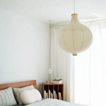
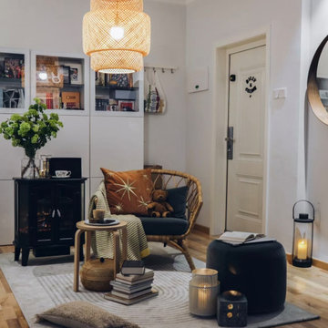
Presenting a customer case from Marseille, France! ??✨ Our client owns a charming 75 sqm, two-bedroom apartment that exudes a captivating vintage and rustic countryside mix. Seeking suitable lighting fixtures for each space, their primary focus was on pendant lights that would provide localized illumination, ample brightness, seamlessly blend with the room's style, and align with their modern, minimalist, and sustainable design preferences.
After reviewing the client's floor plan, we identified the areas that required pendant lighting installation: the living room, balcony, two bedrooms, and dining area. Through multiple consultations, we finalized a lighting plan that predominantly featured bamboo and rattan pendant lights, perfectly capturing the desired ambiance.
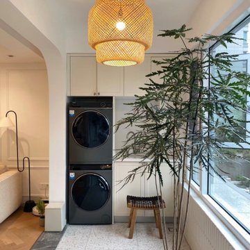
Starting with the living room, a cozy 21 sqm space, we recommended a delightful bamboo pendant light with a touch of rustic charm, ideal for providing localized illumination. Moving to the balcony, which exudes a vintage vibe, we suggested a popular Southeast Asian-inspired bamboo pendant light, making it a captivating centerpiece.
For the bedrooms, we proposed two distinct pendant lights. The first choice was a captivating lotus leaf-shaped bamboo ceiling light, offering a remarkable decorative effect. The second option was a circular white rattan pendant light, radiating a refreshing and serene atmosphere, perfect for creating a tranquil bedroom setting.
In the dining area, where a vintage and rustic countryside theme prevails, we recommended a lotus leaf-shaped pendant light, similar to the one in the bedrooms, but with an adjustable hanging wire. This choice ensures optimal lighting for both the dining space and the vibrant colors of the delectable dishes.
Upon receiving the lighting fixtures, our client expressed utmost satisfaction, stating that each pendant light perfectly aligned with their requirements. We are thrilled to share this case with all of you, hoping it sparks inspiration and ideas for your own home decoration endeavors. ✨?

Sponsored
Sunbury, OH

J.Holderby - Renovations
Franklin County's Leading General Contractors - 2X Best of Houzz!
 Electronic Lifestyle Associates (ela)
These clients were in the second stage of renovating their stylish Tudor when we were approached to help formulate a final design plan for entertainment, technology integration and lighting design and control systems. Although the plan was to implement the final completion of these systems in stages, we needed to prepare the appropriate wiring to accomplish the end goals.
We provided a lighting design plan for the areas under construction and some simple control solutions from Lutron and Universal Remote Control. Once the Family room was completed we brought in the BDI Novia A/V Cabinet in Coco stained Cherry. This excellent piece of A/V furniture was just large enough to house the entertainment system along with the homes WiFi router.
The A/V system was built around a Denon AVR 3809Ci. Source components consisted of Comcast Cable HD DVR, Samsung Blu-Ray DVD player and an Apple TV. The Apple TV was the primarily used for playing the clients music and sharing their family pictures on the 50” Samsung LED TV. The Samsung Blu-Ray DVD player was designed with an internet application for Pandora Radio which is a great way to experience a wide variety of music by creating sets of personable radio stations.
Listing to the entertainment system is a real joy with the Totem Tribe in-wall speakers. These sealed cabinet in-wall speakers are some of the best in the world for a very reasonable price. The Velodyne MiniVee 10 was used as the subwoofer. Panamax surge protection was incorporated for everything including the TV.
The Universal Remote Control MX-980 was programmed to operate the primary entertainment system along with multiple audio zones for Kitchen, Dining, Patio, Master Bed & Bathroom through the Aton DLA6 zoned speaker selector and volume controller. Additional MX900 was used to support the master suite control within that area.
A Lutron Graphic eye was used in the Dining room to manage all of the lighting scenes while the Family room was controlled via the MX-980 remote and RF replacement wall dimmers. This was a great balance of budget and appropriate user interface options.
Client
 Bennett Design Co.
This young family purchased their first home in 2021, and let's say it was full of original 1970s charm - i.e., nothing had been done to this house in the past 50 years.
We had recently completed a project for a family member, so they called us in to help. During our initial consultation, they shared a modest project budget, and we explained that we wouldn't be able to accomplish much on such a limited budget. Several weeks passed, and they ultimately raised their funding, and we signed on for the job.
Even after doubling their budget, we still had our work cut out for us. The original kitchen was very small in comparison to the square footage of the home, and opening up the space meant we needed to add two structural beams between the first and second stories.
These homeowners already had one small child, and were expecting another in the coming months. They also have large families in the area, so creating an ample gathering space for multiple cooks was crucial to the final layout. Some of their wish list items included a bar and a large island with plenty of seating. They also wanted the kitchen open to the family room.
This home had a formal and informal dining area, so we opted to absorb the casual eating area into the newly expanded kitchen floorplan. We relocated their laundry room to create an extended family room, which included the new bar area. We were also able to use the under-stair space to create a kitchen pantry. The kitchen transformed from 115 sq. ft. to a spacious 260 sq. ft., all within existing poorly used space. We were able to create clear sightlines to the backyard and pool from the new kitchen and family room, perfect for a young family.
Aesthetically speaking, our clients wanted a neutral space that could grow and change with their family. We kept the expensive items like cabinets, countertops, and tile in classic finishes like whites and navy blues, while we had more fun with things like the faucet, hardware, and light fixtures that could easily be updated over the years. The finished product is a warm, clean, family-friendly space that invites you to come in and pull up a chair.
 Zepboo
Presenting a customer case from Marseille, France! ??✨ Our client owns a charming 75 sqm, two-bedroom apartment that exudes a captivating vintage and rustic countryside mix. Seeking suitable lighting fixtures for each space, their primary focus was on pendant lights that would provide localized illumination, ample brightness, seamlessly blend with the room's style, and align with their modern, minimalist, and sustainable design preferences.
After reviewing the client's floor plan, we identified the areas that required pendant lighting installation: the living room, balcony, two bedrooms, and dining area. Through multiple consultations, we finalized a lighting plan that predominantly featured bamboo and rattan pendant lights, perfectly capturing the desired ambiance.
Starting with the living room, a cozy 21 sqm space, we recommended a delightful bamboo pendant light with a touch of rustic charm, ideal for providing localized illumination. Moving to the balcony, which exudes a vintage vibe, we suggested a popular Southeast Asian-inspired bamboo pendant light, making it a captivating centerpiece.
For the bedrooms, we proposed two distinct pendant lights. The first choice was a captivating lotus leaf-shaped bamboo ceiling light, offering a remarkable decorative effect. The second option was a circular white rattan pendant light, radiating a refreshing and serene atmosphere, perfect for creating a tranquil bedroom setting.
In the dining area, where a vintage and rustic countryside theme prevails, we recommended a lotus leaf-shaped pendant light, similar to the one in the bedrooms, but with an adjustable hanging wire. This choice ensures optimal lighting for both the dining space and the vibrant colors of the delectable dishes.
Upon receiving the lighting fixtures, our client expressed utmost satisfaction, stating that each pendant light perfectly aligned with their requirements. We are thrilled to share this case with all of you, hoping it sparks inspiration and ideas for your own home decoration endeavors. ✨?
 Zepboo
Presenting a customer case from Marseille, France! ??✨ Our client owns a charming 75 sqm, two-bedroom apartment that exudes a captivating vintage and rustic countryside mix. Seeking suitable lighting fixtures for each space, their primary focus was on pendant lights that would provide localized illumination, ample brightness, seamlessly blend with the room's style, and align with their modern, minimalist, and sustainable design preferences.
After reviewing the client's floor plan, we identified the areas that required pendant lighting installation: the living room, balcony, two bedrooms, and dining area. Through multiple consultations, we finalized a lighting plan that predominantly featured bamboo and rattan pendant lights, perfectly capturing the desired ambiance.
Starting with the living room, a cozy 21 sqm space, we recommended a delightful bamboo pendant light with a touch of rustic charm, ideal for providing localized illumination. Moving to the balcony, which exudes a vintage vibe, we suggested a popular Southeast Asian-inspired bamboo pendant light, making it a captivating centerpiece.
For the bedrooms, we proposed two distinct pendant lights. The first choice was a captivating lotus leaf-shaped bamboo ceiling light, offering a remarkable decorative effect. The second option was a circular white rattan pendant light, radiating a refreshing and serene atmosphere, perfect for creating a tranquil bedroom setting.
In the dining area, where a vintage and rustic countryside theme prevails, we recommended a lotus leaf-shaped pendant light, similar to the one in the bedrooms, but with an adjustable hanging wire. This choice ensures optimal lighting for both the dining space and the vibrant colors of the delectable dishes.
Upon receiving the lighting fixtures, our client expressed utmost satisfaction, stating that each pendant light perfectly aligned with their requirements. We are thrilled to share this case with all of you, hoping it sparks inspiration and ideas for your own home decoration endeavors. ✨?
 Modern Citi Group: Renovations & Remodeling
We helped the Sacara family renovate their 1,200-square-foot home in the prime Upper West Side location. The original layout included two bedrooms with a shared bathroom, a combined living/dining room area, and a separate kitchen. The family wanted to complete a full apartment renovation and make the layout more functional by adding a second bathroom, laundry room, and additional closets as well as creating an open kitchen concept.
The design challenge was to deliver a modern yet classic aesthetic for the entire apartment that captured the family’s vision for a perfect home.
The goal was to combine the kitchen and living room areas creating a harmonious flow of natural light and air; add a kitchen island with an additional seating area, and utilize every inch of usable space in the kitchen.
The design solution offered a cozy seating area by the window for a morning cup of coffee which simultaneously served as a cover for all the plumbing communications and radiator.
A built-in fireplace wall separated the living and dining room zones visually yet allowed them to stay bright and functional.
The design and architectural teams collaborated to create multiple layouts and design solutions so the Sacara family had options. Finally, the choice was made and the clients felt confident in their decision.
At the building stage, the full apartment renovation included the removal and installation of all walls, bathroom and laundry room addition, and complete closet reconfiguration.
Kitchen remodeling featured custom cabinetry, decorative wood island paneling, and a white marble countertop for a luxurious look.
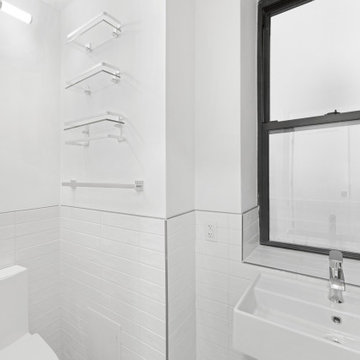
The bathroom renovation highlighted herringbone and onyx tiling for color accents. Additionally, the team replaced all hardwood floors throughout the apartment, installed new baseboards, painted all walls and ceilings, and built the new LED channel lighting with dimmer switches.
In a matter of a few months, the Sacara family had a fully-remodeled home that expressed their style, vision, and improved functionality.
 Modern Citi Group: Renovations & Remodeling
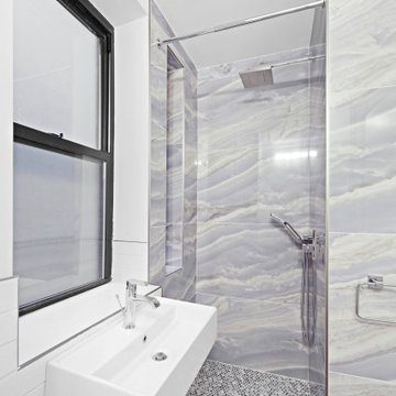
We helped the Sacara family renovate their 1,200-square-foot home in the prime Upper West Side location. The original layout included two bedrooms with a shared bathroom, a combined living/dining room area, and a separate kitchen. The family wanted to complete a full apartment renovation and make the layout more functional by adding a second bathroom, laundry room, and additional closets as well as creating an open kitchen concept.
The design challenge was to deliver a modern yet classic aesthetic for the entire apartment that captured the family’s vision for a perfect home.
The goal was to combine the kitchen and living room areas creating a harmonious flow of natural light and air; add a kitchen island with an additional seating area, and utilize every inch of usable space in the kitchen.
The design solution offered a cozy seating area by the window for a morning cup of coffee which simultaneously served as a cover for all the plumbing communications and radiator.
A built-in fireplace wall separated the living and dining room zones visually yet allowed them to stay bright and functional.
The design and architectural teams collaborated to create multiple layouts and design solutions so the Sacara family had options. Finally, the choice was made and the clients felt confident in their decision.
At the building stage, the full apartment renovation included the removal and installation of all walls, bathroom and laundry room addition, and complete closet reconfiguration.
Kitchen remodeling featured custom cabinetry, decorative wood island paneling, and a white marble countertop for a luxurious look.
The bathroom renovation highlighted herringbone and onyx tiling for color accents. Additionally, the team replaced all hardwood floors throughout the apartment, installed new baseboards, painted all walls and ceilings, and built the new LED channel lighting with dimmer switches.
In a matter of a few months, the Sacara family had a fully-remodeled home that expressed their style, vision, and improved functionality.
 Modern Citi Group: Renovations & Remodeling
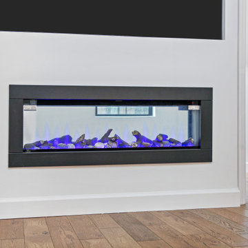
We helped the Sacara family renovate their 1,200-square-foot home in the prime Upper West Side location. The original layout included two bedrooms with a shared bathroom, a combined living/dining room area, and a separate kitchen. The family wanted to complete a full apartment renovation and make the layout more functional by adding a second bathroom, laundry room, and additional closets as well as creating an open kitchen concept.
The design challenge was to deliver a modern yet classic aesthetic for the entire apartment that captured the family’s vision for a perfect home.
The goal was to combine the kitchen and living room areas creating a harmonious flow of natural light and air; add a kitchen island with an additional seating area, and utilize every inch of usable space in the kitchen.
The design solution offered a cozy seating area by the window for a morning cup of coffee which simultaneously served as a cover for all the plumbing communications and radiator.
A built-in fireplace wall separated the living and dining room zones visually yet allowed them to stay bright and functional.
The design and architectural teams collaborated to create multiple layouts and design solutions so the Sacara family had options. Finally, the choice was made and the clients felt confident in their decision.
At the building stage, the full apartment renovation included the removal and installation of all walls, bathroom and laundry room addition, and complete closet reconfiguration.
Kitchen remodeling featured custom cabinetry, decorative wood island paneling, and a white marble countertop for a luxurious look.
The bathroom renovation highlighted herringbone and onyx tiling for color accents. Additionally, the team replaced all hardwood floors throughout the apartment, installed new baseboards, painted all walls and ceilings, and built the new LED channel lighting with dimmer switches.
In a matter of a few months, the Sacara family had a fully-remodeled home that expressed their style, vision, and improved functionality.
59