
Search results for "Sharpening problem solving" in Home Design Ideas
 Lagois Design Build Renovate
New windows, floors, powder room and basement:
We gave the home new windows, new hardwood floors, and paint throughout. We created a new main floor powder room and a new finished basement containing a living area, three-piece bathroom and new bedroom with egress (tilt and turn) windows.
Flipped around and redesigned kitchen:
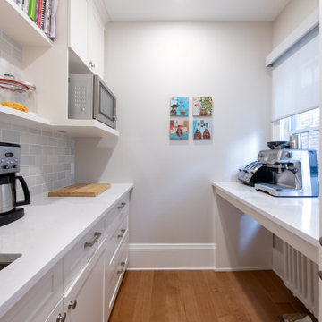
We created a new kitchen. The footprint of the kitchen stayed the same, but we flipped it around and redesigned it. Now it has a walk-in pantry area and more floorspace going in and out, which optimized the flow of traffic. We replaced the old non-functioning mudroom with a new one.
Disappearing balcony and drafty door:
To create a new space using a balcony in a bedroom, we extended the second storey out to line up with the first floor, and this increased the square footage. In that room we turned a drafty door into a window.
We reinstated the rear deck, using as many of the original pieces as we could:
There was a leaking roof problem because the original roof pitches were causing ice damming. We designed a new roof to prevent that in the future.
New windows, stucco, and the challenge of asbestos:
Another challenge was installing new windows in the original stucco finish, which contained asbestos. We waterproofed those properly, future proofing them from leaks.
We solved the situation by installing a 5-inch trim around the perimeter of the window. Specialists cut the asbestos back (we had to set up a containment perimeter around each window), and then we placed windows that are five inches wider than the window frames. We used special flashing tapes and sealed them all up behind the stucco.
 Art Fireplace Technology Limited
With more than 5 years experience in supplying auto ethanol fireplaces,We can say that we have authoritative engineers in solving your problems.We assure 1 year warranty long time.Once out warranty,we also can serve for free.What our Customers buys are not only the products,but also the services!

 Mood Interieur
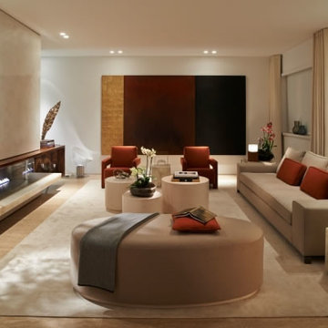
This house needed a total make-over. My clients wanted a solution between living room and serre which added more light and storing space. Mood Interieur was hired to suggest a new floor plan and to act as a sparring partner.
The wall with ceiling high sliding doors and a cupboard over the whole lenght of the wall in the serre solved the light and storing problem.
Mood Interieur also designed the tv cupboard and wardrobe closet.
All the dark colours were replaced by fresh, white colours combined with greige. A colour which beautifully interacts with the shabby-chic Flexform sofa en the greige blue Bomat carpet. The white and wood Arco tablet tables go perfectly with the white tv-cupboard and new doors.
Furniture and curtains are suggested and delivered by Mood Interieur.
Find the right local pro for your project
 Porcea Stone Inc.
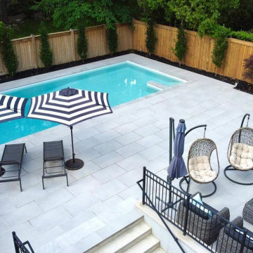
Porcea Indus is a close alternative to Venetian Gray, Cascade Limestone, Thermal Bluestone, Indus Valley, and Indus Gray Limestones. All of these natural stone products have unique challenges including staining from rust (Venetian Gray), lack of availability (Cascade), and a general lack of charm (Thermal Bluestone).
Porcea Indus solves all of these problems and packs a real punch. A sandblasted texture with a subtle off-grey colour tone that is stain-resistant and maintenance-free. The fleuri and shells found on this premium outdoor porcelain paver are both charming and subtle, allowing for an extremely premium and modern design profile. Perfect for modern or high-end projects.
Like all of Porcea Stone’s Elite Collection of outdoor porcelain tiles, this paver is Designed for North America.
 Petrick Architecture
With help from my design-savvy client, I was able to create a stylish yet practical solution to her functional problems in the existing kitchen. The space was dark, cramped, and disorganized. While making dinner, she ran back and forth through a two-way door to communicate with her children in the family room. Backpacks and homework spilled into the kitchen and lights were on regardless of the time of day.
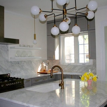
To solve these issues, we opened up the wall between the family room to improve communication and bring in more natural light. A mud room was defined by adding walls near the back door. We raised the ceiling to the original height and the new opening was trimmed to match all existing openings for a seamless design. Making dinner has a whole new outlook with a custom island that faces the family room and the warm southern sunlight. We finished it off embracing current trends with grey cabinets, marble counters with backsplash, brushed brass hardware and open shelving.
 KURV Architecture DPC (Alex Hughes Architects)
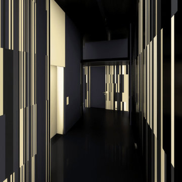
Located in the heart of Manhattan’s Lower East Side, the building was erected on a shallow commercial lot between two 120 year old masonry buildings and a new residential rental building. 330 Grand Street is a mix of 725 SF 1BRs and 1050 SF 2BR apartments. It also contains a 1100 SF two story duplex as well as private and public rooftop space, large private balconies for most units and two large private terraces for the ground floor units.
330 Grand Street was originally designed and approved at the NYC DOB as a prefabricated modular building. During the pandemic, as shipping costs skyrocketed putting the project at risk, we suggested redesigning the building as a reinforced cast-in-place concrete structure. Concrete was readily available and prices had not been affected by the demand increase that many other materials suffered in the pandemic. We took this opportunity to raise floor to ceiling heights, enlarge high performance windows and redistribute the buildings MEPFS and Structural Systems to create very open floor plans.
The challenge was to create a luxurious sensorial living experience with very limited means. In a city with very high construction costs, low cost residential buildings in the area are usually devoid of good quality, design and character. Our approach was to aim high for the end user, prioritizing natural light, open space with long visual perspectives, high ceilings and as always, rejecting the use of predefined building templates.
Our biggest challenge was to ensure that the small spaces feel as clean cut, large and bright as possible. Several unique design decisions were made to ensure low cost and high quality;
Floor plans were laid out so that spaces were wide open and free of clutter from mechanical or structural interruptions. Therefore all infrastructure was placed in lateral demising walls, which in turn act as the unit’s storage and kitchen. The apartments feel wide open, are super quiet and have more storage space than any other comparable apartment in the city.
To solve the problem of the site’s shallow commercial lot which is typically prone to dark interior spaces we focused our attention on the building’s envelope. Instead of the usual small punched window openings, oversized high performance windows were designed to ensure that light penetrated as far as possible into the units. In the smaller 1BR units, the full 50’ depth of the lot is perceived by partitioning spaces with sliding pocket doors that can be retracted to allow deep visual perspectives, making the sight lines in the space feel longer, larger, more ample than normal. In addition to the full height glazing, each unit above the 2nd floor receives a 7 foot covered balcony, adding 120 to 240 sf to each apartment, something unusual in New York City buildings. The space is large enough for a full size dining table, when the weather permits being outside.
We also worked hard to ensure modularity. For example, all kitchen units are all identical throughout the building. The idea of modularity and the economy of the repetitive unit is exercised to the maximum through the building.
Hardware, appliances, flooring, wall coverings and material finishes are all carefully selected to feel bespoke, high quality and unique.
It was important to KURV that the result of this work manifest into something that would deeply connect with the end user and sustain relationships with the consumers of this space.
All images by KURV Architecture ©
 Regal Plastics - San Antonio
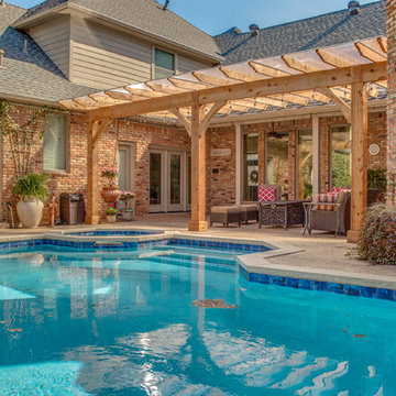
This homeowner was tired of Texas heat and thunderstorms pushing them indoors. They solved the problem by adding a Polygal covered pergola.
Example of a large backyard patio design in Austin with a pergola
Example of a large backyard patio design in Austin with a pergola
 Marilyn's Dreamscapes L.L.C.
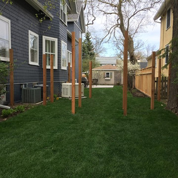
In every site, there is a list of concerns about what the clients would like to improve. Before creating a desired environment, we had many internal problems that had to be solved first.
 Mood Interieur
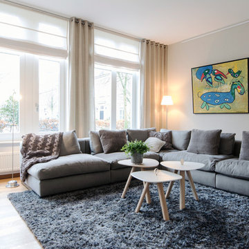
This house needed a total make-over. My clients wanted a solution between living room and serre which added more light and storing space. Mood Interieur was hired to suggest a new floor plan and to act as a sparring partner.
The wall with ceiling high sliding doors and a cupboard over the whole lenght of the wall in the serre solved the light and storing problem.
Mood Interieur also designed the tv cupboard and wardrobe closet.
All the dark colours were replaced by fresh, white colours combined with greige. A colour which beautifully interacts with the shabby-chic Flexform sofa en the greige blue Bomat carpet. The white and wood Arco tablet tables go perfectly with the white tv-cupboard and new doors.
Furniture and curtains are suggested and delivered by Mood Interieur.
 Howell Pathways
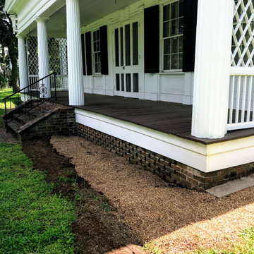
Howell Pathways solved the water issues at this pier and beam historic home. Drainage issues have been a problem for years. French drains were added with 3/8” pea gravel. The gravel was bound with Howell Pathways Patented Klingstone Path gravel binder. The water flows into the French drain but is hard.
This made it ADA compliant, safe for mowers and asthetically beautiful. Our process is approved by the Historical Society as we have installations at Cololnial Williamsburg, and the homes of Thomas Jefferson, James Madison and Booker T Washinton plus many more.
We are perfect for your historical site.
 Edmond Kitchen & Bath LLC
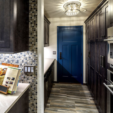
This 1970s ranch style home was in need of a whole revival in the kitchen including a complete new orientation in the space. In order to solve the problem of inadequate passage at the garage door, laundry machines were relocated to another area of the home, and a new "drop zone" for mail and phones was created. A dated soffit was removed and the cooking area was relocated to a longer - focal point wall that allows the cook to be more included while entertaining. An updated rustic and simplified craftsman style was chosen to compliment the other elements of stone and beams in the rest of the home. Of specific note is the installation of both induction and gas cooktops under the same venthood for optional cooking methods. Also note our preferred location for a warming drawer - 2nd position in a nearby drawer stack where it can easily be used. Another great kitchen for a wonderful family. Photos by David Cobb Photography.
 Drury Design
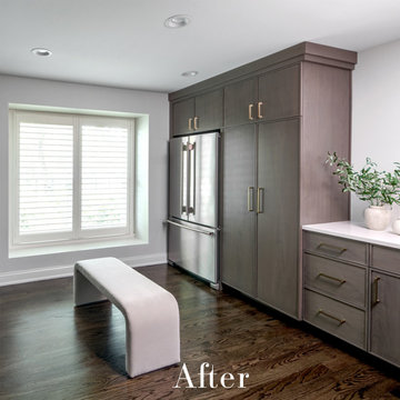
Some rooms never quite find their purpose. That was the case with this space, which had gradually become a combination home office, pantry overflow area, pet zone, and general catch-all for daily life. While it offered plenty of square footage, it wasn’t helping the homeowners stay organized, and valuable storage was scattered between an overcrowded pantry closet and various pieces of furniture throughout the room.
Having previously partnered with Drury Design on a kitchen remodel, these homeowners once again turned to Senior Designer Samantha Schoell to help them rethink how their home could better support the way they actually live. What began as a conversation about adding some cabinetry quickly evolved into a comprehensive storage solution — one designed to accommodate everything from groceries and sports equipment to pet supplies and everyday household essentials.
Design Objectives:
Create Organization: Consolidate pantry overflow, household supplies, and everyday essentials into a single, highly functional space.
Support Family Life: Provide dedicated storage for coats, bags, sports equipment, and the routines of an active household.
Accommodate Pets: Incorporate thoughtful features for the family’s dogs while maintaining a clean, organized appearance.
Maximize Existing Space: Transform an underutilized room without expanding the home’s footprint.
Maintain Flexibility: Preserve the room’s long-term versatility and appeal for future homeowners.
Design Challenges:
Multiple Functions: The room was being used simultaneously as a home office, pantry, storage area, and pet space without a cohesive organizational strategy.
Insufficient Pantry Storage: The nearby pantry closet had become overcrowded and difficult to navigate.
Visual Clutter: Everyday items, pet supplies, and household necessities lacked dedicated storage locations.
Unused Potential: Despite its generous size, the room was not contributing meaningfully to the home’s overall functionality.
Balancing Practicality and Style: The homeowners wanted substantial storage without creating a space that felt overly utilitarian.
Design Solutions:
Purpose-Built Storage Plan: Custom cabinetry was designed to support multiple functions within a unified storage system, allowing the room to serve as a mudroom, pantry extension, household hub, and pet station.
Expanded Pantry Capacity: Floor-to-ceiling cabinetry, a secondary refrigerator, and extensive drawer storage dramatically increased food storage and organization capabilities.
Hidden Organization: Closed cabinetry conceals household items, sports gear, pet supplies, and everyday clutter, creating a calm and orderly appearance.
Full-Room Transformation: Rather than simply adding cabinets to one wall, the design reimagined the entire room, utilizing its footprint to create a true family command center.
Furniture-Inspired Cabinetry: Warm wood finishes, decorative hardware, open display shelving, and thoughtful detailing elevate the room beyond pure utility, helping it feel like a natural extension of the home’s design.
The most successful remodeling projects often solve problems homeowners have simply learned to live with. In this case, a room that once served several purposes — but excelled at none — was transformed into one of the hardest-working spaces in the home.
Today, groceries, pet supplies, seasonal gear, household essentials, and daily routines all have a designated place. Even the family’s dogs were thoughtfully considered, with a built-in resting area integrated into the cabinetry. The result is a room that feels remarkably organized despite supporting countless everyday activities — a reflection of how thoughtful design can bring clarity, efficiency, and calm to the busiest parts of family life.
 Jacob Lilley Architects
Jacob Lilley Architects
Location: Lexington, MA, USA
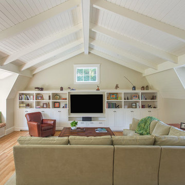
A new garage, kids play room above and a mudroom met the need for more space. A renovated kitchen, bedroom and other living spaces created a refreshed sense of home.
The strategic location of the mudroom as an intermediary connector solved problems with this 19th-century home siting seven feet above the ground with limited access to the rear yard.
The connector between the garage and existing house is a stair that unifies the various levels and develops a strong connection to the yard.
Photographed by: Eric Roth
 Chester County Kitchen & Bath
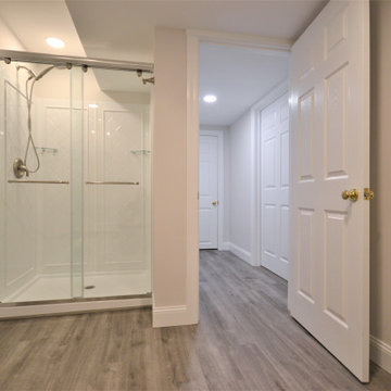
Basement Bath Bryn Mawr PA. Want a basement bath from scratch? Sure, no problem its nothing a little jackhammering concrete and digging trenches for plumbing can’t solve. We changed a doorway to an unfinished storage area to a spacious full bath and hall with access to the remaining storage area. Now family and guests have a more convenient bath when hanging out in the finished basement. The clients also wanted a full shower for the kids after sports, guests staying over, or after a workout in the adjoining fitness room. Some interesting ceiling work was needed to go around the homes existing mechanicals while still maintaining a comfortable ceiling height. Durable and stylish vinyl floating floors are a great choice for the flooring. The Dreamline shower system looks clean and bright. The new bath and hall blend seamlessly with the already finished basement and seem original to the space.
 Kustom Home Design
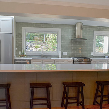
This amazing renovation focused on solving a series of problems that a previous kitchen expansion had created. By rearranging the appliance placement, updating the cabinetry, designing all new storage solutions and maximizing the amazing outdoor views; we cured the spit personality disorder plaguing the existing kitchen. The home now has a beautifully redesigned kitchen and living space perfect for entertaining, relaxing and enjoying the outside views. Vaulted ceilings with bright skylights, reflective glass wall tiles, sleek sophisticated Cambria quartz counter tops, fingerprint-free faucet, multi-functional Prolific kitchen sink by Kohler, stainless steel appliances, creative storage solutions, all new lighting and timeless shaker cabinets by Wellborn lend to the now bright, open, vivacious and flawless function of this newly renovated galley style kitchen. White base cabinets along the outside walls contrast perfectly with the dark grey island cabinets. Linear satin nickel door and drawer pulls coordinate with the stainless steel appliances and sink. An eclectic blend of vintage and modern furnishings, artwork and rugs create a comfortable balance that feels and looks timeless. Breathtaking backyard views are artfully framed by new Pella windows and doors with integral blinds between the glass. Calm, inviting neutral tones provide the perfect backdrop for this refined design.
Photos by: Kimberly Kerl
 Jordan Lockman
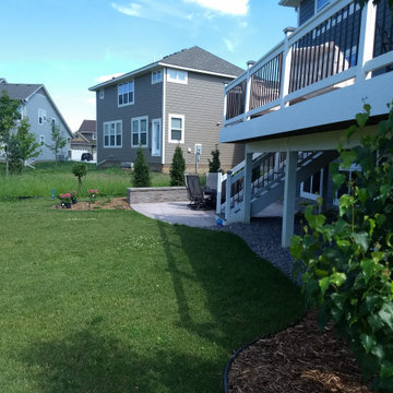
We added granite and fixed the grading under the deck to solve a wet spot water problem.
Elegant home design photo in Minneapolis
Elegant home design photo in Minneapolis
 Petrick Architecture
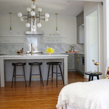
With help from my design-savvy client, I was able to create a stylish yet practical solution to her functional problems in the existing kitchen. The space was dark, cramped, and disorganized. While making dinner, she ran back and forth through a two-way door to communicate with her children in the family room. Backpacks and homework spilled into the kitchen and lights were on regardless of the time of day.
To solve these issues, we opened up the wall between the family room to improve communication and bring in more natural light. A mud room was defined by adding walls near the back door. We raised the ceiling to the original height and the new opening was trimmed to match all existing openings for a seamless design. Making dinner has a whole new outlook with a custom island that faces the family room and the warm southern sunlight. We finished it off embracing current trends with grey cabinets, marble counters with backsplash, brushed brass hardware and open shelving.
 D3 Architects
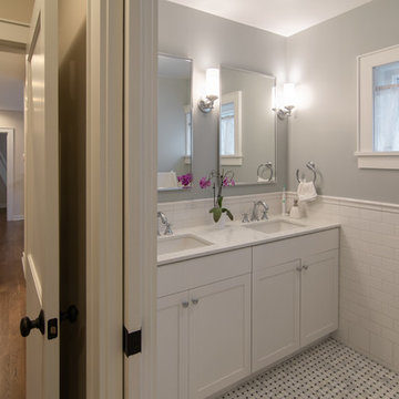
The existing house was narrow, so it was a challenge to lay out the house in a way that felt functional and generous. We were creative in solving these spatial problems, making the bathroom more of a linear layout. The double vanity spans the width of the bathroom while the shower and toilet are to the right of the camera. Behind the camera is the walk in closet.
 Spring Creek Design
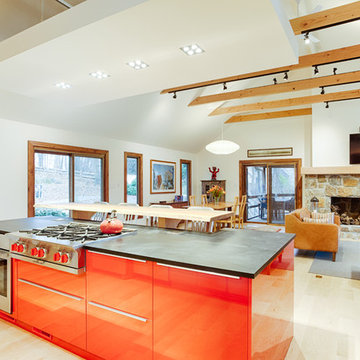
Removing the kitchen walls required a structural alternative to the existing load-bearing ridge beam. Installation of eight 4x8 Douglas Fir rafter ties solved the problem and provided an aesthetic windfall.
The new rafter ties also provided mounting surface for the extensive LED Up and Down lighting.
We designed a large floating soffit to anchor the kitchen without walls.
Suspended from the rafter ties above the island, the soffit also provides a surface to mount unique LED task lighting in this otherwise high-ceilinged space.
Alicia's Art
 Shuler Architecture
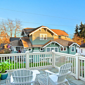
This urban infill project is a make-over of a decrepit structure that had been used as a student rental for close to 50 years. Situated on an elevated, 3300 sf lot, nothing in the original house was salvageable and the entire house was stripped down to the studs. Our challenge with this project was to then open up the original interiors, flood them with natural light while creating a design that appealed to the broadest buyer pool possible.
We solved this problem by organizing a compact floor plan that resulted in a 4 bedroom, 4 bath residence organized around a great room on the main level, a family room on the basement level and an additional 2 bedrooms with city views on the upper. By minimizing circulation space, we were able to re-purpose every square foot of floor area while creating a dramatic, light-filled staircase that tied all 3 levels of the house together into a unified living scheme. Clean lines and clean details, this is another of our attempts at a 'Not So Big House.'
Marketing of the final product lasted less than 10 days and resulted in 3 full priced offers that netted the developer a tidy profit.
42