
Search results for "Sharpening problem solving" in Home Design Ideas
 Degnan Design-Build-Remodel
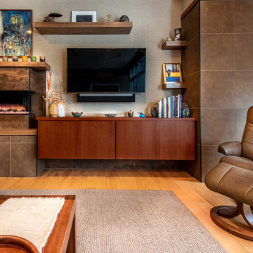
Moving the TV to the ideal viewing location from the furniture placed it off-center in the space. A creative design solution was required to solve this problem.
 User
UserThis hillside home in Piedmont, CA was remodeled to change the style from a 1940's rancher with eight foot ceilings and dark interiors, into a modern geometric composition with vast white interiors for casual living and generous daylighting for displaying the artist-owner's works.
In a city known for rigorous and difficult design review, an addition, two variances, and a full stylistic change were unanimously approved on the first round. All sloped roofs and attics were eliminated and replaced by a series of stacked and overlapping flat roofs. This made the house taller on the inside and shorter on the outside, which helped earn design review cooperation in the community. Windows were concentrated toward the rear yard views or moved up high on the side walls for daylight and privacy, benefitting the owners as well as the neighbors.
At the start, the owner husband was so enthusiastic and engaged in transforming his house into something modern that he presented the architect with a scaled foamcore model, rather than the usual magazine clippings and wish list. He participated in the design decisions throughout the process. The owner wife is the artist who did all the artwork in the house. She had been craving a display space with large walls and good natural light. Both of them loved the location and great views.
The project was an opportunity to transform the style of an older traditional home into a modern one, while solving numerous problems. By rebuilding the 1800 ft2 top of the 3-story home it was possible to change the style of the whole building, since the lower floors were a neutral base, and also to change the lifestyle of the owners, who wanted to move their master suite upstairs and live primarily on the top floor as empty nesters.
Going into the project, the architect knew there were multiple encroachments into the setbacks and potential privacy issues with close by neighbors. He approached this as a complex puzzle made up of architectural and political pieces which all had to fit together elegantly. It took many careful moves, small and large, to arrive at a serene and cohesive result that tied old and new together seamlessly.
The design-build contractor worked closely with the owners and handled all of the construction phase documents and design adjustments, adding ideas of their own to make the project really sing.
The project was a collaboration in three acts. The owner had a strong design concept from the start. The architect developed it into a realistic project and garnered the design approvals. Then the contractor executed brilliantly.
 Donovan Lord Design
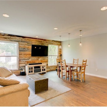
We took an old dank and dark upstairs game room and made it bright and open with a reclaimed wood wall as a feature, added a 2nd window to let in more light, all new electrical and lighting, a neutral paint, and new hardwood floors.
This is a great example of being able to update a space without an enormous budget by making the right architectural and design choices to solve problems with the space.
The furnishings wer selected by the owner.
Find the right local pro for your project
 AFFD Design Firm
GAO Zhiqiang: Exploring the infinite possibilities beyond boundaries - Space Emotion Design Series - Vniau Office
The essence of space design is to pay attention to people’s emotional needs, especially in office designs.
Vniau office is designed by GAO Zhiqiang, a space emotion designer. He created an extremely comfortable and inclusive office space by modern design tech-niques, combined with technology, history and humanities.
/ Explore /
Infinite possibilities beyond boundaries
A humanistic caring, warm and emotional design work, under the continuous changes of social forms, evolves into a space in accordance with the develop-ment of the current era, which is the most solid response from the designer to the space.
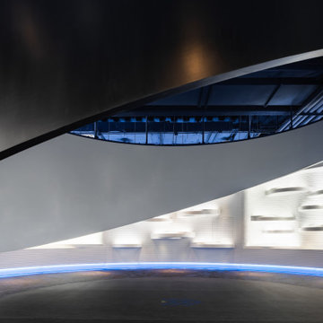
This open space makes you feel like entering into a movie scene. Large areas of black and white contrast, and smooth lines create a powerful aura. However, soft lights bring back a romantic atmosphere. The space is highlighted by vir-tuality and reality.
The development of modern technology diversified people’s cognition and iden-tification of space dimension. The designer tries to break the inherent bound-ary consciousness among technology, humanities and nature by comfortable and efficient spatial perception.
Wandering between virtual and real, light and shadow, the space presents a fu-ture sense through symbols. It shows a bold, free, open, lush, and new office format.
"Compared with technology, we pay more attention to people's emotions and feelings. We have always been advocating using the most common materials to create different spaces, and the key is depended on design." Said designer GAO Zhiqiang.
Therefore, when it came to the selection of materials, pureness presents in-finity, simplicity creates richness. Bright green brings cheerfulness, and the exposed ceiling and cloud-like chandeliers create a natural and agile visual perception. The combination of dynamic and stillness embodies the concentra-tion of the designer.
As the previous office was in Chinese style with redwood furniture, in order to have good effect of the overall space, the designer discussed with the own-er repeatedly, strive to change into a modern style, which matches more with their products, clients, competitors, brand culture and temperament of the of-fice, younger staff, etc., in the end, this design shows up.
This is a ring-shaped office space with same walls and same core tubes, which make people easily disoriented. By the principle of 5 elements - metal, wood, water, fire and earth, the designer placed the reception and exhibition room in the middle, and painted in yellow, corresponding to central earth.
According to this principle, the R & D department on the east side is decorat-ed in green, corresponding to wood, also, the market and finance department on the south side is orange, corresponding to fire. Service department on the west is white color representing metal, CEO and QC office on the north side is given black color, representing water. 5 directions are painted in 5 colors, which make people clearly distinguish departments and directions.
The building wall of the void area has a huge sloped beam, which causes poor visual experience. To solve this problem, the designer creates a magnificent X-shaped style by making use of the original beam structure. Its perforated sides and the luminous aluminum plates are very sci-fi, showing a similar vision of X-Men headquarters.
The interaction, communication and intersection among people are the key points of designing moving lines. Their optimization brings closer collaboration among departments,shorten the distance that people have to walk in the space, such as in conference rooms, negotiation rooms, recreation area, water bar, reception area.
Reasonable moving lines make discussion and communication between people, de-partments, and customers more efficient. At the same time, different spaces create different atmospheres and emotions, relax, or serious, or leisurable, etc., so as to meet needs of different moments.
In addition, the designer GAO Zhiqiang said, "We want to create a feeling of flowing clouds. Lights and curves create moving lines, and give a sense of freedom."
To remove the shackles of traditional office designs, and give a space infi-nite vitality is not just a change in form, it is more about 'people' them-selves. Here, everyone has a very large degree of freedom, and they can feel the infinite possibilities of future. Initiative and creativity are stimulated at the same time. Once people create the environment, areas interact with each other, and the power of design emerges.
Soft curve is a visual expression of tolerance and infinite possibilities. The spatial layout breaks isolation and shortens the distance of human hearts. High efficiency while no boundaries, and everywhere has space for independent thinking and solitude. The space respects each individual and can also unit as a whole.
Gaudi, the most famous Spanish architect, once said that straight lines belong to human, and curves belong to the God. It is probably that the curves give birth to too many wonderful changes. In this space, the curves are formed smoothly, either on the ground or ceiling, or a room, a partition.
"Spatial emotion design" advocates bringing human attributes to spatial func-tions. By designing and shaping the space, people are able to work in the best state of physiological and psychological emotions. Therefore, AFFD is trying their best to create comfortable working environments for employees, to ensure efficient work, as well as physical and mental health of staff.
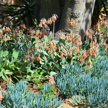
 Noelle Johnson Landscape Consulting
Garden travels. Elk Horn (Cotyledon orbiculata)
Photo of a landscaping in Other.
Photo of a landscaping in Other.
 TOUCH Architect Co., Ltd.
PROJECT | Duplicate-Duplex
TYPE | private residence / home-studio
LOCATION | Phayathai Rd., Bangkok, Thailand
OWNER | Ms. Najaree Ratanajiajaroen / Chanon Treenet
ARCHITECT | TOUCH Architect Co.,Ltd.
FLOOR AREA | 64 sq.m.
FLOOR AREA (by proposing) | 75 sq.m.
COMPLETION | 2018
PHOTOGRAPHER | Chalermwat Wongchompoo
CONTRACTOR | Legend Construction Group
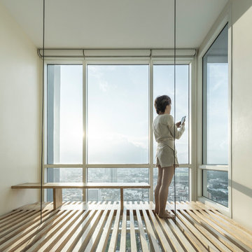
A major pain point of staying in 64 sq.m. of duplex condominium unit, which is used for a home-studio for an animator and an artist, is that there is not enough space for dwelling. Moreover, a double-volume space of living area with a huge glass curtain wall, faces West. High temperature occurs all day long, since it allows direct sunlight to come inside.
In order to solve both mentioned problems, three addition items are proposed which are, GRID PARTITION, EXTENSION DECK, and STEPPING SPACE.
A glass partition not only dividing space between kitchen and living, but also helps reduce electricity charge from air-condition. Grid-like of double glass frame is for stuff and stationery hanging, as to serve the owners’ activities.
Extension deck would help filtrating heat from direct sunlight, since an existing high glass facade facing West.
An existing staircase for going up to the second-floor bedroom, is added by a proposed space above, since this condominium unit has no enough space for dwelling or storage. In order to utilize the space in a small condominium, creating another staircase above the existing one helps increase the space.
The grid partition and the extension deck help ‘decrease’ the electricity charge, while the extension deck and the stepping space help ‘increase’ the space for 11 sq.m.
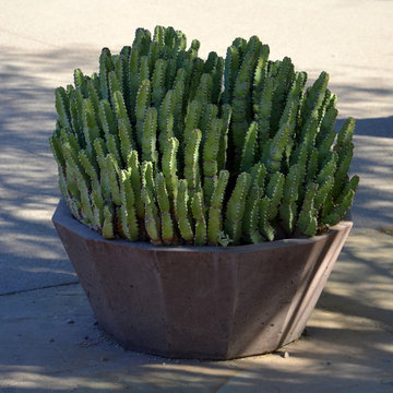 Noelle Johnson Landscape Consulting
Garden travels. A container filled with Moroccan mound (Euphorbia resinifera).
 ARK DESIGN
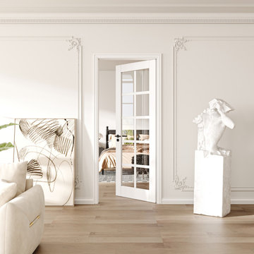
Ark Design door slab also can apply for our pocket door frame.
【Paint Grade-Surface】This product is ready to use and provides a scratch-resistant surface.
【Solid Core】Our solid core door slab provides 70% more sound dampening than a hollow core door.
【Upgraded Glass】 This door is made of 4mm tempered frosted glass, which is safe (SGCC certified) and can protect your privacy. The glass is designed to filter light and brighten your home.
【Widely Applicable】We offer multiple glass and panel door slab options that are suitable for all home decor styles. They can be used in the living room, kitchen, bathroom, dining room, and more. Our stylish designs will blend in perfectly with your home.
【Dedicated Service】We are dedicated to providing you with quality products and services. If you have any questions regarding your purchase, please feel free to contact us and we will do our best to help you solve the problem.
 Design Studio International
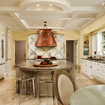
Savena Doychinov, CKD, working closely with the homeowners, designed a floor plan that solved all existing problems – and added so much more. To match the width of the breakfast room and to bring more light in, she added 2’-6’’ deep extension with 11’ of windows, now containing the sink wall. This made all other major improvements possible.
 Inspired Closets Baton Rouge
Many people think about what they want their home to look like from the outside.
But what if you had the chance to design your home from the inside out instead?
You could solve your organizational problems before they start to ensure your new home has form AND function… along with all the pretty stuff that gets all the attention.
An Organized, Forever Oasis
Two-and-a-half years ago, Maureen and her husband, Michael, both in their 70s, embarked on the construction of their forever home, a project not many would take on in their golden years.
Maureen knew it wasn’t going to be easy, but she also knew there were things she wanted.
Top-to-bottom organization in her home’s numerous closets and pantries – and the ease of living that comes along with it – was on the top of the list.
After a recommendation from her trusted Interior Designer, Maureen called us. Rebecca from our team quickly got to work helping Maureen imagine her new, organized forever oasis.
Custom Organization for Unique Lifestyle Needs
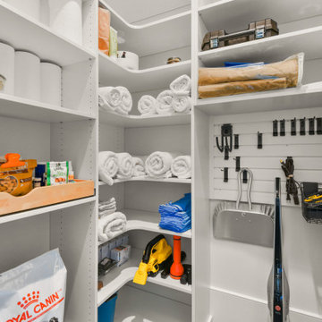
Maureen & Michael’s punch list for the new home buildout included their master closet, guest closets, food pantry, and their ‘dog pantry’ – which serves their 2 beloved furry family members.
Following the initial consultation, Rebecca drew up 3D renderings of each space, mapping out layout, hardware, features, materials & colors to be used.
From high-end shelving to drawer units, spaces for hanging items, cubbies for shoes & small belongings, and storage for dog leashes, pet supplies, cleaning supplies, and more – the goal was to maximize on the square footage of each space.
Turning Stressful into Fun
Along the way, Maureen experienced something surprising – what could have been a very stressful process was actually fun!
Rebecca and the streamlined Inspired Closets consultation combined with our design process was a huge reason why.
The couple completed construction on their new, forever home & moved in 6 months ago.
Maureen was relieved when the big move went off without a hitch and unpacking was a dream.
Everything had a place. She could see everything.
Whether you’re embarking on your new construction, forever home or a renovation for the ages, just imagine how we can help you create your dream closets.
Contact us today to get started: https://www.inspiredclosets.com/locations/baton-rouge/consultation/?sid=2550&ft=appointment
 Edmond Kitchen & Bath LLC
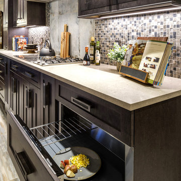
This 1970s ranch style home was in need of a whole revival in the kitchen including a complete new orientation in the space. In order to solve the problem of inadequate passage at the garage door, laundry machines were relocated to another area of the home, and a new "drop zone" for mail and phones was created. A dated soffit was removed and the cooking area was relocated to a longer - focal point wall that allows the cook to be more included while entertaining. An updated rustic and simplified craftsman style was chosen to compliment the other elements of stone and beams in the rest of the home. Of specific note is the installation of both induction and gas cooktops under the same real copper venthood for optional cooking methods. Also note our preferred location for a warming drawer - 2nd position in a nearby drawer stack where it can easily be used. Another great kitchen for a wonderful family. Photos by David Cobb Photography.
 Gemini Design Group LLC
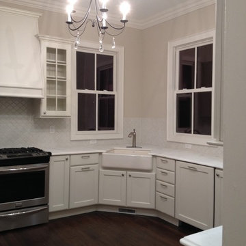
The angled farmsink sink in the corner solved the problem of what to do with the window placement. It created a wonderful flow and more countertop space between the range and the sink.
 JM Kitchen & Bath Design
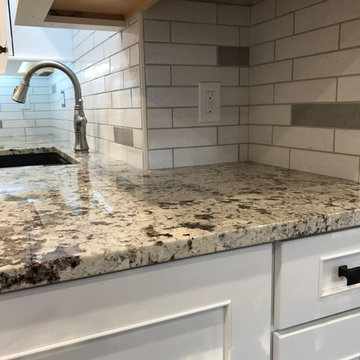
This remodel project started to solve the problem of a kitchen that was too small for the homeowner to have her weekly family dinners in. The kitchen designer Jennifer worked with the owner to balance her vision, her needs, and her budget. Together they made her dream come true. Featuring white shaker doors with bead detail, Tangier Granite, stacking molding, and a Wood Cove Hood, this kitchen has everything it needs to create memories.
The cabinets are Sterling White Shaker Boardwalk Maple, Tangier Granite Countertops, and hand cut Italian white subway tiles with pops of grey.
The hardware and lighting is matte black to contrast with the white and grey tones throughout.
Every detail of this kitchen remodel was thoroughly thought through. From the high stacking crown molding to the interior of the cabinets using rev-a-shelf accessories.
 Feng Shui Agency Ltd
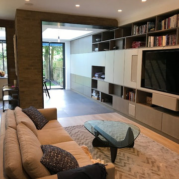
The clever extension design solves the 'cooped in' problem of the original layout. The rounded coffee table and sofa position create good Feng Shui.
Example of a trendy living room design in Other
Example of a trendy living room design in Other
 San Luis Kitchen Co.
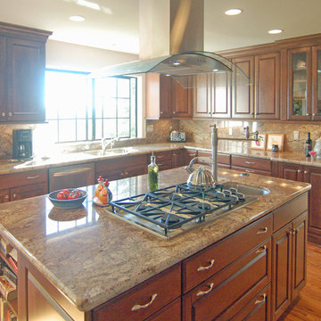
The owners of this kitchen came to us with a conflict between the cook and the clean-up crew -- there just wasn't enough space. We solved the problem by moving the cooktop to the opposite side of the island from the sink and including a bake center to organize the clutter.
Wood-Mode Fine Custom Cabinetry: Brookhaven's Andover
 Alan D. Holt, A.S.L.A., Landscape Architect
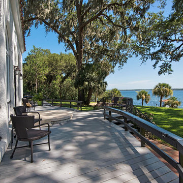
This is a simple addition to the back deck to create an outdoor kitchen and outdoor dining area. A fire pit by the water creates another seating area out in the lawn and gives a perfect place to watch the sun set. The steps and walls improve the access to the boat dock and solve an erosion problem.
Photographed by: Emerald Coast Real Estate Photography
 User
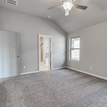
UserConvert your garage into a spacious and luxurious living area, with all the best fittings, furniture & accessories. With a garage to ADU conversion or a new ADU construction in Los Angeles, the problem of living space scarcity is solved to a considerable extent. What do you think?
ADU Contractor in Los Angeles, CA - https://www.leonnedesign.com/
 User
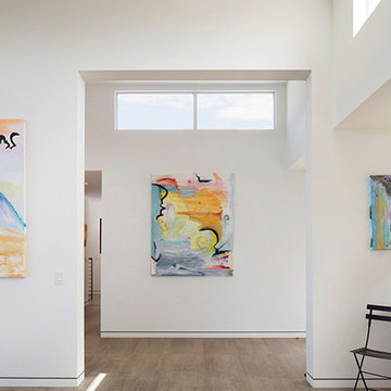
UserThis hillside home in Piedmont, CA was remodeled to change the style from a 1940's rancher with eight foot ceilings and dark interiors, into a modern geometric composition with vast white interiors for casual living and generous daylighting for displaying the artist-owner's works.
In a city known for rigorous and difficult design review, an addition, two variances, and a full stylistic change were unanimously approved on the first round. All sloped roofs and attics were eliminated and replaced by a series of stacked and overlapping flat roofs. This made the house taller on the inside and shorter on the outside, which helped earn design review cooperation in the community. Windows were concentrated toward the rear yard views or moved up high on the side walls for daylight and privacy, benefitting the owners as well as the neighbors.
At the start, the owner husband was so enthusiastic and engaged in transforming his house into something modern that he presented the architect with a scaled foamcore model, rather than the usual magazine clippings and wish list. He participated in the design decisions throughout the process. The owner wife is the artist who did all the artwork in the house. She had been craving a display space with large walls and good natural light. Both of them loved the location and great views.
The project was an opportunity to transform the style of an older traditional home into a modern one, while solving numerous problems. By rebuilding the 1800 ft2 top of the 3-story home it was possible to change the style of the whole building, since the lower floors were a neutral base, and also to change the lifestyle of the owners, who wanted to move their master suite upstairs and live primarily on the top floor as empty nesters.
Going into the project, the architect knew there were multiple encroachments into the setbacks and potential privacy issues with close by neighbors. He approached this as a complex puzzle made up of architectural and political pieces which all had to fit together elegantly. It took many careful moves, small and large, to arrive at a serene and cohesive result that tied old and new together seamlessly.
The design-build contractor worked closely with the owners and handled all of the construction phase documents and design adjustments, adding ideas of their own to make the project really sing.
The project was a collaboration in three acts. The owner had a strong design concept from the start. The architect developed it into a realistic project and garnered the design approvals. Then the contractor executed brilliantly.
 Noelle Johnson Landscape Consulting
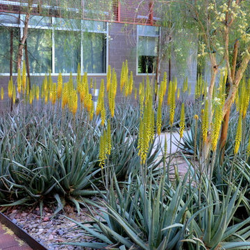
Garden travels. Aloe vera make a colorful spring statement at ASU Polytechnic Campus.
Photo of a landscaping in Other.
Photo of a landscaping in Other.
 House of Shades
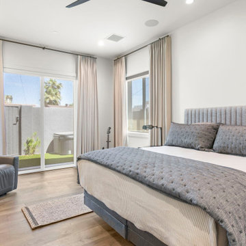
We provided our customer who suffers with sleep problems a solution that features enhanced light control in the bedroom with Motorized Double Roller shades that switch between blackout and sheer options and completed the room darkening effect additionally with adding blackout drapery on a decorative traversing rod allowing for easy operation. The three layers of window treatments also help reduce any outside noise, as well as increasing the energy efficiency of the house which helps reduce the cost of heating and cooling the house .We solved for a tranquil quiet and dark space for good night sleep while adding a touch of warmth and design aesthetic to the space.
44