
Search results for "Sharpening problem solving" in Home Design Ideas
 Best Hot Tubs "Hot Tub and Spa Experts"
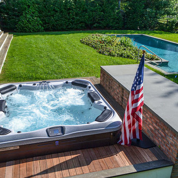
“Bob Barzilay of Proper pH told the clients the hot tub was just too damaged to continue fixing it," says Bill. "It seemed far more economical to get a new hot tub rather than continually fix the old one.”
The clients agreed and Proper pH Pools removed the old hot tub and took out most of the decking around it and reframed it. They also built a raised gravel surround, using railroad ties to create a sand-box-like area that they filled with gravel.
“Proper pH Pools made room for the new spa in same spot as the old hot tub, only it is now lifted above existing grade,” says Bill. “This allows for proper draining and water won’t pool around the new spa like it used to.”
Proper pH Pools also cleverly solved the access problem created in the earlier installation, continues Bill. They put in a removable panel made out of decking which is easy to take out for a service person to get at it.
“With the deck-matching access panel, it is so well done you can’t tell it’s there.”
 Christy Collection International
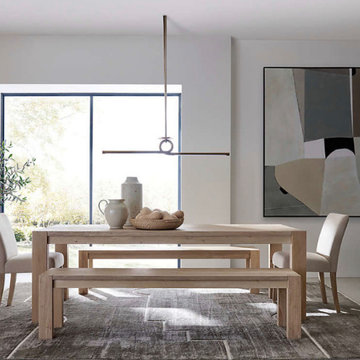
We deliver in 21 days. Our new QUICK Response program responds to the Supply Chain issues plaguing our industry. We set ourselves apart by QUICK SHIP and in STock programs that solve problems and create beautiful spaces for our clients in a hurry. Install within 21 days. ANYWHERE
 Kustom Home Design
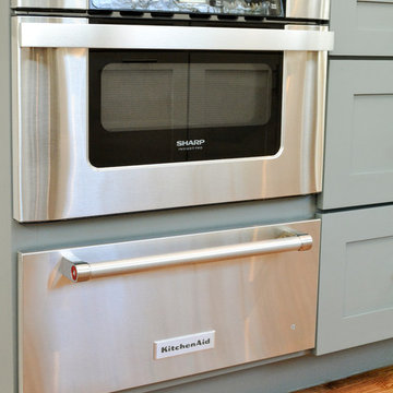
This amazing renovation focused on solving a series of problems that a previous kitchen expansion had created. By rearranging the appliance placement, updating the cabinetry, designing all new storage solutions and maximizing the amazing outdoor views; we cured the spit personality disorder plaguing the existing kitchen. The home now has a beautifully redesigned kitchen and living space perfect for entertaining, relaxing and enjoying the outside views. Vaulted ceilings with bright skylights, reflective glass wall tiles, sleek sophisticated Cambria quartz counter tops, fingerprint-free faucet, multi-functional Prolific kitchen sink by Kohler, stainless steel appliances, creative storage solutions, all new lighting and timeless shaker cabinets by Wellborn lend to the now bright, open, vivacious and flawless function of this newly renovated galley style kitchen. White base cabinets along the outside walls contrast perfectly with the dark grey island cabinets. Linear satin nickel door and drawer pulls coordinate with the stainless steel appliances and sink. An eclectic blend of vintage and modern furnishings, artwork and rugs create a comfortable balance that feels and looks timeless. Breathtaking backyard views are artfully framed by new Pella windows and doors with integral blinds between the glass. Calm, inviting neutral tones provide the perfect backdrop for this refined design.
Photos by: Kimberly Kerl
Find the right local pro for your project
 KURV Architecture DPC (Alex Hughes Architects)
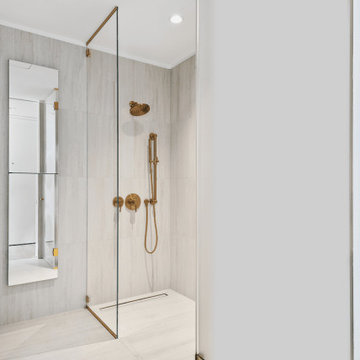
Located in the heart of Manhattan’s Lower East Side, the building was erected on a shallow commercial lot between two 120 year old masonry buildings and a new residential rental building. 330 Grand Street is a mix of 725 SF 1BRs and 1050 SF 2BR apartments. It also contains a 1100 SF two story duplex as well as private and public rooftop space, large private balconies for most units and two large private terraces for the ground floor units.
330 Grand Street was originally designed and approved at the NYC DOB as a prefabricated modular building. During the pandemic, as shipping costs skyrocketed putting the project at risk, we suggested redesigning the building as a reinforced cast-in-place concrete structure. Concrete was readily available and prices had not been affected by the demand increase that many other materials suffered in the pandemic. We took this opportunity to raise floor to ceiling heights, enlarge high performance windows and redistribute the buildings MEPFS and Structural Systems to create very open floor plans.
The challenge was to create a luxurious sensorial living experience with very limited means. In a city with very high construction costs, low cost residential buildings in the area are usually devoid of good quality, design and character. Our approach was to aim high for the end user, prioritizing natural light, open space with long visual perspectives, high ceilings and as always, rejecting the use of predefined building templates.
Our biggest challenge was to ensure that the small spaces feel as clean cut, large and bright as possible. Several unique design decisions were made to ensure low cost and high quality;
Floor plans were laid out so that spaces were wide open and free of clutter from mechanical or structural interruptions. Therefore all infrastructure was placed in lateral demising walls, which in turn act as the unit’s storage and kitchen. The apartments feel wide open, are super quiet and have more storage space than any other comparable apartment in the city.
To solve the problem of the site’s shallow commercial lot which is typically prone to dark interior spaces we focused our attention on the building’s envelope. Instead of the usual small punched window openings, oversized high performance windows were designed to ensure that light penetrated as far as possible into the units. In the smaller 1BR units, the full 50’ depth of the lot is perceived by partitioning spaces with sliding pocket doors that can be retracted to allow deep visual perspectives, making the sight lines in the space feel longer, larger, more ample than normal. In addition to the full height glazing, each unit above the 2nd floor receives a 7 foot covered balcony, adding 120 to 240 sf to each apartment, something unusual in New York City buildings. The space is large enough for a full size dining table, when the weather permits being outside.
We also worked hard to ensure modularity. For example, all kitchen units are all identical throughout the building. The idea of modularity and the economy of the repetitive unit is exercised to the maximum through the building.
Hardware, appliances, flooring, wall coverings and material finishes are all carefully selected to feel bespoke, high quality and unique.
It was important to KURV that the result of this work manifest into something that would deeply connect with the end user and sustain relationships with the consumers of this space.
All images by KURV Architecture ©
 User
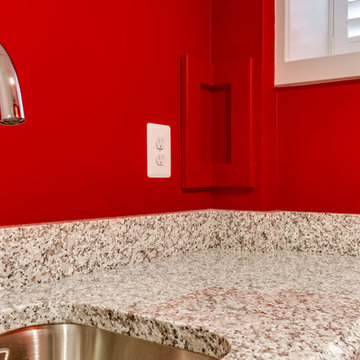
UserThe main waste stack in the corner was unattractive, but had to remain accessible. The access panel with a magnetic latch solves this problem.
Inspiration for a timeless laundry room remodel in DC Metro
Inspiration for a timeless laundry room remodel in DC Metro
 Botanical Concerns LLC
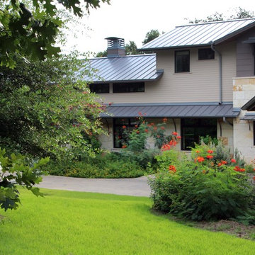
This corner lot was taking on a lot of water from the street, as well as headlights from passing cars. To solve both problems, we created a berm and densely planted it with evergreen screening plants. The berm redirects water around the house, as well as elevating the plant material.
 Black Rock Design | Build
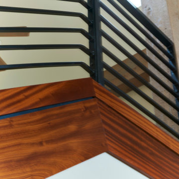
Purchased in a very dated style, these homeowners came to us to solve their remodeling problems! We redesigned the flow of the home to reflect their family's needs and desires. Now they have a masterpiece!
 C&R Remodeling
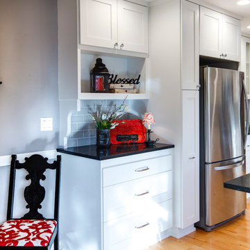
Our Interior Designers tell clients, “Be true to yourself, and you will love the results.” This kitchen remodel reflects that motto. The owners of this Salem area ranch home had a long-standing appreciation of the classic white, black, and red color combination. So when C&R Senior Interior Designer Linda Stewart selected the new color palette, she stayed close to that theme.
A challenge in nearly every older kitchen is the new refrigerator sizes. Remember the day when you could replace your refrigerator and the new one would fit perfectly in the existing space? Not anymore. Now, the super-sized refrigerators wreck havoc on most kitchen spaces. If, by luck, it happens to fit beneath the upper cabinet, it more than likely protrudes out into the room.
This kitchen had that issue. The refrigerator stuck out a good six inches from the cabinet edge, seriously affecting the visual flow. And with that much added depth, reaching the cabinet above was almost impossible.
C&R solved this problem with a custom cabinet and side pantry that extends the full depth of the refrigerator. This accomplished two good things: added architectural interest and a refrigerator proportional to the kitchen as a whole.
Terry Poe Photography
 Kitchen Solvers of Columbus
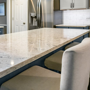
This small kitchen was updated by refacing the cabinets with two tone colors that gave enough contrast to bring the kitchen from an outdated space to a beautiful inviting space. To solve the storage problem, we installed a new pantry. The bead-board backing on the peninsula gave an added interest to the space. The upper cabinets were done in a mist color, while the lower cabinets were done in a midnight color. To finish the new look, we installed an Aria quartz countertop and an igloo ceramic subway tile backsplash. Now this kitchen is ready to be shared with their family and friends.
 Big Brothers Capital Inc
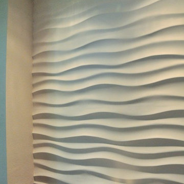
There are handmade contoured plaster panels.
Panels made of plaster. It helps to create a single pattern without seams. Your panels will look like a whole. Soft paneling tiles will give an extraordinary charm and coziness.
Giving it a new look will totally transform your living space. Your house will become an extraordinary beauty for many years! Just paint the panels in a different color and you will have a new room.
Adding a textured wall panel, still in white, can be a way to solve the problem. These panels, with a soft, curvy pattern, can also be painted if colour is more your thing.
 Roeser Home Remodeling
This young couple in Glendale loved their home and their neighborhood, but with three growing children they felt they were running out of space. They began a list of needs which quickly grew after a couple of years. This list helped them to see how they used their current space, but also helped them identify what was lacking.
Their needs list quickly revealed that a two-story addition would be needed to fit all the family’s requirements. With much thought and discussion, a design was created by the Roeser Team in collaboration with Ann Begemann, architect. It was important to the homeowner that the design fit the look of the house. This is always a top priority for Roeser Home Remodeling. We pride ourselves in our finish product appearing as if it had always been there and especially in this remodel, we think we succeeded.
On the list of this family’s needs were to have ample storage space for the three children’s school and sporting equipment. A wider entrance hallway from the garage and the backyard provided a unique place to build custom locker spaces, along with a communication station that will close nice and neat when company is expected. Drawer units also give extra storage and allow for a filing system to keep track of all the paper work that comes home. Extra cabinets above the lockers provide much needed additional storage for out of season belongings. A 12 X 24 S140 tile floor laid in a broken joint pattern provides for easy cleaning of this space and keeps dirty shoes or boots from finding its way into the main living quarters.
The kitchen was at the top of the priority list for this family as well. The existing kitchen was just too small and narrow and did not allow for an eat-in kitchen, or an adequate workspace for the family. Since the homeowner loves to cook, our Roeser Home Remodeling designer came up with a beautiful design plan that allowed for both. The kitchen was moved to the addition, and the existing kitchen was remodeled with a breakfast nook, housing both a custom bench and a table with chairs, along with a pantry and dry bar. This was the perfect plan and now allows the homeowner to have seating and storage for the family and entertaining.
The custom bench was built to match a picture the homeowner had and was custom produced in our own little mill shop. A drawer on both sides of the bench is handy for any extra storage items that the family may need seasonally.
The kitchen quickly became a favorite with the Roeser Home Remodeling Team. With the mix of metals and the many extra features in this space, this kitchen is full of interest as well as function.
The perimeter cabinets are Wellborn Cabinet’s Premier Line, Charleston maple door style with glacier pewter finish. A Kohler Apron Front smart divide sink adds to the design and function of this beautiful kitchen.
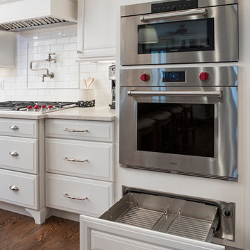
A wall mount pot filler hovers above a Wolfe five-burner stove top. The Wellborn hood unit passes the cabinet depth of the upper cabinets and compliments the Wellborn drawer unit underneath. Deeper drawers housed the 36” Wolf, five-burner professional gas stove top and added more storage. The addition of feet to the bottom of the drawer unit along with pushing back the toe kick gives an added detail and look of a furniture piece.
Flanking each end of the perimeter of cabinets are high end appliances. The 42” built-in French Door Sub-Zero Refrigerator/Freezer is left of the sink and concealed by Wellborn appliance panels. The Bosch 800 Series Dishwasher next in line is also concealed by a Wellborn appliance panel. However, the 30” Professional Wolf Oven and the 30” M Series Wolf Professional Convection Steam Oven sparkle with their stainless-steel finishes complimenting the Kohler Artifacts pull-down kitchen faucet, the Kohler Artifacts Pot Filler and the Top Knobs Hardware (Normandy Appliance Pulls in Polished Nickel, Button Faced Knob in Polish Nickel and the Tuscany Small D- Pull in Pewter Antique). A 30” Kitchen-Aid electric warming drawer is concealed by a Wellborn Drawer front and Top Knob hardware.
The Quartzite counter top in Taj Mahal is always an eye-catching feature for this beautiful kitchen. The large space of the island shows off its remarkable beauty. The island stands on its own with a custom design using Wellborn Cabinets Premier Line, Charleston maple door style in a Pebble Java finish, a darker finish cabinet not only serves as a focal point, but also warms the room against its starker contrast. The island houses a Sharp microwave drawer and its hardware is the same Tuscany small D-Pull as the rest of the kitchen, but in a German Bronze finish to compliment the island’s Hudson Valley Orchard Park light in an Aged Brass Finish.
The original half bath was the only bathroom on this floor of the house and the expense to move it was not an option. The location of the bathroom in the middle of the house was problematic. Roeser Home Remodeling solved the problem by creating an opening between the living room and new family room, along with giving the illusion of a small hallway behind the dry bar in the breakfast room. This created a nice space going into the living room and gave the feeling of an open floor plan, providing and a nice private entry to the existing half bath.
Updating the bath with wallpaper, a new Barclay- Stanford Pedestal Sink, a new Portsmouth wide-spread faucet in polished nickel, a new Devonshire comfort height toilet, new towel ring, paper holder, lighting and mirror made this cute little powder room a jewel in its own right!
The family room was also housed in the addition as a family hang-out place for homework, games and movie watching. Two sets of Sierra Pacific 6’0” X 6’8” aluminum clad wood French Sliding Patio Doors were installed to invite the outdoors in. This allowed for natural lighting and an open spacious feel to the room.
A Custom Entertainment Unit built by Roeser Home Remodeling in our mill shop, is the perfect space to house all the family’s television and gaming needs, keeping them neatly stored, but also close at hand.
Opposite of the French Doors is the original opening to the backyard. By keeping the opening and installing beautiful glass doors, it opened the flow of the house to the formal living room. By adding the glass doors, it provided a cozy area for quiet adult conversation while keeping an eye on the children as they play or watch TV.
 Jarrett Design
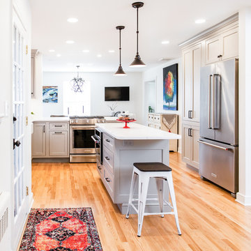
Entertaining friends and family doesn't work well when rooms are small and closed off. So when our clients decided to remodel, they knew they wanted to open up the space to accommodate large gatherings. Also important were ample storage and quality appliances that would hold up to the demands of cooking creative meals several nights a week.
As is sometimes the case with remodeling, solving one problem can create another. Opening up the space involved removing a wall, which sacrificed critical square footage for cabinetry and appliances. We knew the wall needed to come down so we were challenged with making sure every available cabinet space in the kitchen was being utilized as thoughtfully and creatively as possible. A tall pantry was added next to the refrigerator to allow for storage of pots and pans, as well as food, while another pantry in the adjacent dining room housed all dishes and silverware. A small bar area was created in an unused section in the back of the home to store coffee and tea accessories and drinkware. Finally, a small island in the center of the kitchen offered the ideal location for the microwave and most-used pots and pans.
With the expanded space, smart use of storage options and top-notch appliances, our clients are enjoying working in their new kitchen and have already hosted a ravioli-making class!
Matt Villano Photography
 Kustom Home Design
This amazing renovation focused on solving a series of problems that a previous kitchen expansion had created. By rearranging the appliance placement, updating the cabinetry, designing all new storage solutions and maximizing the amazing outdoor views; we cured the spit personality disorder plaguing the existing kitchen. The home now has a beautifully redesigned kitchen and living space perfect for entertaining, relaxing and enjoying the outside views. Vaulted ceilings with bright skylights, reflective glass wall tiles, sleek sophisticated Cambria quartz counter tops, fingerprint-free faucet, multi-functional Prolific kitchen sink by Kohler, stainless steel appliances, creative storage solutions, all new lighting and timeless shaker cabinets by Wellborn lend to the now bright, open, vivacious and flawless function of this newly renovated galley style kitchen. White base cabinets along the outside walls contrast perfectly with the dark grey island cabinets. Linear satin nickel door and drawer pulls coordinate with the stainless steel appliances and sink. An eclectic blend of vintage and modern furnishings, artwork and rugs create a comfortable balance that feels and looks timeless. Breathtaking backyard views are artfully framed by new Pella windows and doors with integral blinds between the glass. Calm, inviting neutral tones provide the perfect backdrop for this refined design.
Photos by: Kimberly Kerl
 San Luis Kitchen Co.
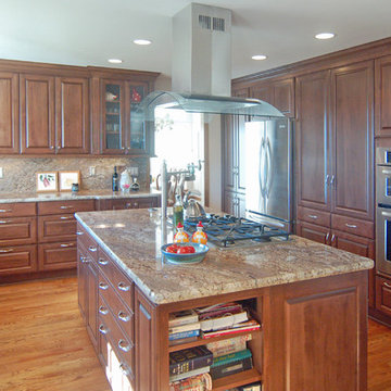
The owners of this kitchen came to us with a conflict between the cook and the clean-up crew -- there just wasn't enough space. We solved the problem by moving the cooktop to the opposite side of the island from the sink and including a bake center to organize the clutter.
Wood-Mode Fine Custom Cabinetry: Brookhaven's Andover
 Lagois Design Build Renovate
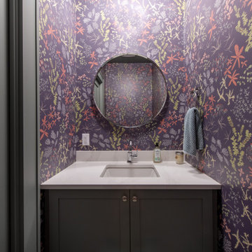
New windows, floors, powder room and basement:
We gave the home new windows, new hardwood floors, and paint throughout. We created a new main floor powder room and a new finished basement containing a living area, three-piece bathroom and new bedroom with egress (tilt and turn) windows.
Flipped around and redesigned kitchen:
We created a new kitchen. The footprint of the kitchen stayed the same, but we flipped it around and redesigned it. Now it has a walk-in pantry area and more floorspace going in and out, which optimized the flow of traffic. We replaced the old non-functioning mudroom with a new one.
Disappearing balcony and drafty door:
To create a new space using a balcony in a bedroom, we extended the second storey out to line up with the first floor, and this increased the square footage. In that room we turned a drafty door into a window.
We reinstated the rear deck, using as many of the original pieces as we could:
There was a leaking roof problem because the original roof pitches were causing ice damming. We designed a new roof to prevent that in the future.
New windows, stucco, and the challenge of asbestos:
Another challenge was installing new windows in the original stucco finish, which contained asbestos. We waterproofed those properly, future proofing them from leaks.
We solved the situation by installing a 5-inch trim around the perimeter of the window. Specialists cut the asbestos back (we had to set up a containment perimeter around each window), and then we placed windows that are five inches wider than the window frames. We used special flashing tapes and sealed them all up behind the stucco.
 Jarrett Design
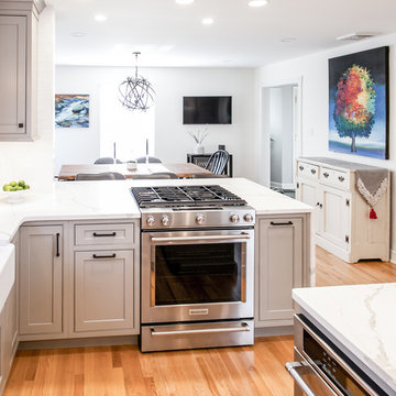
Entertaining friends and family doesn't work well when rooms are small and closed off. So when our clients decided to remodel, they knew they wanted to open up the space to accommodate large gatherings. Also important were ample storage and quality appliances that would hold up to the demands of cooking creative meals several nights a week.
As is sometimes the case with remodeling, solving one problem can create another. Opening up the space involved removing a wall, which sacrificed critical square footage for cabinetry and appliances. We knew the wall needed to come down so we were challenged with making sure every available cabinet space in the kitchen was being utilized as thoughtfully and creatively as possible. A tall pantry was added next to the refrigerator to allow for storage of pots and pans, as well as food, while another pantry in the adjacent dining room housed all dishes and silverware. A small bar area was created in an unused section in the back of the home to store coffee and tea accessories and drinkware. Finally, a small island in the center of the kitchen offered the ideal location for the microwave and most-used pots and pans.
With the expanded space, smart use of storage options and top-notch appliances, our clients are enjoying working in their new kitchen and have already hosted a ravioli-making class!
Matt Villano Photography
 Petrick Architecture
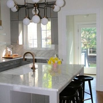
With help from my design-savvy client, I was able to create a stylish yet practical solution to her functional problems in the existing kitchen. The space was dark, cramped, and disorganized. While making dinner, she ran back and forth through a two-way door to communicate with her children in the family room. Backpacks and homework spilled into the kitchen and lights were on regardless of the time of day.
To solve these issues, we opened up the wall between the family room to improve communication and bring in more natural light. A mud room was defined by adding walls near the back door. We raised the ceiling to the original height and the new opening was trimmed to match all existing openings for a seamless design. Making dinner has a whole new outlook with a custom island that faces the family room and the warm southern sunlight. We finished it off embracing current trends with grey cabinets, marble counters with backsplash, brushed brass hardware and open shelving.
 Black Rock Design | Build
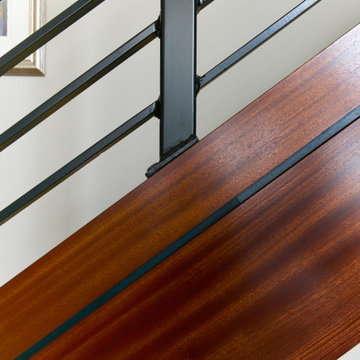
Purchased in a very dated style, these homeowners came to us to solve their remodeling problems! We redesigned the flow of the home to reflect their family's needs and desires. Now they have a masterpiece!
 Arclinea NY
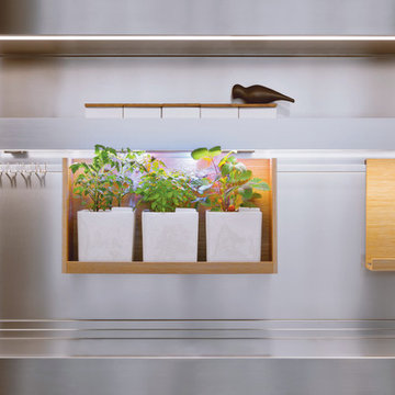
Are you a New Yorker with limited space who'd love to grow your food? Arclinea solved that problem. Check out our LED Greenhouse lights that help grow fresh produce in the heart of your kitchen.
 DAPPLED EARTH– designs to nurture life!
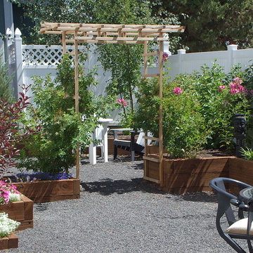
Cottage garden with lots of room for socializing and it solved a drainage problem. Under the gravel is storage and seepage for the surface flows that come to the property from the neighbors and has nowhere to go.
47