
Search results for "Shifted dramatically" in Home Design Ideas
 Advance Design Studio, Ltd.
The major kitchen renovation of this old country farmhouse was a task of love, one that had been planned for many years by these Barrington seasoned homeowners. After interviewing no less than five companies, the homeowners chose the design team at Advance Design Studio to make the transformation they had long planned for.
“They had an understanding of the right design for the space almost from the instant they walked in the room”, says Sharon Scott of the design team of Nicole Ryan at Todd Jurs at Advance Design Studio. “They were the only designers who laid out ideas in the first meeting at the house that we really loved”, she says. “It was obvious that they understood the house, and understood us - and from then on the decision to hire them literally made itself”.
The original kitchen had a dividing “wall” of cabinetry…that made the rather large space seem very small, and cut off the kitchen from the eating area that has a beautiful garden view completely hidden from the main kitchen. Circulation was poor, leaving family members on top of one another when entertaining family and friends.
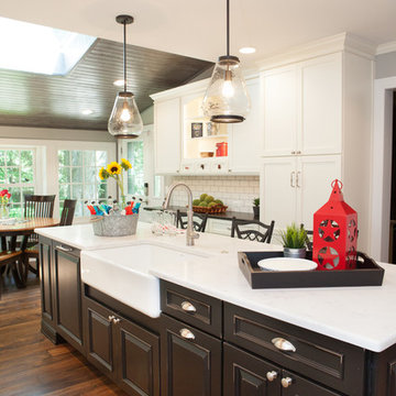
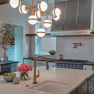
The new kitchen design nearly doubles the kitchen size within the original space; opening it up completely and enjoying an expansive island containing a new Kohler Whitehaven Smart Divide farm sink, a dishwasher, and pull out double trash receptacle. The great new gathering space accommodates four pull out stools beckoning grandchildren and friends alike. Removing the range from the island and relocating it to create a dramatic “feature” wall, completely out of the way of guests; it is now crowned with a beautiful completely customized wood hood designed to ventilate much more efficiently than the original island range containing a limited downdraft system.
The much more efficient use of the space after removing a pantry closet made way for a fully functional “tall wall” housing a double oven and refrigerator, out of the way of guests. Removing the restrictive cabinetry wall now allowed for an expansive floor to ceiling pantry cabinet with full extension pull out shelving, and an elegant display area complete with a beautiful furniture detailed buffet.
Fitting perfectly into the farmhouse charm of the old estate, Medallion Silver Lancaster cabinetry was chosen in a soft white Maple Divinity paint finish lining the perimeter. The stunning island hints to this old home’s past with Medallion Gold’s Maple Devonshire style graced with a Carriage Black Heirloom painted finish. The rubbed off black paint finish reveals the soft wood tones beneath, mimicking furniture you’d see in your grandmother’s home that has lovingly been polished for years to reveal a soft, subtly rubbed-off sheen.
Counter tops reverse contrast with perimeter tops of black “Raven” granite possessing a subtle honed finish, and a shift to Quartz Difinity Viareggio - resembling white Carrera marble on the island. A simple herringbone detail completes the decorative range wall, and subtle porcelain subway tiles grace the backsplash throughout.
The design is finished off with crisp Thermador and Bosch stainless steel appliances, and bright brushed cup pull and handle combination hardware. A pull down Kohler Bellaria faucet makes cleanup a breeze, and soft under-cabinet LED lighting throughout makes every work surface shine softly, and highlights the cabinetry display area with grace.
One special detail was created to make the dramatic ceiling transition to a vaulted area above the breakfast nook extra special. A tongue and groove solid wood ceiling was hung above, and a subtle greenish-grey distressed paint finish was hand developed on site by the talented crew, complementing the new kitchen with a completely unique surface that appears as if it’s been there for many, many years. It’s just one standout feature in the amazing new space that is sure to be in every conversation as newcomers enjoy the newest best hangout in this old home renewed!
After 30 years of renovating homes, this now content homeowner sips a cup of tea enjoying her new garden view, and reminisces projects of past – and lastly reports their experience with Advance Design Studio culminating with their amazing new kitchen to be the most enjoyable and satisfying home experience yet.
Designer: Nicole Ryan
Photographer: Joe Nowak
 K. Dakin Design Inc.
A small courtyard garden in San Francisco.
• Creative use of space in the dense, urban fabric of hilly SF.
• For the last several years the clients had carved out a make shift courtyard garden at the top of their driveway. It was one of the few flat spaces in their yard where they could sit in the sun and enjoy a cup of coffee. We turned the top of a steep driveway into a courtyard garden.
• The actual courtyard design was planned for the maximum dimensions possible to host a dining table and a seating area. The space is conveniently located outside their kitchen and home offices. However we needed to save driveway space for parking the cars and getting in and out.
• The design, fabrication and installation team was comprised of people we knew. I was an acquaintance to the clients having met them through good friends. The landscape contractor, Boaz Mor, http://www.boazmor.com/, is their neighbor and someone I worked with before. The metal fabricator is Murray Sandford of Moz Designs, https://mozdesigns.com/, https://www.instagram.com/moz_designs/ . Both contractors have long histories of working in the Bay Area on a variety of complex designs.
• The size of this garden belies the complexity of the design. We did not want to remove any of the concrete driveway which was 12” or more in thickness, except for the area where the large planter was going. The driveway sloped in two directions. In order to get a “level”, properly, draining patio, we had to start it at around 21” tall at the outside and end it flush by the garage doors.
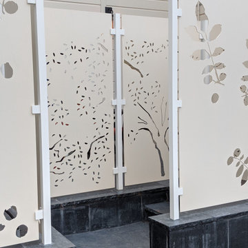
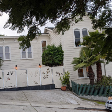
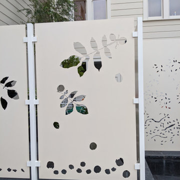
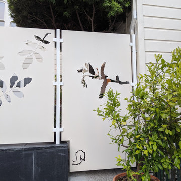
• The fence is the artful element in the garden. It is made of power-coated aluminum. The panels match the house color; and posts match the house trim. The effect is quiet, blending into the overall property. The panels are dramatic. Each fence panel is a different size with a unique pattern.
• The exterior panels that you see from the street are an abstract riff on the seasons of the Persian walnut tree in their front yard. The cut-outs illustrate spring bloom when the walnut leafs out to autumn when the nuts drop to the ground and the squirrels eats them, leaving a mess of shells everywhere. Even the pesky squirrel appears on one of the panels.
• The interior panels, lining the entry into the courtyard, are an abstraction of the entire walnut tree.
• Although the panel design is made of perforations, the openings are designed to retain privacy when you are inside the courtyard.
• There is a large planter on one side of the courtyard, big enough for a tree to soften a harsh expanse of a neighboring wall. Light through the branches cast playful shadows on the wall behind.
• The lighting, mounted on the house is a nod to the client’s love of New Orleans gas lights.
• The paving is black stone from India, dark enough to absorb the warmth of the sun on a cool, summer San Francisco day.
 K. Dakin Design Inc.
A small courtyard garden in San Francisco.
• Creative use of space in the dense, urban fabric of hilly SF.
• For the last several years the clients had carved out a make shift courtyard garden at the top of their driveway. It was one of the few flat spaces in their yard where they could sit in the sun and enjoy a cup of coffee. We turned the top of a steep driveway into a courtyard garden.
• The actual courtyard design was planned for the maximum dimensions possible to host a dining table and a seating area. The space is conveniently located outside their kitchen and home offices. However we needed to save driveway space for parking the cars and getting in and out.
• The design, fabrication and installation team was comprised of people we knew. I was an acquaintance to the clients having met them through good friends. The landscape contractor, Boaz Mor, http://www.boazmor.com/, is their neighbor and someone I worked with before. The metal fabricator is Murray Sandford of Moz Designs, https://mozdesigns.com/, https://www.instagram.com/moz_designs/ . Both contractors have long histories of working in the Bay Area on a variety of complex designs.
• The size of this garden belies the complexity of the design. We did not want to remove any of the concrete driveway which was 12” or more in thickness, except for the area where the large planter was going. The driveway sloped in two directions. In order to get a “level”, properly, draining patio, we had to start it at around 21” tall at the outside and end it flush by the garage doors.
• The fence is the artful element in the garden. It is made of power-coated aluminum. The panels match the house color; and posts match the house trim. The effect is quiet, blending into the overall property. The panels are dramatic. Each fence panel is a different size with a unique pattern.
• The exterior panels that you see from the street are an abstract riff on the seasons of the Persian walnut tree in their front yard. The cut-outs illustrate spring bloom when the walnut leafs out to autumn when the nuts drop to the ground and the squirrels eats them, leaving a mess of shells everywhere. Even the pesky squirrel appears on one of the panels.
• The interior panels, lining the entry into the courtyard, are an abstraction of the entire walnut tree.
• Although the panel design is made of perforations, the openings are designed to retain privacy when you are inside the courtyard.
• There is a large planter on one side of the courtyard, big enough for a tree to soften a harsh expanse of a neighboring wall. Light through the branches cast playful shadows on the wall behind.
• The lighting, mounted on the house is a nod to the client’s love of New Orleans gas lights.
• The paving is black stone from India, dark enough to absorb the warmth of the sun on a cool, summer San Francisco day.
Find the right local pro for your project
 K. Dakin Design Inc.
A small courtyard garden in San Francisco.
• Creative use of space in the dense, urban fabric of hilly SF.
• For the last several years the clients had carved out a make shift courtyard garden at the top of their driveway. It was one of the few flat spaces in their yard where they could sit in the sun and enjoy a cup of coffee. We turned the top of a steep driveway into a courtyard garden.
• The actual courtyard design was planned for the maximum dimensions possible to host a dining table and a seating area. The space is conveniently located outside their kitchen and home offices. However we needed to save driveway space for parking the cars and getting in and out.
• The design, fabrication and installation team was comprised of people we knew. I was an acquaintance to the clients having met them through good friends. The landscape contractor, Boaz Mor, http://www.boazmor.com/, is their neighbor and someone I worked with before. The metal fabricator is Murray Sandford of Moz Designs, https://mozdesigns.com/, https://www.instagram.com/moz_designs/ . Both contractors have long histories of working in the Bay Area on a variety of complex designs.
• The size of this garden belies the complexity of the design. We did not want to remove any of the concrete driveway which was 12” or more in thickness, except for the area where the large planter was going. The driveway sloped in two directions. In order to get a “level”, properly, draining patio, we had to start it at around 21” tall at the outside and end it flush by the garage doors.
• The fence is the artful element in the garden. It is made of power-coated aluminum. The panels match the house color; and posts match the house trim. The effect is quiet, blending into the overall property. The panels are dramatic. Each fence panel is a different size with a unique pattern.
• The exterior panels that you see from the street are an abstract riff on the seasons of the Persian walnut tree in their front yard. The cut-outs illustrate spring bloom when the walnut leafs out to autumn when the nuts drop to the ground and the squirrels eats them, leaving a mess of shells everywhere. Even the pesky squirrel appears on one of the panels.
• The interior panels, lining the entry into the courtyard, are an abstraction of the entire walnut tree.
• Although the panel design is made of perforations, the openings are designed to retain privacy when you are inside the courtyard.
• There is a large planter on one side of the courtyard, big enough for a tree to soften a harsh expanse of a neighboring wall. Light through the branches cast playful shadows on the wall behind.
• The lighting, mounted on the house is a nod to the client’s love of New Orleans gas lights.
• The paving is black stone from India, dark enough to absorb the warmth of the sun on a cool, summer San Francisco day.
 K. Dakin Design Inc.
A small courtyard garden in San Francisco.
• Creative use of space in the dense, urban fabric of hilly SF.
• For the last several years the clients had carved out a make shift courtyard garden at the top of their driveway. It was one of the few flat spaces in their yard where they could sit in the sun and enjoy a cup of coffee. We turned the top of a steep driveway into a courtyard garden.
• The actual courtyard design was planned for the maximum dimensions possible to host a dining table and a seating area. The space is conveniently located outside their kitchen and home offices. However we needed to save driveway space for parking the cars and getting in and out.
• The design, fabrication and installation team was comprised of people we knew. I was an acquaintance to the clients having met them through good friends. The landscape contractor, Boaz Mor, http://www.boazmor.com/, is their neighbor and someone I worked with before. The metal fabricator is Murray Sandford of Moz Designs, https://mozdesigns.com/, https://www.instagram.com/moz_designs/ . Both contractors have long histories of working in the Bay Area on a variety of complex designs.
• The size of this garden belies the complexity of the design. We did not want to remove any of the concrete driveway which was 12” or more in thickness, except for the area where the large planter was going. The driveway sloped in two directions. In order to get a “level”, properly, draining patio, we had to start it at around 21” tall at the outside and end it flush by the garage doors.
• The fence is the artful element in the garden. It is made of power-coated aluminum. The panels match the house color; and posts match the house trim. The effect is quiet, blending into the overall property. The panels are dramatic. Each fence panel is a different size with a unique pattern.
• The exterior panels that you see from the street are an abstract riff on the seasons of the Persian walnut tree in their front yard. The cut-outs illustrate spring bloom when the walnut leafs out to autumn when the nuts drop to the ground and the squirrels eats them, leaving a mess of shells everywhere. Even the pesky squirrel appears on one of the panels.
• The interior panels, lining the entry into the courtyard, are an abstraction of the entire walnut tree.
• Although the panel design is made of perforations, the openings are designed to retain privacy when you are inside the courtyard.
• There is a large planter on one side of the courtyard, big enough for a tree to soften a harsh expanse of a neighboring wall. Light through the branches cast playful shadows on the wall behind.
• The lighting, mounted on the house is a nod to the client’s love of New Orleans gas lights.
• The paving is black stone from India, dark enough to absorb the warmth of the sun on a cool, summer San Francisco day.
 Drury Design
Design Objectives:
Respect the home’s vintage feel while bringing the kitchen up to date
Open up the kitchen area to create an open space for gathering and entertaining
Upgrade appliances to top-of-the-line models
Include a large island with seating
Include seating for casual family meals in a space that won’t be a replacement for the adjacent formal dining room
THE REMODEL
Design Challenges:
Remove a load-bearing wall and combine smaller rooms to create one big kitchen
A powder room in the back corner of the existing kitchen was a huge obstacle to updating the layout
Maintain large windows with views of the yard while still providing ample storage
Design Solutions:
Relocating the powder room to another part of the first floor (a large closet under the stairs) opened up the space dramatically
Create space for a larger island by recessing the fridge/freezer and shifting the pantry to a space adjacent to the kitchen
A banquette saves space and offers a perfect solution for casual dining
The walnut banquette table beautifully complements the fridge/freezer armoire
Utilize a gap created by the new fridge location to create a tall shallow cabinet for liquor storage w/ a wine cubby
Closing off one doorway into the dining room and using the “between the studs” space for a tall storage cabinet
Dish organizing drawers offer handy storage for plates, bowls, and serving dishes right by main sink and dishwasher
Cabinetry backing up to the dining room offers ample storage for glassware and functions both as a coffee station and cocktail bar
Open shelves flanking the hood add storage without blocking views and daylight
A beam was required where the wall was removed. Additional beams added architectural interest and helped integrate the beams into the space
Statement lighting adds drama and personality to the space
THE RENEWED SPACE
This project exemplifies the transformative power of good design. Simply put, good design allows you to live life artfully. The newly remodeled kitchen effortlessly combines functionality and aesthetic appeal, providing a delightful space for cooking and spending quality time together. It’s comfy for regular meals but ultimately outfitted for those special gatherings. Infused with classic finishes and a timeless charm, the kitchen emanates an enduring atmosphere that will never go out of style.



 Drury Design
Design Objectives:
Respect the home’s vintage feel while bringing the kitchen up to date
Open up the kitchen area to create an open space for gathering and entertaining
Upgrade appliances to top-of-the-line models
Include a large island with seating
Include seating for casual family meals in a space that won’t be a replacement for the adjacent formal dining room
THE REMODEL
Design Challenges:
Remove a load-bearing wall and combine smaller rooms to create one big kitchen
A powder room in the back corner of the existing kitchen was a huge obstacle to updating the layout
Maintain large windows with views of the yard while still providing ample storage
Design Solutions:
Relocating the powder room to another part of the first floor (a large closet under the stairs) opened up the space dramatically
Create space for a larger island by recessing the fridge/freezer and shifting the pantry to a space adjacent to the kitchen
A banquette saves space and offers a perfect solution for casual dining
The walnut banquette table beautifully complements the fridge/freezer armoire
Utilize a gap created by the new fridge location to create a tall shallow cabinet for liquor storage w/ a wine cubby
Closing off one doorway into the dining room and using the “between the studs” space for a tall storage cabinet
Dish organizing drawers offer handy storage for plates, bowls, and serving dishes right by main sink and dishwasher
Cabinetry backing up to the dining room offers ample storage for glassware and functions both as a coffee station and cocktail bar
Open shelves flanking the hood add storage without blocking views and daylight
A beam was required where the wall was removed. Additional beams added architectural interest and helped integrate the beams into the space
Statement lighting adds drama and personality to the space
THE RENEWED SPACE
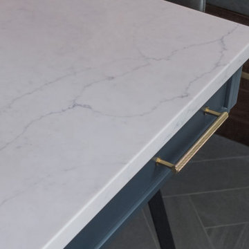
This project exemplifies the transformative power of good design. Simply put, good design allows you to live life artfully. The newly remodeled kitchen effortlessly combines functionality and aesthetic appeal, providing a delightful space for cooking and spending quality time together. It’s comfy for regular meals but ultimately outfitted for those special gatherings. Infused with classic finishes and a timeless charm, the kitchen emanates an enduring atmosphere that will never go out of style. This photo hones in on the lap drawers on seating side of island.
 K. Dakin Design Inc.
A small courtyard garden in San Francisco.
• Creative use of space in the dense, urban fabric of hilly SF.
• For the last several years the clients had carved out a make shift courtyard garden at the top of their driveway. It was one of the few flat spaces in their yard where they could sit in the sun and enjoy a cup of coffee. We turned the top of a steep driveway into a courtyard garden.
• The actual courtyard design was planned for the maximum dimensions possible to host a dining table and a seating area. The space is conveniently located outside their kitchen and home offices. However we needed to save driveway space for parking the cars and getting in and out.
• The design, fabrication and installation team was comprised of people we knew. I was an acquaintance to the clients having met them through good friends. The landscape contractor, Boaz Mor, http://www.boazmor.com/, is their neighbor and someone I worked with before. The metal fabricator is Murray Sandford of Moz Designs, https://mozdesigns.com/, https://www.instagram.com/moz_designs/ . Both contractors have long histories of working in the Bay Area on a variety of complex designs.
• The size of this garden belies the complexity of the design. We did not want to remove any of the concrete driveway which was 12” or more in thickness, except for the area where the large planter was going. The driveway sloped in two directions. In order to get a “level”, properly, draining patio, we had to start it at around 21” tall at the outside and end it flush by the garage doors.
• The fence is the artful element in the garden. It is made of power-coated aluminum. The panels match the house color; and posts match the house trim. The effect is quiet, blending into the overall property. The panels are dramatic. Each fence panel is a different size with a unique pattern.
• The exterior panels that you see from the street are an abstract riff on the seasons of the Persian walnut tree in their front yard. The cut-outs illustrate spring bloom when the walnut leafs out to autumn when the nuts drop to the ground and the squirrels eats them, leaving a mess of shells everywhere. Even the pesky squirrel appears on one of the panels.
• The interior panels, lining the entry into the courtyard, are an abstraction of the entire walnut tree.
• Although the panel design is made of perforations, the openings are designed to retain privacy when you are inside the courtyard.
• There is a large planter on one side of the courtyard, big enough for a tree to soften a harsh expanse of a neighboring wall. Light through the branches cast playful shadows on the wall behind.
• The lighting, mounted on the house is a nod to the client’s love of New Orleans gas lights.
• The paving is black stone from India, dark enough to absorb the warmth of the sun on a cool, summer San Francisco day.
 SM Design
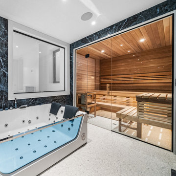
This St. Amdrews wellness suite extends the home's language of tailored luxury into a more immersive, resort-inspired environment. Conceived as a private wellness retreat, the space brings together water, heat, natural timber, stone, and glass to create an experience that feels both highly residential and distinctly elevated.
The sauna is the architectural centerpiece. Enclosed almost entirely in clear glass, it becomes a visual feature rather than a concealed amenity. The transparency preserves the sense of openness within the room while allowing the warmth and texture of the timber interior to become part of the overall composition. Rich natural wood lines the walls, ceiling, benches, and backrests, creating a continuous envelope that immediately shifts the atmosphere from contemporary bathroom to intimate spa.
The detailing within the sauna is intentionally precise. Horizontal timber battens establish a strong linear rhythm, while integrated illumination beneath and between the bench elements creates a soft architectural glow. The layered woodwork gives the sauna depth and dimension, demonstrating how functional wellness spaces can be treated with the same level of craftsmanship as the home's principal living areas.
A dramatic dark stone surround frames the sauna enclosure and introduces a strong counterpoint to the warmth of the timber. Its expressive veining adds movement and visual weight, while the black-framed glazing creates a crisp transition between the darker architectural surround and the lighter adjacent surfaces.
The hydrotherapy tub introduces a second wellness experience and provides a sculptural contrast to the linear sauna. Its generous proportions and clean white form keep the foreground visually calm, while the dark upholstery and surrounding stone reinforce the broader material palette of the home.
The flooring is selected to complement the spa environment, offering a tactile, natural surface that contrasts with the polished glass and stone. Together, the materials create a carefully balanced sensory palette, warm wood, cool stone, transparent glass, and soft water, designed to make the room feel restorative rather than purely functional.
The overall concept is residential wellness elevated to architectural design. Every element is coordinated to create continuity between material, light, texture, and function. The result is a sophisticated private spa that feels integrated into the architecture of the York Mills residence, offering an experience closer to a boutique wellness retreat than a conventional home amenity.
 Advance Design Studio, Ltd.
The major kitchen renovation of this old country farmhouse was a task of love, one that had been planned for many years by these Barrington seasoned homeowners. After interviewing no less than five companies, the homeowners chose the design team at Advance Design Studio to make the transformation they had long planned for.
“They had an understanding of the right design for the space almost from the instant they walked in the room”, says Sharon Scott of the design team of Nicole Ryan at Todd Jurs at Advance Design Studio. “They were the only designers who laid out ideas in the first meeting at the house that we really loved”, she says. “It was obvious that they understood the house, and understood us - and from then on the decision to hire them literally made itself”.
The original kitchen had a dividing “wall” of cabinetry…that made the rather large space seem very small, and cut off the kitchen from the eating area that has a beautiful garden view completely hidden from the main kitchen. Circulation was poor, leaving family members on top of one another when entertaining family and friends.
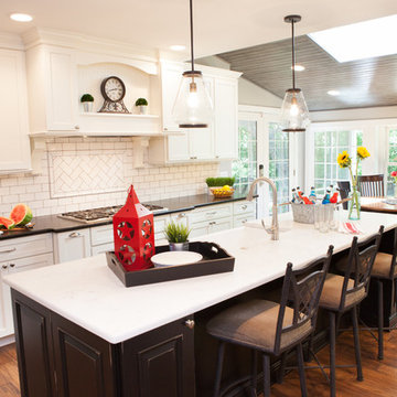
The new kitchen design nearly doubles the kitchen size within the original space; opening it up completely and enjoying an expansive island containing a new Kohler Whitehaven Smart Divide farm sink, a dishwasher, and pull out double trash receptacle. The great new gathering space accommodates four pull out stools beckoning grandchildren and friends alike. Removing the range from the island and relocating it to create a dramatic “feature” wall, completely out of the way of guests; it is now crowned with a beautiful completely customized wood hood designed to ventilate much more efficiently than the original island range containing a limited downdraft system.
The much more efficient use of the space after removing a pantry closet made way for a fully functional “tall wall” housing a double oven and refrigerator, out of the way of guests. Removing the restrictive cabinetry wall now allowed for an expansive floor to ceiling pantry cabinet with full extension pull out shelving, and an elegant display area complete with a beautiful furniture detailed buffet.
Fitting perfectly into the farmhouse charm of the old estate, Medallion Silver Lancaster cabinetry was chosen in a soft white Maple Divinity paint finish lining the perimeter. The stunning island hints to this old home’s past with Medallion Gold’s Maple Devonshire style graced with a Carriage Black Heirloom painted finish. The rubbed off black paint finish reveals the soft wood tones beneath, mimicking furniture you’d see in your grandmother’s home that has lovingly been polished for years to reveal a soft, subtly rubbed-off sheen.
Counter tops reverse contrast with perimeter tops of black “Raven” granite possessing a subtle honed finish, and a shift to Quartz Difinity Viareggio - resembling white Carrera marble on the island. A simple herringbone detail completes the decorative range wall, and subtle porcelain subway tiles grace the backsplash throughout.
The design is finished off with crisp Thermador and Bosch stainless steel appliances, and bright brushed cup pull and handle combination hardware. A pull down Kohler Bellaria faucet makes cleanup a breeze, and soft under-cabinet LED lighting throughout makes every work surface shine softly, and highlights the cabinetry display area with grace.
One special detail was created to make the dramatic ceiling transition to a vaulted area above the breakfast nook extra special. A tongue and groove solid wood ceiling was hung above, and a subtle greenish-grey distressed paint finish was hand developed on site by the talented crew, complementing the new kitchen with a completely unique surface that appears as if it’s been there for many, many years. It’s just one standout feature in the amazing new space that is sure to be in every conversation as newcomers enjoy the newest best hangout in this old home renewed!
After 30 years of renovating homes, this now content homeowner sips a cup of tea enjoying her new garden view, and reminisces projects of past – and lastly reports their experience with Advance Design Studio culminating with their amazing new kitchen to be the most enjoyable and satisfying home experience yet.
Designer: Nicole Ryan
Photographer: Joe Nowak
 Advance Design Studio, Ltd.
The major kitchen renovation of this old country farmhouse was a task of love, one that had been planned for many years by these Barrington seasoned homeowners. After interviewing no less than five companies, the homeowners chose the design team at Advance Design Studio to make the transformation they had long planned for.
“They had an understanding of the right design for the space almost from the instant they walked in the room”, says Sharon Scott of the design team of Nicole Ryan at Todd Jurs at Advance Design Studio. “They were the only designers who laid out ideas in the first meeting at the house that we really loved”, she says. “It was obvious that they understood the house, and understood us - and from then on the decision to hire them literally made itself”.
The original kitchen had a dividing “wall” of cabinetry…that made the rather large space seem very small, and cut off the kitchen from the eating area that has a beautiful garden view completely hidden from the main kitchen. Circulation was poor, leaving family members on top of one another when entertaining family and friends.
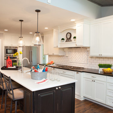
The new kitchen design nearly doubles the kitchen size within the original space; opening it up completely and enjoying an expansive island containing a new Kohler Whitehaven Smart Divide farm sink, a dishwasher, and pull out double trash receptacle. The great new gathering space accommodates four pull out stools beckoning grandchildren and friends alike. Removing the range from the island and relocating it to create a dramatic “feature” wall, completely out of the way of guests; it is now crowned with a beautiful completely customized wood hood designed to ventilate much more efficiently than the original island range containing a limited downdraft system.
The much more efficient use of the space after removing a pantry closet made way for a fully functional “tall wall” housing a double oven and refrigerator, out of the way of guests. Removing the restrictive cabinetry wall now allowed for an expansive floor to ceiling pantry cabinet with full extension pull out shelving, and an elegant display area complete with a beautiful furniture detailed buffet.
Fitting perfectly into the farmhouse charm of the old estate, Medallion Silver Lancaster cabinetry was chosen in a soft white Maple Divinity paint finish lining the perimeter. The stunning island hints to this old home’s past with Medallion Gold’s Maple Devonshire style graced with a Carriage Black Heirloom painted finish. The rubbed off black paint finish reveals the soft wood tones beneath, mimicking furniture you’d see in your grandmother’s home that has lovingly been polished for years to reveal a soft, subtly rubbed-off sheen.
Counter tops reverse contrast with perimeter tops of black “Raven” granite possessing a subtle honed finish, and a shift to Quartz Difinity Viareggio - resembling white Carrera marble on the island. A simple herringbone detail completes the decorative range wall, and subtle porcelain subway tiles grace the backsplash throughout.
The design is finished off with crisp Thermador and Bosch stainless steel appliances, and bright brushed cup pull and handle combination hardware. A pull down Kohler Bellaria faucet makes cleanup a breeze, and soft under-cabinet LED lighting throughout makes every work surface shine softly, and highlights the cabinetry display area with grace.
One special detail was created to make the dramatic ceiling transition to a vaulted area above the breakfast nook extra special. A tongue and groove solid wood ceiling was hung above, and a subtle greenish-grey distressed paint finish was hand developed on site by the talented crew, complementing the new kitchen with a completely unique surface that appears as if it’s been there for many, many years. It’s just one standout feature in the amazing new space that is sure to be in every conversation as newcomers enjoy the newest best hangout in this old home renewed!
After 30 years of renovating homes, this now content homeowner sips a cup of tea enjoying her new garden view, and reminisces projects of past – and lastly reports their experience with Advance Design Studio culminating with their amazing new kitchen to be the most enjoyable and satisfying home experience yet.
Designer: Nicole Ryan
Photographer: Joe Nowak
 Advance Design Studio, Ltd.
The major kitchen renovation of this old country farmhouse was a task of love, one that had been planned for many years by these Barrington seasoned homeowners. After interviewing no less than five companies, the homeowners chose the design team at Advance Design Studio to make the transformation they had long planned for.
“They had an understanding of the right design for the space almost from the instant they walked in the room”, says Sharon Scott of the design team of Nicole Ryan at Todd Jurs at Advance Design Studio. “They were the only designers who laid out ideas in the first meeting at the house that we really loved”, she says. “It was obvious that they understood the house, and understood us - and from then on the decision to hire them literally made itself”.
The original kitchen had a dividing “wall” of cabinetry…that made the rather large space seem very small, and cut off the kitchen from the eating area that has a beautiful garden view completely hidden from the main kitchen. Circulation was poor, leaving family members on top of one another when entertaining family and friends.
The new kitchen design nearly doubles the kitchen size within the original space; opening it up completely and enjoying an expansive island containing a new Kohler Whitehaven Smart Divide farm sink, a dishwasher, and pull out double trash receptacle. The great new gathering space accommodates four pull out stools beckoning grandchildren and friends alike. Removing the range from the island and relocating it to create a dramatic “feature” wall, completely out of the way of guests; it is now crowned with a beautiful completely customized wood hood designed to ventilate much more efficiently than the original island range containing a limited downdraft system.
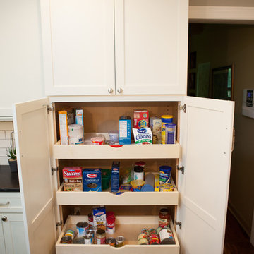
The much more efficient use of the space after removing a pantry closet made way for a fully functional “tall wall” housing a double oven and refrigerator, out of the way of guests. Removing the restrictive cabinetry wall now allowed for an expansive floor to ceiling pantry cabinet with full extension pull out shelving, and an elegant display area complete with a beautiful furniture detailed buffet.
Fitting perfectly into the farmhouse charm of the old estate, Medallion Silver Lancaster cabinetry was chosen in a soft white Maple Divinity paint finish lining the perimeter. The stunning island hints to this old home’s past with Medallion Gold’s Maple Devonshire style graced with a Carriage Black Heirloom painted finish. The rubbed off black paint finish reveals the soft wood tones beneath, mimicking furniture you’d see in your grandmother’s home that has lovingly been polished for years to reveal a soft, subtly rubbed-off sheen.
Counter tops reverse contrast with perimeter tops of black “Raven” granite possessing a subtle honed finish, and a shift to Quartz Difinity Viareggio - resembling white Carrera marble on the island. A simple herringbone detail completes the decorative range wall, and subtle porcelain subway tiles grace the backsplash throughout.
The design is finished off with crisp Thermador and Bosch stainless steel appliances, and bright brushed cup pull and handle combination hardware. A pull down Kohler Bellaria faucet makes cleanup a breeze, and soft under-cabinet LED lighting throughout makes every work surface shine softly, and highlights the cabinetry display area with grace.
One special detail was created to make the dramatic ceiling transition to a vaulted area above the breakfast nook extra special. A tongue and groove solid wood ceiling was hung above, and a subtle greenish-grey distressed paint finish was hand developed on site by the talented crew, complementing the new kitchen with a completely unique surface that appears as if it’s been there for many, many years. It’s just one standout feature in the amazing new space that is sure to be in every conversation as newcomers enjoy the newest best hangout in this old home renewed!
After 30 years of renovating homes, this now content homeowner sips a cup of tea enjoying her new garden view, and reminisces projects of past – and lastly reports their experience with Advance Design Studio culminating with their amazing new kitchen to be the most enjoyable and satisfying home experience yet.
Designer: Nicole Ryan
Photographer: Joe Nowak
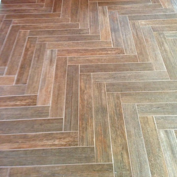
 Lodi Tile Works, Inc
Wood-look tile floor using porcelain plank tiles in a herringbone pattern.
Living room - traditional porcelain tile living room idea in Sacramento
Living room - traditional porcelain tile living room idea in Sacramento
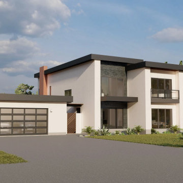
 RWH Architect PLLC
RWH Architect presents the Whistle Hill Lot 8 Residence, a statement home that reflects a bold shift toward modern, refined design. This contemporary residence is defined by its clean lines, dramatic vertical expressions, and a sophisticated mix of architectural forms that culminate in a truly forward-thinking home. From the moment visitors step into the central courtyard that connects the detached garage to the main house, the project introduces a new level of architectural intention rarely seen in the region.
The detached garage, featuring an expansive 18' x 8' door, creates a strong street presence and anchors the courtyard entry sequence. Passing through the courtyard leads to a welcoming entry foyer designed with built-in hooks and a bench, creating a comfortable—and functional—moment of arrival. Just beyond the entry is a private study with custom built-in bookshelves, a space tailored for work, reading, or quiet focus. The main floor unfolds into a sophisticated open-concept layout where the kitchen, great room, and dining areas flow effortlessly together. The kitchen includes a walk-in pantry, a pot filler for convenience, and a dedicated dog-feeding station that integrates seamlessly into the cabinetry. The great room stands as the heart of the home, featuring a built-in wood-burning fireplace and oversized sliding doors that extend the living space out to a covered patio. A centrally located half bath near the kitchen completes the first-floor program.
All bedrooms are located on the second floor to preserve privacy and capitalize on natural light. The master suite is designed as a luxurious retreat, offering a screened-in porch, a spacious walk-in closet, and a unique bathroom where the walk-in shower wraps around a freestanding tub, creating a spa-like environment that blends innovation with comfort. The laundry room is conveniently positioned on the same floor. Two additional bedrooms share a well-appointed bathroom, completing the second-floor layout.
Several design challenges shaped the evolution of this project and ultimately elevated its architectural clarity. One of the primary challenges was organizing the home around a detached garage while maintaining a cohesive architectural experience. RWH resolved this by creating a courtyard that acts as a transitional outdoor room, visually linking the structures and providing a dramatic yet functional entry sequence. Another challenge involved balancing large modern window systems with the bold vertical elements that define the façade. By carefully proportioning the glazing and framing it within thoughtful material changes, RWH maintained a strong contemporary identity while ensuring visual harmony. Integrating the built-in fireplace, open-concept layout, and large patio openings required complex structural solutions; RWH overcame this by using discreetly integrated structural steel that allowed for wide spans without compromising the home’s clean, minimalist interior aesthetic. Designing the master bathroom’s combined shower-and-tub layout also presented a unique challenge, requiring careful grading, waterproofing, and spatial planning. Through strategic detailing and 3D modeling, RWH delivered a seamless spa-like experience that feels both inventive and intuitively functional.
The Whistle Hill Lot 8 Residence stands as a testament to a new architectural direction in the area—one that embraces innovative forms, curated materials, and a lifestyle-driven floor plan. With its modern massing, intentional interior flow, and elevated details, this home reflects RWH Architect’s commitment to pushing residential design into its next era.
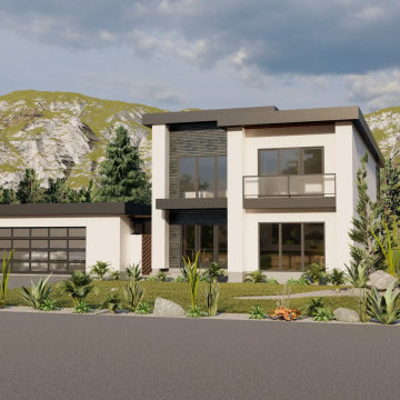 RWH Architect PLLC
RWH Architect presents the Whistle Hill Lot 8 Residence, a statement home that reflects a bold shift toward modern, refined design. This contemporary residence is defined by its clean lines, dramatic vertical expressions, and a sophisticated mix of architectural forms that culminate in a truly forward-thinking home. From the moment visitors step into the central courtyard that connects the detached garage to the main house, the project introduces a new level of architectural intention rarely seen in the region.
The detached garage, featuring an expansive 18' x 8' door, creates a strong street presence and anchors the courtyard entry sequence. Passing through the courtyard leads to a welcoming entry foyer designed with built-in hooks and a bench, creating a comfortable—and functional—moment of arrival. Just beyond the entry is a private study with custom built-in bookshelves, a space tailored for work, reading, or quiet focus. The main floor unfolds into a sophisticated open-concept layout where the kitchen, great room, and dining areas flow effortlessly together. The kitchen includes a walk-in pantry, a pot filler for convenience, and a dedicated dog-feeding station that integrates seamlessly into the cabinetry. The great room stands as the heart of the home, featuring a built-in wood-burning fireplace and oversized sliding doors that extend the living space out to a covered patio. A centrally located half bath near the kitchen completes the first-floor program.
All bedrooms are located on the second floor to preserve privacy and capitalize on natural light. The master suite is designed as a luxurious retreat, offering a screened-in porch, a spacious walk-in closet, and a unique bathroom where the walk-in shower wraps around a freestanding tub, creating a spa-like environment that blends innovation with comfort. The laundry room is conveniently positioned on the same floor. Two additional bedrooms share a well-appointed bathroom, completing the second-floor layout.
Several design challenges shaped the evolution of this project and ultimately elevated its architectural clarity. One of the primary challenges was organizing the home around a detached garage while maintaining a cohesive architectural experience. RWH resolved this by creating a courtyard that acts as a transitional outdoor room, visually linking the structures and providing a dramatic yet functional entry sequence. Another challenge involved balancing large modern window systems with the bold vertical elements that define the façade. By carefully proportioning the glazing and framing it within thoughtful material changes, RWH maintained a strong contemporary identity while ensuring visual harmony. Integrating the built-in fireplace, open-concept layout, and large patio openings required complex structural solutions; RWH overcame this by using discreetly integrated structural steel that allowed for wide spans without compromising the home’s clean, minimalist interior aesthetic. Designing the master bathroom’s combined shower-and-tub layout also presented a unique challenge, requiring careful grading, waterproofing, and spatial planning. Through strategic detailing and 3D modeling, RWH delivered a seamless spa-like experience that feels both inventive and intuitively functional.
The Whistle Hill Lot 8 Residence stands as a testament to a new architectural direction in the area—one that embraces innovative forms, curated materials, and a lifestyle-driven floor plan. With its modern massing, intentional interior flow, and elevated details, this home reflects RWH Architect’s commitment to pushing residential design into its next era.
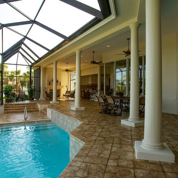
 Progressive Design Build
Challenge
As part-time residents of this Bonita Springs home, our clients were looking to update their outdoor entertainment area. They also planned to be away for the summer during the remodel and needed their renovation project to be finished prior to their return for the winter.
Their needs included:
Changing the color pallet to a monochromatic scheme, removing the yellow brick pavers, adding an outdoor kitchen area, adding an outdoor fireplace, resurfacing the pool and updating the tile, installing a new screen enclosure, and creating privacy from the neighbors, particularly the main sitting areas, pool and outdoor kitchen.
Although there was already a 1,221 sq. ft. lanai under the roof, it lacked functionality needed by the homeowners. Most of its amenities were located at one end of the lanai, and lacked privacy that the homeowners valued.
Solution
The final project design required two additions to the lanai area adding an accumulative 265 sq. ft. to the existing space expanding their sitting area and accommodating a much-needed outdoor kitchen. The new additions also needed to blend with the home’s existing style.
Addition #1—Sitting Area:
The first addition added approximately 145 sq. ft. to the end of the lanai. This allowed Progressive Design Build to tie into the existing gable room for the new space and create privacy from the neighbors.
Addition #2—Outdoor Kitchen:
The second addition was a bump out that added approximately 120 sq. ft. to the end of the house close to the interior kitchen. This allowed the client to add an outdoor over and 52” Viking grill (with a side burner) to their outdoor living space. Other amenities included a new sink and under counter fridge, granite countertops, tumbled stone stile and Cypress cabinetry, custom-fabricated with marine grade plywood boxes and marine grade finishes to withstand moisture, common in the Bonita Bay community.
Special attention was given to the preparation area on either side of the stove, the landing area next to the oven and the serving counter behind the bar. Bar seating was added to the outdoor kitchen, allowing guests to visit with the cook comfortably and easily.
Brick Pavers
During the design phase, we discovered that the original brick pavers were set in sand, with no concrete pad below. Consequently, the retaining wall and several pavers were starting to fail, caused by the shifting sands. To remedy the problem, we installed a new concrete deck and laid new nonslip pavers on top of the deck—ideal for wet area applications.
Pool Renovations
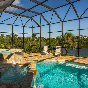
To dramatically improve the enjoyment and ambiance of their pool, Progressive Design Build completely re-plumbed it, putting in additional lighting and new water features. New decorative pool tile, coping, and a paver deck were also installed around the pool. The pool finish chosen by our clients was a nice tropical blue color.
Screen Enclosure
A new screen enclosure was installed in compliance with new local building codes, making it more stable and solid than the existing one. The color change from white to bronze coordinated well with the homeowners’ new color scheme; and the location of the service door and stairs provided convenient access to the new pool equipment.
Results
This project was completed on time and within budget before these homeowners returned for their winter holiday. They were thrilled with the weekly communication, which included two-way phone calls and email photo sharing. They always knew where their project was in the construction process and what was happening at all times—providing security and peace of mind.

 Klopf Architecture
From Mid-Century Classic to the Present
An iconic design updated with comfort, function, and flow for today.
A Remodel That Balances Past and Present
What started as a desire to update a classic Eichler soon became an exploration of how Mid-Century Modern design can successfully evolve for today. The client, a tech professional with a passion for scuba diving and underwater photography, wanted a home that would both honor its original character and feel tailored to his daily life. A lifelong technology enthusiast, he still owns the very first Mac desktop he saved up for as a teenager working at Radio Shack, a detail that underscores his appreciation for design that melds function and form.
Honoring Separation While Expanding Possibility
Unlike many contemporary remodels where walls are opened up to create expansive living spaces, this project took a more restrained approach. The client valued the defined rooms of the original plan and wanted to preserve as much wall space as possible for displaying his large-format underwater photography. The emphasis was not on dramatic spatial reinvention, but on thoughtful refinements. Klopf Architecture shaped a gallery-like backdrop while also expanding the primary suite, modernizing materials and fixtures throughout the home, and improving the functionality and layout of the kitchen. The finished home feels at once timeless and renewed, an Eichler that continues to inspire while fully supporting the lifestyle of its present-day owner.
A major turning point came mid-design. The original project brief had not included an addition, but as the reconfiguration of the primary bedroom and bath unfolded, it became clear that an expansion was the best approach to achieve the client’s vision of a more spacious suite. Fortunately, the adjustment came at a stage when revisions were still manageable and was integrated seamlessly, showing how thoughtful course corrections can strengthen a project rather than hinder it.
Navigating Challenges With Precision
The design development included multiple conceptual rounds, balancing preservation with subtle expansion. During construction, an existing post previously thought to be load-bearing turned out not to be. The structural engineer was able to pivot quickly, and both the post and the cross beam that had been intended to replace it could be omitted, allowing the original rhythm of the Eichler beam bays to be preserved.
Sustainability was not just a checklist item, but a way to align the home with the client’s values of simplicity, efficiency, and long-term functionality. R-38 roof insulation reduced energy usage, solar panels with battery storage provided independence and resilience, and passive comfort strategies eliminated the need forenergy-intensive air conditioning. An electric vehicle charger and an on-demand hot water recirculation system (with call buttons as opposed to having constant circulation) add to the home’s long-term efficiency factors. Together, these moves created a home that is quieter, more comfortable, and better equipped for the future, qualities that supported the client’s pragmatic approach to design and living lightly.
Details That Respect the Eichler DNA
The remodel carries forward the Eichler’s original spirit while introducing new layers of modern livability. Originally, the house was approached along a deep, narrow walk, with the garage on one side and the house on the other, leaving the front door tucked far back within this chasm-like space. By pulling the entry forward, the design reshaped the arrival experience, creating a clearer threshold and a natural drop-off zone for bags, shoes, and keys. This shift also made room for a custom bench at the entry that extends seamlessly through the glass sidelight. The bench and drop-off zone now work together as a single, integrated sequence that supports everyday living while offering a tactile reminder of Eichler’s philosophy of connectedness.
At the client’s request, Klopf reintroduced a classic Eichler gesture by extending the exterior siding into the entry and living room. The detail reinforces a sense of indoor/outdoor continuity while providing a subtle architectural surface that allows the client’s photography to take visual precedence.
The signature concrete masonry wall at the front was reconstructed using blocks sourced to match the originals, now strengthened with rebar for seismic resilience while maintaining a private outdoor courtyard, visually extending the kitchen outward. A decorative trellis element, a detail borrowed from a neighboring Eichler, restores a familiar mid-century modern architectural motif. At the courtyard entry door, a custom etched glass sidelight with an ocean-themed design featuring kelp and jellyfish serves as a subtle homage to the client’s passion for deep-sea diving.
Landscaping became an integral part of the overall transformation. The homeowner engaged landscape architect Randi Johnsen of Third Nature Studio to shape a series of calm, inviting outdoor rooms that read as a natural extension of the interiors. While technically outside of the core construction scope, the landscape design proved central to achieving a sense of completeness and connectedness across the property. Such whole-property considerations often emerge as design ideas take shape, underscoring the importance of flexibility in planning and budgeting, as well as close collaboration among the design team starting early in the process.
The Value of Evolving Scope
As with many custom residential projects, the scope evolved during the design process. What began as a targeted remodel grew to include a new/expanded primary suite, a rebuilt CMU patio wall for strength and longevity, and a solar panel array and battery storage for energy resilience and carbon-reduction. Each thoughtful decision represented a conscious investment in the home’s performance and character, rather than a cost overrun.
The result was a project delivered on schedule, tailored precisely to the client’s lifestyle, and positioned to add long-term value both functionally and aesthetically. By embracing scope evolution as an opportunity rather than a challenge, and relying on good design paired with transparent communication, this remodel demonstrates how Eichler homes can be adapted for contemporary living without erasing their DNA.
Klopf Architecture project team: John Klopf, AIA, and Klara Kevane, Elise Webb and Nicholas LaNasa.
Contractor: Golden Cove Construction
Landscape Design: Third Nature Studio
Structural Engineer: Daniel Bastiao Design
Photography: ©2025 Mariko Reed
Year Completed: 2024
Location: Sunnyvale, CA
 Progressive Design Build
Challenge
As part-time residents of this Bonita Springs home, our clients were looking to update their outdoor entertainment area. They also planned to be away for the summer during the remodel and needed their renovation project to be finished prior to their return for the winter.
Their needs included:
Changing the color pallet to a monochromatic scheme, removing the yellow brick pavers, adding an outdoor kitchen area, adding an outdoor fireplace, resurfacing the pool and updating the tile, installing a new screen enclosure, and creating privacy from the neighbors, particularly the main sitting areas, pool and outdoor kitchen.
Although there was already a 1,221 sq. ft. lanai under the roof, it lacked functionality needed by the homeowners. Most of its amenities were located at one end of the lanai, and lacked privacy that the homeowners valued.
Solution
The final project design required two additions to the lanai area adding an accumulative 265 sq. ft. to the existing space expanding their sitting area and accommodating a much-needed outdoor kitchen. The new additions also needed to blend with the home’s existing style.
Addition #1—Sitting Area:
The first addition added approximately 145 sq. ft. to the end of the lanai. This allowed Progressive Design Build to tie into the existing gable room for the new space and create privacy from the neighbors.
Addition #2—Outdoor Kitchen:
The second addition was a bump out that added approximately 120 sq. ft. to the end of the house close to the interior kitchen. This allowed the client to add an outdoor over and 52” Viking grill (with a side burner) to their outdoor living space. Other amenities included a new sink and under counter fridge, granite countertops, tumbled stone stile and Cypress cabinetry, custom-fabricated with marine grade plywood boxes and marine grade finishes to withstand moisture, common in the Bonita Bay community.
Special attention was given to the preparation area on either side of the stove, the landing area next to the oven and the serving counter behind the bar. Bar seating was added to the outdoor kitchen, allowing guests to visit with the cook comfortably and easily.
Brick Pavers
During the design phase, we discovered that the original brick pavers were set in sand, with no concrete pad below. Consequently, the retaining wall and several pavers were starting to fail, caused by the shifting sands. To remedy the problem, we installed a new concrete deck and laid new nonslip pavers on top of the deck—ideal for wet area applications.
Pool Renovations
To dramatically improve the enjoyment and ambiance of their pool, Progressive Design Build completely re-plumbed it, putting in additional lighting and new water features. New decorative pool tile, coping, and a paver deck were also installed around the pool. The pool finish chosen by our clients was a nice tropical blue color.
Screen Enclosure
A new screen enclosure was installed in compliance with new local building codes, making it more stable and solid than the existing one. The color change from white to bronze coordinated well with the homeowners’ new color scheme; and the location of the service door and stairs provided convenient access to the new pool equipment.
Results
This project was completed on time and within budget before these homeowners returned for their winter holiday. They were thrilled with the weekly communication, which included two-way phone calls and email photo sharing. They always knew where their project was in the construction process and what was happening at all times—providing security and peace of mind.
 Advance Design Studio, Ltd.
The major kitchen renovation of this old country farmhouse was a task of love, one that had been planned for many years by these Barrington seasoned homeowners. After interviewing no less than five companies, the homeowners chose the design team at Advance Design Studio to make the transformation they had long planned for.
“They had an understanding of the right design for the space almost from the instant they walked in the room”, says Sharon Scott of the design team of Nicole Ryan at Todd Jurs at Advance Design Studio. “They were the only designers who laid out ideas in the first meeting at the house that we really loved”, she says. “It was obvious that they understood the house, and understood us - and from then on the decision to hire them literally made itself”.
The original kitchen had a dividing “wall” of cabinetry…that made the rather large space seem very small, and cut off the kitchen from the eating area that has a beautiful garden view completely hidden from the main kitchen. Circulation was poor, leaving family members on top of one another when entertaining family and friends.
The new kitchen design nearly doubles the kitchen size within the original space; opening it up completely and enjoying an expansive island containing a new Kohler Whitehaven Smart Divide farm sink, a dishwasher, and pull out double trash receptacle. The great new gathering space accommodates four pull out stools beckoning grandchildren and friends alike. Removing the range from the island and relocating it to create a dramatic “feature” wall, completely out of the way of guests; it is now crowned with a beautiful completely customized wood hood designed to ventilate much more efficiently than the original island range containing a limited downdraft system.
The much more efficient use of the space after removing a pantry closet made way for a fully functional “tall wall” housing a double oven and refrigerator, out of the way of guests. Removing the restrictive cabinetry wall now allowed for an expansive floor to ceiling pantry cabinet with full extension pull out shelving, and an elegant display area complete with a beautiful furniture detailed buffet.
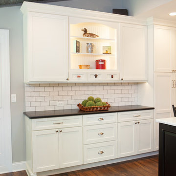
Fitting perfectly into the farmhouse charm of the old estate, Medallion Silver Lancaster cabinetry was chosen in a soft white Maple Divinity paint finish lining the perimeter. The stunning island hints to this old home’s past with Medallion Gold’s Maple Devonshire style graced with a Carriage Black Heirloom painted finish. The rubbed off black paint finish reveals the soft wood tones beneath, mimicking furniture you’d see in your grandmother’s home that has lovingly been polished for years to reveal a soft, subtly rubbed-off sheen.
Counter tops reverse contrast with perimeter tops of black “Raven” granite possessing a subtle honed finish, and a shift to Quartz Difinity Viareggio - resembling white Carrera marble on the island. A simple herringbone detail completes the decorative range wall, and subtle porcelain subway tiles grace the backsplash throughout.
The design is finished off with crisp Thermador and Bosch stainless steel appliances, and bright brushed cup pull and handle combination hardware. A pull down Kohler Bellaria faucet makes cleanup a breeze, and soft under-cabinet LED lighting throughout makes every work surface shine softly, and highlights the cabinetry display area with grace.
One special detail was created to make the dramatic ceiling transition to a vaulted area above the breakfast nook extra special. A tongue and groove solid wood ceiling was hung above, and a subtle greenish-grey distressed paint finish was hand developed on site by the talented crew, complementing the new kitchen with a completely unique surface that appears as if it’s been there for many, many years. It’s just one standout feature in the amazing new space that is sure to be in every conversation as newcomers enjoy the newest best hangout in this old home renewed!
After 30 years of renovating homes, this now content homeowner sips a cup of tea enjoying her new garden view, and reminisces projects of past – and lastly reports their experience with Advance Design Studio culminating with their amazing new kitchen to be the most enjoyable and satisfying home experience yet.
Designer: Nicole Ryan
Photographer: Joe Nowak
29