
Search results for "Shifted dramatically" in Home Design Ideas
 Advance Design Studio, Ltd.
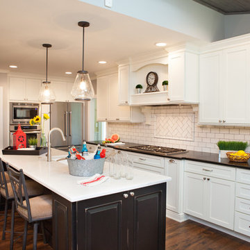
The major kitchen renovation of this old country farmhouse was a task of love, one that had been planned for many years by these Barrington seasoned homeowners. After interviewing no less than five companies, the homeowners chose the design team at Advance Design Studio to make the transformation they had long planned for.
“They had an understanding of the right design for the space almost from the instant they walked in the room”, says Sharon Scott of the design team of Nicole Ryan at Todd Jurs at Advance Design Studio. “They were the only designers who laid out ideas in the first meeting at the house that we really loved”, she says. “It was obvious that they understood the house, and understood us - and from then on the decision to hire them literally made itself”.
The original kitchen had a dividing “wall” of cabinetry…that made the rather large space seem very small, and cut off the kitchen from the eating area that has a beautiful garden view completely hidden from the main kitchen. Circulation was poor, leaving family members on top of one another when entertaining family and friends.
The new kitchen design nearly doubles the kitchen size within the original space; opening it up completely and enjoying an expansive island containing a new Kohler Whitehaven Smart Divide farm sink, a dishwasher, and pull out double trash receptacle. The great new gathering space accommodates four pull out stools beckoning grandchildren and friends alike. Removing the range from the island and relocating it to create a dramatic “feature” wall, completely out of the way of guests; it is now crowned with a beautiful completely customized wood hood designed to ventilate much more efficiently than the original island range containing a limited downdraft system.
The much more efficient use of the space after removing a pantry closet made way for a fully functional “tall wall” housing a double oven and refrigerator, out of the way of guests. Removing the restrictive cabinetry wall now allowed for an expansive floor to ceiling pantry cabinet with full extension pull out shelving, and an elegant display area complete with a beautiful furniture detailed buffet.
Fitting perfectly into the farmhouse charm of the old estate, Medallion Silver Lancaster cabinetry was chosen in a soft white Maple Divinity paint finish lining the perimeter. The stunning island hints to this old home’s past with Medallion Gold’s Maple Devonshire style graced with a Carriage Black Heirloom painted finish. The rubbed off black paint finish reveals the soft wood tones beneath, mimicking furniture you’d see in your grandmother’s home that has lovingly been polished for years to reveal a soft, subtly rubbed-off sheen.
Counter tops reverse contrast with perimeter tops of black “Raven” granite possessing a subtle honed finish, and a shift to Quartz Difinity Viareggio - resembling white Carrera marble on the island. A simple herringbone detail completes the decorative range wall, and subtle porcelain subway tiles grace the backsplash throughout.
The design is finished off with crisp Thermador and Bosch stainless steel appliances, and bright brushed cup pull and handle combination hardware. A pull down Kohler Bellaria faucet makes cleanup a breeze, and soft under-cabinet LED lighting throughout makes every work surface shine softly, and highlights the cabinetry display area with grace.
One special detail was created to make the dramatic ceiling transition to a vaulted area above the breakfast nook extra special. A tongue and groove solid wood ceiling was hung above, and a subtle greenish-grey distressed paint finish was hand developed on site by the talented crew, complementing the new kitchen with a completely unique surface that appears as if it’s been there for many, many years. It’s just one standout feature in the amazing new space that is sure to be in every conversation as newcomers enjoy the newest best hangout in this old home renewed!
After 30 years of renovating homes, this now content homeowner sips a cup of tea enjoying her new garden view, and reminisces projects of past – and lastly reports their experience with Advance Design Studio culminating with their amazing new kitchen to be the most enjoyable and satisfying home experience yet.
Designer: Nicole Ryan
Photographer: Joe Nowak
 Advance Design Studio, Ltd.
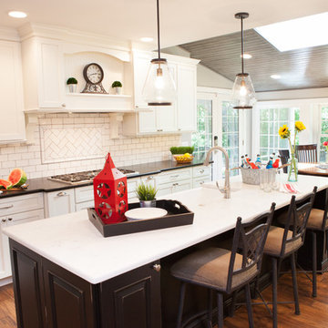
The major kitchen renovation of this old country farmhouse was a task of love, one that had been planned for many years by these Barrington seasoned homeowners. After interviewing no less than five companies, the homeowners chose the design team at Advance Design Studio to make the transformation they had long planned for.
“They had an understanding of the right design for the space almost from the instant they walked in the room”, says Sharon Scott of the design team of Nicole Ryan at Todd Jurs at Advance Design Studio. “They were the only designers who laid out ideas in the first meeting at the house that we really loved”, she says. “It was obvious that they understood the house, and understood us - and from then on the decision to hire them literally made itself”.
The original kitchen had a dividing “wall” of cabinetry…that made the rather large space seem very small, and cut off the kitchen from the eating area that has a beautiful garden view completely hidden from the main kitchen. Circulation was poor, leaving family members on top of one another when entertaining family and friends.
The new kitchen design nearly doubles the kitchen size within the original space; opening it up completely and enjoying an expansive island containing a new Kohler Whitehaven Smart Divide farm sink, a dishwasher, and pull out double trash receptacle. The great new gathering space accommodates four pull out stools beckoning grandchildren and friends alike. Removing the range from the island and relocating it to create a dramatic “feature” wall, completely out of the way of guests; it is now crowned with a beautiful completely customized wood hood designed to ventilate much more efficiently than the original island range containing a limited downdraft system.
The much more efficient use of the space after removing a pantry closet made way for a fully functional “tall wall” housing a double oven and refrigerator, out of the way of guests. Removing the restrictive cabinetry wall now allowed for an expansive floor to ceiling pantry cabinet with full extension pull out shelving, and an elegant display area complete with a beautiful furniture detailed buffet.
Fitting perfectly into the farmhouse charm of the old estate, Medallion Silver Lancaster cabinetry was chosen in a soft white Maple Divinity paint finish lining the perimeter. The stunning island hints to this old home’s past with Medallion Gold’s Maple Devonshire style graced with a Carriage Black Heirloom painted finish. The rubbed off black paint finish reveals the soft wood tones beneath, mimicking furniture you’d see in your grandmother’s home that has lovingly been polished for years to reveal a soft, subtly rubbed-off sheen.
Counter tops reverse contrast with perimeter tops of black “Raven” granite possessing a subtle honed finish, and a shift to Quartz Difinity Viareggio - resembling white Carrera marble on the island. A simple herringbone detail completes the decorative range wall, and subtle porcelain subway tiles grace the backsplash throughout.
The design is finished off with crisp Thermador and Bosch stainless steel appliances, and bright brushed cup pull and handle combination hardware. A pull down Kohler Bellaria faucet makes cleanup a breeze, and soft under-cabinet LED lighting throughout makes every work surface shine softly, and highlights the cabinetry display area with grace.
One special detail was created to make the dramatic ceiling transition to a vaulted area above the breakfast nook extra special. A tongue and groove solid wood ceiling was hung above, and a subtle greenish-grey distressed paint finish was hand developed on site by the talented crew, complementing the new kitchen with a completely unique surface that appears as if it’s been there for many, many years. It’s just one standout feature in the amazing new space that is sure to be in every conversation as newcomers enjoy the newest best hangout in this old home renewed!
After 30 years of renovating homes, this now content homeowner sips a cup of tea enjoying her new garden view, and reminisces projects of past – and lastly reports their experience with Advance Design Studio culminating with their amazing new kitchen to be the most enjoyable and satisfying home experience yet.
Designer: Nicole Ryan
Photographer: Joe Nowak
 Advance Design Studio, Ltd.
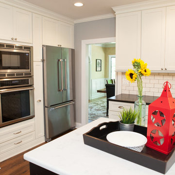
The major kitchen renovation of this old country farmhouse was a task of love, one that had been planned for many years by these Barrington seasoned homeowners. After interviewing no less than five companies, the homeowners chose the design team at Advance Design Studio to make the transformation they had long planned for.
“They had an understanding of the right design for the space almost from the instant they walked in the room”, says Sharon Scott of the design team of Nicole Ryan at Todd Jurs at Advance Design Studio. “They were the only designers who laid out ideas in the first meeting at the house that we really loved”, she says. “It was obvious that they understood the house, and understood us - and from then on the decision to hire them literally made itself”.
The original kitchen had a dividing “wall” of cabinetry…that made the rather large space seem very small, and cut off the kitchen from the eating area that has a beautiful garden view completely hidden from the main kitchen. Circulation was poor, leaving family members on top of one another when entertaining family and friends.
The new kitchen design nearly doubles the kitchen size within the original space; opening it up completely and enjoying an expansive island containing a new Kohler Whitehaven Smart Divide farm sink, a dishwasher, and pull out double trash receptacle. The great new gathering space accommodates four pull out stools beckoning grandchildren and friends alike. Removing the range from the island and relocating it to create a dramatic “feature” wall, completely out of the way of guests; it is now crowned with a beautiful completely customized wood hood designed to ventilate much more efficiently than the original island range containing a limited downdraft system.
The much more efficient use of the space after removing a pantry closet made way for a fully functional “tall wall” housing a double oven and refrigerator, out of the way of guests. Removing the restrictive cabinetry wall now allowed for an expansive floor to ceiling pantry cabinet with full extension pull out shelving, and an elegant display area complete with a beautiful furniture detailed buffet.
Fitting perfectly into the farmhouse charm of the old estate, Medallion Silver Lancaster cabinetry was chosen in a soft white Maple Divinity paint finish lining the perimeter. The stunning island hints to this old home’s past with Medallion Gold’s Maple Devonshire style graced with a Carriage Black Heirloom painted finish. The rubbed off black paint finish reveals the soft wood tones beneath, mimicking furniture you’d see in your grandmother’s home that has lovingly been polished for years to reveal a soft, subtly rubbed-off sheen.
Counter tops reverse contrast with perimeter tops of black “Raven” granite possessing a subtle honed finish, and a shift to Quartz Difinity Viareggio - resembling white Carrera marble on the island. A simple herringbone detail completes the decorative range wall, and subtle porcelain subway tiles grace the backsplash throughout.
The design is finished off with crisp Thermador and Bosch stainless steel appliances, and bright brushed cup pull and handle combination hardware. A pull down Kohler Bellaria faucet makes cleanup a breeze, and soft under-cabinet LED lighting throughout makes every work surface shine softly, and highlights the cabinetry display area with grace.
One special detail was created to make the dramatic ceiling transition to a vaulted area above the breakfast nook extra special. A tongue and groove solid wood ceiling was hung above, and a subtle greenish-grey distressed paint finish was hand developed on site by the talented crew, complementing the new kitchen with a completely unique surface that appears as if it’s been there for many, many years. It’s just one standout feature in the amazing new space that is sure to be in every conversation as newcomers enjoy the newest best hangout in this old home renewed!
After 30 years of renovating homes, this now content homeowner sips a cup of tea enjoying her new garden view, and reminisces projects of past – and lastly reports their experience with Advance Design Studio culminating with their amazing new kitchen to be the most enjoyable and satisfying home experience yet.
Designer: Nicole Ryan
Photographer: Joe Nowak
Find the right local pro for your project
 Advance Design Studio, Ltd.
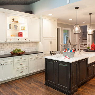
The major kitchen renovation of this old country farmhouse was a task of love, one that had been planned for many years by these Barrington seasoned homeowners. After interviewing no less than five companies, the homeowners chose the design team at Advance Design Studio to make the transformation they had long planned for.
“They had an understanding of the right design for the space almost from the instant they walked in the room”, says Sharon Scott of the design team of Nicole Ryan at Todd Jurs at Advance Design Studio. “They were the only designers who laid out ideas in the first meeting at the house that we really loved”, she says. “It was obvious that they understood the house, and understood us - and from then on the decision to hire them literally made itself”.
The original kitchen had a dividing “wall” of cabinetry…that made the rather large space seem very small, and cut off the kitchen from the eating area that has a beautiful garden view completely hidden from the main kitchen. Circulation was poor, leaving family members on top of one another when entertaining family and friends.
The new kitchen design nearly doubles the kitchen size within the original space; opening it up completely and enjoying an expansive island containing a new Kohler Whitehaven Smart Divide farm sink, a dishwasher, and pull out double trash receptacle. The great new gathering space accommodates four pull out stools beckoning grandchildren and friends alike. Removing the range from the island and relocating it to create a dramatic “feature” wall, completely out of the way of guests; it is now crowned with a beautiful completely customized wood hood designed to ventilate much more efficiently than the original island range containing a limited downdraft system.
The much more efficient use of the space after removing a pantry closet made way for a fully functional “tall wall” housing a double oven and refrigerator, out of the way of guests. Removing the restrictive cabinetry wall now allowed for an expansive floor to ceiling pantry cabinet with full extension pull out shelving, and an elegant display area complete with a beautiful furniture detailed buffet.
Fitting perfectly into the farmhouse charm of the old estate, Medallion Silver Lancaster cabinetry was chosen in a soft white Maple Divinity paint finish lining the perimeter. The stunning island hints to this old home’s past with Medallion Gold’s Maple Devonshire style graced with a Carriage Black Heirloom painted finish. The rubbed off black paint finish reveals the soft wood tones beneath, mimicking furniture you’d see in your grandmother’s home that has lovingly been polished for years to reveal a soft, subtly rubbed-off sheen.
Counter tops reverse contrast with perimeter tops of black “Raven” granite possessing a subtle honed finish, and a shift to Quartz Difinity Viareggio - resembling white Carrera marble on the island. A simple herringbone detail completes the decorative range wall, and subtle porcelain subway tiles grace the backsplash throughout.
The design is finished off with crisp Thermador and Bosch stainless steel appliances, and bright brushed cup pull and handle combination hardware. A pull down Kohler Bellaria faucet makes cleanup a breeze, and soft under-cabinet LED lighting throughout makes every work surface shine softly, and highlights the cabinetry display area with grace.
One special detail was created to make the dramatic ceiling transition to a vaulted area above the breakfast nook extra special. A tongue and groove solid wood ceiling was hung above, and a subtle greenish-grey distressed paint finish was hand developed on site by the talented crew, complementing the new kitchen with a completely unique surface that appears as if it’s been there for many, many years. It’s just one standout feature in the amazing new space that is sure to be in every conversation as newcomers enjoy the newest best hangout in this old home renewed!
After 30 years of renovating homes, this now content homeowner sips a cup of tea enjoying her new garden view, and reminisces projects of past – and lastly reports their experience with Advance Design Studio culminating with their amazing new kitchen to be the most enjoyable and satisfying home experience yet.
Designer: Nicole Ryan
Photographer: Joe Nowak

 safe ZOnea
Ask a kitchen designer in Chicago which countertop question comes up most and you will hear the same answer: white or off-white quartz, and which shade. Homeowners walk into showrooms with a photo saved on their phone, usually a bright, veined slab from a magazine spread, and leave an hour later realizing there are a dozen versions of that same look. The confusion is not about taste. It is about the fact that "white quartz" covers a huge range of patterns, undertones, and price points, and nobody explains the differences before the sale.
Older bungalows and newer builds alike are getting stripped of their dated laminate and butcher block in favor of quartz, and the reasons are practical rather than trendy. Quartz does not need sealing, resists the kind of staining that granite can suffer over decades, and holds up to the freeze-thaw humidity swings that Chicago basements and kitchens go through every year. Once a homeowner commits to quartz, though, the real decision starts: which white, and does the pattern justify the difference in cost.
This piece walks through three specific slabs that keep showing up in Chicago renovation projects, why designers reach for them in different rooms, and what actually separates a flat white surface from one with real depth. None of this requires a design background to follow. It is mostly about paying attention to how a slab behaves under kitchen lighting, how busy the vending gets, and how it photographs versus how it looks in person.
Why White Quartz Took Over Chicago Kitchens
Ten years ago, granite dominated Chicago kitchen remodels almost by default. It was durable, it looked expensive, and every fabricator in the metro area carried a wide range of colors. Quartz has since taken over that position, and the shift happened faster than most contractors expected. Engineered stone gave homeowners a more predictable surface, since natural granite varies slab to slab while quartz is manufactured to a consistent pattern batch after batch.
The other driver is light. Chicago winters are long and gray, and a lot of kitchens, especially in older two-flats and courtyard buildings, do not get much direct sun. A dark granite countertop in a dim kitchen can make the whole room feel smaller. White and light-toned quartz reflects what little natural light comes through the windows, and it makes a galley kitchen or a north-facing space feel noticeably brighter without touching the cabinetry or the layout.
There is also a resale argument that local real estate agents bring up constantly. White quartz photographs well for listings, reads as updated and low-maintenance to buyers touring in person, and does not compete visually with whatever cabinet color the next owner might prefer. It is a safer bet than a bold veined marble look or a colored quartz that might feel dated in five years.
Arctic White and the Cost Question
Among the flatter, more uniform whites, arctic white quartz price comes up constantly in budget conversations because the slab sits at a more approachable point than the heavily veined Italian-marble-inspired patterns. It reads as clean and bright without the busy movement that some homeowners find overwhelming in a small kitchen. Fabricators in the Chicago area tend to keep it in stock precisely because demand stays steady across both new construction and remodel projects.
Part of what keeps this slab affordable relative to its heavily patterned cousins comes down to manufacturing complexity. A quartz surface with minimal veining and a consistent white base is simpler to produce at scale than one that mimics the irregular, high-contrast movement of natural Calacatta marble. That production difference shows up directly in what a homeowner pays per square foot, and it is worth asking a fabricator to walk through that pricing before assuming every white quartz costs the same.
Homeowners planning a full kitchen, including an island, backsplash, and perimeter counters, often use a flatter white like this specifically because it lets other elements carry the visual interest. A patterned tile backsplash or a bold cabinet color reads more clearly against a calm countertop than against one already fighting for attention with heavy veining. Designers frequently pair simpler whites with statement lighting fixtures for exactly this reason.
What Makes Calacatta Patterns Different
Calacatta refers to a family of marble originally quarried in Italy, known for a bright white background broken up by bold, often gold-toned veining that moves in thick, dramatic streaks rather than thin gray lines. Natural Calacatta marble is soft, porous, and expensive to maintain, which is exactly why quartz manufacturers spent years developing engineered versions that replicate the look without the upkeep headaches.
The challenge with any Calacatta-style quartz is getting the veining to look organic instead of printed. Early generations of engineered stone struggled with repetitive patterns that gave away the fact the slab was manufactured rather than cut from actual marble. Modern digital printing and layering techniques have closed that gap considerably, and the better Calacatta-inspired quartz lines now vary the veining across each slab batch so two counters in the same kitchen do not look identical.
Chicago designers gravitate toward Calacatta patterns for kitchens that function as the visual centerpiece of an open floor plan, which describes a large share of the gut renovations happening in neighborhoods like Lincoln Park, Roscoe Village, and the North Shore suburbs. When the kitchen island is visible from the living room and dining area, a dramatic veined surface becomes part of the home's overall design language rather than a purely functional work surface.
Calacatta Arno Under Kitchen Lighting
One of the more popular options in this category, calacatta arno quartz, balances a warm white base with soft gray and gold veining that avoids looking too stark under the cooler LED lighting common in newer Chicago builds. Homeowners touring showrooms sometimes make the mistake of judging a slab entirely under warm incandescent lighting, then get surprised when the same surface looks slightly different once installed under their kitchen's actual fixtures.
What separates this particular pattern from flatter competitors is how the veining clusters rather than spreading evenly across the slab. That clustering mimics the way real quarried marble forms, with denser mineral deposits in some sections and cleaner stretches in others. Fabricators cutting a large island slab from a single piece will often orient the pattern intentionally so the busiest veining lands somewhere visually interesting rather than getting cut off at an edge.
Because the background reads warmer than a stark white, this pattern tends to pair well with brass or matte gold hardware, a combination that has been showing up repeatedly in Chicago kitchen remodels over the past few renovation seasons. Cabinet painters report a similar trend, with more clients requesting warm white or greige cabinet colors specifically because they complement this kind of veined quartz better than a cooler, blue-toned white would.
Silestone's Version of the Calacatta Look
Manufacturers compete directly in this Calacatta-inspired category, and silestone eternal calacatta gold represents one brand's specific take on the pattern, distinguished by richer gold veining set against a brighter white base than some competing slabs in the same family. Silestone has built a reputation around anti-bacterial surface treatments in addition to the standard quartz durability, a detail some homeowners specifically ask about for kitchens used heavily by families with young children.
The veining in this particular slab tends to run in longer, more continuous lines compared to the clustered pattern found in some other Calacatta-style options, which gives large island surfaces a sense of visual flow from one end to the other. Fabricators working with bigger islands, the kind increasingly common in open-concept Chicago remodels, often favor patterns like this because there is less need to worry about seams interrupting a busy, disconnected pattern.
Price positioning for this slab tends to sit toward the upper end of the engineered quartz category, reflecting both the brand's manufacturing process and the complexity of replicating that continuous gold veining consistently across production batches. Homeowners weighing this option against other Calacatta-style quartz should ask their fabricator directly about batch availability, since premium patterns sometimes have longer lead times than standard stock colors.
Living With Quartz Day to Day
Beyond how a slab looks in a showroom or a listing photo, the daily experience of owning quartz countertops matters more once the renovation dust settles. Quartz resists scratching far better than laminate and holds up to the acidic spills, hot pans, and general abuse of an active kitchen without the sealing maintenance that natural stone requires every year or two. That low-maintenance reputation is a large part of why quartz overtook granite in the first place.
Heat resistance is a detail that gets less attention than it should. While quartz handles moderate heat well, manufacturers generally recommend using a trivet or pad for very hot pots straight off the stove, since sudden temperature shock can occasionally cause stress marks in the resin binder that holds the engineered stone together. This is a minor precaution rather than a major limitation, but it is worth mentioning to anyone assuming quartz is entirely indestructible.
Cleaning routines stay simple across almost every pattern in this category. A damp cloth and mild soap handle daily messes, and the nonporous surface means wine, coffee, and tomato-based sauces do not soak in the way they can with unsealed granite or marble. Homeowners moving from an older stone counter often mention how much less they worry about everyday spills once quartz is installed, which is a quality-of-life change that rarely makes it into the initial design conversation.
Choosing Between the Three
There is no single correct answer among these three slabs, and that is exactly why they keep coming up together in the same design conversations across Chicago renovation projects. A flatter white with minimal veining suits kitchens where other elements need to carry the visual interest, while a bolder Calacatta-inspired pattern makes sense when the countertop itself is meant to be the centerpiece of an open floor plan.
Budget matters too, and it is worth having a direct conversation with a fabricator about where each option lands before falling in love with a specific slab in a showroom. Lighting, cabinet color, and how the kitchen connects to the rest of the home all play into which pattern will actually look right once installation is finished rather than just in a photo.
Whatever direction a homeowner leans, seeing a full slab in person under actual kitchen lighting remains the single most useful step before signing off. Photos only go so far once the countertop is sitting in the room it will live in for years.
 Drury Design
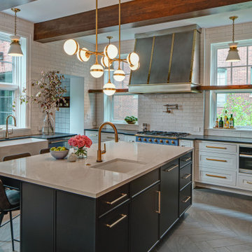
Relocating from San Francisco, this young family immediately zeroed in on the wonderful historic homes around downtown Chicago. Most of the properties they saw checked a lot of wish list boxes, but none of them checked every box. The house they landed on had beautiful curb appeal, a dramatic entry with a welcoming porch and front hall, and a really nice yard. Unfortunately, it did not have a kitchen that was well set-up for cooking and entertaining. Reworking the kitchen area was the top priority.
The family had met with a few other designers and even had an architect take a crack at the space, but they were not able to come up with a viable solution. Here’s how Senior Designer Diana Burton approached the project…
Design Objectives:
Respect the home’s vintage feel while bringing the kitchen up to date
Open up the kitchen area to create an open space for gathering and entertaining
Upgrade appliances to top-of-the-line models
Include a large island with seating
Include seating for casual family meals in a space that won’t be a replacement for the adjacent formal dining room
THE REMODEL
Design Challenges:
Remove a load-bearing wall and combine smaller rooms to create one big kitchen
A powder room in the back corner of the existing kitchen was a huge obstacle to updating the layout
Maintain large windows with views of the yard while still providing ample storage
Design Solutions:
Relocating the powder room to another part of the first floor (a large closet under the stairs) opened up the space dramatically
Create space for a larger island by recessing the fridge/freezer and shifting the pantry to a space adjacent to the kitchen
A banquette saves space and offers a perfect solution for casual dining
The walnut banquette table beautifully complements the fridge/freezer armoire
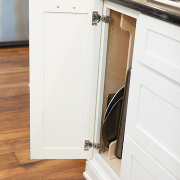
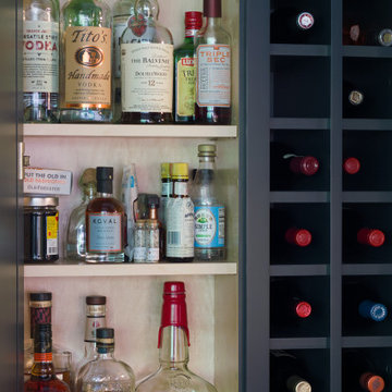
Utilize a gap created by the new fridge location to create a tall shallow cabinet for liquor storage w/ a wine cubby
Closing off one doorway into the dining room and using the “between the studs” space for a tall storage cabinet
Dish organizing drawers offer handy storage for plates, bowls, and serving dishes right by main sink and dishwasher
Cabinetry backing up to the dining room offers ample storage for glassware and functions both as a coffee station and cocktail bar
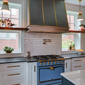
Open shelves flanking the hood add storage without blocking views and daylight
A beam was required where the wall was removed. Additional beams added architectural interest and helped integrate the beams into the space
Statement lighting adds drama and personality to the space
THE RENEWED SPACE
This project exemplifies the transformative power of good design. Simply put, good design allows you to live life artfully. The newly remodeled kitchen effortlessly combines functionality and aesthetic appeal, providing a delightful space for cooking and spending quality time together. It’s comfy for regular meals but ultimately outfitted for those special gatherings. Infused with classic finishes and a timeless charm, the kitchen emanates an enduring atmosphere that will never go out of style.
 Drury Design
Relocating from San Francisco, this young family immediately zeroed in on the wonderful historic homes around downtown Chicago. Most of the properties they saw checked a lot of wish list boxes, but none of them checked every box. The house they landed on had beautiful curb appeal, a dramatic entry with a welcoming porch and front hall, and a really nice yard. Unfortunately, it did not have a kitchen that was well set-up for cooking and entertaining. Reworking the kitchen area was the top priority.
The family had met with a few other designers and even had an architect take a crack at the space, but they were not able to come up with a viable solution. Here’s how Senior Designer Diana Burton approached the project…
Design Objectives:
Respect the home’s vintage feel while bringing the kitchen up to date
Open up the kitchen area to create an open space for gathering and entertaining
Upgrade appliances to top-of-the-line models
Include a large island with seating
Include seating for casual family meals in a space that won’t be a replacement for the adjacent formal dining room
THE REMODEL
Design Challenges:
Remove a load-bearing wall and combine smaller rooms to create one big kitchen
A powder room in the back corner of the existing kitchen was a huge obstacle to updating the layout
Maintain large windows with views of the yard while still providing ample storage
Design Solutions:
Relocating the powder room to another part of the first floor (a large closet under the stairs) opened up the space dramatically
Create space for a larger island by recessing the fridge/freezer and shifting the pantry to a space adjacent to the kitchen
A banquette saves space and offers a perfect solution for casual dining
The walnut banquette table beautifully complements the fridge/freezer armoire
Utilize a gap created by the new fridge location to create a tall shallow cabinet for liquor storage w/ a wine cubby
Closing off one doorway into the dining room and using the “between the studs” space for a tall storage cabinet
Dish organizing drawers offer handy storage for plates, bowls, and serving dishes right by main sink and dishwasher
Cabinetry backing up to the dining room offers ample storage for glassware and functions both as a coffee station and cocktail bar
Open shelves flanking the hood add storage without blocking views and daylight
A beam was required where the wall was removed. Additional beams added architectural interest and helped integrate the beams into the space
Statement lighting adds drama and personality to the space
THE RENEWED SPACE
This project exemplifies the transformative power of good design. Simply put, good design allows you to live life artfully. The newly remodeled kitchen effortlessly combines functionality and aesthetic appeal, providing a delightful space for cooking and spending quality time together. It’s comfy for regular meals but ultimately outfitted for those special gatherings. Infused with classic finishes and a timeless charm, the kitchen emanates an enduring atmosphere that will never go out of style.
This photo illuminates the gorgeous La Cornue range, and the custom stainless and brass range hood.


 Magda Zafer, CKBD, CAPS, CGP / Neil Kelly Company
Photo: Magda Zafer
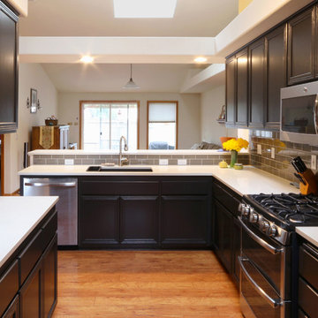
To transform the kitchen we darkened the cabinets with a more dramatic color shift and installed new stainless steel GE appliances.
 Advance Design Studio, Ltd.
The major kitchen renovation of this old country farmhouse was a task of love, one that had been planned for many years by these Barrington seasoned homeowners. After interviewing no less than five companies, the homeowners chose the design team at Advance Design Studio to make the transformation they had long planned for.
“They had an understanding of the right design for the space almost from the instant they walked in the room”, says Sharon Scott of the design team of Nicole Ryan at Todd Jurs at Advance Design Studio. “They were the only designers who laid out ideas in the first meeting at the house that we really loved”, she says. “It was obvious that they understood the house, and understood us - and from then on the decision to hire them literally made itself”.
The original kitchen had a dividing “wall” of cabinetry…that made the rather large space seem very small, and cut off the kitchen from the eating area that has a beautiful garden view completely hidden from the main kitchen. Circulation was poor, leaving family members on top of one another when entertaining family and friends.
The new kitchen design nearly doubles the kitchen size within the original space; opening it up completely and enjoying an expansive island containing a new Kohler Whitehaven Smart Divide farm sink, a dishwasher, and pull out double trash receptacle. The great new gathering space accommodates four pull out stools beckoning grandchildren and friends alike. Removing the range from the island and relocating it to create a dramatic “feature” wall, completely out of the way of guests; it is now crowned with a beautiful completely customized wood hood designed to ventilate much more efficiently than the original island range containing a limited downdraft system.
The much more efficient use of the space after removing a pantry closet made way for a fully functional “tall wall” housing a double oven and refrigerator, out of the way of guests. Removing the restrictive cabinetry wall now allowed for an expansive floor to ceiling pantry cabinet with full extension pull out shelving, and an elegant display area complete with a beautiful furniture detailed buffet.
Fitting perfectly into the farmhouse charm of the old estate, Medallion Silver Lancaster cabinetry was chosen in a soft white Maple Divinity paint finish lining the perimeter. The stunning island hints to this old home’s past with Medallion Gold’s Maple Devonshire style graced with a Carriage Black Heirloom painted finish. The rubbed off black paint finish reveals the soft wood tones beneath, mimicking furniture you’d see in your grandmother’s home that has lovingly been polished for years to reveal a soft, subtly rubbed-off sheen.
Counter tops reverse contrast with perimeter tops of black “Raven” granite possessing a subtle honed finish, and a shift to Quartz Difinity Viareggio - resembling white Carrera marble on the island. A simple herringbone detail completes the decorative range wall, and subtle porcelain subway tiles grace the backsplash throughout.
The design is finished off with crisp Thermador and Bosch stainless steel appliances, and bright brushed cup pull and handle combination hardware. A pull down Kohler Bellaria faucet makes cleanup a breeze, and soft under-cabinet LED lighting throughout makes every work surface shine softly, and highlights the cabinetry display area with grace.
One special detail was created to make the dramatic ceiling transition to a vaulted area above the breakfast nook extra special. A tongue and groove solid wood ceiling was hung above, and a subtle greenish-grey distressed paint finish was hand developed on site by the talented crew, complementing the new kitchen with a completely unique surface that appears as if it’s been there for many, many years. It’s just one standout feature in the amazing new space that is sure to be in every conversation as newcomers enjoy the newest best hangout in this old home renewed!
After 30 years of renovating homes, this now content homeowner sips a cup of tea enjoying her new garden view, and reminisces projects of past – and lastly reports their experience with Advance Design Studio culminating with their amazing new kitchen to be the most enjoyable and satisfying home experience yet.
Designer: Nicole Ryan
Photographer: Joe Nowak
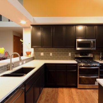 Magda Zafer, CKBD, CAPS, CGP / Neil Kelly Company
Photo: Magda Zafer
To transform the kitchen we darkened the cabinets with a more dramatic color shift and installed new stainless steel GE appliances. The tile countertops were replaced with elegant white quartz. Wooden backsplash was replaced with a glazed ceramic tile in a classic subway pattern.
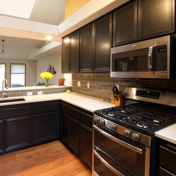 Magda Zafer, CKBD, CAPS, CGP / Neil Kelly Company
Photo: Magda Zafer
To transform the kitchen we darkened the cabinets with a more dramatic color shift and installed new stainless steel GE appliances. The tile countertops were replaced with elegant white quartz. Wooden backsplash was replaced with a glazed ceramic tile in a classic subway pattern. .
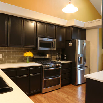 Magda Zafer, CKBD, CAPS, CGP / Neil Kelly Company
Photo: Magda Zafer
To transform the kitchen we darkened the cabinets with a dramatic color shift and installed new stainless steel GE appliances.
 Advance Design Studio, Ltd.
The major kitchen renovation of this old country farmhouse was a task of love, one that had been planned for many years by these Barrington seasoned homeowners. After interviewing no less than five companies, the homeowners chose the design team at Advance Design Studio to make the transformation they had long planned for.
“They had an understanding of the right design for the space almost from the instant they walked in the room”, says Sharon Scott of the design team of Nicole Ryan at Todd Jurs at Advance Design Studio. “They were the only designers who laid out ideas in the first meeting at the house that we really loved”, she says. “It was obvious that they understood the house, and understood us - and from then on the decision to hire them literally made itself”.
The original kitchen had a dividing “wall” of cabinetry…that made the rather large space seem very small, and cut off the kitchen from the eating area that has a beautiful garden view completely hidden from the main kitchen. Circulation was poor, leaving family members on top of one another when entertaining family and friends.
The new kitchen design nearly doubles the kitchen size within the original space; opening it up completely and enjoying an expansive island containing a new Kohler Whitehaven Smart Divide farm sink, a dishwasher, and pull out double trash receptacle. The great new gathering space accommodates four pull out stools beckoning grandchildren and friends alike. Removing the range from the island and relocating it to create a dramatic “feature” wall, completely out of the way of guests; it is now crowned with a beautiful completely customized wood hood designed to ventilate much more efficiently than the original island range containing a limited downdraft system.
The much more efficient use of the space after removing a pantry closet made way for a fully functional “tall wall” housing a double oven and refrigerator, out of the way of guests. Removing the restrictive cabinetry wall now allowed for an expansive floor to ceiling pantry cabinet with full extension pull out shelving, and an elegant display area complete with a beautiful furniture detailed buffet.
Fitting perfectly into the farmhouse charm of the old estate, Medallion Silver Lancaster cabinetry was chosen in a soft white Maple Divinity paint finish lining the perimeter. The stunning island hints to this old home’s past with Medallion Gold’s Maple Devonshire style graced with a Carriage Black Heirloom painted finish. The rubbed off black paint finish reveals the soft wood tones beneath, mimicking furniture you’d see in your grandmother’s home that has lovingly been polished for years to reveal a soft, subtly rubbed-off sheen.
Counter tops reverse contrast with perimeter tops of black “Raven” granite possessing a subtle honed finish, and a shift to Quartz Difinity Viareggio - resembling white Carrera marble on the island. A simple herringbone detail completes the decorative range wall, and subtle porcelain subway tiles grace the backsplash throughout.
The design is finished off with crisp Thermador and Bosch stainless steel appliances, and bright brushed cup pull and handle combination hardware. A pull down Kohler Bellaria faucet makes cleanup a breeze, and soft under-cabinet LED lighting throughout makes every work surface shine softly, and highlights the cabinetry display area with grace.
One special detail was created to make the dramatic ceiling transition to a vaulted area above the breakfast nook extra special. A tongue and groove solid wood ceiling was hung above, and a subtle greenish-grey distressed paint finish was hand developed on site by the talented crew, complementing the new kitchen with a completely unique surface that appears as if it’s been there for many, many years. It’s just one standout feature in the amazing new space that is sure to be in every conversation as newcomers enjoy the newest best hangout in this old home renewed!
After 30 years of renovating homes, this now content homeowner sips a cup of tea enjoying her new garden view, and reminisces projects of past – and lastly reports their experience with Advance Design Studio culminating with their amazing new kitchen to be the most enjoyable and satisfying home experience yet.
Designer: Nicole Ryan
Photographer: Joe Nowak
 Drury Design
Relocating from San Francisco, this young family immediately zeroed in on the wonderful historic homes around downtown Chicago. Most of the properties they saw checked a lot of wish list boxes, but none of them checked every box. The house they landed on had beautiful curb appeal, a dramatic entry with a welcoming porch and front hall, and a really nice yard. Unfortunately, it did not have a kitchen that was well set-up for cooking and entertaining. Reworking the kitchen area was the top priority.
The family had met with a few other designers and even had an architect take a crack at the space, but they were not able to come up with a viable solution. Here’s how Senior Designer Diana Burton approached the project…
Design Objectives:
Respect the home’s vintage feel while bringing the kitchen up to date
Open up the kitchen area to create an open space for gathering and entertaining
Upgrade appliances to top-of-the-line models
Include a large island with seating
Include seating for casual family meals in a space that won’t be a replacement for the adjacent formal dining room
THE REMODEL
Design Challenges:
Remove a load-bearing wall and combine smaller rooms to create one big kitchen
A powder room in the back corner of the existing kitchen was a huge obstacle to updating the layout
Maintain large windows with views of the yard while still providing ample storage
Design Solutions:
Relocating the powder room to another part of the first floor (a large closet under the stairs) opened up the space dramatically
Create space for a larger island by recessing the fridge/freezer and shifting the pantry to a space adjacent to the kitchen
A banquette saves space and offers a perfect solution for casual dining
The walnut banquette table beautifully complements the fridge/freezer armoire
Utilize a gap created by the new fridge location to create a tall shallow cabinet for liquor storage w/ a wine cubby
Closing off one doorway into the dining room and using the “between the studs” space for a tall storage cabinet
Dish organizing drawers offer handy storage for plates, bowls, and serving dishes right by main sink and dishwasher
Cabinetry backing up to the dining room offers ample storage for glassware and functions both as a coffee station and cocktail bar
Open shelves flanking the hood add storage without blocking views and daylight
A beam was required where the wall was removed. Additional beams added architectural interest and helped integrate the beams into the space
Statement lighting adds drama and personality to the space
THE RENEWED SPACE
This project exemplifies the transformative power of good design. Simply put, good design allows you to live life artfully. The newly remodeled kitchen effortlessly combines functionality and aesthetic appeal, providing a delightful space for cooking and spending quality time together. It’s comfy for regular meals but ultimately outfitted for those special gatherings. Infused with classic finishes and a timeless charm, the kitchen emanates an enduring atmosphere that will never go out of style.
This is the special feature utilized a gap created by the new fridge location to create a tall shallow cabinet for liquor storage w/ a wine cubby
 Boyenga Team / Compass
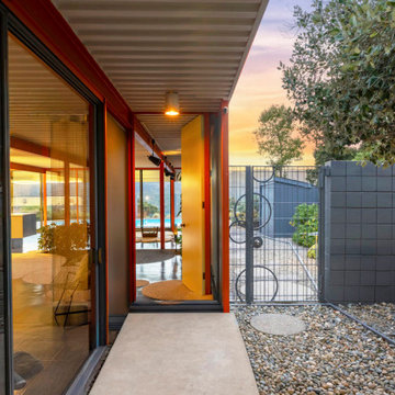
Eichler X-100 Entry: A Threshold Between Architecture and Experience
The entry to the Eichler X-100 is not a conventional front door—it’s an intentional transition, a carefully choreographed sequence that shifts you from the outside world into a fully immersive architectural environment.
Designed by A. Quincy Jones and Frederick Emmons for Joseph Eichler, the entry reflects a core principle of Eichler design: arrival should be felt, not just seen.
A Garden Before the Door
Rather than approaching a traditional façade, visitors are guided into an entry courtyard—a private, inward-facing space that immediately softens the transition from street to home. This space acts as a buffer, both visually and emotionally, creating a sense of calm and separation.
The path is often defined by concrete stepping pads set within planted areas, reinforcing the home’s circular and geometric design language. Movement becomes deliberate—slowed, grounded, and connected to the landscape.
Light as a Guide
Above, translucent skylights filter natural light into the entry sequence, creating shifting patterns of brightness and shadow throughout the day. This interplay of light transforms the entry into something dynamic—never static, always evolving.
Rather than a single moment, the entry unfolds over time.
Blurring Interior and Exterior
The X-100’s entry challenges the idea of where the home actually begins. With interior gardens visible from the moment you arrive, the boundary between outside and inside becomes intentionally ambiguous.
Glass, open sightlines, and planted spaces work together so that by the time you reach the front door, you are already inside the architectural experience.
A Compressed-to-Open Reveal
True to mid-century modern design principles, the entry creates a subtle sense of compression before release. The approach is quiet and modest—almost understated—before opening into the expansive, light-filled interior beyond.
This contrast heightens the impact of arrival, making the interior feel even more dramatic.
A Philosophy of Arrival
The Eichler X-100 entry is not about grandeur—it’s about intention. It invites you to slow down, to notice light, material, and landscape, and to engage with the home on a deeper level.
It’s a reminder that in great architecture, even the act of entering becomes part of the design itself.
 MAKHNO studio
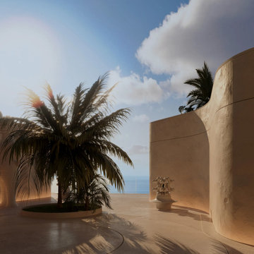
This hotel's architecture celebrates a serene blend of simplicity and organic forms, mirroring the soft contours of the landscape. The curved walls create a fluid, uninterrupted aesthetic that seamlessly integrates the structure with its tropical surroundings, enhancing the sense of escape and relaxation. The use of a monochromatic and textured facade highlights the natural beauty and the ambient light, casting dramatic shadows that shift throughout the day.
 RWH Architect PLLC
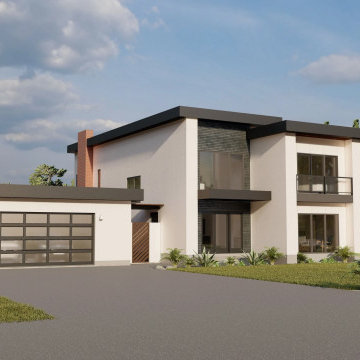
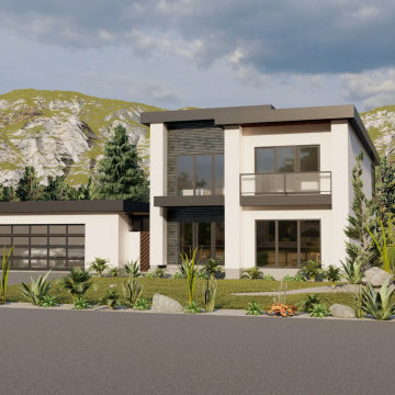
RWH Architect presents the Whistle Hill Lot 8 Residence, a statement home that reflects a bold shift toward modern, refined design. This contemporary residence is defined by its clean lines, dramatic vertical expressions, and a sophisticated mix of architectural forms that culminate in a truly forward-thinking home. From the moment visitors step into the central courtyard that connects the detached garage to the main house, the project introduces a new level of architectural intention rarely seen in the region.
The detached garage, featuring an expansive 18' x 8' door, creates a strong street presence and anchors the courtyard entry sequence. Passing through the courtyard leads to a welcoming entry foyer designed with built-in hooks and a bench, creating a comfortable—and functional—moment of arrival. Just beyond the entry is a private study with custom built-in bookshelves, a space tailored for work, reading, or quiet focus. The main floor unfolds into a sophisticated open-concept layout where the kitchen, great room, and dining areas flow effortlessly together. The kitchen includes a walk-in pantry, a pot filler for convenience, and a dedicated dog-feeding station that integrates seamlessly into the cabinetry. The great room stands as the heart of the home, featuring a built-in wood-burning fireplace and oversized sliding doors that extend the living space out to a covered patio. A centrally located half bath near the kitchen completes the first-floor program.
All bedrooms are located on the second floor to preserve privacy and capitalize on natural light. The master suite is designed as a luxurious retreat, offering a screened-in porch, a spacious walk-in closet, and a unique bathroom where the walk-in shower wraps around a freestanding tub, creating a spa-like environment that blends innovation with comfort. The laundry room is conveniently positioned on the same floor. Two additional bedrooms share a well-appointed bathroom, completing the second-floor layout.
Several design challenges shaped the evolution of this project and ultimately elevated its architectural clarity. One of the primary challenges was organizing the home around a detached garage while maintaining a cohesive architectural experience. RWH resolved this by creating a courtyard that acts as a transitional outdoor room, visually linking the structures and providing a dramatic yet functional entry sequence. Another challenge involved balancing large modern window systems with the bold vertical elements that define the façade. By carefully proportioning the glazing and framing it within thoughtful material changes, RWH maintained a strong contemporary identity while ensuring visual harmony. Integrating the built-in fireplace, open-concept layout, and large patio openings required complex structural solutions; RWH overcame this by using discreetly integrated structural steel that allowed for wide spans without compromising the home’s clean, minimalist interior aesthetic. Designing the master bathroom’s combined shower-and-tub layout also presented a unique challenge, requiring careful grading, waterproofing, and spatial planning. Through strategic detailing and 3D modeling, RWH delivered a seamless spa-like experience that feels both inventive and intuitively functional.
The Whistle Hill Lot 8 Residence stands as a testament to a new architectural direction in the area—one that embraces innovative forms, curated materials, and a lifestyle-driven floor plan. With its modern massing, intentional interior flow, and elevated details, this home reflects RWH Architect’s commitment to pushing residential design into its next era.
 RWH Architect PLLC
RWH Architect presents the Whistle Hill Lot 8 Residence, a statement home that reflects a bold shift toward modern, refined design. This contemporary residence is defined by its clean lines, dramatic vertical expressions, and a sophisticated mix of architectural forms that culminate in a truly forward-thinking home. From the moment visitors step into the central courtyard that connects the detached garage to the main house, the project introduces a new level of architectural intention rarely seen in the region.
The detached garage, featuring an expansive 18' x 8' door, creates a strong street presence and anchors the courtyard entry sequence. Passing through the courtyard leads to a welcoming entry foyer designed with built-in hooks and a bench, creating a comfortable—and functional—moment of arrival. Just beyond the entry is a private study with custom built-in bookshelves, a space tailored for work, reading, or quiet focus. The main floor unfolds into a sophisticated open-concept layout where the kitchen, great room, and dining areas flow effortlessly together. The kitchen includes a walk-in pantry, a pot filler for convenience, and a dedicated dog-feeding station that integrates seamlessly into the cabinetry. The great room stands as the heart of the home, featuring a built-in wood-burning fireplace and oversized sliding doors that extend the living space out to a covered patio. A centrally located half bath near the kitchen completes the first-floor program.
All bedrooms are located on the second floor to preserve privacy and capitalize on natural light. The master suite is designed as a luxurious retreat, offering a screened-in porch, a spacious walk-in closet, and a unique bathroom where the walk-in shower wraps around a freestanding tub, creating a spa-like environment that blends innovation with comfort. The laundry room is conveniently positioned on the same floor. Two additional bedrooms share a well-appointed bathroom, completing the second-floor layout.
Several design challenges shaped the evolution of this project and ultimately elevated its architectural clarity. One of the primary challenges was organizing the home around a detached garage while maintaining a cohesive architectural experience. RWH resolved this by creating a courtyard that acts as a transitional outdoor room, visually linking the structures and providing a dramatic yet functional entry sequence. Another challenge involved balancing large modern window systems with the bold vertical elements that define the façade. By carefully proportioning the glazing and framing it within thoughtful material changes, RWH maintained a strong contemporary identity while ensuring visual harmony. Integrating the built-in fireplace, open-concept layout, and large patio openings required complex structural solutions; RWH overcame this by using discreetly integrated structural steel that allowed for wide spans without compromising the home’s clean, minimalist interior aesthetic. Designing the master bathroom’s combined shower-and-tub layout also presented a unique challenge, requiring careful grading, waterproofing, and spatial planning. Through strategic detailing and 3D modeling, RWH delivered a seamless spa-like experience that feels both inventive and intuitively functional.
The Whistle Hill Lot 8 Residence stands as a testament to a new architectural direction in the area—one that embraces innovative forms, curated materials, and a lifestyle-driven floor plan. With its modern massing, intentional interior flow, and elevated details, this home reflects RWH Architect’s commitment to pushing residential design into its next era.
 Magda Zafer, CKBD, CAPS, CGP / Neil Kelly Company
Photo: Magda Zafer
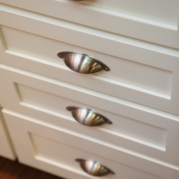
To transform the kitchen we darkened the cabinets with a dramatic color shift. Tile countertops were replaced with elegant white quartz.
 MAKHNO studio
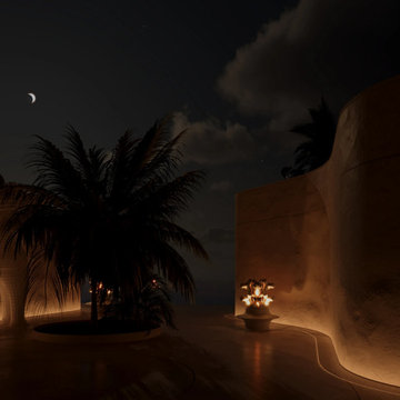
This hotel's architecture celebrates a serene blend of simplicity and organic forms, mirroring the soft contours of the landscape. The curved walls create a fluid, uninterrupted aesthetic that seamlessly integrates the structure with its tropical surroundings, enhancing the sense of escape and relaxation. The use of a monochromatic and textured facade highlights the natural beauty and the ambient light, casting dramatic shadows that shift throughout the day.
9