
Search results for "Shifted dramatically" in Home Design Ideas
 Blair Burke General Contractors, Inc.
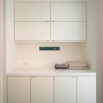
This Cole Valley home is transformed through the integration of a skylight shaft that brings natural light to both stories and nearly all living space within the home. The ingenious design creates a dramatic shift in volume for this modern, two-story rear addition, completed in only four months. In appreciation of the home’s original Victorian bones, great care was taken to restore the architectural details of the front façade.
 Amy A. Alper, Architect
Eric Rorer Photography
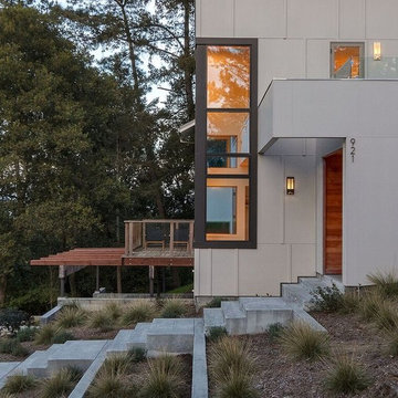
Inspiration for a mid-sized contemporary gray two-story concrete fiberboard house exterior remodel in San Francisco with a shed roof and a shingle roof
Inspiration for a mid-sized contemporary gray two-story concrete fiberboard house exterior remodel in San Francisco with a shed roof and a shingle roof
 KBK Interior Design
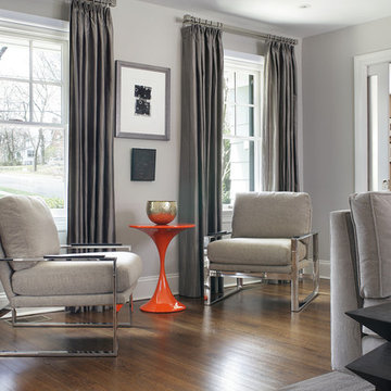
We set the tone for the new modern style of the home by replacing the traditional brick and wood fireplace surround with a dramatic sleek horizontal grained wenge-paneled fireplace with LED-lit flat recessed panels on either side of the surround. The dark contrast of the African-sourced wenge compliments the ethnic-influenced décor and adds texture and warmth to the sleek metal finishes and pale grey and taupe color shifts seen in the upholstery and area rug. Pops of orange create interest on the layered grey tones. Budget-friendly bound broadloom carpet with a strong geometric pattern gave the client the feel she desired without the expense of a hand-tufted rug. Frosted glass pocket doors between the living room and family room echo the rectangular recessed panels in the fireplace surround and allow the areas to be closed for privacy when entertaining.
A magazine photo presented by the client inspired the armless sofas in the living room, upholstered in a durable woven chenille fabric. Three areas allow for both intimate and group seating: two chairs at the front window; group seating around the fireplace; and at the back of the room, four lounge chairs around a coffee table create a casual hang out space overlooking the pool and close to the kitchen.
Designed by KBK Interior Design
www.KBKInteriorDesign.com
Photo Peter Rymwid
Find the right local pro for your project
 Vetter Architects
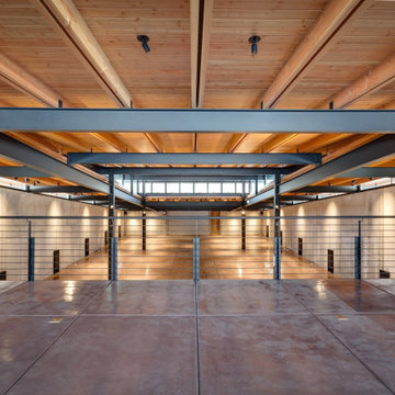
A minimal insertion into a densely wooded landscape, the Collector’s Pavilion provides the owners with an 8,000 sf private fitness space and vintage automobile gallery. On a gently sloping site in amongst a grove of trees, the pavilion slides into the topography - mimicking and contrasting the surrounding landscape with a folded roof plane that hovers over a board formed concrete base.
The clients’ requirement for a nearby room to display a growing car collection as well as provide a remote area for personal fitness carries with it a series of challenges related to privacy and security. The pavilion nestles into the wooded site - finding a home in a small clearing - and merges with the sloping landscape. The building has dual personalities, serving as a private and secure bunker from the exterior, while transforming into a warm and inviting space on the interior. The use of indirect light and the need to obscure direct views from the public right away provides the client with adequate day light for day-to-day use while ensuring that strict privacy is maintained. This shifting personality is also dramatically affected by the seasons - contrasting and merging with the surrounding environment depending on the time of year.
The Collector’s Pavilion employs meticulous detailing of its concrete to steel to wood connections, exploring the grounded nature of poured concrete in conjunction with a delicate wood roof system that floats above a grid of steel. Above all, the Pavilion harmonizes with it’s natural surroundings through it’s materiality, formal language, and siting.
Overview
Chenequa, WI
Size
8,000 sf
Completion Date
May 2013
Services
Architecture, Landscape Architecture, Interior Design
 Marcia Moore Design
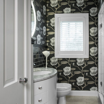
A tiny hall bath was dramatically changed from it's 1950s pink origins into a glamorous black and white statement room. Anne Matheis Photography
Alcove shower - small transitional 3/4 black tile and porcelain tile porcelain tile alcove shower idea with an undermount sink, furniture-like cabinets, white cabinets, marble countertops, a two-piece toilet and black walls
Alcove shower - small transitional 3/4 black tile and porcelain tile porcelain tile alcove shower idea with an undermount sink, furniture-like cabinets, white cabinets, marble countertops, a two-piece toilet and black walls

![Design Fixation [Faith Provencher]](https://st.hzcdn.com/fimgs/07a3fbf7003fc8b3_6655-w32-h32-b0-p0--.jpg) Design Fixation [Faith Provencher]
Design Fixation [Faith Provencher]Photo: Faith Towers © 2018 Houzz
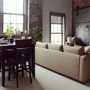
Example of an urban living room design in Boston
Example of an urban living room design in Boston


 Vetter Architects
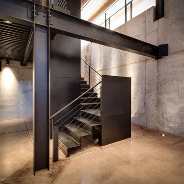
A minimal insertion into a densely wooded landscape, the Collector’s Pavilion provides the owners with an 8,000 sf private fitness space and vintage automobile gallery. On a gently sloping site in amongst a grove of trees, the pavilion slides into the topography - mimicking and contrasting the surrounding landscape with a folded roof plane that hovers over a board formed concrete base.
The clients’ requirement for a nearby room to display a growing car collection as well as provide a remote area for personal fitness carries with it a series of challenges related to privacy and security. The pavilion nestles into the wooded site - finding a home in a small clearing - and merges with the sloping landscape. The building has dual personalities, serving as a private and secure bunker from the exterior, while transforming into a warm and inviting space on the interior. The use of indirect light and the need to obscure direct views from the public right away provides the client with adequate day light for day-to-day use while ensuring that strict privacy is maintained. This shifting personality is also dramatically affected by the seasons - contrasting and merging with the surrounding environment depending on the time of year.
The Collector’s Pavilion employs meticulous detailing of its concrete to steel to wood connections, exploring the grounded nature of poured concrete in conjunction with a delicate wood roof system that floats above a grid of steel. Above all, the Pavilion harmonizes with it’s natural surroundings through it’s materiality, formal language, and siting.
Overview
Chenequa, WI
Size
8,000 sf
Completion Date
May 2013
Services
Architecture, Landscape Architecture, Interior Design
 Vetter Architects
A minimal insertion into a densely wooded landscape, the Collector’s Pavilion provides the owners with an 8,000 sf private fitness space and vintage automobile gallery. On a gently sloping site in amongst a grove of trees, the pavilion slides into the topography - mimicking and contrasting the surrounding landscape with a folded roof plane that hovers over a board formed concrete base.
The clients’ requirement for a nearby room to display a growing car collection as well as provide a remote area for personal fitness carries with it a series of challenges related to privacy and security. The pavilion nestles into the wooded site - finding a home in a small clearing - and merges with the sloping landscape. The building has dual personalities, serving as a private and secure bunker from the exterior, while transforming into a warm and inviting space on the interior. The use of indirect light and the need to obscure direct views from the public right away provides the client with adequate day light for day-to-day use while ensuring that strict privacy is maintained. This shifting personality is also dramatically affected by the seasons - contrasting and merging with the surrounding environment depending on the time of year.
The Collector’s Pavilion employs meticulous detailing of its concrete to steel to wood connections, exploring the grounded nature of poured concrete in conjunction with a delicate wood roof system that floats above a grid of steel. Above all, the Pavilion harmonizes with it’s natural surroundings through it’s materiality, formal language, and siting.
Overview
Chenequa, WI
Size
8,000 sf
Completion Date
May 2013
Services
Architecture, Landscape Architecture, Interior Design
 Progressive Design Build
Challenge
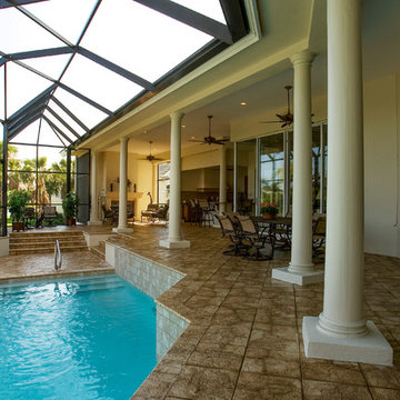
As part-time residents of this Bonita Springs home, our clients were looking to update their outdoor entertainment area. They also planned to be away for the summer during the remodel and needed their renovation project to be finished prior to their return for the winter.
Their needs included:
Changing the color pallet to a monochromatic scheme, removing the yellow brick pavers, adding an outdoor kitchen area, adding an outdoor fireplace, resurfacing the pool and updating the tile, installing a new screen enclosure, and creating privacy from the neighbors, particularly the main sitting areas, pool and outdoor kitchen.
Although there was already a 1,221 sq. ft. lanai under the roof, it lacked functionality needed by the homeowners. Most of its amenities were located at one end of the lanai, and lacked privacy that the homeowners valued.
Solution
The final project design required two additions to the lanai area adding an accumulative 265 sq. ft. to the existing space expanding their sitting area and accommodating a much-needed outdoor kitchen. The new additions also needed to blend with the home’s existing style.
Addition #1—Sitting Area:
The first addition added approximately 145 sq. ft. to the end of the lanai. This allowed Progressive Design Build to tie into the existing gable room for the new space and create privacy from the neighbors.
Addition #2—Outdoor Kitchen:
The second addition was a bump out that added approximately 120 sq. ft. to the end of the house close to the interior kitchen. This allowed the client to add an outdoor over and 52” Viking grill (with a side burner) to their outdoor living space. Other amenities included a new sink and under counter fridge, granite countertops, tumbled stone stile and Cypress cabinetry, custom-fabricated with marine grade plywood boxes and marine grade finishes to withstand moisture, common in the Bonita Bay community.
Special attention was given to the preparation area on either side of the stove, the landing area next to the oven and the serving counter behind the bar. Bar seating was added to the outdoor kitchen, allowing guests to visit with the cook comfortably and easily.
Brick Pavers
During the design phase, we discovered that the original brick pavers were set in sand, with no concrete pad below. Consequently, the retaining wall and several pavers were starting to fail, caused by the shifting sands. To remedy the problem, we installed a new concrete deck and laid new nonslip pavers on top of the deck—ideal for wet area applications.
Pool Renovations
To dramatically improve the enjoyment and ambiance of their pool, Progressive Design Build completely re-plumbed it, putting in additional lighting and new water features. New decorative pool tile, coping, and a paver deck were also installed around the pool. The pool finish chosen by our clients was a nice tropical blue color.
Screen Enclosure
A new screen enclosure was installed in compliance with new local building codes, making it more stable and solid than the existing one. The color change from white to bronze coordinated well with the homeowners’ new color scheme; and the location of the service door and stairs provided convenient access to the new pool equipment.
Results
This project was completed on time and within budget before these homeowners returned for their winter holiday. They were thrilled with the weekly communication, which included two-way phone calls and email photo sharing. They always knew where their project was in the construction process and what was happening at all times—providing security and peace of mind.
 Kelly and Abramson Architecture
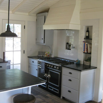
The changes to this kitchen were dramatic. From a bad 1980s floor plan and the original squished breakfast and kitchen. We opened up and connected the kitchen to the dining, deck and front. The actual kitchen is small, but its role has shifted so that it is now the center of the house
 Drury Design
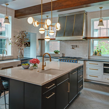
Relocating from San Francisco, this young family immediately zeroed in on the wonderful historic homes around downtown Chicago. Most of the properties they saw checked a lot of wish list boxes, but none of them checked every box. The house they landed on had beautiful curb appeal, a dramatic entry with a welcoming porch and front hall, and a really nice yard. Unfortunately, it did not have a kitchen that was well set-up for cooking and entertaining. Reworking the kitchen area was the top priority.
The family had met with a few other designers and even had an architect take a crack at the space, but they were not able to come up with a viable solution. Here’s how Senior Designer Diana Burton approached the project…
Design Objectives:
Respect the home’s vintage feel while bringing the kitchen up to date
Open up the kitchen area to create an open space for gathering and entertaining
Upgrade appliances to top-of-the-line models
Include a large island with seating
Include seating for casual family meals in a space that won’t be a replacement for the adjacent formal dining room
THE REMODEL
Design Challenges:
Remove a load-bearing wall and combine smaller rooms to create one big kitchen
A powder room in the back corner of the existing kitchen was a huge obstacle to updating the layout
Maintain large windows with views of the yard while still providing ample storage
Design Solutions:
Relocating the powder room to another part of the first floor (a large closet under the stairs) opened up the space dramatically
Create space for a larger island by recessing the fridge/freezer and shifting the pantry to a space adjacent to the kitchen
A banquette saves space and offers a perfect solution for casual dining
The walnut banquette table beautifully complements the fridge/freezer armoire
Utilize a gap created by the new fridge location to create a tall shallow cabinet for liquor storage w/ a wine cubby
Closing off one doorway into the dining room and using the “between the studs” space for a tall storage cabinet
Dish organizing drawers offer handy storage for plates, bowls, and serving dishes right by main sink and dishwasher
Cabinetry backing up to the dining room offers ample storage for glassware and functions both as a coffee station and cocktail bar
Open shelves flanking the hood add storage without blocking views and daylight
A beam was required where the wall was removed. Additional beams added architectural interest and helped integrate the beams into the space
Statement lighting adds drama and personality to the space
THE RENEWED SPACE
This project exemplifies the transformative power of good design. Simply put, good design allows you to live life artfully. The newly remodeled kitchen effortlessly combines functionality and aesthetic appeal, providing a delightful space for cooking and spending quality time together. It’s comfy for regular meals but ultimately outfitted for those special gatherings. Infused with classic finishes and a timeless charm, the kitchen emanates an enduring atmosphere that will never go out of style.
 Vetter Architects
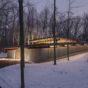
A minimal insertion into a densely wooded landscape, the Collector’s Pavilion provides the owners with an 8,000 sf private fitness space and vintage automobile gallery. On a gently sloping site in amongst a grove of trees, the pavilion slides into the topography - mimicking and contrasting the surrounding landscape with a folded roof plane that hovers over a board formed concrete base.
The clients’ requirement for a nearby room to display a growing car collection as well as provide a remote area for personal fitness carries with it a series of challenges related to privacy and security. The pavilion nestles into the wooded site - finding a home in a small clearing - and merges with the sloping landscape. The building has dual personalities, serving as a private and secure bunker from the exterior, while transforming into a warm and inviting space on the interior. The use of indirect light and the need to obscure direct views from the public right away provides the client with adequate day light for day-to-day use while ensuring that strict privacy is maintained. This shifting personality is also dramatically affected by the seasons - contrasting and merging with the surrounding environment depending on the time of year.
The Collector’s Pavilion employs meticulous detailing of its concrete to steel to wood connections, exploring the grounded nature of poured concrete in conjunction with a delicate wood roof system that floats above a grid of steel. Above all, the Pavilion harmonizes with it’s natural surroundings through it’s materiality, formal language, and siting.
Overview
Chenequa, WI
Size
8,000 sf
Completion Date
May 2013
Services
Architecture, Landscape Architecture, Interior Design
 Magda Zafer, CKBD, CAPS, CGP / Neil Kelly Company
Photo: Magda Zafer
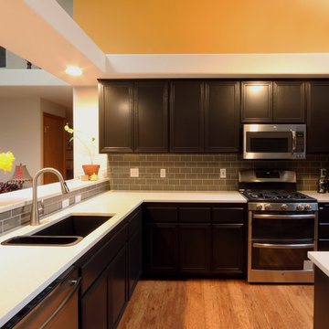
To transform the kitchen we darkened the cabinets with a more dramatic color shift and installed new stainless steel GE appliances. The tile countertops were replaced with elegant white quartz. Wooden backsplash was replaced with a glazed ceramic tile in a classic subway pattern.
 Boyenga Team / Compass
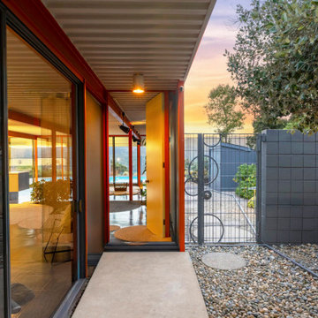
Eichler X-100 Entry: A Threshold Between Architecture and Experience
The entry to the Eichler X-100 is not a conventional front door—it’s an intentional transition, a carefully choreographed sequence that shifts you from the outside world into a fully immersive architectural environment.
Designed by A. Quincy Jones and Frederick Emmons for Joseph Eichler, the entry reflects a core principle of Eichler design: arrival should be felt, not just seen.
A Garden Before the Door
Rather than approaching a traditional façade, visitors are guided into an entry courtyard—a private, inward-facing space that immediately softens the transition from street to home. This space acts as a buffer, both visually and emotionally, creating a sense of calm and separation.
The path is often defined by concrete stepping pads set within planted areas, reinforcing the home’s circular and geometric design language. Movement becomes deliberate—slowed, grounded, and connected to the landscape.
Light as a Guide
Above, translucent skylights filter natural light into the entry sequence, creating shifting patterns of brightness and shadow throughout the day. This interplay of light transforms the entry into something dynamic—never static, always evolving.
Rather than a single moment, the entry unfolds over time.
Blurring Interior and Exterior
The X-100’s entry challenges the idea of where the home actually begins. With interior gardens visible from the moment you arrive, the boundary between outside and inside becomes intentionally ambiguous.
Glass, open sightlines, and planted spaces work together so that by the time you reach the front door, you are already inside the architectural experience.
A Compressed-to-Open Reveal
True to mid-century modern design principles, the entry creates a subtle sense of compression before release. The approach is quiet and modest—almost understated—before opening into the expansive, light-filled interior beyond.
This contrast heightens the impact of arrival, making the interior feel even more dramatic.
A Philosophy of Arrival
The Eichler X-100 entry is not about grandeur—it’s about intention. It invites you to slow down, to notice light, material, and landscape, and to engage with the home on a deeper level.
It’s a reminder that in great architecture, even the act of entering becomes part of the design itself.
 RWH Architect PLLC
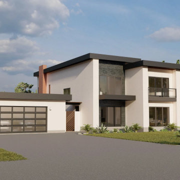
RWH Architect presents the Whistle Hill Lot 8 Residence, a statement home that reflects a bold shift toward modern, refined design. This contemporary residence is defined by its clean lines, dramatic vertical expressions, and a sophisticated mix of architectural forms that culminate in a truly forward-thinking home. From the moment visitors step into the central courtyard that connects the detached garage to the main house, the project introduces a new level of architectural intention rarely seen in the region.
The detached garage, featuring an expansive 18' x 8' door, creates a strong street presence and anchors the courtyard entry sequence. Passing through the courtyard leads to a welcoming entry foyer designed with built-in hooks and a bench, creating a comfortable—and functional—moment of arrival. Just beyond the entry is a private study with custom built-in bookshelves, a space tailored for work, reading, or quiet focus. The main floor unfolds into a sophisticated open-concept layout where the kitchen, great room, and dining areas flow effortlessly together. The kitchen includes a walk-in pantry, a pot filler for convenience, and a dedicated dog-feeding station that integrates seamlessly into the cabinetry. The great room stands as the heart of the home, featuring a built-in wood-burning fireplace and oversized sliding doors that extend the living space out to a covered patio. A centrally located half bath near the kitchen completes the first-floor program.
All bedrooms are located on the second floor to preserve privacy and capitalize on natural light. The master suite is designed as a luxurious retreat, offering a screened-in porch, a spacious walk-in closet, and a unique bathroom where the walk-in shower wraps around a freestanding tub, creating a spa-like environment that blends innovation with comfort. The laundry room is conveniently positioned on the same floor. Two additional bedrooms share a well-appointed bathroom, completing the second-floor layout.
Several design challenges shaped the evolution of this project and ultimately elevated its architectural clarity. One of the primary challenges was organizing the home around a detached garage while maintaining a cohesive architectural experience. RWH resolved this by creating a courtyard that acts as a transitional outdoor room, visually linking the structures and providing a dramatic yet functional entry sequence. Another challenge involved balancing large modern window systems with the bold vertical elements that define the façade. By carefully proportioning the glazing and framing it within thoughtful material changes, RWH maintained a strong contemporary identity while ensuring visual harmony. Integrating the built-in fireplace, open-concept layout, and large patio openings required complex structural solutions; RWH overcame this by using discreetly integrated structural steel that allowed for wide spans without compromising the home’s clean, minimalist interior aesthetic. Designing the master bathroom’s combined shower-and-tub layout also presented a unique challenge, requiring careful grading, waterproofing, and spatial planning. Through strategic detailing and 3D modeling, RWH delivered a seamless spa-like experience that feels both inventive and intuitively functional.
The Whistle Hill Lot 8 Residence stands as a testament to a new architectural direction in the area—one that embraces innovative forms, curated materials, and a lifestyle-driven floor plan. With its modern massing, intentional interior flow, and elevated details, this home reflects RWH Architect’s commitment to pushing residential design into its next era.
 RWH Architect PLLC
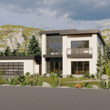
RWH Architect presents the Whistle Hill Lot 8 Residence, a statement home that reflects a bold shift toward modern, refined design. This contemporary residence is defined by its clean lines, dramatic vertical expressions, and a sophisticated mix of architectural forms that culminate in a truly forward-thinking home. From the moment visitors step into the central courtyard that connects the detached garage to the main house, the project introduces a new level of architectural intention rarely seen in the region.
The detached garage, featuring an expansive 18' x 8' door, creates a strong street presence and anchors the courtyard entry sequence. Passing through the courtyard leads to a welcoming entry foyer designed with built-in hooks and a bench, creating a comfortable—and functional—moment of arrival. Just beyond the entry is a private study with custom built-in bookshelves, a space tailored for work, reading, or quiet focus. The main floor unfolds into a sophisticated open-concept layout where the kitchen, great room, and dining areas flow effortlessly together. The kitchen includes a walk-in pantry, a pot filler for convenience, and a dedicated dog-feeding station that integrates seamlessly into the cabinetry. The great room stands as the heart of the home, featuring a built-in wood-burning fireplace and oversized sliding doors that extend the living space out to a covered patio. A centrally located half bath near the kitchen completes the first-floor program.
All bedrooms are located on the second floor to preserve privacy and capitalize on natural light. The master suite is designed as a luxurious retreat, offering a screened-in porch, a spacious walk-in closet, and a unique bathroom where the walk-in shower wraps around a freestanding tub, creating a spa-like environment that blends innovation with comfort. The laundry room is conveniently positioned on the same floor. Two additional bedrooms share a well-appointed bathroom, completing the second-floor layout.
Several design challenges shaped the evolution of this project and ultimately elevated its architectural clarity. One of the primary challenges was organizing the home around a detached garage while maintaining a cohesive architectural experience. RWH resolved this by creating a courtyard that acts as a transitional outdoor room, visually linking the structures and providing a dramatic yet functional entry sequence. Another challenge involved balancing large modern window systems with the bold vertical elements that define the façade. By carefully proportioning the glazing and framing it within thoughtful material changes, RWH maintained a strong contemporary identity while ensuring visual harmony. Integrating the built-in fireplace, open-concept layout, and large patio openings required complex structural solutions; RWH overcame this by using discreetly integrated structural steel that allowed for wide spans without compromising the home’s clean, minimalist interior aesthetic. Designing the master bathroom’s combined shower-and-tub layout also presented a unique challenge, requiring careful grading, waterproofing, and spatial planning. Through strategic detailing and 3D modeling, RWH delivered a seamless spa-like experience that feels both inventive and intuitively functional.
The Whistle Hill Lot 8 Residence stands as a testament to a new architectural direction in the area—one that embraces innovative forms, curated materials, and a lifestyle-driven floor plan. With its modern massing, intentional interior flow, and elevated details, this home reflects RWH Architect’s commitment to pushing residential design into its next era.
 Vetter Architects
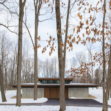
A minimal insertion into a densely wooded landscape, the Collector’s Pavilion provides the owners with an 8,000 sf private fitness space and vintage automobile gallery. On a gently sloping site in amongst a grove of trees, the pavilion slides into the topography - mimicking and contrasting the surrounding landscape with a folded roof plane that hovers over a board formed concrete base.
The clients’ requirement for a nearby room to display a growing car collection as well as provide a remote area for personal fitness carries with it a series of challenges related to privacy and security. The pavilion nestles into the wooded site - finding a home in a small clearing - and merges with the sloping landscape. The building has dual personalities, serving as a private and secure bunker from the exterior, while transforming into a warm and inviting space on the interior. The use of indirect light and the need to obscure direct views from the public right away provides the client with adequate day light for day-to-day use while ensuring that strict privacy is maintained. This shifting personality is also dramatically affected by the seasons - contrasting and merging with the surrounding environment depending on the time of year.
The Collector’s Pavilion employs meticulous detailing of its concrete to steel to wood connections, exploring the grounded nature of poured concrete in conjunction with a delicate wood roof system that floats above a grid of steel. Above all, the Pavilion harmonizes with it’s natural surroundings through it’s materiality, formal language, and siting.
Overview
Chenequa, WI
Size
8,000 sf
Completion Date
May 2013
Services
Architecture, Landscape Architecture, Interior Design
 Landis Architects | Builders
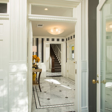
Elegant new entry finished with traditional black and white marble flooring with a basket weave border and trim that matches the home’s era.
The original foyer was dark and had an obtrusive cabinet to hide unsightly meters and pipes. Our in-house plumber reconfigured the plumbing to allow us to build a shallower full-height closet to hide the meters and electric panels, but we still gained space to install storage shelves. We also shifted part of the wall into the adjacent suite to gain square footage to create a more dramatic foyer. The door on the left leads to a basement suite.
Photographer: Greg Hadley
Interior Designer: Whitney Stewart
 Ariel Muller Designs
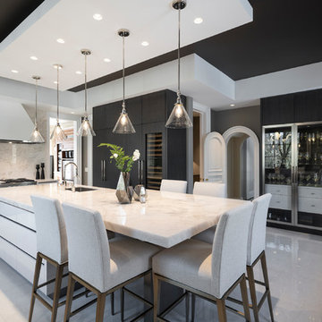
Enclosed kitchen - large contemporary u-shaped porcelain tile and white floor enclosed kitchen idea in Toronto with flat-panel cabinets, quartzite countertops, white backsplash, stone slab backsplash, an island, white countertops, a single-bowl sink, white cabinets and stainless steel appliances
10