
Search results for "Simply extra" in Home Design Ideas
 Skill Construction & Design, LLC
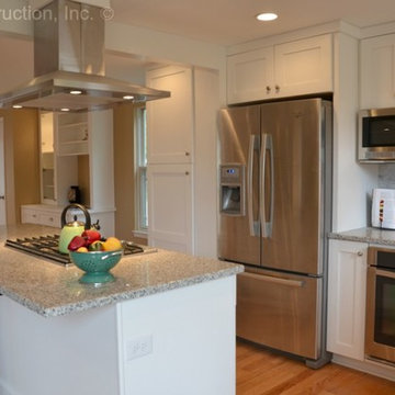
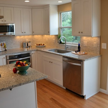
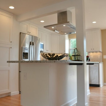
There are so many design elements to this kitchen, I almost don’t know where to start. Bright and airy with crisp clean white cabinets, the kitchen is open and welcoming. Still crisp but gently contrasting, the stainless steel appliance add depth amid the white. To keep this kitchen warm, natural oak covers the floors and a toasted wheat color washes the walls. And then there is the architectural elements. You know. That post and beam in the middle of the room. It’s the center of attention.
When you walk into a room your eyes roam around, establishing the size and shape of the room as your feet take you forward. From the front door of this home straight ahead you encountered this wall. The dining area to the right gives you a glimpse of things to come. Where there is a dining room you will usually find a kitchen.
The architecture of years gone by consistently hides the kitchen, the heart of the home, behind walls. I sympathize with my Mom, and all the other Moms, who have had to spend so much time tucked into a tight kitchen, away from the family. This wall had to go, but it was structural. We needed its support but not its bulk.
So we got rid of the bulk and only the bulk. Instead of a wall we have a post and beam, offering all of the structure we need. We could have installed a huge steel beam and reconfigure the joists to upset the beam, but why? The small beam and post add an incredible architectural element. It’s turning lemons into lemon, we simply made the most of what we had. It may be functional but it’s so fantastic. It looks like we created the effect just for the drama.
The original kitchen may have had a working triangle and some counter space, but it was fairly small, with each area only a step or two away. The dark cabinets made the space feel even smaller and the butcher block patterned laminate counter tops were very dated. The appliances were feeling their age as well, from a coil burner electric stove to a top freezer refrigerator. To keep this kitchen within its space, a half wall separated it from the dining area.
With the wall gone we borrowed some space from the living room and extended what was a U shaped kitchen into an L. At the living room window we start our new kitchen. We kept a small part of the wall to support the other end of our decorative beam. Sandwiched between a large pantry and our new French door refrigerator, the wall disappears. With our new open floor plan a sizable island was in order.
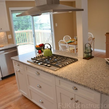
We split our cooking areas and installed a continuous grill gas cooktop into the island. A sleek island hood takes care of exhaust and adds an extra element to our architectural feature. Under the cooktop we added over-sized drawers for pots and pan storage. The frameless cabinets from New River Cabinetry are maple, painted white, with the Herndon door style. With the cooktop safely nestled into our island, we still had to add an oven.
We used the space where the old range sat for a large single oven of stainless steel and glass. If it worked for one, why not two? We created a home for a microwave in the wall cabinets. It’s perfect for heating leftovers so close to the refrigerator.
An important consideration for hot spots in your kitchen is landing zones. Each of our cooking areas have generous landing zones, one on each side of the cooktop and an entire counter area above or below the ovens, depending on which one you’re using.
We wanted to give the sink area more room so the half wall had to come out. We moved the trash and recycle cans into a cabinet, removed the heavy soffits and kept the sink under the window.
With that little bit of extra space we were able to add a larger cabinet above the dishwasher and slide it all down. This used to be where the carpeting met the vinyl floor, but all of it is gone. Long oak planks eliminate that final divide between the kitchen and the dining area, while adding visual length to the area. White wall cabinets on each side of the window reflect the sunlight for a brighter view.
With all of the darker cabinetry the backsplash walls had been painted white. Even still, there was a darkness in the corners and it wasn’t very exciting. We wanted to add visual interest and reflect the new under-cabinet lighting, eliminating the shadows in this corner.
With 1″x 2″ Arabescato Honed marble mosaics and those under-cabinet lights, we achieved the perfect balance. The marble has subtle swirls in gray and beige on a clean white background, but with the honed finish the light is softly reflected instead of glaring. For granite, we chose the soft gray tones of Luna Pearl. The speckles of gray and beige are a gentle contrast to the white cabinets and emulate the color of the stainless steel.
Between the carpet, red half wall, dark railing and dated light fixture, the dining area felt tired. Since the kitchen lacked sufficient storage, a large utility cabinet crowded the table space without adding any decorate elements.
Although it didn’t get any bigger, our dining area feels fresher and more open too. With the oak flooring joining the area to the rest of our space and the toasted wheat on the walls, the white table and chairs compliment the cabinetry while contrasting the warmer colors. We replaced the chandelier with recessed lighting and changed that railing too.
With our new open floor plan, we ended up with a fairly open area in between our foyer closet and the living room window. Not one to miss an opportunity, we filled the space with a multi-functional work space.
With the sunlight streaming in this bright corner works for anything this family needs.
There’s plenty of space for a chair under this large desk drawer. A closed cabinet below, glass doors above and lots of open shelving let you store and or showcase your belongings. We added a lite area at the top to keep away the darker corners.
The transformation is complete. This kitchen and all of its features are truly the center of attention in this home.
http://www.designsbyskill.com/
http://www.rjkconstructioninc.com/
 Waterloo Structures
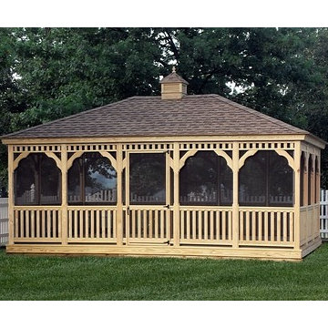
Rectangular wooden gazebo - A gazebo is a perfect way to add extra space to entertain guests for dining or simply relaxing. All you need is to add some comfortable furniture and you will have an inviting place to either entertain or simply to relax with the family.
 User
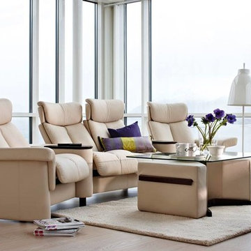
UserThe Stressless Legend features unique cushioning that feels sumptious and luxurious as it embraces and supports your body.
The specially designed foam and the Stressless glide system means the sofa adjusts to your body smoothly. It simply stretches to that extra degree of comfort you have come to expect. This means that it’s more responsive to the way your body moves.
You never have to force it to do anything – simply move, and it moves with you. Enjoy!
Find the right local pro for your project
 Skill Construction & Design, LLC
There are so many design elements to this kitchen, I almost don’t know where to start. Bright and airy with crisp clean white cabinets, the kitchen is open and welcoming. Still crisp but gently contrasting, the stainless steel appliance add depth amid the white. To keep this kitchen warm, natural oak covers the floors and a toasted wheat color washes the walls. And then there is the architectural elements. You know. That post and beam in the middle of the room. It’s the center of attention.
When you walk into a room your eyes roam around, establishing the size and shape of the room as your feet take you forward. From the front door of this home straight ahead you encountered this wall. The dining area to the right gives you a glimpse of things to come. Where there is a dining room you will usually find a kitchen.
The architecture of years gone by consistently hides the kitchen, the heart of the home, behind walls. I sympathize with my Mom, and all the other Moms, who have had to spend so much time tucked into a tight kitchen, away from the family. This wall had to go, but it was structural. We needed its support but not its bulk.
So we got rid of the bulk and only the bulk. Instead of a wall we have a post and beam, offering all of the structure we need. We could have installed a huge steel beam and reconfigure the joists to upset the beam, but why? The small beam and post add an incredible architectural element. It’s turning lemons into lemon, we simply made the most of what we had. It may be functional but it’s so fantastic. It looks like we created the effect just for the drama.
The original kitchen may have had a working triangle and some counter space, but it was fairly small, with each area only a step or two away. The dark cabinets made the space feel even smaller and the butcher block patterned laminate counter tops were very dated. The appliances were feeling their age as well, from a coil burner electric stove to a top freezer refrigerator. To keep this kitchen within its space, a half wall separated it from the dining area.
With the wall gone we borrowed some space from the living room and extended what was a U shaped kitchen into an L. At the living room window we start our new kitchen. We kept a small part of the wall to support the other end of our decorative beam. Sandwiched between a large pantry and our new French door refrigerator, the wall disappears. With our new open floor plan a sizable island was in order.
We split our cooking areas and installed a continuous grill gas cooktop into the island. A sleek island hood takes care of exhaust and adds an extra element to our architectural feature. Under the cooktop we added over-sized drawers for pots and pan storage. The frameless cabinets from New River Cabinetry are maple, painted white, with the Herndon door style. With the cooktop safely nestled into our island, we still had to add an oven.
We used the space where the old range sat for a large single oven of stainless steel and glass. If it worked for one, why not two? We created a home for a microwave in the wall cabinets. It’s perfect for heating leftovers so close to the refrigerator.
An important consideration for hot spots in your kitchen is landing zones. Each of our cooking areas have generous landing zones, one on each side of the cooktop and an entire counter area above or below the ovens, depending on which one you’re using.
We wanted to give the sink area more room so the half wall had to come out. We moved the trash and recycle cans into a cabinet, removed the heavy soffits and kept the sink under the window.
With that little bit of extra space we were able to add a larger cabinet above the dishwasher and slide it all down. This used to be where the carpeting met the vinyl floor, but all of it is gone. Long oak planks eliminate that final divide between the kitchen and the dining area, while adding visual length to the area. White wall cabinets on each side of the window reflect the sunlight for a brighter view.
With all of the darker cabinetry the backsplash walls had been painted white. Even still, there was a darkness in the corners and it wasn’t very exciting. We wanted to add visual interest and reflect the new under-cabinet lighting, eliminating the shadows in this corner.
With 1″x 2″ Arabescato Honed marble mosaics and those under-cabinet lights, we achieved the perfect balance. The marble has subtle swirls in gray and beige on a clean white background, but with the honed finish the light is softly reflected instead of glaring. For granite, we chose the soft gray tones of Luna Pearl. The speckles of gray and beige are a gentle contrast to the white cabinets and emulate the color of the stainless steel.
Between the carpet, red half wall, dark railing and dated light fixture, the dining area felt tired. Since the kitchen lacked sufficient storage, a large utility cabinet crowded the table space without adding any decorate elements.
Although it didn’t get any bigger, our dining area feels fresher and more open too. With the oak flooring joining the area to the rest of our space and the toasted wheat on the walls, the white table and chairs compliment the cabinetry while contrasting the warmer colors. We replaced the chandelier with recessed lighting and changed that railing too.
With our new open floor plan, we ended up with a fairly open area in between our foyer closet and the living room window. Not one to miss an opportunity, we filled the space with a multi-functional work space.
With the sunlight streaming in this bright corner works for anything this family needs.
There’s plenty of space for a chair under this large desk drawer. A closed cabinet below, glass doors above and lots of open shelving let you store and or showcase your belongings. We added a lite area at the top to keep away the darker corners.
The transformation is complete. This kitchen and all of its features are truly the center of attention in this home.
http://www.designsbyskill.com/
http://www.rjkconstructioninc.com/
 Skill Construction & Design, LLC
There are so many design elements to this kitchen, I almost don’t know where to start. Bright and airy with crisp clean white cabinets, the kitchen is open and welcoming. Still crisp but gently contrasting, the stainless steel appliance add depth amid the white. To keep this kitchen warm, natural oak covers the floors and a toasted wheat color washes the walls. And then there is the architectural elements. You know. That post and beam in the middle of the room. It’s the center of attention.
When you walk into a room your eyes roam around, establishing the size and shape of the room as your feet take you forward. From the front door of this home straight ahead you encountered this wall. The dining area to the right gives you a glimpse of things to come. Where there is a dining room you will usually find a kitchen.
The architecture of years gone by consistently hides the kitchen, the heart of the home, behind walls. I sympathize with my Mom, and all the other Moms, who have had to spend so much time tucked into a tight kitchen, away from the family. This wall had to go, but it was structural. We needed its support but not its bulk.
So we got rid of the bulk and only the bulk. Instead of a wall we have a post and beam, offering all of the structure we need. We could have installed a huge steel beam and reconfigure the joists to upset the beam, but why? The small beam and post add an incredible architectural element. It’s turning lemons into lemon, we simply made the most of what we had. It may be functional but it’s so fantastic. It looks like we created the effect just for the drama.
The original kitchen may have had a working triangle and some counter space, but it was fairly small, with each area only a step or two away. The dark cabinets made the space feel even smaller and the butcher block patterned laminate counter tops were very dated. The appliances were feeling their age as well, from a coil burner electric stove to a top freezer refrigerator. To keep this kitchen within its space, a half wall separated it from the dining area.
With the wall gone we borrowed some space from the living room and extended what was a U shaped kitchen into an L. At the living room window we start our new kitchen. We kept a small part of the wall to support the other end of our decorative beam. Sandwiched between a large pantry and our new French door refrigerator, the wall disappears. With our new open floor plan a sizable island was in order.
We split our cooking areas and installed a continuous grill gas cooktop into the island. A sleek island hood takes care of exhaust and adds an extra element to our architectural feature. Under the cooktop we added over-sized drawers for pots and pan storage. The frameless cabinets from New River Cabinetry are maple, painted white, with the Herndon door style. With the cooktop safely nestled into our island, we still had to add an oven.
We used the space where the old range sat for a large single oven of stainless steel and glass. If it worked for one, why not two? We created a home for a microwave in the wall cabinets. It’s perfect for heating leftovers so close to the refrigerator.
An important consideration for hot spots in your kitchen is landing zones. Each of our cooking areas have generous landing zones, one on each side of the cooktop and an entire counter area above or below the ovens, depending on which one you’re using.
We wanted to give the sink area more room so the half wall had to come out. We moved the trash and recycle cans into a cabinet, removed the heavy soffits and kept the sink under the window.
With that little bit of extra space we were able to add a larger cabinet above the dishwasher and slide it all down. This used to be where the carpeting met the vinyl floor, but all of it is gone. Long oak planks eliminate that final divide between the kitchen and the dining area, while adding visual length to the area. White wall cabinets on each side of the window reflect the sunlight for a brighter view.
With all of the darker cabinetry the backsplash walls had been painted white. Even still, there was a darkness in the corners and it wasn’t very exciting. We wanted to add visual interest and reflect the new under-cabinet lighting, eliminating the shadows in this corner.
With 1″x 2″ Arabescato Honed marble mosaics and those under-cabinet lights, we achieved the perfect balance. The marble has subtle swirls in gray and beige on a clean white background, but with the honed finish the light is softly reflected instead of glaring. For granite, we chose the soft gray tones of Luna Pearl. The speckles of gray and beige are a gentle contrast to the white cabinets and emulate the color of the stainless steel.
Between the carpet, red half wall, dark railing and dated light fixture, the dining area felt tired. Since the kitchen lacked sufficient storage, a large utility cabinet crowded the table space without adding any decorate elements.
Although it didn’t get any bigger, our dining area feels fresher and more open too. With the oak flooring joining the area to the rest of our space and the toasted wheat on the walls, the white table and chairs compliment the cabinetry while contrasting the warmer colors. We replaced the chandelier with recessed lighting and changed that railing too.
With our new open floor plan, we ended up with a fairly open area in between our foyer closet and the living room window. Not one to miss an opportunity, we filled the space with a multi-functional work space.
With the sunlight streaming in this bright corner works for anything this family needs.
There’s plenty of space for a chair under this large desk drawer. A closed cabinet below, glass doors above and lots of open shelving let you store and or showcase your belongings. We added a lite area at the top to keep away the darker corners.
The transformation is complete. This kitchen and all of its features are truly the center of attention in this home.
http://www.designsbyskill.com/
http://www.rjkconstructioninc.com/
 O'Hanlon Kitchen & Bath
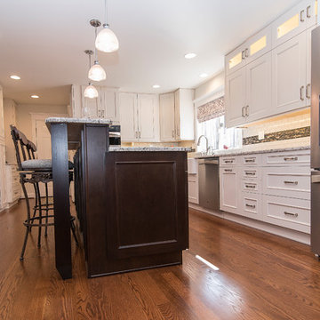
This kitchen went from dated and dull to contemporary and sophisticated. Every inch of this kitchen had a plan from the coffee/wine bar with a beverage cooler to the office nook. The island grounds the space with its warm rich earth tone while providing extra seating and an extra element with the two-tier look. The open floor plan of this home really helps bring the kitchen, dining room, and adjacent living room to be a stunning space to live and entertain.
Cabinetry: St. Martin-Ridgewood- Perimeter-Simply White, Island-Black Walnut
Hardware: Jeffrey Alexander-Ella-Satin Nickel
Countertop: Granite-Bianco Antico
Sink: Blanco-Silgranit-White Farm Sink
Backsplash: Main Tile-Glass Snow Amalfi, Accent-Australia Canberra Stria
Photography by: KeepsakeDesign
 Skill Construction & Design, LLC
There are so many design elements to this kitchen, I almost don’t know where to start. Bright and airy with crisp clean white cabinets, the kitchen is open and welcoming. Still crisp but gently contrasting, the stainless steel appliance add depth amid the white. To keep this kitchen warm, natural oak covers the floors and a toasted wheat color washes the walls. And then there is the architectural elements. You know. That post and beam in the middle of the room. It’s the center of attention.
When you walk into a room your eyes roam around, establishing the size and shape of the room as your feet take you forward. From the front door of this home straight ahead you encountered this wall. The dining area to the right gives you a glimpse of things to come. Where there is a dining room you will usually find a kitchen.
The architecture of years gone by consistently hides the kitchen, the heart of the home, behind walls. I sympathize with my Mom, and all the other Moms, who have had to spend so much time tucked into a tight kitchen, away from the family. This wall had to go, but it was structural. We needed its support but not its bulk.
So we got rid of the bulk and only the bulk. Instead of a wall we have a post and beam, offering all of the structure we need. We could have installed a huge steel beam and reconfigure the joists to upset the beam, but why? The small beam and post add an incredible architectural element. It’s turning lemons into lemon, we simply made the most of what we had. It may be functional but it’s so fantastic. It looks like we created the effect just for the drama.
The original kitchen may have had a working triangle and some counter space, but it was fairly small, with each area only a step or two away. The dark cabinets made the space feel even smaller and the butcher block patterned laminate counter tops were very dated. The appliances were feeling their age as well, from a coil burner electric stove to a top freezer refrigerator. To keep this kitchen within its space, a half wall separated it from the dining area.
With the wall gone we borrowed some space from the living room and extended what was a U shaped kitchen into an L. At the living room window we start our new kitchen. We kept a small part of the wall to support the other end of our decorative beam. Sandwiched between a large pantry and our new French door refrigerator, the wall disappears. With our new open floor plan a sizable island was in order.
We split our cooking areas and installed a continuous grill gas cooktop into the island. A sleek island hood takes care of exhaust and adds an extra element to our architectural feature. Under the cooktop we added over-sized drawers for pots and pan storage. The frameless cabinets from New River Cabinetry are maple, painted white, with the Herndon door style. With the cooktop safely nestled into our island, we still had to add an oven.
We used the space where the old range sat for a large single oven of stainless steel and glass. If it worked for one, why not two? We created a home for a microwave in the wall cabinets. It’s perfect for heating leftovers so close to the refrigerator.
An important consideration for hot spots in your kitchen is landing zones. Each of our cooking areas have generous landing zones, one on each side of the cooktop and an entire counter area above or below the ovens, depending on which one you’re using.
We wanted to give the sink area more room so the half wall had to come out. We moved the trash and recycle cans into a cabinet, removed the heavy soffits and kept the sink under the window.
With that little bit of extra space we were able to add a larger cabinet above the dishwasher and slide it all down. This used to be where the carpeting met the vinyl floor, but all of it is gone. Long oak planks eliminate that final divide between the kitchen and the dining area, while adding visual length to the area. White wall cabinets on each side of the window reflect the sunlight for a brighter view.
With all of the darker cabinetry the backsplash walls had been painted white. Even still, there was a darkness in the corners and it wasn’t very exciting. We wanted to add visual interest and reflect the new under-cabinet lighting, eliminating the shadows in this corner.
With 1″x 2″ Arabescato Honed marble mosaics and those under-cabinet lights, we achieved the perfect balance. The marble has subtle swirls in gray and beige on a clean white background, but with the honed finish the light is softly reflected instead of glaring. For granite, we chose the soft gray tones of Luna Pearl. The speckles of gray and beige are a gentle contrast to the white cabinets and emulate the color of the stainless steel.
Between the carpet, red half wall, dark railing and dated light fixture, the dining area felt tired. Since the kitchen lacked sufficient storage, a large utility cabinet crowded the table space without adding any decorate elements.
Although it didn’t get any bigger, our dining area feels fresher and more open too. With the oak flooring joining the area to the rest of our space and the toasted wheat on the walls, the white table and chairs compliment the cabinetry while contrasting the warmer colors. We replaced the chandelier with recessed lighting and changed that railing too.
With our new open floor plan, we ended up with a fairly open area in between our foyer closet and the living room window. Not one to miss an opportunity, we filled the space with a multi-functional work space.
With the sunlight streaming in this bright corner works for anything this family needs.
There’s plenty of space for a chair under this large desk drawer. A closed cabinet below, glass doors above and lots of open shelving let you store and or showcase your belongings. We added a lite area at the top to keep away the darker corners.
The transformation is complete. This kitchen and all of its features are truly the center of attention in this home.
http://www.designsbyskill.com/
http://www.rjkconstructioninc.com/
Sponsored
Columbus, OH

HomeCraft Remodeling
Custom Craftsmanship & Build Solutions in Franklin County, Ohio
 O'Hanlon Kitchen & Bath
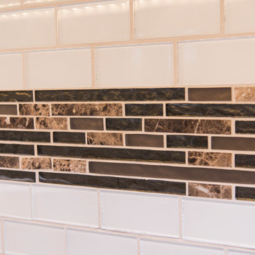
This kitchen went from dated and dull to contemporary and sophisticated. Every inch of this kitchen had a plan from the coffee/wine bar with a beverage cooler to the office nook. The island grounds the space with its warm rich earth tone while providing extra seating and an extra element with the two-tier look. The open floor plan of this home really helps bring the kitchen, dining room, and adjacent living room to be a stunning space to live and entertain.
Cabinetry: St. Martin-Ridgewood- Perimeter-Simply White, Island-Black Walnut
Hardware: Jeffrey Alexander-Ella-Satin Nickel
Countertop: Granite-Bianco Antico
Sink: Blanco-Silgranit-White Farm Sink
Backsplash: Main Tile-Glass Snow Amalfi, Accent-Australia Canberra Stria
Photography by: KeepsakeDesign
 Garage Conversions
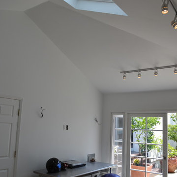
This is a garage into office conversion we did in Los Angeles. Garage remodels are perfect for those who want to add an extra room, extra space, or simply want to beautify their garages.
 Garage Conversions
This is a garage into office conversion we did in Los Angeles. Garage remodels are perfect for those who want to add an extra room, extra space, or simply want to beautify their garages.
 Kitchen Solvers of Miami
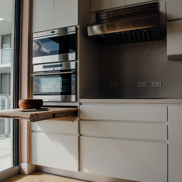
Kitchen remodeling project where the homeowners elected to upgrade their kitchen to a more contemporary look by installing new custom cabinets. For this project it was crucial to find more working space in such a limited kitchen size. To accommodate this, we designed a full Naxo extension table for them. This practical system consists of a tabletop peninsula that fits in the space normally provided by the drawer. Simply open the front panel to deploy the extension table. For the cabinets, the homeowners went with an Elegante door in white supermat by Northern Contours. We then installed a new quartz countertop and backsplash both done in Carrara extra. To complete the new look a new subzero fridge, Wolf induction cooktop, microwave drawer and oven were installed.
 User
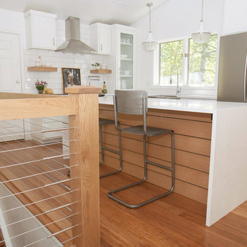
UserFor this vacation home, a complete gut job was needed in order to fit the lifestyle and needs of this young family of four and their guests. The narrow floor plan created unique challenges, but we maximized its full potential. The result was a warm but modern design with plenty of storage and seating.
One of the biggest challenges was making sure everyone had a place to sit in the kitchen. The space between the kitchen and staircase was limiting, but with sleek modern chairs that tuck away, we were able to allow for traffic patterns and seat all of the children.
To accommodate any vacation extras, an extra wide space near the kitchen and bathroom was transformed into additional shelving. We installed floor-to-ceiling cabinets that offer plenty of space for everyone’s belongings.
A clean design was a must, so we opted for a more modern look. We used Benjamin Moore's "Simply White" as the foundation, putting it on the walls and cabinets, and coordinating the countertops and backsplash. To make the home more welcoming, we used natural wood on the island and floating shelves. The wood was coordinated with the floor, creating a cohesive interior.
Project designed by Star Valley, Wyoming interior design firm Tawna Allred Interiors. They also serve Alpine, Auburn, Bedford, Etna, Freedom, Freedom, Grover, Thayne, Turnerville, Swan Valley, and Jackson Hole, Wyoming
 Skill Construction & Design, LLC
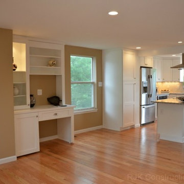
There are so many design elements to this kitchen, I almost don’t know where to start. Bright and airy with crisp clean white cabinets, the kitchen is open and welcoming. Still crisp but gently contrasting, the stainless steel appliance add depth amid the white. To keep this kitchen warm, natural oak covers the floors and a toasted wheat color washes the walls. And then there is the architectural elements. You know. That post and beam in the middle of the room. It’s the center of attention.
When you walk into a room your eyes roam around, establishing the size and shape of the room as your feet take you forward. From the front door of this home straight ahead you encountered this wall. The dining area to the right gives you a glimpse of things to come. Where there is a dining room you will usually find a kitchen.
The architecture of years gone by consistently hides the kitchen, the heart of the home, behind walls. I sympathize with my Mom, and all the other Moms, who have had to spend so much time tucked into a tight kitchen, away from the family. This wall had to go, but it was structural. We needed its support but not its bulk.
So we got rid of the bulk and only the bulk. Instead of a wall we have a post and beam, offering all of the structure we need. We could have installed a huge steel beam and reconfigure the joists to upset the beam, but why? The small beam and post add an incredible architectural element. It’s turning lemons into lemon, we simply made the most of what we had. It may be functional but it’s so fantastic. It looks like we created the effect just for the drama.
The original kitchen may have had a working triangle and some counter space, but it was fairly small, with each area only a step or two away. The dark cabinets made the space feel even smaller and the butcher block patterned laminate counter tops were very dated. The appliances were feeling their age as well, from a coil burner electric stove to a top freezer refrigerator. To keep this kitchen within its space, a half wall separated it from the dining area.
With the wall gone we borrowed some space from the living room and extended what was a U shaped kitchen into an L. At the living room window we start our new kitchen. We kept a small part of the wall to support the other end of our decorative beam. Sandwiched between a large pantry and our new French door refrigerator, the wall disappears. With our new open floor plan a sizable island was in order.
We split our cooking areas and installed a continuous grill gas cooktop into the island. A sleek island hood takes care of exhaust and adds an extra element to our architectural feature. Under the cooktop we added over-sized drawers for pots and pan storage. The frameless cabinets from New River Cabinetry are maple, painted white, with the Herndon door style. With the cooktop safely nestled into our island, we still had to add an oven.
We used the space where the old range sat for a large single oven of stainless steel and glass. If it worked for one, why not two? We created a home for a microwave in the wall cabinets. It’s perfect for heating leftovers so close to the refrigerator.
An important consideration for hot spots in your kitchen is landing zones. Each of our cooking areas have generous landing zones, one on each side of the cooktop and an entire counter area above or below the ovens, depending on which one you’re using.
We wanted to give the sink area more room so the half wall had to come out. We moved the trash and recycle cans into a cabinet, removed the heavy soffits and kept the sink under the window.
With that little bit of extra space we were able to add a larger cabinet above the dishwasher and slide it all down. This used to be where the carpeting met the vinyl floor, but all of it is gone. Long oak planks eliminate that final divide between the kitchen and the dining area, while adding visual length to the area. White wall cabinets on each side of the window reflect the sunlight for a brighter view.
With all of the darker cabinetry the backsplash walls had been painted white. Even still, there was a darkness in the corners and it wasn’t very exciting. We wanted to add visual interest and reflect the new under-cabinet lighting, eliminating the shadows in this corner.
With 1″x 2″ Arabescato Honed marble mosaics and those under-cabinet lights, we achieved the perfect balance. The marble has subtle swirls in gray and beige on a clean white background, but with the honed finish the light is softly reflected instead of glaring. For granite, we chose the soft gray tones of Luna Pearl. The speckles of gray and beige are a gentle contrast to the white cabinets and emulate the color of the stainless steel.
Between the carpet, red half wall, dark railing and dated light fixture, the dining area felt tired. Since the kitchen lacked sufficient storage, a large utility cabinet crowded the table space without adding any decorate elements.
Although it didn’t get any bigger, our dining area feels fresher and more open too. With the oak flooring joining the area to the rest of our space and the toasted wheat on the walls, the white table and chairs compliment the cabinetry while contrasting the warmer colors. We replaced the chandelier with recessed lighting and changed that railing too.
With our new open floor plan, we ended up with a fairly open area in between our foyer closet and the living room window. Not one to miss an opportunity, we filled the space with a multi-functional work space.
With the sunlight streaming in this bright corner works for anything this family needs.
There’s plenty of space for a chair under this large desk drawer. A closed cabinet below, glass doors above and lots of open shelving let you store and or showcase your belongings. We added a lite area at the top to keep away the darker corners.
The transformation is complete. This kitchen and all of its features are truly the center of attention in this home.
http://www.designsbyskill.com/
http://www.rjkconstructioninc.com/
 User
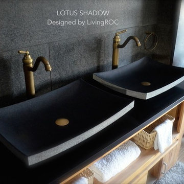
UserReference: BB504-US
Model: LOTUS SHADOW
Color: pure black
Shape: rectangular
Finish: finely bush hammered
honed-matte inside
US Dimensions: 23-2/3" x 15-2/3" x 4-1/3"
EU Dimensions: 60 x 40 x 11cm
US Drain size: 1-1/2""
Weight: 53 lbs - 24 Kgs
Material: Shanxi pure black granite grade A
Our LOTUS SHADOW model is a rectangular single vessel sink stone - 23-2/3" x 15-2/3" x 4-1/3" made in genuine interior decoration trendy pure black granite. The "Exceptional" cut in the block without any comparison with plastic and other chemical resin market often unaffordable. You will definitely not let anyone feel indifferent with this 100% natural stone unique in the US and exclusively available on Living'ROC.net.
The outstanding opportunity to make your world unique! Add great value to your home by installing LivingRoc Creations and tell your stone story through the years of conception. Could you imagine one day installing a single vessel sink made from pure shanxi black granite, sought after by specialists around the world. We put the extra into the extraordinary by using this noble material.
It is a superb design vanity vessel sink with beautiful, pure and elegant lines. LOTUS SHADOW will add class to your bathroom. Our talented masons work shows LOTUS SHADOW perfect curves, its Asian-style look and the quality of handcrafted work. LOTUS SHADOW generous perfect proportion will bring you great comfort. It is double waterproofed so the maintenance is easy. We have selected only the most beautiful stones for an exceptional quality.
This vessel sink is ready to use, sitting on a vanity counter top and Highly resistant to chipping and scratching, Withstands hot temperatures, Tolerant to very high temperature changes. All exposed parts of the stone have been double waterproofed.
if you wish to standardize your project, you can choose among a wide range of black shower bases in black granite or black mongolia basalt (very similar color) carved from the same material (similar tones and finishes) as for example black granite models Spacium Shadow, Palaos Shadow, Quasar Shadow or Dalaos Shadow and mongolia black models Serena Black, Corail Black
Our creation is delivered without an overflow drain (not included) - every US drains models you can find on the market will fit perfectly on Living'ROC vessel sink. This model is ready to use over the countertop.
 Sceltas Custom Homes
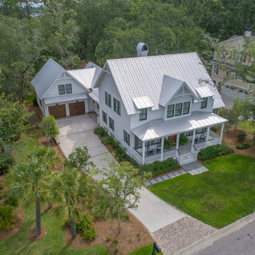
There are so many components of this space that show functionality and glamour. We kept the bright white theme throughout this custom home and extended the shiplap and white high-end materials into the bathroom. One of our favorite pieces that really captured the look included a Victoria + Albert free standing tub. Working with Krystine Edwards on the interior design, the homeowners chose oversized lanterns over the vanities, which were purchased from a local lighting store – Carolina Lanterns. And, the Moroccan style mirrors added just the extra touch of charm. Now, let’s talk about the oversized walk-in, frameless glass shower. It is simply breathtaking. We used Bianca Carerra marble, arabesque tile and penny round tiles on the floor. With three shower heads, there’s the option to set the temperature to each person’s liking. Once the valves are set you never have to change it again; you simply turn on the water! This classic white look will stand the test of time, and the glamorous selections make it one of the most beautiful master bathrooms we’ve constructed.
Drone photography by Nick Holzworth
 Stressless®
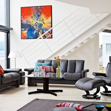
The white paint and simple black sofas are an ideal background for bright colorful accent pillows and art. The Stressless Legend features unique cushioning that feels sumptious and luxurious as it embraces and supports your body. The specially designed foam and the Stressless glide system means the sofa adjusts to your body smoothly. It simply stretches to that extra degree of comfort you have come to expect. You never have to force it to do anything – simply move, and it moves with you.
 User
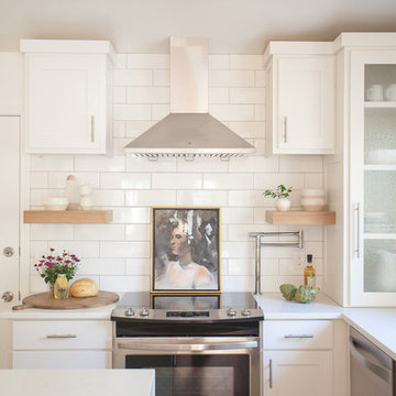
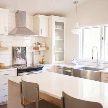
UserFor this vacation home, a complete gut job was needed in order to fit the lifestyle and needs of this young family of four and their guests. The narrow floor plan created unique challenges, but we maximized its full potential. The result was a warm but modern design with plenty of storage and seating.
One of the biggest challenges was making sure everyone had a place to sit in the kitchen. The space between the kitchen and staircase was limiting, but with sleek modern chairs that tuck away, we were able to allow for traffic patterns and seat all of the children.
To accommodate any vacation extras, an extra wide space near the kitchen and bathroom was transformed into additional shelving. We installed floor-to-ceiling cabinets that offer plenty of space for everyone’s belongings.
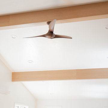
A clean design was a must, so we opted for a more modern look. We used Benjamin Moore's "Simply White" as the foundation, putting it on the walls and cabinets, and coordinating the countertops and backsplash. To make the home more welcoming, we used natural wood on the island and floating shelves. The wood was coordinated with the floor, creating a cohesive interior.
Project designed by Star Valley, Wyoming interior design firm Tawna Allred Interiors. They also serve Alpine, Auburn, Bedford, Etna, Freedom, Freedom, Grover, Thayne, Turnerville, Swan Valley, and Jackson Hole, Wyoming
 User
UserFor this vacation home, a complete gut job was needed in order to fit the lifestyle and needs of this young family of four and their guests. The narrow floor plan created unique challenges, but we maximized its full potential. The result was a warm but modern design with plenty of storage and seating.
One of the biggest challenges was making sure everyone had a place to sit in the kitchen. The space between the kitchen and staircase was limiting, but with sleek modern chairs that tuck away, we were able to allow for traffic patterns and seat all of the children.
To accommodate any vacation extras, an extra wide space near the kitchen and bathroom was transformed into additional shelving. We installed floor-to-ceiling cabinets that offer plenty of space for everyone’s belongings.
A clean design was a must, so we opted for a more modern look. We used Benjamin Moore's "Simply White" as the foundation, putting it on the walls and cabinets, and coordinating the countertops and backsplash. To make the home more welcoming, we used natural wood on the island and floating shelves. The wood was coordinated with the floor, creating a cohesive interior.
Project designed by Star Valley, Wyoming interior design firm Tawna Allred Interiors. They also serve Alpine, Auburn, Bedford, Etna, Freedom, Freedom, Grover, Thayne, Turnerville, Swan Valley, and Jackson Hole, Wyoming
 User
UserFor this vacation home, a complete gut job was needed in order to fit the lifestyle and needs of this young family of four and their guests. The narrow floor plan created unique challenges, but we maximized its full potential. The result was a warm but modern design with plenty of storage and seating.
One of the biggest challenges was making sure everyone had a place to sit in the kitchen. The space between the kitchen and staircase was limiting, but with sleek modern chairs that tuck away, we were able to allow for traffic patterns and seat all of the children.
To accommodate any vacation extras, an extra wide space near the kitchen and bathroom was transformed into additional shelving. We installed floor-to-ceiling cabinets that offer plenty of space for everyone’s belongings.
A clean design was a must, so we opted for a more modern look. We used Benjamin Moore's "Simply White" as the foundation, putting it on the walls and cabinets, and coordinating the countertops and backsplash. To make the home more welcoming, we used natural wood on the island and floating shelves. The wood was coordinated with the floor, creating a cohesive interior.
Project designed by Star Valley, Wyoming interior design firm Tawna Allred Interiors. They also serve Alpine, Auburn, Bedford, Etna, Freedom, Freedom, Grover, Thayne, Turnerville, Swan Valley, and Jackson Hole, Wyoming
 Fast Furnishings
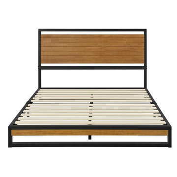
Add modern style to your bedroom with this full size heavy duty industrial metal platform bed with slatted wood panel headboard. Manufactured with a premium metal frame, solid wood headboard and footboard, and wooden mattress support slats. The bed frame is reinforced with a center rail and sturdy support legs for extra stability. Cleaning the platform bed is easy, simply wipe clean with a damp cloth. Contemporary low-profile design, this bed is easy to get into and out of, and is great for families with pets. The medium light brown wood finish headboard will bring a warm and inviting feeling to your bedroom. Ideal for apartments, guest rooms, dormitories, bedrooms, spare rooms and other sleep spaces.
Industrial Modern Style suitable for most home decors. The medium light brown finished headboard brings a warm and inviting feeling to your bedroom.
Sturdy quite design. Featuring 12 wooden mattress support slats, 9 metal legs, and is reinforced with strong iron bars, this heavy duty bed frame is sturdy enough to supports up to 700 lbs. No wobbling or squeaking after proper assembly.
Solid pine wood slatted headboard and footboard panel. The headboard & footboard have a medium light brown finish.
The powder-coated metal bed frame resists scratches and oxidation. Wipe clean with a damp cloth when it gets dirty. Also, the low profile 5-inch ground clearance makes dust difficult to accumulate, and allows the vacuuming robot to clean the under-bed space.
Easy Assembly required. We provide all necessary hardware and tools, along with an illustrated installation manual to help you assemble the bed frame.
No Box-spring required. Simply place your full size mattress directly on top of the mattress support slats. Accommodates a standard full size mattress 54-inch x 75-inch.
Mattress and Bedding not included.
Dimensions: 77 x 55.5 x 37H inches
Weight: 85 lbs.
Max Weight Capacity: 700 lbs.
21