
Search results for "Site expect" in Home Design Ideas
 Western Outdoor Designs
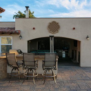
Western Outdoor Design, Landscape Design Process
Our design process begins with an initial consultation to understand and review your style and vision for your outdoor living space. We also work with you to understand how you plan to use the space and the desired feel you would like to achieve. Once these factors are identified, we examine your homes existing architecture to ensure continuity and flow to your new outdoor living space. Taking into consideration locations, views, site conditions and accessibility, we design your outdoor living space to flow from inside your home, out. We can establish a budget to build your project prior to the design phase.
Upon completion of the consultation, our design teams of license landscape architects and landscape designers will translate the vision into conceptual drawings and renderings. A visual presentation will also be prepared to convey the look and feel of the proposed project. Our goal is to come up with a design that is within your budget and surpasses your expectations.
Western Outdoor Design & Build is the ONLY call you need to make. We are your COMPLETE FULL SERVICE OUTDOOR LIVING COMPANY, from concept to completion. #sandiegolandscapedesigner #landscapedesignersinsandiego
www.westernoutdoordesigns.com
 Sunspace of Philly
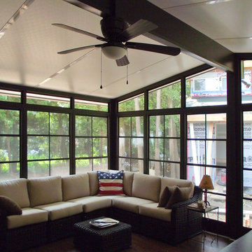
Example of a mid-sized classic light wood floor sunroom design in Philadelphia with a skylight
 Modern Citi Group: Renovations & Remodeling
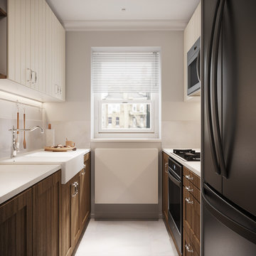
Renovations typically involve hundreds of tiny little decisions
With ready solutions developed by Modern Citi Group, you will only need to make one decision: which of the beautifully designed remodeling packages to choose for your space.
The kitchen package CLASSIC comes fully designed and priced out with an itemized breakdown of labor, building & decoration materials, manufacturing, permits, inspections, approvals and all other associated costs.
All materials are pre selected (hand-picked) by our creative design team. You may select this package in its original configuration (as shown on pictures), or customize it to make it your very own.
Choosing Modern Citi Group for your project you can expect the highest quality craftsmanship, effective management of the site operations, backed by a technical expertise, meticulous attention to detail and a complete transparency throughout the entire project.
Find the right local pro for your project
 Moss Building & Design
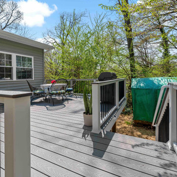
The MOSS design team sat down with the homeowners and went through every single option. With COVID and the distance from the job site to the MOSS office, most sessions were virtual and set to align with the clients’ work schedules. The homeowners felt all of their ideas were brought to life and the design team added interesting pieces and ideas they really liked.
Early in the design process, they decided a focus wall would be amazing. The client loves shiplap but didn’t want anything that looked too country. Our designer and project manager worked together to create a fireplace wall that combined tile, shiplap and a custom mantel for a result that has become one of the most gorgeous parts of the remodel.
With young, active kids, the clients needed a space that could serve as a dump zone for backpacks and sports gear. Combining an underutilized carport shed and a low-functioning pantry resulted in a beautiful, very useful mudroom.
The homeowners expressed that one of the most exciting parts of the process was working with the designers and coming up with new ideas. For example, there was an odd area on one side of the kitchen and our designer suggested making it a double-door pantry. The client’s jaw dropped because she never envisioned having enough storage space to conceal all of her appliances and backstock. She said “It is one of those surprises that came through the design process that we were not expecting and is now one of our favorite parts of the kitchen. We wanted out-of-the-box thinking and that’s what we got.”
 Janvrin & Co.
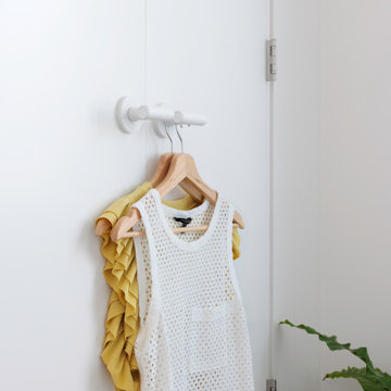
A transformation of a modest raised ranch into a modern oasis. I was the interior designer and general contractor from mechanicals to finishing. It’s also my personal home.
The interior design style is that of modern minimalist meets organic modern. I wanted a space that reduced distractions and let the eyes, head, and soul rest. Where everything inside the home has a specific use and purpose. The objects in our home are fewer but each hold a great personal value. You might expect to see this airy aesthetic, with its gallery white walls, in California or New York. Not nestled in a modest 50 year old neighborhood in Omaha, Nebraska. Creating a minimal aesthetic is one of the trickiest design styles to pull off. It is more than just less stuff and lots of white. It means sticking to these design principals:
-weaving in an abundance of textures
-incorporating natural finishes
-keenly curating art
-giving extra attention to scale
-limiting purely decorative items
-maximizing natural light
This style is not to be confused with the frugality of reductive design. I have incorporated many elevated basics that create an aesthetic of quiet luxury:
-architectural bead for trim-less doors
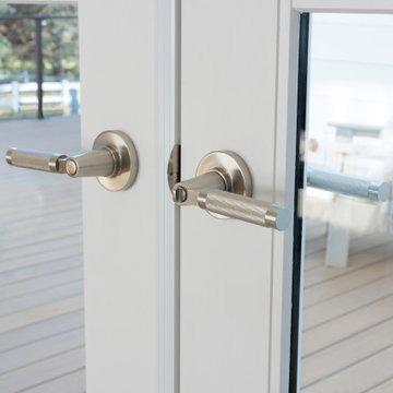
-first-of-its kind interior door hardware made of terrazzo
-historical marble found in landmark interiors like the NY Public Library
-premium flush air vents that disappear out of site
-luxury appliances from GE Café and Signature
-elegant and resilient terrazzo field tiles
Ours was not a simple interior remodel and addition:
-gutted and remodeled the existing 2,000 SF
-added on approximately another 1,000 SF
-moved and installed all new major mechanicals i.e. heating, plumbing and electrical.
-knocked through foundation walls to extend the space back
-dug down and built up
 Yohe Architecture + Design, PC
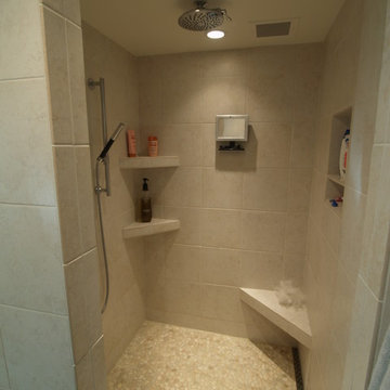
The Master Bath shower is spacious and well lit. | The original home had many of the features that you would expect from the 1950's: expert craftsmanship, beautiful hardwood floors, and understated charm; but also a small secluded kitchen, small windows, and small closets. The renovated home features a master bedroom addition with windows designed to capture the views of the stunning site, a master bathroom with a lofted ceiling, walk-in shower and soaking tub, a new kitchen addition, and a 2nd floor bedroom expansion. The redesign also provided clarity to the entry sequence.
 Corinthian Fine Homes
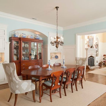
This homeowner lived on a very prominent golf course and wanted to feel like he was on the putting green of the 9th hole while standing at his family room window. The existing layout of the home had the garage enjoying that view with the outdated dining room, family room and kitchen further back on the lot. We completely demoed the garage and a section of the home, allowing us to design and build with that view in mind. The completed project has the family room at the back of the home with a gorgeous view of the golf course from two large curved bay windows. A new fireplace with custom cabinetry and shelf niches and coffered high ceilings makes this room a treasure. The new kitchen boasts of white painted cabinetry, an island with wood top and a 6 burner Wolf cooktop with a custom hood, white tile with multiple trim details and a pot filler faucet. A Butler’s Pantry was added for entertaining complete with beautiful white painted cabinetry with glass upper cabinets, marble countertops and a prep sink and faucet. We converted an unused dining room into a custom, high-end home office with beautiful site- built mahogany bookcases to showcase the homeowners book collections. To complete this renovation, we added a “friends” entry and a mudroom for improved access and functionality. The transformation is not only efficient but aesthetically pleasing to the eye and exceeded the homeowner’s expectations to enjoy their view of the 9th hole.
 Reico Kitchen & Bath
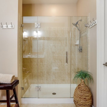
Paula Truchon of Reico Kitchen and Bath in Frederick, MD designed a primary bathroom featuring Ultracraft Cabinetry’s Plantation door style with 5-piece drawer front in Red Birch with a Natural Low Sheen finish.
Selections for bathroom include MSI Q Calacatta Valentin with Polished finish vanity countertops, Jeffery Alexander hardware, Kohler sink, Moen faucet and Kichler lighting.
The client expressed their immense satisfaction. “From the initial planning stage, Paula's insights on cabinetry, lighting, and overall design resonated perfectly with my taste in furnishings. Walking through my home to the bathroom, she was able to pick up my style. The project was painless. Everything was well orchestrated and the pieces just fell into place. The crew in charge of demo and installation worked quickly and fastidiously, protecting floors and leaving the site clean and neat each day. Scott's consistent oversight and collaboration with Paula made the project progress smoothly. Despite my initial concerns of a prolonged demo and tedious installation, Reico's team delivered a quick and flawless job.”
Added the client, “This space is truly gorgeous and has exceeded my expectations. It was a pleasure to deal with Reico and their team. Paula, Lisa, Scott and all the technicians charged with demo and installation. Thank you for allowing me to share this beautiful bathroom!”
Photo courtesy of BTW Images.
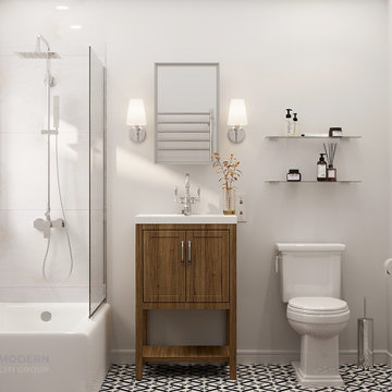 Modern Citi Group: Renovations & Remodeling
Renovations typically involve hundreds of tiny little decisions
With ready solutions developed by Modern Citi Group, you will only need to make one decision: which of the beautifully designed remodeling packages to choose for your space.
The kitchen package CLASSIC comes fully designed and priced out with an itemized breakdown of labor, building & decoration materials, manufacturing, permits, inspections, approvals and all other associated costs.
All materials are pre selected (hand-picked) by our creative design team. You may select this package in its original configuration (as shown on pictures), or customize it to make it your very own.
Choosing Modern Citi Group for your project you can expect the highest quality craftsmanship, effective management of the site operations, backed by a technical expertise, meticulous attention to detail and a complete transparency throughout the entire project.
 Pearson Brown
Technology and function.
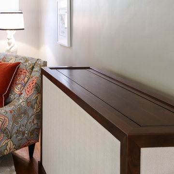
While a TV is the centerpiece of a traditional family room, Ferrer eschewed the eyesore of a wall-mounted TV and tucked it away in a custom-built Cabinet Tronix television cabinet. With a touch of a button, the TV emerges, neatly and discretely, connected to half a dozen media peripherals, including a Blu-Ray player and X-Box, which are also hidden away, enclosed in a compartment at the bottom of the unit.
Inside the cabinet, the family’s former tiny TV was upsized and upgraded with a 43" TCL Roku TV. Since streaming is the new cable, the family cut the cord, and cost, and now uses a TERK Trinity Indoor Amplified HDTV antenna to get basic channels sans subscription.
Atop the cabinet, a stylish Sonos Playbar connects to the TV via optical cable and lends rich AV sound. The app-controlled system connects with other Sonos speakers in the house to stream free and paid playlists from sites like Pandora, Amazon Music, and Spotify. To amplify Wi-Fi throughout the house, a TP-Link VR900 modem/router is paired with the eero extender system to boost bufferless audio and video streaming.
Above the lift cabinet, Ferrer used the wall space as a projection screen for a ZTE Spro2 projector. The palm-sized tablet-like projector transforms the living room into a cinema, streaming directly from the device or connecting to other devices via USB or HDMI cable.
After some research, Ferrer learned that the best color wall for projection was not white, as one might expect, but grey. She chose Sherwin-Williams Passive Gray to make the colors pop and show vividly on the wall.
 Janvrin & Co.
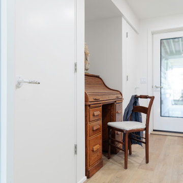
A transformation of a modest raised ranch into a modern oasis. I was the interior designer and general contractor from mechanicals to finishing. It’s also my personal home.
The interior design style is that of modern minimalist meets organic modern. I wanted a space that reduced distractions and let the eyes, head, and soul rest. Where everything inside the home has a specific use and purpose. The objects in our home are fewer but each hold a great personal value. You might expect to see this airy aesthetic, with its gallery white walls, in California or New York. Not nestled in a modest 50 year old neighborhood in Omaha, Nebraska. Creating a minimal aesthetic is one of the trickiest design styles to pull off. It is more than just less stuff and lots of white. It means sticking to these design principals:
-weaving in an abundance of textures
-incorporating natural finishes
-keenly curating art
-giving extra attention to scale
-limiting purely decorative items
-maximizing natural light
This style is not to be confused with the frugality of reductive design. I have incorporated many elevated basics that create an aesthetic of quiet luxury:
-architectural bead for trim-less doors
-first-of-its kind interior door hardware made of terrazzo
-historical marble found in landmark interiors like the NY Public Library
-premium flush air vents that disappear out of site
-luxury appliances from GE Café and Signature
-elegant and resilient terrazzo field tiles
Ours was not a simple interior remodel and addition:
-gutted and remodeled the existing 2,000 SF
-added on approximately another 1,000 SF
-moved and installed all new major mechanicals i.e. heating, plumbing and electrical.
-knocked through foundation walls to extend the space back
-dug down and built up
 Janvrin & Co.
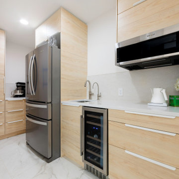
A transformation of a modest raised ranch into a modern oasis. I was the interior designer and general contractor from mechanicals to finishing. It’s also my personal home.
The interior design style is that of modern minimalist meets organic modern. I wanted a space that reduced distractions and let the eyes, head, and soul rest. Where everything inside the home has a specific use and purpose. The objects in our home are fewer but each hold a great personal value. You might expect to see this airy aesthetic, with its gallery white walls, in California or New York. Not nestled in a modest 50 year old neighborhood in Omaha, Nebraska. Creating a minimal aesthetic is one of the trickiest design styles to pull off. It is more than just less stuff and lots of white. It means sticking to these design principals:
-weaving in an abundance of textures
-incorporating natural finishes
-keenly curating art
-giving extra attention to scale
-limiting purely decorative items
-maximizing natural light
This style is not to be confused with the frugality of reductive design. I have incorporated many elevated basics that create an aesthetic of quiet luxury:
-architectural bead for trim-less doors
-first-of-its kind interior door hardware made of terrazzo
-historical marble found in landmark interiors like the NY Public Library
-premium flush air vents that disappear out of site
-luxury appliances from GE Café and Signature
-elegant and resilient terrazzo field tiles
Ours was not a simple interior remodel and addition:
-gutted and remodeled the existing 2,000 SF
-added on approximately another 1,000 SF
-moved and installed all new major mechanicals i.e. heating, plumbing and electrical.
-knocked through foundation walls to extend the space back
-dug down and built up
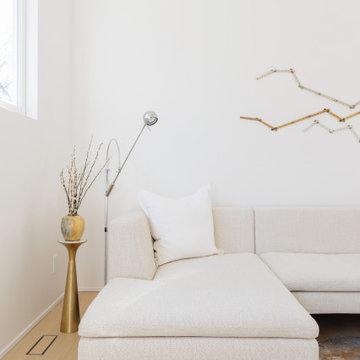 Janvrin & Co.
A transformation of a modest raised ranch into a modern oasis. I was the interior designer and general contractor from mechanicals to finishing. It’s also my personal home.
The interior design style is that of modern minimalist meets organic modern. I wanted a space that reduced distractions and let the eyes, head, and soul rest. Where everything inside the home has a specific use and purpose. The objects in our home are fewer but each hold a great personal value. You might expect to see this airy aesthetic, with its gallery white walls, in California or New York. Not nestled in a modest 50 year old neighborhood in Omaha, Nebraska. Creating a minimal aesthetic is one of the trickiest design styles to pull off. It is more than just less stuff and lots of white. It means sticking to these design principals:
-weaving in an abundance of textures
-incorporating natural finishes
-keenly curating art
-giving extra attention to scale
-limiting purely decorative items
-maximizing natural light
This style is not to be confused with the frugality of reductive design. I have incorporated many elevated basics that create an aesthetic of quiet luxury:
-architectural bead for trim-less doors
-first-of-its kind interior door hardware made of terrazzo
-historical marble found in landmark interiors like the NY Public Library
-premium flush air vents that disappear out of site
-luxury appliances from GE Café and Signature
-elegant and resilient terrazzo field tiles
Ours was not a simple interior remodel and addition:
-gutted and remodeled the existing 2,000 SF
-added on approximately another 1,000 SF
-moved and installed all new major mechanicals i.e. heating, plumbing and electrical.
-knocked through foundation walls to extend the space back
-dug down and built up
 RemodelWest
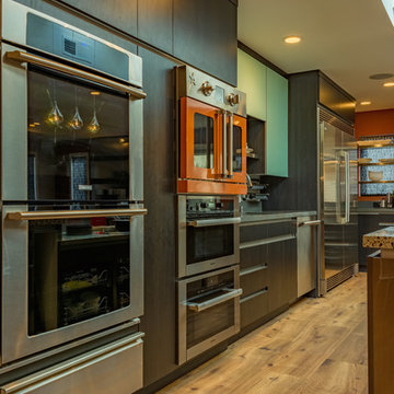
This professional chef requires a menagerie of appliances. In this kitchen we have 6 ovens and our challenge was how to make it all fit in the new space. With lots of research on requirements of installation with regards to height above floor, heat, weight and electrical/gas outlets, we stacked them up, keeping access a priority.
Photo Credit: Ali Atri Photography
 Moss Building & Design
The MOSS design team sat down with the homeowners and went through every single option. With COVID and the distance from the job site to the MOSS office, most sessions were virtual and set to align with the clients’ work schedules. The homeowners felt all of their ideas were brought to life and the design team added interesting pieces and ideas they really liked.
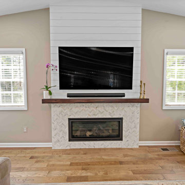
Early in the design process, they decided a focus wall would be amazing. The client loves shiplap but didn’t want anything that looked too country. Our designer and project manager worked together to create a fireplace wall that combined tile, shiplap and a custom mantel for a result that has become one of the most gorgeous parts of the remodel.
With young, active kids, the clients needed a space that could serve as a dump zone for backpacks and sports gear. Combining an underutilized carport shed and a low-functioning pantry resulted in a beautiful, very useful mudroom.
The homeowners expressed that one of the most exciting parts of the process was working with the designers and coming up with new ideas. For example, there was an odd area on one side of the kitchen and our designer suggested making it a double-door pantry. The client’s jaw dropped because she never envisioned having enough storage space to conceal all of her appliances and backstock. She said “It is one of those surprises that came through the design process that we were not expecting and is now one of our favorite parts of the kitchen. We wanted out-of-the-box thinking and that’s what we got.”
 Yohe Architecture + Design, PC
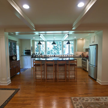
Kitchen addition | The original home had many of the features that you would expect from the 1950's: expert craftsmanship, beautiful hardwood floors, and understated charm; but also a small secluded kitchen, small windows, and small closets. The renovated home features a master bedroom addition with windows designed to capture the views of the stunning site, a master bathroom with a lofted ceiling, walk-in shower and soaking tub, a new kitchen addition, and a 2nd floor bedroom expansion. The redesign also provided clarity to the entry sequence.
 Janvrin & Co.
A transformation of a modest raised ranch into a modern oasis. I was the interior designer and general contractor from mechanicals to finishing. It’s also my personal home.
The interior design style is that of modern minimalist meets organic modern. I wanted a space that reduced distractions and let the eyes, head, and soul rest. Where everything inside the home has a specific use and purpose. The objects in our home are fewer but each hold a great personal value. You might expect to see this airy aesthetic, with its gallery white walls, in California or New York. Not nestled in a modest 50 year old neighborhood in Omaha, Nebraska. Creating a minimal aesthetic is one of the trickiest design styles to pull off. It is more than just less stuff and lots of white. It means sticking to these design principals:
-weaving in an abundance of textures
-incorporating natural finishes
-keenly curating art
-giving extra attention to scale
-limiting purely decorative items
-maximizing natural light
This style is not to be confused with the frugality of reductive design. I have incorporated many elevated basics that create an aesthetic of quiet luxury:
-architectural bead for trim-less doors
-first-of-its kind interior door hardware made of terrazzo
-historical marble found in landmark interiors like the NY Public Library
-premium flush air vents that disappear out of site
-luxury appliances from GE Café and Signature
-elegant and resilient terrazzo field tiles
Ours was not a simple interior remodel and addition:
-gutted and remodeled the existing 2,000 SF
-added on approximately another 1,000 SF
-moved and installed all new major mechanicals i.e. heating, plumbing and electrical.
-knocked through foundation walls to extend the space back
-dug down and built up
 Tile Doctor Ltd
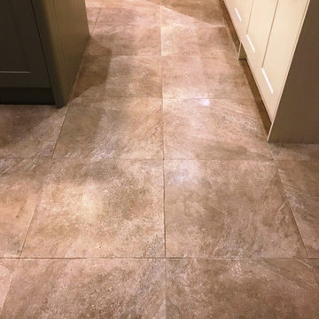
This request came from a client who lives in the Newcastle district of Jesmond who was unhappy with the appearance of their Textured Porcelain floor tiles. The problem was that the Porcelain Tiles were grouted in whilst the underfloor heating was switched on. This resulted in the grout drying out quicker than expected and the tiler struggled to get the excess grout off the tiles. To rectify the problem, the tiler tried to get the dried grout off with acid, but it didn’t work, and the floor was left looking dark and dull. Unable to rectify the problem the client was left with a disappointing pale floor and had searched around the internet for a solution.
Normally grout smears like these (aka Grout Haze) can be removed with an acidic product and Tile Doctor sell Grout Clean-up specially for this purpose. However, some grouts contain acid resistant polymers which need to broken down first. Fortunately, we have a solution for everything tile related and the system we use does not affect the main grout lines only the excess grout. I called in to do a site visit and having surveyed the problem I was confident it could resolved, I gave them a price for the work and agreed a date to return to do the job.
My first task was to spray the tiles with Tile Doctor Remove and Go, this was left to soak into the tile for around ten minutes before being scrubbed in. Remove and Go is a coatings remover that is safe to use on tile and grout; normally we use it to remove old sealers but in this case I applied it to break down the polymers. To work the product into the tile I use a buffing machine fitted with a black scrubbing pad, the mechanical advantage this gives makes the job a lot quicker. Then the slurry generated is rinsed off with water and removed with a wet vacuum. The floor was then left to dry for 30 minutes.
We were then able to remove the excess grout which was done by applying Tile Doctor Grout Clean-Up which I mentioned earlier. The process was the same, i.e. using the buffing machine and a wet vacuum to scrub the floor and extract the soil. The floor was rinsed with water to remove any trace of the products used and dried as much as possible using the wet vacuum. The underfloor heating really helped at this point to dry out the floor.
Once the floor was fully dry including the grout lines a single thin coat of Tile Doctor Colour Grow sealer was applied. The tiles were textured porcelain, so the dirt gets trapped into the textured surface if it is not sealed. We usually find one coat of Tile Doctor Colour Grow is more than enough for this, anything that hadn’t soaked in after three to five minutes was then polished off with clean dry cloths.
The client was very happy with the floor and pleased that the excess grout had been cleaned up and the floor looked as it should. Before leaving I recommended the use a pH Neutral tile cleaner for general cleaning such as Tile Doctor Neutral Tile Cleaner. There is no point sealing the tiles only to have it stripped off later with the use of a bleach based cleaner.
Raf Barrett
Tyneside Tile Doctor
 Reico Kitchen & Bath
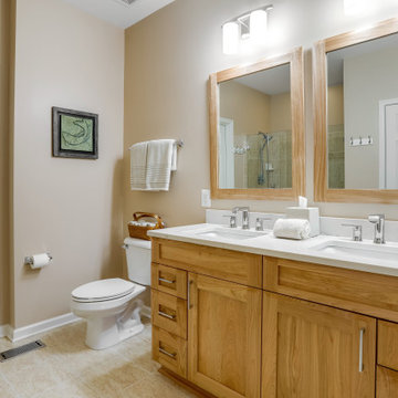
Paula Truchon of Reico Kitchen and Bath in Frederick, MD designed a primary bathroom featuring Ultracraft Cabinetry’s Plantation door style with 5-piece drawer front in Red Birch with a Natural Low Sheen finish.
Selections for bathroom include MSI Q Calacatta Valentin with Polished finish vanity countertops, Jeffery Alexander hardware, Kohler sink, Moen faucet and Kichler lighting.
The client expressed their immense satisfaction. “From the initial planning stage, Paula's insights on cabinetry, lighting, and overall design resonated perfectly with my taste in furnishings. Walking through my home to the bathroom, she was able to pick up my style. The project was painless. Everything was well orchestrated and the pieces just fell into place. The crew in charge of demo and installation worked quickly and fastidiously, protecting floors and leaving the site clean and neat each day. Scott's consistent oversight and collaboration with Paula made the project progress smoothly. Despite my initial concerns of a prolonged demo and tedious installation, Reico's team delivered a quick and flawless job.”
Added the client, “This space is truly gorgeous and has exceeded my expectations. It was a pleasure to deal with Reico and their team. Paula, Lisa, Scott and all the technicians charged with demo and installation. Thank you for allowing me to share this beautiful bathroom!”
Photo courtesy of BTW Images.
 Yohe Architecture + Design, PC
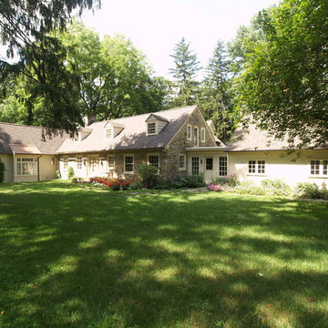
The original home had many of the features that you would expect from the 1950's: expert craftsmanship, beautiful hardwood floors, and understated charm; but also a small secluded kitchen, small windows, and small closets. The renovated home features a master bedroom addition with windows designed to capture the views of the stunning site, a master bathroom with a lofted ceiling, walk-in shower and soaking tub, a new kitchen addition, and a 2nd floor bedroom expansion. The redesign also provided clarity to the entry sequence.
28