
Search results for "Site typically" in Home Design Ideas
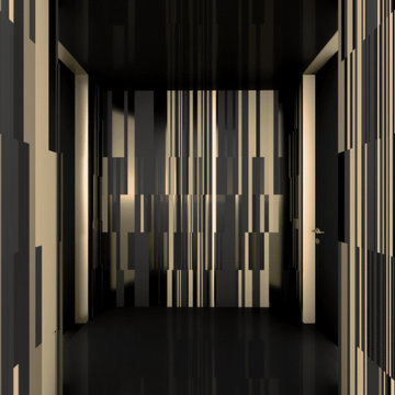
 KURV Architecture DPC (Alex Hughes Architects)
Located in the heart of Manhattan’s Lower East Side, the building was erected on a shallow commercial lot between two 120 year old masonry buildings and a new residential rental building. 330 Grand Street is a mix of 725 SF 1BRs and 1050 SF 2BR apartments. It also contains a 1100 SF two story duplex as well as private and public rooftop space, large private balconies for most units and two large private terraces for the ground floor units.
330 Grand Street was originally designed and approved at the NYC DOB as a prefabricated modular building. During the pandemic, as shipping costs skyrocketed putting the project at risk, we suggested redesigning the building as a reinforced cast-in-place concrete structure. Concrete was readily available and prices had not been affected by the demand increase that many other materials suffered in the pandemic. We took this opportunity to raise floor to ceiling heights, enlarge high performance windows and redistribute the buildings MEPFS and Structural Systems to create very open floor plans.
The challenge was to create a luxurious sensorial living experience with very limited means. In a city with very high construction costs, low cost residential buildings in the area are usually devoid of good quality, design and character. Our approach was to aim high for the end user, prioritizing natural light, open space with long visual perspectives, high ceilings and as always, rejecting the use of predefined building templates.
Our biggest challenge was to ensure that the small spaces feel as clean cut, large and bright as possible. Several unique design decisions were made to ensure low cost and high quality;
Floor plans were laid out so that spaces were wide open and free of clutter from mechanical or structural interruptions. Therefore all infrastructure was placed in lateral demising walls, which in turn act as the unit’s storage and kitchen. The apartments feel wide open, are super quiet and have more storage space than any other comparable apartment in the city.
To solve the problem of the site’s shallow commercial lot which is typically prone to dark interior spaces we focused our attention on the building’s envelope. Instead of the usual small punched window openings, oversized high performance windows were designed to ensure that light penetrated as far as possible into the units. In the smaller 1BR units, the full 50’ depth of the lot is perceived by partitioning spaces with sliding pocket doors that can be retracted to allow deep visual perspectives, making the sight lines in the space feel longer, larger, more ample than normal. In addition to the full height glazing, each unit above the 2nd floor receives a 7 foot covered balcony, adding 120 to 240 sf to each apartment, something unusual in New York City buildings. The space is large enough for a full size dining table, when the weather permits being outside.
We also worked hard to ensure modularity. For example, all kitchen units are all identical throughout the building. The idea of modularity and the economy of the repetitive unit is exercised to the maximum through the building.
Hardware, appliances, flooring, wall coverings and material finishes are all carefully selected to feel bespoke, high quality and unique.
It was important to KURV that the result of this work manifest into something that would deeply connect with the end user and sustain relationships with the consumers of this space.
All images by KURV Architecture ©
 Tonic Design + Tonic Construction
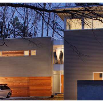
Designed for the lifestyle and budget of a young married couple and growing family, this home offers a viable alternative to the generic speculative home. Occupying a small leftover developer site, just under four tenths of an acre at the end of a suburban cul-de-sac, the Lanning Residence site is anchored by a one hundred year old oak tree. The parcel, once undesirable to developers and their speculative plans, became the inspiration for the project form.
Acting as both designers and builders, the decision was made early to utilize a strategy typical to most suburban construction; maximizing square footage while minimizing the building perimeter. An analysis of the surrounding suburban fabric revealed that the adjoining property lines were heavily planted. Views and window placement were organized to take advantage of the adjacent landscape while maximizing natural light.
The house program is distributed within two main volumes that are connected by a translucent circulation volume. The spacious interior volumes, large windows, plywood shear walls, sheetrock, and simple details allowed for a light construction budget. Spray foam insulation and well designed mechanical systems allowed the family to reduce their monthly utility bills by over half, creating a far more energy efficient lifestyle.
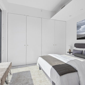 KURV Architecture DPC (Alex Hughes Architects)
Located in the heart of Manhattan’s Lower East Side, the building was erected on a shallow commercial lot between two 120 year old masonry buildings and a new residential rental building. 330 Grand Street is a mix of 725 SF 1BRs and 1050 SF 2BR apartments. It also contains a 1100 SF two story duplex as well as private and public rooftop space, large private balconies for most units and two large private terraces for the ground floor units.
330 Grand Street was originally designed and approved at the NYC DOB as a prefabricated modular building. During the pandemic, as shipping costs skyrocketed putting the project at risk, we suggested redesigning the building as a reinforced cast-in-place concrete structure. Concrete was readily available and prices had not been affected by the demand increase that many other materials suffered in the pandemic. We took this opportunity to raise floor to ceiling heights, enlarge high performance windows and redistribute the buildings MEPFS and Structural Systems to create very open floor plans.
The challenge was to create a luxurious sensorial living experience with very limited means. In a city with very high construction costs, low cost residential buildings in the area are usually devoid of good quality, design and character. Our approach was to aim high for the end user, prioritizing natural light, open space with long visual perspectives, high ceilings and as always, rejecting the use of predefined building templates.
Our biggest challenge was to ensure that the small spaces feel as clean cut, large and bright as possible. Several unique design decisions were made to ensure low cost and high quality;
Floor plans were laid out so that spaces were wide open and free of clutter from mechanical or structural interruptions. Therefore all infrastructure was placed in lateral demising walls, which in turn act as the unit’s storage and kitchen. The apartments feel wide open, are super quiet and have more storage space than any other comparable apartment in the city.
To solve the problem of the site’s shallow commercial lot which is typically prone to dark interior spaces we focused our attention on the building’s envelope. Instead of the usual small punched window openings, oversized high performance windows were designed to ensure that light penetrated as far as possible into the units. In the smaller 1BR units, the full 50’ depth of the lot is perceived by partitioning spaces with sliding pocket doors that can be retracted to allow deep visual perspectives, making the sight lines in the space feel longer, larger, more ample than normal. In addition to the full height glazing, each unit above the 2nd floor receives a 7 foot covered balcony, adding 120 to 240 sf to each apartment, something unusual in New York City buildings. The space is large enough for a full size dining table, when the weather permits being outside.
We also worked hard to ensure modularity. For example, all kitchen units are all identical throughout the building. The idea of modularity and the economy of the repetitive unit is exercised to the maximum through the building.
Hardware, appliances, flooring, wall coverings and material finishes are all carefully selected to feel bespoke, high quality and unique.
It was important to KURV that the result of this work manifest into something that would deeply connect with the end user and sustain relationships with the consumers of this space.
All images by KURV Architecture ©
Find the right local pro for your project
 GCC Designs
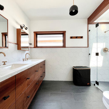
wall mounted vanity, washlet toilet, curbless shower for 2
Inspiration for a contemporary white tile and porcelain tile black floor and double-sink bathroom remodel in Los Angeles with flat-panel cabinets, red cabinets, quartz countertops, white countertops and a floating vanity
Inspiration for a contemporary white tile and porcelain tile black floor and double-sink bathroom remodel in Los Angeles with flat-panel cabinets, red cabinets, quartz countertops, white countertops and a floating vanity
 KURV Architecture DPC (Alex Hughes Architects)
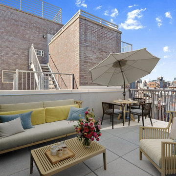
Located in the heart of Manhattan’s Lower East Side, the building was erected on a shallow commercial lot between two 120 year old masonry buildings and a new residential rental building. 330 Grand Street is a mix of 725 SF 1BRs and 1050 SF 2BR apartments. It also contains a 1100 SF two story duplex as well as private and public rooftop space, large private balconies for most units and two large private terraces for the ground floor units.
330 Grand Street was originally designed and approved at the NYC DOB as a prefabricated modular building. During the pandemic, as shipping costs skyrocketed putting the project at risk, we suggested redesigning the building as a reinforced cast-in-place concrete structure. Concrete was readily available and prices had not been affected by the demand increase that many other materials suffered in the pandemic. We took this opportunity to raise floor to ceiling heights, enlarge high performance windows and redistribute the buildings MEPFS and Structural Systems to create very open floor plans.
The challenge was to create a luxurious sensorial living experience with very limited means. In a city with very high construction costs, low cost residential buildings in the area are usually devoid of good quality, design and character. Our approach was to aim high for the end user, prioritizing natural light, open space with long visual perspectives, high ceilings and as always, rejecting the use of predefined building templates.
Our biggest challenge was to ensure that the small spaces feel as clean cut, large and bright as possible. Several unique design decisions were made to ensure low cost and high quality;
Floor plans were laid out so that spaces were wide open and free of clutter from mechanical or structural interruptions. Therefore all infrastructure was placed in lateral demising walls, which in turn act as the unit’s storage and kitchen. The apartments feel wide open, are super quiet and have more storage space than any other comparable apartment in the city.
To solve the problem of the site’s shallow commercial lot which is typically prone to dark interior spaces we focused our attention on the building’s envelope. Instead of the usual small punched window openings, oversized high performance windows were designed to ensure that light penetrated as far as possible into the units. In the smaller 1BR units, the full 50’ depth of the lot is perceived by partitioning spaces with sliding pocket doors that can be retracted to allow deep visual perspectives, making the sight lines in the space feel longer, larger, more ample than normal. In addition to the full height glazing, each unit above the 2nd floor receives a 7 foot covered balcony, adding 120 to 240 sf to each apartment, something unusual in New York City buildings. The space is large enough for a full size dining table, when the weather permits being outside.
We also worked hard to ensure modularity. For example, all kitchen units are all identical throughout the building. The idea of modularity and the economy of the repetitive unit is exercised to the maximum through the building.
Hardware, appliances, flooring, wall coverings and material finishes are all carefully selected to feel bespoke, high quality and unique.
It was important to KURV that the result of this work manifest into something that would deeply connect with the end user and sustain relationships with the consumers of this space.
All images by KURV Architecture ©
 CONTENT Architecture
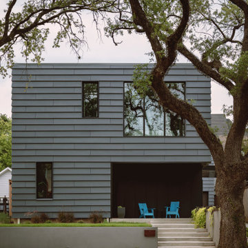
This home for a family of four in Houston Heights nods to the neighborhood’s historic bungalows with oversized 'clapboard' siding and a gable roof form with a distinctly modern reinterpretation. Two mature live oak trees at the front of the site provide a shaded canopy upon entry. The volume of the building tapers slightly from the peak at the center of the site to the primary bedroom at the front of the home where a large window at the foot of the bed frames a view of the tree canopy.
Spaces are carved away from the overall volume in order to bring outdoor space into the interior of the home. In addition to the porches at the front and back of the house that are typical to most homes, each bedroom also opens to a generous private patio recessed within the building’s volume. An interior atrium brings vegetation and natural light into the kitchen and dining spaces while a deep canopy provides shade to a broad opening just outside the living room. At the peak of the gabled roof, a skylight brings daylight into a lofted reading space.
The family’s penchant for puzzles inspired the details within the home. Throughout the house, irregularly shaped millwork door panels overlap with adjacent cabinet boxes to create interlocking planes. Staggered gaps in cabinet doors and drawers serve as handles, creating playful patterns. In the Puzzle Room, a custom designed table allows for puzzles in progress to be stored internally until homework is completed.
 KURV Architecture DPC (Alex Hughes Architects)
Located in the heart of Manhattan’s Lower East Side, the building was erected on a shallow commercial lot between two 120 year old masonry buildings and a new residential rental building. 330 Grand Street is a mix of 725 SF 1BRs and 1050 SF 2BR apartments. It also contains a 1100 SF two story duplex as well as private and public rooftop space, large private balconies for most units and two large private terraces for the ground floor units.
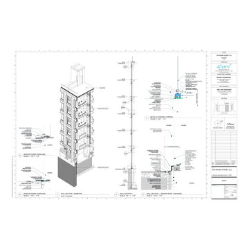
330 Grand Street was originally designed and approved at the NYC DOB as a prefabricated modular building. During the pandemic, as shipping costs skyrocketed putting the project at risk, we suggested redesigning the building as a reinforced cast-in-place concrete structure. Concrete was readily available and prices had not been affected by the demand increase that many other materials suffered in the pandemic. We took this opportunity to raise floor to ceiling heights, enlarge high performance windows and redistribute the buildings MEPFS and Structural Systems to create very open floor plans.
The challenge was to create a luxurious sensorial living experience with very limited means. In a city with very high construction costs, low cost residential buildings in the area are usually devoid of good quality, design and character. Our approach was to aim high for the end user, prioritizing natural light, open space with long visual perspectives, high ceilings and as always, rejecting the use of predefined building templates.
Our biggest challenge was to ensure that the small spaces feel as clean cut, large and bright as possible. Several unique design decisions were made to ensure low cost and high quality;
Floor plans were laid out so that spaces were wide open and free of clutter from mechanical or structural interruptions. Therefore all infrastructure was placed in lateral demising walls, which in turn act as the unit’s storage and kitchen. The apartments feel wide open, are super quiet and have more storage space than any other comparable apartment in the city.
To solve the problem of the site’s shallow commercial lot which is typically prone to dark interior spaces we focused our attention on the building’s envelope. Instead of the usual small punched window openings, oversized high performance windows were designed to ensure that light penetrated as far as possible into the units. In the smaller 1BR units, the full 50’ depth of the lot is perceived by partitioning spaces with sliding pocket doors that can be retracted to allow deep visual perspectives, making the sight lines in the space feel longer, larger, more ample than normal. In addition to the full height glazing, each unit above the 2nd floor receives a 7 foot covered balcony, adding 120 to 240 sf to each apartment, something unusual in New York City buildings. The space is large enough for a full size dining table, when the weather permits being outside.
We also worked hard to ensure modularity. For example, all kitchen units are all identical throughout the building. The idea of modularity and the economy of the repetitive unit is exercised to the maximum through the building.
Hardware, appliances, flooring, wall coverings and material finishes are all carefully selected to feel bespoke, high quality and unique.
It was important to KURV that the result of this work manifest into something that would deeply connect with the end user and sustain relationships with the consumers of this space.
All images by KURV Architecture ©


 KURV Architecture DPC (Alex Hughes Architects)
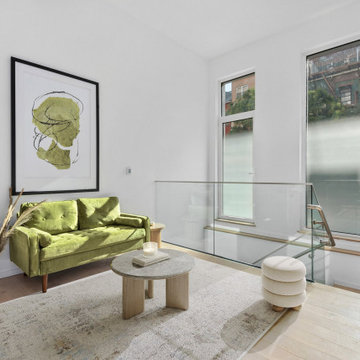
Located in the heart of Manhattan’s Lower East Side, the building was erected on a shallow commercial lot between two 120 year old masonry buildings and a new residential rental building. 330 Grand Street is a mix of 725 SF 1BRs and 1050 SF 2BR apartments. It also contains a 1100 SF two story duplex as well as private and public rooftop space, large private balconies for most units and two large private terraces for the ground floor units.
330 Grand Street was originally designed and approved at the NYC DOB as a prefabricated modular building. During the pandemic, as shipping costs skyrocketed putting the project at risk, we suggested redesigning the building as a reinforced cast-in-place concrete structure. Concrete was readily available and prices had not been affected by the demand increase that many other materials suffered in the pandemic. We took this opportunity to raise floor to ceiling heights, enlarge high performance windows and redistribute the buildings MEPFS and Structural Systems to create very open floor plans.
The challenge was to create a luxurious sensorial living experience with very limited means. In a city with very high construction costs, low cost residential buildings in the area are usually devoid of good quality, design and character. Our approach was to aim high for the end user, prioritizing natural light, open space with long visual perspectives, high ceilings and as always, rejecting the use of predefined building templates.
Our biggest challenge was to ensure that the small spaces feel as clean cut, large and bright as possible. Several unique design decisions were made to ensure low cost and high quality;
Floor plans were laid out so that spaces were wide open and free of clutter from mechanical or structural interruptions. Therefore all infrastructure was placed in lateral demising walls, which in turn act as the unit’s storage and kitchen. The apartments feel wide open, are super quiet and have more storage space than any other comparable apartment in the city.
To solve the problem of the site’s shallow commercial lot which is typically prone to dark interior spaces we focused our attention on the building’s envelope. Instead of the usual small punched window openings, oversized high performance windows were designed to ensure that light penetrated as far as possible into the units. In the smaller 1BR units, the full 50’ depth of the lot is perceived by partitioning spaces with sliding pocket doors that can be retracted to allow deep visual perspectives, making the sight lines in the space feel longer, larger, more ample than normal. In addition to the full height glazing, each unit above the 2nd floor receives a 7 foot covered balcony, adding 120 to 240 sf to each apartment, something unusual in New York City buildings. The space is large enough for a full size dining table, when the weather permits being outside.
We also worked hard to ensure modularity. For example, all kitchen units are all identical throughout the building. The idea of modularity and the economy of the repetitive unit is exercised to the maximum through the building.
Hardware, appliances, flooring, wall coverings and material finishes are all carefully selected to feel bespoke, high quality and unique.
It was important to KURV that the result of this work manifest into something that would deeply connect with the end user and sustain relationships with the consumers of this space.
All images by KURV Architecture ©
 Oriental Designer Rugs
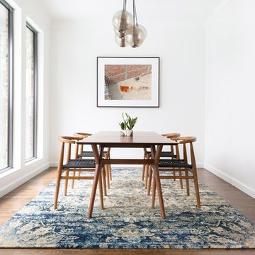
Contemporary dining area with a contemporary rug to match your style
Inspiration for a contemporary dining room remodel in Atlanta
Inspiration for a contemporary dining room remodel in Atlanta
 Wayne Towle Master Finishing & Restoration, Inc.
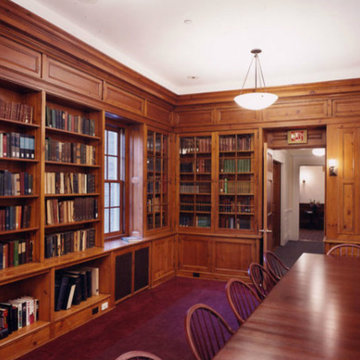
Boston College Conference Room: The old orange shellac finish, typical of old finishes, was stripped off and replaced with a new warmer finish. The sheen has a warm satin glow.
 The Safety Letterbox Company
Floral Court is a mixed-use development featuring a high-quality residential, retail and restaurant space located in London’s Covent Garden. The project has created a new public walkway between Floral Street and King Street, providing increased footfall levels that provide a vital link to the retail and restaurant units in the development.
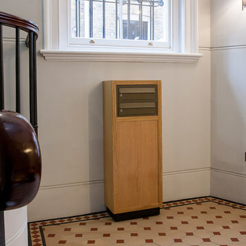
The mailboxes used in the Floral Court project are situated in internal lobby areas that residents pass through to access their apartment. Each bank of mailboxes is fitted into a bespoke timber frame with an internal steel frame support that ensures multiple mailboxes are securely installed in their respective locations.
The chosen mailbox model for this development is the NW2 product, an item that is particularly popular with clients looking for a mailbox that has a minimalist design finish and where mail is to be both delivered and retrieved through the front face. This project uses a lateral variation of the NW2 mailbox, which allows for A4 sized flexible mail to be deposited and securely stored in the post box. The lateral type of post box typically features a shorter depth and larger width, which is ideal for installation areas that are relatively narrow.
To reflect the number of residences that they service, the mailboxes are in a variety of different configurations across the site.
Each post box has been engraved with corresponding residence numbers during the manufacturing process. To allow for a clean finish on the mailbox, the client opted for the engraving to be the same colour as the mailboxes themselves. Being used with the NW2 product, which has been specifically designed to have minimal features, this is the ideal mailbox and engraving combination for a sleek designer look.
The mailbox is engraved with the front family ‘Calisto MT’, which is used in other locations on the site. This ensures a consistent mirroring of fonts used throughout the Floral Court development.
 Footprint Architects Ltd
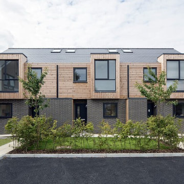
Footprint Architects were called upon to design a new road development in Faith Gardens, Poole. The site was originally a Brownfield site used by the Wyvern Cargo company, but set within a typically suburban surrounding. The challenge was to turn this derelict wasteland into a thriving affordable family housing development, with a modern twist.
The new houses had to fit coherently with the surrounding context as well as have a bold, elegant aesthetic. Phase 4 was completed in summer 2016.
 KURV Architecture DPC (Alex Hughes Architects)
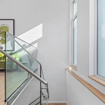
Located in the heart of Manhattan’s Lower East Side, the building was erected on a shallow commercial lot between two 120 year old masonry buildings and a new residential rental building. 330 Grand Street is a mix of 725 SF 1BRs and 1050 SF 2BR apartments. It also contains a 1100 SF two story duplex as well as private and public rooftop space, large private balconies for most units and two large private terraces for the ground floor units.
330 Grand Street was originally designed and approved at the NYC DOB as a prefabricated modular building. During the pandemic, as shipping costs skyrocketed putting the project at risk, we suggested redesigning the building as a reinforced cast-in-place concrete structure. Concrete was readily available and prices had not been affected by the demand increase that many other materials suffered in the pandemic. We took this opportunity to raise floor to ceiling heights, enlarge high performance windows and redistribute the buildings MEPFS and Structural Systems to create very open floor plans.
The challenge was to create a luxurious sensorial living experience with very limited means. In a city with very high construction costs, low cost residential buildings in the area are usually devoid of good quality, design and character. Our approach was to aim high for the end user, prioritizing natural light, open space with long visual perspectives, high ceilings and as always, rejecting the use of predefined building templates.
Our biggest challenge was to ensure that the small spaces feel as clean cut, large and bright as possible. Several unique design decisions were made to ensure low cost and high quality;
Floor plans were laid out so that spaces were wide open and free of clutter from mechanical or structural interruptions. Therefore all infrastructure was placed in lateral demising walls, which in turn act as the unit’s storage and kitchen. The apartments feel wide open, are super quiet and have more storage space than any other comparable apartment in the city.
To solve the problem of the site’s shallow commercial lot which is typically prone to dark interior spaces we focused our attention on the building’s envelope. Instead of the usual small punched window openings, oversized high performance windows were designed to ensure that light penetrated as far as possible into the units. In the smaller 1BR units, the full 50’ depth of the lot is perceived by partitioning spaces with sliding pocket doors that can be retracted to allow deep visual perspectives, making the sight lines in the space feel longer, larger, more ample than normal. In addition to the full height glazing, each unit above the 2nd floor receives a 7 foot covered balcony, adding 120 to 240 sf to each apartment, something unusual in New York City buildings. The space is large enough for a full size dining table, when the weather permits being outside.
We also worked hard to ensure modularity. For example, all kitchen units are all identical throughout the building. The idea of modularity and the economy of the repetitive unit is exercised to the maximum through the building.
Hardware, appliances, flooring, wall coverings and material finishes are all carefully selected to feel bespoke, high quality and unique.
It was important to KURV that the result of this work manifest into something that would deeply connect with the end user and sustain relationships with the consumers of this space.
All images by KURV Architecture ©

 The Safety Letterbox Company
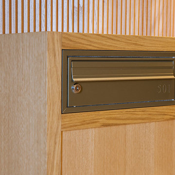
Floral Court is a mixed-use development featuring a high-quality residential, retail and restaurant space located in London’s Covent Garden. The project has created a new public walkway between Floral Street and King Street, providing increased footfall levels that provide a vital link to the retail and restaurant units in the development.
The mailboxes used in the Floral Court project are situated in internal lobby areas that residents pass through to access their apartment. Each bank of mailboxes is fitted into a bespoke timber frame with an internal steel frame support that ensures multiple mailboxes are securely installed in their respective locations.
The chosen mailbox model for this development is the NW2 product, an item that is particularly popular with clients looking for a mailbox that has a minimalist design finish and where mail is to be both delivered and retrieved through the front face. This project uses a lateral variation of the NW2 mailbox, which allows for A4 sized flexible mail to be deposited and securely stored in the post box. The lateral type of post box typically features a shorter depth and larger width, which is ideal for installation areas that are relatively narrow.
To reflect the number of residences that they service, the mailboxes are in a variety of different configurations across the site.
Each post box has been engraved with corresponding residence numbers during the manufacturing process. To allow for a clean finish on the mailbox, the client opted for the engraving to be the same colour as the mailboxes themselves. Being used with the NW2 product, which has been specifically designed to have minimal features, this is the ideal mailbox and engraving combination for a sleek designer look.
The mailbox is engraved with the front family ‘Calisto MT’, which is used in other locations on the site. This ensures a consistent mirroring of fonts used throughout the Floral Court development.
 KURV Architecture DPC (Alex Hughes Architects)
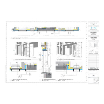
Located in the heart of Manhattan’s Lower East Side, the building was erected on a shallow commercial lot between two 120 year old masonry buildings and a new residential rental building. 330 Grand Street is a mix of 725 SF 1BRs and 1050 SF 2BR apartments. It also contains a 1100 SF two story duplex as well as private and public rooftop space, large private balconies for most units and two large private terraces for the ground floor units.
330 Grand Street was originally designed and approved at the NYC DOB as a prefabricated modular building. During the pandemic, as shipping costs skyrocketed putting the project at risk, we suggested redesigning the building as a reinforced cast-in-place concrete structure. Concrete was readily available and prices had not been affected by the demand increase that many other materials suffered in the pandemic. We took this opportunity to raise floor to ceiling heights, enlarge high performance windows and redistribute the buildings MEPFS and Structural Systems to create very open floor plans.
The challenge was to create a luxurious sensorial living experience with very limited means. In a city with very high construction costs, low cost residential buildings in the area are usually devoid of good quality, design and character. Our approach was to aim high for the end user, prioritizing natural light, open space with long visual perspectives, high ceilings and as always, rejecting the use of predefined building templates.
Our biggest challenge was to ensure that the small spaces feel as clean cut, large and bright as possible. Several unique design decisions were made to ensure low cost and high quality;
Floor plans were laid out so that spaces were wide open and free of clutter from mechanical or structural interruptions. Therefore all infrastructure was placed in lateral demising walls, which in turn act as the unit’s storage and kitchen. The apartments feel wide open, are super quiet and have more storage space than any other comparable apartment in the city.
To solve the problem of the site’s shallow commercial lot which is typically prone to dark interior spaces we focused our attention on the building’s envelope. Instead of the usual small punched window openings, oversized high performance windows were designed to ensure that light penetrated as far as possible into the units. In the smaller 1BR units, the full 50’ depth of the lot is perceived by partitioning spaces with sliding pocket doors that can be retracted to allow deep visual perspectives, making the sight lines in the space feel longer, larger, more ample than normal. In addition to the full height glazing, each unit above the 2nd floor receives a 7 foot covered balcony, adding 120 to 240 sf to each apartment, something unusual in New York City buildings. The space is large enough for a full size dining table, when the weather permits being outside.
We also worked hard to ensure modularity. For example, all kitchen units are all identical throughout the building. The idea of modularity and the economy of the repetitive unit is exercised to the maximum through the building.
Hardware, appliances, flooring, wall coverings and material finishes are all carefully selected to feel bespoke, high quality and unique.
It was important to KURV that the result of this work manifest into something that would deeply connect with the end user and sustain relationships with the consumers of this space.
All images by KURV Architecture ©
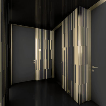 KURV Architecture DPC (Alex Hughes Architects)
Located in the heart of Manhattan’s Lower East Side, the building was erected on a shallow commercial lot between two 120 year old masonry buildings and a new residential rental building. 330 Grand Street is a mix of 725 SF 1BRs and 1050 SF 2BR apartments. It also contains a 1100 SF two story duplex as well as private and public rooftop space, large private balconies for most units and two large private terraces for the ground floor units.
330 Grand Street was originally designed and approved at the NYC DOB as a prefabricated modular building. During the pandemic, as shipping costs skyrocketed putting the project at risk, we suggested redesigning the building as a reinforced cast-in-place concrete structure. Concrete was readily available and prices had not been affected by the demand increase that many other materials suffered in the pandemic. We took this opportunity to raise floor to ceiling heights, enlarge high performance windows and redistribute the buildings MEPFS and Structural Systems to create very open floor plans.
The challenge was to create a luxurious sensorial living experience with very limited means. In a city with very high construction costs, low cost residential buildings in the area are usually devoid of good quality, design and character. Our approach was to aim high for the end user, prioritizing natural light, open space with long visual perspectives, high ceilings and as always, rejecting the use of predefined building templates.
Our biggest challenge was to ensure that the small spaces feel as clean cut, large and bright as possible. Several unique design decisions were made to ensure low cost and high quality;
Floor plans were laid out so that spaces were wide open and free of clutter from mechanical or structural interruptions. Therefore all infrastructure was placed in lateral demising walls, which in turn act as the unit’s storage and kitchen. The apartments feel wide open, are super quiet and have more storage space than any other comparable apartment in the city.
To solve the problem of the site’s shallow commercial lot which is typically prone to dark interior spaces we focused our attention on the building’s envelope. Instead of the usual small punched window openings, oversized high performance windows were designed to ensure that light penetrated as far as possible into the units. In the smaller 1BR units, the full 50’ depth of the lot is perceived by partitioning spaces with sliding pocket doors that can be retracted to allow deep visual perspectives, making the sight lines in the space feel longer, larger, more ample than normal. In addition to the full height glazing, each unit above the 2nd floor receives a 7 foot covered balcony, adding 120 to 240 sf to each apartment, something unusual in New York City buildings. The space is large enough for a full size dining table, when the weather permits being outside.
We also worked hard to ensure modularity. For example, all kitchen units are all identical throughout the building. The idea of modularity and the economy of the repetitive unit is exercised to the maximum through the building.
Hardware, appliances, flooring, wall coverings and material finishes are all carefully selected to feel bespoke, high quality and unique.
It was important to KURV that the result of this work manifest into something that would deeply connect with the end user and sustain relationships with the consumers of this space.
All images by KURV Architecture ©
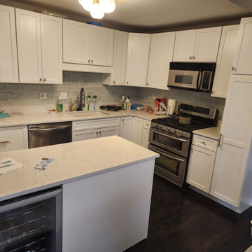
 Windy City Painters
Refresh Your Space with the Best Kitchen Cabinet Painting in Chicago!
Looking for a Kitchen Cabinet Painting Transformation in Wicker Park? Our premier Chicago painting company just completed this stunning cabinet refinishing project, proving that you don't need a full remodel to achieve a high-end, designer look.
As local Chicago painters specializing in professional cabinet painting, we understand the unique aesthetic of Windy City homes—from historic bungalows to modern West Loop condos. Our team focuses on high-durability finishes and meticulous cabinet spraying techniques that deliver a smooth, factory-like appearance. From thorough degreasing and sanding to the final topcoat, every step is handled with the expert care your home deserves. These Wicker Park homeowners are absolutely thrilled with their kitchen's modern new vibe!
Kitchen Cabinet Painting: Frequently Asked Questions
How long does the professional kitchen cabinet painting process typically take from start to finish?
Most residential projects take between five to seven business days. This timeframe includes the removal of doors for off-site spraying, meticulous on-site masking of your kitchen "shell," and the necessary curing time between coats to ensure a rock-hard, durable finish.
What type of paint or finish do you use to ensure the cabinets don't chip or peel over time?
We utilize industrial-grade Italian coatings or high-end waterborne alkyd enamels specifically formulated for cabinetry. These products are much harder than standard wall paint, providing superior resistance to moisture, kitchen grease, and the daily wear and tear of a busy Chicago household.
Do I need to empty all of my kitchen cabinets and drawers before the painters arrive?
While you don't necessarily need to empty the backs of the shelves, we require all items to be moved at least six inches back from the front edges. However, for the best dust-free results, we highly recommend emptying them completely to protect your cookware.
Can you paint cabinets that are made of laminate, thermofoil, or or dark-stained oak?
Yes, we can! The secret lies in the bonding primer. We use specialized high-adhesion primers that "bite" into slick surfaces like laminate or seal the grain of deep oak, ensuring the color stays vibrant and the surface remains perfectly smooth without peeling.
How should I clean and maintain my newly painted cabinets to keep them looking fresh for years?
To maintain the finish, simply wipe them down with a soft microfiber cloth and a gentle mixture of warm water and mild dish soap. Avoid using harsh chemical cleaners, abrasive scrubbing pads, or wax-based polishes, as these can break down the protective topcoat over time.
 The Safety Letterbox Company
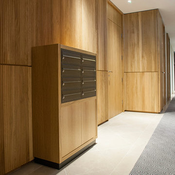
Floral Court is a mixed-use development featuring a high-quality residential, retail and restaurant space located in London’s Covent Garden. The project has created a new public walkway between Floral Street and King Street, providing increased footfall levels that provide a vital link to the retail and restaurant units in the development.
The mailboxes used in the Floral Court project are situated in internal lobby areas that residents pass through to access their apartment. Each bank of mailboxes is fitted into a bespoke timber frame with an internal steel frame support that ensures multiple mailboxes are securely installed in their respective locations.
The chosen mailbox model for this development is the NW2 product, an item that is particularly popular with clients looking for a mailbox that has a minimalist design finish and where mail is to be both delivered and retrieved through the front face. This project uses a lateral variation of the NW2 mailbox, which allows for A4 sized flexible mail to be deposited and securely stored in the post box. The lateral type of post box typically features a shorter depth and larger width, which is ideal for installation areas that are relatively narrow.
To reflect the number of residences that they service, the mailboxes are in a variety of different configurations across the site.
Each post box has been engraved with corresponding residence numbers during the manufacturing process. To allow for a clean finish on the mailbox, the client opted for the engraving to be the same colour as the mailboxes themselves. Being used with the NW2 product, which has been specifically designed to have minimal features, this is the ideal mailbox and engraving combination for a sleek designer look.
The mailbox is engraved with the front family ‘Calisto MT’, which is used in other locations on the site. This ensures a consistent mirroring of fonts used throughout the Floral Court development.
25