
Search results for "Sites require" in Home Design Ideas
 SDM Design, Inc.
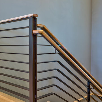
This house was designed for a couple and their son. One of the design program requirements was to have two master suites on the main level. They enjoy cooking and entertaining so the public and food prep. areas are functional, attractive and conducive to people gathering around. Consequently, the square footage of the main level is large.
The house is also on a very steep slope which didn't help with the required footprint. In order to minimize the related costs of building with this site condition, the footprint of the house is long and not deep as it reaches down the slope.
The scale of the existing homes in the neighborhood are unimposing. In order to play down the size as viewed from the street, the facade is broken up into several different masses with low sloping roofs.
Once you're inside, the house opens up with 14 foot ceilings in the entry and living areas. The ceiling height of other spaces on the main level are 10 feet. Universal design was implemented on the main level to provide inherent accessibility for everyone.
The lower level accommodates several guest rooms and baths, an exercise room, a guest den with wet bar and a man cave.
Another design program requirement was to make the house as maintenance-free as possible. Exterior materials include stucco, Pennsylvania Blue Stone and a new aluminum siding product called Longboard. The siding comes in many wood grain finishes and to everyone that has seen it, they think it's real wood. It's also made from heavy gauge aluminum so it doesn't ding like traditional aluminum siding. The roofs are metal standing seam.
The house is energy efficient. It's fully insulated with spray foam insulation-lots of it. The exterior walls were designed with 2x6 studs and roof rafters are 2x12 to provide plenty of space for the insulation, exceeding the required R-values. Windows and doors of course are energy efficient as well. All lighting is LED.
The decking around the exterior is locust, a very hard native wood which is naturally insect and rot resistant.
The best part of the whole project are the owners who love their new home. They initially had plans to live in this house during the summer months and Florida during the winter. They are now seriously considering living here full-time.
 Matt Fajkus Architecture
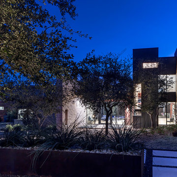
The Control/Shift House is perched on the high side of the site which takes advantage of the view to the southeast. A gradual descending path navigates the change in terrain from the street to the entry of the house. A series of low retaining walls/planter beds gather and release the earth upon the descent resulting in a fairly flat level for the house to sit on the top one third of the site. The entry axis is aligned with the celebrated stair volume and then re-centers on the actual entry axis once you approach the forecourt of the house.
The initial desire was for an “H” scheme house with common entertaining spaces bridging the gap between the more private spaces. After an investigation considering the site, program, and view, a key move was made: unfold the east wing of the “H” scheme to open all rooms to the southeast view resulting in a “T” scheme. The new derivation allows for both a swim pool which is on axis with the entry and main gathering space and a lap pool which occurs on the cross axis extending along the lengthy edge of the master suite, providing direct access for morning exercise and a view of the water throughout the day.
The Control/Shift House was derived from a clever way of following the “rules.” Strict HOA guidelines required very specific exterior massing restrictions which limits the lengths of unbroken elevations and promotes varying sizes of masses. The solution most often used in this neighborhood is one of addition - an aggregation of masses and program randomly attached to the inner core of the house which often results in a parasitic plan. The approach taken with the Control/Shift House was to push and pull program/massing to delineate and define the layout of the house. Massing is intentional and reiterated by the careful selection of materiality that tracks through the house. Voids and relief in the plan are a natural result of this method and allow for light and air to circulate throughout every space of the house, even into the most inner core.
Photography: Charles Davis Smith
 CHRISTOPHER STROM ARCHITECTS
Sommerhus is a private retreat for two empty-nesters. The clients purchased the previous cabin after falling in love with its location on a private, lakefront peninsula. However, this beautiful site was a challenging site to build on, due to its position sandwiched between the lake and protected wet land. The clients disliked the old cabin because it could only be used in the summer months, due to its lack of both insulation and heat. In addition, it was too small for their needs. They wanted to build a new, larger retreat, but were met with yet another constraint: the new cabin would be limited to the previous cabin’s small footprint. Thus, they decided to approach an architect to design their dream cabin.
As the clients described, “We visited Denmark for a family wedding in 2015, and while biking near Gilleleje, a fishing village on the Baltic Sea, we fell in love with the aesthetic of ‘Sommerhus’: dark exteriors, clean, simple lines, and lots of windows.” We set out to design a cabin that fit this aesthetic while also meeting the site’s constraints.
The clients were committed to keeping all existing trees on their site. In addition, zoning codes required the new retreat to stay within the previous cabin's small footprint. Thus, to maximize the square footage of the cabin without removing trees or expanding the footprint, the new structure had to grow vertically. At the same time, the clients wanted to be good neighbors. To them, this meant that their cabin should disappear into the woods, especially when viewed from the lake. To accomplish both these requests, the architect selected a dark exterior metal façade that would visually retreat into the trees. The metal siding is a modern, low-maintenance, and cost-effective solution, especially when compared to traditional wood siding. Warm wood on the soffits of the large roof overhang contrast with the metal siding. Sommerhus's resulting exterior is just as the clients’ requested: boldly modern yet respectful of the serene surroundings.
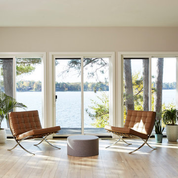
The homeowners desired a beach-house-inspired interior, full of light and warmth, in contrast to the dark exterior. As the homeowner explained, “I wanted it to feel like a porch inside.” To achieve this, the living room has two walls of sliding glass doors that connect to the wrap-around porch. This creates a beautiful, indoor-outdoor living space. The crisp and bright kitchen also connects to the porch with the window that opens to an outdoor counter - perfect for passing food and drinks to those lounging on the porch. The kitchen is open to the rest of the first-floor entertaining space, and brings a playful, beach-house feel to the cabin.
After the completion of the project, the homeowners remarked, “Working with Christopher and Eric [of CSA] was a wonderful experience. We absolutely love our home, and each season on the lake is more special than the last.”
Find the right local pro for your project
 Regan Baker Design Inc.
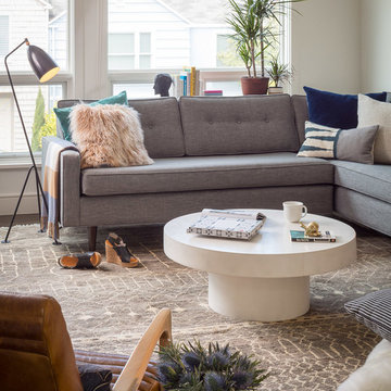
First home, savvy art owners, decided to hire RBD to design their recently purchased two story, four bedroom, midcentury Diamond Heights home to merge their new parenthood and love for entertaining lifestyles. Hired two months prior to the arrival of their baby boy, RBD was successful in installing the nursery just in time. The home required little architectural spatial reconfiguration given the previous owner was an architect, allowing RBD to focus mainly on furniture, fixtures and accessories while updating only a few finishes. New paint grade paneling added a needed midcentury texture to the entry, while an existing site for sore eyes radiator, received a new walnut cover creating a built-in mid-century custom headboard for the guest room, perfect for large art and plant decoration. RBD successfully paired furniture and art selections to connect the existing material finishes by keeping fabrics neutral and complimentary to the existing finishes. The backyard, an SF rare oasis, showcases a hanging chair and custom outdoor floor cushions for easy lounging, while a stylish midcentury heated bench allows easy outdoor entertaining in the SF climate.
Photography Credit: Scott Hargis Photography
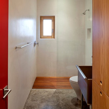
 Zola European Windows
Located in an existing neighborhood of post-war houses, Skidmore Passivhaus merges contemporary design with the highest level of energy efficiency. Gernerous insulation, extremely airtight construction (tested at .32ach50), high performing triple glazed Zola European Windows, and a super-efficient heat recovery ventilator allow the structure to meet the stringent requirements of the German Passivhaus standard. Generous amounts of south facing glazing (0.5 shgc) maximize the solar gains for most of the year, while motorized exterior aluminum shades can be lowered to block unwanted summer heat gain resulting in extremely comfortable temperatures year round. An extensive green roof helps manage all stormwater on site, while a roof mounted 4.32 kW PV array provides enough electricity to result in a near net zero and truly sustainable building.
In Situ Architecture
Jeremy Bittermann - BITTERMANN Photography

 RDC Fine Homes, Inc.
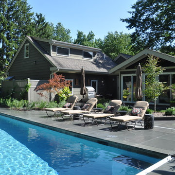
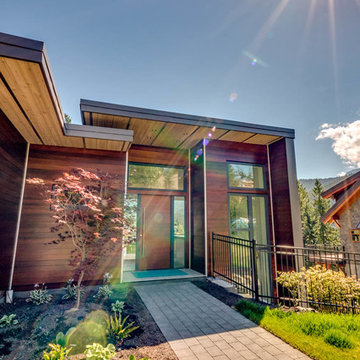
• Steep, rocky, view lot required increased site prep
• Low profile passive solar design optimizes topography, view corridors, outdoor living
• Contemporary simple architecture, cedar and Hardie siding, black trim and railings
• Indigenous plantings edged with natural stone, pathway to rear
• Wood cladding at entrance carries through into mudroom
• Transom windows create visual appeal & increase natural light
 CHRISTOPHER STROM ARCHITECTS
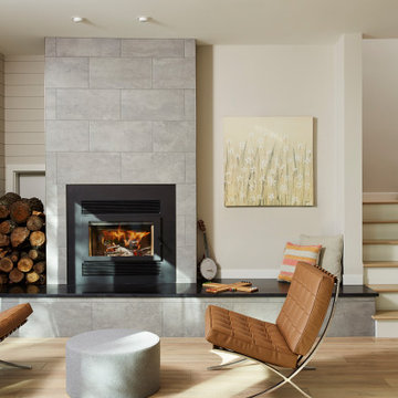
Sommerhus is a private retreat for two empty-nesters. The clients purchased the previous cabin after falling in love with its location on a private, lakefront peninsula. However, this beautiful site was a challenging site to build on, due to its position sandwiched between the lake and protected wet land. The clients disliked the old cabin because it could only be used in the summer months, due to its lack of both insulation and heat. In addition, it was too small for their needs. They wanted to build a new, larger retreat, but were met with yet another constraint: the new cabin would be limited to the previous cabin’s small footprint. Thus, they decided to approach an architect to design their dream cabin.
As the clients described, “We visited Denmark for a family wedding in 2015, and while biking near Gilleleje, a fishing village on the Baltic Sea, we fell in love with the aesthetic of ‘Sommerhus’: dark exteriors, clean, simple lines, and lots of windows.” We set out to design a cabin that fit this aesthetic while also meeting the site’s constraints.
The clients were committed to keeping all existing trees on their site. In addition, zoning codes required the new retreat to stay within the previous cabin's small footprint. Thus, to maximize the square footage of the cabin without removing trees or expanding the footprint, the new structure had to grow vertically. At the same time, the clients wanted to be good neighbors. To them, this meant that their cabin should disappear into the woods, especially when viewed from the lake. To accomplish both these requests, the architect selected a dark exterior metal façade that would visually retreat into the trees. The metal siding is a modern, low-maintenance, and cost-effective solution, especially when compared to traditional wood siding. Warm wood on the soffits of the large roof overhang contrast with the metal siding. Sommerhus's resulting exterior is just as the clients’ requested: boldly modern yet respectful of the serene surroundings.
The homeowners desired a beach-house-inspired interior, full of light and warmth, in contrast to the dark exterior. As the homeowner explained, “I wanted it to feel like a porch inside.” To achieve this, the living room has two walls of sliding glass doors that connect to the wrap-around porch. This creates a beautiful, indoor-outdoor living space. The crisp and bright kitchen also connects to the porch with the window that opens to an outdoor counter - perfect for passing food and drinks to those lounging on the porch. The kitchen is open to the rest of the first-floor entertaining space, and brings a playful, beach-house feel to the cabin.
After the completion of the project, the homeowners remarked, “Working with Christopher and Eric [of CSA] was a wonderful experience. We absolutely love our home, and each season on the lake is more special than the last.”
 Zola European Windows
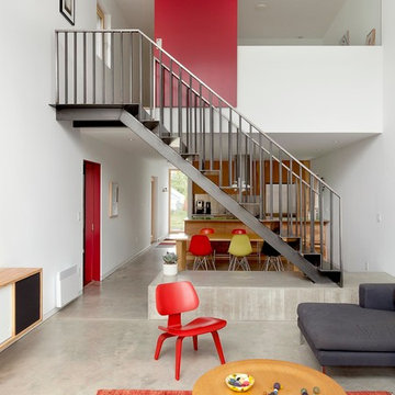
Located in an existing neighborhood of post-war houses, Skidmore Passivhaus merges contemporary design with the highest level of energy efficiency. Gernerous insulation, extremely airtight construction (tested at .32ach50), high performing triple glazed Zola European Windows, and a super-efficient heat recovery ventilator allow the structure to meet the stringent requirements of the German Passivhaus standard. Generous amounts of south facing glazing (0.5 shgc) maximize the solar gains for most of the year, while motorized exterior aluminum shades can be lowered to block unwanted summer heat gain resulting in extremely comfortable temperatures year round. An extensive green roof helps manage all stormwater on site, while a roof mounted 4.32 kW PV array provides enough electricity to result in a near net zero and truly sustainable building.
In Situ Architecture
Jeremy Bittermann - BITTERMANN Photography
 Matt Fajkus Architecture
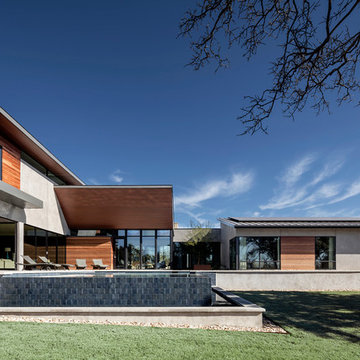
The Control/Shift House is perched on the high side of the site which takes advantage of the view to the southeast. A gradual descending path navigates the change in terrain from the street to the entry of the house. A series of low retaining walls/planter beds gather and release the earth upon the descent resulting in a fairly flat level for the house to sit on the top one third of the site. The entry axis is aligned with the celebrated stair volume and then re-centers on the actual entry axis once you approach the forecourt of the house.
The initial desire was for an “H” scheme house with common entertaining spaces bridging the gap between the more private spaces. After an investigation considering the site, program, and view, a key move was made: unfold the east wing of the “H” scheme to open all rooms to the southeast view resulting in a “T” scheme. The new derivation allows for both a swim pool which is on axis with the entry and main gathering space and a lap pool which occurs on the cross axis extending along the lengthy edge of the master suite, providing direct access for morning exercise and a view of the water throughout the day.
The Control/Shift House was derived from a clever way of following the “rules.” Strict HOA guidelines required very specific exterior massing restrictions which limits the lengths of unbroken elevations and promotes varying sizes of masses. The solution most often used in this neighborhood is one of addition - an aggregation of masses and program randomly attached to the inner core of the house which often results in a parasitic plan. The approach taken with the Control/Shift House was to push and pull program/massing to delineate and define the layout of the house. Massing is intentional and reiterated by the careful selection of materiality that tracks through the house. Voids and relief in the plan are a natural result of this method and allow for light and air to circulate throughout every space of the house, even into the most inner core.
Photography: Charles Davis Smith
 SDM Design, Inc.
This house was designed for a couple and their son. One of the design program requirements was to have two master suites on the main level. They enjoy cooking and entertaining so the public and food prep. areas are functional, attractive and conducive to people gathering around. Consequently, the square footage of the main level is large.
The house is also on a very steep slope which didn't help with the required footprint. In order to minimize the related costs of building with this site condition, the footprint of the house is long and not deep as it reaches down the slope.
The scale of the existing homes in the neighborhood are unimposing. In order to play down the size as viewed from the street, the facade is broken up into several different masses with low sloping roofs.
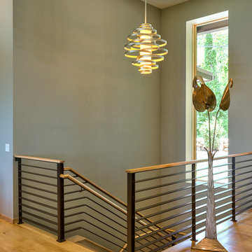
Once you're inside, the house opens up with 14 foot ceilings in the entry and living areas. The ceiling height of other spaces on the main level are 10 feet. Universal design was implemented on the main level to provide inherent accessibility for everyone.
The lower level accommodates several guest rooms and baths, an exercise room, a guest den with wet bar and a man cave.
Another design program requirement was to make the house as maintenance-free as possible. Exterior materials include stucco, Pennsylvania Blue Stone and a new aluminum siding product called Longboard. The siding comes in many wood grain finishes and to everyone that has seen it, they think it's real wood. It's also made from heavy gauge aluminum so it doesn't ding like traditional aluminum siding. The roofs are metal standing seam.
The house is energy efficient. It's fully insulated with spray foam insulation-lots of it. The exterior walls were designed with 2x6 studs and roof rafters are 2x12 to provide plenty of space for the insulation, exceeding the required R-values. Windows and doors of course are energy efficient as well. All lighting is LED.
The decking around the exterior is locust, a very hard native wood which is naturally insect and rot resistant.
The best part of the whole project are the owners who love their new home. They initially had plans to live in this house during the summer months and Florida during the winter. They are now seriously considering living here full-time.
 Mark Brand Architecture
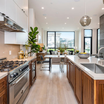
We were approached by a San Francisco firefighter to design a place for him and his girlfriend to live while also creating additional units he could sell to finance the project. He grew up in the house that was built on this site in approximately 1886. It had been remodeled repeatedly since it was first built so that there was only one window remaining that showed any sign of its Victorian heritage. The house had become so dilapidated over the years that it was a legitimate candidate for demolition. Furthermore, the house straddled two legal parcels, so there was an opportunity to build several new units in its place. At our client’s suggestion, we developed the left building as a duplex of which they could occupy the larger, upper unit and the right building as a large single-family residence. In addition to design, we handled permitting, including gathering support by reaching out to the surrounding neighbors and shepherding the project through the Planning Commission Discretionary Review process. The Planning Department insisted that we develop the two buildings so they had different characters and could not be mistaken for an apartment complex. The duplex design was inspired by Albert Frey’s Palm Springs modernism but clad in fibre cement panels and the house design was to be clad in wood. Because the site was steeply upsloping, the design required tall, thick retaining walls that we incorporated into the design creating sunken patios in the rear yards. All floors feature generous 10 foot ceilings and large windows with the upper, bedroom floors featuring 11 and 12 foot ceilings. Open plans are complemented by sleek, modern finishes throughout.
 Mark English Architects, AIA
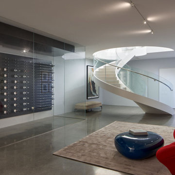
The Atherton House is a family compound for a professional couple in the tech industry, and their two teenage children. After living in Singapore, then Hong Kong, and building homes there, they looked forward to continuing their search for a new place to start a life and set down roots.
The site is located on Atherton Avenue on a flat, 1 acre lot. The neighboring lots are of a similar size, and are filled with mature planting and gardens. The brief on this site was to create a house that would comfortably accommodate the busy lives of each of the family members, as well as provide opportunities for wonder and awe. Views on the site are internal. Our goal was to create an indoor- outdoor home that embraced the benign California climate.
The building was conceived as a classic “H” plan with two wings attached by a double height entertaining space. The “H” shape allows for alcoves of the yard to be embraced by the mass of the building, creating different types of exterior space. The two wings of the home provide some sense of enclosure and privacy along the side property lines. The south wing contains three bedroom suites at the second level, as well as laundry. At the first level there is a guest suite facing east, powder room and a Library facing west.
The north wing is entirely given over to the Primary suite at the top level, including the main bedroom, dressing and bathroom. The bedroom opens out to a roof terrace to the west, overlooking a pool and courtyard below. At the ground floor, the north wing contains the family room, kitchen and dining room. The family room and dining room each have pocketing sliding glass doors that dissolve the boundary between inside and outside.
Connecting the wings is a double high living space meant to be comfortable, delightful and awe-inspiring. A custom fabricated two story circular stair of steel and glass connects the upper level to the main level, and down to the basement “lounge” below. An acrylic and steel bridge begins near one end of the stair landing and flies 40 feet to the children’s bedroom wing. People going about their day moving through the stair and bridge become both observed and observer.
The front (EAST) wall is the all important receiving place for guests and family alike. There the interplay between yin and yang, weathering steel and the mature olive tree, empower the entrance. Most other materials are white and pure.
The mechanical systems are efficiently combined hydronic heating and cooling, with no forced air required.
 Clawson Architects, LLC
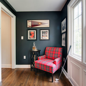
Humble and unassuming, this small cottage was built in 1960 for one of the children of the adjacent mansions. This well sited two bedroom cape is nestled into the landscape on a small brook. The owners a young couple with two little girls called us about expanding their screened porch to take advantage of this feature. The clients shifted their priorities when the existing roof began to leak and the area of the screened porch was deemed to require NJDEP review and approval.
When asked to help with replacing the roof, we took a chance and sketched out the possibilities for expanding and reshaping the roof of the home while maintaining the existing ridge beam to create a master suite with private bathroom and walk in closet from the one large existing master bedroom and two additional bedrooms and a home office from the other bedroom.
The design elements like deeper overhangs, the double brackets and the curving walls from the gable into the center shed roof help create an animated façade with shade and shadow. The house maintains its quiet presence on the block…it has a new sense of pride on the block as the AIA NJ NS Gold Medal Winner for design Excellence!
 Zola European Windows
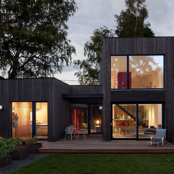
Located in an existing neighborhood of post-war houses, Skidmore Passivhaus merges contemporary design with the highest level of energy efficiency. Gernerous insulation, extremely airtight construction (tested at .32ach50), high performing triple glazed Zola European Windows, and a super-efficient heat recovery ventilator allow the structure to meet the stringent requirements of the German Passivhaus standard. Generous amounts of south facing glazing (0.5 shgc) maximize the solar gains for most of the year, while motorized exterior aluminum shades can be lowered to block unwanted summer heat gain resulting in extremely comfortable temperatures year round. An extensive green roof helps manage all stormwater on site, while a roof mounted 4.32 kW PV array provides enough electricity to result in a near net zero and truly sustainable building.
In Situ Architecture
Jeremy Bittermann - BITTERMANN Photography
 Regan Baker Design Inc.
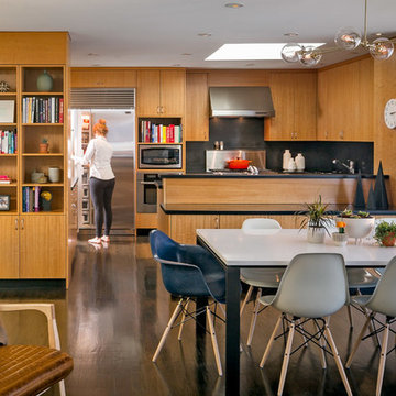
First home, savvy art owners, decided to hire RBD to design their recently purchased two story, four bedroom, midcentury Diamond Heights home to merge their new parenthood and love for entertaining lifestyles. Hired two months prior to the arrival of their baby boy, RBD was successful in installing the nursery just in time. The home required little architectural spatial reconfiguration given the previous owner was an architect, allowing RBD to focus mainly on furniture, fixtures and accessories while updating only a few finishes. New paint grade paneling added a needed midcentury texture to the entry, while an existing site for sore eyes radiator, received a new walnut cover creating a built-in mid-century custom headboard for the guest room, perfect for large art and plant decoration. RBD successfully paired furniture and art selections to connect the existing material finishes by keeping fabrics neutral and complimentary to the existing finishes. The backyard, an SF rare oasis, showcases a hanging chair and custom outdoor floor cushions for easy lounging, while a stylish midcentury heated bench allows easy outdoor entertaining in the SF climate.
Photography Credit: Scott Hargis Photography
 Crome Architecture
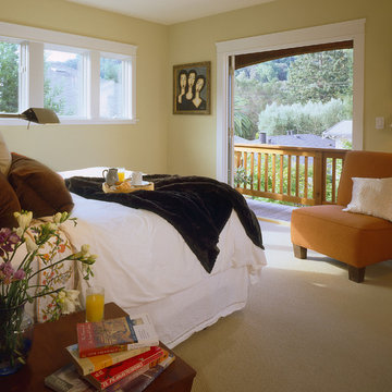
This new 1,700 sf two-story single family residence for a young couple required a minimum of three bedrooms, two bathrooms, packaged to fit unobtrusively in an older low-key residential neighborhood. The house is located on a small non-conforming lot. In order to get the maximum out of this small footprint, we virtually eliminated areas such as hallways to capture as much living space. We made the house feel larger by giving the ground floor higher ceilings, provided ample natural lighting, captured elongated sight lines out of view windows, and used outdoor areas as extended living spaces.
To help the building be a “good neighbor,” we set back the house on the lot to minimize visual volume, creating a friendly, social semi-public front porch. We designed with multiple step-back levels to create an intimacy in scale. The garage is on one level, the main house is on another higher level. The upper floor is set back even further to reduce visual impact.
By designing a single car garage with exterior tandem parking, we minimized the amount of yard space taken up with parking. The landscaping and permeable cobblestone walkway up to the house serves double duty as part of the city required parking space. The final building solution incorporated a variety of significant cost saving features, including a floor plan that made the most of the natural topography of the site and allowed access to utilities’ crawl spaces. We avoided expensive excavation by using slab on grade at the ground floor. Retaining walls also doubled as building walls.
 Think Outside Gardens
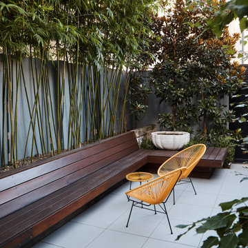
he brief for this Paddington terrace garden was to update an existing rundown courtyard in line with the modern interiors of the house. The design aimed to maintain neat clean lines, use a formal but interesting palette of material, maximise space for entertaining, retain access to the rear lane and deal with a sloping site.
Built in seating with a backrest allows for the change in levels – incorporating retaining and pushed up against the side boundary maximises space for entertaining. A delicate yet contrasting plant palette and water feature selection was chosen to match the house interiors and simple light grey large format tiles let these elements shine. The wrap around bench seat is semi floating to allow for a shadow line and the illusion of more space. It allows for casual seating – a pop of yellow in the Acapulco chairs is a welcome addition against the soft grey facade of the house.
A cluster of white pots on the timber porch adds to the composition and Bamboo and Magnolia Little Gems provide a green backdrop and screen of the neighbouring properties. A fixed outdoor umbrella offers shade over the seating areas.
The design and look of the garden compliments the architecture and interiors of the residence. It is a design that is sophisticated in its simplicity, with interesting materials and plants but also with functional space that perfectly suits the needs and entertaining requirements of its owners.
 Naikoon Contracting Ltd
This project has three components, which is all built differently.
The main house is a waterfront property at the bottom of a steep cliff. All machine and materials are delivered by barge. Concrete is pumped from the top of the cliff down to the bottom with a 400ft line into a boom pump which was delivered by barge. Due to the challenging access to the site, most of the structural backfill is actually Styrofoam (EPS) backfill.
The garage is built from the top of the cliff, with a 27ft tall foundation wall. We needed to excavate to solid bedrock in order to adequately anchor the foundation into the hillside. This tall foundation wall are 10″ thick with a double grid of rebar to retain approximately 350 cu yards of fill. Styrofoam backfill was also used. A funicular (tramway) is also being built on this project, which required it’s own building permit.
Image by Ema Peter Photography
 Zola European Windows
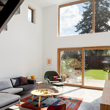
Located in an existing neighborhood of post-war houses, Skidmore Passivhaus merges contemporary design with the highest level of energy efficiency. Gernerous insulation, extremely airtight construction (tested at .32ach50), high performing triple glazed Zola European Windows, and a super-efficient heat recovery ventilator allow the structure to meet the stringent requirements of the German Passivhaus standard. Generous amounts of south facing glazing (0.5 shgc) maximize the solar gains for most of the year, while motorized exterior aluminum shades can be lowered to block unwanted summer heat gain resulting in extremely comfortable temperatures year round. An extensive green roof helps manage all stormwater on site, while a roof mounted 4.32 kW PV array provides enough electricity to result in a near net zero and truly sustainable building.
In Situ Architecture
Jeremy Bittermann - BITTERMANN Photography
74