
Search results for "Smart kids" in Home Design Ideas
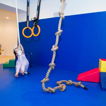
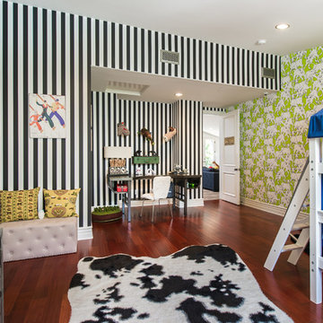
 ForTech Solutions
Tuscan gender-neutral dark wood floor playroom photo in Los Angeles with multicolored walls
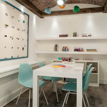
 Smart Playrooms
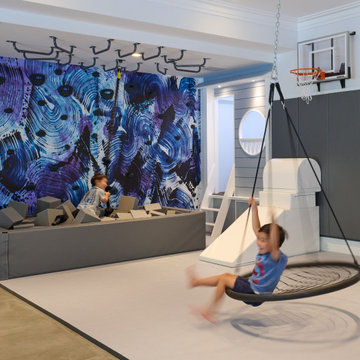
Kids' basement - modern kids' room idea in Greenwich, Connecticut - Houzz
Kids' room - contemporary kids' room idea in New York
Kids' room - contemporary kids' room idea in New York
Find the right local pro for your project

 Paintzen, Inc.
When we imagine the homes of our favorite actors, we often think of picturesque kitchens, artwork hanging on the walls, luxurious furniture, and pristine conditions 24/7. But for celebrities with children, sometimes that last one isn’t always accurate! Kids will be kids – which means there may be messy bedrooms, toys strewn across their play area, and maybe even some crayon marks or finger-paints on walls or floors.
Lucy Liu recently partnered with One Kings Lane and Paintzen to redesign her son Rockwell’s playroom in their Manhattan apartment for that reason. Previously, Lucy had decided not to focus too much on the layout or color of the space – it was simply a room to hold all of Rockwell’s toys. There wasn’t much of a design element to it and very little storage.
Lucy was ready to change that – and transform the room into something more sophisticated and tranquil for both Rockwell and for guests (especially those with kids!). And to really bring that transformation to life, one of the things that needed to change was the lack of color and texture on the walls.
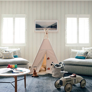
When selecting the color palette, Lucy and One Kings Lane designer Nicole Fisher decided on a more neutral, contemporary style. They chose to avoid the primary colors, which are too often utilized in children’s rooms and playrooms.
Instead, they chose to have Paintzen paint the walls in a cozy gray with warm beige undertones. (Try PPG ‘Slate Pebble’ for a similar look!) It created a perfect backdrop for the decor selected for the room, which included a tepee for Rockwell, some Tribal-inspired artwork, Moroccan woven baskets, and some framed artwork.
To add texture to the space, Paintzen also installed wallpaper on two of the walls. The wallpaper pattern involved muted blues and grays to add subtle color and a slight contrast to the rest of the walls. Take a closer look at this smartly designed space, featuring a beautiful neutral color palette and lots of exciting textures!
 Smart Playrooms
Kids' room - modern kids' room idea in Greenwich, Connecticut - Houzz
Example of a trendy kids' room design in New York
Example of a trendy kids' room design in New York
 Smart Playrooms
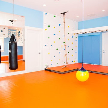
Example of a mid-sized trendy gender-neutral kids' room design in New York with blue walls


 ForTech Solutions
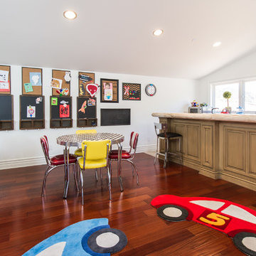
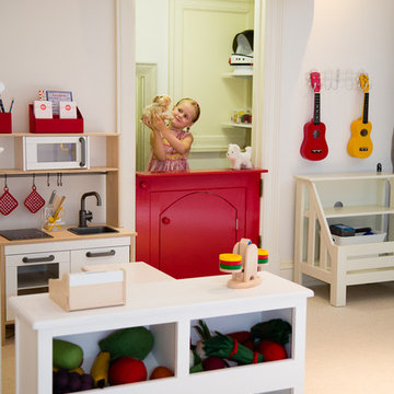
Inspiration for a mediterranean gender-neutral dark wood floor playroom remodel in Los Angeles with white walls
 Smart Playrooms
Julieane Webb Photography
Example of a mid-sized classic gender-neutral carpeted kids' room design in New York with white walls
Example of a mid-sized classic gender-neutral carpeted kids' room design in New York with white walls
 Smart Playrooms
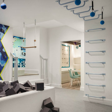
Kids' basement - modern kids' room idea in Greenwich, Connecticut - Houzz
Basement - contemporary basement idea in New York
Basement - contemporary basement idea in New York
 Advance Design Studio, Ltd.
Jackie and Sean loved the Algonquin neighborhood they lived in with the peaceful neighborhood and the close proximity to work and school. What they didn’t love was how outdated their home had become. With a cramped kitchen and an unused dining room, they decided a remodel was the perfect solution to their problem. They would be able to continue to live in the area they loved, while at the same time they could have the dream home they envisioned.
After a thorough search, Jackie came across Advance Design Studio. She was impressed by all of the positive reviews she saw on the internet and saw herself identifying with all of the project stories she saw on the website. Once they met with designer Scott Christensen and owner Todd Jurs, they knew Advance Design was the right company to make their dreams a reality.
The project consisted of four main areas: the kitchen/dining/powder room, the laundry room, the master bathroom, and the kid’s bathroom. They wanted to expand the kitchen into the seldom used dining room and add a large island for hosting parties and family gatherings. They also wanted new hardwood flooring throughout the first level. The laundry room needed to be more functional, and all three bathrooms were in dire need of updating.
The closed off kitchen was opened up to create a sweeping space between the new eating area and the much larger kitchen. A handsome dry bar complete with a beverage refrigerator and lighted glass door cabinetry makes an elegant transition across from a peninsula area filled with storage. An additional decorative cabinet lighting up elegant dishware through the mullioned glass sits directly across from the drybar.
An expansive island was critical to the kitchen plans. Jackie, Sean and Scott worked closely together to create just the right details for their design. They wanted the island to be functional in addition to being the centerpiece of the room. Added storage for the kid’s school supplies was hidden behind cabinet doors so the children could do their schoolwork right at the island, and a microwave drawer glides open with the touch of a finger hidden inconspicuously within the island space. The easy to care for Cambria Britannica Quartz island top with its sweeping grey and white marble look perched atop hand-carved Craftsman corbels was absolutely what they were hoping for, blending both beauty and function perfectly.
Adding a nice contrast to the brightness of the quartz and the white cabinetry, Kodiak - Leather granite countertops were used to balance the light and dark tones of the space. Dura Supreme Classic White painted cabinets grace the perimeter, while Maple Poppy Seed stained cabinets with a beautiful soft grey woodgrain were used in the beverage center and island. The two tones compliment the large space balancing it out nicely creating interest and elegance with the simple Craftsman style full overlay doors.
A deep warm Barnwood White Oak flooring was added throughout the lower level. The new floor brings additional contrast to the bright kitchen and provides unity with the now open floorplan as it rolls in to the foyer and family room. Final details like the show-stopping lunar like duo light fixtures complete the space and intermix expertly with crisscross details of the glass door mullions, the island bar seating and even accessories in the space.
The small cluttered laundry room needed more space and more storage. With a busy family it seemed to overflow daily and did not have anywhere to hide the families “in and out stuff.” Scott designed the new space with a stackable washer and dryer and much more efficiently organized cabinetry. Doing laundry is now (almost!) a pleasure and keeping everyone’s “stuff” hidden, but readily accessible is now a snap.
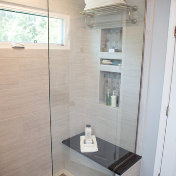
The master bath was not a place where the couple enjoyed spending time getting ready for their day. The tub almost never was used, so removing it made it possible to build an extra-large shower, replacing the small cramped cube of the previous shower they hated. Clean, horizontal lines softly draw your eye around the space with porcelain tile called Driftwood Sea spray. Full overlay cabinetry in a soft white vanity with double sinks makes getting ready for the day much more convenient for the busy couple.
Long floor planks made of porcelain tile mimic real hardwood floors in a soft grey to compliment the shower, but with the ease and care of a tile surface. Cambrian Black Granite counters with a matte finish and under mount porcelain sinks with handsome brushed chrome hardware complete the handsome space. A real bonus in any master bath; a custom built in storage nook was tucked in the corner of the space for linens and heavenly storage.
The kid’s bath was in sad shape because it was original to the house. To keep the budget in control, the tub which was in great condition was retained, but focus was on the new large brick style porcelain charcoal tile on the floor, crisp white new Craftsman style cabinetry with pretty furniture details on the corner base, a striking granite top with white under mount porcelain sinks and fresh hardware and faucets. Some beautiful soft grey wood mirrors to match mom and dads were custom sized and placed under new lighting, and 4 hooks were smartly arranged down the wall for kids’ towels.
This couple was determined not to move, and made their house their dream home. Not only does their home function greatly now, but Jackie says, “When the neighbors come to visit, they’re asking if they can “steal” the design”! The added functionality, elegance, and open floor plan were exactly what this family needed in order to stay.
Advance Design Studio, Joe Nowak
 Smart Playrooms
Julieane Webb Photography
Example of a mid-sized classic gender-neutral carpeted kids' room design in New York with white walls
Example of a mid-sized classic gender-neutral carpeted kids' room design in New York with white walls
 Paintzen, Inc.
When we imagine the homes of our favorite actors, we often think of picturesque kitchens, artwork hanging on the walls, luxurious furniture, and pristine conditions 24/7. But for celebrities with children, sometimes that last one isn’t always accurate! Kids will be kids – which means there may be messy bedrooms, toys strewn across their play area, and maybe even some crayon marks or finger-paints on walls or floors.
Lucy Liu recently partnered with One Kings Lane and Paintzen to redesign her son Rockwell’s playroom in their Manhattan apartment for that reason. Previously, Lucy had decided not to focus too much on the layout or color of the space – it was simply a room to hold all of Rockwell’s toys. There wasn’t much of a design element to it and very little storage.
Lucy was ready to change that – and transform the room into something more sophisticated and tranquil for both Rockwell and for guests (especially those with kids!). And to really bring that transformation to life, one of the things that needed to change was the lack of color and texture on the walls.
When selecting the color palette, Lucy and One Kings Lane designer Nicole Fisher decided on a more neutral, contemporary style. They chose to avoid the primary colors, which are too often utilized in children’s rooms and playrooms.
Instead, they chose to have Paintzen paint the walls in a cozy gray with warm beige undertones. (Try PPG ‘Slate Pebble’ for a similar look!) It created a perfect backdrop for the decor selected for the room, which included a tepee for Rockwell, some Tribal-inspired artwork, Moroccan woven baskets, and some framed artwork.
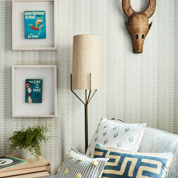
To add texture to the space, Paintzen also installed wallpaper on two of the walls. The wallpaper pattern involved muted blues and grays to add subtle color and a slight contrast to the rest of the walls. Take a closer look at this smartly designed space, featuring a beautiful neutral color palette and lots of exciting textures!
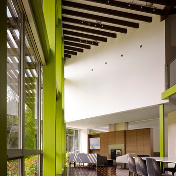
 Thomas Roszak Architecture, LLC
Photo credit: Scott McDonald @ Hedrich Blessing
7RR-Ecohome:
The design objective was to build a house for a couple recently married who both had kids from previous marriages. How to bridge two families together?
The design looks forward in terms of how people live today. The home is an experiment in transparency and solid form; removing borders and edges from outside to inside the house, and to really depict “flowing and endless space”. The house floor plan is derived by pushing and pulling the house’s form to maximize the backyard and minimize the public front yard while welcoming the sun in key rooms by rotating the house 45-degrees to true north. The angular form of the house is a result of the family’s program, the zoning rules, the lot’s attributes, and the sun’s path. We wanted to construct a house that is smart and efficient in terms of construction and energy, both in terms of the building and the user. We could tell a story of how the house is built in terms of the constructability, structure and enclosure, with a nod to Japanese wood construction in the method in which the siding is installed and the exposed interior beams are placed in the double height space. We engineered the house to be smart which not only looks modern but acts modern; every aspect of user control is simplified to a digital touch button, whether lights, shades, blinds, HVAC, communication, audio, video, or security. We developed a planning module based on a 6-foot square room size and a 6-foot wide connector called an interstitial space for hallways, bathrooms, stairs and mechanical, which keeps the rooms pure and uncluttered. The house is 6,200 SF of livable space, plus garage and basement gallery for a total of 9,200 SF. A large formal foyer celebrates the entry and opens up to the living, dining, kitchen and family rooms all focused on the rear garden. The east side of the second floor is the Master wing and a center bridge connects it to the kid’s wing on the west. Second floor terraces and sunscreens provide views and shade in this suburban setting. The playful mathematical grid of the house in the x, y and z axis also extends into the layout of the trees and hard-scapes, all centered on a suburban one-acre lot.
Many green attributes were designed into the home; Ipe wood sunscreens and window shades block out unwanted solar gain in summer, but allow winter sun in. Patio door and operable windows provide ample opportunity for natural ventilation throughout the open floor plan. Minimal windows on east and west sides to reduce heat loss in winter and unwanted gains in summer. Open floor plan and large window expanse reduces lighting demands and maximizes available daylight. Skylights provide natural light to the basement rooms. Durable, low-maintenance exterior materials include stone, ipe wood siding and decking, and concrete roof pavers. Design is based on a 2' planning grid to minimize construction waste. Basement foundation walls and slab are highly insulated. FSC-certified walnut wood flooring was used. Light colored concrete roof pavers to reduce cooling loads by as much as 15%. 2x6 framing allows for more insulation and energy savings. Super efficient windows have low-E argon gas filled units, and thermally insulated aluminum frames. Permeable brick and stone pavers reduce the site’s storm-water runoff. Countertops use recycled composite materials. Energy-Star rated furnaces and smart thermostats are located throughout the house to minimize duct runs and avoid energy loss. Energy-Star rated boiler that heats up both radiant floors and domestic hot water. Low-flow toilets and plumbing fixtures are used to conserve water usage. No VOC finish options and direct venting fireplaces maintain a high interior air quality. Smart home system controls lighting, HVAC, and shades to better manage energy use. Plumbing runs through interior walls reducing possibilities of heat loss and freezing problems. A large food pantry was placed next to kitchen to reduce trips to the grocery store. Home office reduces need for automobile transit and associated CO2 footprint. Plan allows for aging in place, with guest suite than can become the master suite, with no need to move as family members mature.
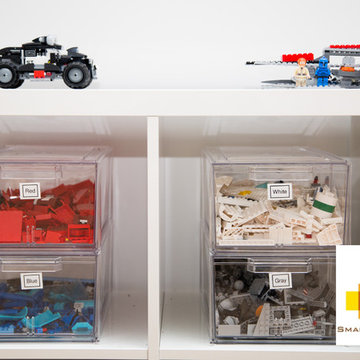 Smart Playrooms
Julieane Webb
Kids' room - mid-sized modern gender-neutral kids' room idea in New York with white walls
Kids' room - mid-sized modern gender-neutral kids' room idea in New York with white walls
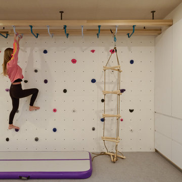 Smart Playrooms
Kids' room - modern kids' room idea in New York - Houzz
Example of a minimalist basement design in New York
Example of a minimalist basement design in New York
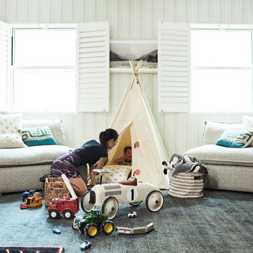 Paintzen, Inc.
When we imagine the homes of our favorite actors, we often think of picturesque kitchens, artwork hanging on the walls, luxurious furniture, and pristine conditions 24/7. But for celebrities with children, sometimes that last one isn’t always accurate! Kids will be kids – which means there may be messy bedrooms, toys strewn across their play area, and maybe even some crayon marks or finger-paints on walls or floors.
Lucy Liu recently partnered with One Kings Lane and Paintzen to redesign her son Rockwell’s playroom in their Manhattan apartment for that reason. Previously, Lucy had decided not to focus too much on the layout or color of the space – it was simply a room to hold all of Rockwell’s toys. There wasn’t much of a design element to it and very little storage.
Lucy was ready to change that – and transform the room into something more sophisticated and tranquil for both Rockwell and for guests (especially those with kids!). And to really bring that transformation to life, one of the things that needed to change was the lack of color and texture on the walls.
When selecting the color palette, Lucy and One Kings Lane designer Nicole Fisher decided on a more neutral, contemporary style. They chose to avoid the primary colors, which are too often utilized in children’s rooms and playrooms.
Instead, they chose to have Paintzen paint the walls in a cozy gray with warm beige undertones. (Try PPG ‘Slate Pebble’ for a similar look!) It created a perfect backdrop for the decor selected for the room, which included a tepee for Rockwell, some Tribal-inspired artwork, Moroccan woven baskets, and some framed artwork.
To add texture to the space, Paintzen also installed wallpaper on two of the walls. The wallpaper pattern involved muted blues and grays to add subtle color and a slight contrast to the rest of the walls. Take a closer look at this smartly designed space, featuring a beautiful neutral color palette and lots of exciting textures!
 designstiles
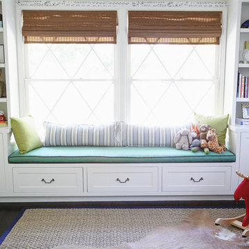
a window seat with bookshelves on either side create symmetry and balance. Personal accessories fill the shelves. Natural woven shades add an organic feel.
 Paintzen, Inc.
When we imagine the homes of our favorite actors, we often think of picturesque kitchens, artwork hanging on the walls, luxurious furniture, and pristine conditions 24/7. But for celebrities with children, sometimes that last one isn’t always accurate! Kids will be kids – which means there may be messy bedrooms, toys strewn across their play area, and maybe even some crayon marks or finger-paints on walls or floors.
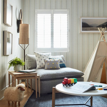
Lucy Liu recently partnered with One Kings Lane and Paintzen to redesign her son Rockwell’s playroom in their Manhattan apartment for that reason. Previously, Lucy had decided not to focus too much on the layout or color of the space – it was simply a room to hold all of Rockwell’s toys. There wasn’t much of a design element to it and very little storage.
Lucy was ready to change that – and transform the room into something more sophisticated and tranquil for both Rockwell and for guests (especially those with kids!). And to really bring that transformation to life, one of the things that needed to change was the lack of color and texture on the walls.
When selecting the color palette, Lucy and One Kings Lane designer Nicole Fisher decided on a more neutral, contemporary style. They chose to avoid the primary colors, which are too often utilized in children’s rooms and playrooms.
Instead, they chose to have Paintzen paint the walls in a cozy gray with warm beige undertones. (Try PPG ‘Slate Pebble’ for a similar look!) It created a perfect backdrop for the decor selected for the room, which included a tepee for Rockwell, some Tribal-inspired artwork, Moroccan woven baskets, and some framed artwork.
To add texture to the space, Paintzen also installed wallpaper on two of the walls. The wallpaper pattern involved muted blues and grays to add subtle color and a slight contrast to the rest of the walls. Take a closer look at this smartly designed space, featuring a beautiful neutral color palette and lots of exciting textures!
 Thomas Roszak Architecture, LLC
Photo credit: Scott McDonald @ Hedrich Blessing
7RR-Ecohome:
The design objective was to build a house for a couple recently married who both had kids from previous marriages. How to bridge two families together?
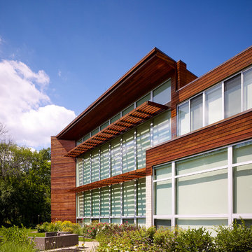
The design looks forward in terms of how people live today. The home is an experiment in transparency and solid form; removing borders and edges from outside to inside the house, and to really depict “flowing and endless space”. The house floor plan is derived by pushing and pulling the house’s form to maximize the backyard and minimize the public front yard while welcoming the sun in key rooms by rotating the house 45-degrees to true north. The angular form of the house is a result of the family’s program, the zoning rules, the lot’s attributes, and the sun’s path. We wanted to construct a house that is smart and efficient in terms of construction and energy, both in terms of the building and the user. We could tell a story of how the house is built in terms of the constructability, structure and enclosure, with a nod to Japanese wood construction in the method in which the siding is installed and the exposed interior beams are placed in the double height space. We engineered the house to be smart which not only looks modern but acts modern; every aspect of user control is simplified to a digital touch button, whether lights, shades, blinds, HVAC, communication, audio, video, or security. We developed a planning module based on a 6-foot square room size and a 6-foot wide connector called an interstitial space for hallways, bathrooms, stairs and mechanical, which keeps the rooms pure and uncluttered. The house is 6,200 SF of livable space, plus garage and basement gallery for a total of 9,200 SF. A large formal foyer celebrates the entry and opens up to the living, dining, kitchen and family rooms all focused on the rear garden. The east side of the second floor is the Master wing and a center bridge connects it to the kid’s wing on the west. Second floor terraces and sunscreens provide views and shade in this suburban setting. The playful mathematical grid of the house in the x, y and z axis also extends into the layout of the trees and hard-scapes, all centered on a suburban one-acre lot.
Many green attributes were designed into the home; Ipe wood sunscreens and window shades block out unwanted solar gain in summer, but allow winter sun in. Patio door and operable windows provide ample opportunity for natural ventilation throughout the open floor plan. Minimal windows on east and west sides to reduce heat loss in winter and unwanted gains in summer. Open floor plan and large window expanse reduces lighting demands and maximizes available daylight. Skylights provide natural light to the basement rooms. Durable, low-maintenance exterior materials include stone, ipe wood siding and decking, and concrete roof pavers. Design is based on a 2' planning grid to minimize construction waste. Basement foundation walls and slab are highly insulated. FSC-certified walnut wood flooring was used. Light colored concrete roof pavers to reduce cooling loads by as much as 15%. 2x6 framing allows for more insulation and energy savings. Super efficient windows have low-E argon gas filled units, and thermally insulated aluminum frames. Permeable brick and stone pavers reduce the site’s storm-water runoff. Countertops use recycled composite materials. Energy-Star rated furnaces and smart thermostats are located throughout the house to minimize duct runs and avoid energy loss. Energy-Star rated boiler that heats up both radiant floors and domestic hot water. Low-flow toilets and plumbing fixtures are used to conserve water usage. No VOC finish options and direct venting fireplaces maintain a high interior air quality. Smart home system controls lighting, HVAC, and shades to better manage energy use. Plumbing runs through interior walls reducing possibilities of heat loss and freezing problems. A large food pantry was placed next to kitchen to reduce trips to the grocery store. Home office reduces need for automobile transit and associated CO2 footprint. Plan allows for aging in place, with guest suite than can become the master suite, with no need to move as family members mature.
8