
Search results for "Solutions packed" in Home Design Ideas
 ABC Design Concepts
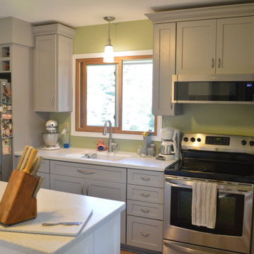
Petite yet packing a powerful punch with convenient storage solutions and useful space. Two toned to keep it light and fresh, appliance wall in gray & island and pantries in white. Base pots & pans drawers, double garbage, cookbook shelf and custom wine rack plus more!
 Mottram Architecture
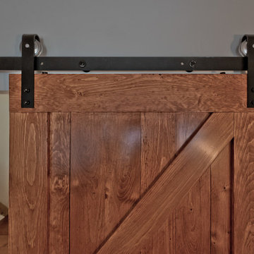
Timber frame homes offer unique challenges during a remodel. What often makes them beautiful and attractive to most homeowners, also makes them challenging for space requirements.
Context: The lovely couple that owned this home were struggling with some interesting floor plan challenges that just didn't work for their family. The loved the beautiful timbers and woodwork of their home, but the dramatically sloping ceilings on the second floor, particularly in the bathroom, just didn't work for this 1 1/2 bath home. Needing to use the skylight to approach the toilet was a less then ideal scenario. Although the bathroom footprint was more then adequate, the sloped ceiling only made half of the space useable. Check out the Before/After post on our blog to see the photos of the house pre-renovation. As much as they loved all the wood features in their home, another challenge they had was light. The wood ceiling made everything inside the house darker, even with a fantastic array of south facing windows, there were spaces in the home that felt dark and small. When they contacted us they wanted to know how could they make their brighter and more inviting, were there solutions to the 2nd floor sloped ceiling issues, and if they were going to do all of this work, how could they make their home more comfortable and efficient. A nagging water leak in the upstairs bathroom spurred them into action and here is how we solved their dilemma.
Conclusion: First, we added a little dormer to the rear of the house so we could get full headroom in nearly all of the upstairs bathroom! Then we decided to extend that dormer one more timber bay over to create a walk in closet with natural light and plenty of space. Since we were contemplating energy efficiency, we resolved a nagging issue that is present in a lot of timber frame construction, air tightness. Commonly found in timber frame construction, fiberglass insulation is installed in the rafter bays and board ceilings are installed over top. Unfortunately, board ceilings are anything but air tight, and fiberglass insulation needs to be in an airtight cavity for maximum effectiveness. So we were able to solve two issues at the same time for this homeowner. We removed the board ceiling and fiberglass insulation, we dense packed the rafter bays with cellulose insulation, and installed sheetrock in place of the boards. The boards were salvaged for re-use by the homeowner, and the space and light quality was dramatically improved. Some may think that losing the board ceiling took something away from the space, but what you'll see in the pictures is that it highly accentuates the heavy timbers and really makes them stand out in a beautiful way. Now with this added airtightness, better insulation, and brighter space, the homeowner hardly runs their wood stove, and it's so quiet in the space, an added bonus from changing the insulation. It became necessary to also add a sheetrock ceiling to the living room to hide the plumbing from the new bathroom layout above. Changing this ceiling gave the homeowner some real quality lighting that was lacking in the living room before. The brighter ceiling and new lighting layout completely transforms the living room into a space you want to hang out, even though the layout didn't change at all. When the homeowner saw the finished spaces she said "I can't believe this is my house, I want to live in this house"
Energy Efficiency: I touched a little on the efficiency above, but like all projects done with Mottram Architecture, we always want to leave you with a little extra. Timber frame construction with board ceilings and fiberglass insulation are notoriously leaky! If you want to know what we think about fiberglass insulation, check our our blog post on Why Fiberglass Insulation Sucks. By installing cellulose insulation and covering it with sheetrock we were able to greatly reduce the heat flowing out of this home. It not only improves cashflow it improves the comfort level in the space. Who wants to sit in their living room and feel a draft? Let us remind you, we are not saying cellulose insulation is an air barrier, we use the sheetrock to help with that, but it does significantly reduce the air flow over fiberglass insulation. And when we reduce the airflow, we reduce the heat flow. And when we reduce the heat flow, we reduce the need to re-heat that drafty air from outside. When it comes to energy efficiency the first and best place to start is air infiltration. We greatly reduced the air infiltration with the new insulation, but we also added a hat and warm boots. What I mean by that is, we improved the insulation in the roof, and we installed insulation in the basement. Maybe it's a silly analogy, but when you think about keeping warm, we always start with the hat and boots! With sustainability in mind, the next project will be to add a deck to the front of this house with rain catchment barrels from the metal roof. They are planning to plant a garden in the spring and the rain catchment system will help to irrigate the new garden.
Builder: East Shore Builders
Photographer: Michael Eric Berube
 Lincoln Lighthill Architect
This project is a story of how buildings and relationships evolve over time, and how the two are intertwined in the making of architecture.
The client, a single man, had just purchased a classic Edwardian flat on San Francisco’s Liberty Street, known for its historic homes and famous neighbors like Tracy Chapman, when his realtor connected him with LLA. The initial brief was to integrate a modern, minimalist kitchen and bathroom with the apartment's traditional aesthetic. The existing condition was a series of cramped rooms and a long hallway that divided the apartment into many separate spaces, some without natural light.
The solution was to remove most of the walls in the middle of the flat, with extensive structural work hidden from view. This created an open connection between the living, dining and kitchen areas that flooded the formerly dark core of the apartment with light.
Midway through the design process, the client and his partner, and avid cook, decided it was time to move in together. The project evolved further and LLA found inventive ways to pack more features and amenities into a design that was fundamentally about simplicity.
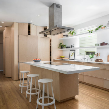
The result of this creative tension is a large open kitchen with deceptively simple forms- a long back counter with three rows of drawers below, an island with a central cooktop and double cantilevers for seating, and a slightly mysterious wood box at the back. The box conceals the refrigerator, storage, linens, and laundry, and through a secret door, a large walk-in pantry.
The bathroom evolved into a mini-spa, with a walk-through shower and Japanese-style soaking tub. The space shares light with the kitchen through a floor-to-ceiling translucent glass panel. Each client has a large dog, and so a small sliver of space under the upstairs neighbor's stair was turned into the perfect doggie den, complete with period correct doorway.
The newly blended family moved in together when the project was completed. A poignant footnote, Maverick, the blonder, fluffier dog in the photos, was very old and sadly passed away shortly after they moved in. It made the photoshoot feel like a special event that honored and preserved his memory in pictures. Like all families, theirs continues to evolve and change, just as their home has over its 90 year life.
Find the right local pro for your project
 Lang's Kitchen & Bath
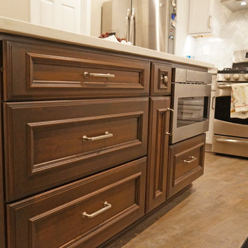
This New Hope, PA kitchen design is packed with customized storage solutions that create a stylish, organized, and efficient space. The perimeter kitchen cabinets are Koch Cabinetry in a white finish, while the Dura Supreme island cabinetry offers contrast in a dark wood finish. The cabinetry is complemented by Top Knobs hardware, gray ceramic tile backsplash, and an MSI Quartz countertop. Behind the cabinet doors sits ample storage including a lighted pantry cabinet with roll out shelves, pull-out spice storage, and a Hafele Lemans swing out base for the corner cabinet. A beverage bar offers a wine rack and wine glass storage in a convenient location away from the cooking area. The bright kitchen has ample natural light, plus in-cabinet and under-cabinet lights, recessed lighting, and Uttermost pendant lights over the island.
 Donovan Lord Design
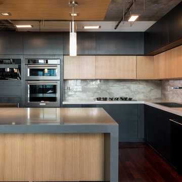
As part of a complete remodel on this McKinney Avenue high rise condo, Edict designed a complete kitchen remodel. The cabinetry is 100% custom designed, no off the shelf or RTA cabinetry here. Made from rift cut white oak, the lighter cabinets have a clear coat natural finish and the darker cabinets are stained in an ebony finish giving a great sense of contrast and interest to this kitchen. The kitchen is packed with high end appliances including a Miele built in coffee machine, a wine fridge, Miele integrated hood and Miele gas cooktop as well as a deep single stainless steel sink, an integrated trash compactor and new integrated SubZero refrigerator. The kitchen's lighting has cable lighting for the main source of light which pulls in the industrial feel of the loft's exposed beams and ductwork, a new custom lightbox suspended above the new island with integrated LED cans and 3 pendants to light it. Also, above the ceiling panel, above the cabinets, under the cabinets and the toe kicks all have integrated LED lighting - all lighting is dimmable giving the most diverse options for a lighting solution. All of the cabinetry doors and drawers have Blum hardware and most are without handles for the most seamless look possible. Instead, one presses the drawers and cabinets and they pop open and close with soft close drawers. There is abundant deep drawer storage for easier access in the new island as well as under the cooktop and sink. The countertops are Quartz. Donovan Lord: Designer Michael Hunter: Photographer
 Rainbow Shaker
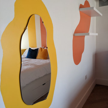
Step inside my vibrant, dopamine-filled transformations from Channel 4’s The Big Interiors Battle! ?✨ From a bold geometric bedroom to a quirky pink & orange bathroom (complete with a dinosaur toilet paper holder! ?) and a colourful, functional kitchen makeover, each space is packed with playful design, statement colours, and creative storage solutions. These fearless interiors blend maximalist style with practicality, proving that home design should be as fun as it is functional!
 Kudos Interior Design
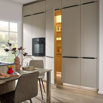
Discover big style in a compact space with our Mini Modern Kitchen boasting a warm wooden finish! ? Perfect for small apartments or trendy studio living, this kitchen packs a punch in both style and functionality. From clever storage solutions to sleek design elements, get ready to be inspired by this mini marvel! ??️ #MiniKitchen #SmallSpaceLiving #ModernDesign #WoodenFinish #CompactLiving #KitchenInspiration #TinyHouseLiving #InteriorDesign #HomeDecor #ViralKitchen

Sponsored
Columbus, OH

Wannemacher Interiors
Customized Award-Winning Interior Design Solutions in Franklin Cnty OH
 MOTIV Interiors
Interior Designer: MOTIV Interiors LLC
Photographer: Sam Angel Photography
Design Challenge: This 8 year-old boy and girl were outgrowing their existing setup and needed to update their rooms with a plan that would carry them forward into middle school and beyond. In addition to gaining storage and study areas, could these twins show off their big personalities? Absolutely, we said! MOTIV Interiors tackled the rooms of these youngsters living in Nashville's 12th South Neighborhood and created an environment where the dynamic duo can learn, create, and grow together for years to come.
Design Solution:
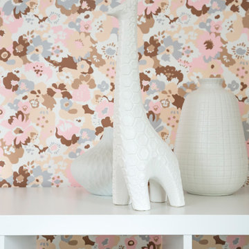
In her room, we wanted to create a fun-filled space that supports softball, sleepovers, science, and anything else a girl might want to get into. The star of the show is a beautiful hand-printed wallpaper by Brooklyn designer Aimee Wilder, whose FSC-certified papers contain no VOC’s (Volatile Organic Compounds). That means that in addition to packing a powerful visual punch, they meet our standard for excellent indoor air quality. We also love this wallpaper because it is composed of so many different neutral colors - this room can organically evolve over time without necessarily replacing the paper (which was installed with a no-VOC adhesive).
We refreshed the remaining walls with a scrubbable no-VOC paint from Sherwin Williams (7008 Alabaster) and gave the carpets in both of the twins’ rooms a good cleaning and simple stretch as opposed to replacing them. In order to provide more functional light in her room, we incorporated a corner floor lamp for reading, a telescoping desk lamp for studying, and an eye-catching LED flower pendant on a dimmer switch sourced from Lightology. Custom window treatments in a linen/cotton blend emphasize the height of the room and bring in a little “bling” with antiqued gold hardware.
Before we even thought about aesthetics, however, MOTIV Interiors got to work right away on increasing functionality. We added a spacious storage unit with plenty of baskets for all of our young client’s animal friends, and we made sure to include ample shelf space for books and hobbies as she finds new passions to explore down the road. We always prefer eco-friendly furnishings that are manufactured responsibly, made with sustainably harvested wood (FSC Certified), and use no glue or non-toxic glues and paints.
The bedding in this project is 100% cotton and contains no synthetic fibers. When purchasing bedding, check for the GOTS Certification (Global Organic Textile Standard). The introduction of a desk and drawer unit created a calming space to study and reflect, or write a letter to a friend. Gold accents add a bit of warmth to the workspace, where she can display her memories, goals, and game plans for a bright future.
We hope you enjoyed this project as much as we did! Each design challenge is an opportunity to push the envelope, by creating a new and exciting aesthetic or finding creative ways to incorporate sustainable design principles.
 Drury Design
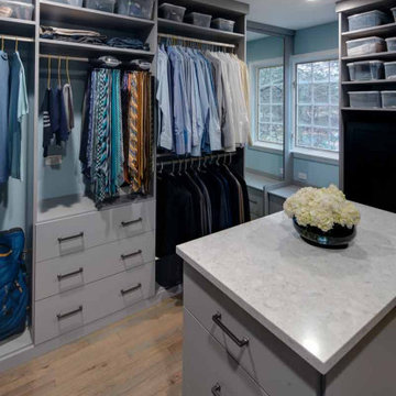
This new primary suite closet is part of a larger remodeling project that also involved a new primary bathroom, an additional bathroom and a large kitchen.
The master suite remodel included converting a long and narrow master bath, a large closet and two awkward baths into a true primary bath oasis. The closet was moved to a new location.
The goal was to create a modern his and hers closet that offered thoughtful organization while maximizing the storage potential of the space. Other needs included space for hampers, a place to iron and a designated space for Indian saris without natural light.
Design challenges:
-Arranging everything: hanging bars, drawers, shoe storage and safes
Design solutions and nice touches:
-Bench in front of the window with shoe storage in drawers
-Two floor-to-ceiling mirrors
-Two tall closet cabinets for storing saris
-She is shorter so hanging clothes on her side are easier to reach
-Plenty of drawer storage
-Two hampers behind doors
-Island in the middle for more storage, with a countertop handy for daily dressing assistance, folding, packing, etc.
-Outlet inside island for collapsible ironing board
-Fully accessorized with valet rods, belt pull-outs
-Rotating tie hangers
 MOTIV Interiors
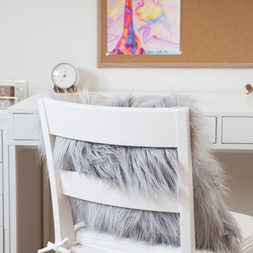
Twins on 12th - HER ROOM - View the complete Photo Gallery and project details at motivinteriors.com/portfolio
Design: MOTIV Interiors LLC
Photography: Sam Angel
Design Challenge: This 8 year-old boy and girl were outgrowing their existing setup and needed to update their rooms with a plan that would carry them forward into middle school and beyond. In addition to gaining storage and study areas, could these twins show off their big personalities? Absolutely, we said! MOTIV Interiors tackled the rooms of these youngsters living in Nashville's 12th South Neighborhood and created an environment where the dynamic duo can learn, create, and grow together for years to come.
Design Solution:
In her room, we wanted to create a fun-filled space that supports softball, sleepovers, science, and anything else a girl might want to get into. The star of the show is a beautiful hand-printed wallpaper by Brooklyn designer Aimee Wilder, whose FSC-certified papers contain no VOC’s (Volatile Organic Compounds). That means that in addition to packing a powerful visual punch, they meet our standard for excellent indoor air quality. We also love this wallpaper because it is composed of so many different neutral colors - this room can organically evolve over time without necessarily replacing the paper (which was installed with a no-VOC adhesive).
We refreshed the remaining walls with a scrubbable no-VOC paint from Sherwin Williams (7008 Alabaster) and gave the carpets in both of the twins’ rooms a good cleaning and simple stretch as opposed to replacing them. In order to provide more functional light in her room, we incorporated a corner floor lamp for reading, a telescoping desk lamp for studying, and an eye-catching LED flower pendant on a dimmer switch sourced from Lightology. Custom window treatments in a linen/cotton blend emphasize the height of the room and bring in a little “bling” with antiqued gold hardware.
Before we even thought about aesthetics, however, MOTIV Interiors got to work right away on increasing functionality. We added a spacious storage unit with plenty of baskets for all of our young client’s animal friends, and we made sure to include ample shelf space for books and hobbies as she finds new passions to explore down the road. We always prefer eco-friendly furnishings that are manufactured responsibly, made with sustainably harvested wood (FSC Certified), and use no glue or non-toxic glues and paints.
The bedding in this project is 100% cotton and contains no synthetic fibers. When purchasing bedding, check for the GOTS Certification (Global Organic Textile Standard). The introduction of a desk and drawer unit created a calming space to study and reflect, or write a letter to a friend. Gold accents add a bit of warmth to the workspace, where she can display her memories, goals, and game plans for a bright future.
We hope you enjoyed this project as much as we did! Each design challenge is an opportunity to push the envelope, by creating a new and exciting aesthetic or finding creative ways to incorporate sustainable design principles.
 Lang's Kitchen & Bath
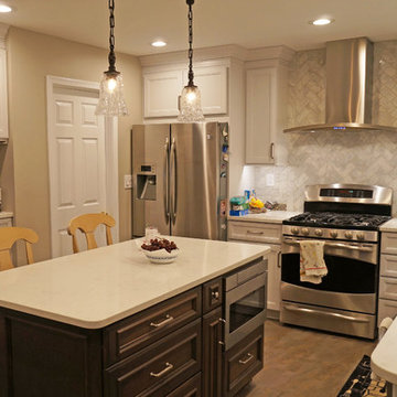
This New Hope, PA kitchen design is packed with customized storage solutions that create a stylish, organized, and efficient space. The perimeter kitchen cabinets are Koch Cabinetry in a white finish, while the Dura Supreme island cabinetry offers contrast in a dark wood finish. The cabinetry is complemented by Top Knobs hardware, gray ceramic tile backsplash, and an MSI Quartz countertop. Behind the cabinet doors sits ample storage including a lighted pantry cabinet with roll out shelves, pull-out spice storage, and a Hafele Lemans swing out base for the corner cabinet. A beverage bar offers a wine rack and wine glass storage in a convenient location away from the cooking area. The bright kitchen has ample natural light, plus in-cabinet and under-cabinet lights, recessed lighting, and Uttermost pendant lights over the island.
 Closet Factory
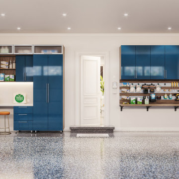
Our modern blue garage is the perfect way to remodel your space. Packed with ample storage solutions such as shelves, cabinets, and drawers all of your tools and things will have a home.
Each portion of the built-in storage is customizable to your exact wants and needs. We can bring your ideas to life. Store your bike out of the way leaving extra room for your car!
 Mottram Architecture
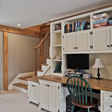
This custom piece of cabinetry was specially designed and built by the homeowner's father!
Timber frame homes offer unique challenges during a remodel. What often makes them beautiful and attractive to most homeowners, also makes them challenging for space requirements.
Context: The lovely couple that owned this home were struggling with some interesting floor plan challenges that just didn't work for their family. The loved the beautiful timbers and woodwork of their home, but the dramatically sloping ceilings on the second floor, particularly in the bathroom, just didn't work for this 1 1/2 bath home. Needing to use the skylight to approach the toilet was a less then ideal scenario. Although the bathroom footprint was more then adequate, the sloped ceiling only made half of the space useable. Check out the Before/After post on our blog to see the photos of the house pre-renovation. As much as they loved all the wood features in their home, another challenge they had was light. The wood ceiling made everything inside the house darker, even with a fantastic array of south facing windows, there were spaces in the home that felt dark and small. When they contacted us they wanted to know how could they make their brighter and more inviting, were there solutions to the 2nd floor sloped ceiling issues, and if they were going to do all of this work, how could they make their home more comfortable and efficient. A nagging water leak in the upstairs bathroom spurred them into action and here is how we solved their dilemma.
Conclusion: First, we added a little dormer to the rear of the house so we could get full headroom in nearly all of the upstairs bathroom! Then we decided to extend that dormer one more timber bay over to create a walk in closet with natural light and plenty of space. Since we were contemplating energy efficiency, we resolved a nagging issue that is present in a lot of timber frame construction, air tightness. Commonly found in timber frame construction, fiberglass insulation is installed in the rafter bays and board ceilings are installed over top. Unfortunately, board ceilings are anything but air tight, and fiberglass insulation needs to be in an airtight cavity for maximum effectiveness. So we were able to solve two issues at the same time for this homeowner. We removed the board ceiling and fiberglass insulation, we dense packed the rafter bays with cellulose insulation, and installed sheetrock in place of the boards. The boards were salvaged for re-use by the homeowner, and the space and light quality was dramatically improved. Some may think that losing the board ceiling took something away from the space, but what you'll see in the pictures is that it highly accentuates the heavy timbers and really makes them stand out in a beautiful way. Now with this added airtightness, better insulation, and brighter space, the homeowner hardly runs their wood stove, and it's so quiet in the space, an added bonus from changing the insulation. It became necessary to also add a sheetrock ceiling to the living room to hide the plumbing from the new bathroom layout above. Changing this ceiling gave the homeowner some real quality lighting that was lacking in the living room before. The brighter ceiling and new lighting layout completely transforms the living room into a space you want to hang out, even though the layout didn't change at all. When the homeowner saw the finished spaces she said "I can't believe this is my house, I want to live in this house"
Energy Efficiency: I touched a little on the efficiency above, but like all projects done with Mottram Architecture, we always want to leave you with a little extra. Timber frame construction with board ceilings and fiberglass insulation are notoriously leaky! If you want to know what we think about fiberglass insulation, check our our blog post on Why Fiberglass Insulation Sucks. By installing cellulose insulation and covering it with sheetrock we were able to greatly reduce the heat flowing out of this home. It not only improves cashflow it improves the comfort level in the space. Who wants to sit in their living room and feel a draft? Let us remind you, we are not saying cellulose insulation is an air barrier, we use the sheetrock to help with that, but it does significantly reduce the air flow over fiberglass insulation. And when we reduce the airflow, we reduce the heat flow. And when we reduce the heat flow, we reduce the need to re-heat that drafty air from outside. When it comes to energy efficiency the first and best place to start is air infiltration. We greatly reduced the air infiltration with the new insulation, but we also added a hat and warm boots. What I mean by that is, we improved the insulation in the roof, and we installed insulation in the basement. Maybe it's a silly analogy, but when you think about keeping warm, we always start with the hat and boots! With sustainability in mind, the next project will be to add a deck to the front of this house with rain catchment barrels from the metal roof. They are planning to plant a garden in the spring and the rain catchment system will help to irrigate the new garden.
Builder: East Shore Builders
Photographer: Michael Eric Berube
Michael Eric Berube, Maine Virtual Home Tours
 Redhead Design
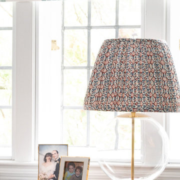
Designed to pack in color, texture and storage galore, this bedroom ensuite has it all. This petite Guilford home has little closet space so a custom built-in was designed to accommodate everything the client needs. The vibrant floral duvet cover sets a feminine, elegant tone, while pops of coral, warm wood tones, and a playful mix of patterns bring the space to life. Clever storage solutions and fun details like a custom-built wall, gold mirror, and chic nightstands make this room both practical and full of personality.
 Revival House
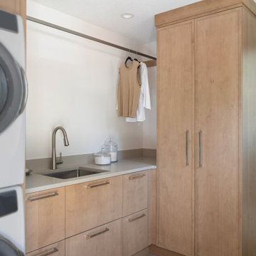
This laundry room is packed with smart storage solutions, featuring ample drawers and a tall pantry for cleaning supplies. By stacking the washer and dryer, we maximized space, creating even more storage without sacrificing functionality!
 Dave Fox Design Build Remodelers
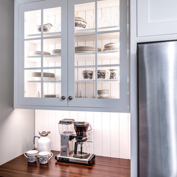
This 1930's charm kitchen is small but packed with hidden storage solutions. The glass front cabinets act as a china cabinet without sacrificing any floor space.
 European Kitchen Center
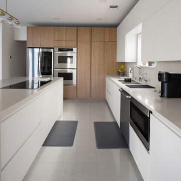
Long lead times and delays are a new normal. At European Kitchen Center, we adapt our business to new standards. We carefully planned this project to avoid extensive periods without cooking. With our help, the client could source and purchase all necessary products. The demolition started when we had cabinetry and all other parts in our possession. As a result, quick installation, pleased client, and a stunning kitchen. The client has opted for a two-tone finish; white lacquer and stunning wood veneer. It features handle-less cabinetry, contemporary design, and the latest in modern kitchen gadgets. PLEASE SEE THE BEFORE PICTUREBesides being aesthetically pleasing, we packed this kitchen with many mechanisms to improve its functionality, An amazing induction cooktop with a built-in downdraft, multi-functional workstation, LED task lighting. Please see the pictures.
 Lincoln Lighthill Architect
This project is a story of how buildings and relationships evolve over time, and how the two are intertwined in the making of architecture.
The client, a single man, had just purchased a classic Edwardian flat on San Francisco’s Liberty Street, known for its historic homes and famous neighbors like Tracy Chapman, when his realtor connected him with LLA. The initial brief was to integrate a modern, minimalist kitchen and bathroom with the apartment's traditional aesthetic. The existing condition was a series of cramped rooms and a long hallway that divided the apartment into many separate spaces, some without natural light.
The solution was to remove most of the walls in the middle of the flat, with extensive structural work hidden from view. This created an open connection between the living, dining and kitchen areas that flooded the formerly dark core of the apartment with light.
Midway through the design process, the client and his partner, and avid cook, decided it was time to move in together. The project evolved further and LLA found inventive ways to pack more features and amenities into a design that was fundamentally about simplicity.
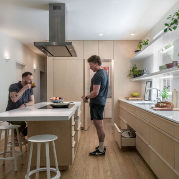
The result of this creative tension is a large open kitchen with deceptively simple forms- a long back counter with three rows of drawers below, an island with a central cooktop and double cantilevers for seating, and a slightly mysterious wood box at the back. The box conceals the refrigerator, storage, linens, and laundry, and through a secret door, a large walk-in pantry.
The bathroom evolved into a mini-spa, with a walk-through shower and Japanese-style soaking tub. The space shares light with the kitchen through a floor-to-ceiling translucent glass panel. Each client has a large dog, and so a small sliver of space under the upstairs neighbor's stair was turned into the perfect doggie den, complete with period correct doorway.
The newly blended family moved in together when the project was completed. A poignant footnote, Maverick, the blonder, fluffier dog in the photos, was very old and sadly passed away shortly after they moved in. It made the photoshoot feel like a special event that honored and preserved his memory in pictures. Like all families, theirs continues to evolve and change, just as their home has over its 90 year life.
 Evans Joinery
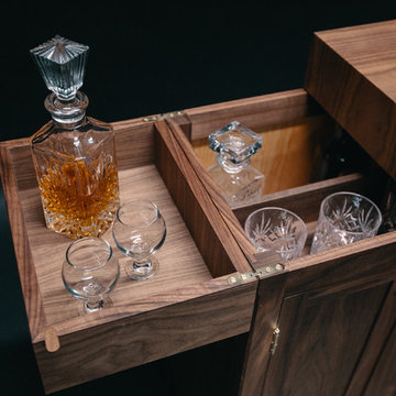
Our Admiral Bar is the elegant high class socialite sure to be the center point at any party. Gracing the room as a sophisticated piece of furniture, then turning into a fully functional bar able to serve your guests all evening, the Admiral Bar gives you enough space to entertain any size gathering and easily packs away again at the end of the night.
Dimensions: When closed 14"Deep x 20"Wide x 36"High
Dimensions: When open 14"Deep x 40"Wide x 32"High
Materials: American Walnut & Brass
Our build time is 4-8 weeks. International orders please email us beforehand for a shipping quote.
 Tile Doctor Ltd
It’s not often that we get called abroad for a job, but when we do, it’s always a fantastic experience. We have done a few jobs abroad in the past, including the restoration of Terracotta tiled restaurant floor at a hotel in Addis Ababa, Ethiopia. This job was closer to home at a chateau in the town of Arcis-le-Ponsart near Reims, located in the Champagne-Ardenne region of North Eastern France. As its name suggests, the Champagne-Ardenne region is famous for its champagne.
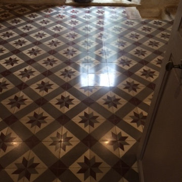
The owner of the chateau was, in fact, an English property developer. He asked us to work on two floors: a Terracotta tiled hallway, and a French Victorian tiled floor. The French style of Victorian tiles are actually made of encaustic cement rather than clay, so we were excited to have the chance to work on something a bit out of the ordinary.
It was going to be a long trip, so after packing the van with the necessary equipment and Tile Doctor products Heidi and I set off to France via the Channel Tunnel. Fortunately, we avoided any disruptions both on the way there and the way back!
On arrival at the chateau, we immediately spent two hours running tests on the two floors to determine the most effective processes. We had four days in which to complete the job, so it was essential to make sure our methods were correct before beginning to avoid any unwelcome surprises later on!
After running the tests, we set about cleaning the Victorian tiles using a combination of clean water and diamond burnishing pads. No damage was done to the tiles, and they polished up well. Following the cleaning process, we began sealing the floor using Tile Doctor Colour Grow, a sealer which helps to bring out the colour in the stone while also providing durable surface protection. We were only able to apply one coat of sealer, however, as the second coat kept smearing, preventing the shine from settling in – this was despite testing the process earlier. Nonetheless, we resolved to polish off the one coat we could apply with a fine burnishing pad. Thankfully, the results were still very good.
The Terracotta tiled hallway had no sealer, and so it had, over time, become very dirty. We cleaned the tiles using a solution of one part Tile Doctor Pro Clean to five parts clean water, in combination with a couple of black burnishing pads.
As you can see from the pictures, the combination really helped to lift out the ingrained dirt, leaving the tiles looking at their best again. The floor took three days to dry completely before we could begin the sealing process. Once the floor was dry enough to seal, we applied eight coats of Tile Doctor Seal & Go, which is suitable for use on a variety of internal, unsealed porous surfaces.
It was a long and exhausting week but the client was delighted with the results on both floors and left the following comments, he also mentioned using Tile Doctor in the future to work on the other properties he is developing.
“Thanks for yours and Heidi’s work in renovating our floors. It was also great to meet you guys and I hope you have enjoyed your visit to champagne and will come back some time. “
27