
Search results for "Solutions play" in Home Design Ideas
 Blondie's Treehouse Inc
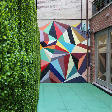
Referencing this square footage as an internal courtyard might be a stretch. A more accurate description would perhaps be the awesome things that New Yorkers can do with the tiny spaces we have.
The parameters of the project lend to its description. This Tribeca residential building’s shared amenity space and gym on the lower level opens up onto a 350 square foot space of brick walls and concrete pavers. The south wall of this space is made up by the terraces belonging to the residential units above and while the setting allows for minimal ambient light, each balcony looks down onto the shared space below.
In order to provide visual interest from the gym and the overhead views, Blondie’s designers Sara Baerwald and Eva Vessio utilized Jay Scott’s rectangle containers lining the north wall as well as surrounding the utilities in the southwest corner. They then created 8 foot faux boxwood hedge on the north wall and the appropriate height to conceal the utilities. From below the hedge creates the feeling of a courtyard and from above it softens the view of the once barren space. Adding color and functionality, the concrete pavers were replaced with rubber tiles in a bright aqua. To play off of this color and add a unique level of visual impact, artist Chris Pearson designed and painted a multi-color prism mural. Primarily on the east wall and then stretching over the hedges to the south, the depth and dimension that this mural provides for the space is incredible. It is a testament to the successful solutions we conjure when thinking outside the box and allowing for unique site specific resolutions.

 DM Design Solutions
DM Designs - Chicago
Design Objective: Convert a studio on the 87th floor of the John Hancock Building into a sophisticated, playful, elegant Mad Men-esque Mens Club / Pied a Terre. This was a complete gut renovation.
Our inspiration was the vintage orange tweed sofa the client had purchased for the space. We wanted classy, not kitschy, so designing the "bones" of the condo in timeless and elegant materials was essential. To ground the space and make a dramatic first impression, we selected reclaimed hardwood flooring from a 1800 French Chateau and laid it on the timeless and classic herringbone pattern. From there, we added seagrass wallpaper, custom wood paneled walls, vintage gun and decorative mirrors from the 1970's for the kitchen backsplash and added classic furnishings such as the Platner dining table and black tulip chairs. The coolest feature by far was the custom bookshelf/hidden door we designed to create a library foyer that masked the entry to the bathroom. Inside the bathroom, we converted a vintage, mid century modern bar cabinet into a vanity complete with a honey onyx countertop that lights up from within when you enter the space. Completing the space overall is a framed, original Men's Club Charter that greets you upon entry and that belonged to the client's father.

 Unique Home Solutions Inc.
This stunning $2 million dollar home in the Town of Mount Royal has an all-new interior from the solid wood floors to the massive windows in every room. It was barely on the market a month before it sold. Staging vacant properties definitely makes them more inviting, desireable and gives homebuyers a much better idea of the space.
If you are planning on selling your home and would like to have a consultation, give us a call, 514-222-5553. We work all over the Montreal area.
Find the right local pro for your project

 Crystal Kitchen + Bath
Infusing this once, drab 80’s kitchen with light and color was one goal in this extensive remodel. By removing the wall separating the dining room from the kitchen, the space doubled in size and allowed natural light to flood it.
Creating a design that filled the space yet remained very functional to the homeowner was extremely important. By implementing the two working triangles, one homeowner can be using the sink, cooktop and refrigerator while the other uses the secondary island for food prep as it has an additional sink.
A large soffit housing HVAC runs through the middle of the townhome and seemed intrusive to the space at first. After embracing it in the design, it’s as if it were meant to be. Three aluminum framed cabinets hang below, one directly underneath the soffit to create an asymmetrical design.
On a budget but still wanting a beautiful design, Crystal’s semi-custom line of cabinetry came into play. Simply White and Light Grey provide the perfect backdrop for natural maple, brushed gold hardware and accessories that infuse the space with color. Inside the cabinetry, the best storage solutions make for an extremely functional kitchen!
What a dream it is to have a kitchen that boasts quality, functionality and makes a person feel inspired within it.
Photography: Paige Kilgore

 Charlie Allen Renovations, Inc.
For a small family in the Boston suburbs, their modest sized home was just the right size. But with some smart changes, they wondered if it could be more enjoyable. Working with architect Joseph S. Artley, we came up with a number of solutions:
• To make the kitchen a more comfortable work and gathering space, a bay window was removed and the kitchen itself bumped out slightly to allow for the introduction of an expansive island, as well as additional countertop and cabinetry.
• The first floor half-bathroom was relocated to the end of the entry hall. This allowed us to connect the kitchen with what had been a three-season porch.
• That three-season porch was properly heated and remodeled as a sunny breakfast nook: the perfect spot for the family to gather in the mornings.
• Near the entry to the breakfast nook, an existing electrical box could not be moved. To conceal it, we suggested an oversized family bulletin board, which we provided as a gift to the homeowners. Now, it offers a great spot to catch up on the day’s activities and enjoy some family artwork while heading in for breakfast.
• This family loves to read and they asked for custom built in bookshelves in the living room that would look original to the home and match existing shelving on the other side of the room.
• The den is a favorite spot for the family to watch movies and play games, but the room, which had also been a three season porch prior to an earlier renovation, was drafty in the winter and hot in the summer. We introduced new, energy efficient windows and insulation throughout, resulting in a much more inviting and cozy room.
Today, after barely increasing the footprint of the home, the family has a new breakfast room, a usable den, a larger and more inviting kitchen, and a better-situated first-floor bath. Lots of simple fixes = a much happier space for the whole family.
Photos by Shelly Harrison

 Visbeen Architects
Builder: AVB Inc.
Interior Design: Vision Interiors by Visbeen
Photographer: Ashley Avila Photography
The Holloway blends the recent revival of mid-century aesthetics with the timelessness of a country farmhouse. Each façade features playfully arranged windows tucked under steeply pitched gables. Natural wood lapped siding emphasizes this homes more modern elements, while classic white board & batten covers the core of this house. A rustic stone water table wraps around the base and contours down into the rear view-out terrace.
Inside, a wide hallway connects the foyer to the den and living spaces through smooth case-less openings. Featuring a grey stone fireplace, tall windows, and vaulted wood ceiling, the living room bridges between the kitchen and den. The kitchen picks up some mid-century through the use of flat-faced upper and lower cabinets with chrome pulls. Richly toned wood chairs and table cap off the dining room, which is surrounded by windows on three sides. The grand staircase, to the left, is viewable from the outside through a set of giant casement windows on the upper landing. A spacious master suite is situated off of this upper landing. Featuring separate closets, a tiled bath with tub and shower, this suite has a perfect view out to the rear yard through the bedrooms rear windows. All the way upstairs, and to the right of the staircase, is four separate bedrooms. Downstairs, under the master suite, is a gymnasium. This gymnasium is connected to the outdoors through an overhead door and is perfect for athletic activities or storing a boat during cold months. The lower level also features a living room with view out windows and a private guest suite.

 Hardwood Bargains
Walk on sunshine with Skyline Floorscapes' Ivory White Oak. This smooth operator of floors adds charm to any room. Its delightfully light tones will have you whistling while you work, play, or relax at home.
This amazing reclaimed wood style is a perfect environmentally-friendly statement for a modern space, or it will match the design of an older house with its vintage style. The ivory color will brighten up any room.
This engineered wood is extremely strong with nine layers and a 3mm wear layer of White Oak on top. The wood is handscraped, adding to the lived-in quality of the wood. This will make it look like it has been in your home all along.
Each piece is 7.5-in. wide by 71-in. long by 5/8-in. thick in size. It comes with a 35-year finish warranty and a lifetime structural warranty.
This is a real wood engineered flooring product made from white oak. It has a beautiful ivory color with hand scraped, reclaimed planks that are finished in oil. The planks have a tongue & groove construction that can be floated, glued or nailed down.

 Blondie's Treehouse Inc
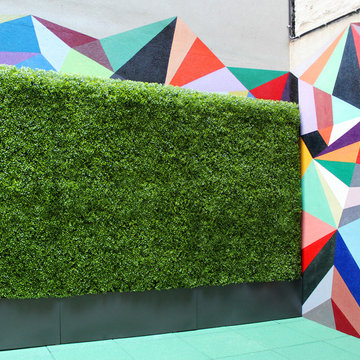
Referencing this square footage as an internal courtyard might be a stretch. A more accurate description would perhaps be the awesome things that New Yorkers can do with the tiny spaces we have.
The parameters of the project lend to its description. This Tribeca residential building’s shared amenity space and gym on the lower level opens up onto a 350 square foot space of brick walls and concrete pavers. The south wall of this space is made up by the terraces belonging to the residential units above and while the setting allows for minimal ambient light, each balcony looks down onto the shared space below.
In order to provide visual interest from the gym and the overhead views, Blondie’s designers Sara Baerwald and Eva Vessio utilized Jay Scott’s rectangle containers lining the north wall as well as surrounding the utilities in the southwest corner. They then created 8 foot faux boxwood hedge on the north wall and the appropriate height to conceal the utilities. From below the hedge creates the feeling of a courtyard and from above it softens the view of the once barren space. Adding color and functionality, the concrete pavers were replaced with rubber tiles in a bright aqua. To play off of this color and add a unique level of visual impact, artist Chris Pearson designed and painted a multi-color prism mural. Primarily on the east wall and then stretching over the hedges to the south, the depth and dimension that this mural provides for the space is incredible. It is a testament to the successful solutions we conjure when thinking outside the box and allowing for unique site specific resolutions.
 DM Design Solutions
DM Designs - Chicago
Design Objective: Convert a studio on the 87th floor of the John Hancock Building into a sophisticated, playful, elegant Mad Men-esque Mens Club / Pied a Terre. This was a complete gut renovation.
Our inspiration was the vintage orange tweed sofa the client had purchased for the space. We wanted classy, not kitschy, so designing the "bones" of the condo in timeless and elegant materials was essential. To ground the space and make a dramatic first impression, we selected reclaimed hardwood flooring from a 1800 French Chateau and laid it on the timeless and classic herringbone pattern. From there, we added seagrass wallpaper, custom wood paneled walls, vintage gun and decorative mirrors from the 1970's for the kitchen backsplash and added classic furnishings such as the Platner dining table and black tulip chairs. The coolest feature by far was the custom bookshelf/hidden door we designed to create a library foyer that masked the entry to the bathroom. Inside the bathroom, we converted a vintage, mid century modern bar cabinet into a vanity complete with a honey onyx countertop that lights up from within when you enter the space. Completing the space overall is a framed, original Men's Club Charter that greets you upon entry and that belonged to the client's father.

 Mayita Dinos Garden Design
mayitadinosphotography.com
Design ideas for a tropical landscaping in Los Angeles.
Design ideas for a tropical landscaping in Los Angeles.

 Irons Brothers Construction Inc
This rambler’s small kitchen was dysfunctional and out of touch with our client’s needs. She desired a larger footprint without an addition or expanding the footprint to stay within a realistic budget for her homes size and neighborhood.
The existing kitchen was “boxed-in” at the back of the house. The entrance from
the hallway was very narrow causing congestion and cramping the cook. In the living room the existing fireplace was a room hog, taking up the middle of the house. The kitchen was isolated from the other room’s downstairs.
The design team and homeowner decided to open the kitchen, connecting it to the dining room by removing the fireplace. This expanded the interior floor space. To create further integration amongst the spaces, the wall opening between the dining and living room was also widened. An archway was built to replicate the existing arch at the hallway & living room, giving a more spacious feel.
The new galley kitchen includes generous workspaces and enhanced storage. All designed for this homeowners’ specific needs in her kitchen. We also created a kitchen peninsula where guests can sit and enjoy conversations with the cook. (After 5,6) The red Viking range gives a fun pop of color to offset the monochromatic floor, cabinets and counters. It also plays to her Stanford alumni colors.
One of our favorite and most notable features of this kitchen is the “flip-out” window at the sink. This creative solution allows for an enhanced outdoor living experience, without an expansive remodel or addition. When the window is open the party can happen inside and outside with an interactive experience between spaces. The countertop was installed flush to the window, specifically designed as a cocktail/counter rail surface.

 Archadeck of Nova Scotia
At Archadeck of Nova Scotia we love any size project big or small. But, that being said, we have a soft spot for the projects that let us show off our talents! This Halifax house was no exception. The owners wanted a space to suit their outdoor lifestyle with materials to last far into the future. The choices were quite simple: stone veneer, Timbertech composite decking and glass railing.
What better way to create that stability than with a solid foundation, concrete columns and decorative stone veneer? The posts were all wrapped with stone and match the retaining wall which was installed to help with soil retention and give the backyard more definition (it’s not too hard on the eyes either).
A set of well-lit steps will guide you up the multi-level deck. The built-in planters soften the hardness of the Timbertech composite deck and provide a little visual relief. The two-tone aesthetic of the deck and railing are a stunning feature which plays up contrasting tones.
From there it’s a game of musical chairs; we recommend the big round one on a September evening with a glass of wine and cozy blanket.
We haven’t gotten there quite yet, but this property has an amazing view (you will see soon enough!). As to not spoil the view, we installed TImbertech composite railing with glass panels. This allows you to take in the surrounding sights while relaxing and not have those pesky balusters in the way.
In any Canadian backyard, there is always the dilemma of dealing with mosquitoes and black flies! Our solution to this itchy problem is to incorporate a screen room as part of your design. This screen room in particular has space for dining and lounging around a fireplace, perfect for the colder evenings!
Ahhh…there’s the view! From the top level of the deck you can really get an appreciation for Nova Scotia. Life looks pretty good from the top of a multi-level deck. Once again, we installed a composite and glass railing on the new composite deck to capture the scenery.
What puts the cherry on top of this project is the balcony! One of the greatest benefits of composite decking and railing is that it can be curved to create beautiful soft edges. Imagine sipping your morning coffee and watching the sunrise over the water.
If you want to know more about composite decking, railing or anything else you’ve seen that sparks your interest; give us a call! We’d love to hear from you.
 Visbeen Architects
Builder: AVB Inc.
Interior Design: Vision Interiors by Visbeen
Photographer: Ashley Avila Photography
The Holloway blends the recent revival of mid-century aesthetics with the timelessness of a country farmhouse. Each façade features playfully arranged windows tucked under steeply pitched gables. Natural wood lapped siding emphasizes this homes more modern elements, while classic white board & batten covers the core of this house. A rustic stone water table wraps around the base and contours down into the rear view-out terrace.
Inside, a wide hallway connects the foyer to the den and living spaces through smooth case-less openings. Featuring a grey stone fireplace, tall windows, and vaulted wood ceiling, the living room bridges between the kitchen and den. The kitchen picks up some mid-century through the use of flat-faced upper and lower cabinets with chrome pulls. Richly toned wood chairs and table cap off the dining room, which is surrounded by windows on three sides. The grand staircase, to the left, is viewable from the outside through a set of giant casement windows on the upper landing. A spacious master suite is situated off of this upper landing. Featuring separate closets, a tiled bath with tub and shower, this suite has a perfect view out to the rear yard through the bedrooms rear windows. All the way upstairs, and to the right of the staircase, is four separate bedrooms. Downstairs, under the master suite, is a gymnasium. This gymnasium is connected to the outdoors through an overhead door and is perfect for athletic activities or storing a boat during cold months. The lower level also features a living room with view out windows and a private guest suite.
Sponsored
Columbus, OH

Wannemacher Interiors
Customized Award-Winning Interior Design Solutions in Franklin Cnty OH
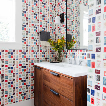
 Jennifer Gardner Design
Step into a space that seamlessly blends functional organization, relaxation, and a touch of fun. The renovation journey unfolded with a meticulous focus on the home's architecture, the client's design preferences, and the need for a practical yet stylish family environment.
The primary bathroom takes center stage in promoting relaxation, featuring a spa-like ambiance with soothing colors, heated floors, a beautiful soaking tub, and gentle under-counter lighting creating a tranquil atmosphere. A cleverly integrated cabinet space is also available, providing a discreet storage solution for the less aesthetically pleasing litter box while ensuring easy access for our feline friends.
In the kitchen, attention to detail shines through with a stunning wood-trimmed vent hood and wooden pulls that punctuate the Indigo Blue cabinets, introducing natural elements and a touch of warmth. Ample storage was a crucial requirement for this kitchen. Featuring expansive pull-out drawers, a concealed lazy Susan, impressive spice storage, and a discreet power source for the cordless vacuum, every detail has been considered for optimal functionality.
Connected to the kitchen, you'll discover a dining area designed for versatility. This multipurpose zone seamlessly integrates wine storage, pantry space, a dedicated baking center, cocktail preparation area, and a convenient coffee zone.
The main level's powder room pays homage to the homeowners' roots, boasting a vibrant wallpaper by Chasing Paper that adds a playful touch.
The harmonious blend of aesthetics and functionality continues with an additional mixed-use space that serves as a delightful getaway, complete with outdoor access and ample countertop space for both utility and enjoyment. This home is a testament to the artful fusion of design, comfort, and entertainment.
Interior Design by: Jennifer Gardner Design
Photography by: Emily Keeney
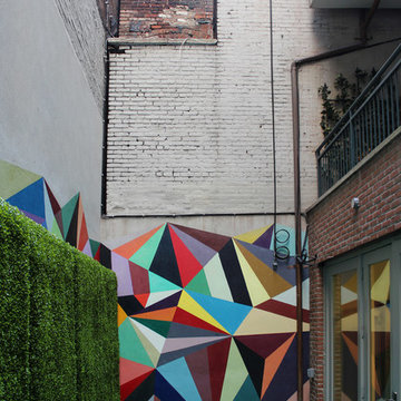 Blondie's Treehouse Inc
Referencing this square footage as an internal courtyard might be a stretch. A more accurate description would perhaps be the awesome things that New Yorkers can do with the tiny spaces we have.
The parameters of the project lend to its description. This Tribeca residential building’s shared amenity space and gym on the lower level opens up onto a 350 square foot space of brick walls and concrete pavers. The south wall of this space is made up by the terraces belonging to the residential units above and while the setting allows for minimal ambient light, each balcony looks down onto the shared space below.
In order to provide visual interest from the gym and the overhead views, Blondie’s designers Sara Baerwald and Eva Vessio utilized Jay Scott’s rectangle containers lining the north wall as well as surrounding the utilities in the southwest corner. They then created 8 foot faux boxwood hedge on the north wall and the appropriate height to conceal the utilities. From below the hedge creates the feeling of a courtyard and from above it softens the view of the once barren space. Adding color and functionality, the concrete pavers were replaced with rubber tiles in a bright aqua. To play off of this color and add a unique level of visual impact, artist Chris Pearson designed and painted a multi-color prism mural. Primarily on the east wall and then stretching over the hedges to the south, the depth and dimension that this mural provides for the space is incredible. It is a testament to the successful solutions we conjure when thinking outside the box and allowing for unique site specific resolutions.
 DM Design Solutions
DM Designs - Chicago
Design Objective: Convert a studio on the 87th floor of the John Hancock Building into a sophisticated, playful, elegant Mad Men-esque Mens Club / Pied a Terre. This was a complete gut renovation.
Our inspiration was the vintage orange tweed sofa the client had purchased for the space. We wanted classy, not kitschy, so designing the "bones" of the condo in timeless and elegant materials was essential. To ground the space and make a dramatic first impression, we selected reclaimed hardwood flooring from a 1800 French Chateau and laid it on the timeless and classic herringbone pattern. From there, we added seagrass wallpaper, custom wood paneled walls, vintage gun and decorative mirrors from the 1970's for the kitchen backsplash and added classic furnishings such as the Platner dining table and black tulip chairs. The coolest feature by far was the custom bookshelf/hidden door we designed to create a library foyer that masked the entry to the bathroom. Inside the bathroom, we converted a vintage, mid century modern bar cabinet into a vanity complete with a honey onyx countertop that lights up from within when you enter the space. Completing the space overall is a framed, original Men's Club Charter that greets you upon entry and that belonged to the client's father.

 Belltown Design LLC
How can anyone live without a coat closet; a place to store belongings as you walk in the door?! The lack of storage space was creating clutter in this compact home, and everything felt dark and messy! The unit we designed and built provided much need doors, to close off jackets, shoes, books and backpacks, out of sight.
North Seattle House - Compact Space Built-Ins. Belltown Design. Photography by Paula McHugh


 Valentini Kids Furniture Brooklyn NY
Italian Kids Bedroom Composition VV S027GO
Made in Italy
This amazing Italian kids bedroom furniture set becomes a great solution for those looking for top quality furniture with huge storage capabilities to adorn and organize the children`s bedroom. The bedroom set also works to not hinder the size of the room, using up only the smallest area of space required in the bedroom as to provide room for storage as well as plenty of room for your kids to play freely. All the pieces within this collection are made with a durable and easy to clean melamine on both sides, which is available in a variety of matt colors that can be mixed and matched to help add a happy and energetic vibe to the kids bedroom.
MATERIAL/CONSTRUCTION:
E1-Class ecological panels, which are produced exclusively trough a wood recycling production process
Bases 18 mm thick melamine
Back panels MDF 3 mm thickness
Doors 18 mm thick melamine
Front drawers 18 mm thick melamine
The starting price is for the composition that includes the following elements:
1 x Composition bridge loft (Reversible);
1 x Twin size platform Trundle or Storage bed ( fit US standard Twin size mattress 39" x 75");
Room/bed decorative accessories and the mattress are not included in the price.
Dimensions:
Composition bridge loft (Reversible): W112.2" x D21.3" x H93"
Twin bed Trundle or Storage internal dimensions W39" x D75" (US Standard)
Full bed Trundle or Storage internal dimensions W54" x D75" (US Standard)
 Crystal Kitchen + Bath
Infusing this once, drab 80’s kitchen with light and color was one goal in this extensive remodel. By removing the wall separating the dining room from the kitchen, the space doubled in size and allowed natural light to flood it.
Creating a design that filled the space yet remained very functional to the homeowner was extremely important. By implementing the two working triangles, one homeowner can be using the sink, cooktop and refrigerator while the other uses the secondary island for food prep as it has an additional sink.
A large soffit housing HVAC runs through the middle of the townhome and seemed intrusive to the space at first. After embracing it in the design, it’s as if it were meant to be. Three aluminum framed cabinets hang below, one directly underneath the soffit to create an asymmetrical design.
On a budget but still wanting a beautiful design, Crystal’s semi-custom line of cabinetry came into play. Simply White and Light Grey provide the perfect backdrop for natural maple, brushed gold hardware and accessories that infuse the space with color. Inside the cabinetry, the best storage solutions make for an extremely functional kitchen!
What a dream it is to have a kitchen that boasts quality, functionality and makes a person feel inspired within it.
Photography: Paige Kilgore
119