
Search results for "Space transforms" in Home Design Ideas

 Storey Design
A shareable couch and soft blanket transform this formal window into a space of comfort
Photo Credit: Helynn Ospina
Bedroom - mid-sized victorian master bedroom idea in San Francisco with gray walls
Bedroom - mid-sized victorian master bedroom idea in San Francisco with gray walls

 Western Window Systems
Praised for its visually appealing, modern yet comfortable design, this Scottsdale residence took home the gold in the 2014 Design Awards from Professional Builder magazine. Built by Calvis Wyant Luxury Homes, the 5,877-square-foot residence features an open floor plan that includes Western Window Systems’ multi-slide pocket doors to allow for optimal inside-to-outside flow. Tropical influences such as covered patios, a pool, and reflecting ponds give the home a lush, resort-style feel.
 Resource Furniture
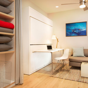
In the beach-side town of Asbury Park, New Jersey, stands Palomino Blackwing, a newly renovated 1920s Art Deco building. Now home to 23 modern duplex apartments, the building was designed with sustainable living in mind. Rather than seeking more space, the ideal design was shifted to using space ingeniously.
Some highlights of each unit include:
The Atoll 000 sofa/wall bed system transforms the living room into a guest bedroom for two when needed.
A Lollisoft bunk bed system with a desk, which allows the downstairs flex space to function in multiple ways as needed: a home office/work space, lounge, or bedroom for two. The two steel frame, single beds easily fold down and comfortably accommodate two children or adults.
Goliath transforming Console/Dining Table eliminates the need for a separate dining room, yet can easily accommodate up to 10 people.
Folding Pocket Chairs that are less than 1” deep when closed; 8 chairs are stored on a rack less than 5.5” deep and hung on the wall above the Goliath.
Find the right local pro for your project
 Colorworks Landscape Design
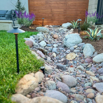
Our team recently completed an incredible outdoor transformation in Huntington Beach! This project included:
- New tile patio for a fresh and modern outdoor living space
- Lush new grass that enhances the beauty of the yard
- A stunning dry river feature for natural elegance
- A serene fountain, adding soothing sounds to the environment
- Gorgeous new trees and landscaping plants to create a peaceful atmosphere
- Custom outdoor lighting to illuminate the space and highlight key features
- Decorative pea rock to tie it all together with a polished, natural look

 FOUR POINT DESIGN BUILD INC
DESIGN BUILD REMODEL | Home Office Transformation | FOUR POINT DESIGN BUILD INC.
This space was once a child's bedroom and now doubles as a professional home photography post production office and a dressing room for graceful ballerinas!
This completely transformed 3,500+ sf family dream home sits atop the gorgeous hills of Calabasas, CA and celebrates the strategic and eclectic merging of contemporary and mid-century modern styles with the earthy touches of a world traveler!
AS SEEN IN Better Homes and Gardens | BEFORE & AFTER | 10 page feature and COVER | Spring 2016
To see more of this fantastic transformation, watch for the launch of our NEW website and blog THE FOUR POINT REPORT, where we celebrate this and other incredible design build journey! Launching September 2016.
Photography by Riley Jamison
#ballet #photography #remodel #LAinteriordesigner #builder #dreamproject #oneinamillion
 Thyme & Place Design LLC
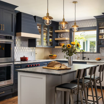
The client requested a kitchen that would not only provide a great space to cook and enjoy family meals but one that would fit in with her unique design sense. An avid collector of contemporary art, she wanted something unexpected in her 100-year-old home in both color and finishes but still providing a great layout with improved lighting, storage, and superior cooking abilities. The existing kitchen was in a closed off space trapped between the family room and the living. If you were in the kitchen, you were isolated from the rest of the house. Making the kitchen an integrated part of the home was a paramount request.
Step one, remove the wall separating the kitchen from the other rooms in the home which allowed the new kitchen to become an integrated space instead of an isolation room for the cook. Next, we relocated the pantry access which was in the family room to the kitchen integrating a poorly used recess which had become a catch all area which did not provide any usable space for storage or working area. To add valuable function in the kitchen we began by capturing unused "cubbies", adding a walk-in pantry from the kitchen, increasing the storage lost to un-needed drop ceilings and bring light and design to the space with a new large awning window, improved lighting, and combining interesting finishes and colors to reflect the artistic attitude of the client.
A bathroom located above the kitchen had been leaking into the plaster ceiling for several years. That along with knob and tube wiring, rotted beams and a brick wall from the back of the fireplace in the adjacent living room all needed to be brought to code. The walls, ceiling and floors in this 100+ year old home were completely out of level and the room’s foot print could not be increased.
The choice of a Sub-Zero wolf product is a standard in my kitchen designs. The quality of the product, its manufacturing and commitment to food preservation is the reason I specify Sub Zero Wolf. For the cook top, the integrated line of the contemporary cooktop and the signature red knobs against the navy blue of the cabinets added to the design vibe of the kitchen. The cooking performance and the large continuous grate on the cooktop makes it an obvious choice for a cook looking for a great cook top with professional results in a more streamlined profile. We selected a Sharp microwave drawer for the island, an XO wine refrigerator, Bosch dishwasher and Kitchen Aid double convection wall ovens to round out the appliance package.
A recess created by the fireplace was outfitted with a cabinet which now holds small appliances within easy reach of my very petite client. Natural maple accents were used inside all the wall cabinets and repeated on the front of the hood and for the sliding door appliance cabinet and the floating shelves. This allows a brighter interior for the painted cabinets instead of the traditional same interior as exterior finish choice. The was an amazing transformation from the old to the new.
The final touches are the honey bronze hardware from Top Knobs, Mitzi pendants from Hudson Valley Lighting group,
a fabulous faucet from Brizo. To eliminate the old freestanding bottled water cooler, we specified a matching water filter faucet.
 Pinnacle Design & Remodeling
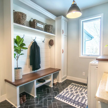
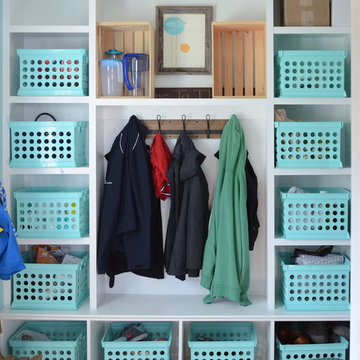
Stunning transitional modern laundry room remodel with new slate herringbone floor, white locker built-ins with characters of leather, and pops of black.
Sponsored
Plain City, OH

The Creative Kitchen Company
Columbus Area Kitchen Remodeling and Refacing Professional
 FineLine Kitchens, Inc.
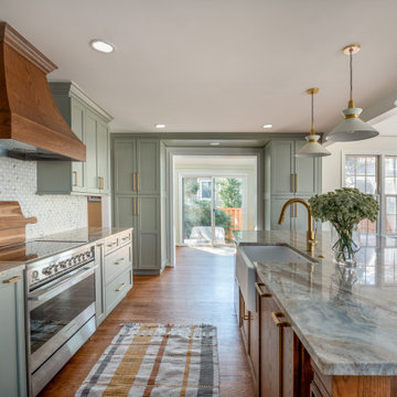
Hi everyone, I'm Sarah and Ogun we are here with fine line kitchens. So we are a couple working together. I do the interior design and remodeling of the space material selection meeting with the clients. And I handled operations outside, you know meaning all the construction work that is taking place the inside. The houses that we work in. I handle all the aspects of the construction, so today's project is very special. We're in Vienna and the client had a very big family. It's a family of seven that lives here. So we had a few aspects that we needed to keep in mind while designing this one. Having everybody be able to sit on the island. So we wanted plenty of seating all the way around. We didn't want anybody standing or anything like that. So what we did is we maximize the space. The center island is the biggest part of the kitchen. We use a natural stone to kind of give it a beautiful texture versus quartz. It's kind of standard white or kind of fabricated, so I wanted something very natural. We did this because I took my inspiration from the outside, so the inspiration if you look at the view right in front of me is there are so many greens there's a lot of brass accents and I wanted to bring this. Into this kitchen while designing it for my clients. She is very warm very. She wanted a very homey, comfy kind of look for the kitchen. So that's what we did today. As you can see, the cabinets are sage green, very light, so I still think it's a neutral, but it's a lighter color that again brings the outside in and we combine that with the oak right behind me so it's a slightly warm oak. It's not very dark. It's not very light. It's a medium brown and the same color went on the island. To kind of tie these two in and the backsplash, my favorite part is where you can see a little bit of design. It is, in my opinion still classic, but includes a pattern so the outside part is as we said in the beginning, is handled by my husband. I'd like him to speak a little bit about that. Thanks, Sarah, I want to talk to you guys a little bit about the construction part of this project. Originally this kitchen was located mostly in this area. They had their stove there sing. It was more of a peninsula layout in Sarah's and the customer vision they wanted. They wanted to get rid of the peninsula and they want to be able to have a huge island that can at least sit seven people because they're familiar with seven. So we wanted to make sure that we can achieve this design and bring it to life so that they can be happy with this layout. Some of the challenges we had, the house, the home being, you know, old home. There were a lot of you know the older electrical and plumbing that had to be replaced. We had to relocate the stove from here to this area. Over here we had put a nice foot fan that we had to relocate all the ductwork and the plumbing. Was being on the peninsula area. We had to relocate it to the center islands. So we achieved all this and kind of like bring it to bring in this kitchen up to date it looks beautiful. That's true, so yes, the old layout did not function for my clients because everything was kind of gathered on one side of the kitchen. So there was like a peninsula right there. So the end of this island kind of continued straight. And that was just the L shape. Kind of where everything was and there used to be another big table here, so they were using only kind of half of the space. So like I said at the beginning, our vision was to kind of feed everybody at the island, create some symmetry. 'cause I love that. So as you can see behind me, this is kind of the focal point symmetrical. Everything is kind of even we wanted to also panel the fridge here so it mimics the pantry and another size. So when you're looking at it, it is bringing again that symmetry back again. I hope you enjoyed this kitchen and this video and I'll see you soon. So how do you think this project turned out? It's nice. I like the color. I think it turned out nice. It's kind of like a little bit different color than what we always do. So I realize. Are you giving me a little bit of credit here that I did something different? Are you proud? I'm so proud of you. Other than that I like it. That they have kind of like a two sink. So if this was our kitchen, if we ever like you can have your own. I can have mine if we ever get into a fight then this can be like my own kitchen. Why are we gonna bring in a fight right now? So I'm cooking anyway. You're grilling most of the time, So what are you even talking about? My kitchen? That's my kitchen. You can just take the small sink. That's fine. It's always good to have your own space right there, so anyways. Thank you guys for watching. We hope to see you soon and if you have any questions please click the link below. It'll lead you to our website, house, YouTube and all of the social media is so nice to have you guys. We'll see you soon. Thanks bye bye-bye.

 Transition I Space
A traditional suburban 1960's house was transformed into a light and airy home that reflected the clients wish for modern spaces with a traditional elements. The two story addition contains a office "treehouse" the new kitchen and family room , and in the basement a two car garage. The wall of glass windows allows lots of sunlight into the great room. D Bentley

 Craig Reynolds Landscape Architecture
Tamara Alvarez
Design ideas for a small tropical partial sun side yard landscaping in Miami with decking.
Design ideas for a small tropical partial sun side yard landscaping in Miami with decking.

 Lumar Interiors
Our goal for this project was to transform this home from family-friendly to an empty nesters sanctuary. We opted for a sophisticated palette throughout the house, featuring blues, greys, taupes, and creams. The punches of colour and classic patterns created a warm environment without sacrificing sophistication.
Home located in Thornhill, Vaughan. Designed by Lumar Interiors who also serve Richmond Hill, Aurora, Nobleton, Newmarket, King City, Markham, Thornhill, York Region, and the Greater Toronto Area.
For more about Lumar Interiors, click here: https://www.lumarinteriors.com/


 Jane Reece Interiors
At the Four Seasons Residence in Austin, R Designs transformed this otherwise bland high-rise condo into a slick and bold space using multiple wall-coverings, ceiling coverings (leather, suede, fabric and paper), custom Italian furnishings and unique custom lighting.
Sponsored
Columbus, OH

Structural Remodeling
Franklin County's Heavy Timber Specialists | Best of Houzz 2020!
 FineLine Kitchens, Inc.
Hi everyone, I'm Sarah and Ogun we are here with fine line kitchens. So we are a couple working together. I do the interior design and remodeling of the space material selection meeting with the clients. And I handled operations outside, you know meaning all the construction work that is taking place the inside. The houses that we work in. I handle all the aspects of the construction, so today's project is very special. We're in Vienna and the client had a very big family. It's a family of seven that lives here. So we had a few aspects that we needed to keep in mind while designing this one. Having everybody be able to sit on the island. So we wanted plenty of seating all the way around. We didn't want anybody standing or anything like that. So what we did is we maximize the space. The center island is the biggest part of the kitchen. We use a natural stone to kind of give it a beautiful texture versus quartz. It's kind of standard white or kind of fabricated, so I wanted something very natural. We did this because I took my inspiration from the outside, so the inspiration if you look at the view right in front of me is there are so many greens there's a lot of brass accents and I wanted to bring this. Into this kitchen while designing it for my clients. She is very warm very. She wanted a very homey, comfy kind of look for the kitchen. So that's what we did today. As you can see, the cabinets are sage green, very light, so I still think it's a neutral, but it's a lighter color that again brings the outside in and we combine that with the oak right behind me so it's a slightly warm oak. It's not very dark. It's not very light. It's a medium brown and the same color went on the island. To kind of tie these two in and the backsplash, my favorite part is where you can see a little bit of design. It is, in my opinion still classic, but includes a pattern so the outside part is as we said in the beginning, is handled by my husband. I'd like him to speak a little bit about that. Thanks, Sarah, I want to talk to you guys a little bit about the construction part of this project. Originally this kitchen was located mostly in this area. They had their stove there sing. It was more of a peninsula layout in Sarah's and the customer vision they wanted. They wanted to get rid of the peninsula and they want to be able to have a huge island that can at least sit seven people because they're familiar with seven. So we wanted to make sure that we can achieve this design and bring it to life so that they can be happy with this layout. Some of the challenges we had, the house, the home being, you know, old home. There were a lot of you know the older electrical and plumbing that had to be replaced. We had to relocate the stove from here to this area. Over here we had put a nice foot fan that we had to relocate all the ductwork and the plumbing. Was being on the peninsula area. We had to relocate it to the center islands. So we achieved all this and kind of like bring it to bring in this kitchen up to date it looks beautiful. That's true, so yes, the old layout did not function for my clients because everything was kind of gathered on one side of the kitchen. So there was like a peninsula right there. So the end of this island kind of continued straight. And that was just the L shape. Kind of where everything was and there used to be another big table here, so they were using only kind of half of the space. So like I said at the beginning, our vision was to kind of feed everybody at the island, create some symmetry. 'cause I love that. So as you can see behind me, this is kind of the focal point symmetrical. Everything is kind of even we wanted to also panel the fridge here so it mimics the pantry and another size. So when you're looking at it, it is bringing again that symmetry back again. I hope you enjoyed this kitchen and this video and I'll see you soon. So how do you think this project turned out? It's nice. I like the color. I think it turned out nice. It's kind of like a little bit different color than what we always do. So I realize. Are you giving me a little bit of credit here that I did something different? Are you proud? I'm so proud of you. Other than that I like it. That they have kind of like a two sink. So if this was our kitchen, if we ever like you can have your own. I can have mine if we ever get into a fight then this can be like my own kitchen. Why are we gonna bring in a fight right now? So I'm cooking anyway. You're grilling most of the time, So what are you even talking about? My kitchen? That's my kitchen. You can just take the small sink. That's fine. It's always good to have your own space right there, so anyways. Thank you guys for watching. We hope to see you soon and if you have any questions please click the link below. It'll lead you to our website, house, YouTube and all of the social media is so nice to have you guys. We'll see you soon. Thanks bye bye-bye.
 Remodeling Consultants
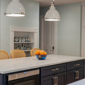
In Riverside, CT, a stunning kitchen remodel, completed in summer 2025, beautifully combines functionality and style. The project expanded the kitchen, adding a mudroom and powder room for enhanced utility.
A striking feature of the remodel is the vibrant blue tile, creating an inviting atmosphere. High-quality materials, including Kraftmaid Vantage cabinets and polished nickel Kohler fixtures, ensure elegance and durability. The kitchen boasts Leadstone Pure White quartz countertops on the perimeter and Emerstone Kailani quartz on the island, offering a stylish contrast.
Harvey Majesty wood windows fill the kitchen with natural light, while Thermatru exterior doors provide outdoor access. REEB interior doors facilitate smooth transitions between spaces.
Homeowners chose cork flooring for the kitchen and mudroom, valuing its comfort, durability, and anti-microbial properties, making it perfect for high-traffic areas.
This Riverside kitchen remodel exemplifies how to blend form and function, transforming the space into a beautiful yet practical hub for modern living.
 Forest Brown Hardscape Inc.
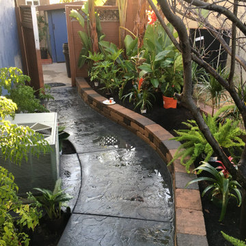
This side yard landscape renovation was designed to transform an outdated and narrow walkway into a warm, functional, resort-inspired outdoor space. The project included decorative concrete walkways, custom curved retaining walls, updated planting areas, irrigation improvements, and tropical landscaping to create a more inviting and usable environment.
Our team carefully reconfigured the layout around the existing trees and landscape to create a natural flowing pathway while maximizing accessibility and visual appeal throughout the property. The curved retaining walls added both structure and dimension to the space while blending seamlessly with the surrounding landscape.
To complete the transformation, we installed lush tropical plants, fresh soil, upgraded planting beds, and landscape lighting to bring life and depth into the entire side yard area.
The final result created a clean, private, and relaxing outdoor environment that combines landscape and hardscape elements into one cohesive design.

Sponsored
Columbus, OH

Hope Restoration & General Contracting
Columbus Design-Build, Kitchen & Bath Remodeling, Historic Renovations

 Casework Inter Design
When the homeowners first purchased the 1925 house, it was compartmentalized, outdated, and completely unfunctional for their growing family. Casework designed the owner's previous kitchen and family room and was brought in to lead up the creative direction for the project. Casework teamed up with architect Paul Crowther and brother sister team Ainslie Davis on the addition and remodel of the Colonial.
The existing kitchen and powder bath were demoed and walls expanded to create a new footprint for the home. This created a much larger, more open kitchen and breakfast nook with mudroom, pantry and more private half bath. In the spacious kitchen, a large walnut island perfectly compliments the homes existing oak floors without feeling too heavy. Paired with brass accents, Calcutta Carrera marble countertops, and clean white cabinets and tile, the kitchen feels bright and open - the perfect spot for a glass of wine with friends or dinner with the whole family.
There was no official master prior to the renovations. The existing four bedrooms and one separate bathroom became two smaller bedrooms perfectly suited for the client’s two daughters, while the third became the true master complete with walk-in closet and master bath. There are future plans for a second story addition that would transform the current master into a guest suite and build out a master bedroom and bath complete with walk in shower and free standing tub.
Overall, a light, neutral palette was incorporated to draw attention to the existing colonial details of the home, like coved ceilings and leaded glass windows, that the homeowners fell in love with. Modern furnishings and art were mixed in to make this space an eclectic haven.

 ED Enterprises, Inc.
The customer and E D Enterprises, Inc. were excited as the old soffits, wall, closets, and header were removed, as well as relocating the dining room door, to reveal and transform the space into an expansive new kitchen.
All electrical plumbing, and HVAC was relocated to comply with the village code.
Our skilled craftsmen installed all of the cabinetry, custom hood, and crown molding, as well.
A bar, (blue tone cabinet) was installed in the dinette area creating an attractive, functional area. Note the tile pattern back splash above the cook top and the brick pattern tile back splash below the glass door cabinet.
Recessed ceiling lights and under cabinet lighting were installed to illuminate the new work space.
General Contractor / Remodel: E D Enterprises, Inc.
Rick Tripple Photography

 Klopf Architecture
, Arterra Landscape Architects, and Flegels Construction updated a classic Eichler open, indoor-outdoor home. Expanding on the original walls of glass and connection to nature that is common in mid-century modern homes. The completely openable walls allow the homeowners to truly open up the living space of the house, transforming it into an open air pavilion, extending the living area outdoors to the private side yards, and taking maximum advantage of indoor-outdoor living opportunities. Taking the concept of borrowed landscape from traditional Japanese architecture, the fountain, concrete bench wall, and natural landscaping bound the indoor-outdoor space. The Truly Open Eichler is a remodeled single-family house in Palo Alto. This 1,712 square foot, 3 bedroom, 2.5 bathroom is located in the heart of the Silicon Valley.
Klopf Architecture Project Team: John Klopf, AIA, Geoff Campen, and Angela Todorova
Landscape Architect: Arterra Landscape Architects
Structural Engineer: Brian Dotson Consulting Engineers
Contractor: Flegels Construction
Photography ©2014 Mariko Reed
Location: Palo Alto, CA
Year completed: 2014
22