
Search results for "Spatial arrangement" in Home Design Ideas
 Dream Coast Builders
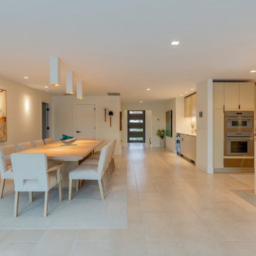
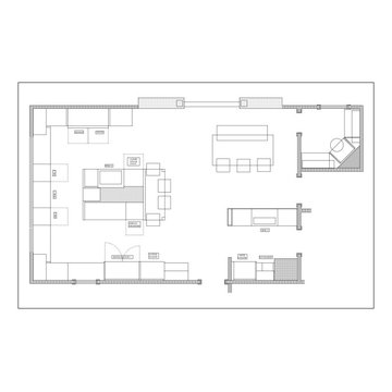
Positioned at the heart of the floorplan, the dining area is defined by a linear arrangement that runs parallel to the kitchen and hallway access, optimizing both movement and spatial efficiency. The table, built from pale natural wood with squared edges, sits on a tightly woven low-pile rug in a soft grey tone that buffers acoustics and anchors the space. Eight dining chairs with clean-profile upholstered frames are arranged symmetrically, offering ergonomic support within a restrained design language.
Overhead, surface-mounted rectangular pendant lights in staggered alignment direct focused downlighting without cluttering the ceiling plane. The adjacent kitchen features flush cabinetry in matte beige with integrated lighting and slab-front finishes, paired with quartz surfaces and dual built-in ovens. Walls and floors remain neutral, using warm-tone porcelain tile in an offset layout to ensure visual continuity. A single abstract wall piece provides controlled contrast against the otherwise monochromatic palette.
 LINKORI Luxury Lighting & Chandeliers
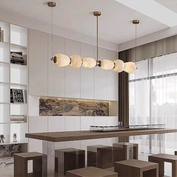
Multiple Spanish alabaster linear chandeliers define this contemporary open-plan kitchen and dining space, introducing sculptural rhythm and balanced illumination across the elongated table surface. Suspended at varied heights, the pendant arrangement enhances vertical volume while creating a composed architectural focal point.
Natural alabaster shades diffuse warm light against clean white paneling, softening the structured grid geometry and bringing tactile depth to the minimalist interior. Dark wood furnishings and transparent seating elements reinforce the dialogue between material warmth and modern precision.
Designed for high-ceiling residences, luxury apartments, and design-led open-concept layouts, this multi-pendant lighting concept demonstrates how repetition, proportion, and natural stone can transform functional dining zones into spatial compositions.

 User
Project: Mr. Shivagar's House
Location: Balagolla, #Kandy
Area: 3000 sqft
Type: Residential Project
Budget: 20 million
Our latest project, this one roof house is located in Balagolla, a residential area in the suburb of Kandy. This building focuses on spatial arrangement and sectional plan rather than exteriors. One Roof is divided into three different spaces, each having different characters in both horizontal and vertical layout.
In a horizontal layout, One Roof suggests separating spaces for parents and children, with the family space connecting them together on the rectangular-shaped ground. This layout achieves true privacy between family members while making better use of family space.
Learn more about our latest projects from www.royalkandyan.com
Contact us
P: (77) 719 8825
E: kandyan.royal@gmail.com
©️Royal Kandyan Design & Engineering (PVT) LTD
#Architecture #InteriorDesign #Design #ModernDesign #LuxuryLifestyle #Construction #ConstructioninSriLanka #KandyArchitect #KandyArchitecture #SriLanka #ConstructionCompanyinSriLanka
Find the right local pro for your project

 Envy Landscape Design Inc.
Design ideas for a mid-sized modern drought-tolerant and full sun backyard water fountain landscape in San Diego with decking.
 Bennett Contracting, Inc.
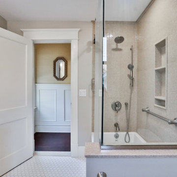
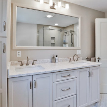
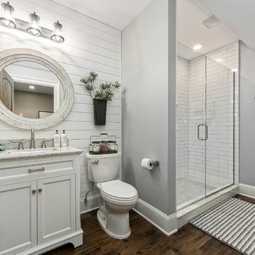
Embarking on the second phase of this renovation journey, Project Manager, George Griffin, and Designer, Justina Auer, seamlessly extended their collaboration to elevate this next space – the bathroom! As with the kitchen area, this was a small space where we strategically eliminated the soffits that made the room feel small and cramped. A reconfiguration of the layout saw the removal of the knee wall at the end of the tub, contributing to a more open and fluid spatial arrangement. The addition of a storage cabinet to the vanity ingeniously designed to house everyday bathroom essentials without compromising on the allure of the double bowl vanity. The generous sized mirror spanning both sinks not only serves a functional purpose but also cleverly conveys an illusion of a larger bathroom. The soft cream colors mixed with sandy beiges and warm tones give the new room a cozy and charming ambiance to the rejuvenated space. The harmonious blend of colors elevates the visual appeal and contributes to the overall comfort of the space. We loved working with these clients, and we’re looking forward to “raising the roof” with them on forthcoming projects in their home.
 Bennett Contracting, Inc.
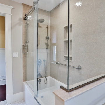
Embarking on the second phase of this renovation journey, Project Manager, George Griffin, and Designer, Justina Auer, seamlessly extended their collaboration to elevate this next space – the bathroom! As with the kitchen area, this was a small space where we strategically eliminated the soffits that made the room feel small and cramped. A reconfiguration of the layout saw the removal of the knee wall at the end of the tub, contributing to a more open and fluid spatial arrangement. The addition of a storage cabinet to the vanity ingeniously designed to house everyday bathroom essentials without compromising on the allure of the double bowl vanity. The generous sized mirror spanning both sinks not only serves a functional purpose but also cleverly conveys an illusion of a larger bathroom. The soft cream colors mixed with sandy beiges and warm tones give the new room a cozy and charming ambiance to the rejuvenated space. The harmonious blend of colors elevates the visual appeal and contributes to the overall comfort of the space. We loved working with these clients, and we’re looking forward to “raising the roof” with them on forthcoming projects in their home.
 Bennett Contracting, Inc.
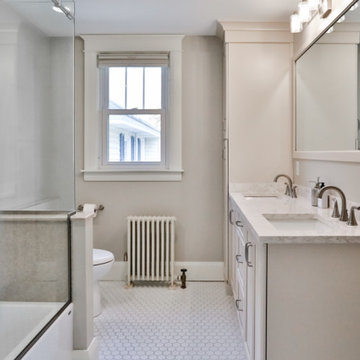
Embarking on the second phase of this renovation journey, Project Manager, George Griffin, and Designer, Justina Auer, seamlessly extended their collaboration to elevate this next space – the bathroom! As with the kitchen area, this was a small space where we strategically eliminated the soffits that made the room feel small and cramped. A reconfiguration of the layout saw the removal of the knee wall at the end of the tub, contributing to a more open and fluid spatial arrangement. The addition of a storage cabinet to the vanity ingeniously designed to house everyday bathroom essentials without compromising on the allure of the double bowl vanity. The generous sized mirror spanning both sinks not only serves a functional purpose but also cleverly conveys an illusion of a larger bathroom. The soft cream colors mixed with sandy beiges and warm tones give the new room a cozy and charming ambiance to the rejuvenated space. The harmonious blend of colors elevates the visual appeal and contributes to the overall comfort of the space. We loved working with these clients, and we’re looking forward to “raising the roof” with them on forthcoming projects in their home.
Sponsored
Columbus, OH

Structural Remodeling
Franklin County's Heavy Timber Specialists | Best of Houzz 2020!
 Bennett Contracting, Inc.
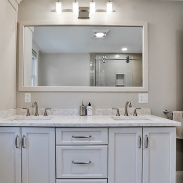
Embarking on the second phase of this renovation journey, Project Manager, George Griffin, and Designer, Justina Auer, seamlessly extended their collaboration to elevate this next space – the bathroom! As with the kitchen area, this was a small space where we strategically eliminated the soffits that made the room feel small and cramped. A reconfiguration of the layout saw the removal of the knee wall at the end of the tub, contributing to a more open and fluid spatial arrangement. The addition of a storage cabinet to the vanity ingeniously designed to house everyday bathroom essentials without compromising on the allure of the double bowl vanity. The generous sized mirror spanning both sinks not only serves a functional purpose but also cleverly conveys an illusion of a larger bathroom. The soft cream colors mixed with sandy beiges and warm tones give the new room a cozy and charming ambiance to the rejuvenated space. The harmonious blend of colors elevates the visual appeal and contributes to the overall comfort of the space. We loved working with these clients, and we’re looking forward to “raising the roof” with them on forthcoming projects in their home.
 Bennett Contracting, Inc.
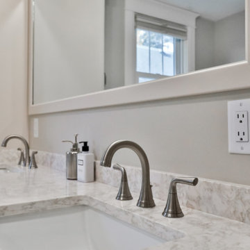
Embarking on the second phase of this renovation journey, Project Manager, George Griffin, and Designer, Justina Auer, seamlessly extended their collaboration to elevate this next space – the bathroom! As with the kitchen area, this was a small space where we strategically eliminated the soffits that made the room feel small and cramped. A reconfiguration of the layout saw the removal of the knee wall at the end of the tub, contributing to a more open and fluid spatial arrangement. The addition of a storage cabinet to the vanity ingeniously designed to house everyday bathroom essentials without compromising on the allure of the double bowl vanity. The generous sized mirror spanning both sinks not only serves a functional purpose but also cleverly conveys an illusion of a larger bathroom. The soft cream colors mixed with sandy beiges and warm tones give the new room a cozy and charming ambiance to the rejuvenated space. The harmonious blend of colors elevates the visual appeal and contributes to the overall comfort of the space. We loved working with these clients, and we’re looking forward to “raising the roof” with them on forthcoming projects in their home.
 Bennett Contracting, Inc.
Embarking on the second phase of this renovation journey, Project Manager, George Griffin, and Designer, Justina Auer, seamlessly extended their collaboration to elevate this next space – the bathroom! As with the kitchen area, this was a small space where we strategically eliminated the soffits that made the room feel small and cramped. A reconfiguration of the layout saw the removal of the knee wall at the end of the tub, contributing to a more open and fluid spatial arrangement. The addition of a storage cabinet to the vanity ingeniously designed to house everyday bathroom essentials without compromising on the allure of the double bowl vanity. The generous sized mirror spanning both sinks not only serves a functional purpose but also cleverly conveys an illusion of a larger bathroom. The soft cream colors mixed with sandy beiges and warm tones give the new room a cozy and charming ambiance to the rejuvenated space. The harmonious blend of colors elevates the visual appeal and contributes to the overall comfort of the space. We loved working with these clients, and we’re looking forward to “raising the roof” with them on forthcoming projects in their home.

 Etheredge Design Associates, Inc.
Converting a home office into a nursery for a growing family presented some interesting challenges because of the spatial limitations. Originally, the space housed an enclosed side porch in this small 1940's post war cottage style home. During the planning stage, the decision was made that the design elements of the nursery would be consistent with those previously used in the refurbished home…a soft, sophisticated mix of traditional furnishings accented with contemporary styled pieces and elements set within a monochromatic color scheme. Knowing that the expected child was a girl enabled the exploration of a full range of feminine options. To maximize style, unify the space, and preserve the impression of childlike innocence a decision was reached to use minimalist colors. Winter Morning coats the walls with just a hint of pink as seen in the sky at sunrise. Texture is introduced in a blush linen; its hue was chosen to increase spatial perception within this compact nursery. The same linen covers the crib bumper pads and upholsters the small scale glider. Blush is repeated in the chenille braid on the bumper pads, the pleat closures for the tailored striped silk crib skirt and, again, on the trim of the stripped silk drapery panels which are hung to the ceiling adding visual height and providing yards of gentle softness to the area. Antique botanicals from the owner's childhood provide femininity and a connection to the past. Mounted from the ceiling is a small glazed chandelier with clear crystal and rose quartz pendants perfectly suited for the little charmer who will occupy this room. The space may be small in size, but it is large in style, functionality, and filled with love.
 Leicht San Diego
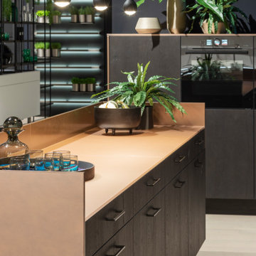
Copper-coloured effect lacquer fronts from the LAIKA range generate visual drama with a metallic effect in this horizontally planned kitchen of the product line PRIMO with a carbon grey carcase. In addition to various unit elements and a satin-finished glass worktop, the metallic look is also reflected in the raised frame of the kitchen island – an architectural detail reminiscent of a bar situation. The colour-contrasting wall unit consists of individual elements placed in front of each other, but, due to the clasping of the side panels in the upper row of shelves, it looks like a coherent furniture soloist. The metallic lacquer in “copper shadow” clearly emphasises the spatially offset part and creates a three-dimensional look. In this way, this kitchen design dissolves the classic arrangement of wall units strung together and creates a completely new look. To match this, the planners of this ensemble chose the MADERO programme in dark “wild oak marsh” and created a modern, trendy flair with a contrast to the copper tone implemented throughout.
 Leicht San Diego
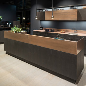
Copper-coloured effect lacquer fronts from the LAIKA range generate visual drama with a metallic effect in this horizontally planned kitchen of the product line PRIMO with a carbon grey carcase. In addition to various unit elements and a satin-finished glass worktop, the metallic look is also reflected in the raised frame of the kitchen island – an architectural detail reminiscent of a bar situation. The colour-contrasting wall unit consists of individual elements placed in front of each other, but, due to the clasping of the side panels in the upper row of shelves, it looks like a coherent furniture soloist. The metallic lacquer in “copper shadow” clearly emphasises the spatially offset part and creates a three-dimensional look. In this way, this kitchen design dissolves the classic arrangement of wall units strung together and creates a completely new look. To match this, the planners of this ensemble chose the MADERO programme in dark “wild oak marsh” and created a modern, trendy flair with a contrast to the copper tone implemented throughout.


 Margaret Carroll Interiors
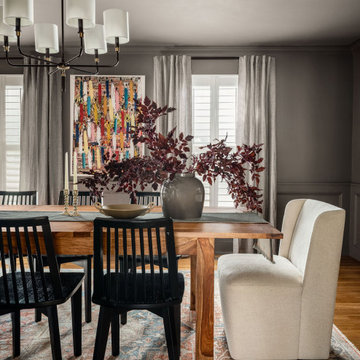
This VIP Design Day project transformed two key spaces in a DC-area home — a dining room and powder room — into rooms that feel both curated and livable. The dining room balances warm walnut tones, mixed seating, and bold artwork against moody gray walls and classic wainscoting, creating a space that's elegant without being precious. The powder room makes a strong first impression with floor-to-ceiling botanical wallpaper, a navy reeded vanity, Calacatta marble countertop, and antique brass fixtures layered with vintage equestrian art.
Margaret Carroll Interiors specializes in architecture-informed interior design for homes in Washington DC, Maryland, and Virginia. Every project integrates spatial thinking with intentional material selection — the result is interiors that look professionally designed and feel deeply personal.
This project is an example of our VIP Design Day service, a focused one-day design experience for homeowners ready to elevate specific rooms quickly and decisively.
Services: Residential Interior Design · VIP Design Day · Space Planning · Furniture Selection · Art Curation
Location: Washington DC Metro Area · Maryland · Virginia · DMV

 RoomService 360
Corner Cocktail Table is the answer to creative demands modern living. Manufactured in Italy by Cattelan Italia, Corner Coffee Table offers a multitude of applications, responding with heightened flexibility to spatial and decorative changes.
Corner Coffee Table is made of four parts (quarters) that can yield a round shape if assembled into a geometrical circle or an avant-garde form when arranged in opposite configurations. But what sets this incredibly clever coffee table apart is its ability to be stacked into a shelving unit if need be. Corner Cocktail Table features a graphite embossed steel base while its top is made of matte black lacquer with laser printed pattern.
 Custom Design Interiors Pvt. Ltd.
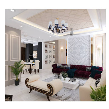
This image is a 3D render of a living and dining space designed in a New Classic style. The design features a blend of traditional and contemporary elements, creating an elegant and sophisticated atmosphere. The living area includes a dark-colored sofa, a decorative bench, and a modern coffee table on a marble-patterned rug. A prominent black and gold chandelier hangs above the space, complemented by recessed lighting and a textured, coffered ceiling.
The walls feature classic wainscoting panels, adding architectural interest and depth to the room. In the background, a dining area is visible with a table and chairs, and a wall adorned with multiple framed pictures. A large, lush green plant adds a touch of nature to the refined indoor setting. The overall aesthetic is luxurious and detailed, showcasing careful attention to texture, lighting, and spatial arrangement. The original design is attributed to Tural.
Sponsored
Sunbury, OH

J.Holderby - Renovations
Franklin County's Leading General Contractors - 2X Best of Houzz!


 Etheredge Design Associates, Inc.
Converting a home office into a nursery for a growing family presented some interesting challenges because of the spatial limitations. Originally, the space housed an enclosed side porch in this small 1940's post war cottage style home. During the planning stage, the decision was made that the design elements of the nursery would be consistent with those previously used in the refurbished home…a soft, sophisticated mix of traditional furnishings accented with contemporary styled pieces and elements set within a monochromatic color scheme. Knowing that the expected child was a girl enabled the exploration of a full range of feminine options. To maximize style, unify the space, and preserve the impression of childlike innocence a decision was reached to use minimalist colors. Winter Morning coats the walls with just a hint of pink as seen in the sky at sunrise. Texture is introduced in a blush linen; its hue was chosen to increase spatial perception within this compact nursery. The same linen covers the crib bumper pads and upholsters the small scale glider. Blush is repeated in the chenille braid on the bumper pads, the pleat closures for the tailored striped silk crib skirt and, again, on the trim of the stripped silk drapery panels which are hung to the ceiling adding visual height and providing yards of gentle softness to the area. Antique botanicals from the owner's childhood provide femininity and a connection to the past. Mounted from the ceiling is a small glazed chandelier with clear crystal and rose quartz pendants perfectly suited for the little charmer who will occupy this room. The space may be small in size, but it is large in style, functionality, and filled with love.
 Etheredge Design Associates, Inc.
Converting a home office into a nursery for a growing family presented some interesting challenges because of the spatial limitations. Originally, the space housed an enclosed side porch in this small 1940's post war cottage style home. During the planning stage, the decision was made that the design elements of the nursery would be consistent with those previously used in the refurbished home…a soft, sophisticated mix of traditional furnishings accented with contemporary styled pieces and elements set within a monochromatic color scheme. Knowing that the expected child was a girl enabled the exploration of a full range of feminine options. To maximize style, unify the space, and preserve the impression of childlike innocence a decision was reached to use minimalist colors. Winter Morning coats the walls with just a hint of pink as seen in the sky at sunrise. Texture is introduced in a blush linen; its hue was chosen to increase spatial perception within this compact nursery. The same linen covers the crib bumper pads and upholsters the small scale glider. Blush is repeated in the chenille braid on the bumper pads, the pleat closures for the tailored striped silk crib skirt and, again, on the trim of the stripped silk drapery panels which are hung to the ceiling adding visual height and providing yards of gentle softness to the area. Antique botanicals from the owner's childhood provide femininity and a connection to the past. Mounted from the ceiling is a small glazed chandelier with clear crystal and rose quartz pendants perfectly suited for the little charmer who will occupy this room. The space may be small in size, but it is large in style, functionality, and filled with love.
8