
Search results for "Specification" in Home Design Ideas
 Isla Homes
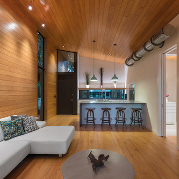
I built this on my property for my aging father who has some health issues. Handicap accessibility was a factor in design. His dream has always been to try retire to a cabin in the woods. This is what he got.
It is a 1 bedroom, 1 bath with a great room. It is 600 sqft of AC space. The footprint is 40' x 26' overall.
The site was the former home of our pig pen. I only had to take 1 tree to make this work and I planted 3 in its place. The axis is set from root ball to root ball. The rear center is aligned with mean sunset and is visible across a wetland.
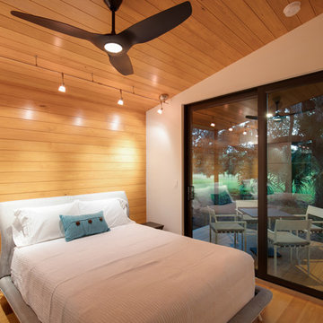
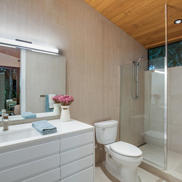
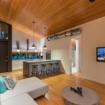
The goal was to make the home feel like it was floating in the palms. The geometry had to simple and I didn't want it feeling heavy on the land so I cantilevered the structure beyond exposed foundation walls. My barn is nearby and it features old 1950's "S" corrugated metal panel walls. I used the same panel profile for my siding. I ran it vertical to match the barn, but also to balance the length of the structure and stretch the high point into the canopy, visually. The wood is all Southern Yellow Pine. This material came from clearing at the Babcock Ranch Development site. I ran it through the structure, end to end and horizontally, to create a seamless feel and to stretch the space. It worked. It feels MUCH bigger than it is.
I milled the material to specific sizes in specific areas to create precise alignments. Floor starters align with base. Wall tops adjoin ceiling starters to create the illusion of a seamless board. All light fixtures, HVAC supports, cabinets, switches, outlets, are set specifically to wood joints. The front and rear porch wood has three different milling profiles so the hypotenuse on the ceilings, align with the walls, and yield an aligned deck board below. Yes, I over did it. It is spectacular in its detailing. That's the benefit of small spaces.
Concrete counters and IKEA cabinets round out the conversation.
For those who cannot live tiny, I offer the Tiny-ish House.
Photos by Ryan Gamma
Staging by iStage Homes
Design Assistance Jimmy Thornton

 safe ZOnea
Ask a kitchen designer in Chicago which countertop question comes up most and you will hear the same answer: white or off-white quartz, and which shade. Homeowners walk into showrooms with a photo saved on their phone, usually a bright, veined slab from a magazine spread, and leave an hour later realizing there are a dozen versions of that same look. The confusion is not about taste. It is about the fact that "white quartz" covers a huge range of patterns, undertones, and price points, and nobody explains the differences before the sale.
Older bungalows and newer builds alike are getting stripped of their dated laminate and butcher block in favor of quartz, and the reasons are practical rather than trendy. Quartz does not need sealing, resists the kind of staining that granite can suffer over decades, and holds up to the freeze-thaw humidity swings that Chicago basements and kitchens go through every year. Once a homeowner commits to quartz, though, the real decision starts: which white, and does the pattern justify the difference in cost.
This piece walks through three specific slabs that keep showing up in Chicago renovation projects, why designers reach for them in different rooms, and what actually separates a flat white surface from one with real depth. None of this requires a design background to follow. It is mostly about paying attention to how a slab behaves under kitchen lighting, how busy the vending gets, and how it photographs versus how it looks in person.
Why White Quartz Took Over Chicago Kitchens
Ten years ago, granite dominated Chicago kitchen remodels almost by default. It was durable, it looked expensive, and every fabricator in the metro area carried a wide range of colors. Quartz has since taken over that position, and the shift happened faster than most contractors expected. Engineered stone gave homeowners a more predictable surface, since natural granite varies slab to slab while quartz is manufactured to a consistent pattern batch after batch.
The other driver is light. Chicago winters are long and gray, and a lot of kitchens, especially in older two-flats and courtyard buildings, do not get much direct sun. A dark granite countertop in a dim kitchen can make the whole room feel smaller. White and light-toned quartz reflects what little natural light comes through the windows, and it makes a galley kitchen or a north-facing space feel noticeably brighter without touching the cabinetry or the layout.
There is also a resale argument that local real estate agents bring up constantly. White quartz photographs well for listings, reads as updated and low-maintenance to buyers touring in person, and does not compete visually with whatever cabinet color the next owner might prefer. It is a safer bet than a bold veined marble look or a colored quartz that might feel dated in five years.
Arctic White and the Cost Question
Among the flatter, more uniform whites, arctic white quartz price comes up constantly in budget conversations because the slab sits at a more approachable point than the heavily veined Italian-marble-inspired patterns. It reads as clean and bright without the busy movement that some homeowners find overwhelming in a small kitchen. Fabricators in the Chicago area tend to keep it in stock precisely because demand stays steady across both new construction and remodel projects.
Part of what keeps this slab affordable relative to its heavily patterned cousins comes down to manufacturing complexity. A quartz surface with minimal veining and a consistent white base is simpler to produce at scale than one that mimics the irregular, high-contrast movement of natural Calacatta marble. That production difference shows up directly in what a homeowner pays per square foot, and it is worth asking a fabricator to walk through that pricing before assuming every white quartz costs the same.
Homeowners planning a full kitchen, including an island, backsplash, and perimeter counters, often use a flatter white like this specifically because it lets other elements carry the visual interest. A patterned tile backsplash or a bold cabinet color reads more clearly against a calm countertop than against one already fighting for attention with heavy veining. Designers frequently pair simpler whites with statement lighting fixtures for exactly this reason.
What Makes Calacatta Patterns Different
Calacatta refers to a family of marble originally quarried in Italy, known for a bright white background broken up by bold, often gold-toned veining that moves in thick, dramatic streaks rather than thin gray lines. Natural Calacatta marble is soft, porous, and expensive to maintain, which is exactly why quartz manufacturers spent years developing engineered versions that replicate the look without the upkeep headaches.
The challenge with any Calacatta-style quartz is getting the veining to look organic instead of printed. Early generations of engineered stone struggled with repetitive patterns that gave away the fact the slab was manufactured rather than cut from actual marble. Modern digital printing and layering techniques have closed that gap considerably, and the better Calacatta-inspired quartz lines now vary the veining across each slab batch so two counters in the same kitchen do not look identical.
Chicago designers gravitate toward Calacatta patterns for kitchens that function as the visual centerpiece of an open floor plan, which describes a large share of the gut renovations happening in neighborhoods like Lincoln Park, Roscoe Village, and the North Shore suburbs. When the kitchen island is visible from the living room and dining area, a dramatic veined surface becomes part of the home's overall design language rather than a purely functional work surface.
Calacatta Arno Under Kitchen Lighting
One of the more popular options in this category, calacatta arno quartz, balances a warm white base with soft gray and gold veining that avoids looking too stark under the cooler LED lighting common in newer Chicago builds. Homeowners touring showrooms sometimes make the mistake of judging a slab entirely under warm incandescent lighting, then get surprised when the same surface looks slightly different once installed under their kitchen's actual fixtures.
What separates this particular pattern from flatter competitors is how the veining clusters rather than spreading evenly across the slab. That clustering mimics the way real quarried marble forms, with denser mineral deposits in some sections and cleaner stretches in others. Fabricators cutting a large island slab from a single piece will often orient the pattern intentionally so the busiest veining lands somewhere visually interesting rather than getting cut off at an edge.
Because the background reads warmer than a stark white, this pattern tends to pair well with brass or matte gold hardware, a combination that has been showing up repeatedly in Chicago kitchen remodels over the past few renovation seasons. Cabinet painters report a similar trend, with more clients requesting warm white or greige cabinet colors specifically because they complement this kind of veined quartz better than a cooler, blue-toned white would.
Silestone's Version of the Calacatta Look
Manufacturers compete directly in this Calacatta-inspired category, and silestone eternal calacatta gold represents one brand's specific take on the pattern, distinguished by richer gold veining set against a brighter white base than some competing slabs in the same family. Silestone has built a reputation around anti-bacterial surface treatments in addition to the standard quartz durability, a detail some homeowners specifically ask about for kitchens used heavily by families with young children.
The veining in this particular slab tends to run in longer, more continuous lines compared to the clustered pattern found in some other Calacatta-style options, which gives large island surfaces a sense of visual flow from one end to the other. Fabricators working with bigger islands, the kind increasingly common in open-concept Chicago remodels, often favor patterns like this because there is less need to worry about seams interrupting a busy, disconnected pattern.
Price positioning for this slab tends to sit toward the upper end of the engineered quartz category, reflecting both the brand's manufacturing process and the complexity of replicating that continuous gold veining consistently across production batches. Homeowners weighing this option against other Calacatta-style quartz should ask their fabricator directly about batch availability, since premium patterns sometimes have longer lead times than standard stock colors.
Living With Quartz Day to Day
Beyond how a slab looks in a showroom or a listing photo, the daily experience of owning quartz countertops matters more once the renovation dust settles. Quartz resists scratching far better than laminate and holds up to the acidic spills, hot pans, and general abuse of an active kitchen without the sealing maintenance that natural stone requires every year or two. That low-maintenance reputation is a large part of why quartz overtook granite in the first place.
Heat resistance is a detail that gets less attention than it should. While quartz handles moderate heat well, manufacturers generally recommend using a trivet or pad for very hot pots straight off the stove, since sudden temperature shock can occasionally cause stress marks in the resin binder that holds the engineered stone together. This is a minor precaution rather than a major limitation, but it is worth mentioning to anyone assuming quartz is entirely indestructible.
Cleaning routines stay simple across almost every pattern in this category. A damp cloth and mild soap handle daily messes, and the nonporous surface means wine, coffee, and tomato-based sauces do not soak in the way they can with unsealed granite or marble. Homeowners moving from an older stone counter often mention how much less they worry about everyday spills once quartz is installed, which is a quality-of-life change that rarely makes it into the initial design conversation.
Choosing Between the Three
There is no single correct answer among these three slabs, and that is exactly why they keep coming up together in the same design conversations across Chicago renovation projects. A flatter white with minimal veining suits kitchens where other elements need to carry the visual interest, while a bolder Calacatta-inspired pattern makes sense when the countertop itself is meant to be the centerpiece of an open floor plan.
Budget matters too, and it is worth having a direct conversation with a fabricator about where each option lands before falling in love with a specific slab in a showroom. Lighting, cabinet color, and how the kitchen connects to the rest of the home all play into which pattern will actually look right once installation is finished rather than just in a photo.
Whatever direction a homeowner leans, seeing a full slab in person under actual kitchen lighting remains the single most useful step before signing off. Photos only go so far once the countertop is sitting in the room it will live in for years.
 Isla Homes
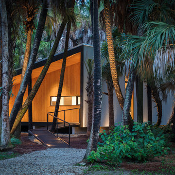
I built this on my property for my aging father who has some health issues. Handicap accessibility was a factor in design. His dream has always been to try retire to a cabin in the woods. This is what he got.
It is a 1 bedroom, 1 bath with a great room. It is 600 sqft of AC space. The footprint is 40' x 26' overall.
The site was the former home of our pig pen. I only had to take 1 tree to make this work and I planted 3 in its place. The axis is set from root ball to root ball. The rear center is aligned with mean sunset and is visible across a wetland.
The goal was to make the home feel like it was floating in the palms. The geometry had to simple and I didn't want it feeling heavy on the land so I cantilevered the structure beyond exposed foundation walls. My barn is nearby and it features old 1950's "S" corrugated metal panel walls. I used the same panel profile for my siding. I ran it vertical to math the barn, but also to balance the length of the structure and stretch the high point into the canopy, visually. The wood is all Southern Yellow Pine. This material came from clearing at the Babcock Ranch Development site. I ran it through the structure, end to end and horizontally, to create a seamless feel and to stretch the space. It worked. It feels MUCH bigger than it is.
I milled the material to specific sizes in specific areas to create precise alignments. Floor starters align with base. Wall tops adjoin ceiling starters to create the illusion of a seamless board. All light fixtures, HVAC supports, cabinets, switches, outlets, are set specifically to wood joints. The front and rear porch wood has three different milling profiles so the hypotenuse on the ceilings, align with the walls, and yield an aligned deck board below. Yes, I over did it. It is spectacular in its detailing. That's the benefit of small spaces.
Concrete counters and IKEA cabinets round out the conversation.
For those who could not live in a tiny house, I offer the Tiny-ish House.
Photos by Ryan Gamma
Staging by iStage Homes
Design assistance by Jimmy Thornton
Find the right local pro for your project

 Alana Spears Home, LLC
This modern organic kitchen blends rift white oak cabinetry with warm white uppers and a spacious island topped in quartz. Woven rattan counter stools introduce natural texture, while black dome pendants add bold contrast. A vertical picket marble backsplash and brass fixtures complete the light-filled, inviting space.
 Tutto Interiors
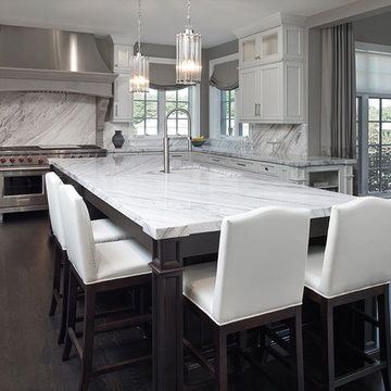
Full design of all Architectural details and finishes with turn key furnishings and styling throughout for this custom new construction kitchen. Dark Espresso kitchen island with Quartzite countertops accented with custom leather counter stools. Love the pendant lighting over the kitchen island.
Photography by Carlson Productions, LLC
 Chairish
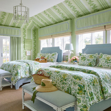
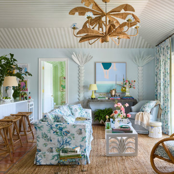
The Chairish Villa at The Colony is a celebration of authentic Palm Beach style, reimagined for today’s tastemaking and affluent guests. As America’s premier emporium for vintage and antique furnishings, Chairish is known for serving up historical design expertise with heaping sides of high/low chic and playful irreverence. Likewise, the Colony is celebrated the world over as a vintage mecca with a 100-year history of tastemaking residents.
This spirit of play guided our design approach, and the Chairish Villa fearlessly mixes historically significant, Palm Beach specific design themes with modern additions like contemporary art, mid-century furnishings and sophisticated layering to delight The Colony’s fashionable clientele. Chinoiserie motifs, animalia details, wicker, rattan, and breezy hues abound.
Palm Beach is a famed treasure trove of vintage and antique furnishings, offered by an extensive community of expert local purveyors. Almost all the furnishings selected by Chairish for the project were locally sourced from Chairish dealers within 5 miles from the hotel, making The Chairish Villa at The Colony both a fashionable and sustainable destination.
We used matching archival wallpaper and fabric pairings. This approach was specifically inspired by the Yellow Roses Room at the Flagler Mansion, and we sourced our textile, wallpaper, and trim pairings exclusively from our partner Schumacher Hospitality. Schumacher’s Del Tesoro pattern, based on a 19th-century French document, served as the project’s overall jumping off point. We also used Hydrangea Drape, which was inspired by a design of Hobe Erwin.
The villa features over 40 pieces of art: largely comprised of contemporary works from 20 artists from around the world, half of which were tapped to create original works specific to the space. This impressive showing is complemented by a small selection of vintage artwork as well. Noteworthy Artists include: Liz Marsh, Hope Olson, Brock DeBoer, Lia Burke Libaire, Venetia Syms, Ron Giusti, and Virginia Chamlee, among others.
Special thanks to our local partners for their incredible work on this project, particularly:
Catharine Willmer Interiors (Interior Design)
David’s Drapery Workroom (Window Treatments)
Associated Interior Designer Service (Upholstery)
Wallpaper by Wendy (Wallpaper Hanger/Installer)
Illume (Custom Lampshades)
 Chairish
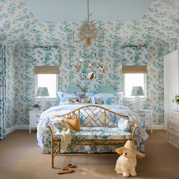
The Chairish Villa at The Colony is a celebration of authentic Palm Beach style, reimagined for today’s tastemaking and affluent guests. As America’s premier emporium for vintage and antique furnishings, Chairish is known for serving up historical design expertise with heaping sides of high/low chic and playful irreverence. Likewise, the Colony is celebrated the world over as a vintage mecca with a 100-year history of tastemaking residents.
This spirit of play guided our design approach, and the Chairish Villa fearlessly mixes historically significant, Palm Beach specific design themes with modern additions like contemporary art, mid-century furnishings and sophisticated layering to delight The Colony’s fashionable clientele. Chinoiserie motifs, animalia details, wicker, rattan, and breezy hues abound.
Palm Beach is a famed treasure trove of vintage and antique furnishings, offered by an extensive community of expert local purveyors. Almost all the furnishings selected by Chairish for the project were locally sourced from Chairish dealers within 5 miles from the hotel, making The Chairish Villa at The Colony both a fashionable and sustainable destination.
We used matching archival wallpaper and fabric pairings. This approach was specifically inspired by the Yellow Roses Room at the Flagler Mansion, and we sourced our textile, wallpaper, and trim pairings exclusively from our partner Schumacher Hospitality. Schumacher’s Del Tesoro pattern, based on a 19th-century French document, served as the project’s overall jumping off point. We also used Hydrangea Drape, which was inspired by a design of Hobe Erwin.
The villa features over 40 pieces of art: largely comprised of contemporary works from 20 artists from around the world, half of which were tapped to create original works specific to the space. This impressive showing is complemented by a small selection of vintage artwork as well. Noteworthy Artists include: Liz Marsh, Hope Olson, Brock DeBoer, Lia Burke Libaire, Venetia Syms, Ron Giusti, and Virginia Chamlee, among others.
Special thanks to our local partners for their incredible work on this project, particularly:
Catharine Willmer Interiors (Interior Design)
David’s Drapery Workroom (Window Treatments)
Associated Interior Designer Service (Upholstery)
Wallpaper by Wendy (Wallpaper Hanger/Installer)
Illume (Custom Lampshades)
 Chairish
The Chairish Villa at The Colony is a celebration of authentic Palm Beach style, reimagined for today’s tastemaking and affluent guests. As America’s premier emporium for vintage and antique furnishings, Chairish is known for serving up historical design expertise with heaping sides of high/low chic and playful irreverence. Likewise, the Colony is celebrated the world over as a vintage mecca with a 100-year history of tastemaking residents.
This spirit of play guided our design approach, and the Chairish Villa fearlessly mixes historically significant, Palm Beach specific design themes with modern additions like contemporary art, mid-century furnishings and sophisticated layering to delight The Colony’s fashionable clientele. Chinoiserie motifs, animalia details, wicker, rattan, and breezy hues abound.
Palm Beach is a famed treasure trove of vintage and antique furnishings, offered by an extensive community of expert local purveyors. Almost all the furnishings selected by Chairish for the project were locally sourced from Chairish dealers within 5 miles from the hotel, making The Chairish Villa at The Colony both a fashionable and sustainable destination.
We used matching archival wallpaper and fabric pairings. This approach was specifically inspired by the Yellow Roses Room at the Flagler Mansion, and we sourced our textile, wallpaper, and trim pairings exclusively from our partner Schumacher Hospitality. Schumacher’s Del Tesoro pattern, based on a 19th-century French document, served as the project’s overall jumping off point. We also used Hydrangea Drape, which was inspired by a design of Hobe Erwin.
The villa features over 40 pieces of art: largely comprised of contemporary works from 20 artists from around the world, half of which were tapped to create original works specific to the space. This impressive showing is complemented by a small selection of vintage artwork as well. Noteworthy Artists include: Liz Marsh, Hope Olson, Brock DeBoer, Lia Burke Libaire, Venetia Syms, Ron Giusti, and Virginia Chamlee, among others.
Special thanks to our local partners for their incredible work on this project, particularly:
Catharine Willmer Interiors (Interior Design)
David’s Drapery Workroom (Window Treatments)
Associated Interior Designer Service (Upholstery)
Wallpaper by Wendy (Wallpaper Hanger/Installer)
Illume (Custom Lampshades)
 Isla Homes
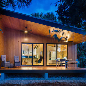
I built this on my property for my aging father who has some health issues. Handicap accessibility was a factor in design. His dream has always been to try retire to a cabin in the woods. This is what he got.
It is a 1 bedroom, 1 bath with a great room. It is 600 sqft of AC space. The footprint is 40' x 26' overall.
The site was the former home of our pig pen. I only had to take 1 tree to make this work and I planted 3 in its place. The axis is set from root ball to root ball. The rear center is aligned with mean sunset and is visible across a wetland.
The goal was to make the home feel like it was floating in the palms. The geometry had to simple and I didn't want it feeling heavy on the land so I cantilevered the structure beyond exposed foundation walls. My barn is nearby and it features old 1950's "S" corrugated metal panel walls. I used the same panel profile for my siding. I ran it vertical to match the barn, but also to balance the length of the structure and stretch the high point into the canopy, visually. The wood is all Southern Yellow Pine. This material came from clearing at the Babcock Ranch Development site. I ran it through the structure, end to end and horizontally, to create a seamless feel and to stretch the space. It worked. It feels MUCH bigger than it is.
I milled the material to specific sizes in specific areas to create precise alignments. Floor starters align with base. Wall tops adjoin ceiling starters to create the illusion of a seamless board. All light fixtures, HVAC supports, cabinets, switches, outlets, are set specifically to wood joints. The front and rear porch wood has three different milling profiles so the hypotenuse on the ceilings, align with the walls, and yield an aligned deck board below. Yes, I over did it. It is spectacular in its detailing. That's the benefit of small spaces.
Concrete counters and IKEA cabinets round out the conversation.
For those who cannot live tiny, I offer the Tiny-ish House.
Photos by Ryan Gamma
Staging by iStage Homes
Design Assistance Jimmy Thornton
 Isla Homes
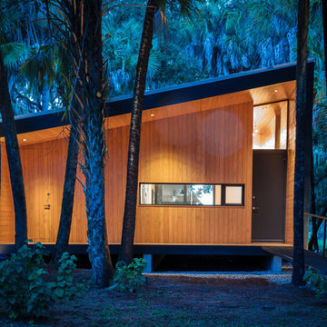
I built this on my property for my aging father who has some health issues. Handicap accessibility was a factor in design. His dream has always been to try retire to a cabin in the woods. This is what he got.
It is a 1 bedroom, 1 bath with a great room. It is 600 sqft of AC space. The footprint is 40' x 26' overall.
The site was the former home of our pig pen. I only had to take 1 tree to make this work and I planted 3 in its place. The axis is set from root ball to root ball. The rear center is aligned with mean sunset and is visible across a wetland.
The goal was to make the home feel like it was floating in the palms. The geometry had to simple and I didn't want it feeling heavy on the land so I cantilevered the structure beyond exposed foundation walls. My barn is nearby and it features old 1950's "S" corrugated metal panel walls. I used the same panel profile for my siding. I ran it vertical to math the barn, but also to balance the length of the structure and stretch the high point into the canopy, visually. The wood is all Southern Yellow Pine. This material came from clearing at the Babcock Ranch Development site. I ran it through the structure, end to end and horizontally, to create a seamless feel and to stretch the space. It worked. It feels MUCH bigger than it is.
I milled the material to specific sizes in specific areas to create precise alignments. Floor starters align with base. Wall tops adjoin ceiling starters to create the illusion of a seamless board. All light fixtures, HVAC supports, cabinets, switches, outlets, are set specifically to wood joints. The front and rear porch wood has three different milling profiles so the hypotenuse on the ceilings, align with the walls, and yield an aligned deck board below. Yes, I over did it. It is spectacular in its detailing. That's the benefit of small spaces.
Concrete counters and IKEA cabinets round out the conversation.
For those who could not live in a tiny house, I offer the Tiny-ish House.
Photos by Ryan Gamma
Staging by iStage Homes
Design assistance by Jimmy Thornton
 Dura Supreme Cabinetry
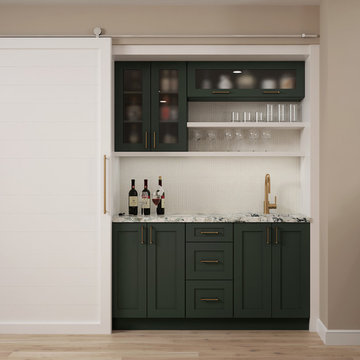
This savvy wet bar area in the dining room of this newly remodeled home features Sherwin-Williams “Jasper” SW 6216 on Dura Supreme’s Craftsman door style. This deep, sophisticated green color is green-black paint that’s sure to be a long-lasting classic. This color was selected for Dura Supreme’s 2017-2018 Curated Color Collection. Dura Supreme’s Curated Color Collection is a collection of cabinet paint colors that are always fresh, current and reflective of popular color trends for home interiors and cabinetry. This offering of colors is continuously updated as color trends shift.
Painted cabinetry is more popular than ever before and the color you select for your home should be a reflection of your personal taste and style. Our Personal Paint Match Program offers the entire Sherwin-William’s paint palette and Benjamin Moore’s paint palette, over 5,000 colors, for your new kitchen or bath cabinetry.
Color is a highly personal preference for most people and although there are specific colors that are considered “on trend” or fashionable, color choices should ultimately be based on what appeals to you personally. Homeowners often ask about color trends and how to incorporate them into newly designed or renovated interiors. And although trends and fashion should be taken into consideration, that should not be the only deciding factor. If you love a specific shade of green, select complementing neutrals and coordinating colors to create an entire palette that will remain an everlasting classic. It could be something as simple as being able to select the perfect shade of white that complements the countertop and tile and works well in a specific lighting situation. Our new Personal Paint Match system makes that process so much easier.
Request a FREE Dura Supreme Brochure Packet:
http://www.durasupreme.com/request-brochure
 Isla Homes
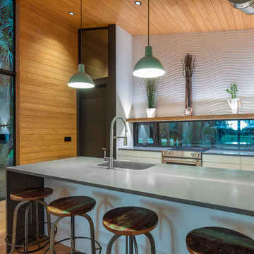
I built this on my property for my aging father who has some health issues. Handicap accessibility was a factor in design. His dream has always been to try retire to a cabin in the woods. This is what he got.
It is a 1 bedroom, 1 bath with a great room. It is 600 sqft of AC space. The footprint is 40' x 26' overall.
The site was the former home of our pig pen. I only had to take 1 tree to make this work and I planted 3 in its place. The axis is set from root ball to root ball. The rear center is aligned with mean sunset and is visible across a wetland.
The goal was to make the home feel like it was floating in the palms. The geometry had to simple and I didn't want it feeling heavy on the land so I cantilevered the structure beyond exposed foundation walls. My barn is nearby and it features old 1950's "S" corrugated metal panel walls. I used the same panel profile for my siding. I ran it vertical to match the barn, but also to balance the length of the structure and stretch the high point into the canopy, visually. The wood is all Southern Yellow Pine. This material came from clearing at the Babcock Ranch Development site. I ran it through the structure, end to end and horizontally, to create a seamless feel and to stretch the space. It worked. It feels MUCH bigger than it is.
I milled the material to specific sizes in specific areas to create precise alignments. Floor starters align with base. Wall tops adjoin ceiling starters to create the illusion of a seamless board. All light fixtures, HVAC supports, cabinets, switches, outlets, are set specifically to wood joints. The front and rear porch wood has three different milling profiles so the hypotenuse on the ceilings, align with the walls, and yield an aligned deck board below. Yes, I over did it. It is spectacular in its detailing. That's the benefit of small spaces.
Concrete counters and IKEA cabinets round out the conversation.
For those who cannot live tiny, I offer the Tiny-ish House.
Photos by Ryan Gamma
Staging by iStage Homes
Design Assistance Jimmy Thornton

 Everything Home
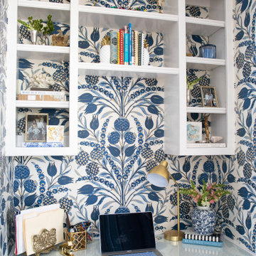
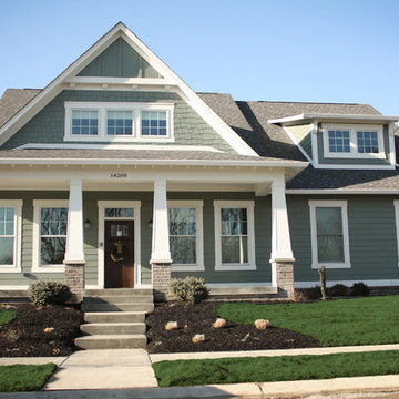
Soft, refreshing colors combine with comfortable furnishing and statement lighting in this elegant home:
Project completed by Wendy Langston's Everything Home interior design firm , which serves Carmel, Zionsville, Fishers, Westfield, Noblesville, and Indianapolis.
For more about Everything Home, click here: https://everythinghomedesigns.com/
 Isla Homes
I built this on my property for my aging father who has some health issues. Handicap accessibility was a factor in design. His dream has always been to try retire to a cabin in the woods. This is what he got.
It is a 1 bedroom, 1 bath with a great room. It is 600 sqft of AC space. The footprint is 40' x 26' overall.
The site was the former home of our pig pen. I only had to take 1 tree to make this work and I planted 3 in its place. The axis is set from root ball to root ball. The rear center is aligned with mean sunset and is visible across a wetland.
The goal was to make the home feel like it was floating in the palms. The geometry had to simple and I didn't want it feeling heavy on the land so I cantilevered the structure beyond exposed foundation walls. My barn is nearby and it features old 1950's "S" corrugated metal panel walls. I used the same panel profile for my siding. I ran it vertical to match the barn, but also to balance the length of the structure and stretch the high point into the canopy, visually. The wood is all Southern Yellow Pine. This material came from clearing at the Babcock Ranch Development site. I ran it through the structure, end to end and horizontally, to create a seamless feel and to stretch the space. It worked. It feels MUCH bigger than it is.
I milled the material to specific sizes in specific areas to create precise alignments. Floor starters align with base. Wall tops adjoin ceiling starters to create the illusion of a seamless board. All light fixtures, HVAC supports, cabinets, switches, outlets, are set specifically to wood joints. The front and rear porch wood has three different milling profiles so the hypotenuse on the ceilings, align with the walls, and yield an aligned deck board below. Yes, I over did it. It is spectacular in its detailing. That's the benefit of small spaces.
Concrete counters and IKEA cabinets round out the conversation.
For those who cannot live tiny, I offer the Tiny-ish House.
Photos by Ryan Gamma
Staging by iStage Homes
Design Assistance Jimmy Thornton
 Isla Homes
I built this on my property for my aging father who has some health issues. Handicap accessibility was a factor in design. His dream has always been to try retire to a cabin in the woods. This is what he got.
It is a 1 bedroom, 1 bath with a great room. It is 600 sqft of AC space. The footprint is 40' x 26' overall.
The site was the former home of our pig pen. I only had to take 1 tree to make this work and I planted 3 in its place. The axis is set from root ball to root ball. The rear center is aligned with mean sunset and is visible across a wetland.
The goal was to make the home feel like it was floating in the palms. The geometry had to simple and I didn't want it feeling heavy on the land so I cantilevered the structure beyond exposed foundation walls. My barn is nearby and it features old 1950's "S" corrugated metal panel walls. I used the same panel profile for my siding. I ran it vertical to match the barn, but also to balance the length of the structure and stretch the high point into the canopy, visually. The wood is all Southern Yellow Pine. This material came from clearing at the Babcock Ranch Development site. I ran it through the structure, end to end and horizontally, to create a seamless feel and to stretch the space. It worked. It feels MUCH bigger than it is.
I milled the material to specific sizes in specific areas to create precise alignments. Floor starters align with base. Wall tops adjoin ceiling starters to create the illusion of a seamless board. All light fixtures, HVAC supports, cabinets, switches, outlets, are set specifically to wood joints. The front and rear porch wood has three different milling profiles so the hypotenuse on the ceilings, align with the walls, and yield an aligned deck board below. Yes, I over did it. It is spectacular in its detailing. That's the benefit of small spaces.
Concrete counters and IKEA cabinets round out the conversation.
For those who cannot live tiny, I offer the Tiny-ish House.
Photos by Ryan Gamma
Staging by iStage Homes
Design Assistance Jimmy Thornton
 Isla Homes
I built this on my property for my aging father who has some health issues. Handicap accessibility was a factor in design. His dream has always been to try retire to a cabin in the woods. This is what he got.
It is a 1 bedroom, 1 bath with a great room. It is 600 sqft of AC space. The footprint is 40' x 26' overall.
The site was the former home of our pig pen. I only had to take 1 tree to make this work and I planted 3 in its place. The axis is set from root ball to root ball. The rear center is aligned with mean sunset and is visible across a wetland.
The goal was to make the home feel like it was floating in the palms. The geometry had to simple and I didn't want it feeling heavy on the land so I cantilevered the structure beyond exposed foundation walls. My barn is nearby and it features old 1950's "S" corrugated metal panel walls. I used the same panel profile for my siding. I ran it vertical to match the barn, but also to balance the length of the structure and stretch the high point into the canopy, visually. The wood is all Southern Yellow Pine. This material came from clearing at the Babcock Ranch Development site. I ran it through the structure, end to end and horizontally, to create a seamless feel and to stretch the space. It worked. It feels MUCH bigger than it is.
I milled the material to specific sizes in specific areas to create precise alignments. Floor starters align with base. Wall tops adjoin ceiling starters to create the illusion of a seamless board. All light fixtures, HVAC supports, cabinets, switches, outlets, are set specifically to wood joints. The front and rear porch wood has three different milling profiles so the hypotenuse on the ceilings, align with the walls, and yield an aligned deck board below. Yes, I over did it. It is spectacular in its detailing. That's the benefit of small spaces.
Concrete counters and IKEA cabinets round out the conversation.
For those who cannot live tiny, I offer the Tiny-ish House.
Photos by Ryan Gamma
Staging by iStage Homes
Design Assistance Jimmy Thornton

 Isla Homes
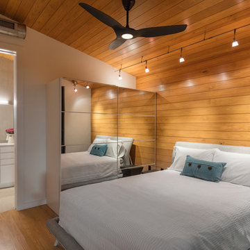
I built this on my property for my aging father who has some health issues. Handicap accessibility was a factor in design. His dream has always been to try retire to a cabin in the woods. This is what he got.
It is a 1 bedroom, 1 bath with a great room. It is 600 sqft of AC space. The footprint is 40' x 26' overall.
The site was the former home of our pig pen. I only had to take 1 tree to make this work and I planted 3 in its place. The axis is set from root ball to root ball. The rear center is aligned with mean sunset and is visible across a wetland.
The goal was to make the home feel like it was floating in the palms. The geometry had to simple and I didn't want it feeling heavy on the land so I cantilevered the structure beyond exposed foundation walls. My barn is nearby and it features old 1950's "S" corrugated metal panel walls. I used the same panel profile for my siding. I ran it vertical to match the barn, but also to balance the length of the structure and stretch the high point into the canopy, visually. The wood is all Southern Yellow Pine. This material came from clearing at the Babcock Ranch Development site. I ran it through the structure, end to end and horizontally, to create a seamless feel and to stretch the space. It worked. It feels MUCH bigger than it is.
I milled the material to specific sizes in specific areas to create precise alignments. Floor starters align with base. Wall tops adjoin ceiling starters to create the illusion of a seamless board. All light fixtures, HVAC supports, cabinets, switches, outlets, are set specifically to wood joints. The front and rear porch wood has three different milling profiles so the hypotenuse on the ceilings, align with the walls, and yield an aligned deck board below. Yes, I over did it. It is spectacular in its detailing. That's the benefit of small spaces.
Concrete counters and IKEA cabinets round out the conversation.
For those who cannot live tiny, I offer the Tiny-ish House.
Photos by Ryan Gamma
Staging by iStage Homes
Design Assistance Jimmy Thornton
31