
Search results for "Spending larger" in Home Design Ideas

 Provanti Designs, Inc
Like many, this family spends a lot time in the back half of their home. Built in 1988, the kitchen and family room were cramped and dimly lit. With this remodel, they wanted a larger space to provide both an updated gourmet kitchen and a family room suitable for entertaining.
While unsure of what new products and current styles to incorporate, these empty-nesters definitely had some notions of what they didn’t like although they didn’t always agree. They wanted the two rooms to flow comfortably and to present an integrated design. Voila – an entertaining space was born and they absolutely love it!
Clarity Northwest Photography: Matthew Gallant
 Curated by Claire
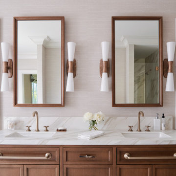
Large transitional master white tile and marble tile marble floor, white floor, double-sink and wallpaper freestanding bathtub photo in San Francisco with recessed-panel cabinets, brown cabinets, a one-piece toilet, beige walls, an undermount sink, marble countertops, a hinged shower door, white countertops and a built-in vanity
 Provanti Designs, Inc
Like many, this family spends a lot time in the back half of their home. Built in 1988, the kitchen and family room were cramped and dimly lit. With this remodel, they wanted a larger space to provide both an updated gourmet kitchen and a family room suitable for entertaining.
While unsure of what new products and current styles to incorporate, these empty-nesters definitely had some notions of what they didn’t like although they didn’t always agree. They wanted the two rooms to flow comfortably and to present an integrated design. Voila – an entertaining space was born and they absolutely love it!
Clarity Northwest Photography: Matthew Gallant
Find the right local pro for your project
 Simply Home Decorating
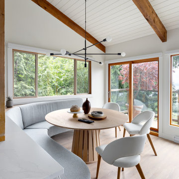
The new owners of this 1974 Post and Beam home originally contacted us for help furnishing their main floor living spaces. But it wasn’t long before these delightfully open minded clients agreed to a much larger project, including a full kitchen renovation. They were looking to personalize their “forever home,” a place where they looked forward to spending time together entertaining friends and family.
In a bold move, we proposed teal cabinetry that tied in beautifully with their ocean and mountain views and suggested covering the original cedar plank ceilings with white shiplap to allow for improved lighting in the ceilings. We also added a full height panelled wall creating a proper front entrance and closing off part of the kitchen while still keeping the space open for entertaining. Finally, we curated a selection of custom designed wood and upholstered furniture for their open concept living spaces and moody home theatre room beyond.
This project is a Top 5 Finalist for Western Living Magazine's 2021 Home of the Year.

 Woodland Cabinetry
Mid-sized elegant l-shaped brown floor and dark wood floor open concept kitchen photo with a farmhouse sink, white cabinets, granite countertops, green backsplash, stainless steel appliances, an island, white countertops, shaker cabinets and subway tile backsplash
 Provanti Designs, Inc
Like many, this family spends a lot time in the back half of their home. Built in 1988, the kitchen and family room were cramped and dimly lit. With this remodel, they wanted a larger space to provide both an updated gourmet kitchen and a family room suitable for entertaining.
While unsure of what new products and current styles to incorporate, these empty-nesters definitely had some notions of what they didn’t like although they didn’t always agree. They wanted the two rooms to flow comfortably and to present an integrated design. Voila – an entertaining space was born and they absolutely love it!
Clarity Northwest Photography: Matthew Gallant

 User
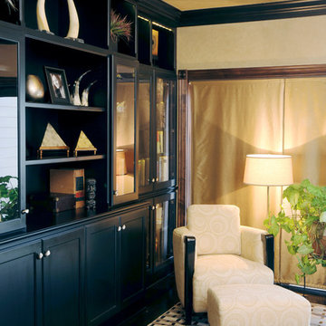
Making a small room feel spacious is always a challenge. Michael Merrill Design Studio designed this 110 square foot guest bedroom in the quietest, simplest, most unobtrusive way possible using many visual cues to create a calm and seemingly larger volume. Diagonal sightlines, open back chairs, furniture that does not extend to the floor, open weave fabrics at the windows all contribute to a sense of spaciousness. This is a room we hope a guest would be happy to spend more than a single night in. (2001)
Photos © Mark Darley Interior And Architectural Photography


 Whistler Builder
Our client planned to spend more time in this home and wanted to increase its livability. The project was complicated by the strata-specified deadline for exterior work, the logistics of working in an occupied strata complex, and the need to minimize the impact on surrounding neighbours.
By reducing the deck space, removing the hot tub, and moving out the dining room wall, we were able to add important livable space inside. Our homeowners were thrilled to have a larger kitchen. The additional 500 square feet of living space integrated seamlessly into the existing architecture.
This award-winning home features reclaimed fir flooring (from the Stanley Park storm), and wood-cased sliding doors in the dining room, that allow full access to the outdoor balcony with its exquisite views.
Green building products and processes were used extensively throughout the renovation, which resulted in a modern, highly-efficient, and beautiful home.

 TKS Design Group
Free ebook, Creating the Ideal Kitchen. DOWNLOAD NOW
This client wanted a complete update of their kitchen and came to us with several objectives. They wanted a larger island and easier access to the dining room. They also wanted to eliminate the existing cooktop location from the island and make the island larger. Because the existing space was not able to accommodate all those requests, we decided to eliminate the breakfast area and incorporate that space into the kitchen. By eliminating an existing bay window and making the kitchen sink window larger, we were able to make the new layout work without sacrificing any natural light. A French door to the newly added and adjoining sunroom and casual outdoor dining spot still allows for multiple dining options. And by enlarging the opening to the dining room, it allows for easier access to this space on a daily basis versus for special occasions only.
The client already had a large desk in the kitchen and spends a lot of time at this area. We were able to make the new desk even larger by moving the refrigerator to another area. The refrigerator is covered in decorative panels so that it blends nicely into the furniture look of the room. The larger island can now seat several people comfortably.
The room’s traditional feel was achieved by providing different finishes on the perimeter, island and desk cabinetry. Handmade gray backsplash tile, a combination of soapstone and Carrera marble give the space a classic appeal. Details provide interest – custom glass mullions, decorative wood hood and bronze hardware give the space character and charm.
Designed by: Susan Klimala, CKD, CBD
Interior Design by: Rachel Alcorn
Architect: Rick Rearick
Contractor: KJN Renovations
Photography by: Mike Kaskel
For more information on kitchen and bath design ideas go to: www.kitchenstudio-ge.com
 Provanti Designs, Inc
Like many, this family spends a lot time in the back half of their home. Built in 1988, the kitchen and family room were cramped and dimly lit. With this remodel, they wanted a larger space to provide both an updated gourmet kitchen and a family room suitable for entertaining.
While unsure of what new products and current styles to incorporate, these empty-nesters definitely had some notions of what they didn’t like although they didn’t always agree. They wanted the two rooms to flow comfortably and to present an integrated design. Voila – an entertaining space was born and they absolutely love it!
Clarity Northwest Photography: Matthew Gallant
 TKS Design Group
Free ebook, Creating the Ideal Kitchen. DOWNLOAD NOW
Starting out with a project that has good bones is always a bonus as was the case with the project. This young family has a great house on a great street in a great location. The kitchen was a large space with ample room and great view to the backyard. The dated cabinets and large peninsula layout however were not working for them, so they came in looking for a fresh start.
Goals for the project included adding a large island with seating for four and a bright, open and cheerful space for daily meals and entertaining. Our clients also wanted to keep the existing breakfast table, but the original space did not allow for an island and breakfast table. Our solution was to create banquette seating which gave us the extra inches necessary to accomplish both.
The larger awning window over the kitchen sink allows for ample light in the new space. The wall between the kitchen and family room was partially removed to provide the more open feeling our clients desired.
The work triangle is centered on the island which serves as a big open prep space conveniently located across from the large pro style range. The island also houses the microwave and a 2nd oven for larger gatherings. A new counter depth fridge and beverage center provide options for refrigeration.
A simple pallet of white cabinetry, Carrera marble countertops and polished nickel fixtures will be a timeless look and provide a lovely backdrop for entertaining and spending time with family.
Designed by: Susan Klimala, CKD, CBD
Photography by: Mike Kaskel
For more information on kitchen and bath design ideas go to: www.kitchenstudio-ge.com
 TKS Design Group
Free ebook, Creating the Ideal Kitchen. DOWNLOAD NOW
This client wanted a complete update of their kitchen and came to us with several objectives. They wanted a larger island and easier access to the dining room. They also wanted to eliminate the existing cooktop location from the island and make the island larger. Because the existing space was not able to accommodate all those requests, we decided to eliminate the breakfast area and incorporate that space into the kitchen. By eliminating an existing bay window and making the kitchen sink window larger, we were able to make the new layout work without sacrificing any natural light. A French door to the newly added and adjoining sunroom and casual outdoor dining spot still allows for multiple dining options. And by enlarging the opening to the dining room, it allows for easier access to this space on a daily basis versus for special occasions only.
The client already had a large desk in the kitchen and spends a lot of time at this area. We were able to make the new desk even larger by moving the refrigerator to another area. The refrigerator is covered in decorative panels so that it blends nicely into the furniture look of the room. The larger island can now seat several people comfortably.
The room’s traditional feel was achieved by providing different finishes on the perimeter, island and desk cabinetry. Handmade gray backsplash tile, a combination of soapstone and Carrera marble give the space a classic appeal. Details provide interest – custom glass mullions, decorative wood hood and bronze hardware give the space character and charm.
Designed by: Susan Klimala, CKD, CBD
Interior Design by: Rachel Alcorn
Architect: Rick Rearick
Contractor: KJN Renovations
Photography by: Mike Kaskel
For more information on kitchen and bath design ideas go to: www.kitchenstudio-ge.com
 Whistler Builder
Our client planned to spend more time in this home and wanted to increase its livability. The project was complicated by the strata-specified deadline for exterior work, the logistics of working in an occupied strata complex, and the need to minimize the impact on surrounding neighbours.
By reducing the deck space, removing the hot tub, and moving out the dining room wall, we were able to add important livable space inside. Our homeowners were thrilled to have a larger kitchen. The additional 500 square feet of living space integrated seamlessly into the existing architecture.
This award-winning home features reclaimed fir flooring (from the Stanley Park storm), and wood-cased sliding doors in the dining room, that allow full access to the outdoor balcony with its exquisite views.
Green building products and processes were used extensively throughout the renovation, which resulted in a modern, highly-efficient, and beautiful home.

 Carolyn Reyes
Photo: Carolyn Reyes © 2016 Houzz
Design: Kelly Mack Home
Inspiration for a victorian bathroom remodel in Los Angeles with recessed-panel cabinets, red cabinets, yellow walls and an undermount sink
Inspiration for a victorian bathroom remodel in Los Angeles with recessed-panel cabinets, red cabinets, yellow walls and an undermount sink
 Decks by Schmillen LLC
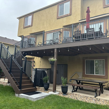
Our customers love spending time outdoors, but their small redwood deck was not conducive to entertaining family and friends. We met with the owners and designed a much larger 10' x 26' composite deck for them. The decking material is Fiberon GoodLife Bungalow with a 3/4 picture frame border in Fiberon Sanctuary Espresso. The deck railing is a Fortress Fe26 steel panel system in matte black with 3" metal posts and pressed dome post caps. The staircase consists of a 90-degree turn landing, with the step treads and risers in the Fiberon Espresso.

 Parker Landscape Design
The homeowners wished to create a larger entertainment space that was conducive to throwing parties and just relaxing with their own family. An outdoor kitchen and firepit were built to allow their family to spend more time outdoors grilling and roasting marshmallows. The newly constructed paver patio was softened by plantings that were chosen for striking color and diversity of bloom time. Soft LED mood lighting helped to create a relaxing ambience and made our clients feel like they were on vacation at their own home.

 Joy Martin Architecture
Renovation of a classic Minneapolis bungalow included this family bathroom. An adjacent closet was converted to a walk-in glass shower and small sinks allowed room for two vanities. The mirrored wall and simple palette helps make the room feel larger. Playful accents like cow head towel hooks from CB2 and custom children's step stools add interest and function to this bathroom. The hexagon floor tile was selected to be in keeping with the original 1920's era of the home.
This bathroom used to be tiny and was the only bathroom on the 2nd floor. We chose to spend the budget on making a very functional family bathroom now and add a master bathroom when the children get bigger. Maybe there is a space in your home that needs a transformation - message me to set up a free consultation today.
Photos: Peter Atkins Photography
 Drury Design
Design objectives for the remodel were aimed at maximizing the flow and functionality of a foodie-level kitchen with multiple cooks, while enhancing the family’s preferences for spending time in the space together:
Create a better workflow
Space out the appliances for better use of the kitchen area
Make the space feel larger visually
Update all materials so the kitchen isn’t all wood
No seating at an island or peninsula
Larger walkways
Brighten up the space with more lights and lighter colors
THE REMODEL
Design challenges to be solved:
The idea was to work within the current walls of the kitchen. Without removing walls, it was more of a challenge to give the kitchen a larger, new feel.
An island in the middle area was part of the original vision. Could a different countertop arrangement incorporate the same purpose?
The homeowners are big cooks so creating room for a larger refrigerator and more countertop space by the range were musts!
The sink and range were originally right next to each other, making things tough for two cooks to work at the same time. How could the new space allow for two work areas while minimizing traffic jams?
THE RENEWED SPACE
Design solutions fell into place once the overall layout was revamped to improve flow and functionality:
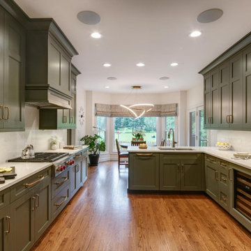
The refrigerator was originally in the middle of the main walkway. To gain more walk space and room for a larger refrigerator, we moved this appliance to the back wall.
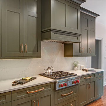
The final design still has a peninsula but we flipped it to the opposite wall. This way, the walkway is more accommodating for traffic entering and exiting through the back garage door. This also gave way to a longer run of countertop space along the cooking wall.
To take cooking to another level, we implemented a speed oven!
The large window by the eating area is also nice for cooks to see, so we kept the sink in the peninsula.
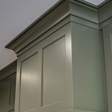
To gain space for storage and make the kitchen feel larger, we brought the wall cabinets all the way to the ceiling. What once felt tight now feels grand!
 Drury Design
Design objectives for the remodel were aimed at maximizing the flow and functionality of a foodie-level kitchen with multiple cooks, while enhancing the family’s preferences for spending time in the space together:
Create a better workflow
Space out the appliances for better use of the kitchen area
Make the space feel larger visually
Update all materials so the kitchen isn’t all wood
No seating at an island or peninsula
Larger walkways
Brighten up the space with more lights and lighter colors
THE REMODEL
Design challenges to be solved:
The idea was to work within the current walls of the kitchen. Without removing walls, it was more of a challenge to give the kitchen a larger, new feel.
An island in the middle area was part of the original vision. Could a different countertop arrangement incorporate the same purpose?
The homeowners are big cooks so creating room for a larger refrigerator and more countertop space by the range were musts!
The sink and range were originally right next to each other, making things tough for two cooks to work at the same time. How could the new space allow for two work areas while minimizing traffic jams?
THE RENEWED SPACE
Design solutions fell into place once the overall layout was revamped to improve flow and functionality:
The refrigerator was originally in the middle of the main walkway. To gain more walk space and room for a larger refrigerator, we moved this appliance to the back wall.
The final design still has a peninsula but we flipped it to the opposite wall. This way, the walkway is more accommodating for traffic entering and exiting through the back garage door. This also gave way to a longer run of countertop space along the cooking wall.
To take cooking to another level, we implemented a speed oven!
The large window by the eating area is also nice for cooks to see, so we kept the sink in the peninsula.
To gain space for storage and make the kitchen feel larger, we brought the wall cabinets all the way to the ceiling. What once felt tight now feels grand!
 Drury Design
Design objectives for the remodel were aimed at maximizing the flow and functionality of a foodie-level kitchen with multiple cooks, while enhancing the family’s preferences for spending time in the space together:
Create a better workflow
Space out the appliances for better use of the kitchen area
Make the space feel larger visually
Update all materials so the kitchen isn’t all wood
No seating at an island or peninsula
Larger walkways
Brighten up the space with more lights and lighter colors
THE REMODEL
Design challenges to be solved:
The idea was to work within the current walls of the kitchen. Without removing walls, it was more of a challenge to give the kitchen a larger, new feel.
An island in the middle area was part of the original vision. Could a different countertop arrangement incorporate the same purpose?
The homeowners are big cooks so creating room for a larger refrigerator and more countertop space by the range were musts!
The sink and range were originally right next to each other, making things tough for two cooks to work at the same time. How could the new space allow for two work areas while minimizing traffic jams?
THE RENEWED SPACE
Design solutions fell into place once the overall layout was revamped to improve flow and functionality:
The refrigerator was originally in the middle of the main walkway. To gain more walk space and room for a larger refrigerator, we moved this appliance to the back wall.
The final design still has a peninsula but we flipped it to the opposite wall. This way, the walkway is more accommodating for traffic entering and exiting through the back garage door. This also gave way to a longer run of countertop space along the cooking wall.
To take cooking to another level, we implemented a speed oven!
The large window by the eating area is also nice for cooks to see, so we kept the sink in the peninsula.
To gain space for storage and make the kitchen feel larger, we brought the wall cabinets all the way to the ceiling. What once felt tight now feels grand!
11