
Search results for "Start losing" in Home Design Ideas
 Revealing Redesign
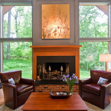
In June of 2015 an amazing sudden summer storm hit our area with violent winds, rain, and tornados. In the aftermath, my clients found, on top of losing 30 or so trees on their property overall, one had actually struck their home, piercing the roof in their great room.
The great room was the very last room in their house that we hadn't done a complete overhaul in. Sure, we had tweaked it, purchased a few pieces of furniture, reworked the layout, but the colors and design were much the same as they had been for decades.
Since things needed to be repaired and painted already, it was decided to jump in with both feet and totally rethink the room, change almost everything, and add architectural details that seemed to be missing in the original design from the 1980's.
So not only were the color palette, rugs, and furnishings changed, but some very important architectural interest was added. For instance, a new, more elegant post was added at the back of the space, visually connecting the downstairs with the loft above. Also, three beaded beams have been added across the vaulted ceiling, as well as a large chandelier, giving warmth, light and visual heft to the peak and upper corners of the room.
The fireplace was given a total facelift as well. New original artwork, which had inspired the palette for the space, is now highlighted inside a custom panel over a beautiful new mantel and fireplace surround.
Even though this project started with something quite unexpected and scary, my clients tell me that the results are something that they just love and enjoy whether at home just the two of them, or entertaining extended family and friends.
Photos by Laura Kicey
 C&R Remodeling
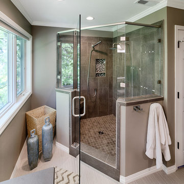
It all started with an unwelcome surprise for these homeowners: stray Lego down the shower drain. Without any other reasonable way to access second-story plumbing, the fiberglass shower had to be removed to make repairs. At that point, the owners figured they might as well take advantage of the opportunity to update their bathroom.
 Acorn Cottage Style
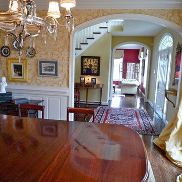
From the front entry foyer the rooms open into the dining room on the left, and the music room on the right. The Turkish oriental in the entry hides traffic and acts as a piece of floor art. The old hand woven carpets will hold up for thousands of years as long as they have a good pad underneath to protect the knots from grinding against the hard surface of the floor. Once the knots are ground away the carpet will start going bald and losing it's pile.
It is important when considering furnishings and colors how one room leads into and relates to another. Here the pop of the raspberry colored walls is repeated in the Orientals in both the entry and in the music room/ The gold oatmeal of the custom made relaxed raw silk Roman shades in the music room relate back to the Dupioni silk drapery in the Dining Room. The entry foyer acts as a transition both in color and furniture style between the dining room and the music room.
Find the right local pro for your project

 Joy Street Design
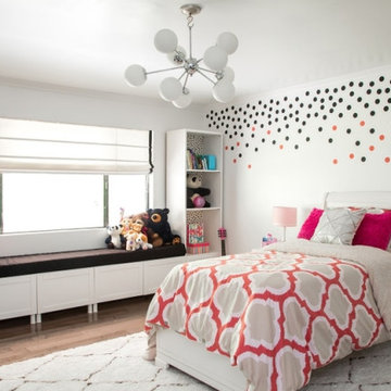
A gorgeous kitchen showcasing a brand new color palette of gray and bold blue! As this was the client’s childhood home, we wanted to preserve her memories while still refreshing the interior and bringing it up-to-date. We started with a new spatial layout and increased the size of wall openings to create the sense of an open plan without removing all the walls. By adding a more functional layout and pops of color throughout the space, we were able to achieve a youthful update to a cherished space without losing all the character and memories that the homeowner loved.
Designed by Joy Street Design serving Oakland, Berkeley, San Francisco, and the whole of the East Bay.
For more about Joy Street Design, click here: https://www.joystreetdesign.com/
To learn more about this project, click here: https://www.joystreetdesign.com/portfolio/randolph-street
 Realogics Sotheby's International Realty
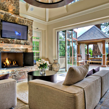
Start the day with a glass of wine in the kitchen, lose your voice watching the Hawks take on the Patriots and end with a celebratory cigar on the veranda. Best Superbowl Ever.
 J & N Lifestyle-Kitchens LLC
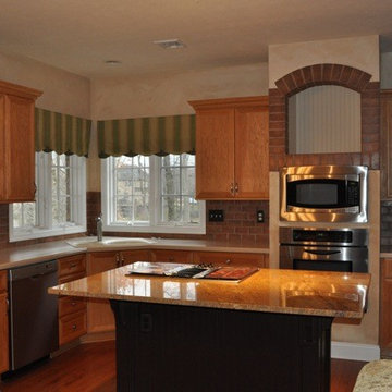
Cabinet Refacing project. Builder oak cabinets in place with granite down. Instead of losing all of granite and starting over with a complete remodel, we saved Thousands of dollars in refacing cabinets

 Joy Street Design
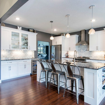
A gorgeous kitchen showcasing a brand new color palette of gray and bold blue! As this was the client’s childhood home, we wanted to preserve her memories while still refreshing the interior and bringing it up-to-date. We started with a new spatial layout and increased the size of wall openings to create the sense of an open plan without removing all the walls. By adding a more functional layout and pops of color throughout the space, we were able to achieve a youthful update to a cherished space without losing all the character and memories that the homeowner loved.
Designed by Joy Street Design serving Oakland, Berkeley, San Francisco, and the whole of the East Bay.
For more about Joy Street Design, click here: https://www.joystreetdesign.com/
To learn more about this project, click here: https://www.joystreetdesign.com/portfolio/randolph-street
 Revealing Redesign
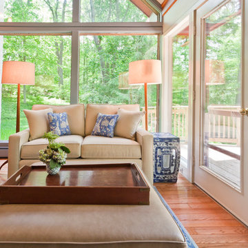
In June of 2015 an amazing sudden summer storm hit our area with violent winds, rain, and tornados. In the aftermath, my clients found, on top of losing 30 or so trees on their property overall, one had actually struck their home, piercing the roof in their great room.
The great room was the very last room in their house that we hadn't done a complete overhaul in. Sure, we had tweaked it, purchased a few pieces of furniture, reworked the layout, but the colors and design were much the same as they had been for decades.
Since things needed to be repaired and painted already, it was decided to jump in with both feet and totally rethink the room, change almost everything, and add architectural details that seemed to be missing in the original design from the 1980's.
So not only were the color palette, rugs, and furnishings changed, but some very important architectural interest was added. For instance, a new, more elegant post was added at the back of the space, visually connecting the downstairs with the loft above. Also, three beaded beams have been added across the vaulted ceiling, as well as a large chandelier, giving warmth, light and visual heft to the peak and upper corners of the room.
The fireplace was given a total facelift as well. New original artwork, which had inspired the palette for the space, is now highlighted inside a custom panel over a beautiful new mantel and fireplace surround.
Even though this project started with something quite unexpected and scary, my clients tell me that the results are something that they just love and enjoy whether at home just the two of them, or entertaining extended family and friends.
Photos by Laura Kicey
 Powell Construction
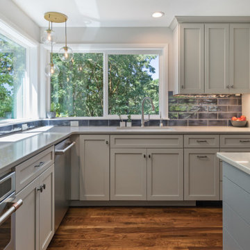
After undertaking a few minor updates over the years, these homeowners came to us ready to tear out their kitchen and start from scratch. The existing kitchen was large, but not laid out well for the everyday use it was getting. A bulky double fireplace in the center of the living space took up a lot of room and made the dining room feel disconnected from the kitchen, despite the substantial opening between the two. We removed the oversized wood burning fireplace and replaced it with a smaller gas one with shiplap above, creating a stylish featured piece. Meanwhile the kitchen was reimagined and reorganized into a functional space for a home chef that will work better for years to come.
These homeowners’ main concern was to update the style and function, as well as having quality materials that would stand the test of time. They wanted updated, gray cabinets; but didn’t want to lose any of the warm feeling of their home. Together with our design team they chose a light, warm gray for the perimeter cabinets and a darker gray to make the island a focal piece. The warm, light colored quartz countertops blend with the lighter gray and contrast nicely with the island. The textured dark blue backsplash tile adds a fun and exciting pop of color without stealing attention from any of the other pieces. To further maintain the warmth, they chose a rich walnut flooring with bold grain patterns.
When the homeowners fell in love with some contemporary brass colored light fixtures, they were nervous that they would compete with their stainless steel appliances and other silver toned pieces. By keeping all the lights in the same color family, we were able to achieve a look that feels intentional and modern. The corner 3-light pendant adds light and interest to the space. Not wanting to take up wall cabinet space with a bulky microwave, they opted for one built into a base cabinet. The other small appliances are neatly hidden away behind custom appliance garages.
For the fireplace, we focused on a clean, bright look that would stand out and look beautiful without competing with the neighboring kitchen. A small powder bathroom was also reorganized to better utilize the potential storage space and add counter space for guests. The style of the kitchen cabinetry was incorporated into the bathroom as well as into the dining room, which featured glass front cabinets to display dishes and mementos.
The redesigned space resulted in a warm and beautiful kitchen and dining area that will be enjoyed for years to come. The main floor living space now feels as cohesive as it was always meant to.
 Powell Construction
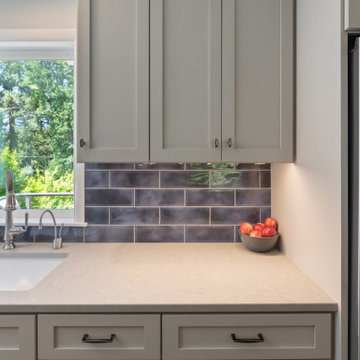
After undertaking a few minor updates over the years, these homeowners came to us ready to tear out their kitchen and start from scratch. The existing kitchen was large, but not laid out well for the everyday use it was getting. A bulky double fireplace in the center of the living space took up a lot of room and made the dining room feel disconnected from the kitchen, despite the substantial opening between the two. We removed the oversized wood burning fireplace and replaced it with a smaller gas one with shiplap above, creating a stylish featured piece. Meanwhile the kitchen was reimagined and reorganized into a functional space for a home chef that will work better for years to come.
These homeowners’ main concern was to update the style and function, as well as having quality materials that would stand the test of time. They wanted updated, gray cabinets; but didn’t want to lose any of the warm feeling of their home. Together with our design team they chose a light, warm gray for the perimeter cabinets and a darker gray to make the island a focal piece. The warm, light colored quartz countertops blend with the lighter gray and contrast nicely with the island. The textured dark blue backsplash tile adds a fun and exciting pop of color without stealing attention from any of the other pieces. To further maintain the warmth, they chose a rich walnut flooring with bold grain patterns.
When the homeowners fell in love with some contemporary brass colored light fixtures, they were nervous that they would compete with their stainless steel appliances and other silver toned pieces. By keeping all the lights in the same color family, we were able to achieve a look that feels intentional and modern. The corner 3-light pendant adds light and interest to the space. Not wanting to take up wall cabinet space with a bulky microwave, they opted for one built into a base cabinet. The other small appliances are neatly hidden away behind custom appliance garages.
For the fireplace, we focused on a clean, bright look that would stand out and look beautiful without competing with the neighboring kitchen. A small powder bathroom was also reorganized to better utilize the potential storage space and add counter space for guests. The style of the kitchen cabinetry was incorporated into the bathroom as well as into the dining room, which featured glass front cabinets to display dishes and mementos.
The redesigned space resulted in a warm and beautiful kitchen and dining area that will be enjoyed for years to come. The main floor living space now feels as cohesive as it was always meant to.
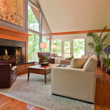 Revealing Redesign
In June of 2015 an amazing sudden summer storm hit our area with violent winds, rain, and tornados. In the aftermath, my clients found, on top of losing 30 or so trees on their property overall, one had actually struck their home, piercing the roof in their great room.
The great room was the very last room in their house that we hadn't done a complete overhaul in. Sure, we had tweaked it, purchased a few pieces of furniture, reworked the layout, but the colors and design were much the same as they had been for decades.
Since things needed to be repaired and painted already, it was decided to jump in with both feet and totally rethink the room, change almost everything, and add architectural details that seemed to be missing in the original design from the 1980's.
So not only were the color palette, rugs, and furnishings changed, but some very important architectural interest was added. For instance, a new, more elegant post was added at the back of the space, visually connecting the downstairs with the loft above. Also, three beaded beams have been added across the vaulted ceiling, as well as a large chandelier, giving warmth, light and visual heft to the peak and upper corners of the room.
The fireplace was given a total facelift as well. New original artwork, which had inspired the palette for the space, is now highlighted inside a custom panel over a beautiful new mantel and fireplace surround.
Even though this project started with something quite unexpected and scary, my clients tell me that the results are something that they just love and enjoy whether at home just the two of them, or entertaining extended family and friends.
Photos by Laura Kicey
20