
Search results for "Start thinking" in Home Design Ideas
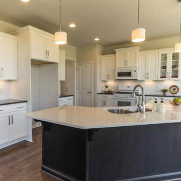
 Inde Kitchen Remodelers
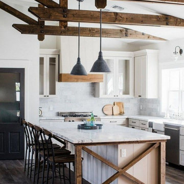
It's time to start thinking about refreshing your kitchen in time for the holidays! Call (585) 249-8100 or schedule an online appointment today.
Inspiration for a kitchen remodel in New York
Inspiration for a kitchen remodel in New York
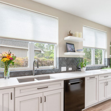
 DTH Remodeling
Swipe through to see this stunning transformation! We took this space from dark, closed-off, and outdated… to bright, open, and modern with clean lines and timeless finishes.
Featuring:
✔️ Custom white shaker cabinetry
✔️ Sleek quartz countertops
✔️ Statement backsplash with texture and depth
✔️ Improved lighting that completely changes the feel of the space
✔️ Open flow into the living area for better functionality
Every detail was designed to maximize light, storage, and everyday livability—and the result speaks for itself.
? Serving The Woodlands and Houston’s premier neighborhoods including Memorial, River Oaks, West University, Bellaire, and more!
? Visit www.dthremodel.com to get started
Thinking about transforming your kitchen? Let’s bring your vision to life.
➡️ Don’t miss the BEFORE at the end!
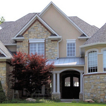
 Carrington Homes Inc.
When it comes to building a custom home, you probably have stacks of photos and notebooks of ideas. One of the things most likely heavy on your mind is the size of your future home. There are several factors that must be considered when choosing the right size. To help you get started thinking about these ideas, take a look at these considerations:
Find the right local pro for your project
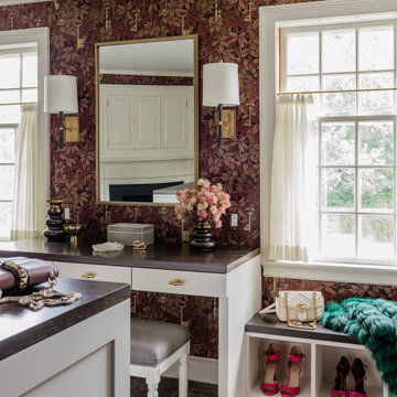
 MANDARINA STUDIO interior design
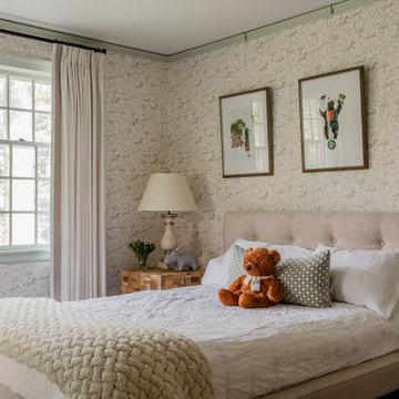
Summary of Scope: gut renovation/reconfiguration of kitchen, coffee bar, mudroom, powder room, 2 kids baths, guest bath, master bath and dressing room, kids study and playroom, study/office, laundry room, restoration of windows, adding wallpapers and window treatments
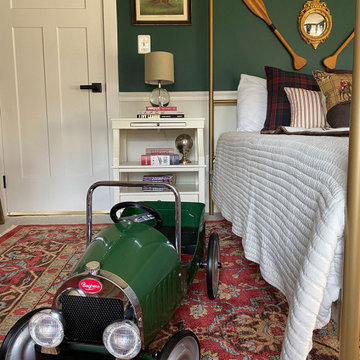
Background/description: The house was built in 1908, my clients are only the 3rd owners of the house. The prior owner lived there from 1940s until she died at age of 98! The old home had loads of character and charm but was in pretty bad condition and desperately needed updates. The clients purchased the home a few years ago and did some work before they moved in (roof, HVAC, electrical) but decided to live in the house for a 6 months or so before embarking on the next renovation phase. I had worked with the clients previously on the wife's office space and a few projects in a previous home including the nursery design for their first child so they reached out when they were ready to start thinking about the interior renovations. The goal was to respect and enhance the historic architecture of the home but make the spaces more functional for this couple with two small kids. Clients were open to color and some more bold/unexpected design choices. The design style is updated traditional with some eclectic elements. An early design decision was to incorporate a dark colored french range which would be the focal point of the kitchen and to do dark high gloss lacquered cabinets in the adjacent coffee bar, and we ultimately went with dark green.
 Rose T Bien-Aime
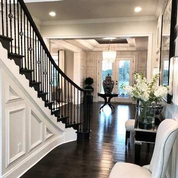
The goal for this entire home was to design everything in black & white and keep each room interesting, well design, sophisticated and most of all, timeless.
A great entryway sets the tone for the rest of your home and prepares you for what’s next. I designed this entryway to be tasteful well design but bold and dramatic to keep you interested. I wanted everyone that entered this house to start thinking in their mind “I want to see more!”
The lighting and artwork I picked out were all out of my clients’ comfort zone, but they trusted me enough to go with my design. I love it when my clients aren’t afraid to take the risk, it always pays off at end!
Let the Picture speak for itself!
Photo Credits: Rose T. Bien-Aime
 MANDARINA STUDIO interior design
Summary of Scope: gut renovation/reconfiguration of kitchen, coffee bar, mudroom, powder room, 2 kids baths, guest bath, master bath and dressing room, kids study and playroom, study/office, laundry room, restoration of windows, adding wallpapers and window treatments
Background/description: The house was built in 1908, my clients are only the 3rd owners of the house. The prior owner lived there from 1940s until she died at age of 98! The old home had loads of character and charm but was in pretty bad condition and desperately needed updates. The clients purchased the home a few years ago and did some work before they moved in (roof, HVAC, electrical) but decided to live in the house for a 6 months or so before embarking on the next renovation phase. I had worked with the clients previously on the wife's office space and a few projects in a previous home including the nursery design for their first child so they reached out when they were ready to start thinking about the interior renovations. The goal was to respect and enhance the historic architecture of the home but make the spaces more functional for this couple with two small kids. Clients were open to color and some more bold/unexpected design choices. The design style is updated traditional with some eclectic elements. An early design decision was to incorporate a dark colored french range which would be the focal point of the kitchen and to do dark high gloss lacquered cabinets in the adjacent coffee bar, and we ultimately went with dark green.
 User
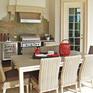
UserNow is the time to start thinking about that outdoor kitchen project so you are ready for a great spring entertaining season!
See ideas at http://www.arthurrutenberghomes.com/


 Granite & Kitchen Studio
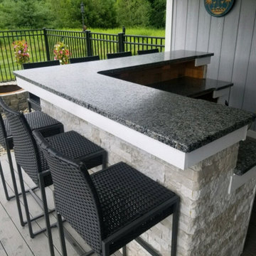
New Caledonia to top this outdoor bar area! It's never too early to start thinking about next spring's projects.
This is an example of a mid-sized modern porch design in Bridgeport.
This is an example of a mid-sized modern porch design in Bridgeport.
 Virtual Studio Innovations
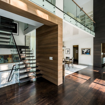
Inspiration for a large mid-century modern wooden u-shaped glass railing staircase remodel in Atlanta with glass risers
 Rose T Bien-Aime
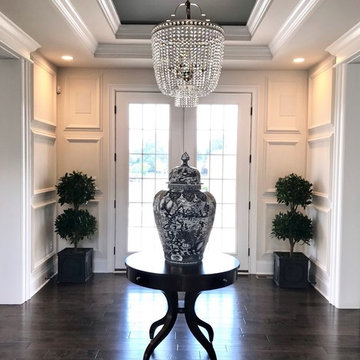
The goal for this entire home was to design everything in black & white and keep each room interesting, well design, sophisticated and most of all, timeless.
A great entryway sets the tone for the rest of your home and prepares you for what’s next. I designed this entryway to be tasteful well design but bold and dramatic to keep you interested. I wanted everyone that entered this house to start thinking in their mind “I want to see more!”
The lighting and artwork I picked out were all out of my clients’ comfort zone, but they trusted me enough to go with my design. I love it when my clients aren’t afraid to take the risk, it always pays off at end!
Let the Picture speak for itself!
Photo Credits: Rose T. Bien-Aime



 Real Big Art
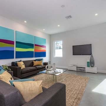
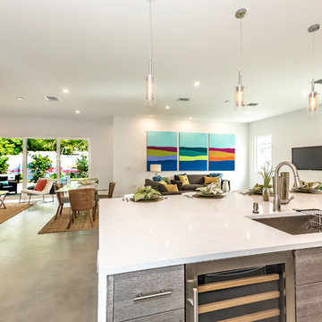
"Water, Earth, and Sky" - (Written by the Artist, Christina Cook Lee) "Growing up in the sixties, I observed Andy Warhol doing his famous graphic treatments of one image in variations. As I studied TV and Film in the 80's, I was taught that the industry developed and succeeded by offering classic plots in what became known as--"the same thing, only different". In other words, when a TV show or movie was successful, the producers would say, "Make another one...the same thing, only different". I painted these three pieces specifically for the wall they are shown on. There was a need for something large with impact. As I did the measurements of the wall and realized three 48"x60" canvases would work nicely, I started thinking about Warhol. Of course, the result I came up with is not a copy of his images at all...it's the same thing, only different." Acrylic on Canvas.


 Rosborough Partners Inc.
With October behind us it is time to start thinking about winter decor and lighting to dress up your exterior as you welcome guests for the holidays.
(Photo by RStarovich)
 Real Big Art
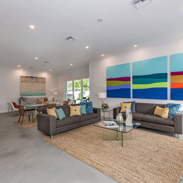
"Water, Earth, and Sky" - (Written by the Artist, Christina Cook Lee) "Growing up in the sixties, I observed Andy Warhol doing his famous graphic treatments of one image in variations. As I studied TV and Film in the 80's, I was taught that the industry developed and succeeded by offering classic plots in what became known as--"the same thing, only different". In other words, when a TV show or movie was successful, the producers would say, "Make another one...the same thing, only different". I painted these three pieces specifically for the wall they are shown on. There was a need for something large with impact. As I did the measurements of the wall and realized three 48"x60" canvases would work nicely, I started thinking about Warhol. Of course, the result I came up with is not a copy of his images at all...it's the same thing, only different." Acrylic on Canvas.
 Real Big Art
"Water, Earth, and Sky" - (Written by the Artist, Christina Cook Lee) "Growing up in the sixties, I observed Andy Warhol doing his famous graphic treatments of one image in variations. As I studied TV and Film in the 80's, I was taught that the industry developed and succeeded by offering classic plots in what became known as--"the same thing, only different". In other words, when a TV show or movie was successful, the producers would say, "Make another one...the same thing, only different". I painted these three pieces specifically for the wall they are shown on. There was a need for something large with impact. As I did the measurements of the wall and realized three 48"x60" canvases would work nicely, I started thinking about Warhol. Of course, the result I came up with is not a copy of his images at all...it's the same thing, only different." Acrylic on Canvas.
 MANDARINA STUDIO interior design
Summary of Scope: gut renovation/reconfiguration of kitchen, coffee bar, mudroom, powder room, 2 kids baths, guest bath, master bath and dressing room, kids study and playroom, study/office, laundry room, restoration of windows, adding wallpapers and window treatments
Background/description: The house was built in 1908, my clients are only the 3rd owners of the house. The prior owner lived there from 1940s until she died at age of 98! The old home had loads of character and charm but was in pretty bad condition and desperately needed updates. The clients purchased the home a few years ago and did some work before they moved in (roof, HVAC, electrical) but decided to live in the house for a 6 months or so before embarking on the next renovation phase. I had worked with the clients previously on the wife's office space and a few projects in a previous home including the nursery design for their first child so they reached out when they were ready to start thinking about the interior renovations. The goal was to respect and enhance the historic architecture of the home but make the spaces more functional for this couple with two small kids. Clients were open to color and some more bold/unexpected design choices. The design style is updated traditional with some eclectic elements. An early design decision was to incorporate a dark colored french range which would be the focal point of the kitchen and to do dark high gloss lacquered cabinets in the adjacent coffee bar, and we ultimately went with dark green.
Sponsored
Sunbury, OH

J.Holderby - Renovations
Franklin County's Leading General Contractors - 2X Best of Houzz!
 MANDARINA STUDIO interior design
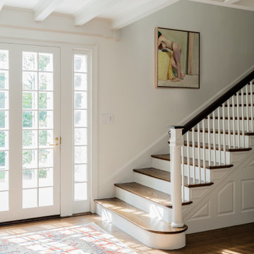
Summary of Scope: gut renovation/reconfiguration of kitchen, coffee bar, mudroom, powder room, 2 kids baths, guest bath, master bath and dressing room, kids study and playroom, study/office, laundry room, restoration of windows, adding wallpapers and window treatments
Background/description: The house was built in 1908, my clients are only the 3rd owners of the house. The prior owner lived there from 1940s until she died at age of 98! The old home had loads of character and charm but was in pretty bad condition and desperately needed updates. The clients purchased the home a few years ago and did some work before they moved in (roof, HVAC, electrical) but decided to live in the house for a 6 months or so before embarking on the next renovation phase. I had worked with the clients previously on the wife's office space and a few projects in a previous home including the nursery design for their first child so they reached out when they were ready to start thinking about the interior renovations. The goal was to respect and enhance the historic architecture of the home but make the spaces more functional for this couple with two small kids. Clients were open to color and some more bold/unexpected design choices. The design style is updated traditional with some eclectic elements. An early design decision was to incorporate a dark colored french range which would be the focal point of the kitchen and to do dark high gloss lacquered cabinets in the adjacent coffee bar, and we ultimately went with dark green.
 Rose T Bien-Aime
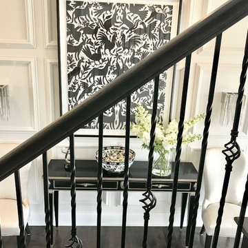
The goal for this entire home was to design everything in black & white and keep each room interesting, well design, sophisticated and most of all, timeless.
A great entryway sets the tone for the rest of your home and prepares you for what’s next. I designed this entryway to be tasteful well design but bold and dramatic to keep you interested. I wanted everyone that entered this house to start thinking in their mind “I want to see more!”
The lighting and artwork I picked out were all out of my clients’ comfort zone, but they trusted me enough to go with my design. I love it when my clients aren’t afraid to take the risk, it always pays off at end!
Let the Picture speak for itself!
Photo Credits: Rose T. Bien-Aime
 Western Pavers
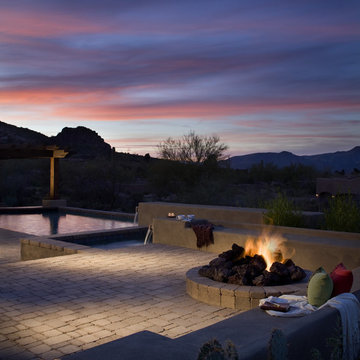
Time to start thinking about Father's Day. Dad will LOVE a new Patio http://www.westernpavers.com/san-diego-pavers-patios-gallery.html
22