
Search results for "Start utilizing" in Home Design Ideas

 TVL Creative Ltd.
Our wonderful Baker clients were ready to remodel the kitchen in their c.1900 home shortly after moving in. They were looking to undo the 90s remodel that existed, and make the kitchen feel like it belonged in their historic home. We were able to design a balance that incorporated the vintage charm of their home and the modern pops that really give the kitchen its personality. We started by removing the mirrored wall that had separated their kitchen from the breakfast area. This allowed us the opportunity to open up their space dramatically and create a cohesive design that brings the two rooms together. To further our goal of making their kitchen appear more open we removed the wall cabinets along their exterior wall and replaced them with open shelves. We then incorporated a pantry cabinet into their refrigerator wall to balance out their storage needs. This new layout also provided us with the space to include a peninsula with counter seating so that guests can keep the cook company. We struck a fun balance of materials starting with the black & white hexagon tile on the floor to give us a pop of pattern. We then layered on simple grey shaker cabinets and used a butcher block counter top to add warmth to their kitchen. We kept the backsplash clean by utilizing an elongated white subway tile, and painted the walls a rich blue to add a touch of sophistication to the space.
 Premier Outdoor Environments, Inc.
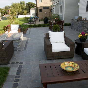
This homeowner is part of a new development and they had a blank slate to start with. They wanted to have a few different spaces but at the same time make them feel that they are separate spaces/rooms. We also mixed in a few different materials utilizing natural bluestone and Unilock pavers. We went over the existing concrete steps with bluestone that complements the Unilock Richcliff paver. We created three rooms that are all broken up with a built in planter. They have their outdoor dining room/kitchen, a lounge area with a custom built fire feature and a quiet sitting area.
 Premier Outdoor Environments, Inc.
This homeowner is part of a new development and they had a blank slate to start with. They wanted to have a few different spaces but at the same time make them feel that they are separate spaces/rooms. We also mixed in a few different materials utilizing natural bluestone and Unilock pavers. We went over the existing concrete steps with bluestone that complements the Unilock Richcliff paver. We created three rooms that are all broken up with a built in planter. They have their outdoor dining room/kitchen, a lounge area with a custom built fire feature and a quiet sitting area.
Find the right local pro for your project
 Premier Outdoor Environments, Inc.
This homeowner is part of a new development and they had a blank slate to start with. They wanted to have a few different spaces but at the same time make them feel that they are separate spaces/rooms. We also mixed in a few different materials utilizing natural bluestone and Unilock pavers. We went over the existing concrete steps with bluestone that complements the Unilock Richcliff paver. We created three rooms that are all broken up with a built in planter. They have their outdoor dining room/kitchen, a lounge area with a custom built fire feature and a quiet sitting area.

 RST Brands
The Milea 8-Piece Deep Seating Set is the perfect outdoor furniture set for gathering around with friends and family. This contemporary furniture set utilizes a mixed material aesthetic for a chic look with balanced proportions. Whether you routinely hold large summer gatherings or you want to start, the Milana 8-Piece Deep Seating Set is the perfect outdoor furniture for a great time.
Features:
Set includes a two-piece sofa, two club chairs, two club ottomans, coordinated accent pillows, a coffee table and side table.
Powder-coated aluminum frame is lightweight and rust-free.
Durable Viro® wicker lasts up to five times longer than other wickers.
Cushions are wrapped in all-weather, fade resistant Sunbrella® fabric.
Engineered for both hot and cold climates.
Easy to clean with a mild soap and water.
Designed to coordinate with the pieces in the Milea Collection by RST Brands.

 Coastal Home Design Studio
This kitchen started as a builder basic with no personality or charm. The layout didn't have the best function and the island was poorly placed. The homeowners purchased this house with remodeling and upgrading in mind. The layout was changed to accommodate two people cooking together. Zones were created for meal prepping, cooking and baking. The island was expanded to fill the space and utilize bar seating. The walk through butlers pantry was turned in to a wine bar with a fridge, storage and custom glass cabinets. A medium toned hardwood floor was layed throughout the entire lower level. An awkward niche off the kitchen was transformed into a cozy seating area for reading.
 TVL Creative Ltd.
Our wonderful Baker clients were ready to remodel the kitchen in their c.1900 home shortly after moving in. They were looking to undo the 90s remodel that existed, and make the kitchen feel like it belonged in their historic home. We were able to design a balance that incorporated the vintage charm of their home and the modern pops that really give the kitchen its personality. We started by removing the mirrored wall that had separated their kitchen from the breakfast area. This allowed us the opportunity to open up their space dramatically and create a cohesive design that brings the two rooms together. To further our goal of making their kitchen appear more open we removed the wall cabinets along their exterior wall and replaced them with open shelves. We then incorporated a pantry cabinet into their refrigerator wall to balance out their storage needs. This new layout also provided us with the space to include a peninsula with counter seating so that guests can keep the cook company. We struck a fun balance of materials starting with the black & white hexagon tile on the floor to give us a pop of pattern. We then layered on simple grey shaker cabinets and used a butcher block counter top to add warmth to their kitchen. We kept the backsplash clean by utilizing an elongated white subway tile, and painted the walls a rich blue to add a touch of sophistication to the space.

Sponsored
Sunbury, OH

J.Holderby - Renovations
Franklin County's Leading General Contractors - 2X Best of Houzz!
 Premier Outdoor Environments, Inc.
This homeowner is part of a new development and they had a blank slate to start with. They wanted to have a few different spaces but at the same time make them feel that they are separate spaces/rooms. We also mixed in a few different materials utilizing natural bluestone and Unilock pavers. We went over the existing concrete steps with bluestone that complements the Unilock Richcliff paver. We created three rooms that are all broken up with a built in planter. They have their outdoor dining room/kitchen, a lounge area with a custom built fire feature and a quiet sitting area.
 TVL Creative Ltd.
Our wonderful Baker clients were ready to remodel the kitchen in their c.1900 home shortly after moving in. They were looking to undo the 90s remodel that existed, and make the kitchen feel like it belonged in their historic home. We were able to design a balance that incorporated the vintage charm of their home and the modern pops that really give the kitchen its personality. We started by removing the mirrored wall that had separated their kitchen from the breakfast area. This allowed us the opportunity to open up their space dramatically and create a cohesive design that brings the two rooms together. To further our goal of making their kitchen appear more open we removed the wall cabinets along their exterior wall and replaced them with open shelves. We then incorporated a pantry cabinet into their refrigerator wall to balance out their storage needs. This new layout also provided us with the space to include a peninsula with counter seating so that guests can keep the cook company. We struck a fun balance of materials starting with the black & white hexagon tile on the floor to give us a pop of pattern. We then layered on simple grey shaker cabinets and used a butcher block counter top to add warmth to their kitchen. We kept the backsplash clean by utilizing an elongated white subway tile, and painted the walls a rich blue to add a touch of sophistication to the space.

 Fco. Martin Designs, llc
This particular project came to us from repeat clients, a husband and wife, we remodeled a kitchen for 9 years ago! Their master bathroom was original to the home from 1990 and was cramped, cluttered, and out of style. The shower itself was small, dark (as it was fully enclosed), and poorly ventilated causing substantial mildew buildup.
With clever design and custom engineering, we were able to open up the space, reconstruct a much bigger shower, keep the his-and-hers sink layout, add a large soaking tub, and double the amount of storage, all in the same footprint. Drawers were custom built to be molded around pipes and plumbing and utilize unused space behind the door to add 3 extra feet of vanity. Cabinetry above the counter featured electrical outlets to charge phones and run appliances, as well as built-in docking stations for rechargeable toothbrushes - all to ensure the owners could keep their beautiful stone countertops free of clutter.
What started out as a dark and dated bathroom now is bright, open, and comfortable. From design to completion, we had a blast working together again with these homeowners.

 Edgewater Design Group
We love it when a home becomes a family compound with wonderful history. That is exactly what this home on Mullet Lake is. The original cottage was built by our client’s father and enjoyed by the family for years. It finally came to the point that there was simply not enough room and it lacked some of the efficiencies and luxuries enjoyed in permanent residences. The cottage is utilized by several families and space was needed to allow for summer and holiday enjoyment. The focus was on creating additional space on the second level, increasing views of the lake, moving interior spaces and the need to increase the ceiling heights on the main level. All these changes led for the need to start over or at least keep what we could and add to it. The home had an excellent foundation, in more ways than one, so we started from there.
It was important to our client to create a northern Michigan cottage using low maintenance exterior finishes. The interior look and feel moved to more timber beam with pine paneling to keep the warmth and appeal of our area. The home features 2 master suites, one on the main level and one on the 2nd level with a balcony. There are 4 additional bedrooms with one also serving as an office. The bunkroom provides plenty of sleeping space for the grandchildren. The great room has vaulted ceilings, plenty of seating and a stone fireplace with vast windows toward the lake. The kitchen and dining are open to each other and enjoy the view.
The beach entry provides access to storage, the 3/4 bath, and laundry. The sunroom off the dining area is a great extension of the home with 180 degrees of view. This allows a wonderful morning escape to enjoy your coffee. The covered timber entry porch provides a direct view of the lake upon entering the home. The garage also features a timber bracketed shed roof system which adds wonderful detail to garage doors.
The home’s footprint was extended in a few areas to allow for the interior spaces to work with the needs of the family. Plenty of living spaces for all to enjoy as well as bedrooms to rest their heads after a busy day on the lake. This will be enjoyed by generations to come.

 Judy Mozen
A blend of contemporary and modern elements make this living room stand apart.
The new EcoSmart fireplace has self-contained ethanol burners, meaning no gas or electrical utility connections.
We developed the design for the firebox using brushed and polished stainless steel in a multi-dimensional fashion. On the remainder of the fireplace, the maple veneers were made into book-matched sections to create a dramatic compliment to the stainless steel.
The granite hearth was elevated to float across the floor supported by steel in the wall and stainless-steel columns.
Photography by John Umberger
 TVL Creative Ltd.
Our wonderful Baker clients were ready to remodel the kitchen in their c.1900 home shortly after moving in. They were looking to undo the 90s remodel that existed, and make the kitchen feel like it belonged in their historic home. We were able to design a balance that incorporated the vintage charm of their home and the modern pops that really give the kitchen its personality. We started by removing the mirrored wall that had separated their kitchen from the breakfast area. This allowed us the opportunity to open up their space dramatically and create a cohesive design that brings the two rooms together. To further our goal of making their kitchen appear more open we removed the wall cabinets along their exterior wall and replaced them with open shelves. We then incorporated a pantry cabinet into their refrigerator wall to balance out their storage needs. This new layout also provided us with the space to include a peninsula with counter seating so that guests can keep the cook company. We struck a fun balance of materials starting with the black & white hexagon tile on the floor to give us a pop of pattern. We then layered on simple grey shaker cabinets and used a butcher block counter top to add warmth to their kitchen. We kept the backsplash clean by utilizing an elongated white subway tile, and painted the walls a rich blue to add a touch of sophistication to the space.
Sponsored
Sunbury, OH
J.Holderby - Renovations
Franklin County's Leading General Contractors - 2X Best of Houzz!
 TVL Creative Ltd.
Our wonderful Baker clients were ready to remodel the kitchen in their c.1900 home shortly after moving in. They were looking to undo the 90s remodel that existed, and make the kitchen feel like it belonged in their historic home. We were able to design a balance that incorporated the vintage charm of their home and the modern pops that really give the kitchen its personality. We started by removing the mirrored wall that had separated their kitchen from the breakfast area. This allowed us the opportunity to open up their space dramatically and create a cohesive design that brings the two rooms together. To further our goal of making their kitchen appear more open we removed the wall cabinets along their exterior wall and replaced them with open shelves. We then incorporated a pantry cabinet into their refrigerator wall to balance out their storage needs. This new layout also provided us with the space to include a peninsula with counter seating so that guests can keep the cook company. We struck a fun balance of materials starting with the black & white hexagon tile on the floor to give us a pop of pattern. We then layered on simple grey shaker cabinets and used a butcher block counter top to add warmth to their kitchen. We kept the backsplash clean by utilizing an elongated white subway tile, and painted the walls a rich blue to add a touch of sophistication to the space.
 TVL Creative Ltd.
Our wonderful Baker clients were ready to remodel the kitchen in their c.1900 home shortly after moving in. They were looking to undo the 90s remodel that existed, and make the kitchen feel like it belonged in their historic home. We were able to design a balance that incorporated the vintage charm of their home and the modern pops that really give the kitchen its personality. We started by removing the mirrored wall that had separated their kitchen from the breakfast area. This allowed us the opportunity to open up their space dramatically and create a cohesive design that brings the two rooms together. To further our goal of making their kitchen appear more open we removed the wall cabinets along their exterior wall and replaced them with open shelves. We then incorporated a pantry cabinet into their refrigerator wall to balance out their storage needs. This new layout also provided us with the space to include a peninsula with counter seating so that guests can keep the cook company. We struck a fun balance of materials starting with the black & white hexagon tile on the floor to give us a pop of pattern. We then layered on simple grey shaker cabinets and used a butcher block counter top to add warmth to their kitchen. We kept the backsplash clean by utilizing an elongated white subway tile, and painted the walls a rich blue to add a touch of sophistication to the space.
 Premier Outdoor Environments, Inc.
This homeowner is part of a new development and they had a blank slate to start with. They wanted to have a few different spaces but at the same time make them feel that they are separate spaces/rooms. We also mixed in a few different materials utilizing natural bluestone and Unilock pavers. We went over the existing concrete steps with bluestone that complements the Unilock Richcliff paver. We created three rooms that are all broken up with a built in planter. They have their outdoor dining room/kitchen, a lounge area with a custom built fire feature and a quiet sitting area.
 Coastal Home Design Studio
This kitchen started as a builder basic with no personality or charm. The layout didn't have the best function and the island was poorly placed. The homeowners purchased this house with remodeling and upgrading in mind. The layout was changed to accommodate two people cooking together. Zones were created for meal prepping, cooking and baking. The island was expanded to fill the space and utilize bar seating. The walk through butlers pantry was turned in to a wine bar with a fridge, storage and custom glass cabinets. A medium toned hardwood floor was layed throughout the entire lower level.

 Wood Anchor
Our design vision for the pieces we designed and built for Prairie Architecture’s new space started with the reception desk.
As the main focal point for their customers and clients when they are greeted we had to design a stately visual piece!
The main feature of the reception desk utilized reclaimed Elm which was specified early on in the project paying homage to Winnipeg’s boulevards.
Part of our overall concept was incorporating angular lines within the designs of the steel work.
The folded steel helped create large flat planes presenting a beautiful contrast to the figured warm character of the Elm.
The use of steel within our designs were to connect to PAI’s existing steel work tables as well as the steel in the heritage building.
Details:
11′-10″ long x 3′ wide with 1-1/2″ solid Elm tops. Main front face and gables cladded in wide lamination Elm veneers on Baltic Birch Ply. Folded raw steel design finished with clear powder coat finish
Photo credits: 2017 © Ray Chan Photo, All Rights Reserved
 HQ Construction & Supplies, Inc.
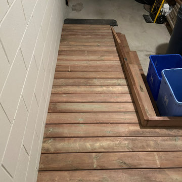
Our client had hired someone to build an accessibility ramp for the front entrance of his home. The work done was not done properly as the spacing between the boards were uneven and some spaces were too large which posed as a potential hazard. The planks of wood were also cut incorrectly; some were not utilized as full pieces to run across the joists.
Client requested for us to complete an accessibility ramp in his garage which turned out beautiful with even cuts and spacing, solid stability, and accurate to the design we made for him before starting the project.
 Coastal Home Design Studio
This kitchen started as a builder basic with no personality or charm. The layout didn't have the best function and the island was poorly placed. The homeowners purchased this house with remodeling and upgrading in mind. The layout was changed to accommodate two people cooking together. Zones were created for meal prepping, cooking and baking. The island was expanded to fill the space and utilize bar seating. The walk through butlers pantry was turned in to a wine bar with a fridge, storage and custom glass cabinets. A medium toned hardwood floor was layed throughout the entire lower level.
43