
Search results for "Starting watering" in Home Design Ideas

 Michael Nash Design, Build & Homes
Starting Each Day Clean and Refreshed In This Classically-Modern, Marble Masterpiece
In 1985, the previous owner of the house had added an addition of which part included a 17 feet by 13 feet space off the master bedroom for both a master bath and walk-in closet. Irrespective of the dated red carpet that blanketed the entire bathroom of this 1964 colonial in Annandale, VA, the combination bathroom/closet space had its other oddities, primarily in that there was no shower. The current homeowners -- a family of five, who has been in the home for 7 years, was tired of going down the hall to use the kids’ bathroom to take a shower before work. The renovation that they have created now is a bright and luxurious space that one could bask in all day. They used this bathroom renovation opportunity to total remake the layout and function of this essential room that sets the tone for the day ahead.
Prior to the renovation, the existing bathroom oddly had two entrances, a typical one off of the master bedroom, but another straight off the upstairs hallway. As the toilet was out in the open in the previous design, ensuring that this second door was closed when company was in town was essential and a nuisance. As you entered the room, situated below the arc window, a large soaking tub that was covered on three sides with wooden steps dominated the room from the corner it projected. A relatively small 42” single bowl sink did not leave much space for his and hers toiletries, and there was no other linen closet or cabinetry for storage in the bathroom. The 8 foot by 5 foot closet with accordion doors had poorly laid out rungs not letting the storage space to be fully utilized. At over 220 square feet, the room did offer considerable space to work with, yet the existing layout, which even included a partition wall behind the vanity, felt cramped and dysfunctional.
The homeowners wished to create a classic yet modern, private, deluxe bathroom that would better integrate into their master suite and enable them to start and end each day in a luxurious way. They wanted to maintain having a soaking tub, add in a large shower, have an enclosed commode, expand to include double sinks, and add more storage for toiletries and linens. We worked with the customer to develop a creative design with extensive plumbing rework that accomplished all these needs and more.
The first order of business was to gut out all the carpet, tub, cabinetry, and non-load bearing partition walls. The new tub would be generally in the same location, but as the previous walk-in closet would be repurposed for the commode and the walk-in shower additional water lines, plumbing, and draining needed to be added; fortunately the room below is the garage, which enabled the team to frame out some bulkheads to accomplish this complex plumbing. Following the framing, including walling up the second entrance to the bathroom, adding in a pocket door for the commode, and creating the shape of the new shower, the team also laid down the wiring for one of the luxuries of this room – heated flooring. A glossy percaline boarder, and two-inch hexagon shape percaline tiles cover the entire floor, making it much easier and cleaner than the previous carpet.
Marble look tile is predominant throughout the bathroom as despite the angled frameless glass door, the entire shower is covered in 18 inch polished marble look tiles. The shower coats the user in water from either the overhead rain head, large main showerhead and/or the hand held sprayer. Over 7 feet of white Italian Statuetto marble countertop, enable the couple to have two sink bowls and plenty of room on each side. The bowls are exposed in this stainless steel console sink design which required the team to ensure that the exposed plumbing looked pristine, and painting the bottom of the porcelain bowl to match the coloring.
The white cast-iron 72-inch Cecilia claw-foot soaking tub and its chrome lion’s paws complement that other chrome and white used throughout the room. A tall, almost floor-to-ceiling linen closet finished in arctic white is nestled in the corner near the tub, enabling ample storage of towels, etc. Other cabinetry includes an 18 inch-wide vanity with decorative footing is centered between the two sinks, and a 27 inch wall mounted cabinet with shelf is above the Kohler Devonshire elongated toilet.
Billowing cloud colored grey blue paint was a great choice for this room to pick up on the veining in the marble. Mirrored medicine chests, a chandelier, wall sconces, and overhead recessed lighting also were incorporated into the design and function of the new room.
The artful combination of classic design from material choices, such as free-standing Victorian claw-foot tub along with the modern design as seen in the angled shower, frameless medicine cabinet mirrors, and frosted glass pocket door on the commode, make this bathroom quite a masterpiece.
The clients are enjoying having their private space and not having the use the kids’ bathroom anymore.
 Crystal Kitchen + Bath
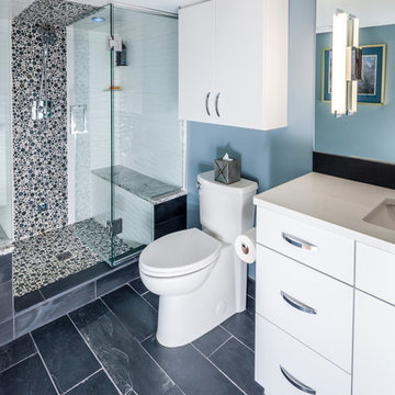
I always wanted a sauna or steam shower, when I was at a spa and could use both, I found a steam shower was better for me. The basement bathroom was perfect size for a large steam shower for two.
A tub/shower was removed. Cambria shower benches were the first items chosen for this bath, then I found the bubble glass tiles that blended with the Cambria and had them for the floor of the shower and accent strip on the wall and ceiling. The large white water textured tiles were a perfect fit for this multiple use shower. The ceiling was sloped for the steam water droplets to run towards the back wall and not drip on my head when steaming. The shower head has 2 purposes-fixed shower head or remove the center ring and now it’s a hand held shower head.
The steam shower it’s self has aroma therapy, Chroma therapy and built in Speakers that are blue tooth to my music system. A cold water mist at the end of the steam is a good way to start the day.
For a very spoiled cat-the ultimate add on was an electronic faucet in the bath sink, so the cat could have fresh water whenever he wanted, we just had to teach him to put his paw in front of the sensor.
 Tile Doctor Ltd
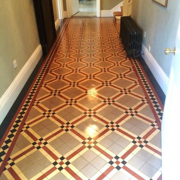
A client from the village of Heytesbury contacted me to see whether we could improve the look of her Victorian tiled hallway floor. It turns out that a competitor had previously cleaned and sealed it two years prior but she was disappointed with the result once she realised that the floor still had dirt ingrained in the tile. As per our normal practice we ran a test clean and she booked us in immediately.
We started by wetting the floor using a strong solution of Tile Doctor Pro-Clean and left it dwell for ten minutes. We then attached a black stripping pad to a rotary machine and slowly covered the whole area to remove ingrained dirt and any existing seals that may be evident. The dirty slurry was then removed with a wet vacuum and then floor rinsed with the aid of a deck brush and a wet vacuum.
Next we used a heavy duty scraper to remove paint splashes around the edges from years of decorating. Once we were satisfied we’d removed all evident dirt, seal and paint we rinsed the floor thoroughly several times to make sure all contaminants are removed again using the wet vacuum to remove the water.
We returned five days later to let the floor dry out thoroughly. Upon our return we tested with a damp meter which tested fine so we proceeded to seal the floor using six coats of Tile Doctor Seal & Go to provide protection and add a nice sheen to the floor which I think you will agree now looks amazing.
Stuart Ford
Wiltshire Tile Doctor
Find the right local pro for your project
 Windy City Painters
? Elevate Your Home's Charm with a Front Porch Makeover! ?
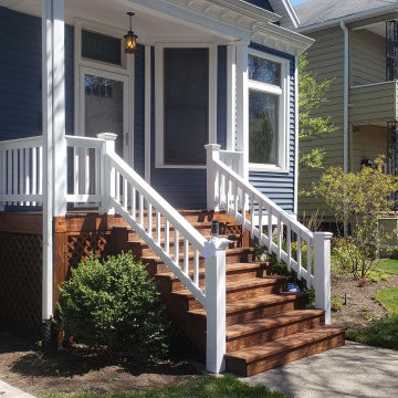
✨ Front porch beautifully refinished by the top-notch professionals at Windy City Painters, the best painting company in Chicago! ?
Here's a glimpse of the meticulous process :
? Power Wash Magic:
Started with a thorough power wash to bid farewell to dirt, grime, and the remnants of old paint. The porch now sparkles!
? Wood Whispering - Sanding Edition:
Embraced the art of sanding to create a smooth canvas for the upcoming masterpiece. Goodbye rough edges, hello silky surfaces!
? Stairway to Elegance - Staining the Steps:
The step treads and landing got a luxurious makeover with a premium stain, adding warmth and sophistication to the entrance. It's like a red carpet for your doorstep!
⚪ Radiant in White - Railings, Risers, and Sides:
The talented hands at Windy City Painters painted the railings, risers, and step sides in a crisp, classic white. The result? A porch that exudes timeless charm and curb appeal.
?♂️ About Windy City Painters:
? Expertise Beyond Compare: Windy City Painters specializes not only in front porch refinishing but also in wrought iron fences and metal porches. They work their magic with rust removal, treatment, and restoration, ensuring longevity and beauty.
? Drywall Water Damage Repairs: Water damage? Not a problem! They're your go-to for seamless drywall repairs, leaving no traces of past troubles.
?️ Wallpaper Wizards: Transform your interiors with their impeccable wallpaper installation services. From subtle textures to bold patterns, they bring your vision to life.
? Kitchen Cabinets Revival: Give your kitchen a facelift! Windy City Painters excels in painting kitchen cabinets, turning them from outdated to dazzling.
? Contact Windy City Painters:
? WindyCityPainters.com
? WindyPainters.com
☎️ Phone: 773-818-6331
? andy@windypainters.com
✅ Experience the Windy City Painters Difference!
Transforming homes into masterpieces, one stroke at a time. Schedule your consultation today and let the experts work their magic. Your dream home awaits!
#WindyCityPainters #ChicagoPainting #HomeMakeover #FrontPorchRefinishing #PorchPainter #ChicagoWallpaperInstaller #ChicagoCabinetsPainter ✨?️

 Tracy Berman Interiors
This gorgeous beach condo sits on the banks of the Pacific ocean in Solana Beach, CA. The previous design was dark, heavy and out of scale for the square footage of the space. We removed an outdated bulit in, a column that was not supporting and all the detailed trim work. We replaced it with white kitchen cabinets, continuous vinyl plank flooring and clean lines throughout. The entry was created by pulling the lower portion of the bookcases out past the wall to create a foyer. The shelves are open to both sides so the immediate view of the ocean is not obstructed. New patio sliders now open in the center to continue the view. The shiplap ceiling was updated with a fresh coat of paint and smaller LED can lights. The bookcases are the inspiration color for the entire design. Sea glass green, the color of the ocean, is sprinkled throughout the home. The fireplace is now a sleek contemporary feel with a tile surround. The mantel is made from old barn wood. A very special slab of quartzite was used for the bookcase counter, dining room serving ledge and a shelf in the laundry room. The kitchen is now white and bright with glass tile that reflects the colors of the water. The hood and floating shelves have a weathered finish to reflect drift wood. The laundry room received a face lift starting with new moldings on the door, fresh paint, a rustic cabinet and a stone shelf. The guest bathroom has new white tile with a beachy mosaic design and a fresh coat of paint on the vanity. New hardware, sinks, faucets, mirrors and lights finish off the design. The master bathroom used to be open to the bedroom. We added a wall with a barn door for privacy. The shower has been opened up with a beautiful pebble tile water fall. The pebbles are repeated on the vanity with a natural edge finish. The vanity received a fresh paint job, new hardware, faucets, sinks, mirrors and lights. The guest bedroom has a custom double bunk with reading lamps for the kiddos. This space now reflects the community it is in, and we have brought the beach inside.
 Tracy Berman Interiors
This gorgeous beach condo sits on the banks of the Pacific ocean in Solana Beach, CA. The previous design was dark, heavy and out of scale for the square footage of the space. We removed an outdated bulit in, a column that was not supporting and all the detailed trim work. We replaced it with white kitchen cabinets, continuous vinyl plank flooring and clean lines throughout. The entry was created by pulling the lower portion of the bookcases out past the wall to create a foyer. The shelves are open to both sides so the immediate view of the ocean is not obstructed. New patio sliders now open in the center to continue the view. The shiplap ceiling was updated with a fresh coat of paint and smaller LED can lights. The bookcases are the inspiration color for the entire design. Sea glass green, the color of the ocean, is sprinkled throughout the home. The fireplace is now a sleek contemporary feel with a tile surround. The mantel is made from old barn wood. A very special slab of quartzite was used for the bookcase counter, dining room serving ledge and a shelf in the laundry room. The kitchen is now white and bright with glass tile that reflects the colors of the water. The hood and floating shelves have a weathered finish to reflect drift wood. The laundry room received a face lift starting with new moldings on the door, fresh paint, a rustic cabinet and a stone shelf. The guest bathroom has new white tile with a beachy mosaic design and a fresh coat of paint on the vanity. New hardware, sinks, faucets, mirrors and lights finish off the design. The master bathroom used to be open to the bedroom. We added a wall with a barn door for privacy. The shower has been opened up with a beautiful pebble tile water fall. The pebbles are repeated on the vanity with a natural edge finish. The vanity received a fresh paint job, new hardware, faucets, sinks, mirrors and lights. The guest bedroom has a custom double bunk with reading lamps for the kiddos. This space now reflects the community it is in, and we have brought the beach inside.

Sponsored
Columbus, OH
Free consultation for landscape design!

Peabody Landscape Group
Columbus' Reliable Landscape Design & Contracting
 Tracy Berman Interiors
This gorgeous beach condo sits on the banks of the Pacific ocean in Solana Beach, CA. The previous design was dark, heavy and out of scale for the square footage of the space. We removed an outdated bulit in, a column that was not supporting and all the detailed trim work. We replaced it with white kitchen cabinets, continuous vinyl plank flooring and clean lines throughout. The entry was created by pulling the lower portion of the bookcases out past the wall to create a foyer. The shelves are open to both sides so the immediate view of the ocean is not obstructed. New patio sliders now open in the center to continue the view. The shiplap ceiling was updated with a fresh coat of paint and smaller LED can lights. The bookcases are the inspiration color for the entire design. Sea glass green, the color of the ocean, is sprinkled throughout the home. The fireplace is now a sleek contemporary feel with a tile surround. The mantel is made from old barn wood. A very special slab of quartzite was used for the bookcase counter, dining room serving ledge and a shelf in the laundry room. The kitchen is now white and bright with glass tile that reflects the colors of the water. The hood and floating shelves have a weathered finish to reflect drift wood. The laundry room received a face lift starting with new moldings on the door, fresh paint, a rustic cabinet and a stone shelf. The guest bathroom has new white tile with a beachy mosaic design and a fresh coat of paint on the vanity. New hardware, sinks, faucets, mirrors and lights finish off the design. The master bathroom used to be open to the bedroom. We added a wall with a barn door for privacy. The shower has been opened up with a beautiful pebble tile water fall. The pebbles are repeated on the vanity with a natural edge finish. The vanity received a fresh paint job, new hardware, faucets, sinks, mirrors and lights. The guest bedroom has a custom double bunk with reading lamps for the kiddos. This space now reflects the community it is in, and we have brought the beach inside.
 Aloha Kitchen, Bath & Design
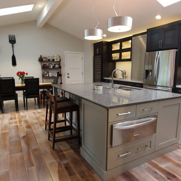
California modern rancher. Blend of warm and cool tones and material balance this space. Outdoor environment is low water use and drought resistant but still has greenery and inviting to hang out.
In the kitchen we removed the walls that made up the tiny closet of a kitchen that was in the corner under the skylight and was able to hide the ceiling height differences at the small desk area and oven cabinets and keep the skylight. The effect is a wide-open concept with the least amount of construction possible.
For the kitchen layout, we created a cozy zone for the chef to work in the corner without any cross traffic, seating area around the outside of the island keeps guest out of the work area but still close and part of the process. The warming drawer in the island positioned for proximity to the "buffet line" at the island when entertaining. On the dining end of the kitchen there is a coffee and wine bar. Coffee bar is hidden behind the metal roll up door, and the wine and liquor bar are to the left and both share the sink in the middle, making it a functional and useful space from the morning until the evening. I like to call this bar "Start and Stop" ha-ha. Even though this space is very open and airy, it has a ton of storage including underneath the seating area at the island and the little workstation, which is open and uncluttered, has lots of storage nestled in the wall and underneath the counter and hides any CPU and wires neatly.
In the master bath, we updated all the colors and finishes in a clean modern European style with large format porcelain tiles and repurposed a small useless closet (with a window in it) to a second vanity for extra counter space and linen storage. Plus, we added storage over the toilet in the water closet and an updated door and casing into the walk-in closet with frosted glass panels so that at night the light in the closet glowing in those panels can act as a night light. (Photo credit; Kitchens of Diablo)
 Homeowner Services of Michigan LLC
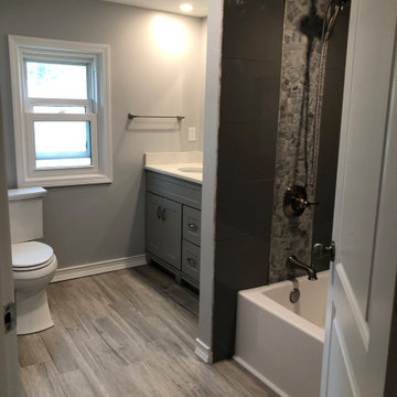
We transformed a small, outdated space into a modern, functional retreat for our recent bathroom remodeling project. This comprehensive renovation began with a complete demolition, taking the bathroom down to the studs. We removed all existing fixtures, walls, flooring, and old plumbing, creating a blank canvas for our vision.
First, we addressed the plumbing. The old, corroded pipes were replaced with new, durable materials, ensuring reliable water flow and pressure for years to come. We installed new supply lines and drainage to accommodate the new fixtures, including the vanity and shower.
Next, we updated the electrical system. The outdated wiring was replaced with new, up-to-code electrical work. We installed new outlets, switches, and light fixtures, providing ample lighting for the space. An exhaust fan was also installed to improve ventilation and prevent moisture buildup, essential for maintaining the bathroom's longevity and hygiene.
We then focused on HVAC improvements, adding a new duct and vent system to ensure proper heating and cooling. This upgrade enhances comfort and contributes to better air quality and energy efficiency.
For the flooring, we chose ceramic tiles with a wood plank look. These tiles offer the warmth and elegance of wood while providing the durability and water resistance of ceramic. The flooring was meticulously installed, creating a seamless and visually appealing surface.
The centerpiece of the remodel is the stock single-sink vanity. This stylish yet practical addition provides ample storage and counter space, making daily routines more convenient. Above the vanity, we installed a sleek mirror that adds both functionality and a touch of sophistication.
The shower area received a complete makeover with new tiles and an adjustable rain shower head. The tile work extends from floor to ceiling, creating a cohesive and luxurious feel. The adjustable rain shower head offers a customizable bathing experience, combining both style and comfort.
This small bathroom remodel exemplifies our commitment to quality and attention to detail. By starting from the studs and rebuilding with modern, high-quality materials, we've created a space that is beautiful and built to last. Our client now enjoys a stylish, functional bathroom that meets their needs and enhances their home's value.

 Design Vision Studio
Erik Grammer Photography -
I recently came across a post on Facebook with a photo of an elderly couple with a quote saying "We were born in a time when if something was broken we would fix it, not throw it away..." This quote resonated with me. I found myself thinking of it while working on the same house - for the fourth time. I affectionately call this beautiful Southern California beach house the Humpty Dumpty home.
I started a wonderful business relationship with one of my favorite clients back in 2003. Initially, I was called in to "fix" and finish what another designer started. Once completed and with everything just so, the couple unfortunately divorced and amicably divided the art, rugs and furnishings. I was hired for a second time to recreate each room as close as possible to replace all items that were missing.
The house was happily restored back to the original design and all was well for a few years. My client relocated to the East Coast for a temporary job assignment and the house was rented to a person (whose name I can't say) from a famous all-girl band. During this time there was a problem with the upstairs laundry room and water damage occurred. I was hired for the third time to help repair and update (ever so slightly) some areas in the house. My client requested to keep the design and feeling of the house intact because he loved it so much.
A few years passed before a pipe broke in the master bathroom while the new renter was out of town on vacation. Unfortunately, things like this do happen - and if not attended to quickly, major damage can occur. In this case, nearly the entire house was flooded requiring it to be completely gutted and stripped down to the floorboards and studs. In January of this year, I was hired to help the client, the insurance company, and the contractor put the house back together again. But unlike the Humpty Dumpty story, this house has actually been put back together again - several times over.
Although, this house and client have experienced some challenges, I say this is a perfect example of design success. My client has had many opportunities to change and create something new in his environment with every mis-adventure. Instead, he realizes his home is exactly the way he likes it. It has been such an honor to work with this man who is definitive, trusting, and confident enough to create (or re-create) the perfect home that "fits" his personality and lifestyle.
Although this Humpty Dumpty home has been good for my business, I hope the next project with this client is to decorate another property - perhaps a New York City Apartment!

 Christiane Holmquist Landscape Design
With this client who has been passionate about plants all his life, there was naturally a close collaboration and a lot of input from him. Upon closer inspection you'd find some very exceptional plants that are sort of experimental but "all worth the try" in Gordon's eyes. And he is right! I relished the opportunity to use Star Magnolia stellata, Redbud Cercis 'Avondale' and 'Silver Cloud', Arabian Lilac 'Grand Duke of Tuscany', Royal Bromeliad Vriesea imperialis, also many unusual bulbs such as Scilla.
Besides structure providing shrubs and trees (Tecoma, existing Indian Hawthorne with beautiful structures, Sweet Pea Bush, Golden Breath of Heaven, Ilex, Ginkgo, Bronze Loquat etc.) you'll see here also my favorite perennials, succulents and grasses, all as low care and undemanding as well as low-water as possible, to keep the landscape colorful and interesting year round.
One of the highlights of this garden are the dry stream beds, bird bath and garden bench that we added. Built originally by himself and his wife, the dry stream beds were overgrown, mostly hidden by plant debris, or half rolling down hill. We had fun selecting a mixed collection of colorful and richly textured boulders of various sizes over, and with the input from 7 team members: Gordon, me, the contractor, the supervisor and three workers, we re-created the stream beds, making sure that anchor stones on the sides were well embedded in the slope, and that stone shelves and “top dressing” with smaller pebbles would add to the visual interest. Now these beds form very pleasing architectural features that look like they have always been there.
We were all surprised how quickly all plants adapted to the site and started growing and putting out bloom. Now the old birdbath, a traditional white thing with dove figurines resting on the scalloped bowl, looked out of place, and I suggested to replace it with a stone bowl. And that part of the garden just called for a bench under the Macademia nut tree, to observe the birds and contemplate the whole creation. Only stone would do, but not any stone! Gordon picked a Basalt boulder that was naturally bowl shaped. It’s so heavy that it took 8 men to heave it into place! The Basalt bench was not much lighter, and together they make a very inviting scene. This job should last for a while.
Photographed by Emma Almendarez at http://www.emmatheodoraphotography.com/
 Michael Nash Design, Build & Homes
Starting Each Day Clean and Refreshed In This Classically-Modern, Marble Masterpiece
In 1985, the previous owner of the house had added an addition of which part included a 17 feet by 13 feet space off the master bedroom for both a master bath and walk-in closet. Irrespective of the dated red carpet that blanketed the entire bathroom of this 1964 colonial in Annandale, VA, the combination bathroom/closet space had its other oddities, primarily in that there was no shower. The current homeowners -- a family of five, who has been in the home for 7 years, was tired of going down the hall to use the kids’ bathroom to take a shower before work. The renovation that they have created now is a bright and luxurious space that one could bask in all day. They used this bathroom renovation opportunity to total remake the layout and function of this essential room that sets the tone for the day ahead.
Prior to the renovation, the existing bathroom oddly had two entrances, a typical one off of the master bedroom, but another straight off the upstairs hallway. As the toilet was out in the open in the previous design, ensuring that this second door was closed when company was in town was essential and a nuisance. As you entered the room, situated below the arc window, a large soaking tub that was covered on three sides with wooden steps dominated the room from the corner it projected. A relatively small 42” single bowl sink did not leave much space for his and hers toiletries, and there was no other linen closet or cabinetry for storage in the bathroom. The 8 foot by 5 foot closet with accordion doors had poorly laid out rungs not letting the storage space to be fully utilized. At over 220 square feet, the room did offer considerable space to work with, yet the existing layout, which even included a partition wall behind the vanity, felt cramped and dysfunctional.
The homeowners wished to create a classic yet modern, private, deluxe bathroom that would better integrate into their master suite and enable them to start and end each day in a luxurious way. They wanted to maintain having a soaking tub, add in a large shower, have an enclosed commode, expand to include double sinks, and add more storage for toiletries and linens. We worked with the customer to develop a creative design with extensive plumbing rework that accomplished all these needs and more.
The first order of business was to gut out all the carpet, tub, cabinetry, and non-load bearing partition walls. The new tub would be generally in the same location, but as the previous walk-in closet would be repurposed for the commode and the walk-in shower additional water lines, plumbing, and draining needed to be added; fortunately the room below is the garage, which enabled the team to frame out some bulkheads to accomplish this complex plumbing. Following the framing, including walling up the second entrance to the bathroom, adding in a pocket door for the commode, and creating the shape of the new shower, the team also laid down the wiring for one of the luxuries of this room – heated flooring. A glossy percaline boarder, and two-inch hexagon shape percaline tiles cover the entire floor, making it much easier and cleaner than the previous carpet.
Marble look tile is predominant throughout the bathroom as despite the angled frameless glass door, the entire shower is covered in 18 inch polished marble look tiles. The shower coats the user in water from either the overhead rain head, large main showerhead and/or the hand held sprayer. Over 7 feet of white Italian Statuetto marble countertop, enable the couple to have two sink bowls and plenty of room on each side. The bowls are exposed in this stainless steel console sink design which required the team to ensure that the exposed plumbing looked pristine, and painting the bottom of the porcelain bowl to match the coloring.
The white cast-iron 72-inch Cecilia claw-foot soaking tub and its chrome lion’s paws complement that other chrome and white used throughout the room. A tall, almost floor-to-ceiling linen closet finished in arctic white is nestled in the corner near the tub, enabling ample storage of towels, etc. Other cabinetry includes an 18 inch-wide vanity with decorative footing is centered between the two sinks, and a 27 inch wall mounted cabinet with shelf is above the Kohler Devonshire elongated toilet.
Billowing cloud colored grey blue paint was a great choice for this room to pick up on the veining in the marble. Mirrored medicine chests, a chandelier, wall sconces, and overhead recessed lighting also were incorporated into the design and function of the new room.
The artful combination of classic design from material choices, such as free-standing Victorian claw-foot tub along with the modern design as seen in the angled shower, frameless medicine cabinet mirrors, and frosted glass pocket door on the commode, make this bathroom quite a masterpiece.
The clients are enjoying having their private space and not having the use the kids’ bathroom anymore.

 Rhodes Architecture + Light
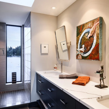
A transformation inspired by the owner’s love of modern architecture, art and color (and the adjacent sand, rock, water, and the northwest landscape), the Indianola House sought to bring the soul of a home to a colorless muted box. The original house was a drab 1990’s-era box with no personality or presence sited on a beautiful secluded bay, facing water and island views, northwest of the City of Seattle. The existing mono-colored stucco-clad exterior and pyramidal glass-block openings had led the neighborhood to dub the structure, unflatteringly, “The Miami Vice House”.
Rhodes Architecture’s Residential Architects careful use of natural light, rich, collaged finishes and ability to open the house to gardens, beach, and outdoor gathering was critical to the design. The house soon became “The Gallery”.
The original home’s grey stucco exterior made the house seem both large and featureless; the introduction of no-maintenance exterior materials that collage and complement each other was a goal of the homeowner and the Seattle Architects who teamed up for this residential design. The bloated scale of the house cried out for the establishment and definition of the parts of the structure, a breaking down of the home’s form and its apparent bland size.
Living, sleeping, and bathing areas that started as staid spaces were in need of opening to the natural environment with additions of large doors, folding glass walls and useable balconies were crucial to each space having a dialogue with the outdoors.
The owner’s extensive art collection was highlighted and became the focus of interior places, well-lit naturally and through a new lighting system. Energy use and sustainable systems were a key component of the design which used high-efficacy lighting, better cladding on a rain-screen system, high-efficiency doors and windows, new insulation and weather barriers, and which added a photovoltaic-generated electrical system. The contemporary design sought to integrate all of these systems, materials, and finishes into a seamless whole that lent interest and drama to a residence which was previously lusterless.
How radically this house was transformed is evident in the exteriors, gardens and the natural spaces the house now opens to, as well as the gallery-like interiors. This home is a stunning testament to what is possible “before-and-after” when remade by Rhodes Architecture + Light.
The clients are an older couple with long professional and political careers, a love of art and a clear desire to connect with the Northwest environment and enliven their daily lives with spaces full of color and natural light.
Rhodes Architecture + Light was hired in 2019 to add new exteriors and interiors, natural light, larger openings to beach and bay, seismic and foundation upgrades to the home, and to infuse life into the house through the re-use of existing space and varied materials, color, textures, and lighting. The only actual change to the exterior “shell” of the house was the introduction of a low “gull-wing” roof with wood soffits above the central atrium space, to add drama and bring natural light into the entry gallery space. Interior spaces, including bedrooms and bathrooms, were re-planned and opened to each other, to greater natural light, to roof decks, and to the incredible views and sea-side environment.
The Builder, Fairbank Construction Company of Bainbridge Island, Washington, met the challenge of the design, first completely deconstructing the finishes inside and out, then precisely interlocking new claddings, windows and doors, cabinetry, finishes and a new gull-wing central roof in a beautiful transformation. The construction was total, thorough, and very detailed, resulting a house that, far from seeming a “remodeling”, is far more present and fitting to the owner’s lives and the natural environment than the house we started with.

 Jennifer Garner Interiors
The exercise room features cork flooring.
Inspiration for a timeless home gym remodel in Austin
Inspiration for a timeless home gym remodel in Austin
 Aloha Kitchen, Bath & Design
California modern rancher. Blend of warm and cool tones and material balance this space. Outdoor environment is low water use and drought resistant but still has greenery and inviting to hang out.
In the kitchen we removed the walls that made up the tiny closet of a kitchen that was in the corner under the skylight and was able to hide the ceiling height differences at the small desk area and oven cabinets and keep the skylight. The effect is a wide-open concept with the least amount of construction possible.
For the kitchen layout, we created a cozy zone for the chef to work in the corner without any cross traffic, seating area around the outside of the island keeps guest out of the work area but still close and part of the process. The warming drawer in the island positioned for proximity to the "buffet line" at the island when entertaining. On the dining end of the kitchen there is a coffee and wine bar. Coffee bar is hidden behind the metal roll up door, and the wine and liquor bar are to the left and both share the sink in the middle, making it a functional and useful space from the morning until the evening. I like to call this bar "Start and Stop" ha-ha. Even though this space is very open and airy, it has a ton of storage including underneath the seating area at the island and the little workstation, which is open and uncluttered, has lots of storage nestled in the wall and underneath the counter and hides any CPU and wires neatly.
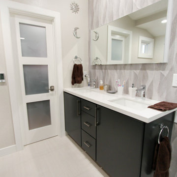
In the master bath, we updated all the colors and finishes in a clean modern European style with large format porcelain tiles and repurposed a small useless closet (with a window in it) to a second vanity for extra counter space and linen storage. Plus, we added storage over the toilet in the water closet and an updated door and casing into the walk-in closet with frosted glass panels so that at night the light in the closet glowing in those panels can act as a night light. (Photo credit; Kitchens of Diablo)
 Tile Doctor Ltd
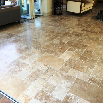
This property in Godalming had the whole downstairs floor tiled with Fired Earth Limestone tiles nine years prior and had never had it cleaned or maintained professionally. The once beautiful stone was now looking dull and the grout had turned black with dirt leaving the floor looking uninviting.
This is quite normal for stone floors as it is the sealer that protects the stone from dirt and enhances its look. Most sealers wear off after three to four years sealer and in this case after nine years it was well overdue a deep clean and reseal.
I visited the property to survey the floor. It was indeed looking in need of some attention and the kitchen was particularly bad. To restore the appearance of the Limestone tile and grout the floor would need to be stripped of what remains of the old sealer, then deep cleaned with attention to the grout, polished with burnishing pads and then finally resealed. I was confident I could get it restored to a nearly new finish and to prove it I completed a small demonstration clean which the homeowner was very happy with. They agreed to my quote and we scheduled in a couple of days to carry out the work.
On day one I started by cleaning the grout using a strong dilution of Tile Doctor Pro-Clean. its run along the grout line and then left to soak in for about ten minutes so it can get to work breaking down dirt and old sealer. The grout is then scrubbed using a grout brush which is then scrubbed backwards and forwards along the grout line until clean. The area is then rinsed with water and all the waste removed with a wet vacuum cleaner.
Next, I turned my attention to the Limestone tiles which needed stripping of any remaining sealer, cleaned and polished. I find the best way to do this is by apply a set of diamond encrusted Burnishing pads in sequence starting with a coarse 400-grit followed by 800, 1500 and finally finishing with an extra fine 3000 grit. Water is used to lubricate the burnishing process and the slurry is rinsed and extracted off the floor between pads. Each pad is run over the tiles three times, and it was a large floor so as you can imagine this process took most of the day.
I left the floor to dry out overnight and returned the next day to seal the Limestone. Before doing that, I reviewed my previous day’s work and I cleaned up any areas that needed further attention. Next step was to ensure the floor was dry as I don’t recommend applying a sealer to damp tile as you won’t get an even appearance, so before sealing a floor I tested for moisture using a damp meter.
To seal the floor, I applied two coats of Tile Doctor Ultra Seal which is an impregnating sealer that works by occupying the small pores in the stone to prevent dirt becoming ingrained there. Limestone is a light stone and most customers like that appearance so I find it best not to use a colour enhancing sealer as it can darken the stone. Ultra-Seal doesn’t contain any colour enhancer and leaves the floor with a natural finish whilst allowing the stone variations and patterns to show through.
Once the sealer was dry, I gave it a further polish with the 3000-grit pad which further brought out the natural beauty of the stone. My client was very happy with the floor, it really lifted the who area and the Kitchen in particular.
Rupert Mcleod
West Surrey Tile Doctor

 Tracy Berman Interiors
This gorgeous beach condo sits on the banks of the Pacific ocean in Solana Beach, CA. The previous design was dark, heavy and out of scale for the square footage of the space. We removed an outdated bulit in, a column that was not supporting and all the detailed trim work. We replaced it with white kitchen cabinets, continuous vinyl plank flooring and clean lines throughout. The entry was created by pulling the lower portion of the bookcases out past the wall to create a foyer. The shelves are open to both sides so the immediate view of the ocean is not obstructed. New patio sliders now open in the center to continue the view. The shiplap ceiling was updated with a fresh coat of paint and smaller LED can lights. The bookcases are the inspiration color for the entire design. Sea glass green, the color of the ocean, is sprinkled throughout the home. The fireplace is now a sleek contemporary feel with a tile surround. The mantel is made from old barn wood. A very special slab of quartzite was used for the bookcase counter, dining room serving ledge and a shelf in the laundry room. The kitchen is now white and bright with glass tile that reflects the colors of the water. The hood and floating shelves have a weathered finish to reflect drift wood. The laundry room received a face lift starting with new moldings on the door, fresh paint, a rustic cabinet and a stone shelf. The guest bathroom has new white tile with a beachy mosaic design and a fresh coat of paint on the vanity. New hardware, sinks, faucets, mirrors and lights finish off the design. The master bathroom used to be open to the bedroom. We added a wall with a barn door for privacy. The shower has been opened up with a beautiful pebble tile water fall. The pebbles are repeated on the vanity with a natural edge finish. The vanity received a fresh paint job, new hardware, faucets, sinks, mirrors and lights. The guest bedroom has a custom double bunk with reading lamps for the kiddos. This space now reflects the community it is in, and we have brought the beach inside.
 Homeowner Services of Michigan LLC
We transformed a small, outdated space into a modern, functional retreat for our recent bathroom remodeling project. This comprehensive renovation began with a complete demolition, taking the bathroom down to the studs. We removed all existing fixtures, walls, flooring, and old plumbing, creating a blank canvas for our vision.
First, we addressed the plumbing. The old, corroded pipes were replaced with new, durable materials, ensuring reliable water flow and pressure for years to come. We installed new supply lines and drainage to accommodate the new fixtures, including the vanity and shower.
Next, we updated the electrical system. The outdated wiring was replaced with new, up-to-code electrical work. We installed new outlets, switches, and light fixtures, providing ample lighting for the space. An exhaust fan was also installed to improve ventilation and prevent moisture buildup, essential for maintaining the bathroom's longevity and hygiene.
We then focused on HVAC improvements, adding a new duct and vent system to ensure proper heating and cooling. This upgrade enhances comfort and contributes to better air quality and energy efficiency.
For the flooring, we chose ceramic tiles with a wood plank look. These tiles offer the warmth and elegance of wood while providing the durability and water resistance of ceramic. The flooring was meticulously installed, creating a seamless and visually appealing surface.
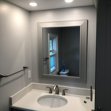
The centerpiece of the remodel is the stock single-sink vanity. This stylish yet practical addition provides ample storage and counter space, making daily routines more convenient. Above the vanity, we installed a sleek mirror that adds both functionality and a touch of sophistication.
The shower area received a complete makeover with new tiles and an adjustable rain shower head. The tile work extends from floor to ceiling, creating a cohesive and luxurious feel. The adjustable rain shower head offers a customizable bathing experience, combining both style and comfort.
This small bathroom remodel exemplifies our commitment to quality and attention to detail. By starting from the studs and rebuilding with modern, high-quality materials, we've created a space that is beautiful and built to last. Our client now enjoys a stylish, functional bathroom that meets their needs and enhances their home's value.

 Universal Appliance and Kitchen Center
Simply Revolutionary
The beautiful, patented stainless steel tap is designed to be built into any tabletop. The simplicity of the TopBrewer fits elegantly into any surroundings and allows you to focus on a more direct contact with your customers or clients. The TopBrewer brews a perfect cup of fresh-bean coffee – every time.
Put coffee in the centre of your workplace.
Imagine a product which adapts to your needs. The TopBrewer is designed to seamlessly become a part of your regular work environment, and enhances it. If you're looking for cold water, juice or a piping hot espresso, this is the solution for you. Your café, reception or meeting area will never be the same. With the TopBrewer you take up only 1% counterspace in return for 100% customer satisfaction. Combine multiple TopBrewer units, to cater for all your needs, easily adapting to your environment and allowing for several servings simultaneously.
Low energy usage.
Not only does the TopBrewer have more drinks than any other coffeebrewer. It offers higher performance than any previous coffeebrewers, it’s also more energy efficient, using up to 90 per cent less energy in the idle state than our competitors.
Friendly to the environment.
The coffee-brewer is mostly produced using steel. Steel is the most recycled material in the world, and in it's recycled state it saves 80% CO2 emissions and 75% of the energy needed to create steel from raw materials. Steel can be recycled infinitively without loss of strength or durability.
Power saving - standby timer.
With most units in the coffee world, they very rarely want to switch them to standby or even switch them completely off. The reason being there is a internal water tank which is being kept warm. In the TopBrewer, we encourage you to use the powersaving mode, the unit is designed so that from a cold start to the first brew it only takes 45 sec. The schedule system within the machine ensures, that it will not be using energy when you dont desire it.
Single touch brewing.
One-Click function for fast and easy operations with a clean surfaced animation - interacting with our app and brewing a cup of coffee, is all part of the coffee experience.
Brew status always in presence:
As a user of the TopBrewer, you will always be presented with the current state. Is the machine ready to brew, queuing a drink or is it in the process of grinding your fresh beans. No matter what happens in the process, the TopBrewer will inform you of it's current activity.
172