
Search results for "Straightened" in Home Design Ideas
 Swanson Homes
Landmark Photography - Jim Krueger
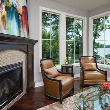
Living room - small transitional formal and enclosed medium tone wood floor and brown floor living room idea in Minneapolis with gray walls, a corner fireplace, a tile fireplace and no tv
Living room - small transitional formal and enclosed medium tone wood floor and brown floor living room idea in Minneapolis with gray walls, a corner fireplace, a tile fireplace and no tv
 Speed Pro Painting
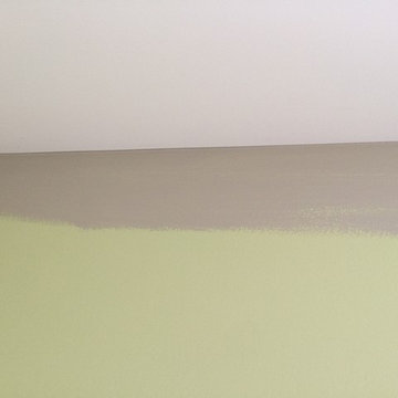
Straighten up old lines.
AFTER
Bedroom - modern carpeted bedroom idea in Detroit with gray walls
Bedroom - modern carpeted bedroom idea in Detroit with gray walls
 Studio TOOP
design: Studio TOOP, 2009
location: Amersfoort, NL
status: built in 2009, Tuinvreugd
photo: Jolanthe Lalkens, 2010
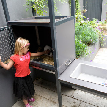
A family friendly garden that, doesn't look like, well, a family garden. That was the assignment. Clean lines, a modern feel, not too much work, enough space for the kids to play and, oh yeah, a cage for the rabbit all in a space less than 50 m2.
The new extension on the back of the house, catty cornered slightly with the original facade and the garden boundaries brought it's own challenges. This diagonal was used to make extra space for different functions but "straightened" in the experience of the inner square. Inside the aluminum pergola (coated in the same gray - ral 7016 - as the woodwork on the extension) house various functions: the rabbit cage, a water and sand table, the swing (steel rod in the aluminum for extra support) and a table where the kids can draw or play table football.
Find the right local pro for your project
 Port Elgin Home Installs
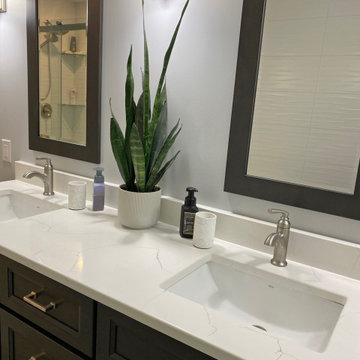
This Port Elgin renovation involved a complete kitchen & bathroom remodel, and new flooring throughout. Unfortunately, when we pulled up the existing flooring in the dining area, we discovered major issues with the floor joists underneath, which had caused the floor to sag. That required extensive work replacing the floor joists in order to bring the floor back to level. Once the repair was done, we were able to lay the new flooring.
In the meantime, the Home Installs team had carried on with the rest of the work had been going on. There were additional items the team worked on, such as replacing the main stair rail & bannister, removing an existing staircase at the back of the house, straightening some walls and more. But the bulk of the work was the kitchen and the main bathroom.
Stonewood "Belrose Lakeside Ensuite" cabinets.
Maxx "Delsia" free-standing tub.
Cowan "Snow" wall tile (discontinued).
Shaw Paragon Floor Tile Plus "Pebble".
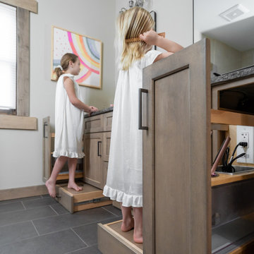
 Docking Drawer
In drawer outlets by Docking Drawer provide a safe way to power and store hair tools such as hair dryers and hair straighteners. Bathroom design by Dorig Designs LLC
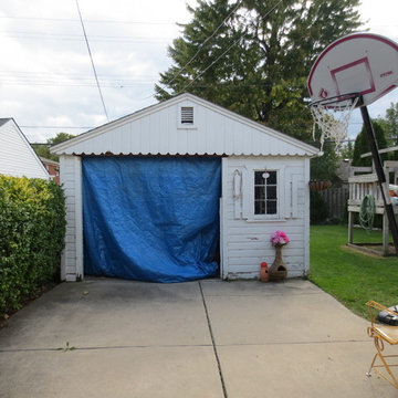
 Jewel Construction And Remodeling Services
Original garage plumed and straighten garage, updated with aluminum siding around four sides of the garage, Installed garage door, installed new gutters.
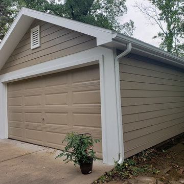
 Shield Xteriors
After. 7" reveal James Hardie lap siding in Khaki Brown, with Arctic White trim, soffit, and fascia. Painted garage door to match siding. Walls have been straightened out.
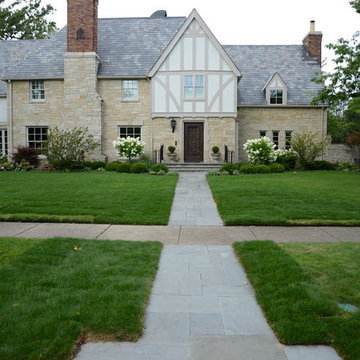
 Marilyn's Dreamscapes L.L.C.
This walkway was straightened after the Maple tree was removed. It used to curve around the tree.
Inspiration for a large traditional partial sun stone landscaping in Chicago.
Inspiration for a large traditional partial sun stone landscaping in Chicago.
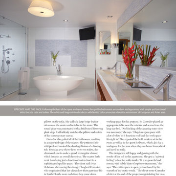
 J Design Group - Interior Designers Miami - Modern
AVENTURA MAGAZINE selected our client’s luxury 5000 Sf ocean front apartment in Miami Beach, to publish it in their issue and they Said:
Story by Linda Marx, Photography by Daniel Newcomb
Light & Bright
New York snowbirds redesigned their Miami Beach apartment to take advantage of the tropical lifestyle.
WHEN INTERIOR DESIGNER JENNIFER CORREDOR was asked to recreate a four-bedroom, six-bath condominium at The Bath Club in Miami Beach, she seized the opportunity to open the rooms and better utilize the vast ocean views.
In five months last year, the designer transformed a dark and closed 5,000-square-foot unit located on a high floor into a series of sweeping waterfront spaces and updated the well located apartment into a light and airy retreat for a sports-loving family of five.
“They come down from New York every other weekend and wanted to make their waterfront home a series of grand open spaces,” says Corrredor, of the J. Design Group in Coral Gables, a firm specializing in modern and contemporary interiors. “Since many of the rooms face the ocean, it made sense to open and lighten up the home, taking advantage of the awesome views of the sea and the bay.”
The designer used 40 x 40 all white tile throughout the apartment as a clean base. This way, her sophisticated use of color would stand out and bring the outdoors in.
The close-knit family members—two parents and three boys in college—like to do things together. But there were situations to overcome in the process of modernizing and opening the space. When Corredor was briefed on their desires, nothing seemed too daunting. The confident designer was ready to delve in. For example, she fixed an area at the front door
that was curved. “The wood was concave so I straightened it out,” she explains of a request from the clients. “It was an obstacle that I overcame as part of what I do in a redesign. I don’t consider it a difficult challenge. Improving what I see is part of the process.”
She also tackled the kitchen with gusto by demolishing a wall. The kitchen had formerly been enclosed, which was a waste of space and poor use of available waterfront ambience. To create a grand space linking the kitchen to the living room and dining room area, something had to go. Once the wall was yesterday’s news, she relocated the refrigerator and freezer (two separate appliances) to the other side of the room. This change was a natural functionality in the new open space. “By tearing out the wall, the family has a better view of the kitchen from the living and dining rooms,” says Corredor, who also made it easier to walk in and out of one area and into the other. “The views of the larger public space and the surrounding water are breathtaking.
Opening it up changed everything.”
They clients can now see the kitchen from the living and dining areas, and at the same time, dwell in an airy and open space instead of feeling stuck in a dark enclosed series of rooms. In fact, the high-top bar stools that Corredor selected for the kitchen can be twirled around to use for watching TV in the living room.
In keeping with the theme of moving seamlessly from one room to the other, Corredor designed a subtle wall of glass in the living room along with lots of comfortable seating. This way, all family members feel at ease while relaxing, talking, or watching sporting events on the large flat screen television. “For this room, I wanted more open space, light and a supreme airy feeling,” she says. “With the glass design making a statement, it quickly became the star of the show.”…….
….. To add texture and depth, Corredor custom created wood doors here, and in other areas of the home. They provide a nice contrast to the open Florida tropical feel. “I added character to the openness by using exotic cherry wood,” she says. “I repeated this throughout the home and it works well.”
Known for capturing the client’s vision while adding her own innovative twists, Corredor lightened the family room, giving it a contemporary and modern edge with colorful art and matching throw pillows on the sofas. She added a large beige leather ottoman as the center coffee table in the room. This round piece was punctuated with a bold-toned flowering plant atop. It effortlessly matches the pillows and colors of the contemporary canvas.
Miami,
Miami Interior Designers,
Miami Interior Designer,
Interior Designers Miami,
Interior Designer Miami,
Modern Interior Designers,
Modern Interior Designer,
Modern interior decorators,
Modern interior decorator,
Contemporary Interior Designers,
Contemporary Interior Designer,
Interior design decorators,
Interior design decorator,
Interior Decoration and Design,
Black Interior Designers,
Black Interior Designer,
Interior designer,
Interior designers,
Interior design decorators,
Interior design decorator,
Home interior designers,
Home interior designer,
Interior design companies,
Interior decorators,
Interior decorator,
Decorators,
Decorator,
Miami Decorators,
Miami Decorator,
Decorators Miami,
Decorator Miami,
Interior Design Firm,
Interior Design Firms,
Interior Designer Firm,
Interior Designer Firms,
Interior design,
Interior designs,
Home decorators,
Interior decorating Miami,
Best Interior Designers,
Interior design decorator,

 Deb Seeley Designs LLC
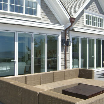
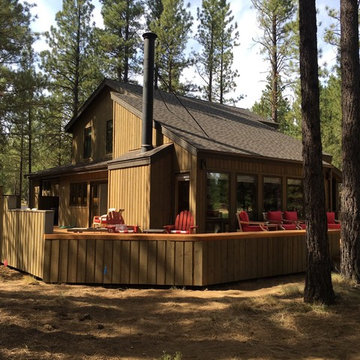
Added cedar siding with a custom stain. Straighten the wall left of the fireplace and went out to add four bedrooms, four bathrooms, laundry room, and single car garage with storage room. Added approximately 1600 square feet to the foot print.
 Studio41 Home Design Showroom
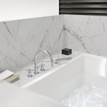
YOU DON'T CHANGE A CLASSIC. YOU REFINE IT. | Tara is the contemporary interpretation of a design icon. Evolution in design, in architecture, new finishes and colors. These are small changes, fine details. But it is precisely these details that determine the class of Tara. Tara looks even more elegant. The extended body formally straightens up the fitting. The rosettes and handles are more streamlined, and the overall contours are sharper. All this is done to put even greater emphasis on the perfect, geometric, symmetric and clear use of form and to concentrate and refocus. TARA has set the standard for more than a decade. Tara will set the standard for the future. | Available at www.shopstudio41.com
 Marilyn's Dreamscapes L.L.C.
The existing perennial garden curved into the lawn and was overrun with daylillies and ferns. The edge was straighten, moved back, simplified and is now ready for new colorful plantings in the Spring.
The Parking Pad was added to create two more parking places out of Brussel Blocks.
Marilyn Musgjerd
 Cape Associates, Inc.
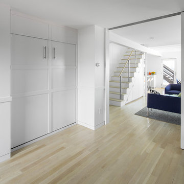
This 1,200 square-foot Provincetown condominium lives large, both functionally and aesthetically, thanks to its recent renovation. The waterfront home, overlooking Cape Cod Bay, is part of an historic grouping of three individual buildings on Commercial Street that have been combined into condominiums.
Begun in November 2014 and completed just in time for summer in May 2016, b Architecture Studios and Cape Associates Builders worked with a budget of $366,000 to transform this prosaic dwelling into a stunning light-flooded space—designed to maximize both the living space and the mesmerizing views of the bay.
“The space was totally reconfigured,” said project manager Jon Ziperman. “It was a total gut job requiring leveling of floors, straightening of walls, removing a chimney and fireplace that ran up to the above neighbors’ unit.” The renovation also required a complete rewiring and plumbing system that involved wires and pipes that were integrated into the surrounding units. From wall to wall and floor to ceiling, there was nothing that could be salvaged from the original space.
One of the most prominent changes was moving the stairway from its original placement, where it originally broke up the living and dining space and blocked views to the bay beyond. The stairway now sits on the opposite side of the condominium. With the stairs tucked to the left side of the living area, the sightline now extends from the entry straight through the living and dining areas to the water. The new design allowed for storage space beneath the stairs, which lead to an airy sleeping loft, and room for a desk niche. A light well, where the former sleeping area was, and new windows bring abundant natural light to the central living area.
Innovative features in the entry room include a Murphy bed and sliding glass door separating it from the living area, so that the space can double as a guest room.
“The Murphy bed fit in nicely, allowing for a flush wall at the entry/guest room and a desk niche in the adjacent room,” Brown said. “Convincing the client to create the wrap-around chair rail, lined up with the divided lights of the sliding glass door, makes a purposeful connection in a small space.”
Neolith countertops in the open kitchen and details like the flush minimal baseboard contribute to the sleek, modern aesthetic, now complemented by the owner’s contemporary furnishings. This complete renovation has rendered this compact home worthy of its beautiful setting.
 Synergy Design & Construction
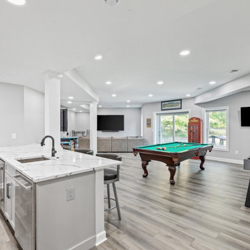
After: By straightening the bar footprint, creating a single-level surface, and reorienting the rest of the room, the bar is now part of the natural flow of the basement. The front and back bar areas, with a sleek undermount sink and Delta Trinsic faucet in matte black, turn this spot into a natural hub for entertaining.
 The Design House
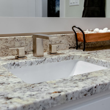
This Corinth bathroom update proves that durability can still look sophisticated. For this high-traffic vanity, we selected Bianco Antico Granite. unlike engineered surfaces, natural granite is incredibly heat-resistant, making it the perfect choice for bathrooms where hot curling irons or straighteners might be set down on the counter.
The "Practical Luxury" Execution:
The Stone: We fabricated this granite vanity top in-house at Stonemeyer Granite. Notice the tight eased edge profile—simple, modern, and easy to clean. We also installed a matching 4-inch granite backsplash to protect the drywall from water splashes, a practical must-have for kids' bathrooms.
The Sink: We modernized the look by swapping the standard oval bowl for a crisp Rectangular Porcelain Undermount Sink. It maximizes counter space and gives the vanity a fresher, updated feel.
The Faucet: Our plumbing team (Haltex Plumbing) installed a widespread Brushed Nickel Faucet with a modern square profile. Widespread faucets are easier to clean around than localized "centerset" options, keeping hard water buildup at bay.
The Value: By using a remnant piece from our massive Denton Slab Yard, the homeowner got premium natural stone for a fraction of the cost of a full slab—one of the perks of working with a remodeler who owns their own inventory.
Materials Used:
Countertop: Bianco Antico Granite (Polished)
Sink: Rectangular White Ceramic Undermount
Faucet: Widespread Brushed Nickel [Square Profile]
Cabinetry: White Shaker (Existing Repainted)
If you need a bathroom countertop replacement in Corinth that balances budget, style, and bulletproof durability, visit The Design House slab yard today.
 Studio TOOP
design: Studio TOOP, 2009
location: Amersfoort, NL
status: built in 2009, Tuinvreugd
photo: Jolanthe Lalkens, 2010
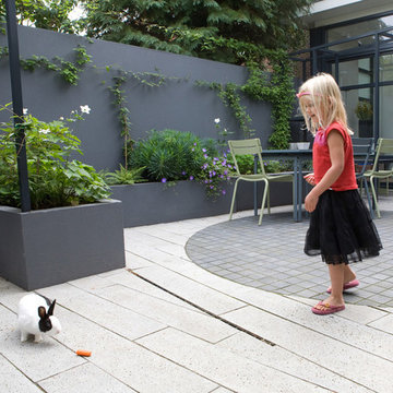
A family friendly garden that, doesn't look like, well, a family garden. That was the assignment. Clean lines, a modern feel, not too much work, enough space for the kids to play and, oh yeah, a cage for the rabbit all in a space less than 50 m2.
The new extension on the back of the house, catty cornered slightly with the original facade and the garden boundaries brought it's own challenges. This diagonal was used to make extra space for different functions but "straightened" in the experience of the inner square. Inside the aluminum pergola (coated in the same gray - ral 7016 - as the woodwork on the extension) house various functions: the rabbit cage, a water and sand table, the swing (steel rod in the aluminum for extra support) and a table where the kids can draw or play table football.
 Gary J. Basten Construction, Inc.
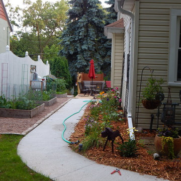
A beautiful Allouez home with many foundation issues.
Large trendy yellow two-story vinyl house exterior photo in Other
Large trendy yellow two-story vinyl house exterior photo in Other
 Cedarstone Group Inc.
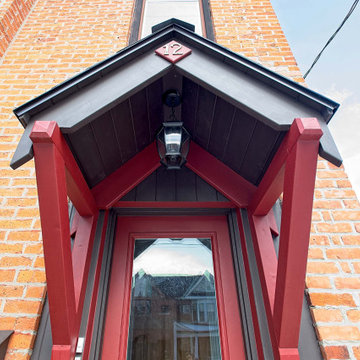
This 100+ year old house in East York needed a new face lift on the front porch. We rebuilt the whole porch to the front entrance, straightening everything back up. The stunning red really pops in the contrast with the black/deep blue.
 Benvenuti and Stein
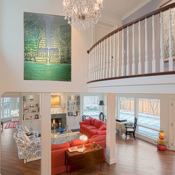
We literally rebuilt the structure on the inside, gutting the framing from 1st floor to the roof rafters in many areas, doubling every stud that remained to straighten walls that were 2” out of plumb, adding a dozen steel columns and a number of steel beams to support the new open design. The glass walls facing the yard and pool open up the home giving a sense that the exterior spaces are an extension of the interior, very typical of southern California living.
Norman Sizemore- photographer
11