
Search results for "Streamlined examine in" in Home Design Ideas
 Shades of Gray Design Studio
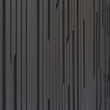
Wood accent wall.
Living room - contemporary open concept vaulted ceiling living room idea in Austin with a wall-mounted tv
Living room - contemporary open concept vaulted ceiling living room idea in Austin with a wall-mounted tv
 GRANGE FURNITURE INC.
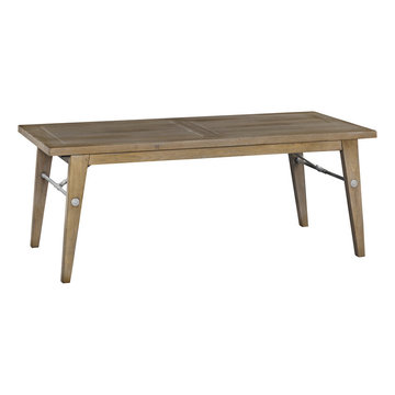
1094 Conservatory Table L 78 ¾ x H 30 ¾ x D 37 ½
Elegant home design photo in New York
Elegant home design photo in New York


Find the right local pro for your project


 Ollin Stone
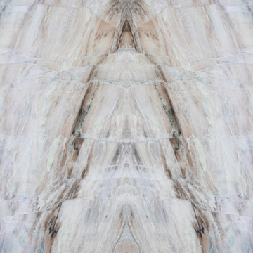
This Zermatt Quartzite is certainly the belle of the ball – rare, luxurious, and full of color. The stone appears quite delicate with its rosy hue “marred” by the unique pattern left by the dark veins scrawled across the surface. Elegance still reigns, thanks to the patches of white quartz. 2CM Quartzite slabs w/ polished finish, custom finishes available upon request.



 KURV Architecture DPC (Alex Hughes Architects)
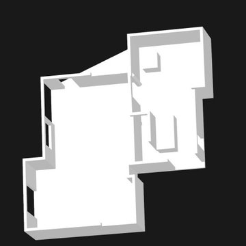
Located in the heart of Manhattan’s Lower East Side, the building was erected on a shallow commercial lot between two 120 year old masonry buildings and a new residential rental building. 330 Grand Street is a mix of 725 SF 1BRs and 1050 SF 2BR apartments. It also contains a 1100 SF two story duplex as well as private and public rooftop space, large private balconies for most units and two large private terraces for the ground floor units.
330 Grand Street was originally designed and approved at the NYC DOB as a prefabricated modular building. During the pandemic, as shipping costs skyrocketed putting the project at risk, we suggested redesigning the building as a reinforced cast-in-place concrete structure. Concrete was readily available and prices had not been affected by the demand increase that many other materials suffered in the pandemic. We took this opportunity to raise floor to ceiling heights, enlarge high performance windows and redistribute the buildings MEPFS and Structural Systems to create very open floor plans.
The challenge was to create a luxurious sensorial living experience with very limited means. In a city with very high construction costs, low cost residential buildings in the area are usually devoid of good quality, design and character. Our approach was to aim high for the end user, prioritizing natural light, open space with long visual perspectives, high ceilings and as always, rejecting the use of predefined building templates.
Our biggest challenge was to ensure that the small spaces feel as clean cut, large and bright as possible. Several unique design decisions were made to ensure low cost and high quality;
Floor plans were laid out so that spaces were wide open and free of clutter from mechanical or structural interruptions. Therefore all infrastructure was placed in lateral demising walls, which in turn act as the unit’s storage and kitchen. The apartments feel wide open, are super quiet and have more storage space than any other comparable apartment in the city.
To solve the problem of the site’s shallow commercial lot which is typically prone to dark interior spaces we focused our attention on the building’s envelope. Instead of the usual small punched window openings, oversized high performance windows were designed to ensure that light penetrated as far as possible into the units. In the smaller 1BR units, the full 50’ depth of the lot is perceived by partitioning spaces with sliding pocket doors that can be retracted to allow deep visual perspectives, making the sight lines in the space feel longer, larger, more ample than normal. In addition to the full height glazing, each unit above the 2nd floor receives a 7 foot covered balcony, adding 120 to 240 sf to each apartment, something unusual in New York City buildings. The space is large enough for a full size dining table, when the weather permits being outside.
We also worked hard to ensure modularity. For example, all kitchen units are all identical throughout the building. The idea of modularity and the economy of the repetitive unit is exercised to the maximum through the building.
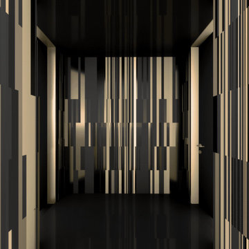
Hardware, appliances, flooring, wall coverings and material finishes are all carefully selected to feel bespoke, high quality and unique.
It was important to KURV that the result of this work manifest into something that would deeply connect with the end user and sustain relationships with the consumers of this space.
All images by KURV Architecture ©

 TVL Creative Ltd.
There’s nothing as wonderful as walking into a mid-century gem with clients who love the character of their new home. Our goal for this project was to incorporate the mid-century bones of this home into a new design that would better meet the contemporary needs of our clients. We started by taking down the walls that had separated this kitchen from the rest of the home and creating a welcoming space that blended seamlessly with the new open concept. The new kitchen design was a win for our clients with increased storage, more work surfaces, and a peninsula with plenty of seating. We utilized wood finishes through out this space with light wood flooring, medium-tones on the cabinetry, and darker wood accents throughout giving us a beautiful balance and a calm backdrop. This home had beautiful horizontal lines that we wanted to accentuate, so we selected a dark wood finish for the central beam and tied it in with the dark finish on the wood fireplace mantel and the stair handrail to emphasize the horizontal features. But we never miss an opportunity for a fun mid-century pop, and this home provided plenty of inspiration! The boomerang hardware on the cabinets and escher backsplash tiles give us great geometric elements to break up the clean lines of the rest of the space. One of our favorite features of this home was the original plaster ceilings with the custom hand troweled texture. We knew from the beginning that this was an element we wanted to maintain and accentuate, so when we opened up the kitchen and added recessed lighting we reached out to a local plaster artisan to carry the texture throughout the space, and we couldn’t be happier with the results. This design brings together the mid-century aesthetics of clean lines and fun patterns with the modern-day functionality our clients were looking for in their new kitchen.

 User
Embark on an Ozarks excursion with a modest 1,300 square-foot design called The Flatlands. It’s a basic human drive to want to surround oneself with beautiful, traditional, or even timeless landscapes like those witnessed in the Ozark region of Missouri and Arkansas. Believe it or not, this secluded and remote landscape edges ever closer to easily achievable reality thanks to innovations in technology never before seen. This design features a large living space, ample master suite, and an efficient kitchen/dining arrangement with adjacent screened porch. In addition, this design incorporates a second-level loft space with clerestory views and a generous wrap-around exterior deck.
Image by REspace Design





 Bennett Contracting, Inc.
This Loudonville couple started by getting a quote to finish their attic space, but then changed gears and decided the kitchen was more important at this time. Estimator Anthony and designer Justina from Bennett Contracting went to work on a new design. The home is an older colonial with classic features, and the existing kitchen was a poorly laid out 90’s nightmare. With children in the home the island cooktop alone was a constant danger. By adding a window and removing the wall from the dining room, the new kitchen is much brighter and connected to the rest of the home. Bennett removed the old vinyl tile and continued the wood flooring into the new kitchen space. Justina admits it was so much fun working on this project because the owners were open to all sorts of design features. Roll-outs in most cabinets, hidden bread boards, hutch coffee bar, brass chicken wire, and the very cool antique foot rail. Then there are the custom cabinet colors. RD Henry Cabinets matched Glidden paint colors to get the exact color the client desired. They even sent three cabinet samples to get it right. These classic features combined with the modern design brings new life to the space.
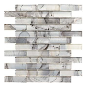
 Italo Céramique
This beautiful and unique glass mosaic tile brings a touch of color to any tone-based room! The mix of color, mother-of-pearl effect and its subtle intricacy will surely catch the everyone's attention!
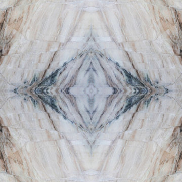 Ollin Stone
This Zermatt Quartzite is certainly the belle of the ball – rare, luxurious, and full of color. The stone appears quite delicate with its rosy hue “marred” by the unique pattern left by the dark veins scrawled across the surface. Elegance still reigns, thanks to the patches of white quartz. 2CM Quartzite slabs w/ polished finish, custom finishes available upon request.


33