
Search results for "Structured approach" in Home Design Ideas
 Homeowner Services of Michigan LLC
Homeowner Services of Michigan (HSM) is excited to share the details of a new 16' x 22' family room expansion in Ann Arbor, Michigan. This project reflects our dedication to meeting our clients' specific needs.
Our clients approached us needing more space for their growing family and wanted a seamless integration with their existing home. After thorough consultations, we developed a plan to bring their vision to life.
The project began with careful architectural planning. We worked with a local architect to create detailed plans and secured all necessary permits to ensure compliance with local building codes.
Site preparation involved demolishing an existing carport, grading, and excavation to prepare the building pad for the new foundation. This step was essential to ensure a stable base for the construction.
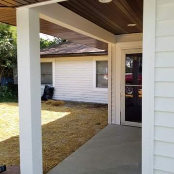
Our team then focused on structural framing, tying the new addition to the existing home. We ensured that the new structure matched the current architectural style for a seamless blend. The addition was then roofed and sheathed to provide a sturdy and weatherproof exterior.
Next, we addressed the electrical work, installing new circuits for lighting, HVAC, and receptacles, and adding smoke and carbon monoxide detectors to meet safety standards. A licensed journeyman electrician performed the electrical service to ensure high-quality and compliant installations.
Insulation and drywall installation followed. We installed batt insulation to meet or exceed Michigan Energy Code requirements. The interior surfaces were finished with drywall, taping, mudding, sanding, and priming to prepare for painting. Baseboard molding and trim around doors and windows added the finishing touches.
Exterior features were also important. We framed and installed new windows and a front entry door and added a front eyebrow vent feature to match the existing structure. Vinyl siding was installed to complete the exterior, ensuring a cohesive look and enhanced curb appeal.
Throughout the project, we maintained a clean and professional worksite, disposing of debris responsibly and minimizing disruption to the client's daily lives. Our focus was always on delivering quality and ensuring client satisfaction.
This home addition project highlights our commitment to understanding and fulfilling our clients' needs. We are proud to have added valuable space and enhanced the overall functionality and aesthetic of the home.
These folks had a vision, a budget, and a whole lot of patience. We got through this family room remodel during a global pandemic. What great people to work with!
 Homeowner Services of Michigan LLC
Homeowner Services of Michigan (HSM) is excited to share the details of a new 16' x 22' family room expansion in Ann Arbor, Michigan. This project reflects our dedication to meeting our clients' specific needs.
Our clients approached us needing more space for their growing family and wanted a seamless integration with their existing home. After thorough consultations, we developed a plan to bring their vision to life.
The project began with careful architectural planning. We worked with a local architect to create detailed plans and secured all necessary permits to ensure compliance with local building codes.
Site preparation involved demolishing an existing carport, grading, and excavation to prepare the building pad for the new foundation. This step was essential to ensure a stable base for the construction.
Our team then focused on structural framing, tying the new addition to the existing home. We ensured that the new structure matched the current architectural style for a seamless blend. The addition was then roofed and sheathed to provide a sturdy and weatherproof exterior.
Next, we addressed the electrical work, installing new circuits for lighting, HVAC, and receptacles, and adding smoke and carbon monoxide detectors to meet safety standards. A licensed journeyman electrician performed the electrical service to ensure high-quality and compliant installations.
Insulation and drywall installation followed. We installed batt insulation to meet or exceed Michigan Energy Code requirements. The interior surfaces were finished with drywall, taping, mudding, sanding, and priming to prepare for painting. Baseboard molding and trim around doors and windows added the finishing touches.
Exterior features were also important. We framed and installed new windows and a front entry door and added a front eyebrow vent feature to match the existing structure. Vinyl siding was installed to complete the exterior, ensuring a cohesive look and enhanced curb appeal.
Throughout the project, we maintained a clean and professional worksite, disposing of debris responsibly and minimizing disruption to the client's daily lives. Our focus was always on delivering quality and ensuring client satisfaction.
This home addition project highlights our commitment to understanding and fulfilling our clients' needs. We are proud to have added valuable space and enhanced the overall functionality and aesthetic of the home.
These folks had a vision, a budget, and a whole lot of patience. We got through this family room remodel during a global pandemic. What great people to work with!
 CAST architecture
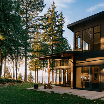
Just north of Seattle, this family home is tucked away on a magical parcel of land within the Edmonds city limits. Designed to maximize the site’s breathtaking views, it is carefully sited to blend into its wooded setting while opening fully to expansive views.
On our first visit, we found a secluded forest glade with stunning vistas of Puget Sound and the Olympic Mountains perched atop a high seaside bluff. Preserving and enhancing this singular landscape as the surrounding neighborhood fills in with development was central to our design.
The approach is intentionally restrained—the home does not reveal itself entirely upon arrival. The house is composed of two wings that cradle the meadow, making it the most important “room.” Interior spaces are oriented towards the lush landscape and impressive views framed by mature trees.
The structures are kept close to the perimeter, leaving the center of the site unbuilt. A covered bridge with a green roof acts as a front porch, linking the upslope garage/office with the main house. A gentle stair flows through the gap between the structures, drawing visitors into the clearing.
The floorplan is highly efficient, carefully tuned to the family’s daily routines. Each room is exactly suited to its purpose, yet no larger than needed.
An open corner with double-height windows creates a jewel-box dining room. Free of a corner structure, the home expands to encompass the covered patio for outdoor cooking and dining, plus easy access to the kitchen, encouraging year-round outdoor living.
Human-scale moments are intentionally created, from a stairway window seat with peekaboo views to a covered outdoor extension of the great room that fosters a cozy relationship between interior and exterior.
Much of the light-filled interior is wrapped in clear-finished fir, giving it a warm glow even on rainy winter days. White oak cabinets and black soapstone countertops add warmth to the kitchen. The built-in furniture in the library loft and the cold-rolled steel fireplace surround were crafted by the owner’s father, an expert woodworker, increasing the connection between the home and its occupants. The second story includes the primary suite with treehouse vibes.
Located on a steep slope in a landslide-prone area, the Edmonds Overlook overcame numerous technical and engineering challenges to address vehicle and fire access, stormwater and erosion mitigation, and potential earth movement.
Green Design:
Compact footprint and conditioned area compared to comparable homes, reducing carbon and ongoing energy use
Green roof at covered entry
Heat-pump air and water heating with multiple zones to maximize efficiency
Whole-house Heat Recovery Ventilation system
Engineered On-Site Stormwater Management System
Landscape restoration using 100% native species, added 47 trees to site, plus meadow plantings
Find the right local pro for your project
 Charles Rose Architects Inc.
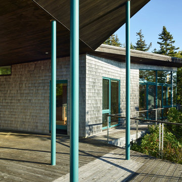
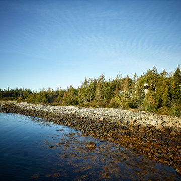
The approach to Edge House, a walk through verdant woodland abundant with ferns and moss, is a lesson in arrival. What appears is a woodsy yet contemporary dwelling divided into two volumes, framing an ocean view. Located on an island off Midcoast, Maine, Edge House is a low-slung cabin that hugs the rocky coast. The client commissioned Charles Rose Architects to design a simple cottage retreat that could take full advantage of the view, while also remaining inconspicuously nestled in the trees. The solution was a simple wood-shingled structure that features large glass windows, connecting both structure and inhabitant to the site. From the water’s edge, only a few hundred meters away, the house is barely visible. The selection of contextual materials, specifically cedar shingles, was meant to embed the structure in the landscape. For the interior, bedrooms are purposefully small, and beds were positioned close to the full-height windows, allowing occupants to immerse themselves in the view. Clerestory windows under the roof further amplify the quality of natural light and create a weightless effect on the roof from the outside. The stone fireplace, located in the living room, was crafted with stones gathered from the site as another way to bring the outdoors in.
 KURV Architecture DPC (Alex Hughes Architects)
Located in the heart of Manhattan’s Lower East Side, the building was erected on a shallow commercial lot between two 120 year old masonry buildings and a new residential rental building. 330 Grand Street is a mix of 725 SF 1BRs and 1050 SF 2BR apartments. It also contains a 1100 SF two story duplex as well as private and public rooftop space, large private balconies for most units and two large private terraces for the ground floor units.
330 Grand Street was originally designed and approved at the NYC DOB as a prefabricated modular building. During the pandemic, as shipping costs skyrocketed putting the project at risk, we suggested redesigning the building as a reinforced cast-in-place concrete structure. Concrete was readily available and prices had not been affected by the demand increase that many other materials suffered in the pandemic. We took this opportunity to raise floor to ceiling heights, enlarge high performance windows and redistribute the buildings MEPFS and Structural Systems to create very open floor plans.
The challenge was to create a luxurious sensorial living experience with very limited means. In a city with very high construction costs, low cost residential buildings in the area are usually devoid of good quality, design and character. Our approach was to aim high for the end user, prioritizing natural light, open space with long visual perspectives, high ceilings and as always, rejecting the use of predefined building templates.
Our biggest challenge was to ensure that the small spaces feel as clean cut, large and bright as possible. Several unique design decisions were made to ensure low cost and high quality;
Floor plans were laid out so that spaces were wide open and free of clutter from mechanical or structural interruptions. Therefore all infrastructure was placed in lateral demising walls, which in turn act as the unit’s storage and kitchen. The apartments feel wide open, are super quiet and have more storage space than any other comparable apartment in the city.
To solve the problem of the site’s shallow commercial lot which is typically prone to dark interior spaces we focused our attention on the building’s envelope. Instead of the usual small punched window openings, oversized high performance windows were designed to ensure that light penetrated as far as possible into the units. In the smaller 1BR units, the full 50’ depth of the lot is perceived by partitioning spaces with sliding pocket doors that can be retracted to allow deep visual perspectives, making the sight lines in the space feel longer, larger, more ample than normal. In addition to the full height glazing, each unit above the 2nd floor receives a 7 foot covered balcony, adding 120 to 240 sf to each apartment, something unusual in New York City buildings. The space is large enough for a full size dining table, when the weather permits being outside.
We also worked hard to ensure modularity. For example, all kitchen units are all identical throughout the building. The idea of modularity and the economy of the repetitive unit is exercised to the maximum through the building.
Hardware, appliances, flooring, wall coverings and material finishes are all carefully selected to feel bespoke, high quality and unique.
It was important to KURV that the result of this work manifest into something that would deeply connect with the end user and sustain relationships with the consumers of this space.
All images by KURV Architecture ©
 Picus Woodwrights
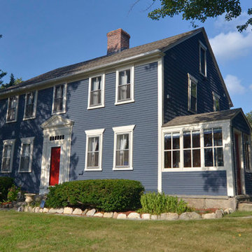
While we are not home inspectors, we are sometimes asked by clients who are considering buying an antique home to offer our thoughts and opinions on individual properties before they purchase them. Such was the case with Bryan and Erin in Smithfield, Rhode Island. When they called, they had already looked at the early nineteenth-century center chimney colonial on the hilltop and they were interested in looking again. Much of the house was original and, as is often the case in two-hundred-year-old buildings, long of tooth and ready for a new family to move in.
Erin and Bryan decided to be that family and we were thrilled to work with them to make the house their own. That started with performing a full structural evaluation of the existing house and determining what repairs they needed to consider. We also designed a single-storey shed style addition that would house a new kitchen and bathroom.
As with many projects undertaken on old buildings, it is wise to approach the work with a master plan in mind. We understand and share the hard truth that owning an antique property is often a financial burden and the decision to do so an expression of passion for… something different. Working with Bryan and Erin, we developed a master plan that established outlines for the work to happen over time.
They started with extensive structural repairs in the basement and portions of the exterior walls. We also added a new foundation for the addition and decided to reframe the flooring system through the original house out through the addition. This spared us the task of rebuilding the original collapsing foundation along that wall. We created a kitchen with an open floorplan but used reclaimed hard pine flooring through the addition to match the original floors elsewhere. We also reproduced any original millwork from elsewhere in the house for the added space.
Erin and Bryan aren’t farmers but they could be. Even before they moved in, they planted gardens and as our work wound down, they sent us home with vegetables daily.
 Southern Pro-Vision Landscape Construction
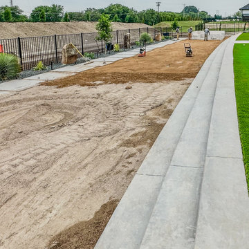
This project showcases a bold, architectural approach to a large-scale residential landscape, emphasizing clean lines and high-contrast materials to create a truly high-end outdoor experience.
The Design Vision:
The objective was to transform this expansive estate into a series of functional "outdoor rooms" that maintain a sleek, minimalist aesthetic. We focused on precision masonry and a neutral palette to allow the structural elements of the design to take center stage.
Key Features:
Architectural Hardscaping: We utilized large-scale, custom concrete pavers in a "floating" layout, creating a rhythmic and structured pathway that guides movement through the estate.
The Sunken Fire Lounge: A primary focal point, the sunken fire pit area features a custom-built, L-shaped bench with integrated stone backing. The use of sleek, light-toned stone veneer and smooth concrete surfaces creates a sophisticated space for evening entertainment.
Lush, Low-Maintenance Greenery: Vibrant, emerald artificial turf provides a stark, clean contrast against the cool gray tones of the concrete and stone. To add texture, we integrated native agave and yucca plantings set within dark basalt gravel beds, anchored by large natural boulders.
Structural Definition: The entire space is framed by clean-lined black ornamental fencing and multi-level concrete retaining walls, which manage the site's grade while adding to the modern, tiered look of the property.
The final result is a seamless blend of luxury and functionality, offering a refined Texas Modern aesthetic that is built for both high-impact visual appeal and effortless living.
Sponsored
Columbus, OH
Free consultation for landscape design!

Peabody Landscape Group
Columbus' Reliable Landscape Design & Contracting
 Charles Rose Architects Inc.
The approach to Edge House, a walk through verdant woodland abundant with ferns and moss, is a lesson in arrival. What appears is a woodsy yet contemporary dwelling divided into two volumes, framing an ocean view. Located on an island off Midcoast, Maine, Edge House is a low-slung cabin that hugs the rocky coast. The client commissioned Charles Rose Architects to design a simple cottage retreat that could take full advantage of the view, while also remaining inconspicuously nestled in the trees. The solution was a simple wood-shingled structure that features large glass windows, connecting both structure and inhabitant to the site. From the water’s edge, only a few hundred meters away, the house is barely visible. The selection of contextual materials, specifically cedar shingles, was meant to embed the structure in the landscape. For the interior, bedrooms are purposefully small, and beds were positioned close to the full-height windows, allowing occupants to immerse themselves in the view. Clerestory windows under the roof further amplify the quality of natural light and create a weightless effect on the roof from the outside. The stone fireplace, located in the living room, was crafted with stones gathered from the site as another way to bring the outdoors in.
 Tharanga Hewage Chartered Architect
Urban Family Retreat at Gampaha | A Vision of Seamless Flow
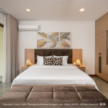
In the heart of Gampaha, an extraordinary residential project has emerged—a refined family retreat that balances modern design with comfort and functionality. The "Pass By Spaces" concept, central to this architectural vision, ensures that each area of the home flows seamlessly into the next. This thoughtful design approach creates a sense of unity and connection throughout the home, offering a sophisticated yet tranquil living experience for its residents.
The Design Concept: "Pass By Spaces"
The underlying philosophy of the project centers on the concept of “Pass By Spaces”—a circulation strategy that serves as the spine of the home. By utilizing this continuous circulation, the design allows the different spaces to interact with one another naturally. From the family living room to the study, guest areas, and private bedrooms, each function flows into the next through this unified circulation, creating a harmonious journey through the home. This approach not only enhances spatial connectivity but also fosters a sense of movement, encouraging ease and fluidity in daily living.
Architectural Team & Project Details
• Principal Architect | Archt. Tharanga Hewage contact | 076 869 0315
• Junior Architects | Sewwandi Nayanathara / Isuri Hettiarachchi
• Structural Engineer | Mr. Mahinda Rathnasiri
• Contractor | Mr. Lal Anura | Lal Construction
• Interior Architecture | Tharanga Hewage Chartered Architect
• Interior design and Contractor | Monara Creations
• Furniture | Singhe Furniture
• Window Fashion | Dilshan Drapers
• Wall Arts | Chakad Creation
• Land Extent | 25.01 perches
• Total Floor Area | 5059 sqft
• Ground Floor | 2802 sqft
• First Floor | 1878 sqft
• Roof Slab & Terraces | 379 sqft
• Photography | Ganidu Balasuriya photography
• Videography | Neyomal Rangeeth
Key Features of the Residence
Exterior and Car Porch:
The home’s exterior is marked by a sleek, modern design that complements its surroundings. A two-vehicle car porch provides ample space and easy access, while maintaining an elegant, minimalistic aesthetic.
Main Circulation:
The hallmark of this design is its single-spine circulation, which connects all key areas of the home. This circulation serves as the backbone of the house, facilitating smooth transitions between private and social spaces. The careful placement of rooms ensures that the flow is intuitive and unobtrusive, allowing each space to remain distinct while still being interconnected.
Interior Layout:
• Bedrooms: The home features five generously sized bedrooms, each designed to offer privacy and comfort. Some bedrooms include private terraces, providing residents with an intimate outdoor space.
• Family & Guest Areas: The expansive family living room is a central gathering space, complemented by a mini pantry for convenience. A dedicated guest living and dining area ensures that visitors enjoy a separate, comfortable space.
• Work & Study: A tranquil study room offers a quiet area for focus and reflection, while a flexible meeting room is perfect for professional engagements or personal gatherings.
• Private Spaces: In addition to the main living areas, the home includes a maid’s room, a laundry room, and four well-appointed bathrooms, including a powder room for guests.
• Storage & Utility: Thoughtful planning includes a generator room and ample storage space to meet the needs of modern living.
Design Considerations
A primary focus of the design is to maximize natural light and ventilation throughout the home. The strategic placement of windows, terraces, and open spaces ensures that every room benefits from an abundance of daylight and fresh air, creating an airy and welcoming environment.
Sustainability also plays a key role in this design. Eco-friendly materials are incorporated to ensure energy efficiency, while landscaping is carefully integrated to maintain harmony between the indoors and the surrounding environment. These design elements allow the home to feel like a serene retreat amidst the urban landscape of Gampaha.
Conclusion
The “Pass By Spaces” design concept not only elevates the architectural experience but also fosters a sense of connection and tranquility for the residents of this urban family retreat. With a seamless flow between spaces, thoughtful use of materials, and an emphasis on sustainability, this home exemplifies a modern approach to residential design that prioritizes both style and functionality. For prospective homeowners looking to create a space that embodies both beauty and practicality, this project serves as a testament to what can be achieved through innovative design and meticulous attention to detail.
Principal Architect | Archt. Tharanga Hewage
contact | 076 869 0315
Website | Design portfolio
https://www.tharangahewage.com/
https://www.behance.net/tharangaon71a4
Facebook Page | Instagram
https://www.facebook.com/Archt.tharangahewage
https://www.instagram.com/architect_tharanga_hewage/
YouTube Channel
https://www.youtube.com/channel/UCZLpclw5H62sOfvBz94XFOA
Linkedin
http://www.linkedin.com/.../archt-tharanga-hewage-aia-sl...
Copyright © 2025 | Archt. Tharanga Sandaruwan Hewage, B.Arch. (Hons), AIA(SL). All Rights Reserved.
 Bergland + Cram Architects
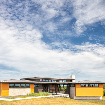
This contemporary home was designed with cues from Prairie and Usonian styles. Open clerestory living on the main floor was accomplished with a hybrid of wood frame construction and structural steel moment frames.
Home Features:
2 Custom fireplaces
Full Interior Design
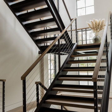
Suspended staircase
Bridge approach to front door
 KURV Architecture DPC (Alex Hughes Architects)
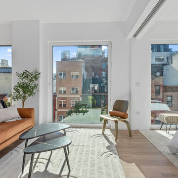
Located in the heart of Manhattan’s Lower East Side, the building was erected on a shallow commercial lot between two 120 year old masonry buildings and a new residential rental building. 330 Grand Street is a mix of 725 SF 1BRs and 1050 SF 2BR apartments. It also contains a 1100 SF two story duplex as well as private and public rooftop space, large private balconies for most units and two large private terraces for the ground floor units.
330 Grand Street was originally designed and approved at the NYC DOB as a prefabricated modular building. During the pandemic, as shipping costs skyrocketed putting the project at risk, we suggested redesigning the building as a reinforced cast-in-place concrete structure. Concrete was readily available and prices had not been affected by the demand increase that many other materials suffered in the pandemic. We took this opportunity to raise floor to ceiling heights, enlarge high performance windows and redistribute the buildings MEPFS and Structural Systems to create very open floor plans.
The challenge was to create a luxurious sensorial living experience with very limited means. In a city with very high construction costs, low cost residential buildings in the area are usually devoid of good quality, design and character. Our approach was to aim high for the end user, prioritizing natural light, open space with long visual perspectives, high ceilings and as always, rejecting the use of predefined building templates.
Our biggest challenge was to ensure that the small spaces feel as clean cut, large and bright as possible. Several unique design decisions were made to ensure low cost and high quality;
Floor plans were laid out so that spaces were wide open and free of clutter from mechanical or structural interruptions. Therefore all infrastructure was placed in lateral demising walls, which in turn act as the unit’s storage and kitchen. The apartments feel wide open, are super quiet and have more storage space than any other comparable apartment in the city.
To solve the problem of the site’s shallow commercial lot which is typically prone to dark interior spaces we focused our attention on the building’s envelope. Instead of the usual small punched window openings, oversized high performance windows were designed to ensure that light penetrated as far as possible into the units. In the smaller 1BR units, the full 50’ depth of the lot is perceived by partitioning spaces with sliding pocket doors that can be retracted to allow deep visual perspectives, making the sight lines in the space feel longer, larger, more ample than normal. In addition to the full height glazing, each unit above the 2nd floor receives a 7 foot covered balcony, adding 120 to 240 sf to each apartment, something unusual in New York City buildings. The space is large enough for a full size dining table, when the weather permits being outside.
We also worked hard to ensure modularity. For example, all kitchen units are all identical throughout the building. The idea of modularity and the economy of the repetitive unit is exercised to the maximum through the building.
Hardware, appliances, flooring, wall coverings and material finishes are all carefully selected to feel bespoke, high quality and unique.
It was important to KURV that the result of this work manifest into something that would deeply connect with the end user and sustain relationships with the consumers of this space.
All images by KURV Architecture ©
 Classic Muskoka Homes
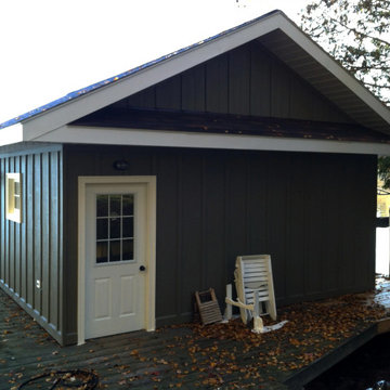
The Owners of this boathouse on Lake Rosseau approached us to modify the existing structure.
Classic Muskoka Homes prepared a Fixed-Price proposal for the construction of a new sloped roof structure for the existing boathouse which had an existing flat roof.
Work got underway with demolition & framing work on the roof structure. Upon investigation, it was determined that water ingress had caused damage to a wall and dock stringer timber along the boathouse's South wall. Port Sandfield Dockworks Incorporated performed repair work on the dock. We subsequently repaired the rotted wall framing in boathouse South wall.
New shingle roofing, board & batten siding, aluminum soffit & fascia were installed to integrate a fresh look for the boathouse.
This boathouse building project was completed within approximately one (1) month in 2013.
 SV Design
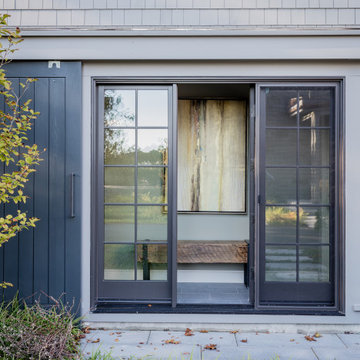
What began as a renovation project morphed into a new house, driven by the natural beauty of the site.
The new structures are perfectly aligned with the coastline, and take full advantage of the views of ocean, islands, and shoals. The location is within walking distance of town and its amenities, yet miles away in the privacy it affords. The house is nestled on a nicely wooded lot, giving the residence screening from the street, with an open meadow leading to the ocean on the rear of the lot.
The design concept was driven by the serenity of the site, enhanced by textures of trees, plantings, sand and shoreline. The newly constructed house sits quietly in a location advantageously positioned to take full advantage of natural light and solar orientations. The visual calm is enhanced by the natural material: stone, wood, and metal throughout the home.
The main structures are comprised of traditional New England forms, with modern connectors serving to unify the structures. Each building is equally suited for single floor living, if that future needs is ever necessary. Unique too is an underground connection between main house and an outbuilding.
With their flowing connections, no room is isolated or ignored; instead each reflects a different level of privacy and social interaction.
Just as there are layers to the exterior in beach, field, forest and oceans, the inside has a layered approach. Textures in wood, stone, and neutral colors combine with the warmth of linens, wools, and metals. Personality and character of the interiors and its furnishings are tailored to the client’s lifestyle. Rooms are arranged and organized in an intersection of public and private spaces. The quiet palette within reflects the nature outside, enhanced with artwork and accessories.

 KURV Architecture DPC (Alex Hughes Architects)
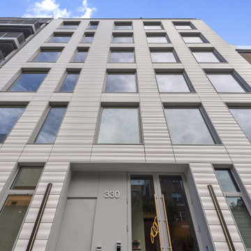
Located in the heart of Manhattan’s Lower East Side, the building was erected on a shallow commercial lot between two 120 year old masonry buildings and a new residential rental building. 330 Grand Street is a mix of 725 SF 1BRs and 1050 SF 2BR apartments. It also contains a 1100 SF two story duplex as well as private and public rooftop space, large private balconies for most units and two large private terraces for the ground floor units.
330 Grand Street was originally designed and approved at the NYC DOB as a prefabricated modular building. During the pandemic, as shipping costs skyrocketed putting the project at risk, we suggested redesigning the building as a reinforced cast-in-place concrete structure. Concrete was readily available and prices had not been affected by the demand increase that many other materials suffered in the pandemic. We took this opportunity to raise floor to ceiling heights, enlarge high performance windows and redistribute the buildings MEPFS and Structural Systems to create very open floor plans.
The challenge was to create a luxurious sensorial living experience with very limited means. In a city with very high construction costs, low cost residential buildings in the area are usually devoid of good quality, design and character. Our approach was to aim high for the end user, prioritizing natural light, open space with long visual perspectives, high ceilings and as always, rejecting the use of predefined building templates.
Our biggest challenge was to ensure that the small spaces feel as clean cut, large and bright as possible. Several unique design decisions were made to ensure low cost and high quality;
Floor plans were laid out so that spaces were wide open and free of clutter from mechanical or structural interruptions. Therefore all infrastructure was placed in lateral demising walls, which in turn act as the unit’s storage and kitchen. The apartments feel wide open, are super quiet and have more storage space than any other comparable apartment in the city.
To solve the problem of the site’s shallow commercial lot which is typically prone to dark interior spaces we focused our attention on the building’s envelope. Instead of the usual small punched window openings, oversized high performance windows were designed to ensure that light penetrated as far as possible into the units. In the smaller 1BR units, the full 50’ depth of the lot is perceived by partitioning spaces with sliding pocket doors that can be retracted to allow deep visual perspectives, making the sight lines in the space feel longer, larger, more ample than normal. In addition to the full height glazing, each unit above the 2nd floor receives a 7 foot covered balcony, adding 120 to 240 sf to each apartment, something unusual in New York City buildings. The space is large enough for a full size dining table, when the weather permits being outside.
We also worked hard to ensure modularity. For example, all kitchen units are all identical throughout the building. The idea of modularity and the economy of the repetitive unit is exercised to the maximum through the building.
Hardware, appliances, flooring, wall coverings and material finishes are all carefully selected to feel bespoke, high quality and unique.
It was important to KURV that the result of this work manifest into something that would deeply connect with the end user and sustain relationships with the consumers of this space.
All images by KURV Architecture ©
 SV Design
What began as a renovation project morphed into a new house, driven by the natural beauty of the site.
The new structures are perfectly aligned with the coastline, and take full advantage of the views of ocean, islands, and shoals. The location is within walking distance of town and its amenities, yet miles away in the privacy it affords. The house is nestled on a nicely wooded lot, giving the residence screening from the street, with an open meadow leading to the ocean on the rear of the lot.
The design concept was driven by the serenity of the site, enhanced by textures of trees, plantings, sand and shoreline. The newly constructed house sits quietly in a location advantageously positioned to take full advantage of natural light and solar orientations. The visual calm is enhanced by the natural material: stone, wood, and metal throughout the home.
The main structures are comprised of traditional New England forms, with modern connectors serving to unify the structures. Each building is equally suited for single floor living, if that future needs is ever necessary. Unique too is an underground connection between main house and an outbuilding.
With their flowing connections, no room is isolated or ignored; instead each reflects a different level of privacy and social interaction.
Just as there are layers to the exterior in beach, field, forest and oceans, the inside has a layered approach. Textures in wood, stone, and neutral colors combine with the warmth of linens, wools, and metals. Personality and character of the interiors and its furnishings are tailored to the client’s lifestyle. Rooms are arranged and organized in an intersection of public and private spaces. The quiet palette within reflects the nature outside, enhanced with artwork and accessories.
 180 RENOVATIONS
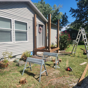
This front porch deck project in Wichita, Kansas was designed to completely upgrade the home’s curb appeal while creating a strong, welcoming entrance. The existing structure lacked both visual impact and long-term durability, making it the perfect opportunity for a full rebuild that would enhance both function and appearance.
At 180 Renovations, we approached this project with a focus on precision and structural integrity from the ground up. The original porch was removed and replaced with a brand-new custom-built deck system designed to provide long-lasting support and a clean, modern finish. Every detail was carefully executed to ensure the new front porch not only looked great but also delivered the reliability homeowners expect from a properly built outdoor structure.
Your front porch is one of the first things people see, and it should reflect the quality of your home. This project is a perfect example of how a professionally built front porch deck can instantly elevate a property. If you’re looking to improve your home’s exterior with a custom deck build or renovation, 180 Renovations is ready to help. Contact us today to get started.
 KURV Architecture DPC (Alex Hughes Architects)
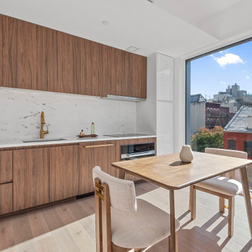
Located in the heart of Manhattan’s Lower East Side, the building was erected on a shallow commercial lot between two 120 year old masonry buildings and a new residential rental building. 330 Grand Street is a mix of 725 SF 1BRs and 1050 SF 2BR apartments. It also contains a 1100 SF two story duplex as well as private and public rooftop space, large private balconies for most units and two large private terraces for the ground floor units.
330 Grand Street was originally designed and approved at the NYC DOB as a prefabricated modular building. During the pandemic, as shipping costs skyrocketed putting the project at risk, we suggested redesigning the building as a reinforced cast-in-place concrete structure. Concrete was readily available and prices had not been affected by the demand increase that many other materials suffered in the pandemic. We took this opportunity to raise floor to ceiling heights, enlarge high performance windows and redistribute the buildings MEPFS and Structural Systems to create very open floor plans.
The challenge was to create a luxurious sensorial living experience with very limited means. In a city with very high construction costs, low cost residential buildings in the area are usually devoid of good quality, design and character. Our approach was to aim high for the end user, prioritizing natural light, open space with long visual perspectives, high ceilings and as always, rejecting the use of predefined building templates.
Our biggest challenge was to ensure that the small spaces feel as clean cut, large and bright as possible. Several unique design decisions were made to ensure low cost and high quality;
Floor plans were laid out so that spaces were wide open and free of clutter from mechanical or structural interruptions. Therefore all infrastructure was placed in lateral demising walls, which in turn act as the unit’s storage and kitchen. The apartments feel wide open, are super quiet and have more storage space than any other comparable apartment in the city.
To solve the problem of the site’s shallow commercial lot which is typically prone to dark interior spaces we focused our attention on the building’s envelope. Instead of the usual small punched window openings, oversized high performance windows were designed to ensure that light penetrated as far as possible into the units. In the smaller 1BR units, the full 50’ depth of the lot is perceived by partitioning spaces with sliding pocket doors that can be retracted to allow deep visual perspectives, making the sight lines in the space feel longer, larger, more ample than normal. In addition to the full height glazing, each unit above the 2nd floor receives a 7 foot covered balcony, adding 120 to 240 sf to each apartment, something unusual in New York City buildings. The space is large enough for a full size dining table, when the weather permits being outside.
We also worked hard to ensure modularity. For example, all kitchen units are all identical throughout the building. The idea of modularity and the economy of the repetitive unit is exercised to the maximum through the building.
Hardware, appliances, flooring, wall coverings and material finishes are all carefully selected to feel bespoke, high quality and unique.
It was important to KURV that the result of this work manifest into something that would deeply connect with the end user and sustain relationships with the consumers of this space.
All images by KURV Architecture ©
 SV Design
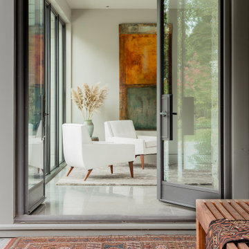
What began as a renovation project morphed into a new house, driven by the natural beauty of the site.
The new structures are perfectly aligned with the coastline, and take full advantage of the views of ocean, islands, and shoals. The location is within walking distance of town and its amenities, yet miles away in the privacy it affords. The house is nestled on a nicely wooded lot, giving the residence screening from the street, with an open meadow leading to the ocean on the rear of the lot.
The design concept was driven by the serenity of the site, enhanced by textures of trees, plantings, sand and shoreline. The newly constructed house sits quietly in a location advantageously positioned to take full advantage of natural light and solar orientations. The visual calm is enhanced by the natural material: stone, wood, and metal throughout the home.
The main structures are comprised of traditional New England forms, with modern connectors serving to unify the structures. Each building is equally suited for single floor living, if that future needs is ever necessary. Unique too is an underground connection between main house and an outbuilding.
With their flowing connections, no room is isolated or ignored; instead each reflects a different level of privacy and social interaction.
Just as there are layers to the exterior in beach, field, forest and oceans, the inside has a layered approach. Textures in wood, stone, and neutral colors combine with the warmth of linens, wools, and metals. Personality and character of the interiors and its furnishings are tailored to the client’s lifestyle. Rooms are arranged and organized in an intersection of public and private spaces. The quiet palette within reflects the nature outside, enhanced with artwork and accessories.
 KURV Architecture DPC (Alex Hughes Architects)
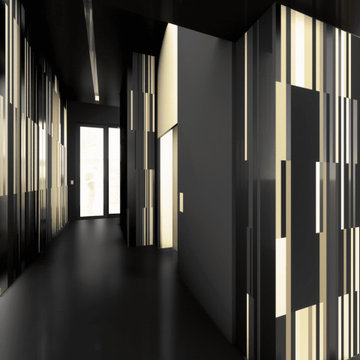
Located in the heart of Manhattan’s Lower East Side, the building was erected on a shallow commercial lot between two 120 year old masonry buildings and a new residential rental building. 330 Grand Street is a mix of 725 SF 1BRs and 1050 SF 2BR apartments. It also contains a 1100 SF two story duplex as well as private and public rooftop space, large private balconies for most units and two large private terraces for the ground floor units.
330 Grand Street was originally designed and approved at the NYC DOB as a prefabricated modular building. During the pandemic, as shipping costs skyrocketed putting the project at risk, we suggested redesigning the building as a reinforced cast-in-place concrete structure. Concrete was readily available and prices had not been affected by the demand increase that many other materials suffered in the pandemic. We took this opportunity to raise floor to ceiling heights, enlarge high performance windows and redistribute the buildings MEPFS and Structural Systems to create very open floor plans.
The challenge was to create a luxurious sensorial living experience with very limited means. In a city with very high construction costs, low cost residential buildings in the area are usually devoid of good quality, design and character. Our approach was to aim high for the end user, prioritizing natural light, open space with long visual perspectives, high ceilings and as always, rejecting the use of predefined building templates.
Our biggest challenge was to ensure that the small spaces feel as clean cut, large and bright as possible. Several unique design decisions were made to ensure low cost and high quality;
Floor plans were laid out so that spaces were wide open and free of clutter from mechanical or structural interruptions. Therefore all infrastructure was placed in lateral demising walls, which in turn act as the unit’s storage and kitchen. The apartments feel wide open, are super quiet and have more storage space than any other comparable apartment in the city.
To solve the problem of the site’s shallow commercial lot which is typically prone to dark interior spaces we focused our attention on the building’s envelope. Instead of the usual small punched window openings, oversized high performance windows were designed to ensure that light penetrated as far as possible into the units. In the smaller 1BR units, the full 50’ depth of the lot is perceived by partitioning spaces with sliding pocket doors that can be retracted to allow deep visual perspectives, making the sight lines in the space feel longer, larger, more ample than normal. In addition to the full height glazing, each unit above the 2nd floor receives a 7 foot covered balcony, adding 120 to 240 sf to each apartment, something unusual in New York City buildings. The space is large enough for a full size dining table, when the weather permits being outside.
We also worked hard to ensure modularity. For example, all kitchen units are all identical throughout the building. The idea of modularity and the economy of the repetitive unit is exercised to the maximum through the building.
Hardware, appliances, flooring, wall coverings and material finishes are all carefully selected to feel bespoke, high quality and unique.
It was important to KURV that the result of this work manifest into something that would deeply connect with the end user and sustain relationships with the consumers of this space.
All images by KURV Architecture ©
 Nathan Fell Architecture
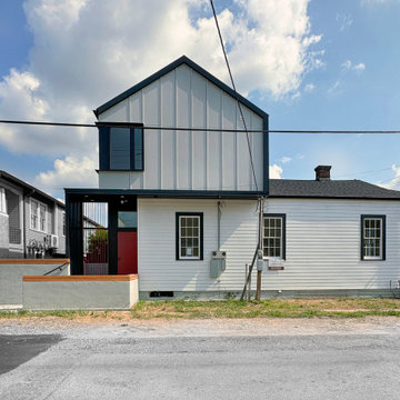
Camel Back in Black is the quintessential “mullet house,” which is the common name for a renovated historic home in the front (business) with a modern addition in the rear (party). In this case the existing structure was an early 20th century New Orleans Shotgun Duplex Home that was adapted to be shorter due to both site constraints and an existing carport addition, which was removed. The design strategy was to create a distinct new entry to the main unit of the home along the side of the property. This was achieved through a clear delineation of a modern massing of a second story addition (called a Camelback in New Orleans) with a roof that wraps to frame an exterior gate. The gate leads to a raised rear yard, which was filled in to be the same height as the main home to make it more of an extension of some of the public spaces rather than a small sunken pit, which can often be a lifeless space.
Many time you will see new Camelback additions in the city that take a more blended approach, but in this case because of the corner lot and the desire to create a prominent entry (along that side) a clear line is delineated between old and new. This was done intentionally to clearly represent the original form with appropriately renovate historic details true to the original, without creating a false sense of history through an addition that would have not represented a proportion that was standard for the time the original structure was built.
The existing home was the childhood dwelling of the owner, who inherited it years after it fell into disrepair. There was mold, rot and structural disrepair, but it was important to the owner that NFA preserved as much of the existing portions of the home as possible; so where there was flooring that could be preserved (and refinished) it was, where there were historic interior and exterior trim detailing that could be preserved it was and if not it was replicated in kind to the original. On the other hand, there were certain modern needs and updates that were desired and didn’t want the design to feel overly constrained by certain replicas of historic troupes. So, the addition and many of the interior finishes were intentionally contemporary.
28