
Search results for "Struggle" in Home Design Ideas
 Drury Design
THE SETUP
“You have to figure out how to rebuild a life worth living,” Basia Kozub’s client says. Her husband passed away suddenly three years ago. Holidays with family became more important, and she found herself struggling with a 37-year old kitchen that was falling apart. “I made a decision to move forward,” she says. “I went, ‘You know what? I’m redoing the kitchen.'”
The big task of getting started was as easy as having a conversation – literally. Basia was on the job, helping the client sort through priorities, wishes and ideas. Basia’s client is 5′ 4″, likes keeping an eye on the kiddoes in the backyard and wanted certain things to have their own place.
THE REMODEL
The objectives were:
Enlarge and open the space
Find a classic look that incorporates blues
Upgrade to easy-to-use appliances
Hide an office space within the space
Ample storage for dishes
Design challenges:
Uneven window alignment on the back wall
Original kitchen smaller than desired, stuctural concerns if walls to be moved
Keep folks close – figure out seating for entertaining
Main sink in corner is ideal, but windows are hard to reach
Lots of storage needed for dishes, glass collection, pantry items, bar bottles and office supplies
Specific storage needs for oft-used spices and utensils
THE RENEWED SPACE
Design solutions:
Replace back wall windows, establish window size continuity
Take out two walls to open up the space, tall shallow cabinet and a tall filler added to conceal a new header
Large island that seats six easily
Custom corner sink cabinet with recessed edge allows vertically challenged homeowner to reach the windows
Mindful storage planning features: plenty of cabinets, pull-out bar bottle storage, file drawers & cubbies with pocket doors for office appliances, magic corner pullouts, and appliance garages with pocket doors
Shelf behind range for easy access to daily-use spices and oils. Also: spice and utensil pullouts on either side of range
The clients says every priority and wish box got checked. The highly functional design absorbed everything that used to be in that area of the house, but now those things are out of the way.
“In the past, we were all spread out when we gathered for the holidays, because we had to spread out. Now, we’re all in here together, including my 92-year old mother. We’re visiting, cooking, laughing… everyone is here. And I’m really learning how to use these appliances. This kitchen has given me a whole new life.”
 Dado Interior Design
Location: Denver, CO, USA
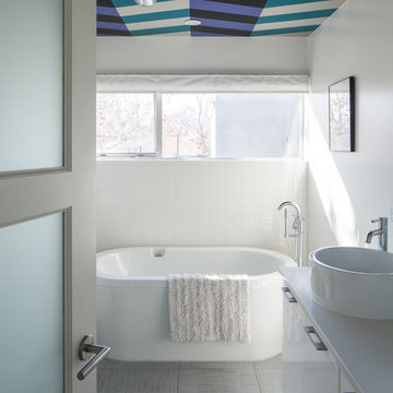
THE CHALLENGE: Elevate a modern residence that struggled with temperature both aesthetically and physically – the home was cold to the touch, and cold to the eye.
THE SOLUTION: Natural wood finishes were added through flooring and window and door details that give the architecture a warmer aesthetic. Bold wall coverings and murals were painted throughout the space, while classic modern furniture with warm textures added the finishing touches.
Dado Interior Design
DAVID LAUER PHOTOGRAPHY
 Darcie A.
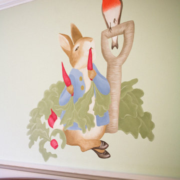
The Peter Rabbit mural I painted over my son's crib. I struggled with the decision of whether to paint on a canvas or the wall. I decided on the wall, but know that I will be sad to cover it up someday...
Find the right local pro for your project
 Alair Homes Plano
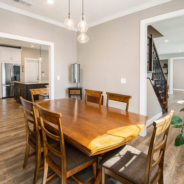
Our clients wanted to increase the size of their kitchen, which was small, in comparison to the overall size of the home. They wanted a more open livable space for the family to be able to hang out downstairs. They wanted to remove the walls downstairs in the front formal living and den making them a new large den/entering room. They also wanted to remove the powder and laundry room from the center of the kitchen, giving them more functional space in the kitchen that was completely opened up to their den. The addition was planned to be one story with a bedroom/game room (flex space), laundry room, bathroom (to serve as the on-suite to the bedroom and pool bath), and storage closet. They also wanted a larger sliding door leading out to the pool.
We demoed the entire kitchen, including the laundry room and powder bath that were in the center! The wall between the den and formal living was removed, completely opening up that space to the entry of the house. A small space was separated out from the main den area, creating a flex space for them to become a home office, sitting area, or reading nook. A beautiful fireplace was added, surrounded with slate ledger, flanked with built-in bookcases creating a focal point to the den. Behind this main open living area, is the addition. When the addition is not being utilized as a guest room, it serves as a game room for their two young boys. There is a large closet in there great for toys or additional storage. A full bath was added, which is connected to the bedroom, but also opens to the hallway so that it can be used for the pool bath.
The new laundry room is a dream come true! Not only does it have room for cabinets, but it also has space for a much-needed extra refrigerator. There is also a closet inside the laundry room for additional storage. This first-floor addition has greatly enhanced the functionality of this family’s daily lives. Previously, there was essentially only one small space for them to hang out downstairs, making it impossible for more than one conversation to be had. Now, the kids can be playing air hockey, video games, or roughhousing in the game room, while the adults can be enjoying TV in the den or cooking in the kitchen, without interruption! While living through a remodel might not be easy, the outcome definitely outweighs the struggles throughout the process.
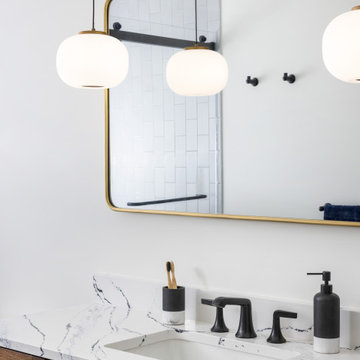
 Forward Design Build Remodel
Our clients relocated to Ann Arbor and struggled to find an open layout home that was fully functional for their family. We worked to create a modern inspired home with convenient features and beautiful finishes.
This 4,500 square foot home includes 6 bedrooms, and 5.5 baths. In addition to that, there is a 2,000 square feet beautifully finished basement. It has a semi-open layout with clean lines to adjacent spaces, and provides optimum entertaining for both adults and kids.
The interior and exterior of the home has a combination of modern and transitional styles with contrasting finishes mixed with warm wood tones and geometric patterns.
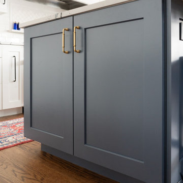 Drury Design
THE SETUP
“You have to figure out how to rebuild a life worth living,” Basia Kozub’s client says. Her husband passed away suddenly three years ago. Holidays with family became more important, and she found herself struggling with a 37-year old kitchen that was falling apart. “I made a decision to move forward,” she says. “I went, ‘You know what? I’m redoing the kitchen.'”
The big task of getting started was as easy as having a conversation – literally. Basia was on the job, helping the client sort through priorities, wishes and ideas. Basia’s client is 5′ 4″, likes keeping an eye on the kiddoes in the backyard and wanted certain things to have their own place.
THE REMODEL
The objectives were:
Enlarge and open the space
Find a classic look that incorporates blues
Upgrade to easy-to-use appliances
Hide an office space within the space
Ample storage for dishes
Design challenges:
Uneven window alignment on the back wall
Original kitchen smaller than desired, stuctural concerns if walls to be moved
Keep folks close – figure out seating for entertaining
Main sink in corner is ideal, but windows are hard to reach
Lots of storage needed for dishes, glass collection, pantry items, bar bottles and office supplies
Specific storage needs for oft-used spices and utensils
THE RENEWED SPACE
Design solutions:
Replace back wall windows, establish window size continuity
Take out two walls to open up the space, tall shallow cabinet and a tall filler added to conceal a new header
Large island that seats six easily
Custom corner sink cabinet with recessed edge allows vertically challenged homeowner to reach the windows
Mindful storage planning features: plenty of cabinets, pull-out bar bottle storage, file drawers & cubbies with pocket doors for office appliances, magic corner pullouts, and appliance garages with pocket doors
Shelf behind range for easy access to daily-use spices and oils. Also: spice and utensil pullouts on either side of range
The clients says every priority and wish box got checked. The highly functional design absorbed everything that used to be in that area of the house, but now those things are out of the way.
“In the past, we were all spread out when we gathered for the holidays, because we had to spread out. Now, we’re all in here together, including my 92-year old mother. We’re visiting, cooking, laughing… everyone is here. And I’m really learning how to use these appliances. This kitchen has given me a whole new life.”
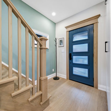
 Sosna Inc
For years, this family felt like their main floor was working against them. The kitchen was a tight galley where only one person could comfortably stand at a time. An old addition felt disconnected and awkward, making everyday life a struggle.
Rethinking the Space
They thought the only solution was a big, expensive addition. But after walking through the home and completing a feasibility study, we found that the square footage was already there. It just needed a smarter plan.
Designing a Floor That Works
We reimagined how the home works day to day. The kitchen became a bright, open hub with a generous island perfect for cooking, homework, and family time. Awkward corners were given clear and useful purposes. A long steel span replaced an exterior wall that could not carry the load, opening the space safely and effectively.
Personal Touches
We made sure the house reflected the family. A custom basement door with a built-in cat door adds charm and function, and cat-shaped handles in the laundry room bring personality throughout the home. Even the piano room feels warm, inviting, and easy to live in.
A Home That Flows
Now, multiple people can cook together comfortably. The rooms feel connected and welcoming. The previously awkward addition feels fully integrated. Daily life flows naturally, and the house finally supports the family instead of working against them.
Discover the Potential in Your Home
If your kitchen does not work or a space feels off, there may be more potential than you realize. Sometimes the right solution is already within your walls. Reach out to us, and see what your home could become!
Sosna Incorporated
7250 Keele Street, Unit 372
Vaughan, ON L4K 1Z8
Phone: 416-888-7366 extension 1
Email: contact@sosna.ca


 Sosna Inc
A Thoughtful Condo Makeover for a Young Chef in the Making
This project began with a middle-aged couple looking to refresh their one-bedroom condo for their young adult son. The unit had been a rental for years and wasn’t well-suited to his needs. The kitchen had an awkward, oversized island, the closets lacked functionality, and the overall look was outdated—cream walls, mismatched narrow flooring, and beige tiles throughout. The bathroom also needed serious attention, with grimy, moldy finishes.
After a tough renovation experience years ago in their other home, the family knew they needed someone they could trust. Having worked with Andrei before, they turned to Sosna with full confidence.
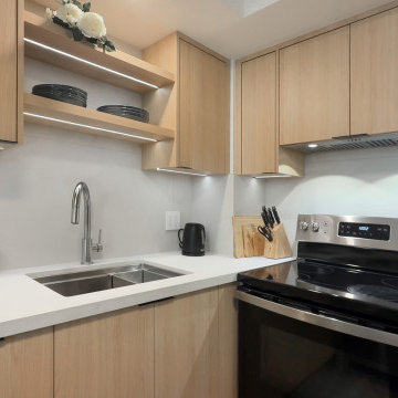
While the general layout remained similar, some key changes made a big impact. The oversized island was replaced with a peninsula, which opened up the space and provided extra storage and a longer counter surface. New custom closet organizers were designed specifically around the son's lifestyle, and the bedroom closet got a set of new doors. We also replaced all of the flooring, using medium-gray porcelain tiles in the foyer and kitchen, and light wood-look vinyl in the living areas and bedroom. To ensure a smooth transition between materials, we used self-leveling compound to keep everything even.
Despite working around holiday delivery schedules and condo board renovation policies, the project stayed on track and was completed on time.
The result is a fresh, Japandi-inspired home that’s both stylish and functional. The kitchen features light wood cabinetry, leathered quartz countertops, a large-format tile backsplash, and matte black accents that bring it all together. A single-bowl sink now easily accommodates a Dutch oven, and the thoughtful closet design gives the son plenty of organized storage space. Fresh paint and updated finishes create a calming, cohesive atmosphere.
One memorable part of the process was helping the family work through design decisions together. As close as they are, they had different tastes and sometimes struggled to align. With clear guidance, we helped them move forward with confidence and find solutions they all loved.
Now, their son has a space that reflects his personality and passions—and the family has peace of mind knowing it was done right.
 New England Sunrooms & Conservatories, Inc.
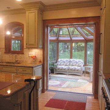
This Wooden Victorian addition and complete kitchen remodel transformed this old outdated traditional home into an elegant and functional space. Now the owners don’t want to move. Even though It looks like an expensive architect designed project, we saved the homeowners the expense of an architect by designing in house with our virtual CAD software to show everything from the chef’s stove, granite top island, pass through arched top window over the kitchen sink and french doors to make the kitchen feel larger, fresh and filled with natural light. With our modular designed Conservatory and structurally insulated floor system, this new favorite part of the house was finished much more quickly than other options.
 Bellwether Windows, Siding & Doors
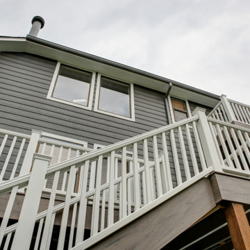
This Louisville home in the Boulder Area had old, cracked and warping cedar siding on it. The homeowners were struggling to maintain it and had a persistent problem with woodpeckers. They like the look of natural wood but wanted something that would outlast their time in the home and would allow for minimal upkeep. We suggested a unique product that we love, which happens to meet both of these requirements: James Hardie siding from WoodTone RusticSeries. This product is a James Hardie lap siding product that has a factory finish from a third-party finishing company, WoodTone. The base product, James Hardie HardiePlank lap siding, has a 30-year warranty. WoodTone's process for finishing this product gives it the look of stained wood with the benefit of a 15-year finish warranty. The homeowner selected the color Costal Gray for the body and James Hardie's Arctic White for the trim. We also installed James Hardie ColorPlus fascia and vented soffits in the color Arctic White. How do you think it turned out?

 Virtu USA
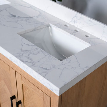
Struggling to find a vanity that truly elevates your large bathroom? Virtu USA’s Large Space Vanity Collection is designed to transform oversized spaces with statement-making style, expansive countertops, and luxurious proportions -giving you the stunning centerpiece your bathroom deserves.
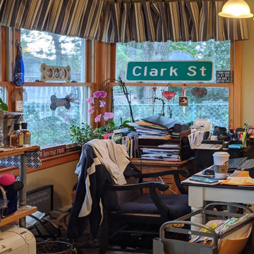 Drury Design
THE SETUP
“You have to figure out how to rebuild a life worth living,” Basia Kozub’s client says. Her husband passed away suddenly three years ago. Holidays with family became more important, and she found herself struggling with a 37-year old kitchen that was falling apart. “I made a decision to move forward,” she says. “I went, ‘You know what? I’m redoing the kitchen.'”
The big task of getting started was as easy as having a conversation – literally. Basia was on the job, helping the client sort through priorities, wishes and ideas. Basia’s client is 5′ 4″, likes keeping an eye on the kiddoes in the backyard and wanted certain things to have their own place.
THE REMODEL
The objectives were:
Enlarge and open the space
Find a classic look that incorporates blues
Upgrade to easy-to-use appliances
Hide an office space within the space
Ample storage for dishes
Design challenges:
Uneven window alignment on the back wall
Original kitchen smaller than desired, stuctural concerns if walls to be moved
Keep folks close – figure out seating for entertaining
Main sink in corner is ideal, but windows are hard to reach
Lots of storage needed for dishes, glass collection, pantry items, bar bottles and office supplies
Specific storage needs for oft-used spices and utensils
THE RENEWED SPACE
Design solutions:
Replace back wall windows, establish window size continuity
Take out two walls to open up the space, tall shallow cabinet and a tall filler added to conceal a new header
Large island that seats six easily
Custom corner sink cabinet with recessed edge allows vertically challenged homeowner to reach the windows
Mindful storage planning features: plenty of cabinets, pull-out bar bottle storage, file drawers & cubbies with pocket doors for office appliances, magic corner pullouts, and appliance garages with pocket doors
Shelf behind range for easy access to daily-use spices and oils. Also: spice and utensil pullouts on either side of range
The clients says every priority and wish box got checked. The highly functional design absorbed everything that used to be in that area of the house, but now those things are out of the way.
“In the past, we were all spread out when we gathered for the holidays, because we had to spread out. Now, we’re all in here together, including my 92-year old mother. We’re visiting, cooking, laughing… everyone is here. And I’m really learning how to use these appliances. This kitchen has given me a whole new life.”
 Synergy Design & Construction
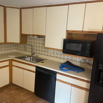
Before: The original kitchen felt dated and confined by its intrusive peninsula. Builder-grade cabinets offered little storage, the awkward split sink disrupted workflow, and outdated square tile surfaces contributed to the cramped and uninviting feel. With small appliances scattered across limited counter space and dim lighting throughout, our client struggled to make the space functional for daily use.
 Concept Renovations, Inc.
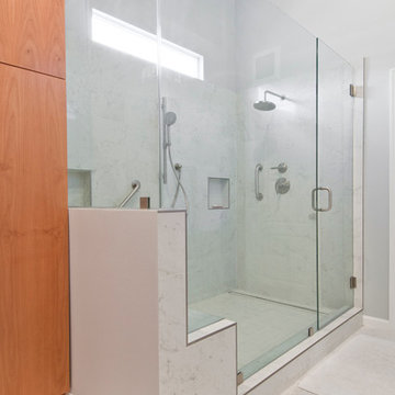
Remodeling your master bathroom in Calabasas offers the perfect opportunity to optimize both functionality and style. Custom features, such as built-in cabinetry and spacious shower designs, can transform an ordinary bathroom into a highly organized, luxurious retreat. I recently worked with a homeowner in Calabasas who struggled with limited storage and a dated design. By integrating custom storage cabinets and a sleek walk-in shower, we were able to create a space that not only looked great but solved their storage woes. The built-in cabinetry, combined with the shower’s marble finishes, added much-needed storage for linens, toiletries, and more, all while maintaining a clean, open layout. The result was a bathroom that was both practical for daily use and aesthetically aligned with the homeowner’s vision.
 Tile Merchant
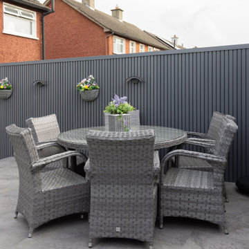
Exterior Wall Cladding: The Ultimate Patio Makeover ?️?
Modern design that actually survives the Irish weather. Take a look at this stunning transformation by the team at Four Seasons Plantscapes.
By choosing our Grey Exterior Wall Panelling, they achieved that sleek, contemporary finish that—let’s be honest—traditional timber just can’t maintain in Ireland without a constant struggle. ???
Why this makeover works:
Architectural Contrast: Clean grey lines that make the garden greenery pop.
Total Resilience: 100% waterproof. No rot, no warping, no drama.
Zero Maintenance: The luxury look of wood without ever picking up a sander or paintbrush again. ??
Professional Finish: Flawless install thanks to our specialized tongue-and-groove system.
It’s the perfect example of how the right materials turn a standard garden into a proper outdoor sanctuary. ☕️?
 VVM Designs
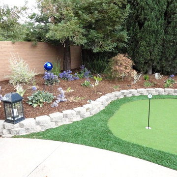
Putting green- replaced lawn area that struggled due to nearby redwoods and Italian cypress. Now it is a space that friends and family use frequently.
Carol Vander Meulen
 Mottram Architecture
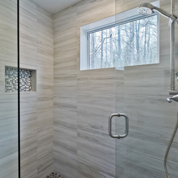
Timber frame homes offer unique challenges during a remodel. What often makes them beautiful and attractive to most homeowners, also makes them challenging for space requirements.
Context: The lovely couple that owned this home were struggling with some interesting floor plan challenges that just didn't work for their family. The loved the beautiful timbers and woodwork of their home, but the dramatically sloping ceilings on the second floor, particularly in the bathroom, just didn't work for this 1 1/2 bath home. Needing to use the skylight to approach the toilet was a less then ideal scenario. Although the bathroom footprint was more then adequate, the sloped ceiling only made half of the space useable. Check out the Before/After post on our blog to see the photos of the house pre-renovation. As much as they loved all the wood features in their home, another challenge they had was light. The wood ceiling made everything inside the house darker, even with a fantastic array of south facing windows, there were spaces in the home that felt dark and small. When they contacted us they wanted to know how could they make their brighter and more inviting, were there solutions to the 2nd floor sloped ceiling issues, and if they were going to do all of this work, how could they make their home more comfortable and efficient. A nagging water leak in the upstairs bathroom spurred them into action and here is how we solved their dilemma.
Conclusion: First, we added a little dormer to the rear of the house so we could get full headroom in nearly all of the upstairs bathroom! Then we decided to extend that dormer one more timber bay over to create a walk in closet with natural light and plenty of space. Since we were contemplating energy efficiency, we resolved a nagging issue that is present in a lot of timber frame construction, air tightness. Commonly found in timber frame construction, fiberglass insulation is installed in the rafter bays and board ceilings are installed over top. Unfortunately, board ceilings are anything but air tight, and fiberglass insulation needs to be in an airtight cavity for maximum effectiveness. So we were able to solve two issues at the same time for this homeowner. We removed the board ceiling and fiberglass insulation, we dense packed the rafter bays with cellulose insulation, and installed sheetrock in place of the boards. The boards were salvaged for re-use by the homeowner, and the space and light quality was dramatically improved. Some may think that losing the board ceiling took something away from the space, but what you'll see in the pictures is that it highly accentuates the heavy timbers and really makes them stand out in a beautiful way. Now with this added airtightness, better insulation, and brighter space, the homeowner hardly runs their wood stove, and it's so quiet in the space, an added bonus from changing the insulation. It became necessary to also add a sheetrock ceiling to the living room to hide the plumbing from the new bathroom layout above. Changing this ceiling gave the homeowner some real quality lighting that was lacking in the living room before. The brighter ceiling and new lighting layout completely transforms the living room into a space you want to hang out, even though the layout didn't change at all. When the homeowner saw the finished spaces she said "I can't believe this is my house, I want to live in this house"
Energy Efficiency: I touched a little on the efficiency above, but like all projects done with Mottram Architecture, we always want to leave you with a little extra. Timber frame construction with board ceilings and fiberglass insulation are notoriously leaky! If you want to know what we think about fiberglass insulation, check our our blog post on Why Fiberglass Insulation Sucks. By installing cellulose insulation and covering it with sheetrock we were able to greatly reduce the heat flowing out of this home. It not only improves cashflow it improves the comfort level in the space. Who wants to sit in their living room and feel a draft? Let us remind you, we are not saying cellulose insulation is an air barrier, we use the sheetrock to help with that, but it does significantly reduce the air flow over fiberglass insulation. And when we reduce the airflow, we reduce the heat flow. And when we reduce the heat flow, we reduce the need to re-heat that drafty air from outside. When it comes to energy efficiency the first and best place to start is air infiltration. We greatly reduced the air infiltration with the new insulation, but we also added a hat and warm boots. What I mean by that is, we improved the insulation in the roof, and we installed insulation in the basement. Maybe it's a silly analogy, but when you think about keeping warm, we always start with the hat and boots! With sustainability in mind, the next project will be to add a deck to the front of this house with rain catchment barrels from the metal roof. They are planning to plant a garden in the spring and the rain catchment system will help to irrigate the new garden.
Builder: East Shore Builders
Photographer: Michael Eric Berube
 Millbrook Construction LLC
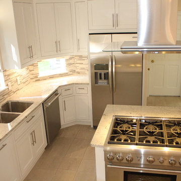
This was an amazing flip. The kitchen before was already new and beautiful; however, the client wanted a more modern feel. The biggest struggle in this kitchen was the octagon shape. We did Custom Built Cabinets with recessed shaker fronts. We used a monotone color palette of white and brought in industrial cooking equipment to help create a minimalist's dream kitchen.

50