
Search results for "Struggled" in Home Design Ideas
 Comerio Homes
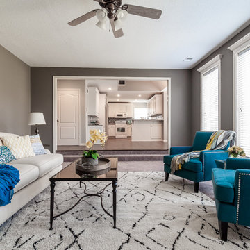
Shabby Chic updated living room
Inspiration for a mid-sized shabby-chic style open concept and formal carpeted living room remodel in Kansas City with gray walls, a standard fireplace, a tile fireplace and a wall-mounted tv
Inspiration for a mid-sized shabby-chic style open concept and formal carpeted living room remodel in Kansas City with gray walls, a standard fireplace, a tile fireplace and a wall-mounted tv
 Unique Design Furniture
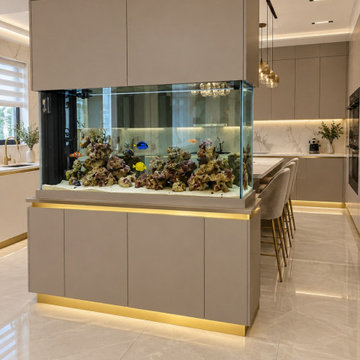
Renovating historic homes in Brooklyn often presents a classic design dilemma: how do you introduce sleek, contemporary aesthetics without fighting the home’s unique architectural character?
In our recent Bay Ridge project, we designed and built a full suite of custom kitchen cabinetry engineered specifically to maximize a compact footprint while delivering an ultra-clean, modern feel.
Key Design & Structural Solutions:
Navigating Pre-War Proportions: Standard, off-the-shelf cabinets struggle with Brooklyn's uneven floors and non-square walls. By measuring and fabricating every unit to the millimeter, we eliminated awkward gaps and filler strips, achieving a seamless floor-to-ceiling fit.
Minimalist Aesthetics: We crafted flat-panel slab doors finished in a light-reflecting neutral tone. The clean lines are paired with integrated under-cabinet LED task lighting and concealed hardware for a streamlined profile.
Smart Storage Engineering: Deep pull-out pantries, customized drawer inserts, and heavy-duty soft-close glides ensure that every square inch of vertical and horizontal space serves a functional purpose.
When working with clients in the Tri-State area, our goal is always to balance high-end visual scale with long-lasting ergonomics.
 Michael Nash Design, Build & Homes
This growing family of six was struggling with a dysfunctional kitchen design. The center island had been installed at an odd angle that limited accessibility and traffic flow. Additionally, storage space was limited by poor cabinet design. Finally, doorways in and out of the kitchen were narrow and poorly located, especially for children dashing in and out.
Other design challenges included how to better use a 10’ x 12’ room for children’s jackets and toys and how to add a professional-quality gas range in a neighborhood were natural gas wasn’t available. The new design would address all of these issues.
DESIGN SOLUTIONS
The new kitchen design revolves around a more proportional island. Carefully placed in the center of the new space with seating for four, it includes a prep sink, a second dishwasher and a beverage center.
The distressed ebony-stained island and hutch provides a brilliant contrast between the white color cabinetry. White Carrera marble countertops and backsplash top both island and perimeter cabinets.
Tall, double stacked cabinetry lines two walls to maximize storage space. Across the room there was an unused wall that now contains a 36” tower fridge and freezer, both covered with matching panels, and a tall cabinet that contains a microwave, steam unit and warming drawer.
A propane tank was buried in the back yard to provide gas to a new 60” professional range and cooktop. A custom-made wood mantel hood blends perfectly with the cabinet style.
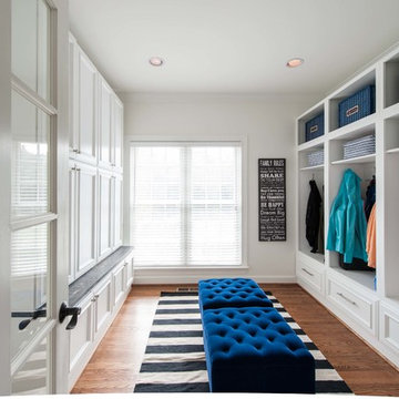
The old laundry room was reconfigured to have lots of locker space for all kids and added cabinetry for storage. A double entry door separated the new mudroom from the rest of the back hall. In the back hall the back windows were replaced with a set of French door and added decking to create a direct access to deck and backyard.
The end result is an open floor plan, high-end appliances, great traffic flow and pleasing colors. The homeowner calls it the “kitchen of her dreams.”
Find the right local pro for your project

 Blackdog Design Build Remodel
We achieved much better function for cooking and storage as well as bringing more natural light and updated lighting to the kitchen. The old layout was a struggle with fragmented storage spread out around the kitchen. It was difficult for two people to be in the kitchen at the same time and it didn’t flow well when cooking as the island was positioned as an obstacle on one end near the stove. The ceilings are high, and original wall cabinets were low with a soffit above them and this made the kitchen look dated. The new wall cabinets include transom cabinets and take full advantage of the high ceiling. By reconfiguring a soffit over the windows, we were able to include a transom window that brings more light into the kitchen. The client was careful about making decisions and took a long time to go through our process because any other project they hired someone to do in the past felt too rushed and they always had regrets and buyer's remorse after. We took our time and it was well worth it.The cabinets are Plato cabinets, full inset. The island top and wall inset behind the stove are special features-the stone is Blue Fusion Quartzite while the perimeter is Silestone Tebas Black. The new space is more beautiful, bright and has high function for the client's lifestyle in the kitchen.

 Corinthian Fine Homes
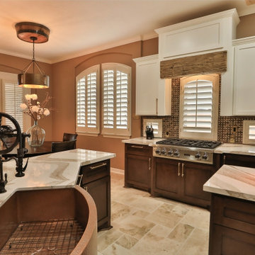
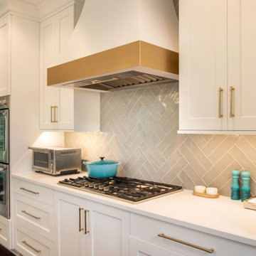
This young family began working with us after struggling with their previous contractor. They were over budget and not achieving what they really needed with the addition they were proposing. Rather than extend the existing footprint of their house as had been suggested, we proposed completely changing the orientation of their separate kitchen, living room, dining room, and sunroom and opening it all up to an open floor plan. By changing the configuration of doors and windows to better suit the new layout and sight lines, we were able to improve the views of their beautiful backyard and increase the natural light allowed into the spaces. We raised the floor in the sunroom to allow for a level cohesive floor throughout the areas. Their extended kitchen now has a nice sitting area within the kitchen to allow for conversation with friends and family during meal prep and entertaining. The sitting area opens to a full dining room with built in buffet and hutch that functions as a serving station. Conscious thought was given that all “permanent” selections such as cabinetry and countertops were designed to suit the masses, with a splash of this homeowner’s individual style in the double herringbone soft gray tile of the backsplash, the mitred edge of the island countertop, and the mixture of metals in the plumbing and lighting fixtures. Careful consideration was given to the function of each cabinet and organization and storage was maximized. This family is now able to entertain their extended family with seating for 18 and not only enjoy entertaining in a space that feels open and inviting, but also enjoy sitting down as a family for the simple pleasure of supper together.
 Greene Design LLC
Photo by Jack Gardner
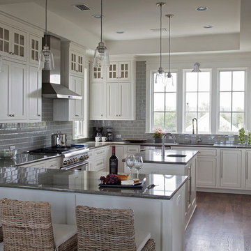
Enclosed kitchen - large coastal u-shaped dark wood floor enclosed kitchen idea in Jacksonville with an island, an undermount sink, shaker cabinets, white cabinets, quartz countertops, gray backsplash, subway tile backsplash and stainless steel appliances
Enclosed kitchen - large coastal u-shaped dark wood floor enclosed kitchen idea in Jacksonville with an island, an undermount sink, shaker cabinets, white cabinets, quartz countertops, gray backsplash, subway tile backsplash and stainless steel appliances


 Ferguson Bath, Kitchen & Lighting Gallery
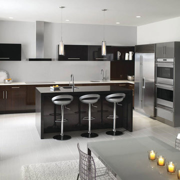
Example of a large trendy single-wall porcelain tile and gray floor eat-in kitchen design with an undermount sink, flat-panel cabinets, brown cabinets, quartz countertops, stainless steel appliances and an island
 Blackdog Design Build Remodel
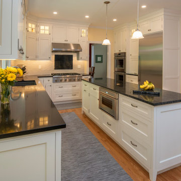
We achieved much better function for cooking and storage as well as bringing more natural light and updated lighting to the kitchen. The old layout was a struggle with fragmented storage spread out around the kitchen. It was difficult for two people to be in the kitchen at the same time and it didn’t flow well when cooking as the island was positioned as an obstacle on one end near the stove. The ceilings are high, and original wall cabinets were low with a soffit above them and this made the kitchen look dated. The new wall cabinets include transom cabinets and take full advantage of the high ceiling. By reconfiguring a soffit over the windows, we were able to include a transom window that brings more light into the kitchen. The client was careful about making decisions and took a long time to go through our process because any other project they hired someone to do in the past felt too rushed and they always had regrets and buyer's remorse after. We took our time and it was well worth it.The cabinets are Plato cabinets, full inset. The island top and wall inset behind the stove are special features-the stone is Blue Fusion Quartzite while the perimeter is Silestone Tebas Black. The new space is more beautiful, bright and has high function for the client's lifestyle in the kitchen.
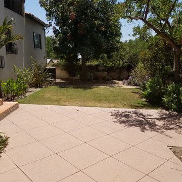
 FormLA Landscaping
By replacing low foliage near the home with more expansive greenery and removing hardscape at the far end of this space, we were able to open up a view of the sunset without subjecting the home to its heat.
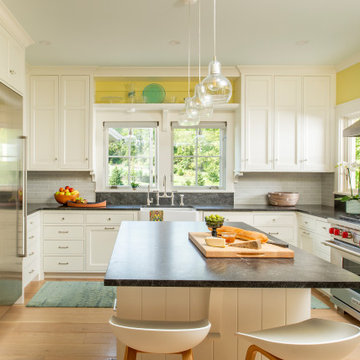
 David Heide Design Studio
In coming to Minnesota from Iceland, the owners of Home 4 found themselves more than 3,000 miles away from home, hoping to build something new – literally and figuratively – that would feel like home for their family of five. They purchased a scenic piece of land in Rochester and identified a general idea of the spaces they would need, but they struggled with how to define a sense of character that would incorporate their culture and identity into the design. The architect-led design team was tasked with creating a house that would help establish the homeowners’ roots in a new country while still recalling familiar comforts of their heritage.
The result is a warm family home that combines elements of Nordic design with a touch of American farmhouse aesthetic. Gracious proportions, custom woodworking, and cheerful details create a welcoming atmosphere, while modern conveniences like a large mudroom and second-floor laundry help day-to-day life feel easy.
Around each corner, a new detail greets the eye, from the Lundie-inspired column at the staircase, to the double-heart detail inscribed in the woodwork, to the custom table designed for the breakfast nook. Each element is lovely individually, but experiencing the holistic effect as the details intentionally pair and play together helps to craft a house that feels like home.
Most important, the homeowners’ history, heritage, and hopes are melded together into a home that represents their family. Each unique element and carefully considered material combine to form a house that feels as if it could have belonged to this family for generations, even though it is brand new.
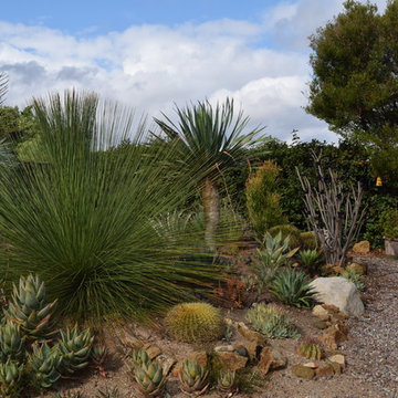
 Nick Martin Landscape Architect Inc.
Design ideas for a mid-sized mediterranean landscaping in San Diego.
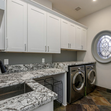
 Phoenix Home Remodeling
Their Kitchen Remodel
Siene & Kentay’s tired kitchen needed some attention. The large and heavy stone covered hood vent paired with the dark stained cabinets sucked the life and light out of the room.
One thing that struggled was lighting. Even with the walls of windows the dark features just absorbed the light.
We started by using a soft white shaker cabinet called Dove White as the main cabinet color in the kitchen. We removed the stone from the hood and the dark slate from the backsplash.
We also removed the dated shape of the peninsula by squaring it off. By doing this, the new walking area improved and allows for transitioning between rooms.
The oddly shaped island in the center struggled to give them the storage they needed. They were large cabinets, but items usually got stuck or lost.
After determining that Siene wanted to prepare food here, we opted to do deep drawer cabinets to store a lot of her prep items at arm’s reach.
The Island and bar cabinets are in a natural stain called Fawn. This color complimented the existing slate flooring. We also lined the hood in trim that matches the island.
The island is also waterfalled on both sides with quartz from Arizona Tile called Ivory White Honed.
Kitchen getting remodeled before & after photo
Kitchen being remodeled before and after photo
Just off the kitchen there was a bar, however it was hidden from all rooms. We decided that we would move the bar to a more prominent place in the home, and the existing would be turned into an appliance pantry.
A place for the coffee maker, microwave, and other smaller appliance storage.
We finished the kitchen with a simple backsplash in a lantern white mosaic with a natural tan grout. The door hardware, faucet from Delta and the new pendant lighting are all in the stainless family allowing for depth and consistency.
The new bar features a Sub-Zero wine column with refrigerated storage below. The upper lit glass cabinets offer a chance to showcase stemware and spirits.
This custom cabinet install allows the wood to shine and offers storage.
Lastly, the additional lighting installed in all areas now is controllable. Siene and Kentay have full control and can direct the light and how much is used.
When they want a night in, they can turn down the lights and relax. In their new updated family room in front of a newly integrated modern fireplace.
Kitchen getting renovated before and after photo
Laundry Room Remodeling
Jokingly, Siene called her Laundry Room the Christmas Box. We traded the red and green wallpaper for paint called Drift of Mist from Sherwin Williams.
The new white cabinetry offers a lot of storage they are , and a dedicated folding station was integrated for easy transitioning between loads of laundry.
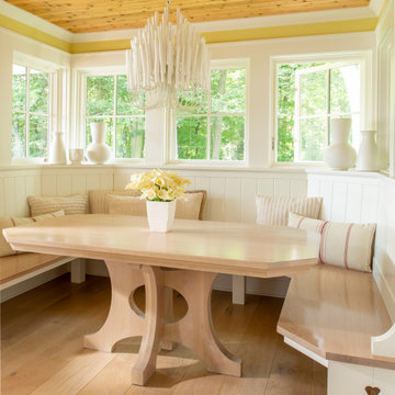 David Heide Design Studio
In coming to Minnesota from Iceland, the owners of Home 4 found themselves more than 3,000 miles away from home, hoping to build something new – literally and figuratively – that would feel like home for their family of five. They purchased a scenic piece of land in Rochester and identified a general idea of the spaces they would need, but they struggled with how to define a sense of character that would incorporate their culture and identity into the design. The architect-led design team was tasked with creating a house that would help establish the homeowners’ roots in a new country while still recalling familiar comforts of their heritage.
The result is a warm family home that combines elements of Nordic design with a touch of American farmhouse aesthetic. Gracious proportions, custom woodworking, and cheerful details create a welcoming atmosphere, while modern conveniences like a large mudroom and second-floor laundry help day-to-day life feel easy.
Around each corner, a new detail greets the eye, from the Lundie-inspired column at the staircase, to the double-heart detail inscribed in the woodwork, to the custom table designed for the breakfast nook. Each element is lovely individually, but experiencing the holistic effect as the details intentionally pair and play together helps to craft a house that feels like home.
Most important, the homeowners’ history, heritage, and hopes are melded together into a home that represents their family. Each unique element and carefully considered material combine to form a house that feels as if it could have belonged to this family for generations, even though it is brand new.
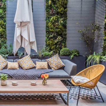
 UpScapers: Landscape, Elevated
Here in this basement courtyard, a great example of green walls in the context of a complete garden revamp. The client had a rather dull, lifeless, and dark space and wanted to inject some color into the courtyard.
The client wanted grey tones to be the overall theme of the garden, but also realised the need to counterbalance this with bursts of color, and what better way than to incorporate some stunning greenery. However, the limited space in the courtyard minimized the available space for planting and thus, a vertical option was sought. This would have the added benefit of breaking up the timber screening which could have made the garden look rather enclosed on its own. But a vertical green wall also presented its own issues. Real plants would require a costly irrigation system and would add a significant amount of weight to the wall. Plus, the height of the walls meant that a living wall may have struggled through a lack of sunlight being allowed in.
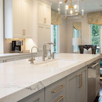 Corinthian Fine Homes
This young family began working with us after struggling with their previous contractor. They were over budget and not achieving what they really needed with the addition they were proposing. Rather than extend the existing footprint of their house as had been suggested, we proposed completely changing the orientation of their separate kitchen, living room, dining room, and sunroom and opening it all up to an open floor plan. By changing the configuration of doors and windows to better suit the new layout and sight lines, we were able to improve the views of their beautiful backyard and increase the natural light allowed into the spaces. We raised the floor in the sunroom to allow for a level cohesive floor throughout the areas. Their extended kitchen now has a nice sitting area within the kitchen to allow for conversation with friends and family during meal prep and entertaining. The sitting area opens to a full dining room with built in buffet and hutch that functions as a serving station. Conscious thought was given that all “permanent” selections such as cabinetry and countertops were designed to suit the masses, with a splash of this homeowner’s individual style in the double herringbone soft gray tile of the backsplash, the mitred edge of the island countertop, and the mixture of metals in the plumbing and lighting fixtures. Careful consideration was given to the function of each cabinet and organization and storage was maximized. This family is now able to entertain their extended family with seating for 18 and not only enjoy entertaining in a space that feels open and inviting, but also enjoy sitting down as a family for the simple pleasure of supper together.
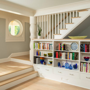 David Heide Design Studio
In coming to Minnesota from Iceland, the owners of Home 4 found themselves more than 3,000 miles away from home, hoping to build something new – literally and figuratively – that would feel like home for their family of five. They purchased a scenic piece of land in Rochester and identified a general idea of the spaces they would need, but they struggled with how to define a sense of character that would incorporate their culture and identity into the design. The architect-led design team was tasked with creating a house that would help establish the homeowners’ roots in a new country while still recalling familiar comforts of their heritage.
The result is a warm family home that combines elements of Nordic design with a touch of American farmhouse aesthetic. Gracious proportions, custom woodworking, and cheerful details create a welcoming atmosphere, while modern conveniences like a large mudroom and second-floor laundry help day-to-day life feel easy.
Around each corner, a new detail greets the eye, from the Lundie-inspired column at the staircase, to the double-heart detail inscribed in the woodwork, to the custom table designed for the breakfast nook. Each element is lovely individually, but experiencing the holistic effect as the details intentionally pair and play together helps to craft a house that feels like home.
Most important, the homeowners’ history, heritage, and hopes are melded together into a home that represents their family. Each unique element and carefully considered material combine to form a house that feels as if it could have belonged to this family for generations, even though it is brand new.
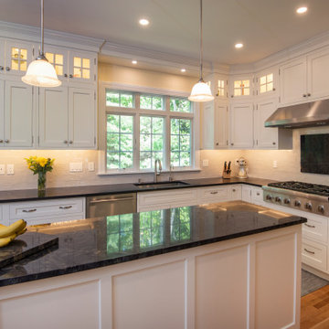 Blackdog Design Build Remodel
We achieved much better function for cooking and storage as well as bringing more natural light and updated lighting to the kitchen. The old layout was a struggle with fragmented storage spread out around the kitchen. It was difficult for two people to be in the kitchen at the same time and it didn’t flow well when cooking as the island was positioned as an obstacle on one end near the stove. The ceilings are high, and original wall cabinets were low with a soffit above them and this made the kitchen look dated. The new wall cabinets include transom cabinets and take full advantage of the high ceiling. By reconfiguring a soffit over the windows, we were able to include a transom window that brings more light into the kitchen. The client was careful about making decisions and took a long time to go through our process because any other project they hired someone to do in the past felt too rushed and they always had regrets and buyer's remorse after. We took our time and it was well worth it.The cabinets are Plato cabinets, full inset. The island top and wall inset behind the stove are special features-the stone is Blue Fusion Quartzite while the perimeter is Silestone Tebas Black. The new space is more beautiful, bright and has high function for the client's lifestyle in the kitchen.
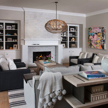
 Lori Gentile Interior Design
Collaborative vision and thoughtful design went into every detail of this Rancho Santa Fe remodel. Clean lines and modern furnishings added a youthful style to traditional architecture. The chrome hood, display cabinet, and hardware set the elevated tone and sparkle along with clean, fresh cabinetry detailing. This design transformation exceeded our client's expectations.


42