
Search results for "Study natural" in Home Design Ideas
 User
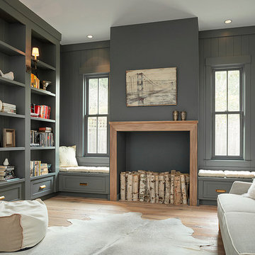
UserRenovation in Mill Valley, Marin. Photos: Jeff Zaruba. Living Room.
Cottage medium tone wood floor family room library photo in San Francisco with gray walls
Cottage medium tone wood floor family room library photo in San Francisco with gray walls
 Orren Pickell Building Group
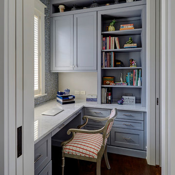
A home office off the kitchen can be concealed with a pocket door. Gray-painted maple Wood-Mode cabinetry complements the kitchen finishes but makes the space unique.
**Project Overview**
A small, quiet, efficient office space for one that is perfect for sorting mail and paying bills. Though small it has a great deal of natural light and views out the front of the house of the lush landscaping and wildlife. A pocket door makes the office disappear when it's time to entertain.
**What Makes This Project Unique?**
Small yet incredibly functional, this desk space is a comfortable, quiet place to catch up on home management tasks. Filled with natural light and offering a view of lush landscaping, the compact space is light and airy. To keep it from feeling cramped or crowded, we complemented warm gray-painted maple cabinetry with light countertops and tile. Taller ceilings allow ample storage, including full-height open storage, to manage all of the papers, files and extras that find their way into the home.
**Design Challenges**
While the office was intentionally designed into a tiny nook off the kitchen and pantry, we didn't want it to feel small for the people using it. By keeping the color palette light, taking cabinetry to the ceiling, incorporating open storage and maximizing natural light, the space feels cozy, and larger than it actually is.
Photo by MIke Kaskel.
 Martin Kobus Home
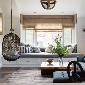
An extraordinary WARHOL collection was the starting point of this project for a family with young kids in need of functional yet stylish interiors. Brightly colored, lacquered walls are the backdrop for the art which dictated the colors used. Custom built-ins and 3 dimensional walls add interest and definition to the spaces. A Missoni carpet connects the dots.
Photography by: David Duncan Livingston
Find the right local pro for your project
 Kriste Michelini Interiors
Thomas Kuoh
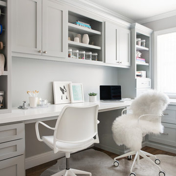
Mid-sized transitional built-in desk medium tone wood floor and brown floor craft room photo in San Francisco with gray walls
Mid-sized transitional built-in desk medium tone wood floor and brown floor craft room photo in San Francisco with gray walls
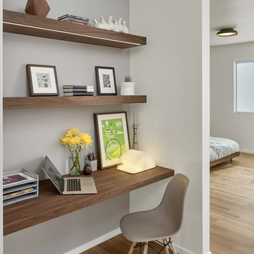
 Knock Architecture and Design
Inspiration for a small 1950s built-in desk light wood floor study room remodel in San Francisco with white walls
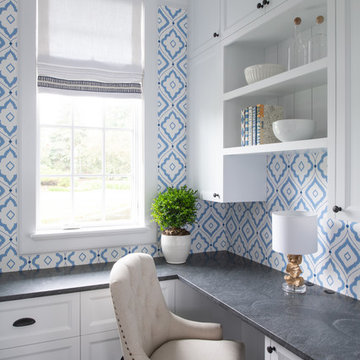
 Studio M Interiors
Scott Amundson Photography
Inspiration for a small transitional built-in desk dark wood floor and brown floor study room remodel in Minneapolis with blue walls and no fireplace
Inspiration for a small transitional built-in desk dark wood floor and brown floor study room remodel in Minneapolis with blue walls and no fireplace
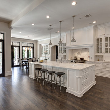
 Simmons Estate Homes
Example of a classic dark wood floor open concept kitchen design in Dallas with recessed-panel cabinets, white cabinets, white backsplash and stone slab backsplash

 Apple Wood Construction, Inc.
Kath & Keith Photography
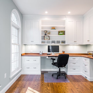
Mid-sized elegant built-in desk dark wood floor study room photo in Boston with gray walls and no fireplace
Mid-sized elegant built-in desk dark wood floor study room photo in Boston with gray walls and no fireplace
 ZeroEnergy Design
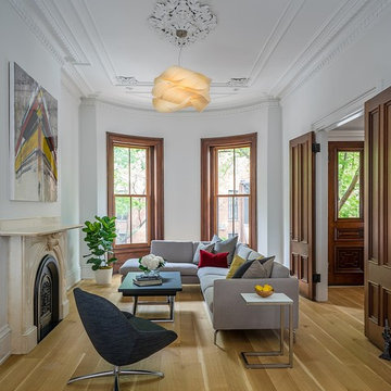
This renovated brick rowhome in Boston’s South End offers a modern aesthetic within a historic structure, creative use of space, exceptional thermal comfort, a reduced carbon footprint, and a passive stream of income.
DESIGN PRIORITIES. The goals for the project were clear - design the primary unit to accommodate the family’s modern lifestyle, rework the layout to create a desirable rental unit, improve thermal comfort and introduce a modern aesthetic. We designed the street-level entry as a shared entrance for both the primary and rental unit. The family uses it as their everyday entrance - we planned for bike storage and an open mudroom with bench and shoe storage to facilitate the change from shoes to slippers or bare feet as they enter their home. On the main level, we expanded the kitchen into the dining room to create an eat-in space with generous counter space and storage, as well as a comfortable connection to the living space. The second floor serves as master suite for the couple - a bedroom with a walk-in-closet and ensuite bathroom, and an adjacent study, with refinished original pumpkin pine floors. The upper floor, aside from a guest bedroom, is the child's domain with interconnected spaces for sleeping, work and play. In the play space, which can be separated from the work space with new translucent sliding doors, we incorporated recreational features inspired by adventurous and competitive television shows, at their son’s request.
MODERN MEETS TRADITIONAL. We left the historic front facade of the building largely unchanged - the security bars were removed from the windows and the single pane windows were replaced with higher performing historic replicas. We designed the interior and rear facade with a vision of warm modernism, weaving in the notable period features. Each element was either restored or reinterpreted to blend with the modern aesthetic. The detailed ceiling in the living space, for example, has a new matte monochromatic finish, and the wood stairs are covered in a dark grey floor paint, whereas the mahogany doors were simply refinished. New wide plank wood flooring with a neutral finish, floor-to-ceiling casework, and bold splashes of color in wall paint and tile, and oversized high-performance windows (on the rear facade) round out the modern aesthetic.
RENTAL INCOME. The existing rowhome was zoned for a 2-family dwelling but included an undesirable, single-floor studio apartment at the garden level with low ceiling heights and questionable emergency egress. In order to increase the quality and quantity of space in the rental unit, we reimagined it as a two-floor, 1 or 2 bedroom, 2 bathroom apartment with a modern aesthetic, increased ceiling height on the lowest level and provided an in-unit washer/dryer. The apartment was listed with Jackie O'Connor Real Estate and rented immediately, providing the owners with a source of passive income.
ENCLOSURE WITH BENEFITS. The homeowners sought a minimal carbon footprint, enabled by their urban location and lifestyle decisions, paired with the benefits of a high-performance home. The extent of the renovation allowed us to implement a deep energy retrofit (DER) to address air tightness, insulation, and high-performance windows. The historic front facade is insulated from the interior, while the rear facade is insulated on the exterior. Together with these building enclosure improvements, we designed an HVAC system comprised of continuous fresh air ventilation, and an efficient, all-electric heating and cooling system to decouple the house from natural gas. This strategy provides optimal thermal comfort and indoor air quality, improved acoustic isolation from street noise and neighbors, as well as a further reduced carbon footprint. We also took measures to prepare the roof for future solar panels, for when the South End neighborhood’s aging electrical infrastructure is upgraded to allow them.
URBAN LIVING. The desirable neighborhood location allows the both the homeowners and tenant to walk, bike, and use public transportation to access the city, while each charging their respective plug-in electric cars behind the building to travel greater distances.
OVERALL. The understated rowhouse is now ready for another century of urban living, offering the owners comfort and convenience as they live life as an expression of their values.
Eric Roth Photo
 Rosewood Custom Builders
Jenn Baker
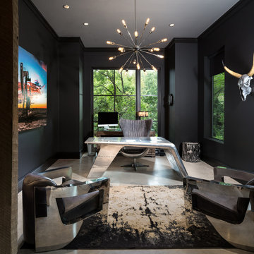
Example of a mid-sized urban freestanding desk concrete floor study room design in Dallas with black walls
Example of a mid-sized urban freestanding desk concrete floor study room design in Dallas with black walls

 FineLine Kitchens, Inc.
Hi everyone, I'm Sarah and Ogun we are here with fine line kitchens. So we are a couple working together. I do the interior design and remodeling of the space material selection meeting with the clients. And I handled operations outside, you know meaning all the construction work that is taking place the inside. The houses that we work in. I handle all the aspects of the construction, so today's project is very special. We're in Vienna and the client had a very big family. It's a family of seven that lives here. So we had a few aspects that we needed to keep in mind while designing this one. Having everybody be able to sit on the island. So we wanted plenty of seating all the way around. We didn't want anybody standing or anything like that. So what we did is we maximize the space. The center island is the biggest part of the kitchen. We use a natural stone to kind of give it a beautiful texture versus quartz. It's kind of standard white or kind of fabricated, so I wanted something very natural. We did this because I took my inspiration from the outside, so the inspiration if you look at the view right in front of me is there are so many greens there's a lot of brass accents and I wanted to bring this. Into this kitchen while designing it for my clients. She is very warm very. She wanted a very homey, comfy kind of look for the kitchen. So that's what we did today. As you can see, the cabinets are sage green, very light, so I still think it's a neutral, but it's a lighter color that again brings the outside in and we combine that with the oak right behind me so it's a slightly warm oak. It's not very dark. It's not very light. It's a medium brown and the same color went on the island. To kind of tie these two in and the backsplash, my favorite part is where you can see a little bit of design. It is, in my opinion still classic, but includes a pattern so the outside part is as we said in the beginning, is handled by my husband. I'd like him to speak a little bit about that. Thanks, Sarah, I want to talk to you guys a little bit about the construction part of this project. Originally this kitchen was located mostly in this area. They had their stove there sing. It was more of a peninsula layout in Sarah's and the customer vision they wanted. They wanted to get rid of the peninsula and they want to be able to have a huge island that can at least sit seven people because they're familiar with seven. So we wanted to make sure that we can achieve this design and bring it to life so that they can be happy with this layout. Some of the challenges we had, the house, the home being, you know, old home. There were a lot of you know the older electrical and plumbing that had to be replaced. We had to relocate the stove from here to this area. Over here we had put a nice foot fan that we had to relocate all the ductwork and the plumbing. Was being on the peninsula area. We had to relocate it to the center islands. So we achieved all this and kind of like bring it to bring in this kitchen up to date it looks beautiful. That's true, so yes, the old layout did not function for my clients because everything was kind of gathered on one side of the kitchen. So there was like a peninsula right there. So the end of this island kind of continued straight. And that was just the L shape. Kind of where everything was and there used to be another big table here, so they were using only kind of half of the space. So like I said at the beginning, our vision was to kind of feed everybody at the island, create some symmetry. 'cause I love that. So as you can see behind me, this is kind of the focal point symmetrical. Everything is kind of even we wanted to also panel the fridge here so it mimics the pantry and another size. So when you're looking at it, it is bringing again that symmetry back again. I hope you enjoyed this kitchen and this video and I'll see you soon. So how do you think this project turned out? It's nice. I like the color. I think it turned out nice. It's kind of like a little bit different color than what we always do. So I realize. Are you giving me a little bit of credit here that I did something different? Are you proud? I'm so proud of you. Other than that I like it. That they have kind of like a two sink. So if this was our kitchen, if we ever like you can have your own. I can have mine if we ever get into a fight then this can be like my own kitchen. Why are we gonna bring in a fight right now? So I'm cooking anyway. You're grilling most of the time, So what are you even talking about? My kitchen? That's my kitchen. You can just take the small sink. That's fine. It's always good to have your own space right there, so anyways. Thank you guys for watching. We hope to see you soon and if you have any questions please click the link below. It'll lead you to our website, house, YouTube and all of the social media is so nice to have you guys. We'll see you soon. Thanks bye bye-bye.
 FINNE Architects
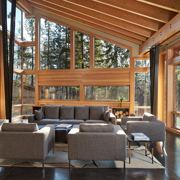
The Mazama house is located in the Methow Valley of Washington State, a secluded mountain valley on the eastern edge of the North Cascades, about 200 miles northeast of Seattle.
The house has been carefully placed in a copse of trees at the easterly end of a large meadow. Two major building volumes indicate the house organization. A grounded 2-story bedroom wing anchors a raised living pavilion that is lifted off the ground by a series of exposed steel columns. Seen from the access road, the large meadow in front of the house continues right under the main living space, making the living pavilion into a kind of bridge structure spanning over the meadow grass, with the house touching the ground lightly on six steel columns. The raised floor level provides enhanced views as well as keeping the main living level well above the 3-4 feet of winter snow accumulation that is typical for the upper Methow Valley.
To further emphasize the idea of lightness, the exposed wood structure of the living pavilion roof changes pitch along its length, so the roof warps upward at each end. The interior exposed wood beams appear like an unfolding fan as the roof pitch changes. The main interior bearing columns are steel with a tapered “V”-shape, recalling the lightness of a dancer.
The house reflects the continuing FINNE investigation into the idea of crafted modernism, with cast bronze inserts at the front door, variegated laser-cut steel railing panels, a curvilinear cast-glass kitchen counter, waterjet-cut aluminum light fixtures, and many custom furniture pieces. The house interior has been designed to be completely integral with the exterior. The living pavilion contains more than twelve pieces of custom furniture and lighting, creating a totality of the designed environment that recalls the idea of Gesamtkunstverk, as seen in the work of Josef Hoffman and the Viennese Secessionist movement in the early 20th century.
The house has been designed from the start as a sustainable structure, with 40% higher insulation values than required by code, radiant concrete slab heating, efficient natural ventilation, large amounts of natural lighting, water-conserving plumbing fixtures, and locally sourced materials. Windows have high-performance LowE insulated glazing and are equipped with concealed shades. A radiant hydronic heat system with exposed concrete floors allows lower operating temperatures and higher occupant comfort levels. The concrete slabs conserve heat and provide great warmth and comfort for the feet.
Deep roof overhangs, built-in shades and high operating clerestory windows are used to reduce heat gain in summer months. During the winter, the lower sun angle is able to penetrate into living spaces and passively warm the exposed concrete floor. Low VOC paints and stains have been used throughout the house. The high level of craft evident in the house reflects another key principle of sustainable design: build it well and make it last for many years!
Photo by Benjamin Benschneider
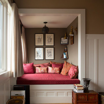
 Margot Hartford Photography
Photo: Margot Hartford © 2014 Houzz
Eclectic medium tone wood floor living room photo in San Francisco with brown walls
Eclectic medium tone wood floor living room photo in San Francisco with brown walls

 Yunker Associates Architecture
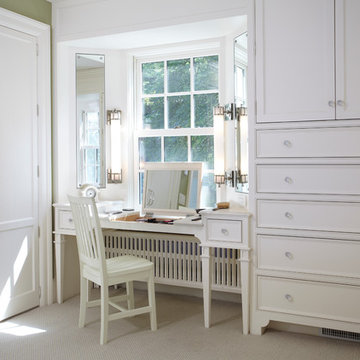
Photo: Karen Melvin
Example of a cottage dressing room design in Minneapolis
Example of a cottage dressing room design in Minneapolis
 Amantea Architects
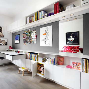
Lisa Petrole Photography
Inspiration for a study space and mid-sized contemporary gender-neutral medium tone wood floor kids' study room remodel in Toronto with white walls
Inspiration for a study space and mid-sized contemporary gender-neutral medium tone wood floor kids' study room remodel in Toronto with white walls
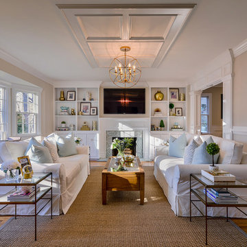
 Jeanne Campana Design
Project Cooper & Ella - Living Room -
Long Island, NY
Interior Design: Jeanne Campana Design -
www.jeannecampanadesign.com
Example of a mid-sized transitional enclosed medium tone wood floor living room design in New York with a standard fireplace, a wall-mounted tv and beige walls
Example of a mid-sized transitional enclosed medium tone wood floor living room design in New York with a standard fireplace, a wall-mounted tv and beige walls
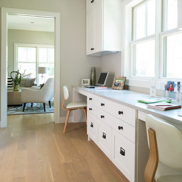
 Andrea Swan - Swan Architecture
A beautifully boarded stair hall welcomes you into this inspirational modern Cape Cod home. The spacious floor plan includes an expansive kitchen, dining, and living area, complete with a charming butler's pantry and home office.
Photo Credit: Scott Amundson
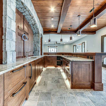
Sponsored
Fredericksburg, OH

High Point Cabinets
Columbus' Experienced Custom Cabinet Builder | 4x Best of Houzz Winner
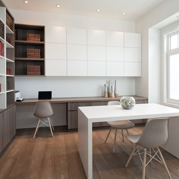
 Area3 Design Studio Inc.
Kristen McGaughey
Inspiration for a mid-sized scandinavian built-in desk medium tone wood floor study room remodel in Vancouver with white walls
Inspiration for a mid-sized scandinavian built-in desk medium tone wood floor study room remodel in Vancouver with white walls
 Garrison Foundry Architecture + Decor
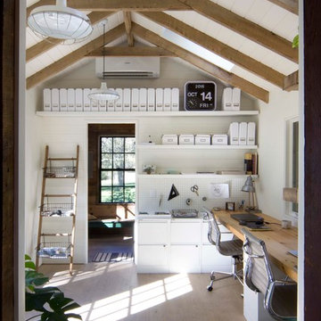
Home office - country built-in desk light wood floor home office idea in New York with white walls
 Regan Wood Photography
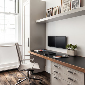
Inspiration for a contemporary built-in desk dark wood floor study room remodel in New York with white walls
8