
Search results for "Style problem" in Home Design Ideas
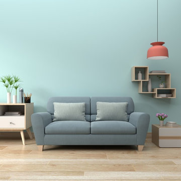
 Fresh Coat Painters of Monrovia
Want an HGTV Styled Room? Get an Accent Wall
If you’re moving into a new apartment/home or you’re finally getting to that laundry list of renovations;
here’s one statement piece that will set your place apart from the rest: an accent wall. An accent wall is
simply a wall that features a color that's different from the rest of the walls. It could be a green wall
along the sea of beige walls or a peach wall amongst a palette of white walls. It serves as an eye-opener
for guests entering the room, delivering an upbeat, fresh tone in your house.
Still need more convincing on why you need an accent wall? Here's a list of how accent walls are an
absolute game-changer for your place:
It gives your room personality. This rule is pretty straightforward. Add a bright or even neutral color to
just one wall, and it will make any room pop. The key is to select colors that play up a specific area in
your home. If you have a girl nursery room, you can paint one wall cotton candy pink to highlight the
plush toys and brightly colored crib. To make your office space look more "official," emphasize your
creative zone with a black, front-facing accent wall that shows off your flashy accessories and computers
while giving you the perfect color to concentrate in.
It modernizes your place without serious renovations. Since most homes typically have similarly
painted walls and tones, and accent wall gives off a modern, almost futuristic vibe. Accent walls
naturally draw in our eyes, and its color distinction causes objects in the room to take a unique form.
Instead of budgeting funds for new furniture, hone in a cool bohemian look with a cinnamon brown
accent wall. To play up the bohemian vibes, you can add wooden accessories like tables, picture frames,
vases, or compliment the brown with some colorful green houseplants!
Accent walls also work as an accessory. Living in a minimalist space? No problem! An accent wall with a
bright, unique hue will doll up your area without you having to add more objects. A burnt orange accent
wall is the perfect look for a living room space accompanied by a tall plant, rug, sofa, and coffee table.
The burnt orange opens up the room, drawing all eyes to the playful contrast of the plant’s green
against the orange while balancing the place out with a neutral rug and a wooden coffee table to play up
earthy tones. People will think you spent all day decorating your room when in reality you only painted
one wall.
You can manipulate your room to look bigger or smaller. Accent walls have a science behind them
depending on what color palette you select. If you’re rooming in a small space, to make it look bigger
use bright colors like lemon yellow or French roses pink to make your room more reflective, maximizing
all the natural light coming in. This will leave your room feeling open and breezy. On the contrast, if you
are stuck with too much space, or want to minimize a corner as a small reading nook, use dark colors
like seaweed green to absorb light and tighten up the space.
Hopefully, this list was able to get you excited to kick-off your new (or next set) of accent walls. Feel free
to marathon HGTV while you paint or wait for the painters to arrive. Stay tuned for future pieces on how
to accentuate and best practices for painting!
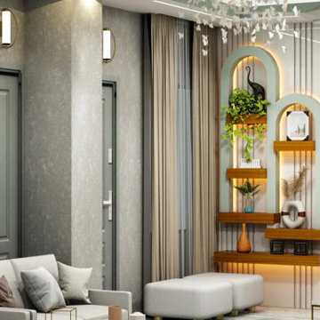
 InteriorArt Ltd
Hasan Ali's Apartment Interior Design – Pallabi, Mirpur, BD
InteriorArt Ltd is currently completing a 1,748 sqft residential interior design and renovation project for Mr. Hasan Ali in Pallabi, Mirpur — one of Dhaka's busier residential pockets where older apartment layouts often no longer match how families actually live today. This project is a strong example of our approach to home interior design: not just decorating existing rooms, but rethinking the floor plan itself to solve real everyday problems.
Rebuilding the Layout
The original apartment had four bedrooms, but the layout felt tight and disconnected. Rather than preserving every room by default, our design team made the call to remove one bedroom entirely, freeing up space to give the remaining rooms — and the shared living areas — room to breathe. This kind of structural rethinking is central to how we approach every residential interior design project, where the floor plan matters as much as the finishes.
A Hotel-Style Master Suite
The bathroom adjoining the primary bedroom was expanded and merged into the sleeping area, creating a single connected master suite. This upgrade reflects our broader bedroom interior design philosophy — treating the bedroom not as an isolated box, but as part of a larger, more functional living experience.
A Kitchen Built for Dhaka's Climate
The kitchen was rebuilt from scratch with an efficient galley layout and premium, low-maintenance finishes — a necessity in Bangladesh's humid conditions where materials face constant wear. You can see how this fits into our wider kitchen interior design approach, where every cabinet run and work surface is planned around how a family actually cooks, not just how it photographs.
One Consistent Design Language
Across the drawing room interior design and dining room interior design, we carried a unified neutral material palette — flooring, wall tone, and finish quality — so the apartment reads as one cohesive home rather than a set of unrelated rooms stitched together.
The Result
What began as an aging, awkwardly divided apartment is becoming a light-filled, modern home with a layout that genuinely supports daily family life. Completed on a 70-day build schedule, the project reflects InteriorArt Ltd's structured, end-to-end process — from first site visit through 3D visualization, material selection, and final handover.
Explore more of our work across Dhaka on our residential portfolio, or browse our full interior design services to see how we approach projects like this one from concept to completion.
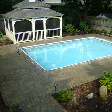
 Pennsylvania Landscape & Nursery Association
Kimicata Brothers, INC http://www.kimicatabrothers.com
Project Entry: Johnson
2014 PLNA Awards for Landscape Excellence Winner
Category: Hardscaping-Residential $30,000-$60,000
Award Level: Honorable Mention
Photo Description:
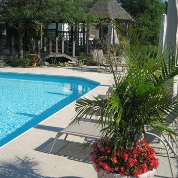
We were contacted by the Johnson’s to update their backyard fenced in pool area in the summer of 2012. Over the years the deck around the pool had deteriorated and the plants had become over grown and made walking around the deck difficult. The old concrete patio was small and only lit by bright 120 volt spot lights. What made this job difficult was the access to the backyard was limited to using a neighbor’s backyard for the project. We had to bring all debris out and materials in from a neighboring street, down the neighbor’s driveway, across the backyard, through an 8’ section that was in the far corner of the neighbor’s yard that corresponded to the entrance to Johnson’s backyard. They had a plan that they wanted to work from. Since access was a problem, we had to secure permission from the neighbor before we could consider bidding the job. After the neighbor’s permission was obtained we discussed materials for the drawing they had. It only included the hardscape and gazebo. Other difficulties included not damaging lighting and plumbing for the pool during excavation and construction. Also the ladders into the pool fit into cups screwed to the deck. These had to be replaced with precisely placed pipes mounted into the base for stability. Care had to be taken to make sure water would not drain from the deck into the pool. So we had to place channel drains between the patio area and pool deck area. A channel drain was placed between the exposed aggregate finished slab for the gazebo and the pool deck. This allowed for proper sloping of the hardscape to provide the drains to move rain away from the pool. We used polymeric sand in the paver joints to prevent breakdown of the installation and avoid wind and water moving sand into the pool. The slab for the gazebo was an exposed aggregate finish that measured 12’ 6” x 16’ 6”. The pagoda style roof for the gazebo and screening make it attractive and functional as a bug free area to entertain in. We discussed adding low voltage lighting, 120 volt plugs and drip irrigation early on so we could place conduits during the construction. After the hardscape installation we installed the low voltage lighting. We installed a transformer with a timer and an optional dusk to dawn photocell. The Johnsons did not like the old 120 volt spot light to light the back, they wanted something softer. We installed 20 path lights to illuminate the hardscape and 3 wall wash lights to add evening depth to the yard. We installed the plantings and Hunter drip irrigation system in the spring of 2013. It was easy to convince them that the drip system was the proper way to irrigate the area. There would be no spray to blow onto patio furniture or into the gazebo. Also drip irrigation uses less water so they are economical to operate. This gave them a low maintenance yard, a nice finished look and something blooming throughout the growing season. The Johnsons have been very happy with the look and the functionality of the pool deck, patio, lights, irrigation and gazebo.
Find the right local pro for your project

 Advance Design Studio, Ltd.
Jackie and Sean loved the Algonquin neighborhood they lived in with the peaceful neighborhood and the close proximity to work and school. What they didn’t love was how outdated their home had become. With a cramped kitchen and an unused dining room, they decided a remodel was the perfect solution to their problem. They would be able to continue to live in the area they loved, while at the same time they could have the dream home they envisioned.
After a thorough search, Jackie came across Advance Design Studio. She was impressed by all of the positive reviews she saw on the internet and saw herself identifying with all of the project stories she saw on the website. Once they met with designer Scott Christensen and owner Todd Jurs, they knew Advance Design was the right company to make their dreams a reality.
The project consisted of four main areas: the kitchen/dining/powder room, the laundry room, the master bathroom, and the kid’s bathroom. They wanted to expand the kitchen into the seldom used dining room and add a large island for hosting parties and family gatherings. They also wanted new hardwood flooring throughout the first level. The laundry room needed to be more functional, and all three bathrooms were in dire need of updating.
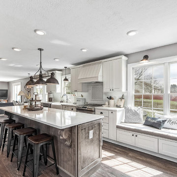
The closed off kitchen was opened up to create a sweeping space between the new eating area and the much larger kitchen. A handsome dry bar complete with a beverage refrigerator and lighted glass door cabinetry makes an elegant transition across from a peninsula area filled with storage. An additional decorative cabinet lighting up elegant dishware through the mullioned glass sits directly across from the drybar.
An expansive island was critical to the kitchen plans. Jackie, Sean and Scott worked closely together to create just the right details for their design. They wanted the island to be functional in addition to being the centerpiece of the room. Added storage for the kid’s school supplies was hidden behind cabinet doors so the children could do their schoolwork right at the island, and a microwave drawer glides open with the touch of a finger hidden inconspicuously within the island space. The easy to care for Cambria Britannica Quartz island top with its sweeping grey and white marble look perched atop hand-carved Craftsman corbels was absolutely what they were hoping for, blending both beauty and function perfectly.
Adding a nice contrast to the brightness of the quartz and the white cabinetry, Kodiak - Leather granite countertops were used to balance the light and dark tones of the space. Dura Supreme Classic White painted cabinets grace the perimeter, while Maple Poppy Seed stained cabinets with a beautiful soft grey woodgrain were used in the beverage center and island. The two tones compliment the large space balancing it out nicely creating interest and elegance with the simple Craftsman style full overlay doors.
A deep warm Barnwood White Oak flooring was added throughout the lower level. The new floor brings additional contrast to the bright kitchen and provides unity with the now open floorplan as it rolls in to the foyer and family room. Final details like the show-stopping lunar like duo light fixtures complete the space and intermix expertly with crisscross details of the glass door mullions, the island bar seating and even accessories in the space.
The small cluttered laundry room needed more space and more storage. With a busy family it seemed to overflow daily and did not have anywhere to hide the families “in and out stuff.” Scott designed the new space with a stackable washer and dryer and much more efficiently organized cabinetry. Doing laundry is now (almost!) a pleasure and keeping everyone’s “stuff” hidden, but readily accessible is now a snap.
The master bath was not a place where the couple enjoyed spending time getting ready for their day. The tub almost never was used, so removing it made it possible to build an extra-large shower, replacing the small cramped cube of the previous shower they hated. Clean, horizontal lines softly draw your eye around the space with porcelain tile called Driftwood Sea spray. Full overlay cabinetry in a soft white vanity with double sinks makes getting ready for the day much more convenient for the busy couple.
Long floor planks made of porcelain tile mimic real hardwood floors in a soft grey to compliment the shower, but with the ease and care of a tile surface. Cambrian Black Granite counters with a matte finish and under mount porcelain sinks with handsome brushed chrome hardware complete the handsome space. A real bonus in any master bath; a custom built in storage nook was tucked in the corner of the space for linens and heavenly storage.
The kid’s bath was in sad shape because it was original to the house. To keep the budget in control, the tub which was in great condition was retained, but focus was on the new large brick style porcelain charcoal tile on the floor, crisp white new Craftsman style cabinetry with pretty furniture details on the corner base, a striking granite top with white under mount porcelain sinks and fresh hardware and faucets. Some beautiful soft grey wood mirrors to match mom and dads were custom sized and placed under new lighting, and 4 hooks were smartly arranged down the wall for kids’ towels.
This couple was determined not to move, and made their house their dream home. Not only does their home function greatly now, but Jackie says, “When the neighbors come to visit, they’re asking if they can “steal” the design”! The added functionality, elegance, and open floor plan were exactly what this family needed in order to stay.
Advance Design Studio, Joe Nowak

 Jasper + Phoenix
Amber works from home and was sacrificing a dining room for her home office. By utilizing the double wide closet space in her guest bedroom, she now walks into her home without the reminder of work, and can have guests over for a meal in her dining room (dining room reveal coming soon). The walls were freshly painted Sea Salt by Sherwin Williams. This gives the room a fresh, clean look and also adds contrast to the beige carpet.
Amber had her homework assignments cut out for her as she had to do some major purging in her throw all guest room. Once she started letting go, she was on a roll and continually surprised me as she cleaned out closets throughout the house. One dresser was filled with cds, dvds, books, albums, scrap-booking materials; items taking up precious real estate in her life that she didn't even know were there. There really wasn't a storage problem after-all, she was just holding on to a collection of things that no longer served her. Each time I would visit, and her space would become more open, I could see the weight lifting off her and her self love building. Amber had a recent breakup with her boyfriend and this makeover helped her not only focus on making a home sanctuary for herself, but helped her let go of the pains of the past and focus on the exciting future ahead. At one point when we were moving sofas in the living room (which we will also reveal soon), we found an ex's flip-flop. We were figuratively and literally sweeping away the past. Editing your home and your life makes room for your future; for new people and things. We are so happy to finally reveal the room to you! We can't wait to unveil the rest of Amber's home, once we complete the finishing touches.
Challenges:
Amber's home was filled with mix-matched furniture from family and college. She had no idea what her decorating style was. After shopping together and exchanging somepinterest boards, I was finally able to get a sense of what she loves.
I had to work on a tight budget, which meant really digging out the creativity and utilizing other items in the home. See how I transformed a table from the discard pile into a faux marble bedside table by clicking web link.
Amber's dad was able to help with the desk materials and building to cut costs.
We wanted to save the closet doors in the event she sold her home or no longer needed an office someday. There wasn't any extra space to store these closet doors, so I used them as a headboard.
The only items purchased were: Curtains, Curtain Rod, Bedspread Set, Throw Pillows, 2 Lamps and Paint.

 Cheryl Oldershaw
Countertop Artwork at it's best "Cambria" Aberdeen with the Exotic Veneer European Slab Anigre Design Craft Kitchen by Elkay, stainless steel appliances, Elkay E-granite sink and Dura Ceramic Flooring and Hafele LED Undercabinet lighting. Designed By Cheryl Oldershaw Chant from Marco Island, Florida a designer with McDaniels Kitchen and Bath a beautiful 4500sf showroom located in Lansing, Michigan
Contact Cheryl to discuss you new kitchen or bath project at cherylo@gomcdaniels.com
Cell (239)-450-0126
Office (517)-482-0748 ext.24
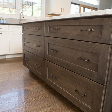 Advance Design Studio, Ltd.
Jackie and Sean loved the Algonquin neighborhood they lived in with the peaceful neighborhood and the close proximity to work and school. What they didn’t love was how outdated their home had become. With a cramped kitchen and an unused dining room, they decided a remodel was the perfect solution to their problem. They would be able to continue to live in the area they loved, while at the same time they could have the dream home they envisioned.
After a thorough search, Jackie came across Advance Design Studio. She was impressed by all of the positive reviews she saw on the internet and saw herself identifying with all of the project stories she saw on the website. Once they met with designer Scott Christensen and owner Todd Jurs, they knew Advance Design was the right company to make their dreams a reality.
The project consisted of four main areas: the kitchen/dining/powder room, the laundry room, the master bathroom, and the kid’s bathroom. They wanted to expand the kitchen into the seldom used dining room and add a large island for hosting parties and family gatherings. They also wanted new hardwood flooring throughout the first level. The laundry room needed to be more functional, and all three bathrooms were in dire need of updating.
The closed off kitchen was opened up to create a sweeping space between the new eating area and the much larger kitchen. A handsome dry bar complete with a beverage refrigerator and lighted glass door cabinetry makes an elegant transition across from a peninsula area filled with storage. An additional decorative cabinet lighting up elegant dishware through the mullioned glass sits directly across from the drybar.
An expansive island was critical to the kitchen plans. Jackie, Sean and Scott worked closely together to create just the right details for their design. They wanted the island to be functional in addition to being the centerpiece of the room. Added storage for the kid’s school supplies was hidden behind cabinet doors so the children could do their schoolwork right at the island, and a microwave drawer glides open with the touch of a finger hidden inconspicuously within the island space. The easy to care for Cambria Britannica Quartz island top with its sweeping grey and white marble look perched atop hand-carved Craftsman corbels was absolutely what they were hoping for, blending both beauty and function perfectly.
Adding a nice contrast to the brightness of the quartz and the white cabinetry, Kodiak - Leather granite countertops were used to balance the light and dark tones of the space. Dura Supreme Classic White painted cabinets grace the perimeter, while Maple Poppy Seed stained cabinets with a beautiful soft grey woodgrain were used in the beverage center and island. The two tones compliment the large space balancing it out nicely creating interest and elegance with the simple Craftsman style full overlay doors.
A deep warm Barnwood White Oak flooring was added throughout the lower level. The new floor brings additional contrast to the bright kitchen and provides unity with the now open floorplan as it rolls in to the foyer and family room. Final details like the show-stopping lunar like duo light fixtures complete the space and intermix expertly with crisscross details of the glass door mullions, the island bar seating and even accessories in the space.
The small cluttered laundry room needed more space and more storage. With a busy family it seemed to overflow daily and did not have anywhere to hide the families “in and out stuff.” Scott designed the new space with a stackable washer and dryer and much more efficiently organized cabinetry. Doing laundry is now (almost!) a pleasure and keeping everyone’s “stuff” hidden, but readily accessible is now a snap.
The master bath was not a place where the couple enjoyed spending time getting ready for their day. The tub almost never was used, so removing it made it possible to build an extra-large shower, replacing the small cramped cube of the previous shower they hated. Clean, horizontal lines softly draw your eye around the space with porcelain tile called Driftwood Sea spray. Full overlay cabinetry in a soft white vanity with double sinks makes getting ready for the day much more convenient for the busy couple.
Long floor planks made of porcelain tile mimic real hardwood floors in a soft grey to compliment the shower, but with the ease and care of a tile surface. Cambrian Black Granite counters with a matte finish and under mount porcelain sinks with handsome brushed chrome hardware complete the handsome space. A real bonus in any master bath; a custom built in storage nook was tucked in the corner of the space for linens and heavenly storage.
The kid’s bath was in sad shape because it was original to the house. To keep the budget in control, the tub which was in great condition was retained, but focus was on the new large brick style porcelain charcoal tile on the floor, crisp white new Craftsman style cabinetry with pretty furniture details on the corner base, a striking granite top with white under mount porcelain sinks and fresh hardware and faucets. Some beautiful soft grey wood mirrors to match mom and dads were custom sized and placed under new lighting, and 4 hooks were smartly arranged down the wall for kids’ towels.
This couple was determined not to move, and made their house their dream home. Not only does their home function greatly now, but Jackie says, “When the neighbors come to visit, they’re asking if they can “steal” the design”! The added functionality, elegance, and open floor plan were exactly what this family needed in order to stay.
Advance Design Studio, Joe Nowak
Sponsored
Sunbury, OH

J.Holderby - Renovations
Franklin County's Leading General Contractors - 2X Best of Houzz!
 Main Line Kitchen Design
 has a different business model than other kitchen showrooms, designers, and cabinetry dealers. The difference helps us to do five important things better than our competitors.
The kitchens we sell are better designed and our designers are more experienced. This is because we insist on showing customers designs we recommend, BEFORE, we do a design they request. This way, final designs tend to be more collaborative and professional. Our designers are more experienced because they are better paid and design with more cabinet brands than at other dealers.
Our pricing for cabinets is less than other cabinet dealers. This is because we do not have a showroom open to the public, and we require a small deposit and a screening before we accept customers. This helps our designers spend their time more effectively. And, it eliminates 80% of the overhead kitchen showrooms spend on staffing, larger displays, and on a curbside location.
We carry more brands of cabinetry than other dealers. This is possible because we display one cabinet for each brand we sell. Through glass countertops clients can examine a brands construction quality, and we display the door styles and finishes of our brands. Instead of the larger displays customers see in traditional showrooms, our customers can view 5 million kitchens on Houzz.com, or the hundreds of our kitchen renovations we show on Houzz, our web site, and in framed photos on the walls of our office building.
Kitchen construction is often better organized and generally costs less. This is because we recommend general contractors free of charge. They supervise construction from scheduling to completion. This eliminates a middleman, reduces delays, and eliminates the fees that almost all showrooms and home centers charge their customers. We are also happy to work with any contractor a customer finds on their own. If we haven’t worked with that contractor before they may need more of our direction, but both companies can benefit from working together and possibly referring each other in the future.
Less problems arise, and if they do, they are handled more quickly. This is because every kitchen we sell is reviewed by at least 3 kitchen designers during the ordering process. Our Operations Manager Ed Sossich checks orders and schedules all warehouse and home deliveries. Our delivery manager Mark Mitten supervises every delivery and checks in each cabinet and part. And our CRM system, Monday, prompts each person responsible for each phase of a customer’s kitchen with automated alerts. This keeps things moving, even during supply chain disruptions, and ensures no step is overlooked.
Main Line Kitchen Design’s company slogan is “The world of kitchen design is changing . . . “. We pride ourselves on being innovative in everything we do. From our web site and how we advertise, to the gift we send each customer upon the completion of their kitchen.
Our business model helps us receive 100’s of 5-star reviews, and makes our kitchen projects more enjoyable for everyone.
We look forward to working with you.
 Main Line Kitchen Design
 has a different business model than other kitchen showrooms, designers, and cabinetry dealers. The difference helps us to do five important things better than our competitors.
The kitchens we sell are better designed and our designers are more experienced. This is because we insist on showing customers designs we recommend, BEFORE, we do a design they request. This way, final designs tend to be more collaborative and professional. Our designers are more experienced because they are better paid and design with more cabinet brands than at other dealers.
Our pricing for cabinets is less than other cabinet dealers. This is because we do not have a showroom open to the public, and we require a small deposit and a screening before we accept customers. This helps our designers spend their time more effectively. And, it eliminates 80% of the overhead kitchen showrooms spend on staffing, larger displays, and on a curbside location.
We carry more brands of cabinetry than other dealers. This is possible because we display one cabinet for each brand we sell. Through glass countertops clients can examine a brands construction quality, and we display the door styles and finishes of our brands. Instead of the larger displays customers see in traditional showrooms, our customers can view 5 million kitchens on Houzz.com, or the hundreds of our kitchen renovations we show on Houzz, our web site, and in framed photos on the walls of our office building.
Kitchen construction is often better organized and generally costs less. This is because we recommend general contractors free of charge. They supervise construction from scheduling to completion. This eliminates a middleman, reduces delays, and eliminates the fees that almost all showrooms and home centers charge their customers. We are also happy to work with any contractor a customer finds on their own. If we haven’t worked with that contractor before they may need more of our direction, but both companies can benefit from working together and possibly referring each other in the future.
Less problems arise, and if they do, they are handled more quickly. This is because every kitchen we sell is reviewed by at least 3 kitchen designers during the ordering process. Our Operations Manager Ed Sossich checks orders and schedules all warehouse and home deliveries. Our delivery manager Mark Mitten supervises every delivery and checks in each cabinet and part. And our CRM system, Monday, prompts each person responsible for each phase of a customer’s kitchen with automated alerts. This keeps things moving, even during supply chain disruptions, and ensures no step is overlooked.
Main Line Kitchen Design’s company slogan is “The world of kitchen design is changing . . . “. We pride ourselves on being innovative in everything we do. From our web site and how we advertise, to the gift we send each customer upon the completion of their kitchen.
Our business model helps us receive 100’s of 5-star reviews, and makes our kitchen projects more enjoyable for everyone.
We look forward to working with you.

 Kathleen Jennison
An Arts & Crafts Bungalow is one of my favorite styles of homes. We have quite a few of them in our Stockton Mid-Town area. And when C&L called us to help them remodel their 1923 American Bungalow, I was beyond thrilled.
As per usual, when we get a new inquiry, we quickly Google the project location while we are talking to you on the phone. My excitement escalated when I saw the Google Earth Image of the sweet Sage Green bungalow in Mid-Town Stockton. "Yes, we would be interested in working with you," I said trying to keep my cool.
But what made it even better was meeting C&L and touring their home, because they are the nicest young couple, eager to make their home period perfect. Unfortunately, it had been slightly molested by some bad house-flippers, and we needed to bring the bathroom back to it "roots."
We knew we had to banish the hideous brown tile and cheap vanity quickly. But C&L complained about the condensation problems and the constant fight with mold. This immediately told me that improper remodeling had occurred and we needed to remedy that right away.
The Before: Frustrations with a Botched Remodel
The bathroom needed to be brought back to period appropriate design with all the functionality of a modern bathroom. We thought of things like marble countertop, white mosaic floor tiles, white subway tile, board and batten molding, and of course a fabulous wallpaper.
This small (and only) bathroom on a tight budget required a little bit of design sleuthing to figure out how we could get the proper look and feel. Our goal was to determine where to splurge and where to economize and how to complete the remodel as quickly as possible because C&L would have to move out while construction was going on.
The Process: Hard Work to Remedy Design and Function
During our initial design study, (which included 2 hours in the owners’ home), we noticed framed images of William Morris Arts and Crafts textile patterns and knew this would be our design inspiration. We presented C&L with three options and they quickly selected the Pimpernel Design Concept.
We had originally selected the Black and Olive colors with a black vanity, mirror, and black and white floor tile. C&L liked it but weren’t quite sure about the black, We went back to the drawing board and decided the William & Co Pimpernel Wallpaper in Bayleaf and Manilla color with a softer gray painted vanity and mirror and white floor tile was more to their liking.
After the Design Concept was approved, we went to work securing the building permit, procuring all the elements, and scheduling our trusted tradesmen to perform the work.
We did uncover some shoddy work by the flippers such as live electrical wires hidden behind the wall, plumbing venting cut-off and buried in the walls (hence the constant dampness), the tub barely balancing on two fence boards across the floor joist, and no insulation on the exterior wall.
All of the previous blunders were fixed and the bathroom put back to its previous glory. We could feel the house thanking us for making it pretty again.
The After Reveal: Cohesive Design Decisions
We selected a simple white subway tile for the tub/shower. This is always classic and in keeping with the style of the house.
We selected a pre-fab vanity and mirror, but they look rich with the quartz countertop. There is much more storage in this small vanity than you would think.
The Transformation: A Period Perfect Refresh
We began the remodel just as the pandemic reared and stay-in-place orders went into effect. As C&L were already moved out and living with relatives, we got the go-ahead from city officials to get the work done (after all, how can you shelter in place without a bathroom?).
All our tradesmen were scheduled to work so that only one crew was on the job site at a time. We stayed on the original schedule with only a one week delay.
The end result is the sweetest little bathroom I've ever seen (and I can't wait to start work on C&L's kitchen next).
Thank you for joining me in this project transformation. I hope this inspired you to think about being creative with your design projects, determining what works best in keeping with the architecture of your space, and carefully assessing how you can have the best life in your home.
 Kathleen Jennison
An Arts & Crafts Bungalow is one of my favorite styles of homes. We have quite a few of them in our Stockton Mid-Town area. And when C&L called us to help them remodel their 1923 American Bungalow, I was beyond thrilled.
As per usual, when we get a new inquiry, we quickly Google the project location while we are talking to you on the phone. My excitement escalated when I saw the Google Earth Image of the sweet Sage Green bungalow in Mid-Town Stockton. "Yes, we would be interested in working with you," I said trying to keep my cool.
But what made it even better was meeting C&L and touring their home, because they are the nicest young couple, eager to make their home period perfect. Unfortunately, it had been slightly molested by some bad house-flippers, and we needed to bring the bathroom back to it "roots."
We knew we had to banish the hideous brown tile and cheap vanity quickly. But C&L complained about the condensation problems and the constant fight with mold. This immediately told me that improper remodeling had occurred and we needed to remedy that right away.
The Before: Frustrations with a Botched Remodel
The bathroom needed to be brought back to period appropriate design with all the functionality of a modern bathroom. We thought of things like marble countertop, white mosaic floor tiles, white subway tile, board and batten molding, and of course a fabulous wallpaper.
This small (and only) bathroom on a tight budget required a little bit of design sleuthing to figure out how we could get the proper look and feel. Our goal was to determine where to splurge and where to economize and how to complete the remodel as quickly as possible because C&L would have to move out while construction was going on.
The Process: Hard Work to Remedy Design and Function
During our initial design study, (which included 2 hours in the owners’ home), we noticed framed images of William Morris Arts and Crafts textile patterns and knew this would be our design inspiration. We presented C&L with three options and they quickly selected the Pimpernel Design Concept.
We had originally selected the Black and Olive colors with a black vanity, mirror, and black and white floor tile. C&L liked it but weren’t quite sure about the black, We went back to the drawing board and decided the William & Co Pimpernel Wallpaper in Bayleaf and Manilla color with a softer gray painted vanity and mirror and white floor tile was more to their liking.
After the Design Concept was approved, we went to work securing the building permit, procuring all the elements, and scheduling our trusted tradesmen to perform the work.
We did uncover some shoddy work by the flippers such as live electrical wires hidden behind the wall, plumbing venting cut-off and buried in the walls (hence the constant dampness), the tub barely balancing on two fence boards across the floor joist, and no insulation on the exterior wall.
All of the previous blunders were fixed and the bathroom put back to its previous glory. We could feel the house thanking us for making it pretty again.
The After Reveal: Cohesive Design Decisions
We selected a simple white subway tile for the tub/shower. This is always classic and in keeping with the style of the house.
We selected a pre-fab vanity and mirror, but they look rich with the quartz countertop. There is much more storage in this small vanity than you would think.
The Transformation: A Period Perfect Refresh
We began the remodel just as the pandemic reared and stay-in-place orders went into effect. As C&L were already moved out and living with relatives, we got the go-ahead from city officials to get the work done (after all, how can you shelter in place without a bathroom?).
All our tradesmen were scheduled to work so that only one crew was on the job site at a time. We stayed on the original schedule with only a one week delay.
The end result is the sweetest little bathroom I've ever seen (and I can't wait to start work on C&L's kitchen next).
Thank you for joining me in this project transformation. I hope this inspired you to think about being creative with your design projects, determining what works best in keeping with the architecture of your space, and carefully assessing how you can have the best life in your home.

 River Valley Landscapes
The property is one of the original farm houses located on the main street of a small town. It has been in the family for many years and our client just inherited the property. They were trying to have balance of preserving the old while realizing modern day living has its benefits too. The house had a large addition added using mostly old style materials, but designed with function and modern day luxuries. Our goal was to carry that theme to the outside.
Our first problem we had to address was how to transition between the first floor elevation changes. The lower room was the husband’s office. He stated in the future he may have clients over and it would be nice to have an area to sit outside. The wife’s main concern was to renew the four corner garden. She also felt it was very important to be able to see it from the kitchen area. Finally there was an old wishing well stuck right outside the kitchen. They both felt it would be neat to be able to incorporate this in some how. They wanted a patio area with a built in grill to accommodate there family and friends. They also wanted to keep a large play area for the kids.
We were able to pull this off successfully. We addressed the first issue by having a small lower level flagstone area. This area is large enough for 1 to 2 people to sit comfortably. It also provides a transition from his office to the larger patio area. We installed a simple small gravel sitting area opposite of the main patio. This provides our client a secluded place to relax or do business. Mrs.... told me she is amazed how much her and her husband enjoys this area. It is so peaceful looking at the small creek over a glass of wine.
We built a natural limestone retaining wall to create the patio terrace. The stone was chosen to extend the houses architectural elements into the landscape. Irregular broken flagstone was used to give it a more casual feel. We installed three Serviceberries into the patio terrace to replace some trees that were taken down during the remodeling. She was very concern that they would block the view of the four corner garden. We new they were crucial to nestle in the terrace, so we placed them for a couple days for her to decide. Fortunately she agreed they not only kept the view open, but helped frame the garden.
The four corner garden was designed to be viewed from afar and experienced up close. We wanted the space to have some formal structure while keeping with the casual farm house feel. Another natural limestone retaining wall was created. This leveled the garden terrace and helped associate it with the rest of the property. The four corner garden is nestled into the existing woods edge. This provides three distinct experiences to entering the garden; a more formal from the driveway, an open feel from the lower lawn, and a more natural / casual experience from the wooded area. The Plymouth brown gravel was used for the center of the garden. This helped highlight the stone post that was found during construction. The gravel also brings the sense of sound into the garden space. Lamb’s ear was chosen as a fun way to get kids interest in horticulture.
The balance of using the new to create the old feel is what makes this project a success. The property has already hosted a local historical society event and won an award for its preservation efforts. When Mrs.... can’t find her husband, she knows he is either reading the newspaper by the grill or resting in the hammock along the wood’s path.



 Advance Design Studio, Ltd.
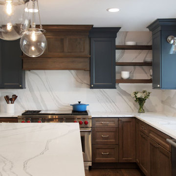
Our clients in Tower Lakes, IL, needed more storage and functionality from their kitchen. They were primarily focused on finding the right combination of cabinets, shelves, and drawers that fit all their cookware, flatware, and appliances. They wanted a brighter, bigger space with a natural cooking flow and plenty of storage. Soffits and crown molding needed to be removed to make the kitchen feel larger. Redesign elements included: relocating the fridge, adding a baking station and coffee bar, and placing the microwave in the kitchen island.
Advance Design Studio’s Claudia Pop offered functional, creative, and unique solutions to the homeowners’ problems. Our clients wanted a unique kitchen that was not completely white, a balance of design and function. Claudia offered functional, creative, and unique solutions to Chad and Karen’s kitchen design challenges. The first thing to go was soffits. Today, most kitchens can benefit from the added height and space; removing soffits is nearly always step one. Steely gray-blue was the color of choice for a freshly unique look bringing a sophisticated-looking space to wrap around the fresh new kitchen. Cherry cabinetry in a true brown stain compliments the stormy accents with sharp contrasting white Cambria quartz top balancing out the space with a dramatic flair.
“We wanted something unique and special in this space, something none of the neighbors would have,” said Claudia.
The dramatic veined Cambria countertops continue upward into a backsplash behind three complimentary open shelves. These countertops provide visual texture and movement in the kitchen. The kitchen includes two larder cabinets for both the coffee bar and baking station. The kitchen is now functional and unique in design.
“When we design a new kitchen space, as designers, we are always looking for ways to balance interesting design elements with practical functionality,” Claudia said. “This kitchen’s new design is not only way more functional but is stunning in a way a piece of art can catch one’s attention.”
Decorative mullions with mirrored inserts sit atop dual sentinel pantries flanking the new refrigerator, while a 48″ dual fuel Wolf range replaced the island cooktop and double oven. The new microwave is cleverly hidden within the island, eliminating the cluttered counter and attention-grabbing wall of stainless steel from the previous space.
The family room was completely renovated, including a beautifully functional entertainment bar with the same combination of woods and stone as the kitchen and coffee bar. Mesh inserts instead of plain glass add visual texture while revealing pristine glassware. Handcrafted built-ins surround the fireplace.
The beautiful and efficient design created by designer Claudia transitioned directly to the installation team seamlessly, much like the basement project experience Chad and Karen enjoyed previously.
“We definitely will and have recommended Advance Design Studio to friends who are looking to embark on a project small or large,” Karen said.
“Everything that was designed and built exactly how we envisioned it, and we are really enjoying it to its full potential,” Karen said.
Our award-winning design team would love to create a beautiful, functional, and spacious place for you and your family. With our “Common Sense Remodeling” approach, the process of renovating your home has never been easier. Contact us today at 847-665-1711 or schedule an appointment.
 Jasper + Phoenix
Amber works from home and was sacrificing a dining room for her home office. By utilizing the double wide closet space in her guest bedroom, she now walks into her home without the reminder of work, and can have guests over for a meal in her dining room (dining room reveal coming soon). The walls were freshly painted Sea Salt by Sherwin Williams. This gives the room a fresh, clean look and also adds contrast to the beige carpet.
Amber had her homework assignments cut out for her as she had to do some major purging in her throw all guest room. Once she started letting go, she was on a roll and continually surprised me as she cleaned out closets throughout the house. One dresser was filled with cds, dvds, books, albums, scrap-booking materials; items taking up precious real estate in her life that she didn't even know were there. There really wasn't a storage problem after-all, she was just holding on to a collection of things that no longer served her. Each time I would visit, and her space would become more open, I could see the weight lifting off her and her self love building. Amber had a recent breakup with her boyfriend and this makeover helped her not only focus on making a home sanctuary for herself, but helped her let go of the pains of the past and focus on the exciting future ahead. At one point when we were moving sofas in the living room (which we will also reveal soon), we found an ex's flip-flop. We were figuratively and literally sweeping away the past. Editing your home and your life makes room for your future; for new people and things. We are so happy to finally reveal the room to you! We can't wait to unveil the rest of Amber's home, once we complete the finishing touches.
Challenges:
Amber's home was filled with mix-matched furniture from family and college. She had no idea what her decorating style was. After shopping together and exchanging somepinterest boards, I was finally able to get a sense of what she loves.
I had to work on a tight budget, which meant really digging out the creativity and utilizing other items in the home. See how I transformed a table from the discard pile into a faux marble bedside table by clicking web link.
Amber's dad was able to help with the desk materials and building to cut costs.
We wanted to save the closet doors in the event she sold her home or no longer needed an office someday. There wasn't any extra space to store these closet doors, so I used them as a headboard.
The only items purchased were: Curtains, Curtain Rod, Bedspread Set, Throw Pillows, 2 Lamps and Paint.
 Main Line Kitchen Design
 has a different business model than other kitchen showrooms, designers, and cabinetry dealers. The difference helps us to do five important things better than our competitors.
The kitchens we sell are better designed and our designers are more experienced. This is because we insist on showing customers designs we recommend, BEFORE, we do a design they request. This way, final designs tend to be more collaborative and professional. Our designers are more experienced because they are better paid and design with more cabinet brands than at other dealers.
Our pricing for cabinets is less than other cabinet dealers. This is because we do not have a showroom open to the public, and we require a small deposit and a screening before we accept customers. This helps our designers spend their time more effectively. And, it eliminates 80% of the overhead kitchen showrooms spend on staffing, larger displays, and on a curbside location.
We carry more brands of cabinetry than other dealers. This is possible because we display one cabinet for each brand we sell. Through glass countertops clients can examine a brands construction quality, and we display the door styles and finishes of our brands. Instead of the larger displays customers see in traditional showrooms, our customers can view 5 million kitchens on Houzz.com, or the hundreds of our kitchen renovations we show on Houzz, our web site, and in framed photos on the walls of our office building.
Kitchen construction is often better organized and generally costs less. This is because we recommend general contractors free of charge. They supervise construction from scheduling to completion. This eliminates a middleman, reduces delays, and eliminates the fees that almost all showrooms and home centers charge their customers. We are also happy to work with any contractor a customer finds on their own. If we haven’t worked with that contractor before they may need more of our direction, but both companies can benefit from working together and possibly referring each other in the future.
Less problems arise, and if they do, they are handled more quickly. This is because every kitchen we sell is reviewed by at least 3 kitchen designers during the ordering process. Our Operations Manager Ed Sossich checks orders and schedules all warehouse and home deliveries. Our delivery manager Mark Mitten supervises every delivery and checks in each cabinet and part. And our CRM system, Monday, prompts each person responsible for each phase of a customer’s kitchen with automated alerts. This keeps things moving, even during supply chain disruptions, and ensures no step is overlooked.
Main Line Kitchen Design’s company slogan is “The world of kitchen design is changing . . . “. We pride ourselves on being innovative in everything we do. From our web site and how we advertise, to the gift we send each customer upon the completion of their kitchen.
Our business model helps us receive 100’s of 5-star reviews, and makes our kitchen projects more enjoyable for everyone.
We look forward to working with you.
 Main Line Kitchen Design
 has a different business model than other kitchen showrooms, designers, and cabinetry dealers. The difference helps us to do five important things better than our competitors.
The kitchens we sell are better designed and our designers are more experienced. This is because we insist on showing customers designs we recommend, BEFORE, we do a design they request. This way, final designs tend to be more collaborative and professional. Our designers are more experienced because they are better paid and design with more cabinet brands than at other dealers.
Our pricing for cabinets is less than other cabinet dealers. This is because we do not have a showroom open to the public, and we require a small deposit and a screening before we accept customers. This helps our designers spend their time more effectively. And, it eliminates 80% of the overhead kitchen showrooms spend on staffing, larger displays, and on a curbside location.
We carry more brands of cabinetry than other dealers. This is possible because we display one cabinet for each brand we sell. Through glass countertops clients can examine a brands construction quality, and we display the door styles and finishes of our brands. Instead of the larger displays customers see in traditional showrooms, our customers can view 5 million kitchens on Houzz.com, or the hundreds of our kitchen renovations we show on Houzz, our web site, and in framed photos on the walls of our office building.
Kitchen construction is often better organized and generally costs less. This is because we recommend general contractors free of charge. They supervise construction from scheduling to completion. This eliminates a middleman, reduces delays, and eliminates the fees that almost all showrooms and home centers charge their customers. We are also happy to work with any contractor a customer finds on their own. If we haven’t worked with that contractor before they may need more of our direction, but both companies can benefit from working together and possibly referring each other in the future.
Less problems arise, and if they do, they are handled more quickly. This is because every kitchen we sell is reviewed by at least 3 kitchen designers during the ordering process. Our Operations Manager Ed Sossich checks orders and schedules all warehouse and home deliveries. Our delivery manager Mark Mitten supervises every delivery and checks in each cabinet and part. And our CRM system, Monday, prompts each person responsible for each phase of a customer’s kitchen with automated alerts. This keeps things moving, even during supply chain disruptions, and ensures no step is overlooked.
Main Line Kitchen Design’s company slogan is “The world of kitchen design is changing . . . “. We pride ourselves on being innovative in everything we do. From our web site and how we advertise, to the gift we send each customer upon the completion of their kitchen.
Our business model helps us receive 100’s of 5-star reviews, and makes our kitchen projects more enjoyable for everyone.
We look forward to working with you.
Sponsored
Fredericksburg, OH

High Point Cabinets
Columbus' Experienced Custom Cabinet Builder | 4x Best of Houzz Winner
 Pennsylvania Landscape & Nursery Association
Kimicata Brothers, INC http://www.kimicatabrothers.com
Project Entry: Johnson
2014 PLNA Awards for Landscape Excellence Winner
Category: Hardscaping-Residential $30,000-$60,000
Award Level: Honorable Mention
Photo Description:
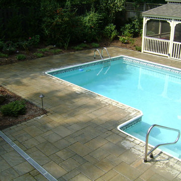
We were contacted by the Johnson’s to update their backyard fenced in pool area in the summer of 2012. Over the years the deck around the pool had deteriorated and the plants had become over grown and made walking around the deck difficult. The old concrete patio was small and only lit by bright 120 volt spot lights. What made this job difficult was the access to the backyard was limited to using a neighbor’s backyard for the project. We had to bring all debris out and materials in from a neighboring street, down the neighbor’s driveway, across the backyard, through an 8’ section that was in the far corner of the neighbor’s yard that corresponded to the entrance to Johnson’s backyard. They had a plan that they wanted to work from. Since access was a problem, we had to secure permission from the neighbor before we could consider bidding the job. After the neighbor’s permission was obtained we discussed materials for the drawing they had. It only included the hardscape and gazebo. Other difficulties included not damaging lighting and plumbing for the pool during excavation and construction. Also the ladders into the pool fit into cups screwed to the deck. These had to be replaced with precisely placed pipes mounted into the base for stability. Care had to be taken to make sure water would not drain from the deck into the pool. So we had to place channel drains between the patio area and pool deck area. A channel drain was placed between the exposed aggregate finished slab for the gazebo and the pool deck. This allowed for proper sloping of the hardscape to provide the drains to move rain away from the pool. We used polymeric sand in the paver joints to prevent breakdown of the installation and avoid wind and water moving sand into the pool. The slab for the gazebo was an exposed aggregate finish that measured 12’ 6” x 16’ 6”. The pagoda style roof for the gazebo and screening make it attractive and functional as a bug free area to entertain in. We discussed adding low voltage lighting, 120 volt plugs and drip irrigation early on so we could place conduits during the construction. After the hardscape installation we installed the low voltage lighting. We installed a transformer with a timer and an optional dusk to dawn photocell. The Johnsons did not like the old 120 volt spot light to light the back, they wanted something softer. We installed 20 path lights to illuminate the hardscape and 3 wall wash lights to add evening depth to the yard. We installed the plantings and Hunter drip irrigation system in the spring of 2013. It was easy to convince them that the drip system was the proper way to irrigate the area. There would be no spray to blow onto patio furniture or into the gazebo. Also drip irrigation uses less water so they are economical to operate. This gave them a low maintenance yard, a nice finished look and something blooming throughout the growing season. The Johnsons have been very happy with the look and the functionality of the pool deck, patio, lights, irrigation and gazebo.
 Main Line Kitchen Design
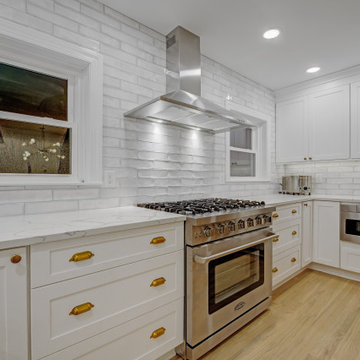
 has a different business model than other kitchen showrooms, designers, and cabinetry dealers. The difference helps us to do five important things better than our competitors.
The kitchens we sell are better designed and our designers are more experienced. This is because we insist on showing customers designs we recommend, BEFORE, we do a design they request. This way, final designs tend to be more collaborative and professional. Our designers are more experienced because they are better paid and design with more cabinet brands than at other dealers.
Our pricing for cabinets is less than other cabinet dealers. This is because we do not have a showroom open to the public, and we require a small deposit and a screening before we accept customers. This helps our designers spend their time more effectively. And, it eliminates 80% of the overhead kitchen showrooms spend on staffing, larger displays, and on a curbside location.
We carry more brands of cabinetry than other dealers. This is possible because we display one cabinet for each brand we sell. Through glass countertops clients can examine a brands construction quality, and we display the door styles and finishes of our brands. Instead of the larger displays customers see in traditional showrooms, our customers can view 5 million kitchens on Houzz.com, or the hundreds of our kitchen renovations we show on Houzz, our web site, and in framed photos on the walls of our office building.
Kitchen construction is often better organized and generally costs less. This is because we recommend general contractors free of charge. They supervise construction from scheduling to completion. This eliminates a middleman, reduces delays, and eliminates the fees that almost all showrooms and home centers charge their customers. We are also happy to work with any contractor a customer finds on their own. If we haven’t worked with that contractor before they may need more of our direction, but both companies can benefit from working together and possibly referring each other in the future.
Less problems arise, and if they do, they are handled more quickly. This is because every kitchen we sell is reviewed by at least 3 kitchen designers during the ordering process. Our Operations Manager Ed Sossich checks orders and schedules all warehouse and home deliveries. Our delivery manager Mark Mitten supervises every delivery and checks in each cabinet and part. And our CRM system, Monday, prompts each person responsible for each phase of a customer’s kitchen with automated alerts. This keeps things moving, even during supply chain disruptions, and ensures no step is overlooked.
Main Line Kitchen Design’s company slogan is “The world of kitchen design is changing . . . “. We pride ourselves on being innovative in everything we do. From our web site and how we advertise, to the gift we send each customer upon the completion of their kitchen.
Our business model helps us receive 100’s of 5-star reviews, and makes our kitchen projects more enjoyable for everyone.
We look forward to working with you.
 Main Line Kitchen Design
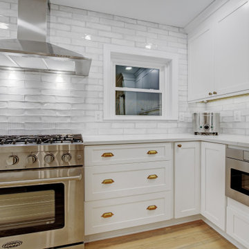
 has a different business model than other kitchen showrooms, designers, and cabinetry dealers. The difference helps us to do five important things better than our competitors.
The kitchens we sell are better designed and our designers are more experienced. This is because we insist on showing customers designs we recommend, BEFORE, we do a design they request. This way, final designs tend to be more collaborative and professional. Our designers are more experienced because they are better paid and design with more cabinet brands than at other dealers.
Our pricing for cabinets is less than other cabinet dealers. This is because we do not have a showroom open to the public, and we require a small deposit and a screening before we accept customers. This helps our designers spend their time more effectively. And, it eliminates 80% of the overhead kitchen showrooms spend on staffing, larger displays, and on a curbside location.
We carry more brands of cabinetry than other dealers. This is possible because we display one cabinet for each brand we sell. Through glass countertops clients can examine a brands construction quality, and we display the door styles and finishes of our brands. Instead of the larger displays customers see in traditional showrooms, our customers can view 5 million kitchens on Houzz.com, or the hundreds of our kitchen renovations we show on Houzz, our web site, and in framed photos on the walls of our office building.
Kitchen construction is often better organized and generally costs less. This is because we recommend general contractors free of charge. They supervise construction from scheduling to completion. This eliminates a middleman, reduces delays, and eliminates the fees that almost all showrooms and home centers charge their customers. We are also happy to work with any contractor a customer finds on their own. If we haven’t worked with that contractor before they may need more of our direction, but both companies can benefit from working together and possibly referring each other in the future.
Less problems arise, and if they do, they are handled more quickly. This is because every kitchen we sell is reviewed by at least 3 kitchen designers during the ordering process. Our Operations Manager Ed Sossich checks orders and schedules all warehouse and home deliveries. Our delivery manager Mark Mitten supervises every delivery and checks in each cabinet and part. And our CRM system, Monday, prompts each person responsible for each phase of a customer’s kitchen with automated alerts. This keeps things moving, even during supply chain disruptions, and ensures no step is overlooked.
Main Line Kitchen Design’s company slogan is “The world of kitchen design is changing . . . “. We pride ourselves on being innovative in everything we do. From our web site and how we advertise, to the gift we send each customer upon the completion of their kitchen.
Our business model helps us receive 100’s of 5-star reviews, and makes our kitchen projects more enjoyable for everyone.
We look forward to working with you.
135