
Search results for "Subsequently adding" in Home Design Ideas
 CJ Paone AIA | Archipelago Workshop
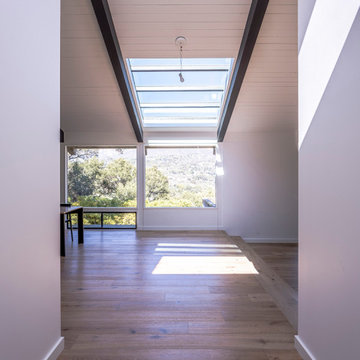
This classic post-and-beam house sits on a ridge in the Riviera neighborhood of Santa Barbara, CA. With stunning views of Gibraltar Rock, Mission Canyon, and Cielito Overlook, the house’s original designers sited it perfectly and implemented an elegantly simple structural system based on a clear design vision. Unfortunately, several subsequent owners lacked that same clarity and made questionable remodeling choices based on passing style fads, effectively turning the house into something it was not and – most perplexing of all – turning their backs to the majesty of the surrounding mountains and valley.
Working with the new owner, who saw through the noise of these misguided remodels, we set out to return the house to its roots and recreate its rhythmic geometry and interior flow. We added new wall-to-wall double sliding doors that open to the expansive northern views, bringing space and light to the living, dining, and kitchen areas and providing easy access to the surrounding natural environment. We also reconsidered the color palette and materials, simplified detailing and trim, and highlighted interior focal points such as the original slump block fireplace and newly remodeled kitchen. The house now entertains easily and provides a comfortable and gracious living space for its owner and guests.
 Square Footage Inc.
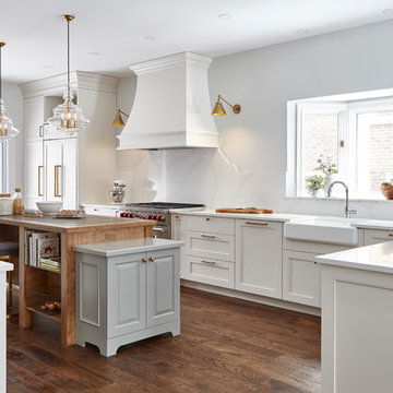
What do you get when Vintage doors and a Gold Glass Backsplash meet soft grey kitchen cabinets with touches of warm wood? A dreamy bespoke kitchen particular to a client's eclectic taste.
Adding a bakers island, to die for drink station, with a sculptured backsplash, made it special. The new custom range hood, peninsula with seating for four, which opens up to a dining room, brings it to the next level, an entertainers dream space.
 2MO
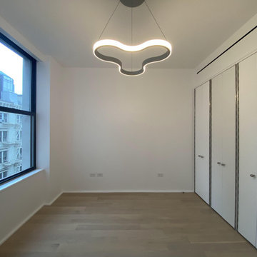
2MOOur design & build company successfully completed a stunning project, transforming a 3-bedroom apartment located on Read Street in Tribeca into a captivating living space for a family of four. The renovation project encompassed several key elements. We began by meticulously removing all wallpaper throughout the apartment, providing a clean canvas for the subsequent enhancements. The walls and ceilings were then expertly painted to the client's desired color palette, adding a fresh and vibrant ambiance to every room. The existing flooring was carefully sanded and stained, restoring its natural beauty and ensuring durability. To enhance both aesthetics and functionality, we installed a new countertop in the kitchen, chosen for their quality and style. Finally, the cabinets were refinished through a meticulous process of sanding and brush painting, giving them a renewed and modern appearance. This project showcases our commitment to delivering exceptional results and creating a truly exquisite living space for our valued clients, while keeping their budget in mind.
Find the right local pro for your project
 FullerHouse Remodeling
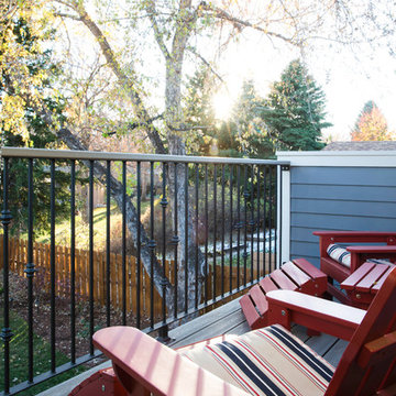
FullerHouse Construction Project: Arapahoe Ridge, Boulder CO whole house remodel
Our clients’ modest, 2,100 SF 1960’s Ranch had received only a few minor cosmetic upgrades since its original construction. And given a need for more space and a desire to stay in their neighborhood – the prime Arapahoe Ridge neighborhood of Boulder – our clients knew their home was due for a major renovation.
By the time DAJ Designs of Louisville had completed drawings, it was clear that very little of the original house was going to remain the same.
To create the space and configuration they desired, the first goal was to add a 2nd story, allocated solely for the new Master Suite, with its own private Balcony. But to create additional space needed for the Kitchen and walk-in pantry, we also pushed out into the original Garage footprint, subsequently extending the Garage to create room for 3+ vehicles. We also reworked nearly every other interior partition wall on the main floor to accommodate a spacious Great Room, 2 kids’ bedrooms, an Office, 2 bathrooms, and a dedicated Laundry room.
With clean white Craftsman details for the Exterior and interior trim and doors, natural granite counters, glass tiles, and creamy white Shaker-style cabinetry, our clients’ good taste added a timeless warmth to their now larger (3,000 SF) and more functional home.
 2MO
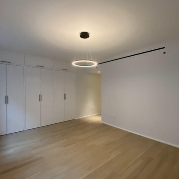
2MOOur design & build company successfully completed a stunning project, transforming a 3-bedroom apartment located on Read Street in Tribeca into a captivating living space for a family of four. The renovation project encompassed several key elements. We began by meticulously removing all wallpaper throughout the apartment, providing a clean canvas for the subsequent enhancements. The walls and ceilings were then expertly painted to the client's desired color palette, adding a fresh and vibrant ambiance to every room. The existing flooring was carefully sanded and stained, restoring its natural beauty and ensuring durability. To enhance both aesthetics and functionality, we installed a new countertop in the kitchen, chosen for their quality and style. Finally, the cabinets were refinished through a meticulous process of sanding and brush painting, giving them a renewed and modern appearance. This project showcases our commitment to delivering exceptional results and creating a truly exquisite living space for our valued clients, while keeping their budget in mind.
 2MO
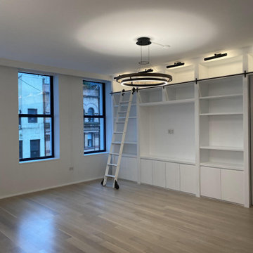
2MOOur design & build company successfully completed a stunning project, transforming a 3-bedroom apartment located on Read Street in Tribeca into a captivating living space for a family of four. The renovation project encompassed several key elements. We began by meticulously removing all wallpaper throughout the apartment, providing a clean canvas for the subsequent enhancements. The walls and ceilings were then expertly painted to the client's desired color palette, adding a fresh and vibrant ambiance to every room. The existing flooring was carefully sanded and stained, restoring its natural beauty and ensuring durability. To enhance both aesthetics and functionality, we installed a new countertop in the kitchen, chosen for their quality and style. Finally, the cabinets were refinished through a meticulous process of sanding and brush painting, giving them a renewed and modern appearance. This project showcases our commitment to delivering exceptional results and creating a truly exquisite living space for our valued clients, while keeping their budget in mind.
 CJ Paone AIA | Archipelago Workshop
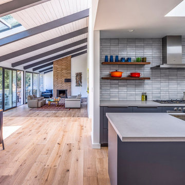
This classic post-and-beam house sits on a ridge in the Riviera neighborhood of Santa Barbara, CA. With stunning views of Gibraltar Rock, Mission Canyon, and Cielito Overlook, the house’s original designers sited it perfectly and implemented an elegantly simple structural system based on a clear design vision. Unfortunately, several subsequent owners lacked that same clarity and made questionable remodeling choices based on passing style fads, effectively turning the house into something it was not and – most perplexing of all – turning their backs to the majesty of the surrounding mountains and valley.
Working with the new owner, who saw through the noise of these misguided remodels, we set out to return the house to its roots and recreate its rhythmic geometry and interior flow. We added new wall-to-wall double sliding doors that open to the expansive northern views, bringing space and light to the living, dining, and kitchen areas and providing easy access to the surrounding natural environment. We also reconsidered the color palette and materials, simplified detailing and trim, and highlighted interior focal points such as the original slump block fireplace and newly remodeled kitchen. The house now entertains easily and provides a comfortable and gracious living space for its owner and guests.

Sponsored
Columbus, OH

Hope Restoration & General Contracting
Columbus Design-Build, Kitchen & Bath Remodeling, Historic Renovations
 FullerHouse Remodeling
FullerHouse Construction Project: Arapahoe Ridge, Boulder CO whole house remodel
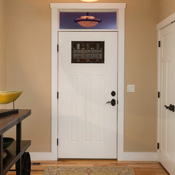
Our clients’ modest, 2,100 SF 1960’s Ranch had received only a few minor cosmetic upgrades since its original construction. And given a need for more space and a desire to stay in their neighborhood – the prime Arapahoe Ridge neighborhood of Boulder – our clients knew their home was due for a major renovation.
By the time DAJ Designs of Louisville had completed drawings, it was clear that very little of the original house was going to remain the same.
To create the space and configuration they desired, the first goal was to add a 2nd story, allocated solely for the new Master Suite, with its own private Balcony. But to create additional space needed for the Kitchen and walk-in pantry, we also pushed out into the original Garage footprint, subsequently extending the Garage to create room for 3+ vehicles. We also reworked nearly every other interior partition wall on the main floor to accommodate a spacious Great Room, 2 kids’ bedrooms, an Office, 2 bathrooms, and a dedicated Laundry room.
With clean white Craftsman details for the Exterior and interior trim and doors, natural granite counters, glass tiles, and creamy white Shaker-style cabinetry, our clients’ good taste added a timeless warmth to their now larger (3,000 SF) and more functional home.
 2MO
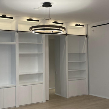
2MOOur design & build company successfully completed a stunning project, transforming a 3-bedroom apartment located on Read Street in Tribeca into a captivating living space for a family of four. The renovation project encompassed several key elements. We began by meticulously removing all wallpaper throughout the apartment, providing a clean canvas for the subsequent enhancements. The walls and ceilings were then expertly painted to the client's desired color palette, adding a fresh and vibrant ambiance to every room. The existing flooring was carefully sanded and stained, restoring its natural beauty and ensuring durability. To enhance both aesthetics and functionality, we installed a new countertop in the kitchen, chosen for their quality and style. Finally, the cabinets were refinished through a meticulous process of sanding and brush painting, giving them a renewed and modern appearance. This project showcases our commitment to delivering exceptional results and creating a truly exquisite living space for our valued clients, while keeping their budget in mind.
 CJ Paone AIA | Archipelago Workshop
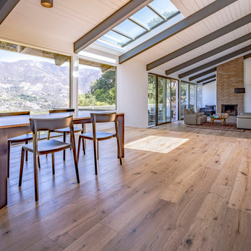
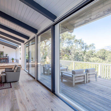
This classic post-and-beam house sits on a ridge in the Riviera neighborhood of Santa Barbara, CA. With stunning views of Gibraltar Rock, Mission Canyon, and Cielito Overlook, the house’s original designers sited it perfectly and implemented an elegantly simple structural system based on a clear design vision. Unfortunately, several subsequent owners lacked that same clarity and made questionable remodeling choices based on passing style fads, effectively turning the house into something it was not and – most perplexing of all – turning their backs to the majesty of the surrounding mountains and valley.
Working with the new owner, who saw through the noise of these misguided remodels, we set out to return the house to its roots and recreate its rhythmic geometry and interior flow. We added new wall-to-wall double sliding doors that open to the expansive northern views, bringing space and light to the living, dining, and kitchen areas and providing easy access to the surrounding natural environment. We also reconsidered the color palette and materials, simplified detailing and trim, and highlighted interior focal points such as the original slump block fireplace and newly remodeled kitchen. The house now entertains easily and provides a comfortable and gracious living space for its owner and guests.
 CJ Paone AIA | Archipelago Workshop
This classic post-and-beam house sits on a ridge in the Riviera neighborhood of Santa Barbara, CA. With stunning views of Gibraltar Rock, Mission Canyon, and Cielito Overlook, the house’s original designers sited it perfectly and implemented an elegantly simple structural system based on a clear design vision. Unfortunately, several subsequent owners lacked that same clarity and made questionable remodeling choices based on passing style fads, effectively turning the house into something it was not and – most perplexing of all – turning their backs to the majesty of the surrounding mountains and valley.
Working with the new owner, who saw through the noise of these misguided remodels, we set out to return the house to its roots and recreate its rhythmic geometry and interior flow. We added new wall-to-wall double sliding doors that open to the expansive northern views, bringing space and light to the living, dining, and kitchen areas and providing easy access to the surrounding natural environment. We also reconsidered the color palette and materials, simplified detailing and trim, and highlighted interior focal points such as the original slump block fireplace and newly remodeled kitchen. The house now entertains easily and provides a comfortable and gracious living space for its owner and guests.
 JUMA architects
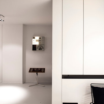
Optiek Herpol wanted to move to a better, more central location with plenty of parking space. A property that complied with these conditions was found on the Market in Deinze, and JUMA architects were subsequently asked to design a new interior for the store.
The property in question is very deep and narrow with little natural light entry. JUMA set to work despite these constraints in an attempt to transform these challenges into qualities.
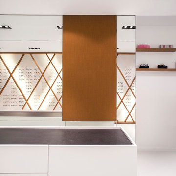
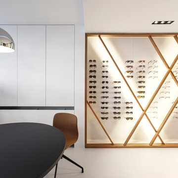
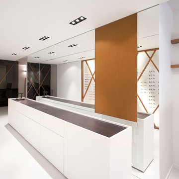
The architects positioned the sales counter right behind the shop window, so as to make optimum use of the available natural light. This also makes store activities visible from the outside, adding an extra element of attraction. At the narrowest section of the store, a large wall mirror was put in to visually double the space. The wall onto which the eyeglasses are displayed is located opposite the mirror and is literally the eye catcher in the store. A wooden lattice makes for an interesting play of diagonal lines behind which the glasses are presented. This unique concept animates the entire store without detracting from the fact that the glasses should remain the main focal point in the store. The workshop is located in the back, separated from the store by a wall in smoked grey glass. In this way, the optician can keep an eye on the store at all times.
The colour palette is predominantly white, to keep the interior as light as possible. As a counterpoint, warm wood accents are added. The chairs at the counter are upholstered in a colour that harmonizes perfectly with the wood.
Pictures © Thomas De Bruyne
 JUMA architects
Optiek Herpol wanted to move to a better, more central location with plenty of parking space. A property that complied with these conditions was found on the Market in Deinze, and JUMA architects were subsequently asked to design a new interior for the store.
The property in question is very deep and narrow with little natural light entry. JUMA set to work despite these constraints in an attempt to transform these challenges into qualities.
The architects positioned the sales counter right behind the shop window, so as to make optimum use of the available natural light. This also makes store activities visible from the outside, adding an extra element of attraction. At the narrowest section of the store, a large wall mirror was put in to visually double the space. The wall onto which the eyeglasses are displayed is located opposite the mirror and is literally the eye catcher in the store. A wooden lattice makes for an interesting play of diagonal lines behind which the glasses are presented. This unique concept animates the entire store without detracting from the fact that the glasses should remain the main focal point in the store. The workshop is located in the back, separated from the store by a wall in smoked grey glass. In this way, the optician can keep an eye on the store at all times.
The colour palette is predominantly white, to keep the interior as light as possible. As a counterpoint, warm wood accents are added. The chairs at the counter are upholstered in a colour that harmonizes perfectly with the wood.
Pictures © Thomas De Bruyne

Sponsored
Columbus, OH
Hope Restoration & General Contracting
Columbus Design-Build, Kitchen & Bath Remodeling, Historic Renovations
 JUMA architects
Optiek Herpol wanted to move to a better, more central location with plenty of parking space. A property that complied with these conditions was found on the Market in Deinze, and JUMA architects were subsequently asked to design a new interior for the store.
The property in question is very deep and narrow with little natural light entry. JUMA set to work despite these constraints in an attempt to transform these challenges into qualities.
The architects positioned the sales counter right behind the shop window, so as to make optimum use of the available natural light. This also makes store activities visible from the outside, adding an extra element of attraction. At the narrowest section of the store, a large wall mirror was put in to visually double the space. The wall onto which the eyeglasses are displayed is located opposite the mirror and is literally the eye catcher in the store. A wooden lattice makes for an interesting play of diagonal lines behind which the glasses are presented. This unique concept animates the entire store without detracting from the fact that the glasses should remain the main focal point in the store. The workshop is located in the back, separated from the store by a wall in smoked grey glass. In this way, the optician can keep an eye on the store at all times.
The colour palette is predominantly white, to keep the interior as light as possible. As a counterpoint, warm wood accents are added. The chairs at the counter are upholstered in a colour that harmonizes perfectly with the wood.
Pictures © Thomas De Bruyne
 JUMA architects
Optiek Herpol wanted to move to a better, more central location with plenty of parking space. A property that complied with these conditions was found on the Market in Deinze, and JUMA architects were subsequently asked to design a new interior for the store.
The property in question is very deep and narrow with little natural light entry. JUMA set to work despite these constraints in an attempt to transform these challenges into qualities.
The architects positioned the sales counter right behind the shop window, so as to make optimum use of the available natural light. This also makes store activities visible from the outside, adding an extra element of attraction. At the narrowest section of the store, a large wall mirror was put in to visually double the space. The wall onto which the eyeglasses are displayed is located opposite the mirror and is literally the eye catcher in the store. A wooden lattice makes for an interesting play of diagonal lines behind which the glasses are presented. This unique concept animates the entire store without detracting from the fact that the glasses should remain the main focal point in the store. The workshop is located in the back, separated from the store by a wall in smoked grey glass. In this way, the optician can keep an eye on the store at all times.
The colour palette is predominantly white, to keep the interior as light as possible. As a counterpoint, warm wood accents are added. The chairs at the counter are upholstered in a colour that harmonizes perfectly with the wood.
Pictures © Thomas De Bruyne
 Ethan Allen Toronto
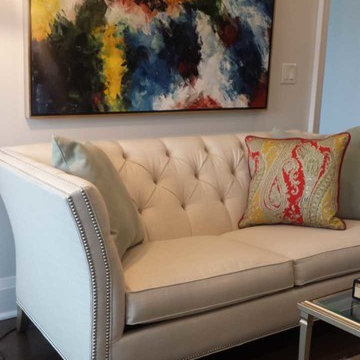
The pillow was selected to add a mixture of colour into the room and to mimic the painting in its addition of flair and style to the room. In subsequent photos you will notice that we changed the carpet and added an extra pillow for texture.
 FullerHouse Remodeling
FullerHouse Construction Project: Arapahoe Ridge, Boulder CO whole house remodel
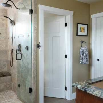
Our clients’ modest, 2,100 SF 1960’s Ranch had received only a few minor cosmetic upgrades since its original construction. And given a need for more space and a desire to stay in their neighborhood – the prime Arapahoe Ridge neighborhood of Boulder – our clients knew their home was due for a major renovation.
By the time DAJ Designs of Louisville had completed drawings, it was clear that very little of the original house was going to remain the same.
To create the space and configuration they desired, the first goal was to add a 2nd story, allocated solely for the new Master Suite, with its own private Balcony. But to create additional space needed for the Kitchen and walk-in pantry, we also pushed out into the original Garage footprint, subsequently extending the Garage to create room for 3+ vehicles. We also reworked nearly every other interior partition wall on the main floor to accommodate a spacious Great Room, 2 kids’ bedrooms, an Office, 2 bathrooms, and a dedicated Laundry room.
With clean white Craftsman details for the Exterior and interior trim and doors, natural granite counters, glass tiles, and creamy white Shaker-style cabinetry, our clients’ good taste added a timeless warmth to their now larger (3,000 SF) and more functional home.

Sponsored
Columbus, OH
Hope Restoration & General Contracting
Columbus Design-Build, Kitchen & Bath Remodeling, Historic Renovations
 Go Home Builders Inc
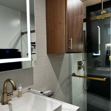
Enter a ‘Modern Chic’ serene and luxurious oasis, where every detail has been thoughtfully designed to create a captivating bathroom experience. The walls are covered with classic white subway tiles, adding a timeless charm to the space. At your feet, a mesmerizing black hexagon charcoal floor starts from the entrance all the way to the back, nicely climbing up the shower wall. Furthermore, it’s a striking and modern touch that immediately catches your eye.
Relaxation Starts Here
Approaching the shower area, you can’t help but feel a sense of excitement. A sleek glass sliding door begs you to step inside and enjoy a refreshing shower. Easily gliding open, it offers both privacy and a spacious open feel to the room.
Take a moment to appreciate the elegant fixtures and faucets in a warm bronze finish. Their subtle glow beautifully complements the white tiles, adding a touch of sophistication and style. In addition, each tap and handle reflects meticulous attention to detail, showcasing the careful craftsmanship that went into creating this exquisite bathroom.
Attention on You
Turn your attention to the vanity area, where a mirror has built-in lighting. The soft glow creates a flattering ambiance, casting a warm and inviting light across the entire bathroom. It should be noted, the mirror not only serves its practical purpose but also adds a touch of glamour and elegance to the space, enhancing your daily morning routine.
Now, focus on the custom-made vanity cabinet, expertly crafted from dark walnut. The rich, luxurious wood exudes timeless beauty and sophistication. Additionally, it offers ample storage and space, cleverly designed to keep all your essentials organized and within easy reach. Sitting atop the cabinet is a stunning white slab counter with delicate grey veins across its surface.
Elegant Lighting
To enhance the overall atmosphere, recessed LED lights have been strategically placed throughout the bathroom. Casting a soft glow, highlighting the textures, colors, and architectural features. Clearly, the combination of light and shadow creates a captivating visual effect, adding depth and dimension to the space.
This detailed designed bathroom harmoniously blends style and functionality, creating a haven of beauty and relaxation. It invites you to unwind and escape from the outside world. Subsequently, immerse yourself in this captivating bathroom experience, where every element has been carefully curated to provide a serene and rejuvenating environment.
 CJ Paone AIA | Archipelago Workshop
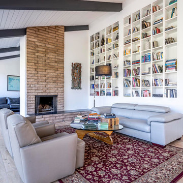
This classic post-and-beam house sits on a ridge in the Riviera neighborhood of Santa Barbara, CA. With stunning views of Gibraltar Rock, Mission Canyon, and Cielito Overlook, the house’s original designers sited it perfectly and implemented an elegantly simple structural system based on a clear design vision. Unfortunately, several subsequent owners lacked that same clarity and made questionable remodeling choices based on passing style fads, effectively turning the house into something it was not and – most perplexing of all – turning their backs to the majesty of the surrounding mountains and valley.
Working with the new owner, who saw through the noise of these misguided remodels, we set out to return the house to its roots and recreate its rhythmic geometry and interior flow. We added new wall-to-wall double sliding doors that open to the expansive northern views, bringing space and light to the living, dining, and kitchen areas and providing easy access to the surrounding natural environment. We also reconsidered the color palette and materials, simplified detailing and trim, and highlighted interior focal points such as the original slump block fireplace and newly remodeled kitchen. The house now entertains easily and provides a comfortable and gracious living space for its owner and guests.
 CJ Paone AIA | Archipelago Workshop
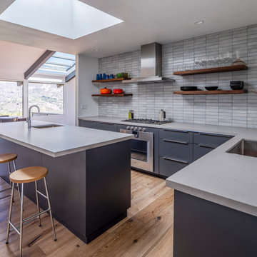
This classic post-and-beam house sits on a ridge in the Riviera neighborhood of Santa Barbara, CA. With stunning views of Gibraltar Rock, Mission Canyon, and Cielito Overlook, the house’s original designers sited it perfectly and implemented an elegantly simple structural system based on a clear design vision. Unfortunately, several subsequent owners lacked that same clarity and made questionable remodeling choices based on passing style fads, effectively turning the house into something it was not and – most perplexing of all – turning their backs to the majesty of the surrounding mountains and valley.
Working with the new owner, who saw through the noise of these misguided remodels, we set out to return the house to its roots and recreate its rhythmic geometry and interior flow. We added new wall-to-wall double sliding doors that open to the expansive northern views, bringing space and light to the living, dining, and kitchen areas and providing easy access to the surrounding natural environment. We also reconsidered the color palette and materials, simplified detailing and trim, and highlighted interior focal points such as the original slump block fireplace and newly remodeled kitchen. The house now entertains easily and provides a comfortable and gracious living space for its owner and guests.
4