
Search results for "Substantial" in Home Design Ideas
 Columbia Cabinets
 http://www.ccabinet.com
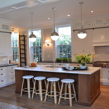
Understated Elegance for Historic Saratoga Home
Project Details
Designer: Ray Roberts
Cabinetry: Wood-Mode Framed Cabinetry
Wood: Perimeter – Maple; Island – Quarter Sawn Oak
Finishes: Perimeter – Nordic White; Island – Nut Brown
Door: Perimeter – Regent Recessed Inset; Island – Alexandria Recessed Inset
Countertop: Perimeter – Soapstone; Island – Calacatta Marble
Perhaps one of my favorite projects of the year, this historic home on Broadway in Saratoga Springs deserved the finest of kitchens. And that it always fun to design. The real challenge here was to capture an understated elegance worthy of the history of the home, the street, the town itself. This particular refinement meant having the sum of the parts be greater than the whole…meticulous focus on every detail to create something grand but livable, historically appropriate but adapted for today’s modern family, luxe but quietly graceful. Some of the details include a beautifully detailed wooden hood, a rolling ladder to access the double stacked upper cabinets which feature antiqued mirror inserts, a substantial, grounding quarter sawn oak island in a contrasting nut brown finish as well as historically appropriate hardware contrasted with modern fixtures and lighting.
 Kate Roos Design LLC
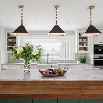
The new, large picture window allows the view of the lake to take center stage.
Example of a large transitional porcelain tile and beige floor eat-in kitchen design in Minneapolis with a farmhouse sink, recessed-panel cabinets, white cabinets, quartzite countertops, ceramic backsplash, stainless steel appliances, an island and white countertops
Example of a large transitional porcelain tile and beige floor eat-in kitchen design in Minneapolis with a farmhouse sink, recessed-panel cabinets, white cabinets, quartzite countertops, ceramic backsplash, stainless steel appliances, an island and white countertops
 Green Love Homes, LLC
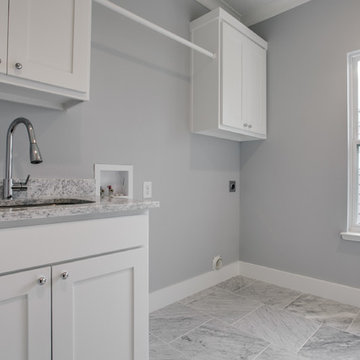
Inspiration for a mid-sized craftsman single-wall marble floor dedicated laundry room remodel in Dallas with an undermount sink, shaker cabinets, white cabinets, marble countertops, gray walls and a side-by-side washer/dryer
Find the right local pro for your project
 Mary Hannah Interiors
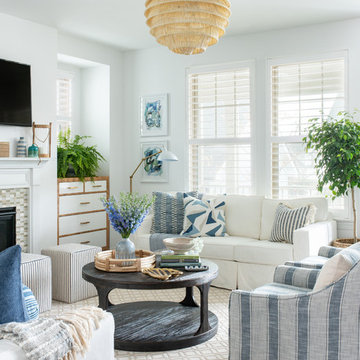
An expansive living room called for substantial seating that would also be kid-friendly so we gladly accepted the challenge. These slipcovered sofas and darling striped swivels are life-proof and leave plenty of room for crawling on the floor or playing legos. Yet, impeccable style is also achieved, by Mary Hannah Interiors.
 Donald Lococo Architects
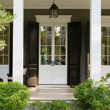
A simple front facade consisting solely of ten-foot shuttered French doors radiates elegance in this new traditional foursquare home in Washington, D.C. Featured in Country Living magazine, the airy plan offers spaciousness in a limited-fronted site of the American foursquare house. The goal for the design was creating a contemporary foursquare style house. The family room and kitchen of this American foursquare interior are separated by a glassy built-in rather than walls, encouraging visual connection between the spaces in the four square house. Though nestled in the city, this American foursquare home feels like a classic country home.
 C2 | Studio Landscape Architecture
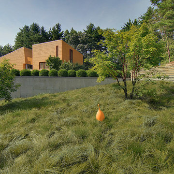
A conceptual framework of long, straight lines anchors the landscape design for this proposed contemporary house set in a rural wetland environment. Against this datum, the site’s subtleties reveal themselves for interpretation and appreciation. The iconic element of a strong axial grass ‘runway’ serves both as a horizontal extrusion against which to read the natural topography and also as a platform for viewing the site’s wetlands. A monolithic retaining wall stratifies the entry area into a lower, private parking court and an upper, public one, which is further defined by a series of rough-hewn stone planters containing formal plantings of dogwoods. These planters break the plane of the retaining wall and extend to the ground, alluding to the substantial bedrock deposits that underlie much of the site. Stepped down from this plane is the fire pit terrace, nestled into the rocky structure of the site and offering views towards a vernal pond.
Scott Carman
 ODS Architecture
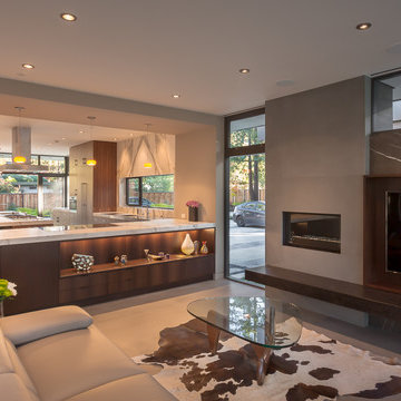
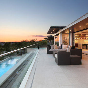
Atherton has many large substantial homes - our clients purchased an existing home on a one acre flag-shaped lot and asked us to design a new dream home for them. The result is a new 7,000 square foot four-building complex consisting of the main house, six-car garage with two car lifts, pool house with a full one bedroom residence inside, and a separate home office /work out gym studio building. A fifty-foot swimming pool was also created with fully landscaped yards.
Given the rectangular shape of the lot, it was decided to angle the house to incoming visitors slightly so as to more dramatically present itself. The house became a classic u-shaped home but Feng Shui design principals were employed directing the placement of the pool house to better contain the energy flow on the site. The main house entry door is then aligned with a special Japanese red maple at the end of a long visual axis at the rear of the site. These angles and alignments set up everything else about the house design and layout, and views from various rooms allow you to see into virtually every space tracking movements of others in the home.
The residence is simply divided into two wings of public use, kitchen and family room, and the other wing of bedrooms, connected by the living and dining great room. Function drove the exterior form of windows and solid walls with a line of clerestory windows which bring light into the middle of the large home. Extensive sun shadow studies with 3D tree modeling led to the unorthodox placement of the pool to the north of the home, but tree shadow tracking showed this to be the sunniest area during the entire year.
Sustainable measures included a full 7.1kW solar photovoltaic array technically making the house off the grid, and arranged so that no panels are visible from the property. A large 16,000 gallon rainwater catchment system consisting of tanks buried below grade was installed. The home is California GreenPoint rated and also features sealed roof soffits and a sealed crawlspace without the usual venting. A whole house computer automation system with server room was installed as well. Heating and cooling utilize hot water radiant heated concrete and wood floors supplemented by heat pump generated heating and cooling.
A compound of buildings created to form balanced relationships between each other, this home is about circulation, light and a balance of form and function.
Photo by John Sutton Photography.


 Brooke Wagner Design
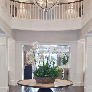
Inspiration for a large transitional dark wood floor entryway remodel in Los Angeles with white walls and a white front door
 Twelve Stones Designs, LLC
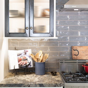
The owners of this kitchen had spent the money to upgrade the finishes in their kitchen upon building the home 12 years ago, but after living in the space for several years they realized how nonfunctional the layout really was. The (then) two preschool aged children had grown into busy, hungry teenagers with many friends who also liked to hang out at the house. So the family needed a more functional kitchen with better traffic flow, space for daily activities revolving around the kitchen at different times of day, and a kitchen that could accommodate cooking for and serving large groups. Furthermore, the dark, traditional finishes no longer reflected the homeowners’ style. They requested a brighter, more relaxed, coastal style that reflected their love of the seaside cities they like to visit.
Originally, the kitchen was U-shaped with a narrow island in the middle. The island created narrow aisles that bottle-necked at the dishwasher, refrigerator, and cooktop areas. There was a pass-through from the foyer into the kitchen, but the owners never liked that the pass-through was also located so close to the powder room. The awkward proximity was unappealing and made guests feel uncomfortable.
The kitchen’s storage was made up of lots of narrow cabinets, apothecary drawers, clipped corner units, and very few drawers. It lacked useful storage for the larger items the family used on a daily basis. And the kitchen’s only pantry was small closet that had only builder-grade, narrow shelving with no illumination to be able to see the contents inside.
Overall, the kitchen’s lighting plan was poorly executed. Only six recessed cans illuminated the entire kitchen and nook areas. The under cabinet lighting was not evenly distributed either. In fact, the builder had mis-placed the under cabinet lighting around the decorative pilasters which made for choppy, dark cubbies. Further, the builder didn’t include any lighting over the sink or the bar area, which meant whoever was doing the dishes was always in their own shadow. That, coupled with the steep overhang of the game room above made the bar area feel like a dim, cavernous space that wasn’t inviting or task oriented. The kitchen looked out into the main living space, but the raised bar and a narrow wall (which held the only large cabinet in the kitchen) created more of a barrier than a relationship to the living room or breakfast nook. In fact, one couldn’t even see the breakfast nook from the cooktop or sink areas due to its orientation. The raised bar top was too narrow to comfortably sit to either dine at or chat from due to the lack of knee space. The the homeowners confided that the kitchen felt more like a dark, dirty prison than place where the family, or their guests, wanted to gather and commune.
The clients' needs and desires were:
➢ to create a kitchen that would be a space the family loved to be in; to relate to the adjacent spaces all around, and to have better flow for entertaining large groups
➢ to remove the walls between the breakfast nook and living area and to be able to utilize the natural light from the windows in both those areas
➢ to incorporate a functional chopping block for prepping fresh food for home cooked meals, an island with a large sink and drain board, 2 pull out trash cans, and seating for at least the 2 teens to eat or do homework
➢ to design a kitchen and breakfast nook with an airy, coastal, relaxed vibe that blended with the rest of the house's coastal theme
➢ to integrate a layered lighting plan which would include ample general illumination, specific task lighting, decorative lighting, and lots of illuminated storage
➢ to design a kitchen with not only more storage for all the husband’s kitchen gadgets and collection of oils and spices, but smart storage, including a coffee/breakfast bar and a place to store and conceal the toaster oven and microwave
➢ to find a way to utilize the large open space between the kitchen, pantry area, and breakfast nook
Twelve Stones Designs achieved the owner's goals by:
➢ removing the walls between the kitchen and living room to allow the natural light to filter in from the adjacent rooms and to create a connection between the kitchen, nook, and living spaces for a sense of unity and communion
➢ removing the existing pantry and designing 3 large pantry style cabinets with LED tape lights and rollout drawers to house lots of kitchen appliances, gadgets, and tons of groceries. We also took the cabinets all the way up to the 9’ ceiling for additional storage for seasonal items and bulk storage.
➢ designing 2 islands - 1 with a gorgeous black walnut chopping block that houses a drawer for chopping and carving knives and a custom double pull out trash unit for point of use utilization - and 1 that houses the dishwasher, a large Blanco Gourmet sink with integrated drain board, woven baskets for fresh root vegetables and kitchen towels, plenty of drawer storage for kitchen items, and bar seating for up to 4 diners.
➢ closing off the space between the kitchen and the powder room to create a beautiful new private alcove for the powder room as well as adding some decorative storage. This also gave us space to include more tall storage near the new range for precision placement of the husband’s extensive oil and spice collection as well as a location for a combo-steam oven the wife wanted for baking and cooking healthy meals.
The project is enhanced functionally by:
➢ incorporated USB and standard receptacles for the kids’ laptops and phone charging in the large island
➢ designing the small island to include additional open shelving for items used on a daily basis such as a variety of bowls, plates, and colanders. This set up also works well for the husband who prefers to “plate” his dinners in restaurant-style fashion before presenting them to the table.
➢ the integration of specific storage units, such as double stacked cutlery drawers, a custom spice pull-out, a Kuerig coffee and tea pod drawer, and custom double stacked utensil drawers
➢ moving the refrigerator to the old oven location - this eliminated the bottle neck as well as created a better relationship to the eating table. It also utilizes the floor space between the pantry, nook, and kitchen
➢ creating a banquet style breakfast nook - this banquette seating not only doubles the amount of seating for large gatherings but it better utilizes the odd space between the kitchen and the previous nook area. It also helps to create a distinct pathway from the mudroom room through the pantry area, kitchen, nook, and living room.
➢ the coffee/breakfast bar area which includes the perfect location for the concealed microwave and toaster oven, convenient storage for the coffee pods and tea accoutrements. Roll-out drawers below also house the smoothie maker, hot water kettle, and a plethora of smoothie-making ingredients such as protein powders, smoothie additives, etc. Furthermore, the drawers below the Keurig house measuring utensil, cutlery, baking supplies and tupperware storage.
➢ incorporating lots of wide drawers and pullouts to accommodate large cookware.
➢ utilizing as much vertical space as possible by building storage to the ceiling which accommodates the family’s abundant amount of serving platters, baking sheets, bakeware, casserole dishes, and additional cutting boards.
The project is enhanced aesthetically by:
➢ new 5-piece Versailles pattern porcelain tile that now seamlessly joins the entire down stairs area together creating a bright, cohesiveness feeling instead of choppy separated spaces - it also adds a coastal feeling
➢ designing a cabinet to conceal the microwave and toaster oven
➢ the coastal influenced light fixtures over the nook table and island
➢ the sandy colors of the Langdon Cambria countertops. The swirling pattern and sparkling quartz pieces remind the homeowner of black-and-tan sandy beaches
➢ the striped banquet seating whose creamy white background and blue-green stripes were the inspiration for the cabinet and wall colors.
➢ All the interior doors were painted black to coordinate with the blacks and grays in the backsplash tile and countertop. This also adds a hint of tailored formality to an otherwise casual space.
➢ the use of WAC's Oculux small aperture LED units for the overhead lighting complimented with Diode LED strips for task lighting under the cabinets and inside the pantry and glass wall cabinets. All of the lighting applications are on separate dimmer switches.
Innovative uses of materials or construction methods by Realty Restoration LLC:
➢ Each 1-1/2” x 3” block of reclaimed end-grain black walnut that makes up the center island chopping block was hand milled and built in the shop. It was designed to look substantial and proportional to the surrounding elements, executed by creating the 4 inch tall top with a solid wood chamfered edge band.
➢ The metal doors on either side of the vent hood were also custom designed for this project and built in the Realty Restoration LLC shop. They are made 1x2, 11-gauge mild steel with ribbed glass. Weighing 60 lbs a piece, heavy duty cabinet hinges were added to support the weight of the door and keep them from sagging.
➢ Under-cabinet receptacles were added along the range wall in order to have a clean, uninterrupted backsplash.
Design obstacles to overcome:
➢ Because we were removing the demising walls between the kitchen and living room, we had to find a way to plumb and vent the new island. We did this by tunneling through the slab (the slab had post tension cables which prevented us from just trenching) to run a new wet vent through a nearby structural wall. We pulled the existing hot and cold lines between upper floor joists and ran them down the structural wall as well and up through a conduit in the tunnel.
➢ Since we were converting from wall overs to a gas range it allowed us to utilize the 220 feed for the wall ovens to provide a new sub panel for all the new kitchen circuits
➢ Due to framing deficiencies inherited from the original build there was a 1-1/2” differential in the floor-to-ceiling height over a 20 foot span; by utilizing the process of cutting and furring coupled with the crown moulding details on the cabinet elevations we were able to mask the problem and provide seamless transitions between the cabinet components.
Evidence of superior craftsmanship:
➢ uniquely designed, one-of-a-kind metal “X” end panels on the large island. The end panels were custom made in the Realty Restoration LLC shop and fitted to the exact dimensions of the island. The welding seams are completely indistinguishable - the posts look like they are cut from a single sheet of metal
➢ square metal posts on the small island were also custom made and designed to compliment and carry through the metal element s throughout the kitchen
➢ the beautiful, oversized end panels on the pantry cabinets which give the breakfast nook a tailored look
➢ integrating a large format 5 piece Versailles tile pattern to seamlessly flow from the existing spaces into the new kitchen space
➢ By constructing a custom cabinet that jogged around a corner we could not remodel (housing the entry way coat closet) we were able to camouflage the adjacent wall offset within the upper and lower cabinets. By designing around the existing jog in the structural walls we accomplished a few things: we were able to find the space to house, and hide, the microwave and toaster oven yet still have a clean cohesive appearance from the kitchen side. Additionally, the owners were able to keep their much needed coat closet and we didn’t have to increase the budget with unnecessary structural work.
 Zola European Windows
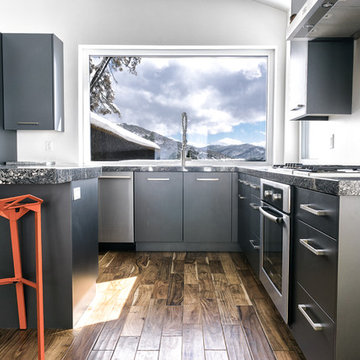
Located in, Summit Park, Park City UT lies one of the most efficient houses in the country. The Summit Haus – designed and built by Chris Price of PCD+B, is an exploration in design and construction of advanced high performance housing. Seeing a rising demand for sustainable housing along with rising Carbon emissions leading to global warming, this house strives to show that sensible, good design can create spaces adequate for today’s housing demands while adhering to strict standards. The house was designed to meet the very rigid Passiv House rating system – 90% more efficient than a typical home in the area.
The house itself was intended to nestle neatly into the 45 degree sloped site and to take full advantage of the limited solar access and views. The views range from short, highly wooded views to a long corridor out towards the Uinta Mountain range towards the east. The house was designed and built based off Passiv Haus standards, and the framing and ventilation became critical elements to maintain such minimal energy requirements.
Zola triple-pane, tilt-and-turn Thermo uPVC windows contribute substantially to the home’s energy efficiency, and takes advantage of the beautiful surrounding of the location, including forrest views from the deck off of the kitchen.
Photographer: City Home Collective
 Pineapple House Interior Design
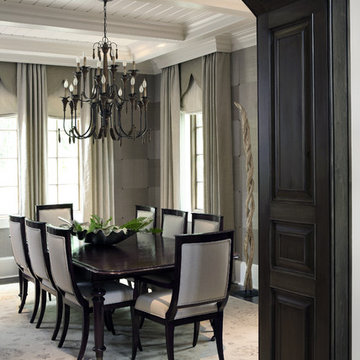
Our client wanted their dream home to be an informal place where they could easily entertain and enjoy themselves. We were awarded the interior design and architectural specification package, which allowed us to recommend substantial alterations prior to construction, including raising the ceiling height, removing walls, reconfiguring rooms and entrances, and specifying appealing ceiling, wall and flooring treatments. In this dining room, we added a partial wall and a dark, wood stained transition arch. The partial wall increases the feel of privacy in the room. We cut wallpaper into squares and turned each square when hanging it, to create a subtle, textured visual effect. Each corner has nail head accents. We added a gothic-inspired valance to the window treatments and integrated the drapery cornices into crown molding. This creates crown molding along the room's perimeter with a flowing, seamless appearance.
Chris Little Photography
 Bickford And Company
Built by Ashner Construction
Photography by Bob Greenspan
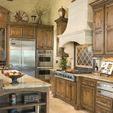
Inspiration for a mediterranean kitchen remodel in Kansas City
Inspiration for a mediterranean kitchen remodel in Kansas City
 Ann Kenkel Interiors DC PREMIERE DESIGN FIRM
Ann Kenkel Interiors
Gwin Hunt Photography
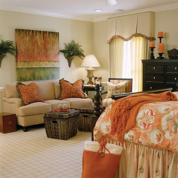
Coastal Estate in St. Michael's Maryland on the Chesapeake Bay. House was designed after the original 1770's house on the property. Home was designed to be a formal house but was now being used as a weekend retreat. Ann Kenkel had to decorate the house in a manner which was coastal enough so owner's felt like they were on vacation yet formal enough for the style of the house.
AK found the house filled with wallpaper from the 1980's. Wallpaper from every room was removed and all trim had to be painted a neutral color.
The formal dining room only had one entry. AK opened up a second entry into the dining room which provided a view of the Chesapeake Bay.
Keywords: coastal estate, bay estate, luxury estate on Chesapeake Bay, St. Michael's home, best designer in St. Michael's, best coastal designer, best Chesapeake bay designer, window treatments, window treatments for over transom windows, chenille sofas, silk pillows, TV over fireplace, blue and yellow bedroom, coral and beige bedroom, british plantation style, blue toile bedroom, blue and green bedroom, coral dining room, red dining room, hand planed table, neutral living room, neutral sunroom, blue and green kitchen, blue family room, cherry paneled library, Ralph Lauren leather chairs, yellow chinoiserie wallpaper, shell mirror, tole lamps, gated drive, pea gravel drive, circular drive, piano, zebra fabric, trim on pillows, trim on draperies, panels and valances, georgian house, sunburst mirror, glass coffee table, star lamps, red and yellow toile draperies, ivory painted chairs, white painted chairs, nautical accessories, coastal coral bedroom, coastal blue bedroom, coastal yellow bedroom, blue and green toile bedroom, stables, paddock, outdoor stainless kitchen, dock, tan draperies, neutral chenille sofas, blue sofas, blue chairs with white frame, needlepoint rug, shell plates, bamboo silverware, white bedroom furniture, dark wood bedroom furniture, plaid chairs, wilton carpet, bright sunroom, chairs and ottomans, regency valance, scarf swags, swags, red leopard pillows, toile bedding, game table, game table chairs on coaster, shells, hydrangeas, shell lamp, sailboat art, sailboat paintings, cane headboard, 4 poster bed.
 Breeze Giannasio Interiors
Meghan Bob Photography
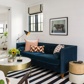
Inspiration for a mid-sized transitional light wood floor and brown floor family room remodel in Los Angeles with white walls, a ribbon fireplace, a wood fireplace surround and a wall-mounted tv
Inspiration for a mid-sized transitional light wood floor and brown floor family room remodel in Los Angeles with white walls, a ribbon fireplace, a wood fireplace surround and a wall-mounted tv

 ODS Architecture
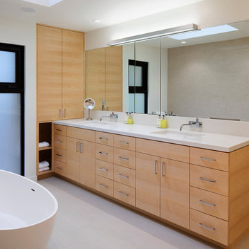
Loaded with storage, the double sink vanity ends in a substantial linen cabinet and open shelves for towels. A Pentalquartz countertop has two Duravit sinks with Hansgrohe faucets and flush mirrors with hidden medicine cabinets. The LED overhead light is by Artemide.
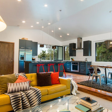 Zola European Windows
Located in, Summit Park, Park City UT lies one of the most efficient houses in the country. The Summit Haus – designed and built by Chris Price of PCD+B, is an exploration in design and construction of advanced high performance housing. Seeing a rising demand for sustainable housing along with rising Carbon emissions leading to global warming, this house strives to show that sensible, good design can create spaces adequate for today’s housing demands while adhering to strict standards. The house was designed to meet the very rigid Passiv House rating system – 90% more efficient than a typical home in the area.
The house itself was intended to nestle neatly into the 45 degree sloped site and to take full advantage of the limited solar access and views. The views range from short, highly wooded views to a long corridor out towards the Uinta Mountain range towards the east. The house was designed and built based off Passiv Haus standards, and the framing and ventilation became critical elements to maintain such minimal energy requirements.
Zola triple-pane, tilt-and-turn Thermo uPVC windows contribute substantially to the home’s energy efficiency, and takes advantage of the beautiful surrounding of the location, including forrest views from the deck off of the kitchen.
Photographer: City Home Collective
 Northwest Construction & Landscape, LLC
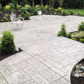
Formal Backyard Garden Showcases the Beauty of Natural Gray Concrete
This Pacific Northwest project called for a total backyard transformation that required a significant reduction in lawn space, most of which was saturated and mossy. Emily of Emily Russell Landscape Architecture designed this formal backyard garden which was installed by Northwest Construction & Landscape, LLC.
Previously unused space was organized through the creation of a courtyard patio which functions as an extension of the house that the homeowner can use for family gatherings, entertaining, or reflection. Budgetary concerns led her to opt for concrete rather than a mortared flagstone patio. “I always let homeowners know that we can do either for them, but to me, going with concrete is an easy choice to make because of the cost savings,” says Colby Brand, President of Northwest of Construction & Landscape, LLC.
Ashlar slate stamped concrete was suggested by Colby to mimic the pattern used in Emily’s conceptual design. The final plan featured natural gray, ashlar slate stamped concrete with antique coloring for texture. Colby and his team poured the steps first. Substantial in size – the rise is 4’ with a run of 5,’ and includes a 4’ landing on top – the steps allow an easy and fluid transition from inside to outside.
After the steps were completed, the curved walkway on the side of the house was poured, connecting the backyard to the front yard. Instead of a conventional, rectangular shape for the 647 sf courtyard patio area, the formality of the plan called for sections of the concrete to bump out into the garden beds against the back side of the house, tying the contrasting elements together.
Granite urns and curved, concrete benches purchased by the homeowner rest atop the rounded portion of the concrete and provide a space for sitting and an inviting view from the house. Regarding the final product, Emily Russell states, “My client and I are extremely happy with the finished patio. It's such an inviting space that is well loved and used on a regular basis.”
 Beyond Beige Interior Design Inc.
Beyond Beige Interior Design with Tavan Developments | www.beyondbeige.com | Ph: 604-876-3800
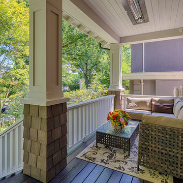
Small arts and crafts front porch idea in Vancouver with decking and a roof extension
Small arts and crafts front porch idea in Vancouver with decking and a roof extension

41