
Search results for "Suffered" in Home Design Ideas

 PB Kitchen Design
Utility cabinet in Laundry Room
Utility room - large scandinavian medium tone wood floor utility room idea in Chicago with gray cabinets, quartz countertops, gray walls, a side-by-side washer/dryer and recessed-panel cabinets
Utility room - large scandinavian medium tone wood floor utility room idea in Chicago with gray cabinets, quartz countertops, gray walls, a side-by-side washer/dryer and recessed-panel cabinets
 Dovetail Renovation, Inc.
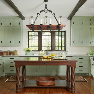
Example of a tuscan u-shaped medium tone wood floor and brown floor kitchen design in Minneapolis with an undermount sink, recessed-panel cabinets, green cabinets, white backsplash, stainless steel appliances, an island and white countertops
 Fiorito Interior Design
Finding a home is not easy in a seller’s market, but when my clients discovered one—even though it needed a bit of work—in a beautiful area of the Santa Cruz Mountains, they decided to jump in. Surrounded by old-growth redwood trees and a sense of old-time history, the house’s location informed the design brief for their desired remodel work. Yet I needed to balance this with my client’s preference for clean-lined, modern style.
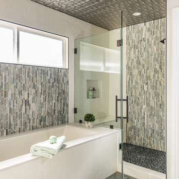
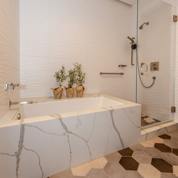
Suffering from a previous remodel, the galley-like bathroom in the master suite was long and dank. My clients were willing to completely redesign the layout of the suite, so the bathroom became the walk-in closet. We borrowed space from the bedroom to create a new, larger master bathroom which now includes a separate tub and shower.
The look of the room nods to nature with organic elements like a pebbled shower floor and vertical accent tiles of honed green slate. A custom vanity of blue weathered wood and a ceiling that recalls the look of pressed tin evoke a time long ago when people settled this mountain region. At the same time, the hardware in the room looks to the future with sleek, modular shapes in a chic matte black finish. Harmonious, serene, with personality: just what my clients wanted.
Photo: Bernardo Grijalva
Find the right local pro for your project

 Forward Design Build Remodel
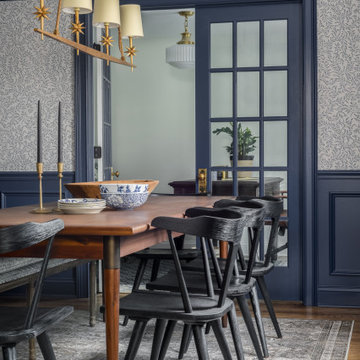
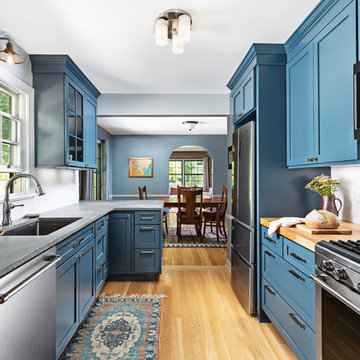
Our clients had a kitchen that suffered from a lack of natural light, little connection to the dining and entertaining space, and many storage problems. With brand-new cabinetry, one less wall and more durable finishes, we were able to give them the kitchen they've always wanted.


 Jess Diab Studio
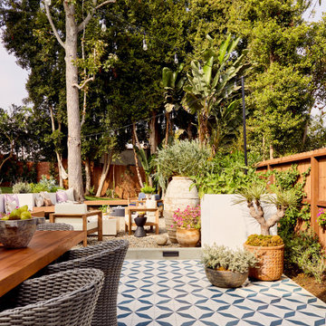
A 1930s Spanish Revival home with custom landscaping, hardscaping, exteriors color consultation. Natural materials like terracotta, breathable linens, and vintage rugs create a layered, lived-in family home. We designed landscaping that acted as an outdoor entertaining space for multiple families which was especially needed in light of the pandemic restrixctions.
 Jane Ellison
This home in Napa off Silverado was rebuilt after burning down in the 2017 fires. Architect David Rulon, a former associate of Howard Backen, known for this Napa Valley industrial modern farmhouse style. Composed in mostly a neutral palette, the bones of this house are bathed in diffused natural light pouring in through the clerestory windows. Beautiful textures and the layering of pattern with a mix of materials add drama to a neutral backdrop. The homeowners are pleased with their open floor plan and fluid seating areas, which allow them to entertain large gatherings. The result is an engaging space, a personal sanctuary and a true reflection of it's owners' unique aesthetic.
Inspirational features are metal fireplace surround and book cases as well as Beverage Bar shelving done by Wyatt Studio, painted inset style cabinets by Gamma, moroccan CLE tile backsplash and quartzite countertops.

 Elan Landscape Development Inc.
Dan Wells
Photo of a craftsman partial sun backyard garden path in Chicago.
Photo of a craftsman partial sun backyard garden path in Chicago.
 Dora Brigham Interiors
Leonard Ortiz
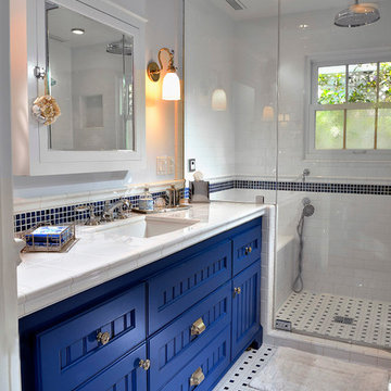
Example of a beach style 3/4 black and white tile and ceramic tile mosaic tile floor and multicolored floor alcove shower design in Orange County with white walls, recessed-panel cabinets, blue cabinets, an undermount sink, tile countertops and a hinged shower door
Example of a beach style 3/4 black and white tile and ceramic tile mosaic tile floor and multicolored floor alcove shower design in Orange County with white walls, recessed-panel cabinets, blue cabinets, an undermount sink, tile countertops and a hinged shower door
 Urban Oasis Landscape Design
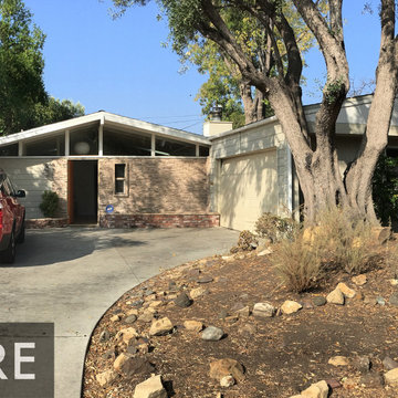
This vintage Palmer & Krisel home cried out to be restored it to its vintage charm. In addition to the landscaping, we were asked to work on the exterior aesthetics of the house.


 August Interiors
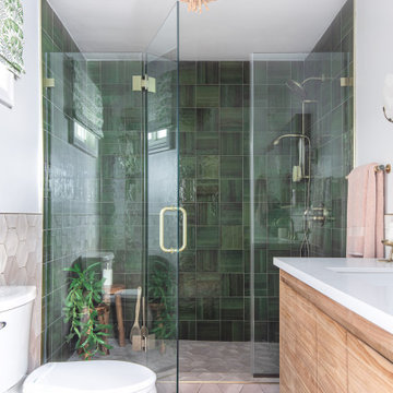
This project involved 2 bathrooms, one in front of the other. Both needed facelifts and more space. We ended up moving the wall to the right out to give the space (see the before photos!) This is the master bathroom, which suffered before from being dark, outdated, and non-functional. My client and I call this "organic glam". we wanted a spa-like bath but with some color. I decided on an earthy, organic palette of taupes, grays, and green. We ditched the tub for a walk-in shower. Satin brass fixtures, a teak vanity, acrylic accessories add to the luxe feel.
 Fiorito Interior Design
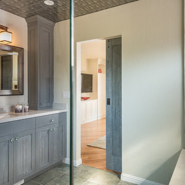
Finding a home is not easy in a seller’s market, but when my clients discovered one—even though it needed a bit of work—in a beautiful area of the Santa Cruz Mountains, they decided to jump in. Surrounded by old-growth redwood trees and a sense of old-time history, the house’s location informed the design brief for their desired remodel work. Yet I needed to balance this with my client’s preference for clean-lined, modern style.
Suffering from a previous remodel, the galley-like bathroom in the master suite was long and dank. My clients were willing to completely redesign the layout of the suite, so the bathroom became the walk-in closet. We borrowed space from the bedroom to create a new, larger master bathroom which now includes a separate tub and shower.
The look of the room nods to nature with organic elements like a pebbled shower floor and vertical accent tiles of honed green slate. A custom vanity of blue weathered wood and a ceiling that recalls the look of pressed tin evoke a time long ago when people settled this mountain region. At the same time, the hardware in the room looks to the future with sleek, modular shapes in a chic matte black finish. Harmonious, serene, with personality: just what my clients wanted.
Photo: Bernardo Grijalva
 Hotel Collection
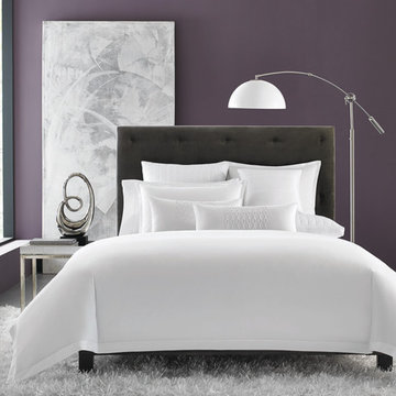
Pure luxury. Hotel Collection's 600 Thread Count Egyptian Cotton Bedding Collection is a best-selling basic that features layers of white/ivory for a clean, sophisticated look. Irresistible textures provide a 5-star feel.
Color: white/ivory
Available in Full, Queen, King, & California King
Available exclusively at Macy's and macys.com
Have a question? Ask us at www.macys.com/contactus
Getting married? Create a registry at www.macys.com/registry
Let us help! Macy’s By Appointment can style your bedroom or bathroom for FREE! Learn more at www.macys.com/mba
 Fiorito Interior Design
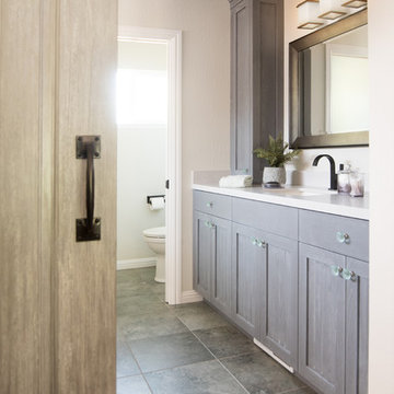
Finding a home is not easy in a seller’s market, but when my clients discovered one—even though it needed a bit of work—in a beautiful area of the Santa Cruz Mountains, they decided to jump in. Surrounded by old-growth redwood trees and a sense of old-time history, the house’s location informed the design brief for their desired remodel work. Yet I needed to balance this with my client’s preference for clean-lined, modern style.
Suffering from a previous remodel, the galley-like bathroom in the master suite was long and dank. My clients were willing to completely redesign the layout of the suite, so the bathroom became the walk-in closet. We borrowed space from the bedroom to create a new, larger master bathroom which now includes a separate tub and shower.
The look of the room nods to nature with organic elements like a pebbled shower floor and vertical accent tiles of honed green slate. A custom vanity of blue weathered wood and a ceiling that recalls the look of pressed tin evoke a time long ago when people settled this mountain region. At the same time, the hardware in the room looks to the future with sleek, modular shapes in a chic matte black finish. Harmonious, serene, with personality: just what my clients wanted.
Photo: Bernardo Grijalva
 KURV Architecture DPC (Alex Hughes Architects)
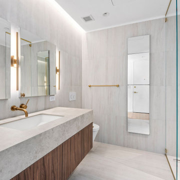
Located in the heart of Manhattan’s Lower East Side, the building was erected on a shallow commercial lot between two 120 year old masonry buildings and a new residential rental building. 330 Grand Street is a mix of 725 SF 1BRs and 1050 SF 2BR apartments. It also contains a 1100 SF two story duplex as well as private and public rooftop space, large private balconies for most units and two large private terraces for the ground floor units.
330 Grand Street was originally designed and approved at the NYC DOB as a prefabricated modular building. During the pandemic, as shipping costs skyrocketed putting the project at risk, we suggested redesigning the building as a reinforced cast-in-place concrete structure. Concrete was readily available and prices had not been affected by the demand increase that many other materials suffered in the pandemic. We took this opportunity to raise floor to ceiling heights, enlarge high performance windows and redistribute the buildings MEPFS and Structural Systems to create very open floor plans.
The challenge was to create a luxurious sensorial living experience with very limited means. In a city with very high construction costs, low cost residential buildings in the area are usually devoid of good quality, design and character. Our approach was to aim high for the end user, prioritizing natural light, open space with long visual perspectives, high ceilings and as always, rejecting the use of predefined building templates.
Our biggest challenge was to ensure that the small spaces feel as clean cut, large and bright as possible. Several unique design decisions were made to ensure low cost and high quality;
Floor plans were laid out so that spaces were wide open and free of clutter from mechanical or structural interruptions. Therefore all infrastructure was placed in lateral demising walls, which in turn act as the unit’s storage and kitchen. The apartments feel wide open, are super quiet and have more storage space than any other comparable apartment in the city.
To solve the problem of the site’s shallow commercial lot which is typically prone to dark interior spaces we focused our attention on the building’s envelope. Instead of the usual small punched window openings, oversized high performance windows were designed to ensure that light penetrated as far as possible into the units. In the smaller 1BR units, the full 50’ depth of the lot is perceived by partitioning spaces with sliding pocket doors that can be retracted to allow deep visual perspectives, making the sight lines in the space feel longer, larger, more ample than normal. In addition to the full height glazing, each unit above the 2nd floor receives a 7 foot covered balcony, adding 120 to 240 sf to each apartment, something unusual in New York City buildings. The space is large enough for a full size dining table, when the weather permits being outside.
We also worked hard to ensure modularity. For example, all kitchen units are all identical throughout the building. The idea of modularity and the economy of the repetitive unit is exercised to the maximum through the building.
Hardware, appliances, flooring, wall coverings and material finishes are all carefully selected to feel bespoke, high quality and unique.
It was important to KURV that the result of this work manifest into something that would deeply connect with the end user and sustain relationships with the consumers of this space.
All images by KURV Architecture ©
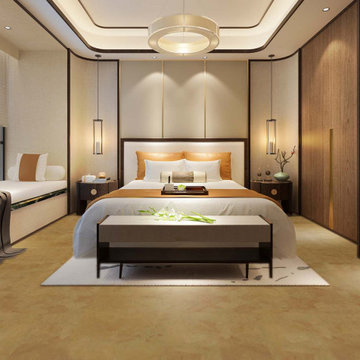
 iCork Floor
Fusion Cork flooring is clean, durable as stone, and warm to walk on, and is fabulous for people suffering from allergies and asthma
Bedroom photo
Bedroom photo
2