
Search results for "Suffered" in Home Design Ideas
 Jarrett Design
This bathroom needed help as it was tired, dated and cramped! The vanity area was open to the master bedroom and sandwiched between a closet and existing bathroom wall. Behind the bathroom wall, was a second sink, a small walk-in shower and the commode. A poorly placed linen closet ate into the area and there was a soffit over the shower adding to the cramped feeling. The ceiling was cluttered with old-school heating lamps, flush-mount fixtures and ventilation grills. The “movie star” lighting meant to add some glamour only made the bathroom feel dated and sad. Our clients wanted to bring this bathroom to life.
We built a wall and added a door between the bedroom and bathroom to ensure more privacy and define the space. In addition, we removed the wall separating the actual bathroom and vanity area to make the master bathroom larger. The linen closet was also taken out so the shower could be expanded significantly. Our homeowner had recently suffered a knee injury so they were looking for future solutions that would work for them as they continued to age. We made the shower large enough to include a bench and installed a handheld sprayer located near the seat. Shower walls were reinforced so that when the day came that a grab bar was needed, they would be ready.
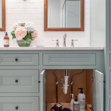
We added a tall cabinet that featured two, deep rollouts and interior shelving to keep linens and bathroom supplies organized. Beneath the sinks, we included rollout drawers so items would not get lost in those dark areas under the plumbing. Everything that had been cluttering the ceiling was removed including the shower soffit and heat lamp. With those gone, we added evenly-spaced, recessed ceiling lights to help brighten the space making it safer and more practical.
We chose a custom blue-green paint for the cabinets which was understated enough to provide a sense of serenity while still offering a splash of color to help liven up the room. Walnut-framed mirrors added a touch of warmth and the patterned floor tile made the whole room fun! An old bathroom came alive!
 All-Craft Decks & Sunrooms
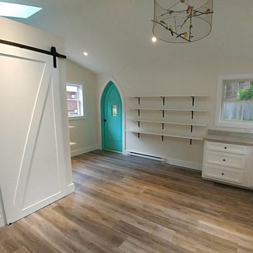
The she shed was intended for a combination art studio and a place to relax for the homeowner who was elderly and suffered with a severe medical condition. We needed to maximize the space to it’s potential, especially since it’s a small space. Included was higher-end pieces such as a stunning chandelier and a stunning Anderson door entrance system. For a more tranquil environment, we incorporated space for comfortable furniture and a propane fireplace. Space was used to the max with built in shelving and cabinetry for the art work and supplies
This 12x18 she-shed was customized with:
Tear-drop custom door by Anderson
Cathedral ceiling with skylights for abundance of natural light
Propane fireplace
Built in cabinets and shelving for art studio supplies
Barn door entrance to small garden tool storage area
 Lamont Bros. Design & Construction
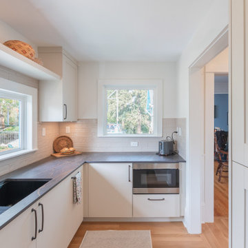
After years of suffering through a poorly designed kitchen that didn’t meet her needs, our client made the difficult decision to re-remodel her kitchen. Now that the kitchen is complete, she's happier than ever in her new kitchen. What used to be a space that was intimidating and difficult to use has become a place designed specifically for her needs, where every appliance and shelf is within comfortable reach and the design is tailored exactly to her personal style.
Find the right local pro for your project
 Thompson Builders Inc
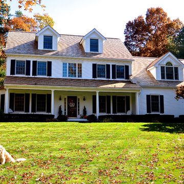
This South Shore home suffered major damage from snow and melting ice dams. To make way for demolition and repairs, the interior had to be completely emptied and the family moved to temporary housing. Extensive work was needed on all three floors, including complete demolition and reconstruction of the kitchen, extensive work to the entrance hall, a new roof, re-insulation, reworking of heating and mechanical systems and replacement of hardwood floors.
Photos - Dick Sullivan, IdeaHooks
 Saikley Architects
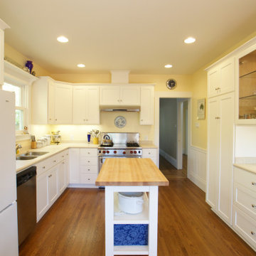
The original house suffered from issues common in many older homes: the existing kitchen was cramped, poorly laid out, and separated from the back yard by several tiny inefficient rooms, storage was inadequate, and the old deck was oversized and in poor condition.
https://saikleyarchitects.com/portfolio/open-kitchen/
 Elizabeth Minish Design
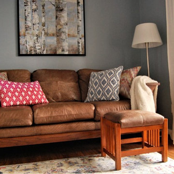
The TV room/Den in this multi-level townhouse suffered from an identity crisis. It opened onto a covered patio but the carpeted floor made it seem more like a bedroom than a room with outdoor access. It sometimes served as an extra bedroom for guests, but was primarily a TV room. An adjacent laundry room was oddly configured and opened into a busy hallway/landing area. The fix included closing off the existing door to the laundry room and opening it up to the den. This made both rooms more user-friendly. The carpet was replaced with luxury vinyl plank flooring in both rooms, making a much more practical surface for a room with an exterior door. A pocket door was not feasible in the location so barn-door hardware solved the problem of a door opening onto the sofa.
 Cancork Floor Inc.
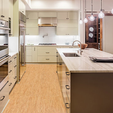
Floating cork floors are naturally resistant to invasive organisms such as mold and mildew. It is one of the better hypoallergenic flooring options available, making it an first-rate choice for allergy sufferers. Available in dozens of colors and natural tones, floating cork flooring can easily suit any home’s design aesthetic. It also an easier install in comparison with other flooring choices.
 Rick Roberts Lawn Service Inc.
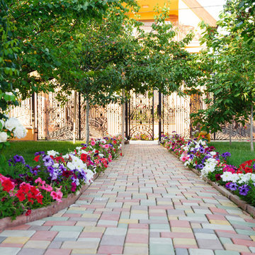
Nothing says "home" like a lush, green, manicured lawn. A professionally designed and installed landscape can increase your enjoyment of your home while also increase the resale value of your property. Often times, though, keeping your lawn maintained takes too much time, is too much of a hassle and requires more tools than many homeowners have at their disposal. To keep your lawn healthy and save yourself from the hassle, enlist help from the lawn maintenance professionals at Rick Roberts Lawn Service. Our team has over 20 years of experience providing lawn care services to homeowners throughout Southwest Florida, and we take pride in offering quality results.
At Rick Roberts Lawn Service, our residential lawn maintenance contractors provide exceptional quality residential lawn maintenance services at fair pricing. In the event of a hurricane, you can rest assured that our lawn maintenance company can take care of any storm related damages your yard suffers because we have the experience and necessary equipment to provide quick storm recovery lawn maintenance services.
 Blinds.com
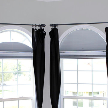
Alison suffers from terrible migraines and wanted a room in her home that was dark enough to help her recover naturally. She found that our Ultimate Blackout Cellular Shades and Movable Arch Blackout Shades were the perfect fit for her unique shaped windows. These shades have vinyl channels that block all light coming in from the sides of the shades for a complete blackout.
To learn more about Alison of How She Does, check out here blog post, here: http://www.howdoesshe.com/migraines-blinds-com/
 KURV Architecture DPC (Alex Hughes Architects)
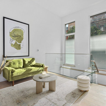
Located in the heart of Manhattan’s Lower East Side, the building was erected on a shallow commercial lot between two 120 year old masonry buildings and a new residential rental building. 330 Grand Street is a mix of 725 SF 1BRs and 1050 SF 2BR apartments. It also contains a 1100 SF two story duplex as well as private and public rooftop space, large private balconies for most units and two large private terraces for the ground floor units.
330 Grand Street was originally designed and approved at the NYC DOB as a prefabricated modular building. During the pandemic, as shipping costs skyrocketed putting the project at risk, we suggested redesigning the building as a reinforced cast-in-place concrete structure. Concrete was readily available and prices had not been affected by the demand increase that many other materials suffered in the pandemic. We took this opportunity to raise floor to ceiling heights, enlarge high performance windows and redistribute the buildings MEPFS and Structural Systems to create very open floor plans.
The challenge was to create a luxurious sensorial living experience with very limited means. In a city with very high construction costs, low cost residential buildings in the area are usually devoid of good quality, design and character. Our approach was to aim high for the end user, prioritizing natural light, open space with long visual perspectives, high ceilings and as always, rejecting the use of predefined building templates.
Our biggest challenge was to ensure that the small spaces feel as clean cut, large and bright as possible. Several unique design decisions were made to ensure low cost and high quality;
Floor plans were laid out so that spaces were wide open and free of clutter from mechanical or structural interruptions. Therefore all infrastructure was placed in lateral demising walls, which in turn act as the unit’s storage and kitchen. The apartments feel wide open, are super quiet and have more storage space than any other comparable apartment in the city.
To solve the problem of the site’s shallow commercial lot which is typically prone to dark interior spaces we focused our attention on the building’s envelope. Instead of the usual small punched window openings, oversized high performance windows were designed to ensure that light penetrated as far as possible into the units. In the smaller 1BR units, the full 50’ depth of the lot is perceived by partitioning spaces with sliding pocket doors that can be retracted to allow deep visual perspectives, making the sight lines in the space feel longer, larger, more ample than normal. In addition to the full height glazing, each unit above the 2nd floor receives a 7 foot covered balcony, adding 120 to 240 sf to each apartment, something unusual in New York City buildings. The space is large enough for a full size dining table, when the weather permits being outside.
We also worked hard to ensure modularity. For example, all kitchen units are all identical throughout the building. The idea of modularity and the economy of the repetitive unit is exercised to the maximum through the building.
Hardware, appliances, flooring, wall coverings and material finishes are all carefully selected to feel bespoke, high quality and unique.
It was important to KURV that the result of this work manifest into something that would deeply connect with the end user and sustain relationships with the consumers of this space.
All images by KURV Architecture ©
 Weckenmann Architecture, LLC
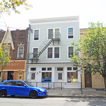
Located in the Village neighborhood in downtown Jersey City, the original building dates from the mid 1800's. In the 1970's the ground floor commercial space was converted into an apartment, the original storefront was bricked over and most of the building's historic features were lost. Suffering from years of neglect and in a state of severe disrepair, the new owner sought to renovate the building to modern standards and restore the facade back to its original appearance.
The apartment count was maintained but redistributed throughout the building to maximize efficiency. The oversized ground floor unit was divided into two one-bedroom units and the second and third floors each house a single two-bedroom apartment. The building was completely gutted and extensive structural work was required to stabilize the building. The original staircase, the only surviving historical element, was also rebuilt and preserved. The facade was reconstructed with clapboard siding and decorative moldings to match the original profiles, new windows, a refurbished fire escape, and a new ground floor storefront to match the original configuration.
This project was completed for Sionas Architecture, PC


 Lincoln Lighthill Architect
What does a roof deck look like when every part of the roof, even areas deemed uninhabitable and structurally weak, is utilized and optimized?
This large midcentury home on the edge of Presidio National Park in San Francisco had an incredible location and views. But the original roof deck suffered from poor design detailing that had rendered it a leaking, deteriorating mess. Even worse, the previous owner had covered three roof areas surrounding the deck with river stones, structurally overloading the building and endangering its occupants.
We removed the river stones and everything else down to the framing. An expertly detailed drainage and waterproofing system underlies everything above. The deck and access stairs are surfaced with durable and refined porcelain pavers. The guardrail is made from custom stainless steel supports with clear, low-iron, laminated glass spanning between for an unobstructed view. Heated seats make watching the chilly fog roll in through the gate comfy.
Planting and greenery surround the deck. The type varies depending on structural conditions- a deep planter sits on top of a structural wall, sedums in shallow soil occupy the strong edges of the surrounding rooftops, and faux grass turf fills out the middle in areas that can’t support the weight of wet soil.
 Home Taylored
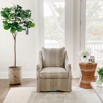
When I met my clients, their room suffered from two things, furniture that was too small for the room AND a lack of layers and textures to warm it up.
My clients were a dream to work with, and really trusted me to add to the room. Through the design process, they saw how by adding more things to the room, it actually made it feel bigger, not smaller. We also utilized all the space in the room by filling in dead space that was previously wasted. They live by the water and had a vision for comfortable and welcoming family room with coastal touches.
 Moto Designshop
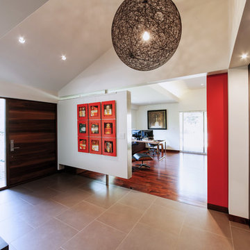
Over the years, this Gladwyne home suffered numerous piecemeal renovations and modifications, and was in dire need of a cohesive vision. Seeing past this, the new owners purchased the property because of the home’s unique siting on the land. Abutting the eastern property line, they noticed the potential of a proper renovation which would unify the home and create expansive views across the 2 acre site to the west.
Our office was commissioned to create a cohesive design which emphasized these ideas. This completed master bedroom and bathroom suite, marks the end of the first renovation phase. The master suite was expanded and focused around a new 16’ window overlooking the property. The bed is flanked at both sides with a sitting area and custom casework. The perpendicular floor boards define the space and pull the eye into the closet/bath. A composition of reflections distort boundaries, pulling outside inward and provide an evolving seasonal experience.
For the lower floor renovation, the client requested the removal of all dividing walls to make the space as visually open as possible. To do this, the entire 2nd floor was temporarily propped up while the 1st floor structure was removed and a strategically designed new structural steel frame system was installed. The remaining central bearing wall also stabilizes the custom stair treads while the guardrails suspend the opposite end from the ceiling. The floor to ceiling glazing opens the views of the sprawling grounds and provides a casual sitting area. A sliding bright red wall divides the office / family room area and the rough sawn wood cabinetry maintain a handmade warm character to the contemporary design.

 August Interiors
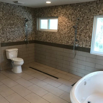
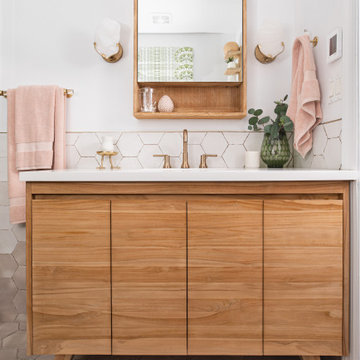
This project involved 2 bathrooms, one in front of the other. Both needed facelifts and more space. We ended up moving the wall to the right out to give the space (see the before photos!) This is the master bathroom, which suffered before from being dark, outdated, and non-functional. My client and I call this "organic glam". we wanted a spa-like bath but with some color. I decided on an earthy, organic palette of taupes, grays, and green. We ditched the tub for a walk-in shower. Satin brass fixtures, a teak vanity, acrylic accessories add to the luxe feel.
 Paradox Interior Design Inc.
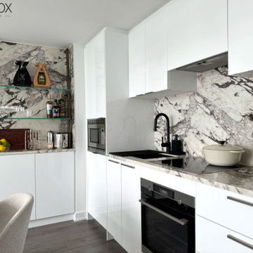
Challenge: Our client needed their downtown Toronto condo to serve as a peaceful retreat from the demanding pace of urban professional life. The space suffered from the sterile, impersonal aesthetic typical of many Toronto condos, lacking the warmth and tranquility needed to truly unwind after busy workdays in the city's core.
Solution: We approached this project in thoughtful stages, transforming the condo into a serene sanctuary that promotes relaxation and rejuvenation. By incorporating a palette of light, calming colors and introducing rich textural elements throughout the space, we elevated the sterile interior into a sophisticated retreat. Each design decision was made with the goal of creating visual and tactile interest that would engage the senses and promote a sense of calm.
Highlights: • Staged design approach that allowed for thoughtful evolution of the space • Light color palette that enhances natural light and creates an airy, peaceful atmosphere • Rich variety of textures that add warmth and visual interest to combat sterile condo interiors • Strategic material selection that transforms typical condo finishes into sophisticated design elements
Results: The transformed Downtown Zen condo now serves as the perfect urban escape—a space that immediately shifts the client's mindset from work mode to relaxation. This project demonstrates how thoughtful design can overcome the limitations of typical Toronto condo interiors, creating a personalized sanctuary that enhances daily life and well-being.
 Johnson + Fernàndez Interior Design
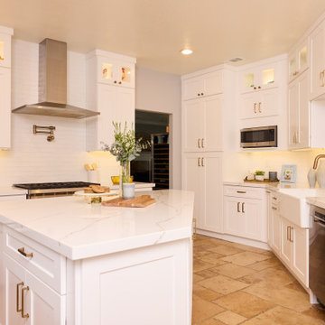
This kitchen suffered a water leak. The entire back wall was damaged where the range and fridge live. We did all new cabinetry, new countertops, new backsplash, new hardware and lighting. Pretty much we replaced the entire kitchen but the floors. We kept the existing layout to make it more simple and easy to turnaround.
 G. Christianson Construction, Inc.
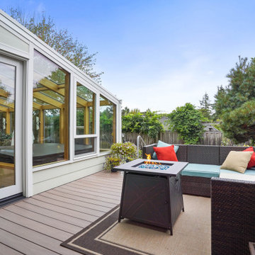
We recently completed a spectacularly beautiful sunroom for Richard and Cynthia. We worked previously with Cynthia on her business and because of our relationship, she felt comfortable asking us to build their Corvallis sunroom. The inspiration for this project came from the desire to have the ambiance of an outdoor hot tub, but without Corvallis’ cold wet weather. The sunroom adds a warm, bright 325 square feet just outside their kitchen and living room. This is the perfect addition if you are suffering from Corvallis’ cloud cover. The vibrant hues of the stained and finished Douglas fir glulam beams complement the beauty of the outdoors. These beams support the glass roof. In addition, the sunroom includes two operable skylights, a nine foot wide bifold door, a full glass roof system and full glass walls. Westview Sunrooms (the manufacturer) has a number of other beautiful ideas on their site: http://www.westviewproducts.com/pictures.html We would love the opportunity to build for you.
23