
Search results for "Suffered" in Home Design Ideas
 Tracy Berman Interiors
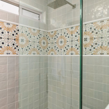
This beach house was not only dated but the kitchen was suffering from a wall that closed it off and a peninsula that cut the space in half. Those were the first things we corrected. The wall was removed which opened the space up. The new layout has a large island instead of the peninsula for better flow and entertaining. This home is across the street from the beach so our design cues came from the ocean and natural surroundings. Our color pallet is white and coastal blue for the cabinets. The new luxury vinyl plank floor is light like the sand. The glass backsplash tile and quartz countertops carry the coastal feel. The main bathroom for the lower level is off the kitchen. We improved the shower size and updated all of the finishes. This beach house is now bright and open with a warm coastal feel.
 Ravenwood Construction Ltd
As seen in another photo within this project showing the before picture, this kitchen suffered from poor flow and felt quite cramped. During the first consultation, there was discussion about knocking walls down and including the dining room as part of the kitchen. We went to the design board and came up with the most economical solution we could to meet all the requirements. No walls needed to be removed.
We redesigned the entire kitchen to allow for better flow and space. The end product is still amazing. A few of the changes included the relocation of the dishwasher, fridge and the centering of the sink. Originally the dishwasher and sink were located on the same wall making it very cramped and non-functional. By moving the dishwasher to where the fridge originally was located and then centering the sink allows for a comfortable and functional use of space.
Lighting was an essential part of the design with the addition of numerous recessed lights and under cabinet lighting all with the ability to dim. This allows for a full range of ambient lighting.
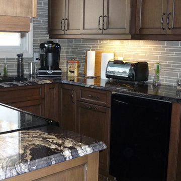
A good portion of the budget went to installing the granite counter tops. The movement is unique in every piece and draws the eye immediately. The glass mosaic tile back splash adds glamour without taking anything away from the granite. The use of different size upper cabinets accentuates the crown molding and gives the kitchen a more custom look but helped stay on budget by using standard sizes. A new Delta kitchen faucet with two wave technology locations make clean up easy when your hands are dirty, and filling a pot less straining on the wrist as you just place it under the faucet and the water turns on automatically. Finishing the kitchen off is the Mannington vinyl tile flooring that requires grouting. Laid on a diagonal, again raises the level of this kitchen to a more custom feel.
 12/12 Architects & Planners
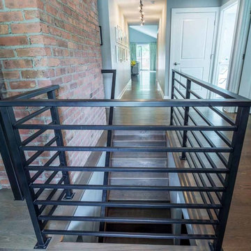
This family of 5 was quickly out-growing their 1,220sf ranch home on a beautiful corner lot. Rather than adding a 2nd floor, the decision was made to extend the existing ranch plan into the back yard, adding a new 2-car garage below the new space - for a new total of 2,520sf. With a previous addition of a 1-car garage and a small kitchen removed, a large addition was added for Master Bedroom Suite, a 4th bedroom, hall bath, and a completely remodeled living, dining and new Kitchen, open to large new Family Room. The new lower level includes the new Garage and Mudroom. The existing fireplace and chimney remain - with beautifully exposed brick. The homeowners love contemporary design, and finished the home with a gorgeous mix of color, pattern and materials.
The project was completed in 2011. Unfortunately, 2 years later, they suffered a massive house fire. The house was then rebuilt again, using the same plans and finishes as the original build, adding only a secondary laundry closet on the main level.
Find the right local pro for your project
 DANE AUSTIN INTERIOR DESIGN Boston & Cambridge
When this 6,000-square-foot vacation home suffered water damage in its family room, the homeowners decided it was time to update the interiors at large. They wanted an elegant, sophisticated, and comfortable style that served their lives but also required a design that would preserve and enhance various existing details.
To begin, we focused on the timeless and most interesting aspects of the existing design. Details such as Spanish tile floors in the entry and kitchen were kept, as were the dining room's spirited marine-blue combed walls, which were refinished to add even more depth. A beloved lacquered linen coffee table was also incorporated into the great room's updated design.
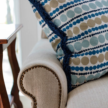
To modernize the interior, we looked to the home's gorgeous water views, bringing in colors and textures that related to sand, sea, and sky. In the great room, for example, textured wall coverings, nubby linen, woven chairs, and a custom mosaic backsplash all refer to the natural colors and textures just outside. Likewise, a rose garden outside the master bedroom and study informed color selections there. We updated lighting and plumbing fixtures and added a mix of antique and new furnishings.
In the great room, seating and tables were specified to fit multiple configurations – the sofa can be moved to a window bay to maximize summer views, for example, but can easily be moved by the fireplace during chillier months.
Project designed by Boston interior design Dane Austin Design. Dane serves Boston, Cambridge, Hingham, Cohasset, Newton, Weston, Lexington, Concord, Dover, Andover, Gloucester, as well as surrounding areas.
For more about Dane Austin Design, click here: https://daneaustindesign.com/
To learn more about this project, click here:
https://daneaustindesign.com/oyster-harbors-estate
 ZAXIS MODERN
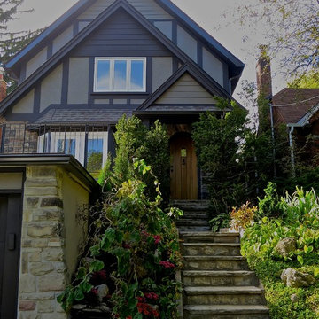
The traditional facade of this Toronto home is preserved to maintain the neighbourhood style while the interior is modern. The original one-and-a-half storey house suffered from low headroom space and a small second floor. The roof was raised to convert it to a full two-storey house increasing the second floor area. The new second floor roof was set back from the front wall to retain the original facade of the house.
 12/12 Architects & Planners
This family of 5 was quickly out-growing their 1,220sf ranch home on a beautiful corner lot. Rather than adding a 2nd floor, the decision was made to extend the existing ranch plan into the back yard, adding a new 2-car garage below the new space - for a new total of 2,520sf. With a previous addition of a 1-car garage and a small kitchen removed, a large addition was added for Master Bedroom Suite, a 4th bedroom, hall bath, and a completely remodeled living, dining and new Kitchen, open to large new Family Room. The new lower level includes the new Garage and Mudroom. The existing fireplace and chimney remain - with beautifully exposed brick. The homeowners love contemporary design, and finished the home with a gorgeous mix of color, pattern and materials.
The project was completed in 2011. Unfortunately, 2 years later, they suffered a massive house fire. The house was then rebuilt again, using the same plans and finishes as the original build, adding only a secondary laundry closet on the main level.
 Irene Designs
Kitchen — Project Description (Bolton, CT)
(Full Renovation • Reconfiguration • Architectural Corrections)
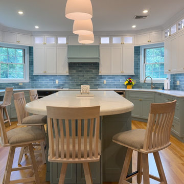
The original kitchen suffered from spatial imbalance and limited functionality: the right side was visually and physically heavy with cabinetry and appliances, the 135-degree angled walls lacked symmetry due to a missing window on the driveway side, and the small island could only seat two. Circulation was obstructed by a desk positioned in the main traffic flow, and the low French door felt disproportionate in scale compared to the large windows and adjacent two-story Great Room.
Major Structural & Functional Improvements
Repositioned window on the front elevation to the right, creating a long-desired view to the driveway while freeing space for a centered cooktop and statement hood — visually aligning with the Great Room’s redesigned fireplace focal wall.
Installed a new custom sliding door, significantly taller and wider than the original French door. This upgrade enhances natural light, visually opens the kitchen to the deck, and provides unobstructed traffic flow thanks to its sliding operation.
New Kitchen Layout & Enhanced Functionality
Designed an entirely new layout centered around a 10' double-slab island, providing expansive workspace and a natural gathering zone.
Added conversational seating for the whole family, allowing comfortable interaction on all sides of the island.
Introduced purpose-designed storage solutions, including pullouts, rollouts, spice towers, tray organizers, and deep drawers to maximize usability.
Reallocated the desk area to a dedicated window spot overlooking the backyard, removing it from traffic paths and improving both functionality and comfort.
Cabinetry & Architectural Detailing
Custom two-tone cabinetry in soft white and a serene blue-green tone reflects the visual language of the adjacent Great Room, creating whole-home cohesion.
Installed lit upper glass cabinets along the entire perimeter, balancing vertical proportions and creating an elegant display band throughout the kitchen.
A custom range hood was designed and painted to match the base cabinetry, becoming a focal point framed by symmetrical windows.
Surfaces, Lighting & Finishes
The island features a double-thickness quartz slab with a soft ogee radius for a timeless, furniture-like feel.
A full-height, handcrafted aqua subway tile backsplash introduces depth, texture, and a gentle reflective quality.
New layered lighting concept, including recessed lights, pendants, task lighting, and integrated cabinet lighting, ensures a warm and functional workspace at any time of day.
 KURV Architecture DPC (Alex Hughes Architects)
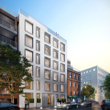
Located in the heart of Manhattan’s Lower East Side, the building was erected on a shallow commercial lot between two 120 year old masonry buildings and a new residential rental building. 330 Grand Street is a mix of 725 SF 1BRs and 1050 SF 2BR apartments. It also contains a 1100 SF two story duplex as well as private and public rooftop space, large private balconies for most units and two large private terraces for the ground floor units.
330 Grand Street was originally designed and approved at the NYC DOB as a prefabricated modular building. During the pandemic, as shipping costs skyrocketed putting the project at risk, we suggested redesigning the building as a reinforced cast-in-place concrete structure. Concrete was readily available and prices had not been affected by the demand increase that many other materials suffered in the pandemic. We took this opportunity to raise floor to ceiling heights, enlarge high performance windows and redistribute the buildings MEPFS and Structural Systems to create very open floor plans.
The challenge was to create a luxurious sensorial living experience with very limited means. In a city with very high construction costs, low cost residential buildings in the area are usually devoid of good quality, design and character. Our approach was to aim high for the end user, prioritizing natural light, open space with long visual perspectives, high ceilings and as always, rejecting the use of predefined building templates.
Our biggest challenge was to ensure that the small spaces feel as clean cut, large and bright as possible. Several unique design decisions were made to ensure low cost and high quality;
Floor plans were laid out so that spaces were wide open and free of clutter from mechanical or structural interruptions. Therefore all infrastructure was placed in lateral demising walls, which in turn act as the unit’s storage and kitchen. The apartments feel wide open, are super quiet and have more storage space than any other comparable apartment in the city.
To solve the problem of the site’s shallow commercial lot which is typically prone to dark interior spaces we focused our attention on the building’s envelope. Instead of the usual small punched window openings, oversized high performance windows were designed to ensure that light penetrated as far as possible into the units. In the smaller 1BR units, the full 50’ depth of the lot is perceived by partitioning spaces with sliding pocket doors that can be retracted to allow deep visual perspectives, making the sight lines in the space feel longer, larger, more ample than normal. In addition to the full height glazing, each unit above the 2nd floor receives a 7 foot covered balcony, adding 120 to 240 sf to each apartment, something unusual in New York City buildings. The space is large enough for a full size dining table, when the weather permits being outside.
We also worked hard to ensure modularity. For example, all kitchen units are all identical throughout the building. The idea of modularity and the economy of the repetitive unit is exercised to the maximum through the building.
Hardware, appliances, flooring, wall coverings and material finishes are all carefully selected to feel bespoke, high quality and unique.
It was important to KURV that the result of this work manifest into something that would deeply connect with the end user and sustain relationships with the consumers of this space.
All images by KURV Architecture ©

 Dino Carbetta Italian Fine Art Photography
“The mystical reflections of Villa Borghese – Rome”… I stumbled into photography just before graduation at the U of TN while volunteering at a local hospital where I was influenced to attend Brooks Institute. The instructors preached the technical aspects of photography, and upon graduation…we could implement our own artistic vision. As a commercial photographer since graduation, I have had little time to express my artistic vision…until I went to Italy for the first time, where I discovered my true love and passion! I consider myself a “contemplative” photographer, and as such, I have a three-part process to achieve my final presentation for each image: the discovery, how I perceive the image creation, and how I hope others will perceive the image. This artistic pursuit, I imagine, is similar to Michelangelo viewing a piece of marble for the first time. Villa Borghese in Roma is a famous Gardens and Museum begun in the early 17th century, highlighted by a "Temple of Aesculapius” at the garden lake. Surrounding this small lake is a three-foot iron fence, which I now affectionately call “Il lago di dolore”, or Lake Pain! I tried to cross this iron fence with camera in hand and a 20lb bag on my shoulder…needless to say, it did not go well! Despite the intense pain, I continued to take 60 images around the lake, and upon return home, I stubbornly refused to look at them until recently. My disdain for Lake Pain kept me from discovering the true artistic vision I first saw when I began creating these images. I finally gave into the contempt I had for the Lake and began working on several images. Perhaps, the viewer will perceive the great pain it took to finally engender a feeling of solace and peace in the true vision, and find that suffering eventually brought forth eminent beauty. As for this photographer, Il lago di dolore will be a constant reminder that the creation of great art sometimes endures great pain!
 N Sabella Inc
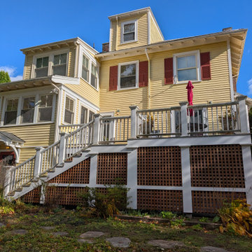
Deck restoration took center stage as our team revitalized this repeat client’s outdoor space with a complete structural and aesthetic upgrade. We replaced aging decking, reframed structural areas that had suffered rot from prior construction, and ensured the framework was solid.
To elevate both function and appearance, we installed new lattice panels around the deck. The lattice provides essential airflow beneath the structure while giving the deck a clean, finished look that complements the home’s exterior.
We also built custom double doors within the lattice enclosure, creating a convenient and discreet access point for under-deck storage. The result is a seamless design that hides clutter while maintaining the deck’s classic charm.
From structural repairs to fine finishing details, this project highlights our expertise in deck restoration, custom carpentry, and exterior upgrades that blend craftsmanship with lasting value.
 Tracy Berman Interiors
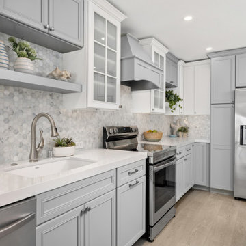
This beach house was not only dated but the kitchen was suffering from a wall that closed it off and a peninsula that cut the space in half. Those were the first things we corrected. The wall was removed which opened the space up. The new layout has a large island instead of the peninsula for better flow and entertaining. This home is across the street from the beach so our design cues came from the ocean and natural surroundings. Our color pallet is white and coastal blue for the cabinets. The new luxury vinyl plank floor is light like the sand. The glass backsplash tile and quartz countertops carry the coastal feel. The main bathroom for the lower level is off the kitchen. We improved the shower size and updated all of the finishes. This beach house is now bright and open with a warm coastal feel.


 StudioLAB
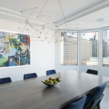
Close to Lincoln Center Plaza, two existing apartments were combined into a single custom tailored 4-bedroom residence. Characteristic with other buildings from the same post-war era, the existing apartments suffered greatly from a low, monotonous ceiling slab. To break up the ceiling, floating planes containing low-profile LED recessed lighting were incorporated throughout. Grey-washed birch veneer millwork is seen as you enter into the new foyer space. A blackened steel inlaid panel serves as a datum that continues throughout the apartment, wrapping the entry unit and extending around the corner to then transform into a floating bookshelf. The unit not only divides the entry area from the Living room, but also serves its utilitarian purpose on the foyer side as coat and storage closets, and then an entertaining function on the opposing side with a TV niche and custom liquor bar. Whitewashed rift and quartered white oak floors were used to brighten the space. In the kitchen, marble counters extend up the wall and onto the ceiling marking the separation of the kitchen/dining area from the living room/entry area. The kid’s room contains a custom curved desk area built beneath the bay windows to take advantage of the views. In the master bedroom, the blackened steel inlay reappears inset into the wardrobe wall unit.
 PaintChicks
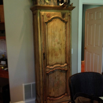
This piece was bought as is by the client but had suffered a lot of wear & tear over the years, with stain and matched paint colors, it was bought back to life.
 12/12 Architects & Planners
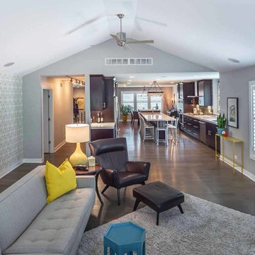
This family of 5 was quickly out-growing their 1,220sf ranch home on a beautiful corner lot. Rather than adding a 2nd floor, the decision was made to extend the existing ranch plan into the back yard, adding a new 2-car garage below the new space - for a new total of 2,520sf. With a previous addition of a 1-car garage and a small kitchen removed, a large addition was added for Master Bedroom Suite, a 4th bedroom, hall bath, and a completely remodeled living, dining and new Kitchen, open to large new Family Room. The new lower level includes the new Garage and Mudroom. The existing fireplace and chimney remain - with beautifully exposed brick. The homeowners love contemporary design, and finished the home with a gorgeous mix of color, pattern and materials.
The project was completed in 2011. Unfortunately, 2 years later, they suffered a massive house fire. The house was then rebuilt again, using the same plans and finishes as the original build, adding only a secondary laundry closet on the main level.
 Halmann Vella
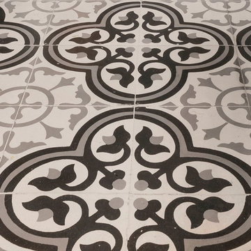
The original patterned tiles of the house suffered considerable damage and required replacement. Halmann Vella created a custom-made pattern reminiscent of the traditional Maltese patterned tiles. This new pattern perfectly marries the traditional aspect of the house with its branding.
Photograph by Fredrick Muscat.
 Lamont Bros. Design & Construction
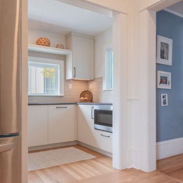
After years of suffering through a poorly designed kitchen that didn’t meet her needs, our client made the difficult decision to re-remodel her kitchen. Now that the kitchen is complete, she's happier than ever in her new kitchen. What used to be a space that was intimidating and difficult to use has become a place designed specifically for her needs, where every appliance and shelf is within comfortable reach and the design is tailored exactly to her personal style.
 The Renowned Group
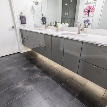
 The original Master bath suffered a tiny shower and a tub that was never used. It was very dark and cavernous and needed some softness to oppose angled walls. The tub was removed to make a larger, more accessible shower. The desired style was modern but not severe. We installed Cambria Britannica quartz slab with large veining and soft flowing movement on all the shower walls. A dark floor grounds the space. A combination of light walls, and sleek floating cabinets, creates an overall softness in this Modern Masterpiece.
 Plain & Posh
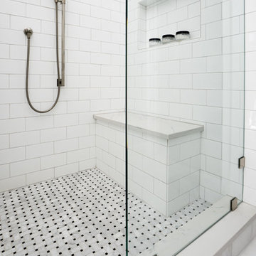
This master bath was long and narrow and suffered from a 1990's renovation with a huge tub no one used and a tiny shower area. The vanity was also quite small. By removing the tub and relocating the shower from the toilet room to the main area, the shower was able to double in size.
The vanity area is also almost twice as large as before.
 Spring Creek Design
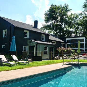
The homeowners loved the lot this home sat on, but it lacked a garage and the exterior suffered from years of deferred maintenance before they purchased. With new siding, windows, roof, and an attached two-car garage addition with bonus room above, they have more living and storage space, and a clearly dedicated path to the front door — the addition also added a foyer. Corrugated metal accents add interest. The new screened porch is convenient to the pool and house.
Photo by Liz Smutko
22