
Search results for "Suitable match" in Home Design Ideas
 Angela Free Design
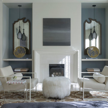
Living room - transitional formal and enclosed light wood floor living room idea in San Francisco with blue walls, a standard fireplace, a tile fireplace and no tv
 Jacqueline Rose Interiors, LLC
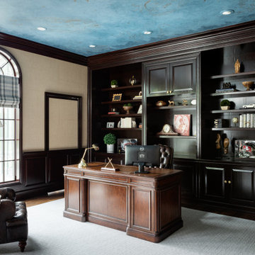
Home office - traditional freestanding desk medium tone wood floor, brown floor, wall paneling and wallpaper home office idea in New York with beige walls
 Klopf Architecture
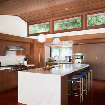
Nestled in the hills of Orinda, California, this 1951 residence is one of only seven extant homes, now known as “The Magnificent Seven”, designed by architect Olof Dahlstrand, a protégé of Frank Lloyd Wright. With its low-slung rooflines, natural materials, and deep integration with the sloping landscape, the home is a pristine example of mid-century modern design inspired by Wright’s organic principles. Over the years, prior homeowners have emphasized preservation, ensuring that the house remained relatively untouched. Each owner has respected the original architecture and stayed true to Dahlstrand’s intent. When a family of five—two college-aged sons and a middle school-aged daughter—acquired the property, they were captivated by its history, legacy of care, and architectural significance. While they appreciated Dahlstrand’s original vision, they also recognized the need to adapt the home for contemporary living while preserving its design integrity.
The remodel was conceived as a thoughtful response to the past—an effort to bring the house into the 21st century without compromising its soul. The primary mandate was to maintain architectural continuity while improving the functionality, comfort, and livability for a modern family. The design team—architects and contractor alike—worked with a shared reverence for the original architecture, allowing that mindset to guide even the most technical or pragmatic decisions.
A key objective was to increase natural light in the kitchen—a departure from Wrightian principles of enclosed, intimate cooking spaces—while maintaining the home’s architectural language. The kitchen was reconfigured to foster a stronger connection to adjacent living spaces while retaining the underlying concept of spatial separation. One of the most transformative architectural changes was the removal of a ridge beam that was originally planned to remain visible through the kitchen. During construction, the team collaborated on a better solution: a wide-flanged steel beam concealed within the roof envelope. This subtle move preserved the clean lines and ceiling continuity, a modern update carried out with utmost respect for the existing framework.
The home’s original powder room, previously accessible only through the kitchen, was relocated for better flow and privacy. A new powder room was carved out of former kitchen cabinetry—a narrow, interior space that could have felt dark and enclosed. To avoid this, the design extended the line of original transom windows into the new powder room and added a skylight above the vanity. The result is a bright and airy space that feels consistent with the rest of the home. Other updates included the installation of new solid-core interior doors with veneers carefully matched to the original mahogany, enhancing the continuity of the interiors. Even smaller decisions, such as placing the door knobs at 42 inches high, mirrored the original proportions. Every choice reflected a shared belief between the architect, contractor, and client: that new work should serve the integrity of the old.
The home’s extensive interior redwood millwork and paneling was meticulously restored. Where new materials were introduced—such as the replacement redwood soffit paneling—the contractor took pains to find finish nails that matched the original, rather than using modern equivalents. This level of craftsmanship and collaboration defined the project. It extended even to the detailing of a blind door to the new powder room, which had to disappear into the existing redwood board-and-batten wall. It was a team effort: the owner found a suitable handle, the architects devised the custom in-swing mechanism, and the contractor executed it so the door aligned precisely with the battens. Throughout, the homeowners were deeply engaged in the design process. One, a meticulous design enthusiast, focused on aesthetic integrity and historic detail. The other brought a practical and function-driven perspective, ensuring that new fixtures and materials would be durable and require minimal maintenance.
While the home’s location posed no major site challenges, sustainability was a key concern. The team upgraded the roof insulation, installed solar panels with battery storage, and added ductless mini-split cooling systems. Lighting was another area where modern technology was woven into a historic framework: new square LED fixtures echo the original custom perimeter soffit lights, maintaining the design language while offering advanced performance.
A planned expansion of a bedroom into suite with a bathroom had to be shelved due to budget constraints and the high cost of below-grade foundation work. Still, the team focused their efforts on making the most of the existing footprint, resolving constraints through design ingenuity rather than adding square footage. This renovation represents a collaborative achievement in preserving and evolving a historically significant home. Every decision was shaped by a shared ethos among clients, architects, and contractor: to maintain the home’s architectural soul while updating it for contemporary life. The result is a timeless modernist residence that continues Olof Dahlstrand’s legacy, remaining grounded in nature, craftsmanship, and human-scale design.
Klopf Architecture Team: John Klopf, AIA, Klara Kevane, Fernanda Bernardes
Interior Architectural Design: Klopf Architecture
Structural Engineer: Daniel Bastiao
Contractor: Don Larwood, Larwood Construction
Photography: Mariko Reed
Year Completed: 2022
Find the right local pro for your project
 Ecraft LLC.
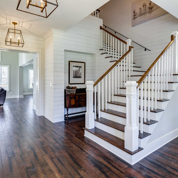
Inspiration for a transitional wooden l-shaped staircase remodel in Atlanta with painted risers
 YØDEZEEN
A bedroom and a bathroom unit are presented as separate rooms
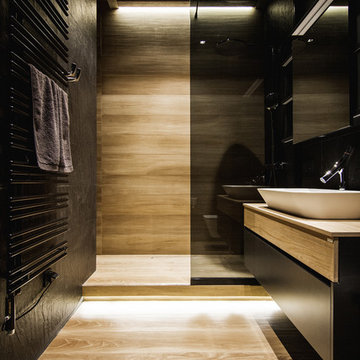
Trendy 3/4 light wood floor alcove shower photo in Seattle with a vessel sink, flat-panel cabinets, black cabinets and black walls
Trendy 3/4 light wood floor alcove shower photo in Seattle with a vessel sink, flat-panel cabinets, black cabinets and black walls
 SHED Architecture & Design
Mark Woods
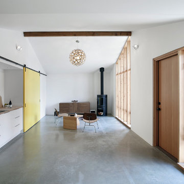
Wet bar - small mid-century modern single-wall concrete floor wet bar idea in Seattle with white cabinets, wood countertops, white backsplash, a drop-in sink and flat-panel cabinets
Wet bar - small mid-century modern single-wall concrete floor wet bar idea in Seattle with white cabinets, wood countertops, white backsplash, a drop-in sink and flat-panel cabinets
 Bosler Earth Design
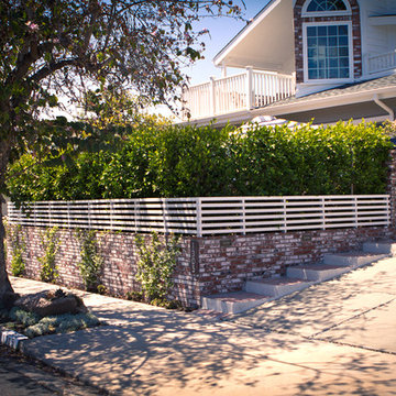
The front yard was sloped down so a new retaining wall was built with matching brick work to the existing architecture. Inside the wall we planted a hedge to provide privacy for the new usable space as comfortable as any back yard patio space.
©Daniel Bosler Photography

 EL & EL Wood Products Corp.
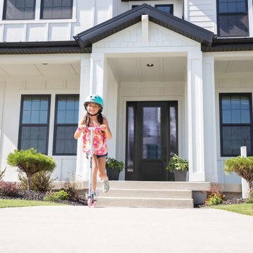
Modern Farmhouses are very in-style, complete the look with a front door and sidelites to match.
Door: Belleville Smooth 1 Panel Hollister Door 3/4 Lite with Chord Glass - BLS-122-115-1
Sidelite: Solution Series Chord Glass Insert - SIASS152-115
 InnovationLand
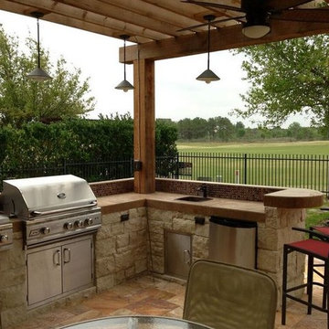
We love this rustic-modern Houston patio addition with an outdoor kitchen and double pergola!
It not only made the most of a long, narrow space while satisfying strict homeowners association rules, but did so affordably in a warm, timeless style.
“The client really enjoys outdoor living, but had a specific budget they wanted to meet,” explains Outdoor Homescapes owner Wayne Franks. “They also live on a golf course and had to meet particular HOA requirements.”
The HOA requirements restricted how far back the new 450-square-foot patio and pergola could extend back into the yard. The HOA also wanted to make sure the patio’s colors and materials matched the existing home and others around it.
“We chose colors and materials that offered texture and character, but that would go with just about anything around it,” says Wayne. “We found what we were looking for in the Fantastico travertine and Austin limestone – two materials clients love and just can’t go wrong with.”
The Austin limestone facing the 8-foot-square, L-shaped kitchen island is dry-stacked in a castle pattern for a naturalistic, rustic look. Yet its light, neutral color keeps the style fresh and modern.
Adding to the modern look are the stainless steel appliances: an RCS 30-inch stainless steel grill, double burner and outdoor fridge. Even though the finishes on the sink and light fixtures (Hunter pendant lamps and Hampton Bay light/fan combos) have a different finish – oil-rubbed-bronze – this actually follows the recent trend of mixing different metals, materials and finishes.
“The look’s not so matchy-matchy anymore,” explains Wayne. “Mixing it up makes it look more authentic and personalized.”
That’s why backsplashes like the one in this project – done in glass and metal mosaic – are also becoming more popular than traditional ceramic tile.
Another recent trend can be seen here, too – an amping up of color variation and texture.
“In addition to the split-face texture of the rock, you can definitely see the bold color variation in the travertine,” says Wayne.
The flooring is a Fantastico travertine, laid out in a Versailles pattern. “The Fantastico tile is killer,” says Wayne. “The warm reds go great with red brick, which we have a lot of around here.”
The countertop with the rounded, raised bar at the end is English walnut travertine.
The red bar stools also add a pop of exciting color that contrasts nicely with the greenery around the patio.
The double pergola, continues Wayne, is No. 2 pine stained a Minwax honey-gold. One side of the pergola – the side over the seating area – is covered with Lexan, a clear material that keeps out rain, heat and UV rays.
The pergola also juts further into the yard on that side. “It’s called a scallop, and it just lends some visual interest,” explains Wayne. “It prevents the pergola from just looking like one big rectangular hunk of wood.”
Wayne particularly likes how everything blended so well with the brick – which was a big concern – yet didn’t come off as too neutral or boring.
“The Fantastico travertine and red chairs do an excellent job of pulling the red from the brick and working with the warmth of that color to make a super-inviting space,” says Wayne. “We’re really pleased with how it all ties together so well.”
 Gardner/Fox Associates, Inc
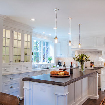
The original breakfast room was removed and the corner corner squared off a the site of the new sink. The removal of the wall dividing the kitchen and dining areas allowed the kitchen to expand and accommodate the open concept floor plan. The result is an amazingly comfortable & beautiful space in which to cook & entertain.
 Trilogy Construction Company
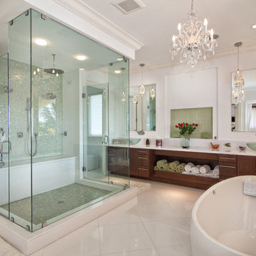
This master bath is the ultimate in luxury. From the full spa shower with body jets, rain head and dual shower heads to the polished marble floor and crystal chandelier.
 Tom Ralston Concrete
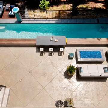
Epei benches warm the platinum gray concrete benches and the Firepit will warm legs and bodies as some will eventually sink into the rattan couch or chair which sits squarley on the stamped concrete Sandstone pool deck.
 DeForest Architects
John Granen
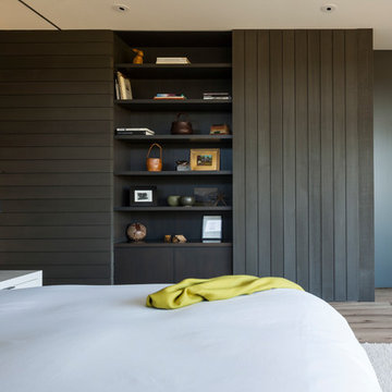
Example of a minimalist master light wood floor bedroom design with white walls
Example of a minimalist master light wood floor bedroom design with white walls







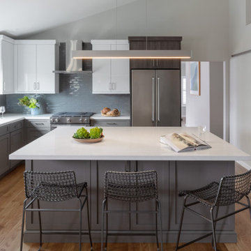
 JS Design + Build, Inc.
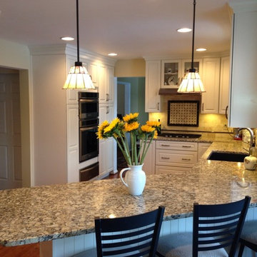
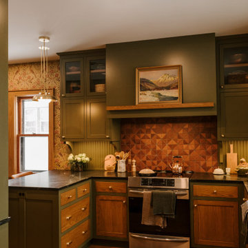
Times have changed and so has how we live in our homes. We took a 70's Napa Valley kitchen and went down to the studs to make a functional space. After our client rented out her house for years, she decided to return to Napa and remodel her home to make it an open concept and suitable for entertaining. We introduced a timeless modern palette, mixed cabinet finishes and installed oversized barn doors for the pantry.

4