
Search results for "Surgical" in Home Design Ideas

 Studioteka Design, LLC
Studioteka’s dream team takes on this eclectic and stylish project, a surgical renovation with architecture and interiors to bring this 2-bed, 2-bath Gramercy apartment, with gorgeous views and a key to the park, from a minimalist to maximalist design aesthetic perfect for entertaining! Our mission? Scandi rock n’ roll vibe for a client with impeccable taste and an international roster of clients. The elegant foyer design sets the theme for the space, with its bold contrasting hues and a mix of old world and new style.
 Herron Horton Architects, Inc.
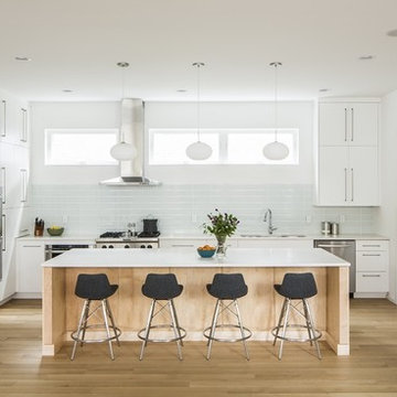
Example of a mid-sized danish l-shaped light wood floor eat-in kitchen design in Little Rock with an undermount sink, flat-panel cabinets, white cabinets, quartz countertops, white backsplash, glass tile backsplash, stainless steel appliances and an island
 Lincoln Lighthill Architect
How do you modernize modernism on a budget? This house had charming midcentury character and lots of potential but had been neglected for many years and was sorely in need of a refresh to bring it up to modern standards of comfort, finish, and sustainability. The tight budget dictated that it would not be a down-to-the-studs, gut remodel, but more of a surgical intervention.
Built in 1955, the house had settled on the downhill side, making the floors slope almost 4” from the front to the back of the house. Using an innovative and inexpensive push-pile method, the foundation was reinforced and the house was jacked back up. It now sits solidly on bedrock and the floor is level to within a half-inch throughout.
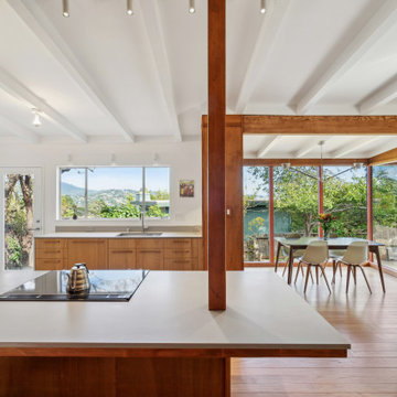
Inside, the original kitchen was worn and needed replacement. This presented an opportunity to remove the walls separating it from the living and dining area and create a wide-open great room with a peninsula counter for guests to gather and an almost continuous wall of windows to take in views of the hills, trees, and bay.
Throughout the rest of the house, most finishes were restored, or replaced when necessary. Wood floors were refinished, and new cork flooring, a slightly less durable but much less expensive alternative to tile and similar materials, was used in all wet areas, with the added benefit of warmth and resiliency. The existing textured walls and ceilings were skim-coated smooth with plaster, dark beams painted white, and existing wood wall paneling in the living room was cleaned and color-matched where new pieces were required. All of the existing frameless, direct-glazed windows were replaced with double pane units, and a new floor-to-ceiling window on the south side of the living room provides a key source of natural light.
In the bathrooms, existing tile and vanities were saved, and a strangely colored tub and sinks were re-glazed. Flooring, toilets, lighting, double medicine cabinets, and paint in each space make these mostly unaltered rooms feel new again.
Sustainability and comfort upgrades include an induction range (step one of an eventual transition to full electrification), spray foam insulation under the floor, spray-in cellulose in the walls, and warm-dim LED lighting throughout on a simple whole-house control system. Combined with a modern thermostat, the house’s systems are all accessible via app from anywhere.
And the most sustainable feature of all? What we didn’t do: tear it down and start over. In a country that demolishes a million homes a year- 1% of our residential housing stock- reusing an existing home is the greenest solution of all.
Find the right local pro for your project
 Sol Haus Design
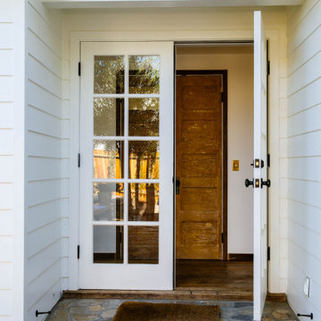
Summer Street House Remodel in Ojai is a small, three bedroom house tucked away in a quiet corner near downtown Ojai. Two unassuming, white farmhouse cottages are centered around a courtyard with two small cabins in the back. The first cottage contains the living room, dining room, kitchen and a powder room. Connected by a gravel courtyard and stone walkway, the second cottage contains the bedrooms, bathrooms and laundry room. All four structures on the property have recently undergone a full renovation completed in early 2021. The central courtyard has a custom made dining table under a canopy of mature olives and flanked by a stone fire pit.
 Plan Architecture
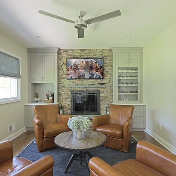
Here is a transformation first floor renovation where we surgically removed both structural and non-structural walls to give new life to this cape cod home in Parsippany, NJ. With a request to provide more natural light, an open living plan and functional Kitchen, we delivered this fresh space with multiple view points and access to light from each direction. The space feels double its actual size.
 Lincoln Lighthill Architect
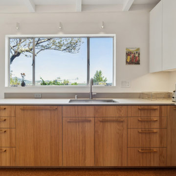
How do you modernize modernism on a budget? This house had charming midcentury character and lots of potential but had been neglected for many years and was sorely in need of a refresh to bring it up to modern standards of comfort, finish, and sustainability. The tight budget dictated that it would not be a down-to-the-studs, gut remodel, but more of a surgical intervention.
Built in 1955, the house had settled on the downhill side, making the floors slope almost 4” from the front to the back of the house. Using an innovative and inexpensive push-pile method, the foundation was reinforced and the house was jacked back up. It now sits solidly on bedrock and the floor is level to within a half-inch throughout.
Inside, the original kitchen was worn and needed replacement. This presented an opportunity to remove the walls separating it from the living and dining area and create a wide-open great room with a peninsula counter for guests to gather and an almost continuous wall of windows to take in views of the hills, trees, and bay.
Throughout the rest of the house, most finishes were restored, or replaced when necessary. Wood floors were refinished, and new cork flooring, a slightly less durable but much less expensive alternative to tile and similar materials, was used in all wet areas, with the added benefit of warmth and resiliency. The existing textured walls and ceilings were skim-coated smooth with plaster, dark beams painted white, and existing wood wall paneling in the living room was cleaned and color-matched where new pieces were required. All of the existing frameless, direct-glazed windows were replaced with double pane units, and a new floor-to-ceiling window on the south side of the living room provides a key source of natural light.
In the bathrooms, existing tile and vanities were saved, and a strangely colored tub and sinks were re-glazed. Flooring, toilets, lighting, double medicine cabinets, and paint in each space make these mostly unaltered rooms feel new again.
Sustainability and comfort upgrades include an induction range (step one of an eventual transition to full electrification), spray foam insulation under the floor, spray-in cellulose in the walls, and warm-dim LED lighting throughout on a simple whole-house control system. Combined with a modern thermostat, the house’s systems are all accessible via app from anywhere.
And the most sustainable feature of all? What we didn’t do: tear it down and start over. In a country that demolishes a million homes a year- 1% of our residential housing stock- reusing an existing home is the greenest solution of all.
 CARNEMARK design + build
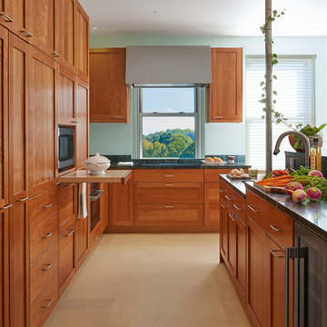
SPLIT LEVELS.
Perimeter cabinetry houses an under-counter speed oven, induction cooktop, and drawer bases for convenient access. Counters measure 32.5 inches in height—lower than the usual 36 inches—
to increase usability. The matching island has
two levels: standard-height to accommodate the dishwasher and wine fridge and a lowered prep sink and work area.
Photography by Anice Hoachlander
 ENVY Landscapes
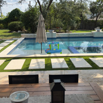
Beautiful limestone pavers elegantly wrapped around your pool, perfectly matched to the coping—because, let's be real, that's the only way it's done right. We’ve also got thick 87oz turf inlaid and pinned down with surgical precision, while expertly dodging those shallow pool pipes. Big shoutout to the pool builder for the obstacle course!
 CARNEMARK design + build
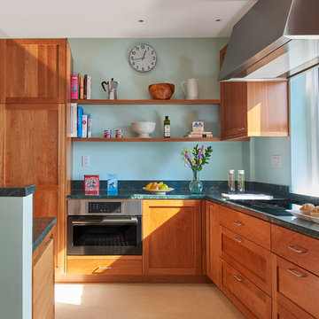
FLOOR PLANS.
The kitchen’s open design plan and wide aisles allow for easy movement between workstations and into the adjoining living area—even with a walker or wheelchair. Underfoot, foam rubber tiles provide extra traction and comfort. Designed for aquatic environment like pool decks, the slip-resistant tiles are waterproof, low-
maintenance, and resistant to stains, mold, and bacteria. Even better, should a fall happen, the cushioned surface softens the landing.
Photography by Anice Hoachlander
 Klopf Architecture
Built for the Bluff, A Sea Ranch Home is Remade from the Inside Out
The house had always been grounded, on an ocean bluff at The Sea Ranch. It sits unencumbered, adjacent to one of the most dramatic stretches of the Sonoma coast with protected commons meadow to the east, uninterrupted Pacific views to the west, and a bluff trail running alongside. What it lacked was the feeling of home, one that could hold up its own against the natural landscape.
The owners are entrepreneurs with deep involvement across tech, real estate, and development and they know how things are built. The Sea Ranch house had been in their lives for years, a second residence and a place for family to gather. Built for a different time, it felt more compromising than comfortable. Sitting in a closed off nook, the kitchen fit one cook at a time and turned its back on the rest of the house. The entry was dim and compressed, divided by a structural column that presented itself at exactly the wrong moment. The primary suite was small relative to the view outside it. A large rear bedroom sat behind a lowered ceiling with a bathroom that had never been added. The house was certainly worth the trouble of doing it right.
What followed was not one project but four, each with its own design challenge, each addressed over a period of time.
Where the House Meets the Ocean
The most complex piece of the project, in both structural and spatial terms, was the kitchen expansion. The existing room was a single-person galley squeezed in as an afterthought with no meaningful connection to the dining room, the living space, or the deck outside. To make it useful for a family that cooks and gathers, it needed to grow outward into an existing patio and flow into the rooms around it.
A big challenge was the roofline. Several planes at different pitches and angles converged directly where additional volume was needed. A new form had to join that geometry without reading as a correction. The solution found the simplest possible connection between the existing angles, a roofline that from outside the structure, appears entirely original. From the bluff trail where the addition is visible, there is no discernible seam.
Inside, the kitchen is now open to the living and dining rooms without interruption. A large sliding glass door connects the space onto the rear deck. The deck itself was expanded and oriented so that the body of the house shields it from the coastal wind which is a common consideration that determines whether outdoor space at The Sea Ranch actually gets used. The result is a room that works for large family gatherings where no one feels cutoff, and one that makes the boundary between being inside and outside easy to ignore.
Welcoming Light
A structural column stood at the convergence of eight distinct roof planes in the entry. It was load-bearing, but it was also the reason the entry had always felt like a hallway rather than a welcoming arrival.
With the structural engineer, a custom steel connector was designed to receive beams from six separate directions, redistributing the load through a single new continuous beam. The column was surgically removed. Three triangular skylights were then cut into the roof above, their shapes drawn from the
existing geometry of the planes around them. The entry is now bright and open. The skylights feel native to the structure because they follow the logic already present in the roof.
Two Suites, Two Views
At opposite ends of the house, the two bedroom suites were each reconfigured, and each found a different way to introduce more of the landscape into the room.
An addition to the primary suite extended the structure outward to create a wraparound plan with a loop from the bedroom through bath and closet that had not been possible before. The expansion opened a slot view from the tub and shower toward the ocean. The view is precise and private. The ocean view is present and deliberate.
The rear bedroom absorbed an adjacent storage room to transform it into a full second suite with a vaulted ceiling, a large bathroom with a tub, a shower, and a sauna. A private fenced garden courtyard sits just beyond the glass bringing the outdoors inside. The tub was placed so that, looking past the courtyard and through the bedroom beyond, the ocean is visible at the far end. It is a long view and it makes the room feel larger and more settled than its footprint would suggest.
Glass on Four Sides, Fire at the Center
The main living and gathering room had always been caught between two competing facts: glass on four sides meant exceptional views but at The Sea Ranch, it also meant a cold room. A 360-degree cylindrical fireplace was added at the center on a raised stone base, providing radiant heat in every direction and giving the room a focal point around which a group naturally orients itself, whether that means two people at the end of the day or the whole family after dinner.
Owners Who Picked Up the Tools
The owner was not a passive client. they came with construction knowledge, specific ideas, and the desire to be an active part of the process, a dynamic that other architects may had found difficult, which Klopf Architecture accepted as an asset. They took it upon themselves to complete some of the work during construction, including the installation of a new radiant heating system beneath the floors.
The radiant system added to the older and less-desirable forced-air setup. At The Sea Ranch, that change matters as the house sits close enough to the ocean and moving air competes with the sound of it, where radiant heat does not. Solar panels were added to the roof as part of the new system. Insulation was upgraded throughout the walls, roof, and crawl space. The house that had always had the right setting now holds warmth the way a house on the bluff should.
They were also deeply involved in the design and selections throughout, and the finished house reflects both of them in ways that are specific rather than generic. The process took longer and moved through more iterations than a more arms-length relationship might have allowed. The result is more defined and personal because of it.
The Landscape Holds Priority
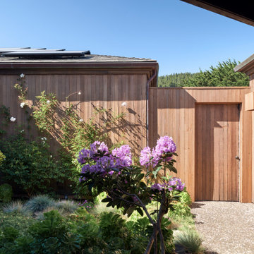
Every exterior decision was shaped by The Sea Ranch Design Standards, which require that buildings defer to the landscape around them rather than compete with it. Because this house sits on the bluff and is visible from the public trail, the additions faced a close review. Existing materials were matched. Geometries were resolved. The additions had to become indistinguishable from the original building.
From the trail, the house reads exactly as it always has — low, cedar-clad, secondary to the meadow and the water. The setting holds priority. Inside, the house has been remade.
Klopf Architecture Project Team: Geoff Campen and Trenton Jewett
Contractor: Shawn Bettega Construction
Photography: ©2025 Mariko Reed
Year Completed: 2023
Location: The Sea Ranch, CA
 Plan Architecture
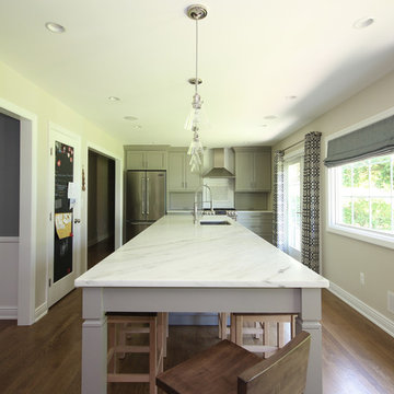
Here is a transformation first floor renovation where we surgically removed both structural and non-structural walls to give new life to this cape cod home in Parsippany, NJ. With a request to provide more natural light, an open living plan and functional Kitchen, we delivered this fresh space with multiple view points and access to light from each direction. The space feels double its actual size.
 Plan Architecture
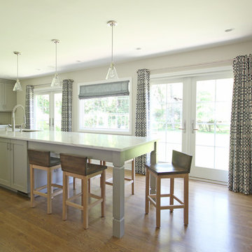
Here is a transformation first floor renovation where we surgically removed both structural and non-structural walls to give new life to this cape cod home in Parsippany, NJ. With a request to provide more natural light, an open living plan and functional Kitchen, we delivered this fresh space with multiple view points and access to light from each direction. The space feels double its actual size.
 Lincoln Lighthill Architect
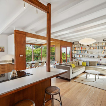
How do you modernize modernism on a budget? This house had charming midcentury character and lots of potential but had been neglected for many years and was sorely in need of a refresh to bring it up to modern standards of comfort, finish, and sustainability. The tight budget dictated that it would not be a down-to-the-studs, gut remodel, but more of a surgical intervention.
Built in 1955, the house had settled on the downhill side, making the floors slope almost 4” from the front to the back of the house. Using an innovative and inexpensive push-pile method, the foundation was reinforced and the house was jacked back up. It now sits solidly on bedrock and the floor is level to within a half-inch throughout.
Inside, the original kitchen was worn and needed replacement. This presented an opportunity to remove the walls separating it from the living and dining area and create a wide-open great room with a peninsula counter for guests to gather and an almost continuous wall of windows to take in views of the hills, trees, and bay.
Throughout the rest of the house, most finishes were restored, or replaced when necessary. Wood floors were refinished, and new cork flooring, a slightly less durable but much less expensive alternative to tile and similar materials, was used in all wet areas, with the added benefit of warmth and resiliency. The existing textured walls and ceilings were skim-coated smooth with plaster, dark beams painted white, and existing wood wall paneling in the living room was cleaned and color-matched where new pieces were required. All of the existing frameless, direct-glazed windows were replaced with double pane units, and a new floor-to-ceiling window on the south side of the living room provides a key source of natural light.
In the bathrooms, existing tile and vanities were saved, and a strangely colored tub and sinks were re-glazed. Flooring, toilets, lighting, double medicine cabinets, and paint in each space make these mostly unaltered rooms feel new again.
Sustainability and comfort upgrades include an induction range (step one of an eventual transition to full electrification), spray foam insulation under the floor, spray-in cellulose in the walls, and warm-dim LED lighting throughout on a simple whole-house control system. Combined with a modern thermostat, the house’s systems are all accessible via app from anywhere.
And the most sustainable feature of all? What we didn’t do: tear it down and start over. In a country that demolishes a million homes a year- 1% of our residential housing stock- reusing an existing home is the greenest solution of all.
 CARNEMARK design + build
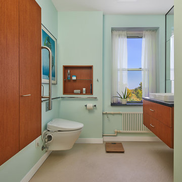
POWDER FRESH.
The powder room also has a bidet, along with a more generous sink and vanity and recessed tall cabinetry for extra storage. Other shared features include convenient shelf and niche storage, bright LED lighting, and expansive mirrors.
Photography by Anice Hoachlander
 Rachiele Custom Sinks
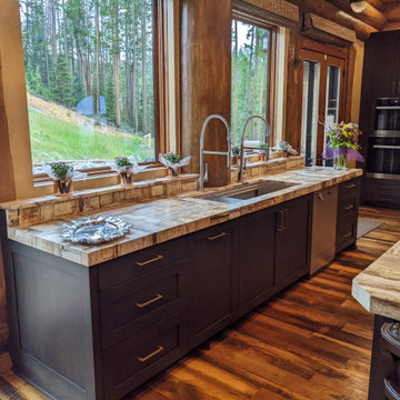
Dual tier, tri-level custom stainless teel workstation sink featuring 316L surgical grade stainless and a whopping 18" interior bowl space above AND below the ledge system. This allows for standard half sheet pans to fit on the top tier and the floor of the sink. Our client had petrified wood quarried in Romania made into her countertops throughout the kitchen.


 Bill Fry Construction - Wm. H. Fry Const. Co.
Covid During Construction and Making Face Masks
Dear Houzz Folks,
We've started getting back to work and are educating everyone at our projects on how to be safe during COVID, posting signage, and we've been making masks for our employees, colleagues, friends, family etc... Here's some information on what I've learned so far in sewing the best fitting face mask for COVID.
1. Put in a wire at the nose bridge (about 3.5 inches) - it helps with fit and if you wear glasses, it keeps them from fogging up. I found that doorbell wire, available at the hardware store, seems to work well. It isn't too thin or too fat, bends easily and holds its shape. I attach it by using a zigzag stitch on the interior seam of the outside of the mask (so there's a bit more cushion on the inside).
2. For the shaped masks, I make a pocket in case my friends, family, colleagues, want to insert a filter - it also allows for three layers of fabric in the breathing area and less bulk where the ties go. For patterns that don't offer pockets, I just make my own pattern pocket. I also first baste the two inside pieces first and then sew the front on. This way, there's no worries about slipping. No pins are needed and no pins minimizes the number of extra air holes in the fabric.
3. So that the ties/loops can be replaced or modified, I make a channel for rather than sewing it in permanently. Many videos show using a safety pin to pull the elastic through. If you sew much, you might have a bodkin in your sewing box, but it might be a bit too wide. Instead, I use a long hairpin (you could probably make a long loop with a paper clip). I run the hairpin through the channel, loop the elastic through the end of the pin and pull through. That takes much less time than piercing it with a safety-pin.
4. For the inside of the masks, it is nice to have softer fabric inside, so high-thread-count sheets purchased on sale work great. Then you can easily tell what is inside as well.
5. For surgical-style masks, there's a pattern with a pocket on the inside and a wire. I like the ideas in this video but use 2 fabrics and make them bigger. About a 9x9 inch for the outside and 9x8 inch for the inside. 5/8 seam on the nose and 1/4 seam on the bottom.
6. For the fitted masks, there are two patterns that I like. For this one, https://moinliz.de/mundschutz-naehen-mit-schnittmuster it expects you to print on European-sized paper, so if you want to get the size right, print at 100%
I also really like this pattern and I added a pocket and lengthened the ends to make channels https://intermountainhealthcare.org/covid19-coronavirus/homemade-cloth-face-coverings/ (scroll down to a link to download the pdf) Lots of folks sew craftpassion, but I like the fit of these patterns better. There are still some other patterns I have left to try!
6. After breaking lots of needles, I realized that I really didn't need to topstich the fitted masks over the bridge, so I just started skipping the bridge.
7. If you're going to wear a face-covering for a really long time, you might want to skip the ear hangers and go for ties behind the head. Instead of two ties, I'll use one long one so that the bottom one is a loop and the top one ties. Bungee cord works nice.
Happy Sewing!
: ) Rhoda Fry, Bill Fry Construction
 Laurel Feldman Interiors, IIDA
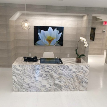
This plastic surgeons office is used for non- surgical procedures...skin care. Keeping that in mind LFI wanted the design to be one of a serene, calm, sophisticated and yet classic feel for the patients. The use of classic Calcutta marble with dramatic markings for the reception desk , the blocked rectangle designed wall covering resembling stone , glass and polished chrome Eileen Gray coffee table, floral wall covering , textured fabric on the banquettes, and the hand blown glass pendant and the large format of Laurel's Botanic Portrait of a lotus gives the space a classic measured design juxtaposed with the organic. The pallatte of grays and whites also contribute to the fresh , new feel,of the space.
 Rachiele Custom Sinks
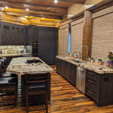
Dual tier, tri-level custom stainless teel workstation sink featuring 316L surgical grade stainless and a whopping 18" interior bowl space above AND below the ledge system. This allows for standard half sheet pans to fit on the top tier and the floor of the sink. Our client had petrified wood quarried in Romania made into her countertops throughout the kitchen.
 Laurel Feldman Interiors, IIDA
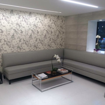
This plastic surgeons office is used for non- surgical procedures...skin care. Keeping that in mind LFI wanted the design to be one of a serene, calm, sophisticated and yet classic feel for the patients. The use of classic Calcutta marble with dramatic markings for the reception desk , the blocked rectangle designed wall covering resembling stone , glass and polished chrome Eileen Gray coffee table, floral wall covering , textured fabric on the banquettes, and the hand blown glass pendant and the large format of Laurel's Botanic Portrait of a lotus gives the space a classic measured design juxtaposed with the organic. The pallatte of grays and whites also contribute to the fresh , new feel,of the space.
3