
Search results for "Sympathetic" in Home Design Ideas
 Morpurgo Architects
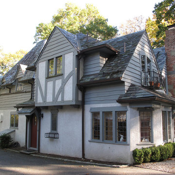
This Tudor house was built in the early 1930’s in a historic district that became known as the Cheelcroft Section of Hohokus. The characteristic features that distinguish these homes reflect the old world charm of stone facades, slate roofs and decorative half-timber and stucco siding.
Morpurgo Architects’ clients’ request for a Master Bedroom Suite, kitchen extension and ancillary areas resulted in our designing for their home sympathetic additions with complex roof intersections. We also created an accessory building that includes a 3-car garage with a media and entertainment room above. In keeping with the Tudor details of the main residence, this structure incorporates retrofitted steel windows and doors. The additions to the house and the plan for the garage fit seamlessly with this classic 80-year-old Tudor.
 BBA Architects
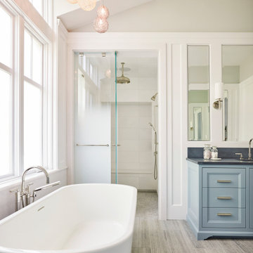
Situated along the perimeter of the property, this unique home creates a continuous street wall, both preserving plenty of open yard space and maintaining privacy from the prominent street corner. A one-story mudroom connects the garage to the house at the rear of the lot which required a local zoning variance. The resulting L-shaped plan and the central location of a glass-enclosed stair allow natural light to enter the home from multiple sides of nearly every room. The Arts & Crafts inspired detailing creates a familiar yet unique facade that is sympathetic to the character and scale of the neighborhood. A chevron pattern is a key design element on the window bays and doors and continues inside throughout the interior of the home.
2022 NAHB Platinum Best in American Living Award
View more of this home through #BBAModernCraftsman on Instagram.
 Period Architecture Ltd.
Angle Eye Photography
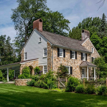
Traditional brown two-story stone gable roof idea in Philadelphia
Traditional brown two-story stone gable roof idea in Philadelphia
Find the right local pro for your project
 Period Architecture Ltd.
Angle Eye Photography
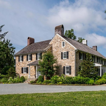
Example of a classic two-story stone gable roof design in Philadelphia
Example of a classic two-story stone gable roof design in Philadelphia
 Donald Lococo Architects
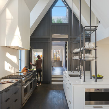
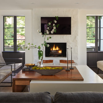
Subsequent additions are covered with living green walls to deemphasize stylistic conflicts imposed on a 1940’s Tudor and become backdrop surrounding a kitchen addition. On the interior, further added architectural inconsistencies are edited away, and the language of the Tudor’s original reclaimed integrity is referenced for the addition. Sympathetic to the home, windows and doors remain untrimmed and stark plaster walls contrast the original black metal windows. Sharp black elements contrast fields of white. With a ceiling pitch matching the existing and chiseled dormers, a stark ceiling hovers over the kitchen space referencing the existing homes plaster walls. Grid members in windows and on saw scored paneled walls and cabinetry mirror the machine age windows as do exposed steel beams. The exaggerated white field is pierced by an equally exaggerated 13 foot black steel tower that references the existing homes steel door and window members. Glass shelves in the tower further the window parallel. Even though it held enough dinner and glassware for eight, its thin members and transparent shelves defy its massive nature, allow light to flow through it and afford the kitchen open views and the feeling of continuous space. The full glass at the end of the kitchen reveres a grouping of 50 year old Hemlocks. At the opposite end, a window close to the peak looks up to a green roof.
 Donald Lococo Architects
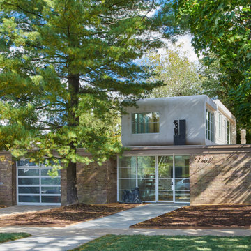
Designed in 1970 for an art collector, the existing referenced 70’s architectural principles. With its cadence of ‘70’s brick masses punctuated by a garage and a 4-foot-deep entrance recess. This recess, however, didn’t convey to the interior, which was occupied by disjointed service spaces. To solve, service spaces are moved and reorganized in open void in the garage. (See plan) This also organized the home: Service & utility on the left, reception central, and communal living spaces on the right.
To maintain clarity of the simple one-story 70’s composition, the second story add is recessive. A flex-studio/extra bedroom and office are designed ensuite creating a slender form and orienting them front to back and setting it back allows the add recede. Curves create a definite departure from the 70s home and by detailing it to "hover like a thought" above the first-floor roof and mentally removable sympathetic add.Existing unrelenting interior walls and a windowless entry, although ideal for fine art was unconducive for the young family of three. Added glass at the front recess welcomes light view and the removal of interior walls not only liberate rooms to communicate with each other but also reinform the cleared central entry space as a hub.
Even though the renovation reinforms its relationship with art, the joy and appreciation of art was not dismissed. A metal sculpture lost in the corner of the south side yard bumps the sculpture at the front entrance to the kitchen terrace over an added pedestal. (See plans) Since the roof couldn’t be railed without compromising the one-story '70s composition, the sculpture garden remains physically inaccessible however mirrors flanking the chimney allow the sculptures to be appreciated in three dimensions. The mirrors also afford privacy from the adjacent Tudor's large master bedroom addition 16-feet away.
 Donald Lococo Architects
Subsequent additions are covered with living green walls to deemphasize stylistic conflicts imposed on a 1940’s Tudor and become backdrop surrounding a kitchen addition. On the interior, further added architectural inconsistencies are edited away, and the language of the Tudor’s original reclaimed integrity is referenced for the addition. Sympathetic to the home, windows and doors remain untrimmed and stark plaster walls contrast the original black metal windows. Sharp black elements contrast fields of white. With a ceiling pitch matching the existing and chiseled dormers, a stark ceiling hovers over the kitchen space referencing the existing homes plaster walls. Grid members in windows and on saw scored paneled walls and cabinetry mirror the machine age windows as do exposed steel beams. The exaggerated white field is pierced by an equally exaggerated 13 foot black steel tower that references the existing homes steel door and window members. Glass shelves in the tower further the window parallel. Even though it held enough dinner and glassware for eight, its thin members and transparent shelves defy its massive nature, allow light to flow through it and afford the kitchen open views and the feeling of continuous space. The full glass at the end of the kitchen reveres a grouping of 50 year old Hemlocks. At the opposite end, a window close to the peak looks up to a green roof.
 Donald Lococo Architects
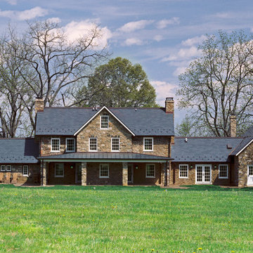
©️Maxwell MacKenzie THE HOME, ESSENTIALLY A RUIN WAS PRESERVED THROUGH NEGLECT. A CLARIFIED HISTORIC RENOVATION REMOVES BAY WINDOWS AND 1950’S WINDOWS FROM THE MAIN FAÇADE. TWO WINGS AND A THIRD FLOOR AND A SYMPATHETIC STAIRWAY ACCOMMODATE MODERN LIFE. MASONS WERE TASKED TO MAKE THE STONE WORK LOOK AS THOUGH “A FARMER BUILT THE WALLS DURING THE NON-PLANTING SEASON,” THE FINAL DESIGN SIMPLIFIES THE FIRST FLOOR PLAN AND LEAVES LOGICAL LOCATIONS FOR EXPANSION INTO COMING DECADES. AMONG OTHER AWARDS, THIS TRADITIONAL YET HISTORIC RENOVATION LOCATED IN MIDDLEBURG, VA HAS RECEIVED 2 AWARDS FROM THE AMERICAN INSTITUTE OF ARCHITECTURE.. AND A NATIONAL PRIVATE AWARD FROM VETTE WINDOWS
WASHINGTON DC ARCHITECT DONALD LOCOCO UPDATED THIS HISTORIC STONE HOUSE IN MIDDLEBURG, VA.lauded by the American Institute of Architects with an Award of Excellence for Historic Architecture, as well as an Award of Merit for Residential Architecture
 BBA Architects
Situated along the perimeter of the property, this unique home creates a continuous street wall, both preserving plenty of open yard space and maintaining privacy from the prominent street corner. A one-story mudroom connects the garage to the house at the rear of the lot which required a local zoning variance. The resulting L-shaped plan and the central location of a glass-enclosed stair allow natural light to enter the home from multiple sides of nearly every room. The Arts & Crafts inspired detailing creates a familiar yet unique facade that is sympathetic to the character and scale of the neighborhood. A chevron pattern is a key design element on the window bays and doors and continues inside throughout the interior of the home.
2022 NAHB Platinum Best in American Living Award
View more of this home through #BBAModernCraftsman on Instagram.
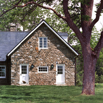 Donald Lococo Architects
©️Maxwell MacKenzie THE HOME, ESSENTIALLY A RUIN WAS PRESERVED THROUGH NEGLECT. A CLARIFIED HISTORIC RENOVATION REMOVES BAY WINDOWS AND 1950’S WINDOWS FROM THE MAIN FAÇADE. TWO WINGS AND A THIRD FLOOR AND A SYMPATHETIC STAIRWAY ACCOMMODATE MODERN LIFE. MASONS WERE TASKED TO MAKE THE STONE WORK LOOK AS THOUGH “A FARMER BUILT THE WALLS DURING THE NON-PLANTING SEASON,” THE FINAL DESIGN SIMPLIFIES THE FIRST FLOOR PLAN AND LEAVES LOGICAL LOCATIONS FOR EXPANSION INTO COMING DECADES. AMONG OTHER AWARDS, THIS TRADITIONAL YET HISTORIC RENOVATION LOCATED IN MIDDLEBURG, VA HAS RECEIVED 2 AWARDS FROM THE AMERICAN INSTITUTE OF ARCHITECTURE.. AND A NATIONAL PRIVATE AWARD FROM VETTE WINDOWS
WASHINGTON DC ARCHITECT DONALD LOCOCO UPDATED THIS HISTORIC STONE HOUSE IN MIDDLEBURG, VA.lauded by the American Institute of Architects with an Award of Excellence for Historic Architecture, as well as an Award of Merit for Residential Architecture
 b Studio Architecture
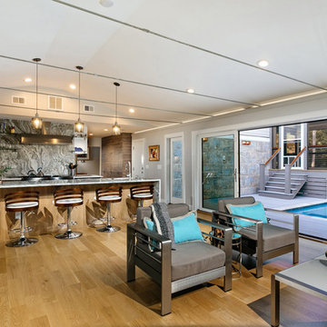
Originally a ranch, this house was lifted after Hurricane Hugo and added onto un-sympathetically at the rear. It had a strange layout with multiple levels, small bedrooms, and closed off spaces. Our task was to transform the home for modern living. Create indoor / outdoor connections to a new pool, kitchen and the everyday spaces used most. The transformation from a 'pink palace' to a modern showpiece gave the owners living space to entertain and enjoy their home with friends & extended family.
Photos by Newport653
 Penza Bailey Architects
Penza Bailey Architects designed this extensive renovation and addition of a two-story penthouse in an iconic Beaux Arts condominium in Baltimore for clients they have been working with for over 3 decades.
The project was highly complex as it not only involved complete demolition of the interior spaces, but considerable demolition and new construction on the exterior of the building.
A two-story addition was designed to contrast the existing symmetrical brick building, yet used materials sympathetic to the original structure. The design takes full advantage of views of downtown Baltimore from grand living spaces and four new private terraces carved into the additions. The firm worked closely with the condominium management, contractors and sub-contractors due to the highly technical and complex requirements of adding onto the 12th and 13th stories of an existing building.
 Donald Lococo Architects
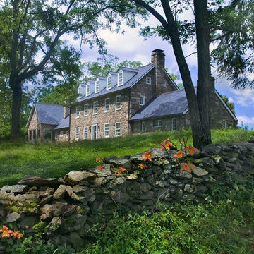
©️Maxwell MacKenzie THE HOME, ESSENTIALLY A RUIN WAS PRESERVED THROUGH NEGLECT. A CLARIFIED HISTORIC RENOVATION REMOVES BAY WINDOWS AND 1950’S WINDOWS FROM THE MAIN FAÇADE. TWO WINGS AND A THIRD FLOOR AND A SYMPATHETIC STAIRWAY ACCOMMODATE MODERN LIFE. MASONS WERE TASKED TO MAKE THE STONE WORK LOOK AS THOUGH “A FARMER BUILT THE WALLS DURING THE NON-PLANTING SEASON,” THE FINAL DESIGN SIMPLIFIES THE FIRST FLOOR PLAN AND LEAVES LOGICAL LOCATIONS FOR EXPANSION INTO COMING DECADES. AMONG OTHER AWARDS, THIS TRADITIONAL YET HISTORIC RENOVATION LOCATED IN MIDDLEBURG, VA HAS RECEIVED 2 AWARDS FROM THE AMERICAN INSTITUTE OF ARCHITECTURE.. AND A NATIONAL PRIVATE AWARD FROM VETTE WINDOWS
WASHINGTON DC ARCHITECT DONALD LOCOCO UPDATED THIS HISTORIC STONE HOUSE IN MIDDLEBURG, VA.lauded by the American Institute of Architects with an Award of Excellence for Historic Architecture, as well as an Award of Merit for Residential Architecture
 Donald Lococo Architects
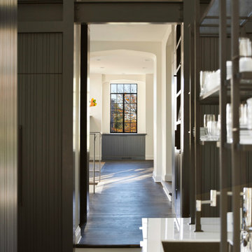
Subsequent additions are covered with living green walls to deemphasize stylistic conflicts imposed on a 1940’s Tudor and become backdrop surrounding a kitchen addition. On the interior, further added architectural inconsistencies are edited away, and the language of the Tudor’s original reclaimed integrity is referenced for the addition. Sympathetic to the home, windows and doors remain untrimmed and stark plaster walls contrast the original black metal windows. Sharp black elements contrast fields of white. With a ceiling pitch matching the existing and chiseled dormers, a stark ceiling hovers over the kitchen space referencing the existing homes plaster walls. Grid members in windows and on saw scored paneled walls and cabinetry mirror the machine age windows as do exposed steel beams. The exaggerated white field is pierced by an equally exaggerated 13 foot black steel tower that references the existing homes steel door and window members. Glass shelves in the tower further the window parallel. Even though it held enough dinner and glassware for eight, its thin members and transparent shelves defy its massive nature, allow light to flow through it and afford the kitchen open views and the feeling of continuous space. The full glass at the end of the kitchen reveres a grouping of 50 year old Hemlocks. At the opposite end, a window close to the peak looks up to a green roof.
 Period Architecture Ltd.
Angle Eye Photography
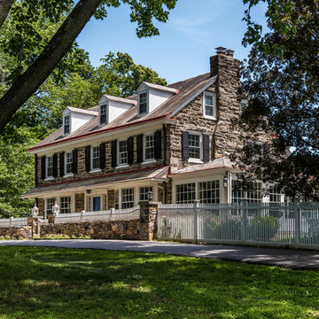
Traditional brown three-story stone gable roof idea in Philadelphia
Traditional brown three-story stone gable roof idea in Philadelphia

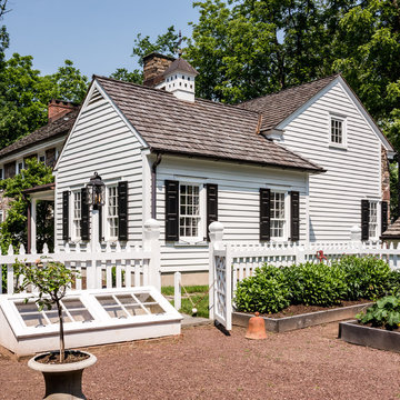 Period Architecture Ltd.
Photography by Angle Eye Photography
Example of a mid-sized classic brown two-story stone gable roof design in Philadelphia
Example of a mid-sized classic brown two-story stone gable roof design in Philadelphia
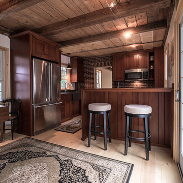
 The Kennebec Company
This sympathetic kitchen space appears to have grown here
Inspiration for a small farmhouse l-shaped light wood floor enclosed kitchen remodel in Portland Maine with a farmhouse sink, stainless steel appliances, a peninsula, recessed-panel cabinets, dark wood cabinets and red backsplash
Inspiration for a small farmhouse l-shaped light wood floor enclosed kitchen remodel in Portland Maine with a farmhouse sink, stainless steel appliances, a peninsula, recessed-panel cabinets, dark wood cabinets and red backsplash
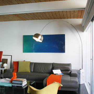
 Laidlaw Schultz architects
The project’s starting point was to understand the building’s original post and beam structure and to use that internal logic to formulate a sympathetic remodel. With an emphasis on the upper back unit, the owner’s private residence within this recently purchased Edward Killingsworth triplex, the first order of business was to strip the excess out and to return the complex to something that resembled the original. With a limited budget, the tact was to restore where possible, and to insert where needed, but always with a sympathetic eye. The kitchen quickly became the primary focus and it was soon realized that by removing the division between the existing galley and family room that the essence of the structural system could be revealed. Once opened the datum of the layered beams was adhered to with the kitchen reinforcing this overhead water line. The primary internal wall was then highlighted with a new wood veneer with the refrigerator recessed (borrowing a bit of space from the master closet) and the existing heater chromed.
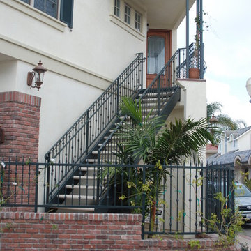
 Musser: Architects, Inc.
The two story renovation of this beach property required new stairs. Decorative steel stringers, guardrails, and handrails are sympathetic to the design of the fences and other steel structural details. The used brick walls match the brick pilasters at the garage doors.
4