
Search results for "Sympathetic" in Home Design Ideas
 Architect Fred M Fargotstein
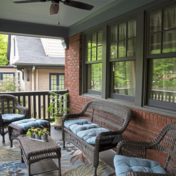
The restored front porch virtually replicates the original design, and is significantly more sympathetic to the other homes on the street, nearly all of which share this feature. The new tongue & groove wood flooring is traditional for houses of this era, as are the sky-blue beaded board ceiling and the wood railing that was custom-fabricated from the one surviving segment of the original. A new Craftsman style front door (with beefy solid bronze hardware) and period-appropriate lighting fixtures provide a welcoming first impression, and a deep, rich paint palette accentuates the home’s picturesque qualities.
 Accoya Wood
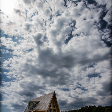
Designed by architect Alexandru Cristian, Accoya was recommended by distributor Tecade for use in the construction of the building, which needed to be aesthetically pleasing as well as highly durable in order to withstand the country’s extreme climate. Tecade recommended the use of Accoya to ensure that the building would sit sympathetically within its natural surroundings, while also maintaining its structural integrity against the harsh environment.
Originally Accoya was specified solely to construct the windows and the terrace. However, due to its aesthetic appeal, both the owner and the architect decided to use Accoya for all applications throughout the home including the façade, interior doors, indoor and outdoor furniture, terrace, garage door and railings. The architect specified 28mm by 150mm of Accoya for the outdoor terrace and constructed the terrace furniture using around 1 cubic meters of Accoya to build 3 tables and 36 chairs for external use. Tecade also crafted kitchen furniture, a TV stand, office desk and multiple bathroom cabinets from Accoya.
Photo Credit: Tecade
 Proctor Watts Cole Rutter
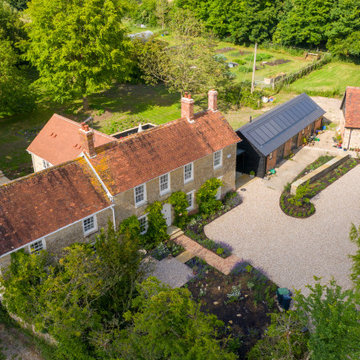
Extension, whole house refurbishment and barn conversion for a private client in Dorset. An inefficient and outdated farm house has been transformed into a low energy, modern family home. With sympathetic extensions as well as conversions of existing redundant out buildings, bringing them into use as part of the dwelling
Find the right local pro for your project
 Katie Hutchison Studio
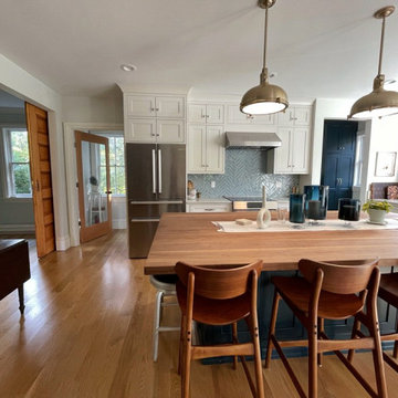
This project for a builder husband and interior-designer wife involved adding onto and restoring the luster of a c. 1883 Carpenter Gothic cottage in Barrington that they had occupied for years while raising their two sons. They were ready to ditch their small tacked-on kitchen that was mostly isolated from the rest of the house, views/daylight, as well as the yard, and replace it with something more generous, brighter, and more open that would improve flow inside and out. They were also eager for a better mudroom, new first-floor 3/4 bath, new basement stair, and a new second-floor master suite above.
The design challenge was to conceive of an addition and renovations that would be in balanced conversation with the original house without dwarfing or competing with it. The new cross-gable addition echoes the original house form, at a somewhat smaller scale and with a simplified more contemporary exterior treatment that is sympathetic to the old house but clearly differentiated from it.
Renovations included the removal of replacement vinyl windows by others and the installation of new Pella black clad windows in the original house, a new dormer in one of the son’s bedrooms, and in the addition. At the first-floor interior intersection between the existing house and the addition, two new large openings enhance flow and access to daylight/view and are outfitted with pairs of salvaged oversized clear-finished wooden barn-slider doors that lend character and visual warmth.
A new exterior deck off the kitchen addition leads to a new enlarged backyard patio that is also accessible from the new full basement directly below the addition.
(Interior fit-out and interior finishes/fixtures by the Owners)
 Donald Lococo Architects
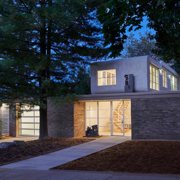
Designed in 1970 for an art collector, the existing referenced 70’s architectural principles. With its cadence of ‘70’s brick masses punctuated by a garage and a 4-foot-deep entrance recess. This recess, however, didn’t convey to the interior, which was occupied by disjointed service spaces. To solve, service spaces are moved and reorganized in open void in the garage. (See plan) This also organized the home: Service & utility on the left, reception central, and communal living spaces on the right.
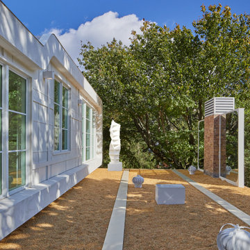
To maintain clarity of the simple one-story 70’s composition, the second story add is recessive. A flex-studio/extra bedroom and office are designed ensuite creating a slender form and orienting them front to back and setting it back allows the add recede. Curves create a definite departure from the 70s home and by detailing it to "hover like a thought" above the first-floor roof and mentally removable sympathetic add.Existing unrelenting interior walls and a windowless entry, although ideal for fine art was unconducive for the young family of three. Added glass at the front recess welcomes light view and the removal of interior walls not only liberate rooms to communicate with each other but also reinform the cleared central entry space as a hub.
Even though the renovation reinforms its relationship with art, the joy and appreciation of art was not dismissed. A metal sculpture lost in the corner of the south side yard bumps the sculpture at the front entrance to the kitchen terrace over an added pedestal. (See plans) Since the roof couldn’t be railed without compromising the one-story '70s composition, the sculpture garden remains physically inaccessible however mirrors flanking the chimney allow the sculptures to be appreciated in three dimensions. The mirrors also afford privacy from the adjacent Tudor's large master bedroom addition 16-feet away.
 Donald Lococo Architects
Designed in 1970 for an art collector, the existing referenced 70’s architectural principles. With its cadence of ‘70’s brick masses punctuated by a garage and a 4-foot-deep entrance recess. This recess, however, didn’t convey to the interior, which was occupied by disjointed service spaces. To solve, service spaces are moved and reorganized in open void in the garage. (See plan) This also organized the home: Service & utility on the left, reception central, and communal living spaces on the right.
To maintain clarity of the simple one-story 70’s composition, the second story add is recessive. A flex-studio/extra bedroom and office are designed ensuite creating a slender form and orienting them front to back and setting it back allows the add recede. Curves create a definite departure from the 70s home and by detailing it to "hover like a thought" above the first-floor roof and mentally removable sympathetic add.Existing unrelenting interior walls and a windowless entry, although ideal for fine art was unconducive for the young family of three. Added glass at the front recess welcomes light view and the removal of interior walls not only liberate rooms to communicate with each other but also reinform the cleared central entry space as a hub.
Even though the renovation reinforms its relationship with art, the joy and appreciation of art was not dismissed. A metal sculpture lost in the corner of the south side yard bumps the sculpture at the front entrance to the kitchen terrace over an added pedestal. (See plans) Since the roof couldn’t be railed without compromising the one-story '70s composition, the sculpture garden remains physically inaccessible however mirrors flanking the chimney allow the sculptures to be appreciated in three dimensions. The mirrors also afford privacy from the adjacent Tudor's large master bedroom addition 16-feet away.
 Sheldon Richard Kostelecky Architect
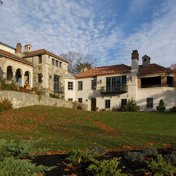
The large metal French doors on the second floor of the addition offer views from the kitchen and eating area to the pond. The covered porch, to the right, has a built-in fireplace for grill and rotisserie cooking; it's ceiling is vaulted and has exposed salvaged timber beams and planks for a rustic look.
 Doug Walter Architect
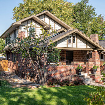
A compatible 800 s.f. addition to an 1100 s.f. Craftsman bungalow in Denver that houses a spacious master suite and a home office up top. Gentle remodeling of the first floor and basement
 Thomas J. Pearson, Inc.
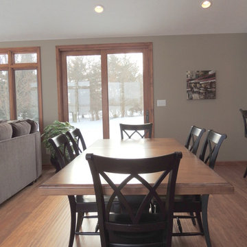
This 24’ by 22’ addition opens up the kitchen space with an additional room which the kitchen connects to. The newly constructed space serves as a living room/sunroom.
To do this, we tore down the kitchen wall and built a temporary plywood wall to keep the space closed off from the new construction. The new structure was framed and the roof was shingled. To allow for the roof line, new window openings were built and new windows were purchased to meet current egress requirements. The double door that initially went to the exterior was transformed into an 8’ tall opening. The kitchen window at the sink was taken out and now has a wood jamb opening with a granite countertop for a bar where people can sit and watch the cooks at work.
Inside the addition we created some additional cabinet space for another serving area. The cabinetry was framed to fit a beverage cooler. The floor in the addition matches the existing hand scraped wood floor in the kitchen. One particular challenge we faced in the addition was ensuring that the floor elevation for the new addition lined perfectly so that it was seamless.
On the exterior we installed a new cultured ledge stone and a real limestone sill with actual rock face to provide a natural appearance. The stone steps on each of the entryways into the addition have a similar look. The radius steps contain the rock face feature as well. Large windows were installed which match the pitch of the existing roof. The siding on the new structure is sympathetic to the siding on the home. We also installed new state of the art skylights that shut themselves when it rains.
 Thomas J. Pearson, Inc.
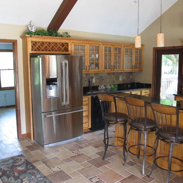
With this pool home renovation and addition we removed the existing flooring, drywall, insulation, cabinetry, and electrical. After demolition there were only the existing wall structures for the interior. We then added on to the pool home to the west and south to make the space nearly three times as large. The space included a full-size kitchen with appliances, a large family room, a full bathroom, and a full bedroom. The kitchen of the pool home contained maple cabinets, granite countertops, and a tile floor. We also ensured that the addition’s exterior remained sympathetic and blended harmoniously to the existing structure. Thomas J. Pearson, Inc.
 Artscape Garden Associates Ltd
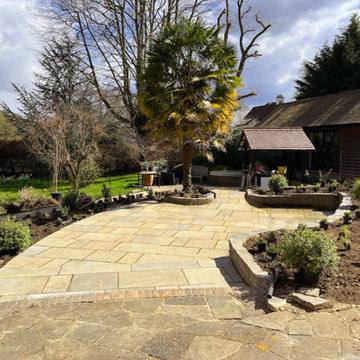
This paving and planting scheme features new hard landscaping elements and a new planting scheme. Artscape was initially briefed to extend and enhance the patio in the garden of a lovely home in the village of Cookham Dean in Berkshire. Our clients wanted to increase the size of the paved area so they could use it more frequently for relaxing and dining in the sun during the day. As well as increasing its size and practicality, they wanted the terrace to look and feel more inviting. The existing site was a mixture of brick paving, which was slippery underfoot, and tired concrete crazy paving. The patio also had stone retaining walls surrounded by sloped lawns and a few poorly maintained and mismatched shrubs.
Redesigned and repaved area
We first created a new, larger layout with a series of wider steps closer to the house, making a more inviting and welcoming area. Our landscapers paved the area with coursed sandstone, renowned for its incredible strength and durability. The earthy tones and unique texture of the sandstone gives it a natural timeless look which blends sympathetically with the garden setting. The worn finish of the paving also makes the surface safer to walk on. The edge of the paving curves in line from the end of the house to visually link the areas.
Bullnosed edges enhance looks and safety
Bullnosing provides the garden step edges with a smooth, luxury appearance, which also enhance safety. Safety is an important factor to consider when renovating or building new steps and paved areas. Smooth, rounded bullnosed steps or edges means there won’t be any harshly cut, sharp edges to injure someone should they trip or fall. Our Artscape paving experts can advise on the best bespoke, professionally profiled bullnose edges to suit the needs of your garden project.
Replacing sloped lawns with plants
Our initial brief was to create a new planted border just around the paved area. However, after various discussions and designs, our clients decided to follow our recommendation to expand the planting, so it included the whole sloping bank. The planting design also included the addition of small trees to create vertical interest.
New nature-friendly planting
The planting features an easy-to-maintain mix of perennials, grasses, and shrubs. This adds softness to the seating area and brings an everchanging display of flowers, foliage, textures and colours to the garden. The plants will attract more birds and butterflies to the garden, and will be beneficial for insects too.
The lawn was doing very little to support a diversity of insects and birds. Replacing even a small section of lawn with perennial flowers, shrubs, grasses, wildflowers, or groundcovers will benefit nature and wildlife. As well as supporting greater biodiversity, plants are more environmentally friendly than maintaining a lawn. Lawns are drought tolerant and will recover even if the grass has turned brown and patchy in a heatwave. But to keep the lawn looking lush, green, and beautiful in a hot, dry spell will require constant and wasteful watering.
The planting is informal and includes grasses, taking inspiration from the fields opposite. Ornamental grasses soften the scheme and bring movement to the garden as they shimmer in the slightest of breezes. Grasses are easy to grow and require little ongoing care. The main maintenance task is to cut the planting back in spring ready for the new growth to come through.
To keep the whole project within our client’s budget, we retained the existing walls, simply carrying out some small repairs and modifications where necessary. We were also able to add stunning new atmospheric lighting to the older existing lighting circuit to illuminate the area at night.
 Greg D. Fisher, Architect, PLLC
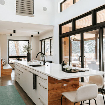
While being the new kid on the block, this home was designed to be a good neighbor to it's older surroundings. Progressive in materiality, fenestration and detailing but sympathetic in scale and form. It provides the homeowners privacy from the street but is very open to the backyard and the southern sun exposure afforded there. While the home is not certified, it subscribes to many Passive House principles which means it provides a very comfortable environment with good indoor air quality as well as reducing energy consumption. To further tread lightly on the planet, the home is all electric thereby directly excluding the use of fossil fuels. Alternative energy is provided by geothermal and solar photovoltaic systems. The homeowners are also big proponents of local bike culture and have prioritized bike use with an attached bike garage that also serves as a space for training and repairs, and a small bike trail looping the urban property.
 Accoya Wood
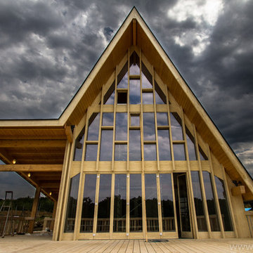
Designed by architect Alexandru Cristian, Accoya was recommended by distributor Tecade for use in the construction of the building, which needed to be aesthetically pleasing as well as highly durable in order to withstand the country’s extreme climate. Tecade recommended the use of Accoya to ensure that the building would sit sympathetically within its natural surroundings, while also maintaining its structural integrity against the harsh environment.
Originally Accoya was specified solely to construct the windows and the terrace. However, due to its aesthetic appeal, both the owner and the architect decided to use Accoya for all applications throughout the home including the façade, interior doors, indoor and outdoor furniture, terrace, garage door and railings. The architect specified 28mm by 150mm of Accoya for the outdoor terrace and constructed the terrace furniture using around 1 cubic meters of Accoya to build 3 tables and 36 chairs for external use. Tecade also crafted kitchen furniture, a TV stand, office desk and multiple bathroom cabinets from Accoya.
Photo Credit: Tecade
 Donald Lococo Architects
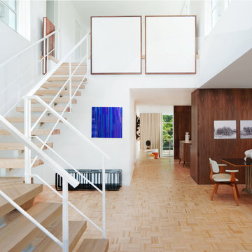
Designed in 1970 for an art collector, the existing referenced 70’s architectural principles. With its cadence of ‘70’s brick masses punctuated by a garage and a 4-foot-deep entrance recess. This recess, however, didn’t convey to the interior, which was occupied by disjointed service spaces. To solve, service spaces are moved and reorganized in open void in the garage. (See plan) This also organized the home: Service & utility on the left, reception central, and communal living spaces on the right.
To maintain clarity of the simple one-story 70’s composition, the second story add is recessive. A flex-studio/extra bedroom and office are designed ensuite creating a slender form and orienting them front to back and setting it back allows the add recede. Curves create a definite departure from the 70s home and by detailing it to "hover like a thought" above the first-floor roof and mentally removable sympathetic add.Existing unrelenting interior walls and a windowless entry, although ideal for fine art was unconducive for the young family of three. Added glass at the front recess welcomes light view and the removal of interior walls not only liberate rooms to communicate with each other but also reinform the cleared central entry space as a hub.
Even though the renovation reinforms its relationship with art, the joy and appreciation of art was not dismissed. A metal sculpture lost in the corner of the south side yard bumps the sculpture at the front entrance to the kitchen terrace over an added pedestal. (See plans) Since the roof couldn’t be railed without compromising the one-story '70s composition, the sculpture garden remains physically inaccessible however mirrors flanking the chimney allow the sculptures to be appreciated in three dimensions. The mirrors also afford privacy from the adjacent Tudor's large master bedroom addition 16-feet away.
 Slocum Hall Design Group, LLC
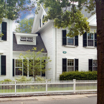
The owners of this 1818 Federal Revival, located in Dedham’s historical district, needed additional space for their growing family. A unique solution presented itself when the neighboring home became available. Separated by a narrow driveway, we combined them with a sympathetically designed connector that effectively unified the two homes.
 Katie Hutchison Studio
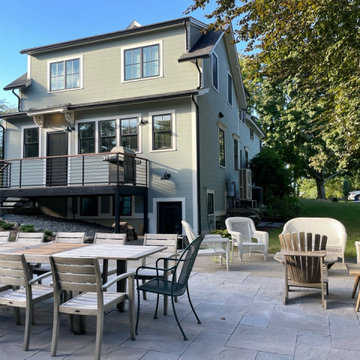
This project for a builder husband and interior-designer wife involved adding onto and restoring the luster of a c. 1883 Carpenter Gothic cottage in Barrington that they had occupied for years while raising their two sons. They were ready to ditch their small tacked-on kitchen that was mostly isolated from the rest of the house, views/daylight, as well as the yard, and replace it with something more generous, brighter, and more open that would improve flow inside and out. They were also eager for a better mudroom, new first-floor 3/4 bath, new basement stair, and a new second-floor master suite above.
The design challenge was to conceive of an addition and renovations that would be in balanced conversation with the original house without dwarfing or competing with it. The new cross-gable addition echoes the original house form, at a somewhat smaller scale and with a simplified more contemporary exterior treatment that is sympathetic to the old house but clearly differentiated from it.
Renovations included the removal of replacement vinyl windows by others and the installation of new Pella black clad windows in the original house, a new dormer in one of the son’s bedrooms, and in the addition. At the first-floor interior intersection between the existing house and the addition, two new large openings enhance flow and access to daylight/view and are outfitted with pairs of salvaged oversized clear-finished wooden barn-slider doors that lend character and visual warmth.
A new exterior deck off the kitchen addition leads to a new enlarged backyard patio that is also accessible from the new full basement directly below the addition.
(Interior fit-out and interior finishes/fixtures by the Owners)
 OBM International
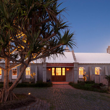
An American couple with a large extended family were regular visitors to Bermuda and actively seeking a Bermuda home when they found Castle Point. Well known for its prominent Castle Folly overlooking Castle Harbour, the property featured an abandoned main house, a guest cottage, ancillary buildings, and an excavated lot. It had become overgrown and had seen little maintenance since the mid-1980s.
Their dream was to work with architects to design a flexible retreat—one that could be intimate when it was just the two of them, but also functional for hosting the entire family and guests. OBMI was challenged to enhance the property and its poetic yet rugged beauty. Only two of the eight acres were available for residential development, requiring careful analysis of our options. We designed a three-bedroom main house, two guest cottages, and a caretaker’s cottage that remained sympathetic to the surrounding landscape and left habitat for native birds and other species. The aesthetic follows classic Bermudian architecture using local materials and maximizing the legendary views.
 BBA Architects
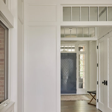
Situated along the perimeter of the property, this unique home creates a continuous street wall, both preserving plenty of open yard space and maintaining privacy from the prominent street corner. A one-story mudroom connects the garage to the house at the rear of the lot which required a local zoning variance. The resulting L-shaped plan and the central location of a glass-enclosed stair allow natural light to enter the home from multiple sides of nearly every room. The Arts & Crafts inspired detailing creates a familiar yet unique facade that is sympathetic to the character and scale of the neighborhood. A chevron pattern is a key design element on the window bays and doors and continues inside throughout the interior of the home.
2022 NAHB Platinum Best in American Living Award
View more of this home through #BBAModernCraftsman on Instagram.
 Accoya Wood
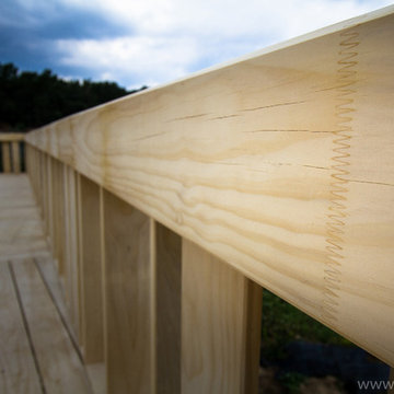
Designed by architect Alexandru Cristian, Accoya was recommended by distributor Tecade for use in the construction of the building, which needed to be aesthetically pleasing as well as highly durable in order to withstand the country’s extreme climate. Tecade recommended the use of Accoya to ensure that the building would sit sympathetically within its natural surroundings, while also maintaining its structural integrity against the harsh environment.
Originally Accoya was specified solely to construct the windows and the terrace. However, due to its aesthetic appeal, both the owner and the architect decided to use Accoya for all applications throughout the home including the façade, interior doors, indoor and outdoor furniture, terrace, garage door and railings. The architect specified 28mm by 150mm of Accoya for the outdoor terrace and constructed the terrace furniture using around 1 cubic meters of Accoya to build 3 tables and 36 chairs for external use. Tecade also crafted kitchen furniture, a TV stand, office desk and multiple bathroom cabinets from Accoya.
Photo Credit: Tecade
 Accoya Wood
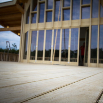
Designed by architect Alexandru Cristian, Accoya was recommended by distributor Tecade for use in the construction of the building, which needed to be aesthetically pleasing as well as highly durable in order to withstand the country’s extreme climate. Tecade recommended the use of Accoya to ensure that the building would sit sympathetically within its natural surroundings, while also maintaining its structural integrity against the harsh environment.
Originally Accoya was specified solely to construct the windows and the terrace. However, due to its aesthetic appeal, both the owner and the architect decided to use Accoya for all applications throughout the home including the façade, interior doors, indoor and outdoor furniture, terrace, garage door and railings. The architect specified 28mm by 150mm of Accoya for the outdoor terrace and constructed the terrace furniture using around 1 cubic meters of Accoya to build 3 tables and 36 chairs for external use. Tecade also crafted kitchen furniture, a TV stand, office desk and multiple bathroom cabinets from Accoya.
Photo Credit: Tecade
18