
Search results for "Sympathetic" in Home Design Ideas
 Ian McClelland Associates Ltd
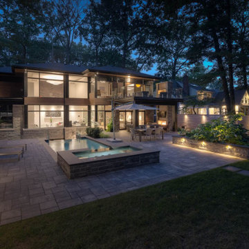
Set in the heavily treed neighbourhood of Minneola, this project was developed in a way to be sympathetic to its mature trees and woodland views. The negative-edge pool is predominantly viewed from inside the home, while the outdoor kitchen, fireplace and dinning are clearly for entertaining. The surrounding forest provides a rich backdrop and seclusion.
 Ian McClelland Associates Ltd
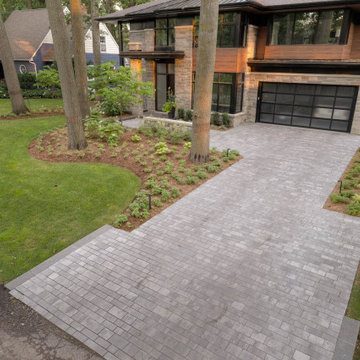
Set in the heavily treed neighbourhood of Minneola, this project was developed in a way to be sympathetic to its mature trees and woodland views. The negative-edge pool is predominantly viewed from inside the home, while the outdoor kitchen, fireplace and dinning are clearly for entertaining. The surrounding forest provides a rich backdrop and seclusion.
 Donald Lococo Architects
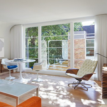
Designed in 1970 for an art collector, the existing referenced 70’s architectural principles. With its cadence of ‘70’s brick masses punctuated by a garage and a 4-foot-deep entrance recess. This recess, however, didn’t convey to the interior, which was occupied by disjointed service spaces. To solve, service spaces are moved and reorganized in open void in the garage. (See plan) This also organized the home: Service & utility on the left, reception central, and communal living spaces on the right.
To maintain clarity of the simple one-story 70’s composition, the second story add is recessive. A flex-studio/extra bedroom and office are designed ensuite creating a slender form and orienting them front to back and setting it back allows the add recede. Curves create a definite departure from the 70s home and by detailing it to "hover like a thought" above the first-floor roof and mentally removable sympathetic add.Existing unrelenting interior walls and a windowless entry, although ideal for fine art was unconducive for the young family of three. Added glass at the front recess welcomes light view and the removal of interior walls not only liberate rooms to communicate with each other but also reinform the cleared central entry space as a hub.
Even though the renovation reinforms its relationship with art, the joy and appreciation of art was not dismissed. A metal sculpture lost in the corner of the south side yard bumps the sculpture at the front entrance to the kitchen terrace over an added pedestal. (See plans) Since the roof couldn’t be railed without compromising the one-story '70s composition, the sculpture garden remains physically inaccessible however mirrors flanking the chimney allow the sculptures to be appreciated in three dimensions. The mirrors also afford privacy from the adjacent Tudor's large master bedroom addition 16-feet away.
Find the right local pro for your project
 Thomas J. Pearson, Inc.
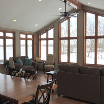
This 24’ by 22’ addition opens up the kitchen space with an additional room which the kitchen connects to. The newly constructed space serves as a living room/sunroom.
To do this, we tore down the kitchen wall and built a temporary plywood wall to keep the space closed off from the new construction. The new structure was framed and the roof was shingled. To allow for the roof line, new window openings were built and new windows were purchased to meet current egress requirements. The double door that initially went to the exterior was transformed into an 8’ tall opening. The kitchen window at the sink was taken out and now has a wood jamb opening with a granite countertop for a bar where people can sit and watch the cooks at work.
Inside the addition we created some additional cabinet space for another serving area. The cabinetry was framed to fit a beverage cooler. The floor in the addition matches the existing hand scraped wood floor in the kitchen. One particular challenge we faced in the addition was ensuring that the floor elevation for the new addition lined perfectly so that it was seamless.
On the exterior we installed a new cultured ledge stone and a real limestone sill with actual rock face to provide a natural appearance. The stone steps on each of the entryways into the addition have a similar look. The radius steps contain the rock face feature as well. Large windows were installed which match the pitch of the existing roof. The siding on the new structure is sympathetic to the siding on the home. We also installed new state of the art skylights that shut themselves when it rains.
 Penza Bailey Architects
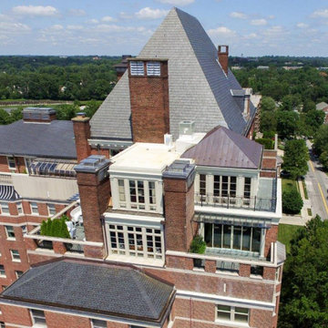
Penza Bailey Architects designed this extensive renovation and addition of a two-story penthouse in an iconic Beaux Arts condominium in Baltimore for clients they have been working with for over 3 decades.
The project was highly complex as it not only involved complete demolition of the interior spaces, but considerable demolition and new construction on the exterior of the building.
A two-story addition was designed to contrast the existing symmetrical brick building, yet used materials sympathetic to the original structure. The design takes full advantage of views of downtown Baltimore from grand living spaces and four new private terraces carved into the additions. The firm worked closely with the condominium management, contractors and sub-contractors due to the highly technical and complex requirements of adding onto the 12th and 13th stories of an existing building.
 Habitation Solutions
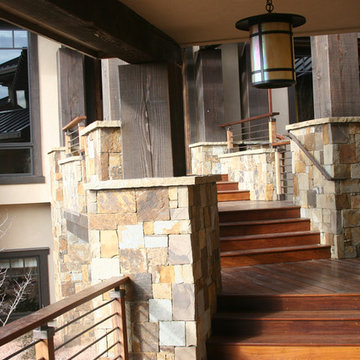
The customers wanted a retirement home that would accommodate guests. Several design options were presented that took advantage of the site features and views, while accommodating guests and preserving the owner’s privacy.
This home was nestled into a hilly site bisected by a large drainage swale. A bridge crossing the drainage swale unified the two halves of the home and provided a dramatic entry. All of the owners’ main living spaces were on one level, and two guest suites were provided in different parts of the home away from the owners’ living area. The design of the home captures the wonderful views from most living areas. The landscaping, shape, form, and materials—stone, stucco, heavy timbering, and a metal roof—offer protection from the desert sun but remain sympathetic to the surrounding environment. Work completed while at SBA.
 Gertler & Wente Architects
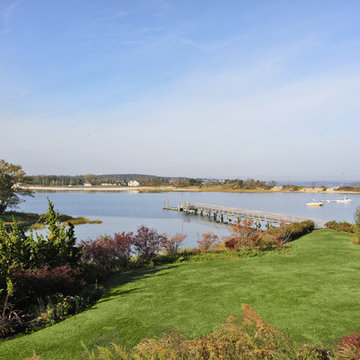
Gertler & Wente Architects was hired to design this 12,000 s.f. residence for a family of five. It is situated, facing west, on Oyster Bay with views of Long Island Sound, Oyster Bay Harbor and Oyster Bay beach. The house was designed to be sympathetic to its context and the history of north shore residences. A range of outdoor terraces, porches, and structures extends the living area of the house into the landscape. The building is mostly steel frame construction.
Photography by Edberg Marketing and Tony Calarco
 Thomas J. Pearson, Inc.
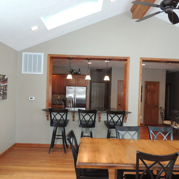
This 24’ by 22’ addition opens up the kitchen space with an additional room which the kitchen connects to. The newly constructed space serves as a living room/sunroom.
To do this, we tore down the kitchen wall and built a temporary plywood wall to keep the space closed off from the new construction. The new structure was framed and the roof was shingled. To allow for the roof line, new window openings were built and new windows were purchased to meet current egress requirements. The double door that initially went to the exterior was transformed into an 8’ tall opening. The kitchen window at the sink was taken out and now has a wood jamb opening with a granite countertop for a bar where people can sit and watch the cooks at work.
Inside the addition we created some additional cabinet space for another serving area. The cabinetry was framed to fit a beverage cooler. The floor in the addition matches the existing hand scraped wood floor in the kitchen. One particular challenge we faced in the addition was ensuring that the floor elevation for the new addition lined perfectly so that it was seamless.
On the exterior we installed a new cultured ledge stone and a real limestone sill with actual rock face to provide a natural appearance. The stone steps on each of the entryways into the addition have a similar look. The radius steps contain the rock face feature as well. Large windows were installed which match the pitch of the existing roof. The siding on the new structure is sympathetic to the siding on the home. We also installed new state of the art skylights that shut themselves when it rains.
 Thomas J. Pearson, Inc.
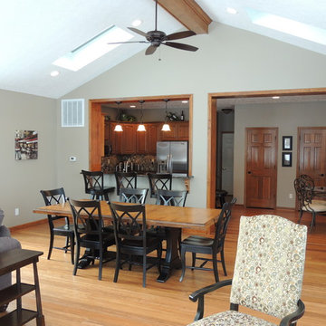
This 24’ by 22’ addition opens up the kitchen space with an additional room which the kitchen connects to. The newly constructed space serves as a living room/sunroom.
To do this, we tore down the kitchen wall and built a temporary plywood wall to keep the space closed off from the new construction. The new structure was framed and the roof was shingled. To allow for the roof line, new window openings were built and new windows were purchased to meet current egress requirements. The double door that initially went to the exterior was transformed into an 8’ tall opening. The kitchen window at the sink was taken out and now has a wood jamb opening with a granite countertop for a bar where people can sit and watch the cooks at work.
Inside the addition we created some additional cabinet space for another serving area. The cabinetry was framed to fit a beverage cooler. The floor in the addition matches the existing hand scraped wood floor in the kitchen. One particular challenge we faced in the addition was ensuring that the floor elevation for the new addition lined perfectly so that it was seamless.
On the exterior we installed a new cultured ledge stone and a real limestone sill with actual rock face to provide a natural appearance. The stone steps on each of the entryways into the addition have a similar look. The radius steps contain the rock face feature as well. Large windows were installed which match the pitch of the existing roof. The siding on the new structure is sympathetic to the siding on the home. We also installed new state of the art skylights that shut themselves when it rains.
 Thomas J. Pearson, Inc.
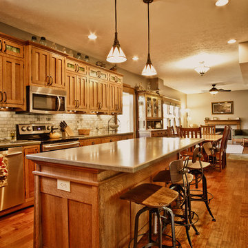
In this project, the client wanted to make an arts and crafts themed first floor. First, walls were torn down to open up the space. To carry the arts and crafts theme throughout the first floor quarter sawn cabinets and a hand-scraped wood floors were installed in the kitchen, new arts and crafts columns were added between the kitchen and family room, and doors and trim sympathetic to the rest of the theme were replaced in each room. The staircase was also completely redone with new null posts, balusters, skirt boards, and risers.
Thomas J. Pearson, Inc.
Bird & Branch Photography
 Thomas J. Pearson, Inc.
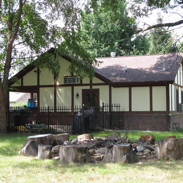
With this pool home renovation and addition we removed the existing flooring, drywall, insulation, cabinetry, and electrical. After demolition there were only the existing wall structures for the interior. We then added on to the pool home to the west and south to make the space nearly three times as large. The space included a full-size kitchen with appliances, a large family room, a full bathroom, and a full bedroom. The kitchen of the pool home contained maple cabinets, granite countertops, and a tile floor. We also ensured that the addition’s exterior remained sympathetic and blended harmoniously to the existing structure. Thomas J. Pearson, Inc.
 Donald Lococo Architects
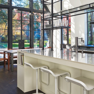
Subsequent additions are covered with living green walls to deemphasize stylistic conflicts imposed on a 1940’s Tudor and become backdrop surrounding a kitchen addition. On the interior, further added architectural inconsistencies are edited away, and the language of the Tudor’s original reclaimed integrity is referenced for the addition. Sympathetic to the home, windows and doors remain untrimmed and stark plaster walls contrast the original black metal windows. Sharp black elements contrast fields of white. With a ceiling pitch matching the existing and chiseled dormers, a stark ceiling hovers over the kitchen space referencing the existing homes plaster walls. Grid members in windows and on saw scored paneled walls and cabinetry mirror the machine age windows as do exposed steel beams. The exaggerated white field is pierced by an equally exaggerated 13 foot black steel tower that references the existing homes steel door and window members. Glass shelves in the tower further the window parallel. Even though it held enough dinner and glassware for eight, its thin members and transparent shelves defy its massive nature, allow light to flow through it and afford the kitchen open views and the feeling of continuous space. The full glass at the end of the kitchen reveres a grouping of 50 year old Hemlocks. At the opposite end, a window close to the peak looks up to a green roof.
 Penza Bailey Architects
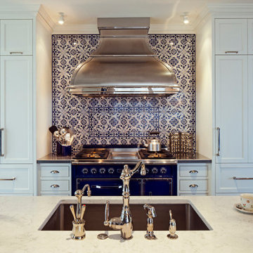
Penza Bailey Architects designed this extensive renovation and addition of a two-story penthouse in an iconic Beaux Arts condominium in Baltimore for clients they have been working with for over 3 decades.
The project was highly complex as it not only involved complete demolition of the interior spaces, but considerable demolition and new construction on the exterior of the building.
A two-story addition was designed to contrast the existing symmetrical brick building, yet used materials sympathetic to the original structure. The design takes full advantage of views of downtown Baltimore from grand living spaces and four new private terraces carved into the additions. The firm worked closely with the condominium management, contractors and sub-contractors due to the highly technical and complex requirements of adding onto the 12th and 13th stories of an existing building.
Appliances: Sub Zero Refrigerator and refrigerator drawers, Viking Range, Buest Hood, Fisher Paykel dishwashers
Plumbing fixtures: Franke, Waterworks, Kohler, Newport Brass, Graff
 Sheldon Richard Kostelecky Architect
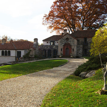
View showing circular entry drive, with crushed gravel, leading both to the front entry door of the original 1930s house and down to the new addition's garage, below the gourmet kitchen above (the three arched windows in the stucco).
 Tim Andersen Architect
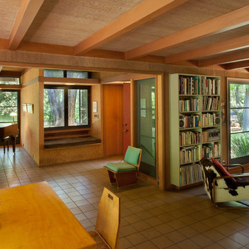
New entry is in addition. There is a four foot wide link between original house and addition with full height windows at both ends. Built-in bench contains a drawer for firewood that can be loaded from outside. Scott Mayoral photo
 Building Designers Association of Australia
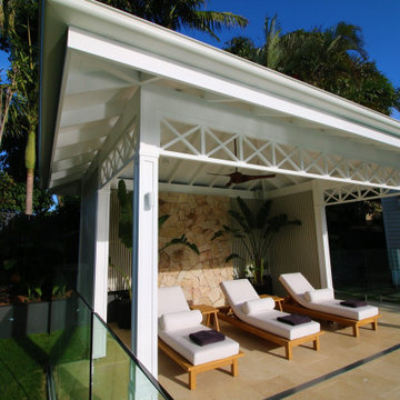
HAWTHORNE HAMPTONS The Hawthorne House is a fusion between the Classic Queenslander and Hampton style home. The Harmony between the 2-style work well together and we had to be sympathetic to the existing pre-1946 character home. The street scape had to be fused together between old and new so the house read as one and would stand the test of time. The clients brief was to make the house more functional for the family with more space and usable areas that connected all spaces to the outdoors. The lower rooms still had to capture natural light and breeze but have a connection to the outdoor courtyard area. The current house lacked views of the Brisbane city so the key for the design was to enhance the city views from the upstairs living areas with large doors and windows that framed the city. The client particular wanted WOW features in the house. Upon arriving at the entrance, a large void/Entrance carries your attention up through the house with the stunning coffered ceilings and wainscoting drawings your eyes to the upper floors. The 1st floor was all about connecting the living areas together while enjoying the amazing Brisbane city views. The heart of the house is the Kitchen that connects the indoors and outdoors together. Outdoors is where the family can enjoy their summer days around the pool area.Hawthorne House is a truly stunning house with Hampton details that make this house a truly enjoyable house to live in.
 Allen Ross Architecture, LLC
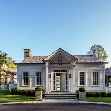
Allen Ross Architecture was hired to design a new retreat center that includes a multi-purpose Party Barn with a 3/4 basketball court, guest house, pool, sports field, tennis court, adventure course, outdoor kitchen, and changing cabana. Careful thought was given to the component relationships and how one moves through the site. Elements were configured to address function, aesthetics, security, and safety. Code mandated pool enclosure requirements were met without blocking views and without enclosure fencing.
Adjacent wetlands, storm water management requirements, and multiple zoning limitations necessitated thoughtful permitting applications. Zoning Board of Appeals and Planning Board approvals were required. Extensive infrastructure improvements and property grading were needed to meet the regulatory and client program requirements.
The design intent was a crisp transitional style that is sympathetic with the Georgian buildings located elsewhere on the site. Timber trusses support the guest house roof and steel moment frames support the barn roof.
 Donald Lococo Architects
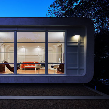
Designed in 1970 for an art collector, the existing referenced 70’s architectural principles. With its cadence of ‘70’s brick masses punctuated by a garage and a 4-foot-deep entrance recess. This recess, however, didn’t convey to the interior, which was occupied by disjointed service spaces. To solve, service spaces are moved and reorganized in open void in the garage. (See plan) This also organized the home: Service & utility on the left, reception central, and communal living spaces on the right.
To maintain clarity of the simple one-story 70’s composition, the second story add is recessive. A flex-studio/extra bedroom and office are designed ensuite creating a slender form and orienting them front to back and setting it back allows the add recede. Curves create a definite departure from the 70s home and by detailing it to "hover like a thought" above the first-floor roof and mentally removable sympathetic add.Existing unrelenting interior walls and a windowless entry, although ideal for fine art was unconducive for the young family of three. Added glass at the front recess welcomes light view and the removal of interior walls not only liberate rooms to communicate with each other but also reinform the cleared central entry space as a hub.
Even though the renovation reinforms its relationship with art, the joy and appreciation of art was not dismissed. A metal sculpture lost in the corner of the south side yard bumps the sculpture at the front entrance to the kitchen terrace over an added pedestal. (See plans) Since the roof couldn’t be railed without compromising the one-story '70s composition, the sculpture garden remains physically inaccessible however mirrors flanking the chimney allow the sculptures to be appreciated in three dimensions. The mirrors also afford privacy from the adjacent Tudor's large master bedroom addition 16-feet away.
 Thomas J. Pearson, Inc.
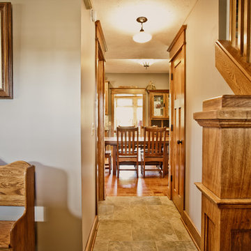
In this project, the client wanted to make an arts and crafts themed first floor. First, walls were torn down to open up the space. To carry the arts and crafts theme throughout the first floor quarter sawn cabinets and a hand-scraped wood floors were installed in the kitchen, new arts and crafts columns were added between the kitchen and family room, and doors and trim sympathetic to the rest of the theme were replaced in each room. The staircase was also completely redone with new null posts, balusters, skirt boards, and risers.
Thomas J. Pearson, Inc.
Bird & Branch Photography
 Building Designers Association of Australia
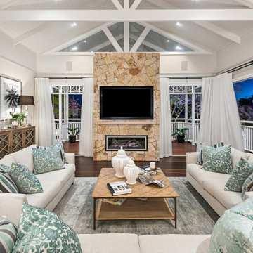
HAWTHORNE HAMPTONS The Hawthorne House is a fusion between the Classic Queenslander and Hampton style home. The Harmony between the 2-style work well together and we had to be sympathetic to the existing pre-1946 character home. The street scape had to be fused together between old and new so the house read as one and would stand the test of time. The clients brief was to make the house more functional for the family with more space and usable areas that connected all spaces to the outdoors. The lower rooms still had to capture natural light and breeze but have a connection to the outdoor courtyard area. The current house lacked views of the Brisbane city so the key for the design was to enhance the city views from the upstairs living areas with large doors and windows that framed the city. The client particular wanted WOW features in the house. Upon arriving at the entrance, a large void/Entrance carries your attention up through the house with the stunning coffered ceilings and wainscoting drawings your eyes to the upper floors. The 1st floor was all about connecting the living areas together while enjoying the amazing Brisbane city views. The heart of the house is the Kitchen that connects the indoors and outdoors together. Outdoors is where the family can enjoy their summer days around the pool area.Hawthorne House is a truly stunning house with Hampton details that make this house a truly enjoyable house to live in.
20