
Search results for "Sympathetic" in Home Design Ideas
 Thomas J. Pearson, Inc.
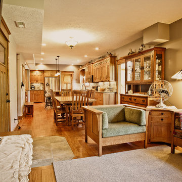
In this project, the client wanted to make an arts and crafts themed first floor. First, walls were torn down to open up the space. To carry the arts and crafts theme throughout the first floor quarter sawn cabinets and a hand-scraped wood floors were installed in the kitchen, new arts and crafts columns were added between the kitchen and family room, and doors and trim sympathetic to the rest of the theme were replaced in each room. The staircase was also completely redone with new null posts, balusters, skirt boards, and risers.
Thomas J. Pearson, Inc.
Bird & Branch Photography
 JRML Associates, Inc.
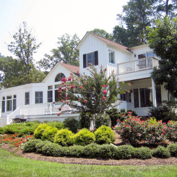
This project consisted of additions and interior renovations to a 1930's waterfront summer cottage. The client’s asked us to maximize water views and advance modern needs, while remaining sympathetic to the home's historic fabric and serene setting. The broad scope of work ranged from enlarging the existing kitchen and dining area to a second floor addition that featured a master bedroom, bath and large walk-on closet with flanking bookcases accessed from the hallway. Craftsman detailing was consistent throughout, including replicating the existing interior millwork and board and batten siding. To save the living area’s existing wall paneling, the second-floor joist system was supported on steel columns, finished to resemble pilasters. JRML provided the interior and exterior design, finish specifications, lighting design and decorating.
 Katie Hutchison Studio
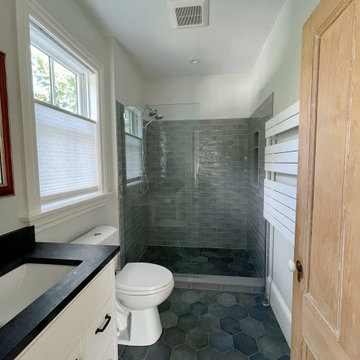
This project for a builder husband and interior-designer wife involved adding onto and restoring the luster of a c. 1883 Carpenter Gothic cottage in Barrington that they had occupied for years while raising their two sons. They were ready to ditch their small tacked-on kitchen that was mostly isolated from the rest of the house, views/daylight, as well as the yard, and replace it with something more generous, brighter, and more open that would improve flow inside and out. They were also eager for a better mudroom, new first-floor 3/4 bath, new basement stair, and a new second-floor master suite above.
The design challenge was to conceive of an addition and renovations that would be in balanced conversation with the original house without dwarfing or competing with it. The new cross-gable addition echoes the original house form, at a somewhat smaller scale and with a simplified more contemporary exterior treatment that is sympathetic to the old house but clearly differentiated from it.
Renovations included the removal of replacement vinyl windows by others and the installation of new Pella black clad windows in the original house, a new dormer in one of the son’s bedrooms, and in the addition. At the first-floor interior intersection between the existing house and the addition, two new large openings enhance flow and access to daylight/view and are outfitted with pairs of salvaged oversized clear-finished wooden barn-slider doors that lend character and visual warmth.
A new exterior deck off the kitchen addition leads to a new enlarged backyard patio that is also accessible from the new full basement directly below the addition.
(Interior fit-out and interior finishes/fixtures by the Owners)
Find the right local pro for your project
 Doug Walter Architect
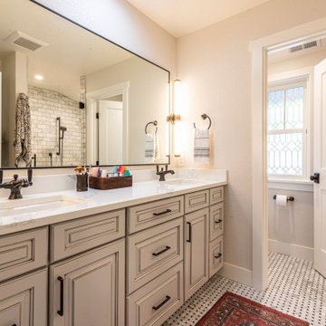
Owners bath with Solatube daylight device over counter. Water closet beyond, and large shower opposite Heated marble floors
Inspiration for a mid-sized craftsman master white tile and marble tile marble floor and double-sink double shower remodel in Denver with raised-panel cabinets, distressed cabinets, a one-piece toilet, gray walls, an undermount sink, quartz countertops, a hinged shower door, white countertops and a built-in vanity
Inspiration for a mid-sized craftsman master white tile and marble tile marble floor and double-sink double shower remodel in Denver with raised-panel cabinets, distressed cabinets, a one-piece toilet, gray walls, an undermount sink, quartz countertops, a hinged shower door, white countertops and a built-in vanity
 Brush & Trowel, LLC
 https://brush-trowel.shoplightspeed.com/all-white-no-2005.html
A totally pure white
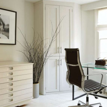
All White is exactly what it says! Unusually, it contains no other pigment except for white, creating the softest most sympathetic colour without the colder blue undertones of a brilliant white. One of our Contemporary Neutrals, All White pairs seamlessly with Skimming Stone and Strong White for a warm scheme with a slight edge. For a clean and almost graphic finish, contrast with fresh, strong tones like Pitch Black and St Giles Blue.

 Proctor Watts Cole Rutter
Extension, whole house refurbishment and barn conversion for a private client in Dorset. An inefficient and outdated farm house has been transformed into a low energy, modern family home. With sympathetic extensions as well as conversions of existing redundant out buildings, bringing them into use as part of the dwelling
 Gertler & Wente Architects
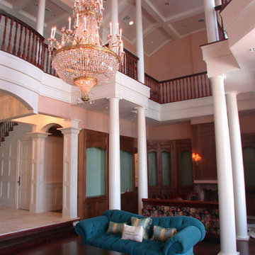
Gertler & Wente Architects was hired to design this 12,000 s.f. residence for a family of five. It is situated, facing west, on Oyster Bay with views of Long Island Sound, Oyster Bay Harbor and Oyster Bay beach. The house was designed to be sympathetic to its context and the history of north shore residences. A range of outdoor terraces, porches, and structures extends the living area of the house into the landscape. The building is mostly steel frame construction.
Photography by Edberg Marketing and Tony Calarco
 BBA Architects
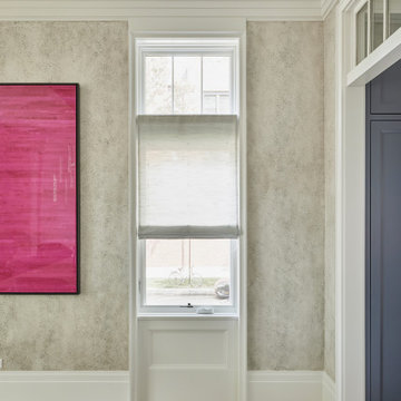
Situated along the perimeter of the property, this unique home creates a continuous street wall, both preserving plenty of open yard space and maintaining privacy from the prominent street corner. A one-story mudroom connects the garage to the house at the rear of the lot which required a local zoning variance. The resulting L-shaped plan and the central location of a glass-enclosed stair allow natural light to enter the home from multiple sides of nearly every room. The Arts & Crafts inspired detailing creates a familiar yet unique facade that is sympathetic to the character and scale of the neighborhood. A chevron pattern is a key design element on the window bays and doors and continues inside throughout the interior of the home.
2022 NAHB Platinum Best in American Living Award
View more of this home through #BBAModernCraftsman on Instagram.
 Donald Lococo Architects
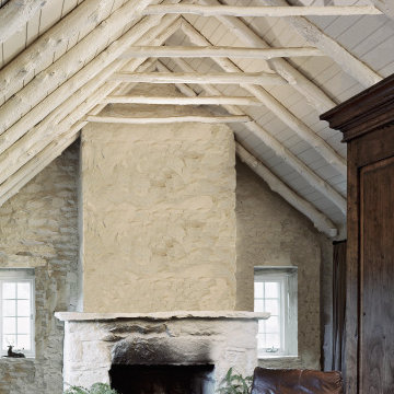
©️Maxwell MacKenzie THE HOME, ESSENTIALLY A RUIN WAS PRESERVED THROUGH NEGLECT. A CLARIFIED HISTORIC RENOVATION REMOVES BAY WINDOWS AND 1950’S WINDOWS FROM THE MAIN FAÇADE. TWO WINGS AND A THIRD FLOOR AND A SYMPATHETIC STAIRWAY ACCOMMODATE MODERN LIFE. MASONS WERE TASKED TO MAKE THE STONE WORK LOOK AS THOUGH “A FARMER BUILT THE WALLS DURING THE NON-PLANTING SEASON,” THE FINAL DESIGN SIMPLIFIES THE FIRST FLOOR PLAN AND LEAVES LOGICAL LOCATIONS FOR EXPANSION INTO COMING DECADES. AMONG OTHER AWARDS, THIS TRADITIONAL YET HISTORIC RENOVATION LOCATED IN MIDDLEBURG, VA HAS RECEIVED 2 AWARDS FROM THE AMERICAN INSTITUTE OF ARCHITECTURE.. AND A NATIONAL PRIVATE AWARD FROM VETTE WINDOWS
WASHINGTON DC ARCHITECT DONALD LOCOCO UPDATED THIS HISTORIC STONE HOUSE IN MIDDLEBURG, VA.lauded by the American Institute of Architects with an Award of Excellence for Historic Architecture, as well as an Award of Merit for Residential Architecture
 Morpurgo Architects
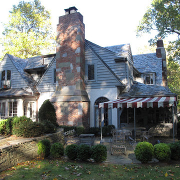
This Tudor house was built in the early 1930’s in a historic district that became known as the Cheelcroft Section of Hohokus. The characteristic features that distinguish these homes reflect the old world charm of stone facades, slate roofs and decorative half-timber and stucco siding.
Morpurgo Architects’ clients’ request for a Master Bedroom Suite, kitchen extension and ancillary areas resulted in our designing for their home sympathetic additions with complex roof intersections. We also created an accessory building that includes a 3-car garage with a media and entertainment room above. In keeping with the Tudor details of the main residence, this structure incorporates retrofitted steel windows and doors. The additions to the house and the plan for the garage fit seamlessly with this classic 80-year-old Tudor.
 DesignARC
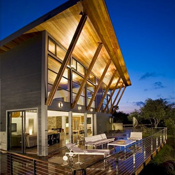
Falcon House is located on Falcon Ridge Road, which winds along a steeply inclined ridge in a stretch of foothills within Carmel Valley in Monterey County. An old lichen covered barn and split rail, cedar fences characterize this area known as Markham Ranch, and contrast sharply with the preponderance of sprawling, large estate-style homes, many more at-home in the Italian countryside than any landscape of California.
Designed for a young family, Falcon House responds to the family’s desire to live a more modest lifestyle, eschewing overt displays of extravagance for an intimate and deferential relation to nature.
The 3,200-square-foot residence occupies a difficult portion of the northern slope of a hillside, overlooking a verdant valley and oriented toward Castle Rock in the distance. The steep terrain necessitated a compartmentalized plan capable of negotiating the gentle hillock at the center of the site. A corridor bridge spans two pieces of the house, uniting living and sleeping spaces and allowing an existing watercourse to flow essentially through the house unobstructed.
Large panels of glass open the living spaces to the landscape, beneath the deep overhang of a butterfly roof. Operable clerestories placed high on the window-wall allow prevailing breezes to cool the interior spaces. The bedroom wing of the house hugs the hillside as it turns to the west, ensuring privacy from the main living spaces. The sense of seclusion and protection of this wing is reinforced by its lower roofline and its embedment into the hill.
Initial resistance by neighboring homeowners has given way to appreciation, having seen the results of careful siting and a material and color palate sympathetic to the surrounding hillsides. The dwelling embodies an attitude of respect for the landscape, and through that perspective Falcon House has become as natural a part of its environment as the hawks flying overhead.
2008 AIA Orange County Chapter Merit Award
 Building Designers Association of Australia
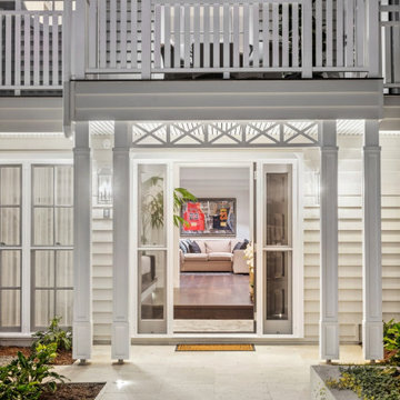
HAWTHORNE HAMPTONS The Hawthorne House is a fusion between the Classic Queenslander and Hampton style home. The Harmony between the 2-style work well together and we had to be sympathetic to the existing pre-1946 character home. The street scape had to be fused together between old and new so the house read as one and would stand the test of time. The clients brief was to make the house more functional for the family with more space and usable areas that connected all spaces to the outdoors. The lower rooms still had to capture natural light and breeze but have a connection to the outdoor courtyard area. The current house lacked views of the Brisbane city so the key for the design was to enhance the city views from the upstairs living areas with large doors and windows that framed the city. The client particular wanted WOW features in the house. Upon arriving at the entrance, a large void/Entrance carries your attention up through the house with the stunning coffered ceilings and wainscoting drawings your eyes to the upper floors. The 1st floor was all about connecting the living areas together while enjoying the amazing Brisbane city views. The heart of the house is the Kitchen that connects the indoors and outdoors together. Outdoors is where the family can enjoy their summer days around the pool area.Hawthorne House is a truly stunning house with Hampton details that make this house a truly enjoyable house to live in.
 Katie Hutchison Studio
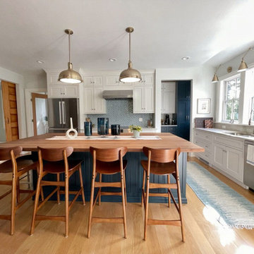
This project for a builder husband and interior-designer wife involved adding onto and restoring the luster of a c. 1883 Carpenter Gothic cottage in Barrington that they had occupied for years while raising their two sons. They were ready to ditch their small tacked-on kitchen that was mostly isolated from the rest of the house, views/daylight, as well as the yard, and replace it with something more generous, brighter, and more open that would improve flow inside and out. They were also eager for a better mudroom, new first-floor 3/4 bath, new basement stair, and a new second-floor master suite above.
The design challenge was to conceive of an addition and renovations that would be in balanced conversation with the original house without dwarfing or competing with it. The new cross-gable addition echoes the original house form, at a somewhat smaller scale and with a simplified more contemporary exterior treatment that is sympathetic to the old house but clearly differentiated from it.
Renovations included the removal of replacement vinyl windows by others and the installation of new Pella black clad windows in the original house, a new dormer in one of the son’s bedrooms, and in the addition. At the first-floor interior intersection between the existing house and the addition, two new large openings enhance flow and access to daylight/view and are outfitted with pairs of salvaged oversized clear-finished wooden barn-slider doors that lend character and visual warmth.
A new exterior deck off the kitchen addition leads to a new enlarged backyard patio that is also accessible from the new full basement directly below the addition.
(Interior fit-out and interior finishes/fixtures by the Owners)
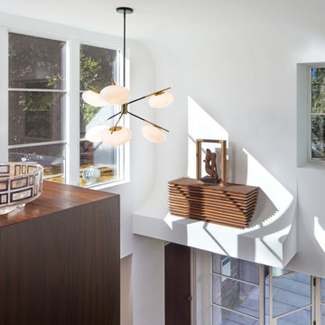 Donald Lococo Architects
Designed in 1970 for an art collector, the existing referenced 70’s architectural principles. With its cadence of ‘70’s brick masses punctuated by a garage and a 4-foot-deep entrance recess. This recess, however, didn’t convey to the interior, which was occupied by disjointed service spaces. To solve, service spaces are moved and reorganized in open void in the garage. (See plan) This also organized the home: Service & utility on the left, reception central, and communal living spaces on the right.
To maintain clarity of the simple one-story 70’s composition, the second story add is recessive. A flex-studio/extra bedroom and office are designed ensuite creating a slender form and orienting them front to back and setting it back allows the add recede. Curves create a definite departure from the 70s home and by detailing it to "hover like a thought" above the first-floor roof and mentally removable sympathetic add.Existing unrelenting interior walls and a windowless entry, although ideal for fine art was unconducive for the young family of three. Added glass at the front recess welcomes light view and the removal of interior walls not only liberate rooms to communicate with each other but also reinform the cleared central entry space as a hub.
Even though the renovation reinforms its relationship with art, the joy and appreciation of art was not dismissed. A metal sculpture lost in the corner of the south side yard bumps the sculpture at the front entrance to the kitchen terrace over an added pedestal. (See plans) Since the roof couldn’t be railed without compromising the one-story '70s composition, the sculpture garden remains physically inaccessible however mirrors flanking the chimney allow the sculptures to be appreciated in three dimensions. The mirrors also afford privacy from the adjacent Tudor's large master bedroom addition 16-feet away.
 Ashlee O'Grady
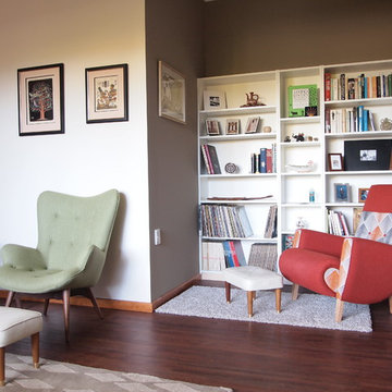
This lounge required updating to a more contemporary and light feel, whilst remaining sympathetic to the traditional furniture in the rest of the house. New timber flooring was laid, and yellow brick covered up with new plasterboard. An unused bar area was converted into a reading nook, helping the space feel more open and getting much more use out of it.
 Artscape Garden Associates Ltd
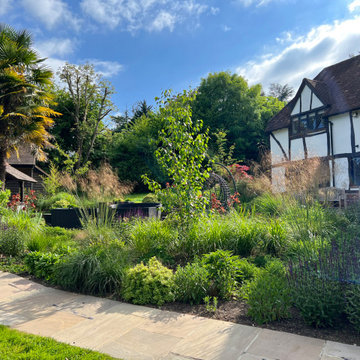
This paving and planting scheme features new hard landscaping elements and a new planting scheme. Artscape was initially briefed to extend and enhance the patio in the garden of a lovely home in the village of Cookham Dean in Berkshire. Our clients wanted to increase the size of the paved area so they could use it more frequently for relaxing and dining in the sun during the day. As well as increasing its size and practicality, they wanted the terrace to look and feel more inviting. The existing site was a mixture of brick paving, which was slippery underfoot, and tired concrete crazy paving. The patio also had stone retaining walls surrounded by sloped lawns and a few poorly maintained and mismatched shrubs.
Redesigned and repaved area
We first created a new, larger layout with a series of wider steps closer to the house, making a more inviting and welcoming area. Our landscapers paved the area with coursed sandstone, renowned for its incredible strength and durability. The earthy tones and unique texture of the sandstone gives it a natural timeless look which blends sympathetically with the garden setting. The worn finish of the paving also makes the surface safer to walk on. The edge of the paving curves in line from the end of the house to visually link the areas.
Bullnosed edges enhance looks and safety
Bullnosing provides the garden step edges with a smooth, luxury appearance, which also enhance safety. Safety is an important factor to consider when renovating or building new steps and paved areas. Smooth, rounded bullnosed steps or edges means there won’t be any harshly cut, sharp edges to injure someone should they trip or fall. Our Artscape paving experts can advise on the best bespoke, professionally profiled bullnose edges to suit the needs of your garden project.
Replacing sloped lawns with plants
Our initial brief was to create a new planted border just around the paved area. However, after various discussions and designs, our clients decided to follow our recommendation to expand the planting, so it included the whole sloping bank. The planting design also included the addition of small trees to create vertical interest.
New nature-friendly planting
The planting features an easy-to-maintain mix of perennials, grasses, and shrubs. This adds softness to the seating area and brings an everchanging display of flowers, foliage, textures and colours to the garden. The plants will attract more birds and butterflies to the garden, and will be beneficial for insects too.
The lawn was doing very little to support a diversity of insects and birds. Replacing even a small section of lawn with perennial flowers, shrubs, grasses, wildflowers, or groundcovers will benefit nature and wildlife. As well as supporting greater biodiversity, plants are more environmentally friendly than maintaining a lawn. Lawns are drought tolerant and will recover even if the grass has turned brown and patchy in a heatwave. But to keep the lawn looking lush, green, and beautiful in a hot, dry spell will require constant and wasteful watering.
The planting is informal and includes grasses, taking inspiration from the fields opposite. Ornamental grasses soften the scheme and bring movement to the garden as they shimmer in the slightest of breezes. Grasses are easy to grow and require little ongoing care. The main maintenance task is to cut the planting back in spring ready for the new growth to come through.
To keep the whole project within our client’s budget, we retained the existing walls, simply carrying out some small repairs and modifications where necessary. We were also able to add stunning new atmospheric lighting to the older existing lighting circuit to illuminate the area at night.
 Ian McClelland Associates Ltd
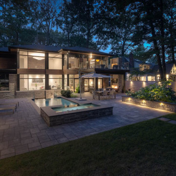
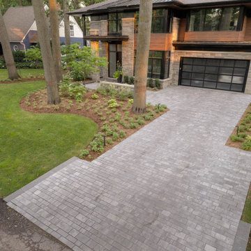
Set in the heavily treed neighbourhood of Minneola, this project was developed in a way to be sympathetic to its mature trees and woodland views. The negative-edge pool is predominantly viewed from inside the home, while the outdoor kitchen, fireplace and dinning are clearly for entertaining. The surrounding forest provides a rich backdrop and seclusion.
 Ian McClelland Associates Ltd
Set in the heavily treed neighbourhood of Minneola, this project was developed in a way to be sympathetic to its mature trees and woodland views. The negative-edge pool is predominantly viewed from inside the home, while the outdoor kitchen, fireplace and dinning are clearly for entertaining. The surrounding forest provides a rich backdrop and seclusion.
 Donald Lococo Architects
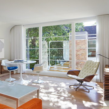
Designed in 1970 for an art collector, the existing referenced 70’s architectural principles. With its cadence of ‘70’s brick masses punctuated by a garage and a 4-foot-deep entrance recess. This recess, however, didn’t convey to the interior, which was occupied by disjointed service spaces. To solve, service spaces are moved and reorganized in open void in the garage. (See plan) This also organized the home: Service & utility on the left, reception central, and communal living spaces on the right.
To maintain clarity of the simple one-story 70’s composition, the second story add is recessive. A flex-studio/extra bedroom and office are designed ensuite creating a slender form and orienting them front to back and setting it back allows the add recede. Curves create a definite departure from the 70s home and by detailing it to "hover like a thought" above the first-floor roof and mentally removable sympathetic add.Existing unrelenting interior walls and a windowless entry, although ideal for fine art was unconducive for the young family of three. Added glass at the front recess welcomes light view and the removal of interior walls not only liberate rooms to communicate with each other but also reinform the cleared central entry space as a hub.
Even though the renovation reinforms its relationship with art, the joy and appreciation of art was not dismissed. A metal sculpture lost in the corner of the south side yard bumps the sculpture at the front entrance to the kitchen terrace over an added pedestal. (See plans) Since the roof couldn’t be railed without compromising the one-story '70s composition, the sculpture garden remains physically inaccessible however mirrors flanking the chimney allow the sculptures to be appreciated in three dimensions. The mirrors also afford privacy from the adjacent Tudor's large master bedroom addition 16-feet away.
 Thomas J. Pearson, Inc.
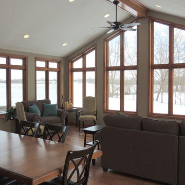
This 24’ by 22’ addition opens up the kitchen space with an additional room which the kitchen connects to. The newly constructed space serves as a living room/sunroom.
To do this, we tore down the kitchen wall and built a temporary plywood wall to keep the space closed off from the new construction. The new structure was framed and the roof was shingled. To allow for the roof line, new window openings were built and new windows were purchased to meet current egress requirements. The double door that initially went to the exterior was transformed into an 8’ tall opening. The kitchen window at the sink was taken out and now has a wood jamb opening with a granite countertop for a bar where people can sit and watch the cooks at work.
Inside the addition we created some additional cabinet space for another serving area. The cabinetry was framed to fit a beverage cooler. The floor in the addition matches the existing hand scraped wood floor in the kitchen. One particular challenge we faced in the addition was ensuring that the floor elevation for the new addition lined perfectly so that it was seamless.
On the exterior we installed a new cultured ledge stone and a real limestone sill with actual rock face to provide a natural appearance. The stone steps on each of the entryways into the addition have a similar look. The radius steps contain the rock face feature as well. Large windows were installed which match the pitch of the existing roof. The siding on the new structure is sympathetic to the siding on the home. We also installed new state of the art skylights that shut themselves when it rains.
24