
Search results for "Sympathetic" in Home Design Ideas
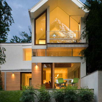
 Meditch Murphey Architects
maxwell mackenzie
Contemporary two-story mixed siding exterior home idea in DC Metro
Contemporary two-story mixed siding exterior home idea in DC Metro
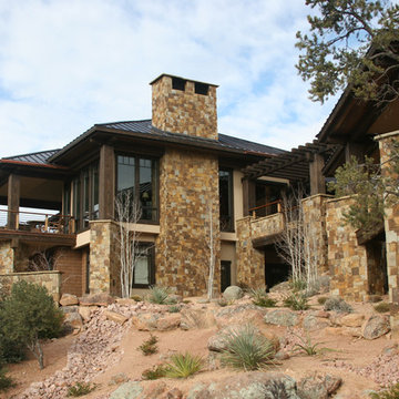
 Habitation Solutions
The customers wanted a retirement home that would accommodate guests. Several design options were presented that took advantage of the site features and views, while accommodating guests and preserving the owner’s privacy.
This home was nestled into a hilly site bisected by a large drainage swale. A bridge crossing the drainage swale unified the two halves of the home and provided a dramatic entry. All of the owners’ main living spaces were on one level, and two guest suites were provided in different parts of the home away from the owners’ living area. The design of the home captures the wonderful views from most living areas. The landscaping, shape, form, and materials—stone, stucco, heavy timbering, and a metal roof—offer protection from the desert sun but remain sympathetic to the surrounding environment. Work completed while at SBA.
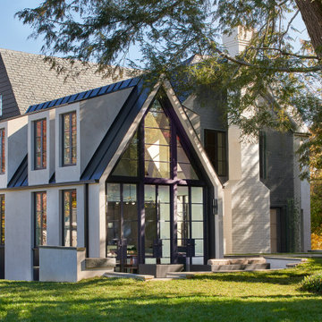
 Donald Lococo Architects
Subsequent additions are covered with living green walls to deemphasize stylistic conflicts imposed on a 1940’s Tudor and become backdrop surrounding a kitchen addition. On the interior, further added architectural inconsistencies are edited away, and the language of the Tudor’s original reclaimed integrity is referenced for the addition. Sympathetic to the home, windows and doors remain untrimmed and stark plaster walls contrast the original black metal windows. Sharp black elements contrast fields of white. With a ceiling pitch matching the existing and chiseled dormers, a stark ceiling hovers over the kitchen space referencing the existing homes plaster walls. Grid members in windows and on saw scored paneled walls and cabinetry mirror the machine age windows as do exposed steel beams. The exaggerated white field is pierced by an equally exaggerated 13 foot black steel tower that references the existing homes steel door and window members. Glass shelves in the tower further the window parallel. Even though it held enough dinner and glassware for eight, its thin members and transparent shelves defy its massive nature, allow light to flow through it and afford the kitchen open views and the feeling of continuous space. The full glass at the end of the kitchen reveres a grouping of 50 year old Hemlocks. At the opposite end, a window close to the peak looks up to a green roof.
Find the right local pro for your project
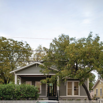
 Charles Di Piazza Architecture
Located in the Heritage Neighborhood of Austin, TX, it was important for the Architecture to maintain the scale and material of the original 1920-era cottage, and for the landscape work to remain sympathetic to the neighboring houses.
 Donald Lococo Architects
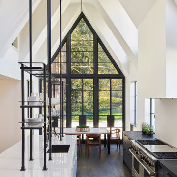
Subsequent additions are covered with living green walls to deemphasize stylistic conflicts imposed on a 1940’s Tudor and become backdrop surrounding a kitchen addition. On the interior, further added architectural inconsistencies are edited away, and the language of the Tudor’s original reclaimed integrity is referenced for the addition. Sympathetic to the home, windows and doors remain untrimmed and stark plaster walls contrast the original black metal windows. Sharp black elements contrast fields of white. With a ceiling pitch matching the existing and chiseled dormers, a stark ceiling hovers over the kitchen space referencing the existing homes plaster walls. Grid members in windows and on saw scored paneled walls and cabinetry mirror the machine age windows as do exposed steel beams. The exaggerated white field is pierced by an equally exaggerated 13 foot black steel tower that references the existing homes steel door and window members. Glass shelves in the tower further the window parallel. Even though it held enough dinner and glassware for eight, its thin members and transparent shelves defy its massive nature, allow light to flow through it and afford the kitchen open views and the feeling of continuous space. The full glass at the end of the kitchen reveres a grouping of 50 year old Hemlocks. At the opposite end, a window close to the peak looks up to a green roof.
 D. A. Dunlevy
Innovative design and smart planning create a lush, private outdoor space.
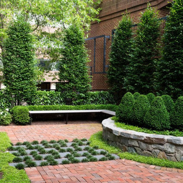
This client’s outdoor courtyard came with a number of interesting challenges—including limited access, structural hurdles, and existing landscape design. The D. A. Dunlevy team built a custom ramp to create ingress from the street, allowing us to bring in all of the materials and plantings.The courtyard has been transformed into a private, tucked-away place for the owners to relax with morning coffee, escape with a good book, or provide an overflow area for visiting guests. The design remained sympathetic to existing architecture and landscaping, utilizing black granite stepping stones and other elements to create cohesion. Clean lines were established with a modern custom bench and stone planter wall. The greenery was chosen to create a simple and structured feel, using narrow European Hornbeam trees for an aerial hedge and adding in boxwoods, nandina, hellebores, and creeping Jenny to round out the verdant, calming effect.
 Robert M. Cain, Architect
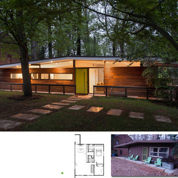
View from the street. Grade slopes dramatically away from the street. The rear of the site is heavily wooded. Entirely new facade below the existing roof creates an aesthetic sympathetic to the design roots of the house
 Gertler & Wente Architects
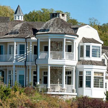
Gertler & Wente Architects was hired to design this 12,000 s.f. residence for a family of five. It is situated, facing west, on Oyster Bay with views of Long Island Sound, Oyster Bay Harbor and Oyster Bay beach. The house was designed to be sympathetic to its context and the history of north shore residences. A range of outdoor terraces, porches, and structures extends the living area of the house into the landscape. The building is mostly steel frame construction.
Photography by Edberg Marketing and Tony Calarco
 The Cultural Landscape Foundation
Saturday June 20, 10:30am to 12:00pm | Willistown
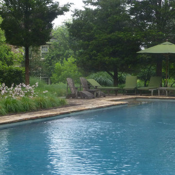
Willistown Country Estate by Allan Summers of Rodney Robinson Landscape Architects, Inc.
Situated on 40 acres, this estate is a harmonious composition of the regional vocabulary of the Brandywine Valley, from gentle hills of pastureland and wood lots, to stream valleys, stone walls, and fences. The landscape architects carefully placed the house and outbuildings, entry drive, fences, orchard, swimming pool, and gardens to take advantage of sunlight and the expansive views. The residence, designed by architect John Milner, is inspired by the vernacular fieldstone farmhouses that can be seen throughout the area. At the rear, a terrace and naturalized water feature transition between the house and elegant pool garden beyond. The lush plantings are designed in broad sweeps sympathetic to the scale of the surrounding landscape, juxtaposed against the garden with a more varied palette near the home’s entrance. Photo by Allan Summers
 DesignARC
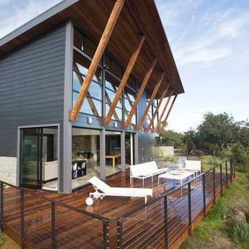
Falcon House is located on Falcon Ridge Road, which winds along a steeply inclined ridge in a stretch of foothills within Carmel Valley in Monterey County. An old lichen covered barn and split rail, cedar fences characterize this area known as Markham Ranch, and contrast sharply with the preponderance of sprawling, large estate-style homes, many more at-home in the Italian countryside than any landscape of California.
Designed for a young family, Falcon House responds to the family’s desire to live a more modest lifestyle, eschewing overt displays of extravagance for an intimate and deferential relation to nature.
The 3,200-square-foot residence occupies a difficult portion of the northern slope of a hillside, overlooking a verdant valley and oriented toward Castle Rock in the distance. The steep terrain necessitated a compartmentalized plan capable of negotiating the gentle hillock at the center of the site. A corridor bridge spans two pieces of the house, uniting living and sleeping spaces and allowing an existing watercourse to flow essentially through the house unobstructed.
Large panels of glass open the living spaces to the landscape, beneath the deep overhang of a butterfly roof. Operable clerestories placed high on the window-wall allow prevailing breezes to cool the interior spaces. The bedroom wing of the house hugs the hillside as it turns to the west, ensuring privacy from the main living spaces. The sense of seclusion and protection of this wing is reinforced by its lower roofline and its embedment into the hill.
Initial resistance by neighboring homeowners has given way to appreciation, having seen the results of careful siting and a material and color palate sympathetic to the surrounding hillsides. The dwelling embodies an attitude of respect for the landscape, and through that perspective Falcon House has become as natural a part of its environment as the hawks flying overhead.
2008 AIA Orange County Chapter Merit Award
 Thomas J. Pearson, Inc.
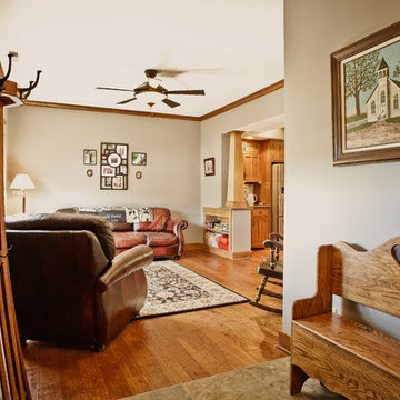
In this project, the client wanted to make an arts and crafts themed first floor. First, walls were torn down to open up the space. To carry the arts and crafts theme throughout the first floor quarter sawn cabinets and a hand-scraped wood floors were installed in the kitchen, new arts and crafts columns were added between the kitchen and family room, and doors and trim sympathetic to the rest of the theme were replaced in each room. The staircase was also completely redone with new null posts, balusters, skirt boards, and risers.
Thomas J. Pearson, Inc.
Bird & Branch Photography
 R G Architects
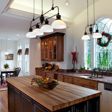
Along with the spatial requirements, major importance was placed upon creating an addition which would blend in suitably with the historic home, using sympathetic and harmonious materials.
The addition aligns the main workspace of the kitchen with the existing door leading from the original house and terminates with a Palladian window, while a vaulted barrel roof and ceiling celebrate the kitchen as the home’s new gathering space for friends and family. The curving bead board ceiling is up lit from fixtures mounted behind a traditional cornice, while traditional cabinetry in natural and painted finishes are topped by natural stone and wood counters. Traditional fixtures and reclaimed heart-pine plank flooring add both character and warmth to the rooms.
Joseph Mullan Photography
 Period Architecture Ltd.
Angle Eye Photography
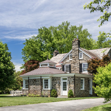
Example of a classic gray one-story stone exterior home design in Philadelphia with a hip roof
Example of a classic gray one-story stone exterior home design in Philadelphia with a hip roof
 Period Architecture Ltd.
Photography by Angle Eye Photography
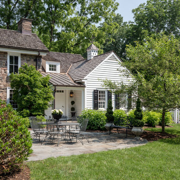
Mid-sized elegant brown two-story stone gable roof photo in Philadelphia
Mid-sized elegant brown two-story stone gable roof photo in Philadelphia
 Morpurgo Architects
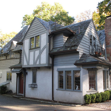
This Tudor house was built in the early 1930’s in a historic district that became known as the Cheelcroft Section of Hohokus. The characteristic features that distinguish these homes reflect the old world charm of stone facades, slate roofs and decorative half-timber and stucco siding.
Morpurgo Architects’ clients’ request for a Master Bedroom Suite, kitchen extension and ancillary areas resulted in our designing for their home sympathetic additions with complex roof intersections. We also created an accessory building that includes a 3-car garage with a media and entertainment room above. In keeping with the Tudor details of the main residence, this structure incorporates retrofitted steel windows and doors. The additions to the house and the plan for the garage fit seamlessly with this classic 80-year-old Tudor.
 B and W Builders
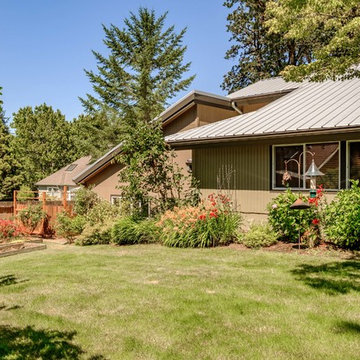
Inspiration for a huge mid-century modern split-level house exterior remodel in Portland with a metal roof
 Donald Lococo Architects
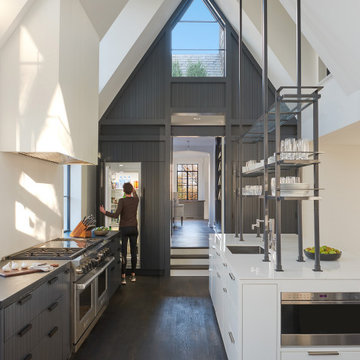
Subsequent additions are covered with living green walls to deemphasize stylistic conflicts imposed on a 1940’s Tudor and become backdrop surrounding a kitchen addition. On the interior, further added architectural inconsistencies are edited away, and the language of the Tudor’s original reclaimed integrity is referenced for the addition. Sympathetic to the home, windows and doors remain untrimmed and stark plaster walls contrast the original black metal windows. Sharp black elements contrast fields of white. With a ceiling pitch matching the existing and chiseled dormers, a stark ceiling hovers over the kitchen space referencing the existing homes plaster walls. Grid members in windows and on saw scored paneled walls and cabinetry mirror the machine age windows as do exposed steel beams. The exaggerated white field is pierced by an equally exaggerated 13 foot black steel tower that references the existing homes steel door and window members. Glass shelves in the tower further the window parallel. Even though it held enough dinner and glassware for eight, its thin members and transparent shelves defy its massive nature, allow light to flow through it and afford the kitchen open views and the feeling of continuous space. The full glass at the end of the kitchen reveres a grouping of 50 year old Hemlocks. At the opposite end, a window close to the peak looks up to a green roof.
 Donald Lococo Architects
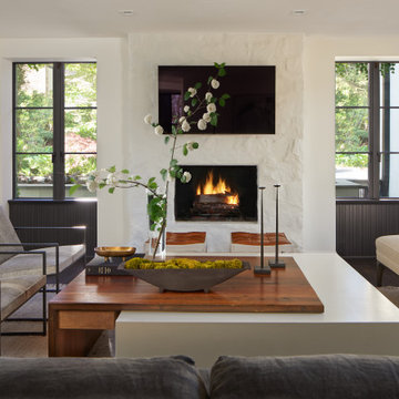
Subsequent additions are covered with living green walls to deemphasize stylistic conflicts imposed on a 1940’s Tudor and become backdrop surrounding a kitchen addition. On the interior, further added architectural inconsistencies are edited away, and the language of the Tudor’s original reclaimed integrity is referenced for the addition. Sympathetic to the home, windows and doors remain untrimmed and stark plaster walls contrast the original black metal windows. Sharp black elements contrast fields of white. With a ceiling pitch matching the existing and chiseled dormers, a stark ceiling hovers over the kitchen space referencing the existing homes plaster walls. Grid members in windows and on saw scored paneled walls and cabinetry mirror the machine age windows as do exposed steel beams. The exaggerated white field is pierced by an equally exaggerated 13 foot black steel tower that references the existing homes steel door and window members. Glass shelves in the tower further the window parallel. Even though it held enough dinner and glassware for eight, its thin members and transparent shelves defy its massive nature, allow light to flow through it and afford the kitchen open views and the feeling of continuous space. The full glass at the end of the kitchen reveres a grouping of 50 year old Hemlocks. At the opposite end, a window close to the peak looks up to a green roof.
 Donald Lococo Architects
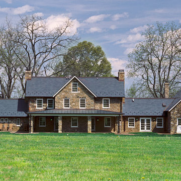
©️Maxwell MacKenzie THE HOME, ESSENTIALLY A RUIN WAS PRESERVED THROUGH NEGLECT. A CLARIFIED HISTORIC RENOVATION REMOVES BAY WINDOWS AND 1950’S WINDOWS FROM THE MAIN FAÇADE. TWO WINGS AND A THIRD FLOOR AND A SYMPATHETIC STAIRWAY ACCOMMODATE MODERN LIFE. MASONS WERE TASKED TO MAKE THE STONE WORK LOOK AS THOUGH “A FARMER BUILT THE WALLS DURING THE NON-PLANTING SEASON,” THE FINAL DESIGN SIMPLIFIES THE FIRST FLOOR PLAN AND LEAVES LOGICAL LOCATIONS FOR EXPANSION INTO COMING DECADES. AMONG OTHER AWARDS, THIS TRADITIONAL YET HISTORIC RENOVATION LOCATED IN MIDDLEBURG, VA HAS RECEIVED 2 AWARDS FROM THE AMERICAN INSTITUTE OF ARCHITECTURE.. AND A NATIONAL PRIVATE AWARD FROM VETTE WINDOWS
WASHINGTON DC ARCHITECT DONALD LOCOCO UPDATED THIS HISTORIC STONE HOUSE IN MIDDLEBURG, VA.lauded by the American Institute of Architects with an Award of Excellence for Historic Architecture, as well as an Award of Merit for Residential Architecture
 Donald Lococo Architects
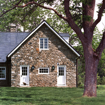
©️Maxwell MacKenzie THE HOME, ESSENTIALLY A RUIN WAS PRESERVED THROUGH NEGLECT. A CLARIFIED HISTORIC RENOVATION REMOVES BAY WINDOWS AND 1950’S WINDOWS FROM THE MAIN FAÇADE. TWO WINGS AND A THIRD FLOOR AND A SYMPATHETIC STAIRWAY ACCOMMODATE MODERN LIFE. MASONS WERE TASKED TO MAKE THE STONE WORK LOOK AS THOUGH “A FARMER BUILT THE WALLS DURING THE NON-PLANTING SEASON,” THE FINAL DESIGN SIMPLIFIES THE FIRST FLOOR PLAN AND LEAVES LOGICAL LOCATIONS FOR EXPANSION INTO COMING DECADES. AMONG OTHER AWARDS, THIS TRADITIONAL YET HISTORIC RENOVATION LOCATED IN MIDDLEBURG, VA HAS RECEIVED 2 AWARDS FROM THE AMERICAN INSTITUTE OF ARCHITECTURE.. AND A NATIONAL PRIVATE AWARD FROM VETTE WINDOWS
WASHINGTON DC ARCHITECT DONALD LOCOCO UPDATED THIS HISTORIC STONE HOUSE IN MIDDLEBURG, VA.lauded by the American Institute of Architects with an Award of Excellence for Historic Architecture, as well as an Award of Merit for Residential Architecture
4